
Search results for "Like new condition" in Home Design Ideas
 Advance Design Studio, Ltd.
Jackie and Sean loved the Algonquin neighborhood they lived in with the peaceful neighborhood and the close proximity to work and school. What they didn’t love was how outdated their home had become. With a cramped kitchen and an unused dining room, they decided a remodel was the perfect solution to their problem. They would be able to continue to live in the area they loved, while at the same time they could have the dream home they envisioned.
After a thorough search, Jackie came across Advance Design Studio. She was impressed by all of the positive reviews she saw on the internet and saw herself identifying with all of the project stories she saw on the website. Once they met with designer Scott Christensen and owner Todd Jurs, they knew Advance Design was the right company to make their dreams a reality.
The project consisted of four main areas: the kitchen/dining/powder room, the laundry room, the master bathroom, and the kid’s bathroom. They wanted to expand the kitchen into the seldom used dining room and add a large island for hosting parties and family gatherings. They also wanted new hardwood flooring throughout the first level. The laundry room needed to be more functional, and all three bathrooms were in dire need of updating.
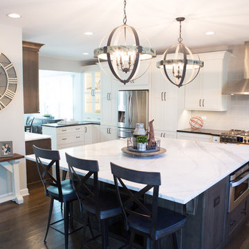
The closed off kitchen was opened up to create a sweeping space between the new eating area and the much larger kitchen. A handsome dry bar complete with a beverage refrigerator and lighted glass door cabinetry makes an elegant transition across from a peninsula area filled with storage. An additional decorative cabinet lighting up elegant dishware through the mullioned glass sits directly across from the drybar.
An expansive island was critical to the kitchen plans. Jackie, Sean and Scott worked closely together to create just the right details for their design. They wanted the island to be functional in addition to being the centerpiece of the room. Added storage for the kid’s school supplies was hidden behind cabinet doors so the children could do their schoolwork right at the island, and a microwave drawer glides open with the touch of a finger hidden inconspicuously within the island space. The easy to care for Cambria Britannica Quartz island top with its sweeping grey and white marble look perched atop hand-carved Craftsman corbels was absolutely what they were hoping for, blending both beauty and function perfectly.
Adding a nice contrast to the brightness of the quartz and the white cabinetry, Kodiak - Leather granite countertops were used to balance the light and dark tones of the space. Dura Supreme Classic White painted cabinets grace the perimeter, while Maple Poppy Seed stained cabinets with a beautiful soft grey woodgrain were used in the beverage center and island. The two tones compliment the large space balancing it out nicely creating interest and elegance with the simple Craftsman style full overlay doors.
A deep warm Barnwood White Oak flooring was added throughout the lower level. The new floor brings additional contrast to the bright kitchen and provides unity with the now open floorplan as it rolls in to the foyer and family room. Final details like the show-stopping lunar like duo light fixtures complete the space and intermix expertly with crisscross details of the glass door mullions, the island bar seating and even accessories in the space.
The small cluttered laundry room needed more space and more storage. With a busy family it seemed to overflow daily and did not have anywhere to hide the families “in and out stuff.” Scott designed the new space with a stackable washer and dryer and much more efficiently organized cabinetry. Doing laundry is now (almost!) a pleasure and keeping everyone’s “stuff” hidden, but readily accessible is now a snap.
The master bath was not a place where the couple enjoyed spending time getting ready for their day. The tub almost never was used, so removing it made it possible to build an extra-large shower, replacing the small cramped cube of the previous shower they hated. Clean, horizontal lines softly draw your eye around the space with porcelain tile called Driftwood Sea spray. Full overlay cabinetry in a soft white vanity with double sinks makes getting ready for the day much more convenient for the busy couple.
Long floor planks made of porcelain tile mimic real hardwood floors in a soft grey to compliment the shower, but with the ease and care of a tile surface. Cambrian Black Granite counters with a matte finish and under mount porcelain sinks with handsome brushed chrome hardware complete the handsome space. A real bonus in any master bath; a custom built in storage nook was tucked in the corner of the space for linens and heavenly storage.
The kid’s bath was in sad shape because it was original to the house. To keep the budget in control, the tub which was in great condition was retained, but focus was on the new large brick style porcelain charcoal tile on the floor, crisp white new Craftsman style cabinetry with pretty furniture details on the corner base, a striking granite top with white under mount porcelain sinks and fresh hardware and faucets. Some beautiful soft grey wood mirrors to match mom and dads were custom sized and placed under new lighting, and 4 hooks were smartly arranged down the wall for kids’ towels.
This couple was determined not to move, and made their house their dream home. Not only does their home function greatly now, but Jackie says, “When the neighbors come to visit, they’re asking if they can “steal” the design”! The added functionality, elegance, and open floor plan were exactly what this family needed in order to stay.
Advance Design Studio, Joe Nowak
 Raji RM
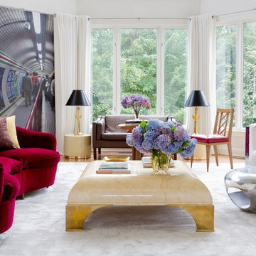
Example of a trendy formal medium tone wood floor living room design in DC Metro with white walls
 Usable Space Interiors, LLC
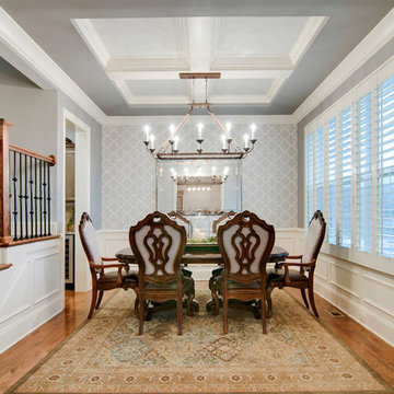
This client wanted to update their dining room without doing complete do-over like the home office. With new wallpaper, paint, re-upholstered chairs, a new light fixture and centerpiece, USI was able to transform this room in a cohesive theme with the rest of of homes "Redo". Look at BEFORE photos and see the difference.
Find the right local pro for your project
 Marcye Philbrook
Siri Blanchette/Blind Dog Photo Associates
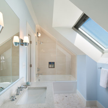
This kids bath has all the fun of a sunny day at the beach. In a contemporary way, the details in the room are nautical and beachy. The color of the walls are like a clear blue sky, the vanity lights look like vintage boat lights, the vanity top looks like sand, and the shower walls are meant to look like a sea shanty with weathered looking wood grained tile plank walls and a shower "window pane" cubby with hand painted tiles designed by Marcye that look like a view out to the beach. The floor is bleached pebbles with hand painted sea creature tiles placed randomly for the kids to find.
 Klopf Architecture
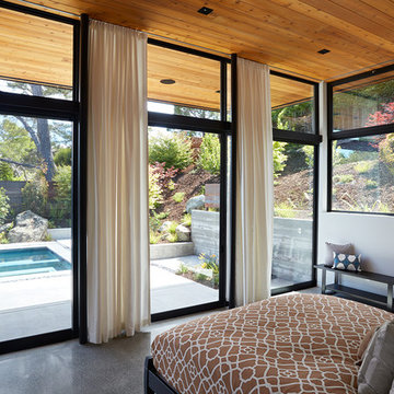
Klopf Architecture, Arterra Landscape Architects and Henry Calvert of Calvert Ventures Designed and built a new warm, modern, Eichler-inspired, open, indoor-outdoor home on a deeper-than-usual San Mateo Highlands property where an original Eichler house had burned to the ground.
The owners wanted multi-generational living and larger spaces than the original home offered, but all parties agreed that the house should respect the neighborhood and blend in stylistically with the other Eichlers. At first the Klopf team considered re-using what little was left of the original home and expanding on it. But after discussions with the owner and builder, all parties agreed that the last few remaining elements of the house were not practical to re-use, so Klopf Architecture designed a new home that pushes the Eichler approach in new directions.
One disadvantage of Eichler production homes is that the house designs were not optimized for each specific lot. A new custom home offered the team a chance to start over. In this case, a longer house that opens up sideways to the south fit the lot better than the original square-ish house that used to open to the rear (west). Accordingly, the Klopf team designed an L-shaped “bar” house with a large glass wall with large sliding glass doors that faces sideways instead of to the rear like a typical Eichler. This glass wall opens to a pool and landscaped yard designed by Arterra Landscape Architects.
Driving by the house, one might assume at first glance it is an Eichler because of the horizontality, the overhanging flat roof eaves, the dark gray vertical siding, and orange solid panel front door, but the house is designed for the 21st Century and is not meant to be a “Likeler.” You won't see any posts and beams in this home. Instead, the ceiling decking is a western red cedar that covers over all the beams. Like Eichlers, this cedar runs continuously from inside to out, enhancing the indoor / outdoor feeling of the house, but unlike Eichlers it conceals a cavity for lighting, wiring, and insulation. Ceilings are higher, rooms are larger and more open, the master bathroom is light-filled and more generous, with a separate tub and shower and a separate toilet compartment, and there is plenty of storage. The garage even easily fits two of today's vehicles with room to spare.
A massive 49-foot by 12-foot wall of glass and the continuity of materials from inside to outside enhance the inside-outside living concept, so the owners and their guests can flow freely from house to pool deck to BBQ to pool and back.
During construction in the rough framing stage, Klopf thought the front of the house appeared too tall even though the house had looked right in the design renderings (probably because the house is uphill from the street). So Klopf Architecture paid the framer to change the roofline from how we had designed it to be lower along the front, allowing the home to blend in better with the neighborhood. One project goal was for people driving up the street to pass the home without immediately noticing there is an "imposter" on this lot, and making that change was essential to achieve that goal.
This 2,606 square foot, 3 bedroom, 3 bathroom Eichler-inspired new house is located in San Mateo in the heart of the Silicon Valley.
Klopf Architecture Project Team: John Klopf, AIA, Klara Kevane
Landscape Architect: Arterra Landscape Architects
Contractor: Henry Calvert of Calvert Ventures
Photography ©2016 Mariko Reed
Location: San Mateo, CA
Year completed: 2016
 Dura Supreme Cabinetry
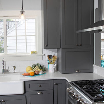
This gray and transitional kitchen remodel bridges the gap between contemporary style and traditional style. The dark gray cabinetry, light gray walls, and white subway tile backsplash make for a beautiful, neutral canvas for the bold teal blue and yellow décor accented throughout the design.
Designer Gwen Adair of Cabinet Supreme by Adair did a fabulous job at using grays to create a neutral backdrop to bring out the bright, vibrant colors that the homeowners love so much.
This Milwaukee, WI kitchen is the perfect example of Dura Supreme's recent launch of gray paint finishes, it has been interesting to see these new cabinetry colors suddenly flowing across our manufacturing floor, destined for homes around the country. We've already seen an enthusiastic acceptance of these new colors as homeowners started immediately selecting our various shades of gray paints, like this example of “Storm Gray”, for their new homes and remodeling projects!
Dura Supreme’s “Storm Gray” is the darkest of our new gray painted finishes (although our current “Graphite” paint finish is a charcoal gray that is almost black). For those that like the popular contrast between light and dark finishes, Storm Gray pairs beautifully with lighter painted and stained finishes.
Request a FREE Dura Supreme Brochure Packet:
http://www.durasupreme.com/request-brochure
 Misiaszek Turpin pllc
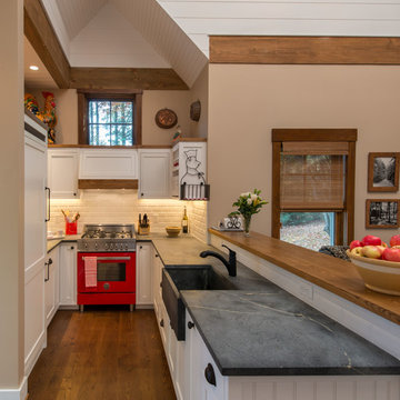
The 800 square-foot guest cottage is located on the footprint of a slightly smaller original cottage that was built three generations ago. With a failing structural system, the existing cottage had a very low sloping roof, did not provide for a lot of natural light and was not energy efficient. Utilizing high performing windows, doors and insulation, a total transformation of the structure occurred. A combination of clapboard and shingle siding, with standout touches of modern elegance, welcomes guests to their cozy retreat.
The cottage consists of the main living area, a small galley style kitchen, master bedroom, bathroom and sleeping loft above. The loft construction was a timber frame system utilizing recycled timbers from the Balsams Resort in northern New Hampshire. The stones for the front steps and hearth of the fireplace came from the existing cottage’s granite chimney. Stylistically, the design is a mix of both a “Cottage” style of architecture with some clean and simple “Tech” style features, such as the air-craft cable and metal railing system. The color red was used as a highlight feature, accentuated on the shed dormer window exterior frames, the vintage looking range, the sliding doors and other interior elements.
Photographer: John Hession
Sponsored
Fredericksburg, OH

High Point Cabinets
Columbus' Experienced Custom Cabinet Builder | 4x Best of Houzz Winner
 Susan Yeley Homes
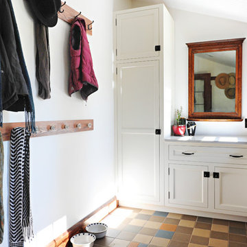
Like most of our projects, we can't gush about this reno—a new kitchen and mudroom, ensuite closet and pantry—without gushing about the people who live there. The best projects, we always say, are the ones in which client, contractor and design team are all present throughout, conception to completion, each bringing their particular expertise to the table and forming a cohesive, trustworthy team that is mutually invested in a smooth and successful process. They listen to each other, give the benefit of the doubt to each other, do what they say they'll do. This project exemplified that kind of team, and it shows in the results.
Most obvious is the opening up of the kitchen to the dining room, decompartmentalizing somewhat a century-old bungalow that was originally quite purposefully compartmentalized. As a result, the kitchen had to become a place one wanted to see clear through from the front door. Inset cabinets and carefully selected details make the functional heart of the house equal in elegance to the more "public" gathering spaces, with their craftsman depth and detail. An old back porch was converted to interior space, creating a mudroom and a much-needed ensuite walk-in closet. A new, larger deck went on: Phase One of an extensive design for outdoor living, that we all hope will be realized over the next few years. Finally, a duplicative back stairwell was repurposed into a walk-in pantry.
Modernizing often means opening spaces up for more casual living and entertaining, and/or making better use of dead space. In this re-conceptualized old house, we did all of that, creating a back-of-the-house that is now bright and cheerful and new, while carefully incorporating meaningful vintage and personal elements.
The best result of all: the clients are thrilled. And everyone who went in to the project came out of it friends.
Contractor: Stumpner Building Services
Cabinetry: Stoll’s Woodworking
Photographer: Gina Rogers
 Ward Jewell Architect AIA
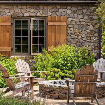
Ward Jewell, AIA was asked to design a comfortable one-story stone and wood pool house that was "barn-like" in keeping with the owner’s gentleman farmer concept. Thus, Mr. Jewell was inspired to create an elegant New England Stone Farm House designed to provide an exceptional environment for them to live, entertain, cook and swim in the large reflection lap pool.
Mr. Jewell envisioned a dramatic vaulted great room with hand selected 200 year old reclaimed wood beams and 10 foot tall pocketing French doors that would connect the house to a pool, deck areas, loggia and lush garden spaces, thus bringing the outdoors in. A large cupola “lantern clerestory” in the main vaulted ceiling casts a natural warm light over the graceful room below. The rustic walk-in stone fireplace provides a central focal point for the inviting living room lounge. Important to the functionality of the pool house are a chef’s working farm kitchen with open cabinetry, free-standing stove and a soapstone topped central island with bar height seating. Grey washed barn doors glide open to reveal a vaulted and beamed quilting room with full bath and a vaulted and beamed library/guest room with full bath that bookend the main space.
The private garden expanded and evolved over time. After purchasing two adjacent lots, the owners decided to redesign the garden and unify it by eliminating the tennis court, relocating the pool and building an inspired "barn". The concept behind the garden’s new design came from Thomas Jefferson’s home at Monticello with its wandering paths, orchards, and experimental vegetable garden. As a result this small organic farm, was born. Today the farm produces more than fifty varieties of vegetables, herbs, and edible flowers; many of which are rare and hard to find locally. The farm also grows a wide variety of fruits including plums, pluots, nectarines, apricots, apples, figs, peaches, guavas, avocados (Haas, Fuerte and Reed), olives, pomegranates, persimmons, strawberries, blueberries, blackberries, and ten different types of citrus. The remaining areas consist of drought-tolerant sweeps of rosemary, lavender, rockrose, and sage all of which attract butterflies and dueling hummingbirds.
Photo Credit: Laura Hull Photography. Interior Design: Jeffrey Hitchcock. Landscape Design: Laurie Lewis Design. General Contractor: Martin Perry Premier General Contractors
 Advance Design Studio, Ltd.
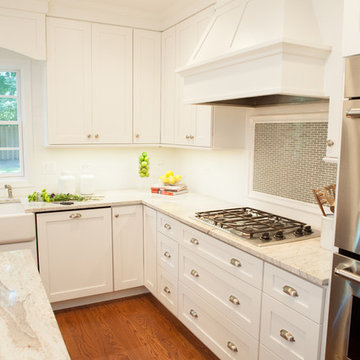
The design challenge was to enhance the square footage, flow and livability in this 1,442 sf 1930’s Tudor style brick house for a growing family of four. A two story 1,000 sf addition was the solution proposed by the design team at Advance Design Studio, Ltd. The new addition provided enough space to add a new kitchen and eating area with a butler pantry, a food pantry, a powder room and a mud room on the lower level, and a new master suite on the upper level.
The family envisioned a bright and airy white classically styled kitchen accented with espresso in keeping with the 1930’s style architecture of the home. Subway tile and timely glass accents add to the classic charm of the crisp white craftsman style cabinetry and sparkling chrome accents. Clean lines in the white farmhouse sink and the handsome bridge faucet in polished nickel make a vintage statement. River white granite on the generous new island makes for a fantastic gathering place for family and friends and gives ample casual seating. Dark stained oak floors extend to the new butler’s pantry and powder room, and throughout the first floor making a cohesive statement throughout. Classic arched doorways were added to showcase the home’s period details.
On the upper level, the newly expanded garage space nestles below an expansive new master suite complete with a spectacular bath retreat and closet space and an impressively vaulted ceiling. The soothing master getaway is bathed in soft gray tones with painted cabinets and amazing “fantasy” granite that reminds one of beach vacations. The floor mimics a wood feel underfoot with a gray textured porcelain tile and the spacious glass shower boasts delicate glass accents and a basket weave tile floor. Sparkling fixtures rest like fine jewelry completing the space.
The vaulted ceiling throughout the master suite lends to the spacious feel as does the archway leading to the expansive master closet. An elegant bank of 6 windows floats above the bed, bathing the space in light.
Photo Credits- Joe Nowak
 Illusions Vinyl Fence
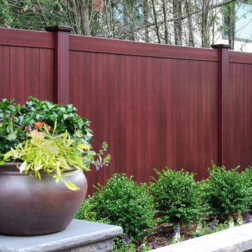
Beautiful new fence idea from Illusions Vinyl Fence. Grand Illusions Vinyl WoodBond Mahogany (W101) PVC vinyl fencing panels. They look like beautiful stained mahogany wood fence without the maintenance. This is a "neighbor-friendly" privacy fence style known as the V300-6W101. Tongue and Groove boards create the non-see through look. Available in 35 colors and 6 wood grains that can be mix and matched. This is simply the best new landscaping idea out there.
 MARGARITA BRAVO
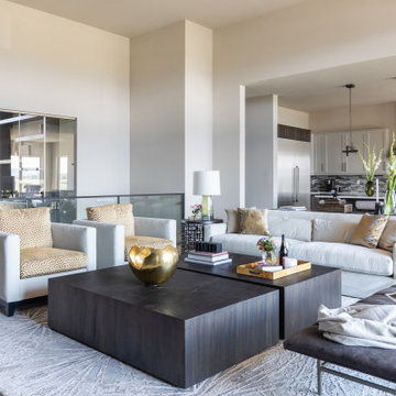
Our studio got to work with incredible clients to design this new-build home from the ground up in the gorgeous Castle Pines Village. We wanted to make certain that we showcased the breathtaking views, so we designed the entire space around the vistas. Our inspiration for this home was a mix of modern design and mountain style homes, and we made sure to add natural finishes and textures throughout. The fireplace in the great room is a perfect example of this, as we featured an Italian marble in different finishes and tied it together with an iron mantle. All the finishes, furniture, and material selections were hand-picked–like the 200-pound chandelier in the master bedroom and the hand-made wallpaper in the living room–to accentuate the natural setting of the home as well as to serve as focal design points themselves.
---
Project designed by Miami interior designer Margarita Bravo. She serves Miami as well as surrounding areas such as Coconut Grove, Key Biscayne, Miami Beach, North Miami Beach, and Hallandale Beach.
For more about MARGARITA BRAVO, click here: https://www.margaritabravo.com/
To learn more about this project, click here:
https://www.margaritabravo.com/portfolio/castle-pines-village-interior-design/
 Klopf Architecture
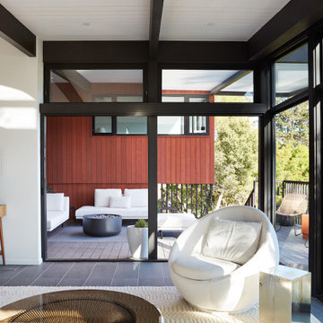
The Roger Lee designed house from 1962 was purchased by the current homeowners in almost original condition, as the previous owners elected to defer most maintenance projects over the years. The clients were able to see beyond the dated materials and finishes, single-paned glass and uninsulated walls and they approached Klopf Architecture to help them expand and update the entire home, one the family could settle into and enjoy for years to come. It was important that the new designs were aligned with Lee's original intent not only because of the client's appreciation for mid-century modern architecture, but also because the house was deemed historical. The Stanford Real Estate Office requires a stringent design review which safeguards the integrity of the community, which Klopf Architecture was happy to oblige going into their updated designs.
As with many original mid-century modern homes, the house was scaled to the 1960s lifestyle where rooms were smaller and openings to views were limited and tightly framed. The original conditions defined the direction the family of four would take in updating the house and making it comfortable for their modern lifestyle. Klopf designed a full gut remodel and major addition to bring the house into the 21st century and provide the living area needed for the client's family. The newly expanded house added just about 1,100 sf to create an airy, comfortable and family friendly house, taking full advantage of the beautiful southwestern views that extend out to the hills beyond. The enclosed garage created an additional 240 sf of covered space for long-term storage.
A cracked swimming pool created an eyesore taking up a majority of the backyard landscape, so it was one of the first elements to go during the transformation. Working with Outer Space Landscape Architects, the family asked for a mix of relaxing outdoor patio spaces that eventually blend into the native landscaping, extending their views outward toward the natural greenery of the trees beyond their property. Filling in the old pool was a smart way to expand the living spaces outward. The orientation of the house was designed to enjoy the views, but the original architecture provided the first homeowners with mere glimpses of the landscape outside.
Klopf was able to broaden those views, continuing and extending on the original architecture to take full advantage of the unobstructed natural views across the rear facade of the house. Small horizontal openings in the primary bedroom and office were replaced with much taller windows that now follow the angled roof line upward, extending across almost all of the facade. We worked with Western Windows, whose designs included an oblique-shaped, operable casement that allowed our design to rise with the slope. A new corner office added to the primary suite, offers a bright and functional work-from-home solution that looks out at the distant views and added natural light from the expanded window configuration that now wraps around the corner.
The existing lower level was designed by Lee as a utilitarian space, serving as a wet pool room with a drain in the center of the floor, bathroom, laundry and storage areas. Without the need for a pool room, Klopf was able to convert the area into a much more comfortable and functional living space with a new family room and guest suite. The new spaces enjoy easy access to a new outdoor patio through floor to ceiling, full-width glass sliders.
Continuing along the rear facade, a previously exposed deck extending from the living room and hallway provided access to the backyard through a single set of stairs leading toward the side of the house which made sense when the pool was in place. The new deck was re-envisioned as an extension of the main living room and now serves as a second outdoor living room. A new slatted pergola above provides the homeowners welcome relief from the hot afternoon sun. A second set of stairs now creates a better connection to the redesigned lower level. Klopf was able to reconfigure the spaces, extending the living room outward toward the views, where the family now claims it as the heart of the home, spending a large majority of their time outdoors.
Back inside, the original wood-burning Malm fireplace was beautifully restored and a gas burner installed to comply with California's strict air standards. It now rests in front of a wall of Heath accent tiles where a dated red brick wall used to stand. A new taller window brings more light and views into the refreshed interior living room. The original glass doors opposite the fireplace were replaced by larger sliders that when fully opened, create a seamless transition to the new outdoor living area so the two spaces feel like one connected space. The original utilitarian kitchen was needlessly tucked into the far back corner and closed-off, out of sight from the living room, so the clients asked Klopf to open it up and expand the kitchen forward so it felt more connected. Today the much larger kitchen is connected to the living area where a short wall with a cutout offers a visual glimpse into the kitchen and a handy pass-through counter for serving guests. A new breakfast nook was also added to create another spot where the family can gather for casual meals. Just outside, a new built-in outdoor grill and prep area extends the kitchen outside and connects to a new outdoor dining spot nestled amongst the trees, taking advantage of the views out back.
Klopf was able to expand the other two bedrooms, add a new laundry room and half-bath and convert the carport to an enclosed garage to add more storage areas which was lost when the pool house was converted to the family and guest room.
To maintain a historical connection to the original designs, the exterior siding was repeated on all exterior walls, a full-height stained glass window at the front entryway restored, and an interior slatted screen element repeated outside at the exterior entry courtyard and over the new outdoor living room to create a shade trellis. The new house stands proudly and shines against it's new landscaping features, while respecting and expanding on the original intent of Roger Lee's designs epitomizing the comforts of indoor-outdoor living in Northern California.
Completion year: 2020
Klopf Architecture project team: John Klopf, Klara Kevane, Noel Andrade
Contractor: ORB Construction, Brendan O'Reilly
Structural engineer: Sezen and Moon
Landscape architect: Outer space
Furnishings and decoration: Urbanism Designs
Photographer: Mariko Reed

 Advance Design Studio, Ltd.
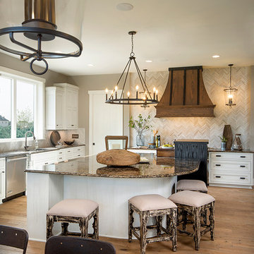
After six years of living in their Huntley IL home, Chris and Meghan were tired of their dark, dingy, outdated kitchen and it was finally time for a long-anticipated change. “The kitchen is the place where we live, it’s where we do everything,” Meghan said. “It was important that it be a space where we wanted to be.” Meghan loves cooking and enjoys including their girls in healthy meal prepping, this led them to want a brighter, more enjoyable kitchen with increased functionality and improved storage.
For Chris especially, the laundry room was an entirely dysfunctional eyesore. “We had a washer and a dryer, but it was all kind-of cobbled together!” Chris said. “There were always laundry piles everywhere, we weren’t really sure what we wanted to do in there, but it was time for us to make a change.” The mess of the space was stressful every time they walked in the door from the garage each day. Kids’ backpacks and shoes piled up haphazardly in the makeshift boot-bench closet left the family feeling disorganized and stressed. They needed space for folding clothes and locker cubbies to help keep the family organized.
Having known Christine and Todd in the Huntley community for years, Chris and Meghan were familiar with their work. “We already trusted them personally and having seen their projects for years we knew they did top notch work. After we reviewed the initial round of designs, we knew that hiring them was definitely the right choice,” Meghan and Chris said. Although Chris had done a lot of work in their home himself, the kitchen and laundry room renovation was such a large undertaking that he didn’t want to steal time away from his family to spend what would surely be many long weekends doing the job himself. “That would not have been a wise choice for us,” Chris laughed.
“Our designer, Michelle was very, very, easy to work with; anything we wanted to see or weren’t sure about, she went above and beyond to make this easy for us. She was easy to get hold of and always quick to respond,” the couple said. Michelle pulled ideas that mirrored the couple’s taste and style and was adept at directing the couple to limited choices that didn’t overwhelm them and kept the process moving. “I have a hard time making decisions. Michelle made the decision-making process so easy. I loved how she listened to what I liked and then presented three great options for me to choose from,” Meghan said.
The main objectives for the kitchen were better storage solutions, they wanted the space to reflect their lifestyle and taste, and they wanted it to last for years with low maintenance. One of the first steps in creating a more functional kitchen was relocating the refrigerator, creating an improved workflow for the busy family.
“We didn’t know that we could even move the refrigerator to a new location where it is now, that was something that we never would have thought of,” Chris said. “The new refrigerator location makes the kitchen feel so much bigger. We didn’t add any space, but our whole kitchen with the new design just seems like it’s so much larger than before!” Meghan said.
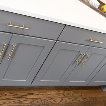
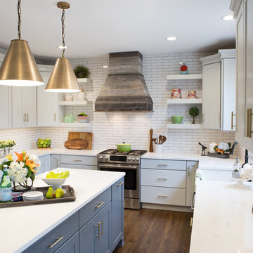
The perimeter mist colored cabinets helped warm and brighten the entire room, while the graphite colored cabinets on the island added contrast. Using this fresh, clean color palette satisfied the couple’s desire for a bright space that was the exact opposite of what they had before. Organization accessories were also added to the cabinets such as a spice drawer tray and roll outs to create hidden convenience.
“I absolutely love the hidden spices – it makes cooking so much more enjoyable!” Chris said. “And all the pull outs, and the double trash bin, who would think you could get so excited about organization!” the couple said in unison.
One thing they hated in their original kitchen was how dark the space felt. Added lighting on the ceiling with the new light fixtures combined with the lighter cabinetry colors throughout solved this problem. “Our new kitchen has this warm, almost cozy feeling that our old kitchen never had, it’s just a space that I love spending my time in now,” Meghan said. The light airy feeling was accentuated with the use of floating white shelves on either side of the decorative range hood. “We have so much cabinetry space, the new design is amazing we actually have more storage space than we will ever need,” Meghan said.
The island was extended to create more work surface and added space for stool seating. “The new island changes how we live. Now the kids can be in the kitchen with us, doing homework, eating breakfast, and the three of us have special dinners there when Chris is working late,” Meghan said.
The Carrara Marmi Quartz countertops were chosen because they are, not only beautiful, but are made from hard-working material that doesn’t require maintenance. The white subway tile backsplash that wraps to the ceiling behind the focal point cooktop range/hood compliments the crisp white countertops perfectly, while brushed brass hardware and light fixtures keep the design fresh and new.
The couple had a few fears at the beginning of the project, as most homeowners do. Their biggest fear was being out of their kitchen and laundry room for an extended time. The crew made it very easy for the family to work in a limited space keeping the washer and dryer hooked up the majority of the time, and also getting appliances working with minimal downtime.
“They above and beyond accommodated us to get us through the process,” Meghan said. “They did a great job making sure we were as comfortable as possible throughout the process,” Chris added.
“Our project manager DJ did a great job. He was very good at updating us on schedule changes, getting guys in as quickly as possible. Everyone that stepped in the house was nice and did great work,” said Chris. They thought Advance’s carpenter was phenomenal and were impressed when he took a conceptual idea from a photograph and worked with designer Michelle to create a one of a kind range/hood that has become the topic of conversation with friends and family who visit the new kitchen. “He was in our house literally every day for several weeks. He was easy to work with and good at what he did,” Meghan and Chris said.
The focal point of the kitchen; a hand-crafted, custom-built ventilation hood was clad with handpicked reclaimed barnwood. Advance Design’s carpenter built the framework and the cladding to create a one-of-a-kind design element that the couple loves.
“I think it was especially fun for him to create something unique from scratch, showcasing his talent in this area,” Meghan said. “I love that my kitchen is not like everyone else’s. I got to pick out the wood on my hood and watch it being built and was able to choose what pieces of wood went where on it. It’s totally unique.”
Red Oak flooring was toothed-in throughout the kitchen and the rest of the first floor anywhere changes were made. Then the whole floor was refinished to tone down the orange undertones in the existing floor stain, ultimately changing the color complexion of the entire first floor. The result is a completely new feeling to the entire home.
Renovating the laundry room was extremely important to Meghan and Chris, but they had trouble visualizing what the possibilities were for the seemingly small space. Michelle produced beautiful 3D illustrations that helped them envision the space in a whole new way.
“I must have told Michelle 100 times that I am a visual person, seeing the designs in 3D made it so easy to make decisions and see what we could really do with our space,” Meghan said.
A dividing wall and doorway were removed between the existing laundry room and hallway formerly containing a coat closet, providing space to design specialized graphite colored cabinetry matching the kitchen island to house custom storage cubbies for each family member. Adding the tall utility cabinetry in the new laundry area helped solve the storage issue, tucking away cleaning supplies, household items, and even the cat got its own cubby.
“I love how everything is now hidden in its own space. I can’t tell you how much I hated coming home and seeing everything sitting around on counters,” Chris said.
Electrical outlets were planned for the inside of utility cabinets, so devices could charge in hidden locations. Stacking the washer and dryer allowed for wider countertop space to provide a folding area and a special space for clothes to hang. “The way I do laundry has been completely transformed! I can actually fold clothes and hang them now right out of the washer and dryer,” Meghan said.
“The end result in the kitchen and the laundry/mud room was an updated light and bright space, with a smarter work flow that better meets the needs of this family,” Michelle said.
“I would totally recommend Advance Design,” Meghan said. “Sometimes I sit and just look at my kitchen and laundry room and think ‘Wow, I can’t believe I get to live here!’ It’s an understatement to say we love our new space.”
 Blue Heron
Trent Bell Photography
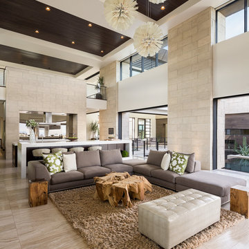
Huge trendy open concept living room photo in Las Vegas with white walls
Huge trendy open concept living room photo in Las Vegas with white walls
 Beechen & Dill Homes
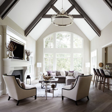
A custom home builder in Chicago's western suburbs, Summit Signature Homes, ushers in a new era of residential construction. With an eye on superb design and value, industry-leading practices and superior customer service, Summit stands alone. Custom-built homes in Clarendon Hills, Hinsdale, Western Springs, and other western suburbs.
 Advance Design Studio, Ltd.
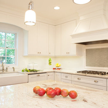
The design challenge was to enhance the square footage, flow and livability in this 1,442 sf 1930’s Tudor style brick house for a growing family of four. A two story 1,000 sf addition was the solution proposed by the design team at Advance Design Studio, Ltd. The new addition provided enough space to add a new kitchen and eating area with a butler pantry, a food pantry, a powder room and a mud room on the lower level, and a new master suite on the upper level.
The family envisioned a bright and airy white classically styled kitchen accented with espresso in keeping with the 1930’s style architecture of the home. Subway tile and timely glass accents add to the classic charm of the crisp white craftsman style cabinetry and sparkling chrome accents. Clean lines in the white farmhouse sink and the handsome bridge faucet in polished nickel make a vintage statement. River white granite on the generous new island makes for a fantastic gathering place for family and friends and gives ample casual seating. Dark stained oak floors extend to the new butler’s pantry and powder room, and throughout the first floor making a cohesive statement throughout. Classic arched doorways were added to showcase the home’s period details.
On the upper level, the newly expanded garage space nestles below an expansive new master suite complete with a spectacular bath retreat and closet space and an impressively vaulted ceiling. The soothing master getaway is bathed in soft gray tones with painted cabinets and amazing “fantasy” granite that reminds one of beach vacations. The floor mimics a wood feel underfoot with a gray textured porcelain tile and the spacious glass shower boasts delicate glass accents and a basket weave tile floor. Sparkling fixtures rest like fine jewelry completing the space.
The vaulted ceiling throughout the master suite lends to the spacious feel as does the archway leading to the expansive master closet. An elegant bank of 6 windows floats above the bed, bathing the space in light.
Photo Credits- Joe Nowak
Sponsored
Fredericksburg, OH
High Point Cabinets
Columbus' Experienced Custom Cabinet Builder | 4x Best of Houzz Winner
 Klopf Architecture
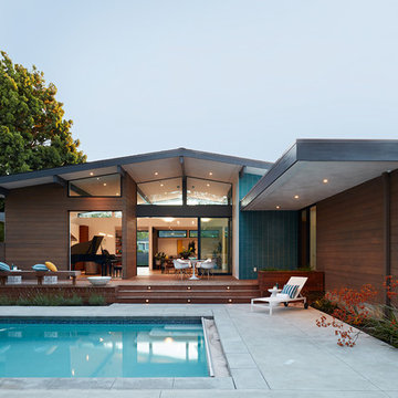
Klopf Architecture and Outer space Landscape Architects designed a new warm, modern, open, indoor-outdoor home in Los Altos, California. Inspired by mid-century modern homes but looking for something completely new and custom, the owners, a couple with two children, bought an older ranch style home with the intention of replacing it.
Created on a grid, the house is designed to be at rest with differentiated spaces for activities; living, playing, cooking, dining and a piano space. The low-sloping gable roof over the great room brings a grand feeling to the space. The clerestory windows at the high sloping roof make the grand space light and airy.
Upon entering the house, an open atrium entry in the middle of the house provides light and nature to the great room. The Heath tile wall at the back of the atrium blocks direct view of the rear yard from the entry door for privacy.
The bedrooms, bathrooms, play room and the sitting room are under flat wing-like roofs that balance on either side of the low sloping gable roof of the main space. Large sliding glass panels and pocketing glass doors foster openness to the front and back yards. In the front there is a fenced-in play space connected to the play room, creating an indoor-outdoor play space that could change in use over the years. The play room can also be closed off from the great room with a large pocketing door. In the rear, everything opens up to a deck overlooking a pool where the family can come together outdoors.
Wood siding travels from exterior to interior, accentuating the indoor-outdoor nature of the house. Where the exterior siding doesn’t come inside, a palette of white oak floors, white walls, walnut cabinetry, and dark window frames ties all the spaces together to create a uniform feeling and flow throughout the house. The custom cabinetry matches the minimal joinery of the rest of the house, a trim-less, minimal appearance. Wood siding was mitered in the corners, including where siding meets the interior drywall. Wall materials were held up off the floor with a minimal reveal. This tight detailing gives a sense of cleanliness to the house.
The garage door of the house is completely flush and of the same material as the garage wall, de-emphasizing the garage door and making the street presentation of the house kinder to the neighborhood.
The house is akin to a custom, modern-day Eichler home in many ways. Inspired by mid-century modern homes with today’s materials, approaches, standards, and technologies. The goals were to create an indoor-outdoor home that was energy-efficient, light and flexible for young children to grow. This 3,000 square foot, 3 bedroom, 2.5 bathroom new house is located in Los Altos in the heart of the Silicon Valley.
Klopf Architecture Project Team: John Klopf, AIA, and Chuang-Ming Liu
Landscape Architect: Outer space Landscape Architects
Structural Engineer: ZFA Structural Engineers
Staging: Da Lusso Design
Photography ©2018 Mariko Reed
Location: Los Altos, CA
Year completed: 2017
 Advance Design Studio, Ltd.
After six years of living in their Huntley IL home, Chris and Meghan were tired of their dark, dingy, outdated kitchen and it was finally time for a long-anticipated change. “The kitchen is the place where we live, it’s where we do everything,” Meghan said. “It was important that it be a space where we wanted to be.” Meghan loves cooking and enjoys including their girls in healthy meal prepping, this led them to want a brighter, more enjoyable kitchen with increased functionality and improved storage.
For Chris especially, the laundry room was an entirely dysfunctional eyesore. “We had a washer and a dryer, but it was all kind-of cobbled together!” Chris said. “There were always laundry piles everywhere, we weren’t really sure what we wanted to do in there, but it was time for us to make a change.” The mess of the space was stressful every time they walked in the door from the garage each day. Kids’ backpacks and shoes piled up haphazardly in the makeshift boot-bench closet left the family feeling disorganized and stressed. They needed space for folding clothes and locker cubbies to help keep the family organized.
Having known Christine and Todd in the Huntley community for years, Chris and Meghan were familiar with their work. “We already trusted them personally and having seen their projects for years we knew they did top notch work. After we reviewed the initial round of designs, we knew that hiring them was definitely the right choice,” Meghan and Chris said. Although Chris had done a lot of work in their home himself, the kitchen and laundry room renovation was such a large undertaking that he didn’t want to steal time away from his family to spend what would surely be many long weekends doing the job himself. “That would not have been a wise choice for us,” Chris laughed.
“Our designer, Michelle was very, very, easy to work with; anything we wanted to see or weren’t sure about, she went above and beyond to make this easy for us. She was easy to get hold of and always quick to respond,” the couple said. Michelle pulled ideas that mirrored the couple’s taste and style and was adept at directing the couple to limited choices that didn’t overwhelm them and kept the process moving. “I have a hard time making decisions. Michelle made the decision-making process so easy. I loved how she listened to what I liked and then presented three great options for me to choose from,” Meghan said.
The main objectives for the kitchen were better storage solutions, they wanted the space to reflect their lifestyle and taste, and they wanted it to last for years with low maintenance. One of the first steps in creating a more functional kitchen was relocating the refrigerator, creating an improved workflow for the busy family.
“We didn’t know that we could even move the refrigerator to a new location where it is now, that was something that we never would have thought of,” Chris said. “The new refrigerator location makes the kitchen feel so much bigger. We didn’t add any space, but our whole kitchen with the new design just seems like it’s so much larger than before!” Meghan said.
The perimeter mist colored cabinets helped warm and brighten the entire room, while the graphite colored cabinets on the island added contrast. Using this fresh, clean color palette satisfied the couple’s desire for a bright space that was the exact opposite of what they had before. Organization accessories were also added to the cabinets such as a spice drawer tray and roll outs to create hidden convenience.
“I absolutely love the hidden spices – it makes cooking so much more enjoyable!” Chris said. “And all the pull outs, and the double trash bin, who would think you could get so excited about organization!” the couple said in unison.
One thing they hated in their original kitchen was how dark the space felt. Added lighting on the ceiling with the new light fixtures combined with the lighter cabinetry colors throughout solved this problem. “Our new kitchen has this warm, almost cozy feeling that our old kitchen never had, it’s just a space that I love spending my time in now,” Meghan said. The light airy feeling was accentuated with the use of floating white shelves on either side of the decorative range hood. “We have so much cabinetry space, the new design is amazing we actually have more storage space than we will ever need,” Meghan said.
The island was extended to create more work surface and added space for stool seating. “The new island changes how we live. Now the kids can be in the kitchen with us, doing homework, eating breakfast, and the three of us have special dinners there when Chris is working late,” Meghan said.
The Carrara Marmi Quartz countertops were chosen because they are, not only beautiful, but are made from hard-working material that doesn’t require maintenance. The white subway tile backsplash that wraps to the ceiling behind the focal point cooktop range/hood compliments the crisp white countertops perfectly, while brushed brass hardware and light fixtures keep the design fresh and new.
The couple had a few fears at the beginning of the project, as most homeowners do. Their biggest fear was being out of their kitchen and laundry room for an extended time. The crew made it very easy for the family to work in a limited space keeping the washer and dryer hooked up the majority of the time, and also getting appliances working with minimal downtime.
“They above and beyond accommodated us to get us through the process,” Meghan said. “They did a great job making sure we were as comfortable as possible throughout the process,” Chris added.
“Our project manager DJ did a great job. He was very good at updating us on schedule changes, getting guys in as quickly as possible. Everyone that stepped in the house was nice and did great work,” said Chris. They thought Advance’s carpenter was phenomenal and were impressed when he took a conceptual idea from a photograph and worked with designer Michelle to create a one of a kind range/hood that has become the topic of conversation with friends and family who visit the new kitchen. “He was in our house literally every day for several weeks. He was easy to work with and good at what he did,” Meghan and Chris said.
The focal point of the kitchen; a hand-crafted, custom-built ventilation hood was clad with handpicked reclaimed barnwood. Advance Design’s carpenter built the framework and the cladding to create a one-of-a-kind design element that the couple loves.
“I think it was especially fun for him to create something unique from scratch, showcasing his talent in this area,” Meghan said. “I love that my kitchen is not like everyone else’s. I got to pick out the wood on my hood and watch it being built and was able to choose what pieces of wood went where on it. It’s totally unique.”
Red Oak flooring was toothed-in throughout the kitchen and the rest of the first floor anywhere changes were made. Then the whole floor was refinished to tone down the orange undertones in the existing floor stain, ultimately changing the color complexion of the entire first floor. The result is a completely new feeling to the entire home.
Renovating the laundry room was extremely important to Meghan and Chris, but they had trouble visualizing what the possibilities were for the seemingly small space. Michelle produced beautiful 3D illustrations that helped them envision the space in a whole new way.
“I must have told Michelle 100 times that I am a visual person, seeing the designs in 3D made it so easy to make decisions and see what we could really do with our space,” Meghan said.
A dividing wall and doorway were removed between the existing laundry room and hallway formerly containing a coat closet, providing space to design specialized graphite colored cabinetry matching the kitchen island to house custom storage cubbies for each family member. Adding the tall utility cabinetry in the new laundry area helped solve the storage issue, tucking away cleaning supplies, household items, and even the cat got its own cubby.
“I love how everything is now hidden in its own space. I can’t tell you how much I hated coming home and seeing everything sitting around on counters,” Chris said.
Electrical outlets were planned for the inside of utility cabinets, so devices could charge in hidden locations. Stacking the washer and dryer allowed for wider countertop space to provide a folding area and a special space for clothes to hang. “The way I do laundry has been completely transformed! I can actually fold clothes and hang them now right out of the washer and dryer,” Meghan said.
“The end result in the kitchen and the laundry/mud room was an updated light and bright space, with a smarter work flow that better meets the needs of this family,” Michelle said.
“I would totally recommend Advance Design,” Meghan said. “Sometimes I sit and just look at my kitchen and laundry room and think ‘Wow, I can’t believe I get to live here!’ It’s an understatement to say we love our new space.”
 Darci Hether
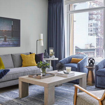
Our client for this project is a financier who has a beautiful home in the suburbs but wanted a second home in NYC as he spent 2-4 nights a week in the city. He wanted an upscale pied-à-terre that was soothing, moody, textural, comfortable, and contemporary while also being family-friendly as his college-age children might use it too. The apartment is a new build in Tribeca, and our New York City design studio loved working on this contemporary project. The entryway welcomes you with dark gray, deeply textured wallpaper and statement pieces like the angular mirror and black metal table that are an ode to industrial NYC style. The open kitchen and dining are sleek and flaunt statement metal lights, while the living room features textured contemporary furniture and a stylish bar cart. The bedroom is an oasis of calm and relaxation, with the textured wallpaper playing the design focal point. The luxury extends to the powder room with modern brass pendants, warm-toned natural stone, deep-toned walls, and organic-inspired artwork.
24