
Search results for "Limited time opportunities" in Home Design Ideas
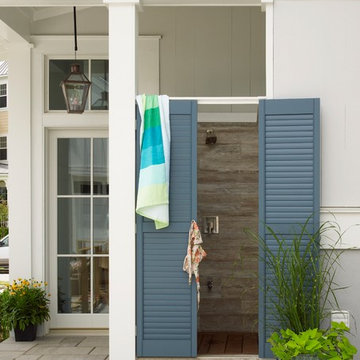
 Our Town Plans
Courtesy Coastal Living, a division of the Time Inc. Lifestyle Group, photography by Tria Giovan. Coastal Living is a registered trademark of Time Inc. and is used with permission.
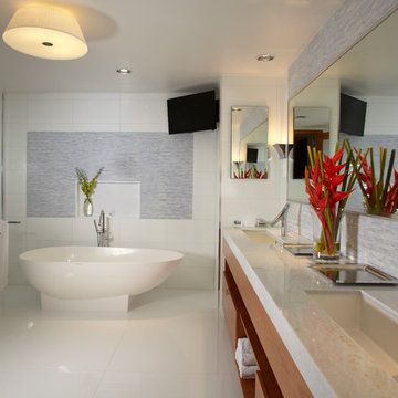
 J Design Group - Interior Designers Miami - Modern
Ocean front, Luxury home in Miami Beach
Projects by J Design Group, Your friendly Interior designers firm in Miami, FL. at your service.
AVENTURA MAGAZINE selected our client’s luxury 5000 Sf ocean front apartment in Miami Beach, to publish it in their issue and they Said:
Story by Linda Marx, Photography by Daniel Newcomb
Light & Bright
New York snowbirds redesigned their Miami Beach apartment to take advantage of the tropical lifestyle.
New York snowbirds redesigned their Miami Beach apartment to take advantage of the tropical lifestyle.
WHEN INTERIOR DESIGNER JENNIFER CORREDOR was asked to recreate a four-bedroom, six-bath condominium at The Bath Club in Miami Beach, she seized the opportunity to open the rooms and better utilize the vast ocean views.
In five months last year, the designer transformed a dark and closed 5,000-square-foot unit located on a high floor into a series of sweeping waterfront spaces and updated the well located apartment into a light and airy retreat for a sports-loving family of five.
“They come down from New York every other weekend and wanted to make their waterfront home a series of grand open spaces,” says Jennifer Corrredor, of the J. Design Group in Miami, a firm specializing in modern and contemporary interiors. “Since many of the rooms face the ocean, it made sense to open and lighten up the home, taking advantage of the awesome views of the sea and the bay.”
The designer used 40 x 40 all white tile throughout the apartment as a clean base. This way, her sophisticated use of color would stand out and bring the outdoors in.
The close-knit family members—two parents and three boys in college—like to do things together. But there were situations to overcome in the process of modernizing and opening the space. When Jennifer Corredor was briefed on their desires, nothing seemed too daunting. The confident designer was ready to delve in. For example, she fixed an area at the front door
that was curved. “The wood was concave so I straightened it out,” she explains of a request from the clients. “It was an obstacle that I overcame as part of what I do in a redesign. I don’t consider it a difficult challenge. Improving what I see is part of the process.”
She also tackled the kitchen with gusto by demolishing a wall. The kitchen had formerly been enclosed, which was a waste of space and poor use of available waterfront ambience. To create a grand space linking the kitchen to the living room and dining room area, something had to go. Once the wall was yesterday’s news, she relocated the refrigerator and freezer (two separate appliances) to the other side of the room. This change was a natural functionality in the new open space. “By tearing out the wall, the family has a better view of the kitchen from the living and dining rooms,” says Jennifer Corredor, who also made it easier to walk in and out of one area and into the other. “The views of the larger public space and the surrounding water are breathtaking.
Opening it up changed everything.”
They clients can now see the kitchen from the living and dining areas, and at the same time, dwell in an airy and open space instead of feeling stuck in a dark enclosed series of rooms. In fact, the high-top bar stools that Jennifer Corredor selected for the kitchen can be twirled around to use for watching TV in the living room.
In keeping with the theme of moving seamlessly from one room to the other, Corredor designed a subtle wall of glass in the living room along with lots of comfortable seating. This way, all family members feel at ease while relaxing, talking, or watching sporting events on the large flat screen television. “For this room, I wanted more open space, light and a supreme airy feeling,” she says. “With the glass design making a statement, it quickly became the star of the show.”…….
….. To add texture and depth, Jennifer Corredor custom created wood doors here, and in other areas of the home. They provide a nice contrast to the open Florida tropical feel. “I added character to the openness by using exotic cherry wood,” she says. “I repeated this throughout the home and it works well.”
Known for capturing the client’s vision while adding her own innovative twists, Jennifer Corredor lightened the family room, giving it a contemporary and modern edge with colorful art and matching throw pillows on the sofas. She added a large beige leather ottoman as the center coffee table in the room. This round piece was punctuated with a bold-toned flowering plant atop. It effortlessly matches the pillows and colors of the contemporary canvas.
Jennifer Corredor also gutted all of the bathrooms, resulting in a major redesign of the master. She jettisoned the whirlpool and created the dazzling illusion of a floating tub. From an area where there were two toilets, she eliminated one to make a grand rectangular shower, which became an overall showpiece. The master bath went from being just a functional water closet to a sophisticated spa-like space. “The client said I was ‘delicious’ after seeing the change,” laughed Jennifer Corredor, who emphasized that her clients love their part-time life in South Florida more each time they come down. Even when the husband has to work from their Miami Beach digs, he is surrounded by tropical beauty. For instance, there are times when the master bedroom must double as the husband’s home office.
The room had to be large enough to accommodate a working space for this purpose. So Jennifer Corredor placed an appropriate table near the window and across from the king-size bed. “No blocking of the amazing water view was necessary,” she says. “I kept an open space with a lot of white so It functions well and the work space fits right in.” She repeated the bold modern art in the room as well as in the guest bedroom, which also has a workspace for the sons when they are home from school and need to study.
The designer is still happy and glowing with the results of her toil in this apartment. She gets a “spiritual feeling” when she walks inside. “It is so peaceful and serene, with subtle hints of explosive statements,” she says. “The entire space is open, yet anchored by the warmth of the exotic woods.” The client wrote Jennifer Corredor a letter at the end of the project congratulating her on a
job well done. She revealed that owning a Miami Beach home was her husband’s dream 30 years ago. “Now we have a quality perfect yet practical home,” she wrote to the designer. “You solved the challenges, and the end
result far exceeds our expectations. We love it.”
Thanks for your interest in our Contemporary Interior Design projects and if you have any question please do not hesitate to ask us.
http://www.JDesignGroup.com
305.444.4611
Modern Interior designer Miami. Contemporary
Miami
Miami Interior Designers
Miami Interior Designer
Interior Designers Miami
Interior Designer Miami
Modern Interior Designers
Modern Interior Designer
Modern interior decorators
Modern interior decorator
Contemporary Interior Designers
Contemporary Interior Designer
Interior design decorators
Interior design decorator
Interior Decoration and Design
Black Interior Designers
Black Interior Designer
Interior designer
Interior designers
Interior design decorators
Interior design decorator
Home interior designers
Home interior designer
Interior design companies
Interior decorators
Interior decorator
Decorators
Decorator
Miami Decorators
Miami Decorator
Decorators Miami
Decorator Miami
Interior Design Firm
Interior Design Firms
Interior Designer Firm
Interior Designer Firms
Interior design
Interior designs
home decorators
Interior decorating Miami
Best Interior Designers.
225 Malaga Ave.
Coral Gable, FL 33134
http://www.JDesignGroup.com
305.444.4611
 J Design Group - Interior Designers Miami - Modern
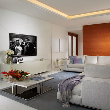
Modern Family Room, Miami Beach.
Ocean front, Luxury home in Miami Beach - Living Room.
Projects by J Design Group, Your friendly Interior designers firm in Miami, FL. at your service.
AVENTURA MAGAZINE selected our client’s luxury 5000 Sf ocean front apartment in Miami Beach, to publish it in their issue and they Said:
Story by Linda Marx, Photography by Daniel Newcomb
Light & Bright
New York snowbirds redesigned their Miami Beach apartment to take advantage of the tropical lifestyle.
New York snowbirds redesigned their Miami Beach apartment to take advantage of the tropical lifestyle.
WHEN INTERIOR DESIGNER JENNIFER CORREDOR was asked to recreate a four-bedroom, six-bath condominium at The Bath Club in Miami Beach, she seized the opportunity to open the rooms and better utilize the vast ocean views.
In five months last year, the designer transformed a dark and closed 5,000-square-foot unit located on a high floor into a series of sweeping waterfront spaces and updated the well located apartment into a light and airy retreat for a sports-loving family of five.
“They come down from New York every other weekend and wanted to make their waterfront home a series of grand open spaces,” says Jennifer Corrredor, of the J. Design Group in Miami, a firm specializing in modern and contemporary interiors. “Since many of the rooms face the ocean, it made sense to open and lighten up the home, taking advantage of the awesome views of the sea and the bay.”
The designer used 40 x 40 all white tile throughout the apartment as a clean base. This way, her sophisticated use of color would stand out and bring the outdoors in.
The close-knit family members—two parents and three boys in college—like to do things together. But there were situations to overcome in the process of modernizing and opening the space. When Jennifer Corredor was briefed on their desires, nothing seemed too daunting. The confident designer was ready to delve in. For example, she fixed an area at the front door
that was curved. “The wood was concave so I straightened it out,” she explains of a request from the clients. “It was an obstacle that I overcame as part of what I do in a redesign. I don’t consider it a difficult challenge. Improving what I see is part of the process.”
She also tackled the kitchen with gusto by demolishing a wall. The kitchen had formerly been enclosed, which was a waste of space and poor use of available waterfront ambience. To create a grand space linking the kitchen to the living room and dining room area, something had to go. Once the wall was yesterday’s news, she relocated the refrigerator and freezer (two separate appliances) to the other side of the room. This change was a natural functionality in the new open space. “By tearing out the wall, the family has a better view of the kitchen from the living and dining rooms,” says Jennifer Corredor, who also made it easier to walk in and out of one area and into the other. “The views of the larger public space and the surrounding water are breathtaking.
Opening it up changed everything.”
They clients can now see the kitchen from the living and dining areas, and at the same time, dwell in an airy and open space instead of feeling stuck in a dark enclosed series of rooms. In fact, the high-top bar stools that Jennifer Corredor selected for the kitchen can be twirled around to use for watching TV in the living room.
In keeping with the theme of moving seamlessly from one room to the other, Corredor designed a subtle wall of glass in the living room along with lots of comfortable seating. This way, all family members feel at ease while relaxing, talking, or watching sporting events on the large flat screen television. “For this room, I wanted more open space, light and a supreme airy feeling,” she says. “With the glass design making a statement, it quickly became the star of the show.”…….
….. To add texture and depth, Jennifer Corredor custom created wood doors here, and in other areas of the home. They provide a nice contrast to the open Florida tropical feel. “I added character to the openness by using exotic cherry wood,” she says. “I repeated this throughout the home and it works well.”
Known for capturing the client’s vision while adding her own innovative twists, Jennifer Corredor lightened the family room, giving it a contemporary and modern edge with colorful art and matching throw pillows on the sofas. She added a large beige leather ottoman as the center coffee table in the room. This round piece was punctuated with a bold-toned flowering plant atop. It effortlessly matches the pillows and colors of the contemporary canvas.
Jennifer Corredor also gutted all of the bathrooms, resulting in a major redesign of the master. She jettisoned the whirlpool and created the dazzling illusion of a floating tub. From an area where there were two toilets, she eliminated one to make a grand rectangular shower, which became an overall showpiece. The master bath went from being just a functional water closet to a sophisticated spa-like space. “The client said I was ‘delicious’ after seeing the change,” laughed Jennifer Corredor, who emphasized that her clients love their part-time life in South Florida more each time they come down. Even when the husband has to work from their Miami Beach digs, he is surrounded by tropical beauty. For instance, there are times when the master bedroom must double as the husband’s home office.
The room had to be large enough to accommodate a working space for this purpose. So Jennifer Corredor placed an appropriate table near the window and across from the king-size bed. “No blocking of the amazing water view was necessary,” she says. “I kept an open space with a lot of white so It functions well and the work space fits right in.” She repeated the bold modern art in the room as well as in the guest bedroom, which also has a workspace for the sons when they are home from school and need to study.
The designer is still happy and glowing with the results of her toil in this apartment. She gets a “spiritual feeling” when she walks inside. “It is so peaceful and serene, with subtle hints of explosive statements,” she says. “The entire space is open, yet anchored by the warmth of the exotic woods.” The client wrote Jennifer Corredor a letter at the end of the project congratulating her on a
job well done. She revealed that owning a Miami Beach home was her husband’s dream 30 years ago. “Now we have a quality perfect yet practical home,” she wrote to the designer. “You solved the challenges, and the end
result far exceeds our expectations. We love it.”
Thanks for your interest in our Contemporary Interior Design projects and if you have any question please do not hesitate to ask us.
http://www.JDesignGroup.com
305.444.4611
Modern Interior designer Miami. Contemporary
Miami
Miami Interior Designers
Miami Interior Designer
Interior Designers Miami
Interior Designer Miami
Modern Interior Designers
Modern Interior Designer
Modern interior decorators
Modern interior decorator
Contemporary Interior Designers
Contemporary Interior Designer
Interior design decorators
Interior design decorator
Interior Decoration and Design
Black Interior Designers
Black Interior Designer
Interior designer
Interior designers
Interior design decorators
Interior design decorator
Home interior designers
Home interior designer
Interior design companies
Interior decorators
Interior decorator
Decorators
Decorator
Miami Decorators
Miami Decorator
Decorators Miami
Decorator Miami
Interior Design Firm
Interior Design Firms
Interior Designer Firm
Interior Designer Firms
Interior design
Interior designs
home decorators
Interior decorating Miami
Best Interior Designers.
225 Malaga Ave.
Coral Gable, FL 33134
http://www.JDesignGroup.com
305.444.4611
Find the right local pro for your project

 Advance Design Studio, Ltd.
Jennifer and Dan have lived in their Deer Park Illinois home for 15 years, slowly making minor fixes like painting and decorating; but they had a new plan for their kitchen the entire time. An awkwardly placed garage door, and an island cooktop with a terrible downdraft made a full-scale kitchen remodel an absolute must. Jennifer had many ideas in mind and wanted to work with a company that could provide high-end work, while partnering with a designer that would tailor the kitchen to her ideas.
She was intrigued by the phrase “Common Sense Remodeling” in Advance Design’s feature she discovered while perusing an issue of the community’s Quintessential Barrington Magazine. Doing further research on the company’s website, as she looked through project profiles and read about Advance Design’s “Common Sense Remodeling” philosophy, she promptly scheduled an appointment to see if the people and ideas she read about were truly who they said they were. The more she read, the more she knew that the “Common Sense” approach to remodeling they described was exactly the type of company she was looking for.
The partnership was sealed after an initial consultation with Owner Todd Jurs and Project Designer Michelle Lecinski. They displayed a combination of friendliness, professionalism and respect that was unmatched by any of the other companies Jennifer talked to. She knew that with Advance Design, she would be able to retain the vision that she had in mind with high-quality craftsmanship.
“I reached out to Advance Design because of the ‘Common Sense Remodeling’ tagline,” Jennifer said. “That’s what lingered for me”. “Advance Design was the most respectful- of the house and of my design ideas, and the most professional of the handful of companies that looked at my project”.
Soon after the meeting Jennifer began working with Michelle on the project design. They quickly developed chemistry. Jennifer loved how Michelle researched and located every detail that Jennifer wanted for the kitchen. Between the two of them, every concept and idea was worked through and perfected. “Jennifer had definite ideas about what she wanted the new kitchen to look like, she just didn’t know how to bring it all together. We worked together really well to make her ideas into the practical reality necessary for a well-functioning kitchen, with the look and feel that she had envisioned”, says Michelle.
“Michelle was wonderful in using the CAD system she would show me new drawings every time we changed the layout while working through the design,” Jennifer said. “She was a really wonderful partner in execution, she made sure everything happened quickly and easily.”
The finished design drew out elements of Jennifer’s style and personality. The pair call the look “sophisticated farmhouse” to describe the kitchen renovation to family and friends. The result was a beautifully crafted, authentic-feeling space that satisfied Jennifer’s dreams 15 years in the making. The whole project consisted of a kitchen remodel, mudroom upgrade with powder room, and garage entry relocation. “The projects I personally like the best, are the ones that put the client’s dreams on display,” Project Designer Michelle said. “And this is one of those projects.”
The main focal point of the kitchen is custom zinc and brass ventilation hood with a vintage sheen, which was hand made to order by a small company in Indiana named Vogler Metalworking. “It’s like sculpture, a true work of art”, says Jennifer. Your eye is immediately drawn towards this elegant yet practical hood that eliminated the home’s downdraft problem and added a striking conversation piece at the same time. The carpenters had to use special gloves when transporting and installing it, so they didn’t smudge it with fingerprints. The beautiful hood centers proudly over the stunning black enamel and brass LaCornue Range. “I had a friend who had a LaCornue range and after learning how easy it was to cook perfect meals, I was convinced I wanted to have one”, says Jennifer. This unique, breathtaking combination anchors the entire kitchen and is apparent immediately as you walk into the great room the surrounds the space.
DuraSupreme Crestwood cabinets with a Kendall Panel add function and sophistication. A custom gray paint color paired with a storm blue was developed so that the new kitchen looked like it belonged to the existing space. Unlacquered brass faucets and hardware were important to Jennifer because she wanted the living finishes to age over time. Remarkable brass diamond mesh cabinet door inserts imported from the UK continue to add this one-of-a-kind kitchen renovation; giving it a “you won’t see this everywhere” quality. The use of old railcar flooring for the coffee bar countertop and reclaimed oak for the open shelving gives an authenticity to the space uncommon in kitchens today.
Jennifer and Michelle fell in love with the Limestone Grey Stone while they were investigating unique island countertop ideas. They liked the fact that the limestone as a living finish will age and change over time. Calcutta Miel Quartz countertops made for an excellent pairing around the perimeter, as it’s durable and perfect for cooking preparations. A textured white subway tile backsplash that runs to the ceiling keeps your eye moving towards the open shelving, and to the main focal point of the stunning range hood combination.
“The kitchen functions beautifully, and it’s gorgeous,” beams Jennifer as she gestures with both hands while smiling ear to ear. “The most important thing was I wanted a kitchen that had a wonderful flow, cooked beautiful meals and was a great gathering place for family and friends, and this space does that perfectly! Beauty wise, it turned out exactly how I had envisioned. I felt the function part was the hardest part, and that was nailed”!
Relocating the garage entry to the new mudroom was a huge priority and has finally separated the family’s arriving home functions from their kitchen. Now coats and shoes and bags have their own area for dropping once members arrive home. Matching gray DuraSupreme cabinetry helped create gorgeous, purposeful lockers for the family. A reclaimed vintage sink and custom wall paper were added to the tiny powder room to beautify the once previously only functional space. Advance Design was even able to create a custom space for their dog to sleep while the family is away.
“It was unbelievable that a project of this size was completed in such a short time, and I think that’s because of the large amount of planning and preparation that went into it,” Jennifer marveled, “When we started, we were ready, and everything was prepared”.
When it came to execution, Project Manager Justin Davis and his crew were quick, accessible, and organized. Projects like this kitchen are typically completed in as little as 8-10 weeks. Jennifer’s kitchen however despite the relocation of some challenging HVAC in a soffit and moving of an exterior door was completed remarkably fast in part because the team was working with an existing tile floor that ran throughout the first floor that the client really loved.
“You get to know these people really well because they’re living in your house while you’re living in your house. They were so fast and really good, it didn’t take as long as even planned” reported Jennifer. “I would text Justin and he always responded almost immediately. I got to know all the guys who were working in our house and they were all wonderful people”.
Details in a customized kitchen like this one require skill and care from the people who install it. “All the guys on the job were skilled at what the did. I wanted small details like little feet to look like furniture, that is where their carpentry skill came in to make these all perfect”, said Jennifer. “The tile guys were wonderful. They even let me determine how I wanted the texture with the grout to appear for a salt and pepper look; now that is a very skilled trade person making it custom”.
In Jennifer’s interview, she continued to reference Advance Design’s “Common Sense Remodeling”, so I took a minute to ask her exactly what that phrase meant to her and how it played out in her experience with her project and the Advance Design team. Here is what she said: “I was intrigued about Common Sense Remodeling and in my head that there would be clear costs and prices, great communication between the design team, the execution team and me”, said Jennifer. They did deliver on that, it was so clear about the cost breakdown, what I could expect from everyone who came to my house, and everything that we had ordered. That to me is the Common Sense”!
It’s great to see a client take literally our assertion that a well-planned remodeling project is simply “Common Sense”! She anticipated each step of the way would be clear, concise, and predictable, all the while protecting the outcome due to the careful upfront planning. “Advance Design delivered on their ‘Common Sense Remodeling’ promise,” Jennifer said. “From the design team, to the execution team - everything was straight forward like I imagined. The project turned out exactly how I envisioned, I enjoyed this process and absolutely would recommend Advance Design Studio to anyone.”
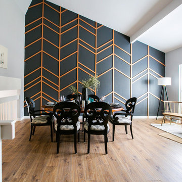
 TVL Creative Ltd.
Cramped kitchen be gone! That was the project motto and top priority. The goal was to transform the current layout from multiple smaller spaces into a connected whole that would activate the main level for our clients, a young family of four.
The biggest obstacle was the wall dividing the kitchen and the dining room. Removing this wall was central to opening up and integrating the main living spaces, but the existing ductwork that ran right through the center of the wall posed a design challenge, er design opportunity. The resulting design solution features a central pantry that captures the ductwork and provides valuable storage- especially when compared to the original kitchen's 18" wide pantry cabinet. The pantry also anchors the kitchen island and serves as a visual separation of space between the kitchen and homework area.
Through our design development process, we learned the formal living room was of no service to their lifestyle and therefore space they rarely spent time in. With that in mind, we proposed to eliminate the unused living room and make it the new dining room. Relocating the dining room to this space inherently felt right given the soaring ceiling and ample room for holiday dinners and celebrations. The new dining room was spacious enough for us to incorporate a conversational seating area in the warm, south-facing window alcove.
Now what to do with the old dining room?! To answer that question we took inspiration from our clients' shared profession in education and developed a craft area/homework station for both of their boys. The semi-custom cabinetry of the desk area carries over to the adjacent wall and forms window bench base with storage that we topped with butcher block for a touch of warmth. While the boys are young, the bench drawers are the perfect place for a stash of toys close to the kitchen.
The kitchen begins just beyond the window seat with their refrigerator enclosure. Opposite the refrigerator is the new pantry with twenty linear feet of shelving and space for brooms and a stick vacuum. Extending from the backside of the pantry the kitchen island design incorporates counter seating on the family room side and a cabinetry configuration on the kitchen side with drawer storage, a trashcan center, farmhouse sink, and dishwasher.
We took careful time in design and execution to align the range and sink because while it might seem like a small detail, it plays an important role in supporting the symmetrical configuration of the back wall of the kitchen. The rear wall design utilizes an appliance garage mirrors the visual impact of the refrigerator enclosure and helps keep the now open kitchen tidy. Between the appliance garage and refrigerator enclosure is the cooking zone with 30" of cabinetry and work surface on either side of the range, a chimney style vent hood, and a bold graphic tile backsplash.
The backsplash is just one of many personal touches we added to the space to reflect our client's modern eclectic style and love of color. Swooping lines of the mid-mod style barstools compliment the pendants and backsplash pattern. A pop of vibrant green on the frame of the pantry door adds a fresh wash of color to an otherwise neutral space. The big show stopper is the custom charcoal gray and copper chevron wall installation in the dining room. This was an idea our clients softly suggested, and we excitedly embraced the opportunity. It is also a kickass solution to the head-scratching design dilemma of how to fill a large and lofty wall.
We are so grateful to bring this design to life for our clients and now dear friends.
 Kadlec Architecture + Design
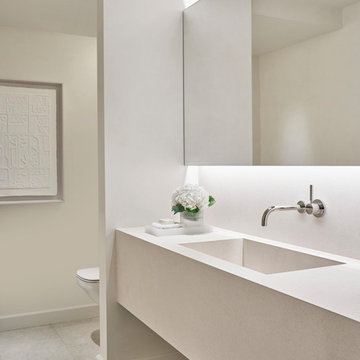
Our clients—philanthropists that split time between Chicago and Naples—embraced a rare opportunity to buy an adjacent unit and experience full-floor city living. With a vision for both intimate and large gatherings and minimal maintenance, we developed simple architectural details that organize the primary living spaces and integrate mechanical, lighting and structural elements. Their growing art collection is set against classic oak paneling, travertine and oak flooring and white lacquer finishes. Seeded glass and metal doors filter natural light into the center of the apartment and reflect city and lake views. The result is an understated yet inviting home.

 Thinkterior LLC
For a family who believes fitness is not only an essential part of life but also a fun opportunity for the whole family to connect, build and achieve greatness together there is nothing better than a custom designed obstacle course right in your back yard.
THEME
The theme of this half mile trail through the woods is evident in the fun, creative and all-inclusive obstacles hidden in the natural flow of the land around this amazing family home. The course was created with adults and children, advanced and beginner athletes, competitive and entertaining events all accounted for. Each of the 13 obstacles was designed to be challenging no matter the size, skill or ability of the athlete lucky enough to run the course.
FOCUS
The focus for this family was to create an outdoor adventure that could be an athletic, social and personal outlet for their entire family while maintaining the natural beauty of the landscape and without altering the sweeping views from the home. The large scale of the challenging obstacles is camouflaged within the landscape using the rolling hills and mature trees as a natural curtain in every season. The beauty of the course does not diminish the functional and demanding nature of the obstacles which are designed to focus on multiple strength, agility, and cardio fitness abilities and intensities.
STORAGE
The start of the trail includes a raised training area offering a dedicated space clear from the ground to place bags, mats and other equipment used during the run. A small all-terrain storage cart was provided for use with 6 yoga mats, 3 medicine balls of various weights, rings, sprinting cones, and a large digital timer to record laps.
GROWTH
The course was designed to provide an athletic and fun challenge for children, teens and adults no matter their experience or athletic prowess. This course offers competitive athletes a challenge and budding athletes an opportunity to experience and ignite their passion for physical activity. Initially the concept for the course was focused on the youngest of the family however as the design grew so did the obstacles and now it is a true family experience that will meet their adapting needs for years. Each obstacle is paired with an instructional sign directing the runners in proper use of the obstacle, adaptations for skill levels and tips on form. These signs are all customized for this course and are printed on metal to ensure they last for many years.
SAFETY
Safety is crucial for all physical activity and an obstacle course of this scale presents unique safety concerns. Children should always be supervised when participating in an adventure on the course however additional care was paid to details on the course to ensure everyone has a great time. All of the course obstacles have been created with pressure treated lumber that will withstand the seasonal poundings. All footer pilings that support obstacles have been placed into the ground between 3 to 4 feet (.9 to 1.2 meters) and each piling has 2 to 3 bags of concrete (totaling over 90 bags used throughout the course) ensuring stability of the structure and safety of the participants. Additionally, all obstacle lumber has been given rounded corners and sanded down offering less splintering and more time for everyone to enjoy the course.
This athletic and charismatic family strives to incorporate a healthy active lifestyle into their daily life and this obstacle course offers their family an opportunity to strengthen themselves and host some memorable and active events at their amazing home.
 Thinkterior LLC
For a family who believes fitness is not only an essential part of life but also a fun opportunity for the whole family to connect, build and achieve greatness together there is nothing better than a custom designed obstacle course right in your back yard.
THEME
The theme of this half mile trail through the woods is evident in the fun, creative and all-inclusive obstacles hidden in the natural flow of the land around this amazing family home. The course was created with adults and children, advanced and beginner athletes, competitive and entertaining events all accounted for. Each of the 13 obstacles was designed to be challenging no matter the size, skill or ability of the athlete lucky enough to run the course.
FOCUS
The focus for this family was to create an outdoor adventure that could be an athletic, social and personal outlet for their entire family while maintaining the natural beauty of the landscape and without altering the sweeping views from the home. The large scale of the challenging obstacles is camouflaged within the landscape using the rolling hills and mature trees as a natural curtain in every season. The beauty of the course does not diminish the functional and demanding nature of the obstacles which are designed to focus on multiple strength, agility, and cardio fitness abilities and intensities.
STORAGE
The start of the trail includes a raised training area offering a dedicated space clear from the ground to place bags, mats and other equipment used during the run. A small all-terrain storage cart was provided for use with 6 yoga mats, 3 medicine balls of various weights, rings, sprinting cones, and a large digital timer to record laps.
GROWTH
The course was designed to provide an athletic and fun challenge for children, teens and adults no matter their experience or athletic prowess. This course offers competitive athletes a challenge and budding athletes an opportunity to experience and ignite their passion for physical activity. Initially the concept for the course was focused on the youngest of the family however as the design grew so did the obstacles and now it is a true family experience that will meet their adapting needs for years. Each obstacle is paired with an instructional sign directing the runners in proper use of the obstacle, adaptations for skill levels and tips on form. These signs are all customized for this course and are printed on metal to ensure they last for many years.
SAFETY
Safety is crucial for all physical activity and an obstacle course of this scale presents unique safety concerns. Children should always be supervised when participating in an adventure on the course however additional care was paid to details on the course to ensure everyone has a great time. All of the course obstacles have been created with pressure treated lumber that will withstand the seasonal poundings. All footer pilings that support obstacles have been placed into the ground between 3 to 4 feet (.9 to 1.2 meters) and each piling has 2 to 3 bags of concrete (totaling over 90 bags used throughout the course) ensuring stability of the structure and safety of the participants. Additionally, all obstacle lumber has been given rounded corners and sanded down offering less splintering and more time for everyone to enjoy the course.
This athletic and charismatic family strives to incorporate a healthy active lifestyle into their daily life and this obstacle course offers their family an opportunity to strengthen themselves and host some memorable and active events at their amazing home.
 MOTIV Interiors
Interior Designer: MOTIV Interiors LLC
Photographer: Sam Angel Photography
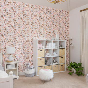
Design Challenge: This 8 year-old boy and girl were outgrowing their existing setup and needed to update their rooms with a plan that would carry them forward into middle school and beyond. In addition to gaining storage and study areas, could these twins show off their big personalities? Absolutely, we said! MOTIV Interiors tackled the rooms of these youngsters living in Nashville's 12th South Neighborhood and created an environment where the dynamic duo can learn, create, and grow together for years to come.
Design Solution:
In her room, we wanted to create a fun-filled space that supports softball, sleepovers, science, and anything else a girl might want to get into. The star of the show is a beautiful hand-printed wallpaper by Brooklyn designer Aimee Wilder, whose FSC-certified papers contain no VOC’s (Volatile Organic Compounds). That means that in addition to packing a powerful visual punch, they meet our standard for excellent indoor air quality. We also love this wallpaper because it is composed of so many different neutral colors - this room can organically evolve over time without necessarily replacing the paper (which was installed with a no-VOC adhesive).
We refreshed the remaining walls with a scrubbable no-VOC paint from Sherwin Williams (7008 Alabaster) and gave the carpets in both of the twins’ rooms a good cleaning and simple stretch as opposed to replacing them. In order to provide more functional light in her room, we incorporated a corner floor lamp for reading, a telescoping desk lamp for studying, and an eye-catching LED flower pendant on a dimmer switch sourced from Lightology. Custom window treatments in a linen/cotton blend emphasize the height of the room and bring in a little “bling” with antiqued gold hardware.
Before we even thought about aesthetics, however, MOTIV Interiors got to work right away on increasing functionality. We added a spacious storage unit with plenty of baskets for all of our young client’s animal friends, and we made sure to include ample shelf space for books and hobbies as she finds new passions to explore down the road. We always prefer eco-friendly furnishings that are manufactured responsibly, made with sustainably harvested wood (FSC Certified), and use no glue or non-toxic glues and paints.
The bedding in this project is 100% cotton and contains no synthetic fibers. When purchasing bedding, check for the GOTS Certification (Global Organic Textile Standard). The introduction of a desk and drawer unit created a calming space to study and reflect, or write a letter to a friend. Gold accents add a bit of warmth to the workspace, where she can display her memories, goals, and game plans for a bright future.
We hope you enjoyed this project as much as we did! Each design challenge is an opportunity to push the envelope, by creating a new and exciting aesthetic or finding creative ways to incorporate sustainable design principles.
 LK Design
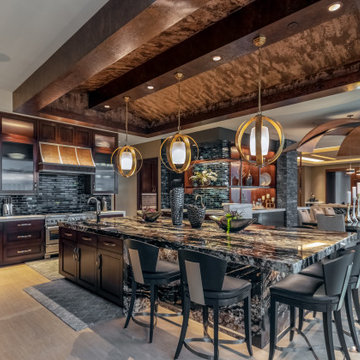
This project began with an entire penthouse floor of open raw space which the clients had the opportunity to section off the piece that suited them the best for their needs and desires. As the design firm on the space, LK Design was intricately involved in determining the borders of the space and the way the floor plan would be laid out. Taking advantage of the southwest corner of the floor, we were able to incorporate three large balconies, tremendous views, excellent light and a layout that was open and spacious. There is a large master suite with two large dressing rooms/closets, two additional bedrooms, one and a half additional bathrooms, an office space, hearth room and media room, as well as the large kitchen with oversized island, butler's pantry and large open living room. The clients are not traditional in their taste at all, but going completely modern with simple finishes and furnishings was not their style either. What was produced is a very contemporary space with a lot of visual excitement. Every room has its own distinct aura and yet the whole space flows seamlessly. From the arched cloud structure that floats over the dining room table to the cathedral type ceiling box over the kitchen island to the barrel ceiling in the master bedroom, LK Design created many features that are unique and help define each space. At the same time, the open living space is tied together with stone columns and built-in cabinetry which are repeated throughout that space. Comfort, luxury and beauty were the key factors in selecting furnishings for the clients. The goal was to provide furniture that complimented the space without fighting it.
 Gallery KBNY
This brownstone renovation was a full gut project in every sense of the word. On top of installing new floors, a kitchen and bath renovation, and all the typical restoration and refinishing involved in a brownstone built in 1899, we also completely updated the exterior, constructed a balcony that was not originally there, and converted the space from a single-family home into an an owner’s triplex. A newly separated studio rental on the garden level offers the opportunity for supplemental income, an uncommon and welcome addition to a New York brownstone.
A TRANSITIONAL GEM
The result is a two-family brownstone that perfectly combines classic townhouse living with today’s modern needs, including SmartHome technology that we installed to control Bluetooth speakers, Nest thermostats, and the security system.
The overall aesthetic goal was to pay homage to the historical periods the brownstone has lived through in a cohesive way that is the hallmark of modern transitional style.
In the kitchen, white Shaker-style cabinetry, a subway tile backsplash, and marble rather than quartz countertops bring a classically upscale sensibility. To modernize the space further, we opened up the back wall to create floor-to-ceiling windows that are also doors, opening up into the newly built balcony.
TIMELY TOUCHES
This brownstone renovation included many quintessential elements, such as millwork like the ceiling medallions. We restored some and custom built others, perfectly recreating their original appearance.
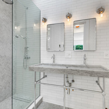
The heated master bathroom is now serene, with a walk-in shower featuring a subtly modern linear drain. A herringbone Carrera marble tiled floor and marble slab sink complete the scene. In the powder room, we embraced a contemporary look by pairing dark hexagonal floors with light chevron tiles, accented with dramatic navy blue wallpaper. With its clear-cut 1920s-style, we selected the wall sconce to reference one of the brownstone’s earlier eras.
DESIGN DETAILS
Natural oak herringbone floors we installed throughout the entire home bring a modern yet warm touch. We restored the wood-burning marble fireplace, which is fully functioning. An elegant staircase with a custom-crafted black wooden banister and white balusters winds up and down alongside a real brick interior wall that we restored and refinished.
In this brownstone renovation, we were also able to create ceiling height, an unexpected yet aesthetically pleasing side benefit. When working on the joists and beams to level out the floors (a common issue in pre-war renovations) we added ceiling height in the main parlor floor by taking the second floor and raising the ceiling an entire foot. The end result is a main floor with stunning 9-foot ceilings.
SOME HIGHLIGHTS
- Solid natural oak herringbone floors throughout
- A fully restored, refinished, and functioning wood burning fireplace with a marble mantle
- Complete exterior renovation of the facade, cornices, windows, mouldings, and even the ironwork, including the railings leading up to the stoop and those facing the street
- A brand new central air and heating system with uniquely modern vents – look above the couch in the living room with the fuzzy rug and large painting
Considering a brownstone renovation? Contact us today! We specialize in brownstone renovations in New York as well as all pre-war apartments. When you work with a design-and-build firm like Gallery to renovate your brownstone, you get the full range of our expertise in working with all the finest details and pre-war architectural elements of these classic New York spaces. We also handle every step of the process, from filing permits and organizing schedules to sourcing custom pieces and building entirely new rooms (or even balconies). Call us for a free initial consultation when you’re ready.
 User
UserReference: BB513-US
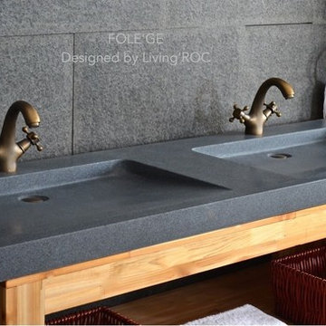
Model: FOLE'GE
Color: trendy gray
Finitions: honed - matte
US Dimensions: 63" x 19-2/3" x 2-1/3"
EU Dimensions: 160 x 50 x 6cm
US Drain size: standard hole size (1.5")
Faucet hole size: 35mm - 1.38" X2
Material: granite
Weight: 275 lbs
The outstanding opportunity to make your world unique! Add great value to your home by installing LivingRoc Creations and tell your stone story through the years of conception. Its Zen-style, pure and sleek lines will give a cool and chic look to your bathroom. Made from a block of Granite the FOLE'GE is from the AQUADEOS range. Our FOLE'GE is the creation of a combined group of talented masons dedicated to the idea of creating bathware made from natural material, which is environmentally friendly.
Adding stone elements will provide a modern, serene, and trendy atmosphere in your bathroom. Honed finishes and its very convenient slope will add practicality to beauty.
This natural stone double sink will complement perfectly our shower gray trendy shower trays (same color and finish) as they are coming from the same quarry and most of the time from the same granite block : Spacium, Palaos, Quasar or Dalaos. This vessel sink is Highly resistant to chipping and scratching, Withstands hot temperatures, Tolerant to very high temperature changes.
Our creation is delivered without an overflow drain and faucet (not included) - every US drains and faucets models you can find on the market will fit perfectly on Living'ROC vessel sink. This model is ready to use over the countertop.
 Advance Design Studio, Ltd.
After six years of living in their Huntley IL home, Chris and Meghan were tired of their dark, dingy, outdated kitchen and it was finally time for a long-anticipated change. “The kitchen is the place where we live, it’s where we do everything,” Meghan said. “It was important that it be a space where we wanted to be.” Meghan loves cooking and enjoys including their girls in healthy meal prepping, this led them to want a brighter, more enjoyable kitchen with increased functionality and improved storage.
For Chris especially, the laundry room was an entirely dysfunctional eyesore. “We had a washer and a dryer, but it was all kind-of cobbled together!” Chris said. “There were always laundry piles everywhere, we weren’t really sure what we wanted to do in there, but it was time for us to make a change.” The mess of the space was stressful every time they walked in the door from the garage each day. Kids’ backpacks and shoes piled up haphazardly in the makeshift boot-bench closet left the family feeling disorganized and stressed. They needed space for folding clothes and locker cubbies to help keep the family organized.
Having known Christine and Todd in the Huntley community for years, Chris and Meghan were familiar with their work. “We already trusted them personally and having seen their projects for years we knew they did top notch work. After we reviewed the initial round of designs, we knew that hiring them was definitely the right choice,” Meghan and Chris said. Although Chris had done a lot of work in their home himself, the kitchen and laundry room renovation was such a large undertaking that he didn’t want to steal time away from his family to spend what would surely be many long weekends doing the job himself. “That would not have been a wise choice for us,” Chris laughed.
“Our designer, Michelle was very, very, easy to work with; anything we wanted to see or weren’t sure about, she went above and beyond to make this easy for us. She was easy to get hold of and always quick to respond,” the couple said. Michelle pulled ideas that mirrored the couple’s taste and style and was adept at directing the couple to limited choices that didn’t overwhelm them and kept the process moving. “I have a hard time making decisions. Michelle made the decision-making process so easy. I loved how she listened to what I liked and then presented three great options for me to choose from,” Meghan said.
The main objectives for the kitchen were better storage solutions, they wanted the space to reflect their lifestyle and taste, and they wanted it to last for years with low maintenance. One of the first steps in creating a more functional kitchen was relocating the refrigerator, creating an improved workflow for the busy family.
“We didn’t know that we could even move the refrigerator to a new location where it is now, that was something that we never would have thought of,” Chris said. “The new refrigerator location makes the kitchen feel so much bigger. We didn’t add any space, but our whole kitchen with the new design just seems like it’s so much larger than before!” Meghan said.
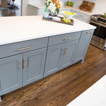
The perimeter mist colored cabinets helped warm and brighten the entire room, while the graphite colored cabinets on the island added contrast. Using this fresh, clean color palette satisfied the couple’s desire for a bright space that was the exact opposite of what they had before. Organization accessories were also added to the cabinets such as a spice drawer tray and roll outs to create hidden convenience.
“I absolutely love the hidden spices – it makes cooking so much more enjoyable!” Chris said. “And all the pull outs, and the double trash bin, who would think you could get so excited about organization!” the couple said in unison.
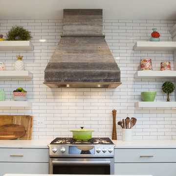
One thing they hated in their original kitchen was how dark the space felt. Added lighting on the ceiling with the new light fixtures combined with the lighter cabinetry colors throughout solved this problem. “Our new kitchen has this warm, almost cozy feeling that our old kitchen never had, it’s just a space that I love spending my time in now,” Meghan said. The light airy feeling was accentuated with the use of floating white shelves on either side of the decorative range hood. “We have so much cabinetry space, the new design is amazing we actually have more storage space than we will ever need,” Meghan said.
The island was extended to create more work surface and added space for stool seating. “The new island changes how we live. Now the kids can be in the kitchen with us, doing homework, eating breakfast, and the three of us have special dinners there when Chris is working late,” Meghan said.
The Carrara Marmi Quartz countertops were chosen because they are, not only beautiful, but are made from hard-working material that doesn’t require maintenance. The white subway tile backsplash that wraps to the ceiling behind the focal point cooktop range/hood compliments the crisp white countertops perfectly, while brushed brass hardware and light fixtures keep the design fresh and new.
The couple had a few fears at the beginning of the project, as most homeowners do. Their biggest fear was being out of their kitchen and laundry room for an extended time. The crew made it very easy for the family to work in a limited space keeping the washer and dryer hooked up the majority of the time, and also getting appliances working with minimal downtime.
“They above and beyond accommodated us to get us through the process,” Meghan said. “They did a great job making sure we were as comfortable as possible throughout the process,” Chris added.
“Our project manager DJ did a great job. He was very good at updating us on schedule changes, getting guys in as quickly as possible. Everyone that stepped in the house was nice and did great work,” said Chris. They thought Advance’s carpenter was phenomenal and were impressed when he took a conceptual idea from a photograph and worked with designer Michelle to create a one of a kind range/hood that has become the topic of conversation with friends and family who visit the new kitchen. “He was in our house literally every day for several weeks. He was easy to work with and good at what he did,” Meghan and Chris said.
The focal point of the kitchen; a hand-crafted, custom-built ventilation hood was clad with handpicked reclaimed barnwood. Advance Design’s carpenter built the framework and the cladding to create a one-of-a-kind design element that the couple loves.
“I think it was especially fun for him to create something unique from scratch, showcasing his talent in this area,” Meghan said. “I love that my kitchen is not like everyone else’s. I got to pick out the wood on my hood and watch it being built and was able to choose what pieces of wood went where on it. It’s totally unique.”
Red Oak flooring was toothed-in throughout the kitchen and the rest of the first floor anywhere changes were made. Then the whole floor was refinished to tone down the orange undertones in the existing floor stain, ultimately changing the color complexion of the entire first floor. The result is a completely new feeling to the entire home.
Renovating the laundry room was extremely important to Meghan and Chris, but they had trouble visualizing what the possibilities were for the seemingly small space. Michelle produced beautiful 3D illustrations that helped them envision the space in a whole new way.
“I must have told Michelle 100 times that I am a visual person, seeing the designs in 3D made it so easy to make decisions and see what we could really do with our space,” Meghan said.
A dividing wall and doorway were removed between the existing laundry room and hallway formerly containing a coat closet, providing space to design specialized graphite colored cabinetry matching the kitchen island to house custom storage cubbies for each family member. Adding the tall utility cabinetry in the new laundry area helped solve the storage issue, tucking away cleaning supplies, household items, and even the cat got its own cubby.
“I love how everything is now hidden in its own space. I can’t tell you how much I hated coming home and seeing everything sitting around on counters,” Chris said.
Electrical outlets were planned for the inside of utility cabinets, so devices could charge in hidden locations. Stacking the washer and dryer allowed for wider countertop space to provide a folding area and a special space for clothes to hang. “The way I do laundry has been completely transformed! I can actually fold clothes and hang them now right out of the washer and dryer,” Meghan said.
“The end result in the kitchen and the laundry/mud room was an updated light and bright space, with a smarter work flow that better meets the needs of this family,” Michelle said.
“I would totally recommend Advance Design,” Meghan said. “Sometimes I sit and just look at my kitchen and laundry room and think ‘Wow, I can’t believe I get to live here!’ It’s an understatement to say we love our new space.”
 Advance Design Studio, Ltd.
After six years of living in their Huntley IL home, Chris and Meghan were tired of their dark, dingy, outdated kitchen and it was finally time for a long-anticipated change. “The kitchen is the place where we live, it’s where we do everything,” Meghan said. “It was important that it be a space where we wanted to be.” Meghan loves cooking and enjoys including their girls in healthy meal prepping, this led them to want a brighter, more enjoyable kitchen with increased functionality and improved storage.
For Chris especially, the laundry room was an entirely dysfunctional eyesore. “We had a washer and a dryer, but it was all kind-of cobbled together!” Chris said. “There were always laundry piles everywhere, we weren’t really sure what we wanted to do in there, but it was time for us to make a change.” The mess of the space was stressful every time they walked in the door from the garage each day. Kids’ backpacks and shoes piled up haphazardly in the makeshift boot-bench closet left the family feeling disorganized and stressed. They needed space for folding clothes and locker cubbies to help keep the family organized.
Having known Christine and Todd in the Huntley community for years, Chris and Meghan were familiar with their work. “We already trusted them personally and having seen their projects for years we knew they did top notch work. After we reviewed the initial round of designs, we knew that hiring them was definitely the right choice,” Meghan and Chris said. Although Chris had done a lot of work in their home himself, the kitchen and laundry room renovation was such a large undertaking that he didn’t want to steal time away from his family to spend what would surely be many long weekends doing the job himself. “That would not have been a wise choice for us,” Chris laughed.
“Our designer, Michelle was very, very, easy to work with; anything we wanted to see or weren’t sure about, she went above and beyond to make this easy for us. She was easy to get hold of and always quick to respond,” the couple said. Michelle pulled ideas that mirrored the couple’s taste and style and was adept at directing the couple to limited choices that didn’t overwhelm them and kept the process moving. “I have a hard time making decisions. Michelle made the decision-making process so easy. I loved how she listened to what I liked and then presented three great options for me to choose from,” Meghan said.
The main objectives for the kitchen were better storage solutions, they wanted the space to reflect their lifestyle and taste, and they wanted it to last for years with low maintenance. One of the first steps in creating a more functional kitchen was relocating the refrigerator, creating an improved workflow for the busy family.
“We didn’t know that we could even move the refrigerator to a new location where it is now, that was something that we never would have thought of,” Chris said. “The new refrigerator location makes the kitchen feel so much bigger. We didn’t add any space, but our whole kitchen with the new design just seems like it’s so much larger than before!” Meghan said.
The perimeter mist colored cabinets helped warm and brighten the entire room, while the graphite colored cabinets on the island added contrast. Using this fresh, clean color palette satisfied the couple’s desire for a bright space that was the exact opposite of what they had before. Organization accessories were also added to the cabinets such as a spice drawer tray and roll outs to create hidden convenience.
“I absolutely love the hidden spices – it makes cooking so much more enjoyable!” Chris said. “And all the pull outs, and the double trash bin, who would think you could get so excited about organization!” the couple said in unison.
One thing they hated in their original kitchen was how dark the space felt. Added lighting on the ceiling with the new light fixtures combined with the lighter cabinetry colors throughout solved this problem. “Our new kitchen has this warm, almost cozy feeling that our old kitchen never had, it’s just a space that I love spending my time in now,” Meghan said. The light airy feeling was accentuated with the use of floating white shelves on either side of the decorative range hood. “We have so much cabinetry space, the new design is amazing we actually have more storage space than we will ever need,” Meghan said.
The island was extended to create more work surface and added space for stool seating. “The new island changes how we live. Now the kids can be in the kitchen with us, doing homework, eating breakfast, and the three of us have special dinners there when Chris is working late,” Meghan said.
The Carrara Marmi Quartz countertops were chosen because they are, not only beautiful, but are made from hard-working material that doesn’t require maintenance. The white subway tile backsplash that wraps to the ceiling behind the focal point cooktop range/hood compliments the crisp white countertops perfectly, while brushed brass hardware and light fixtures keep the design fresh and new.
The couple had a few fears at the beginning of the project, as most homeowners do. Their biggest fear was being out of their kitchen and laundry room for an extended time. The crew made it very easy for the family to work in a limited space keeping the washer and dryer hooked up the majority of the time, and also getting appliances working with minimal downtime.
“They above and beyond accommodated us to get us through the process,” Meghan said. “They did a great job making sure we were as comfortable as possible throughout the process,” Chris added.
“Our project manager DJ did a great job. He was very good at updating us on schedule changes, getting guys in as quickly as possible. Everyone that stepped in the house was nice and did great work,” said Chris. They thought Advance’s carpenter was phenomenal and were impressed when he took a conceptual idea from a photograph and worked with designer Michelle to create a one of a kind range/hood that has become the topic of conversation with friends and family who visit the new kitchen. “He was in our house literally every day for several weeks. He was easy to work with and good at what he did,” Meghan and Chris said.
The focal point of the kitchen; a hand-crafted, custom-built ventilation hood was clad with handpicked reclaimed barnwood. Advance Design’s carpenter built the framework and the cladding to create a one-of-a-kind design element that the couple loves.
“I think it was especially fun for him to create something unique from scratch, showcasing his talent in this area,” Meghan said. “I love that my kitchen is not like everyone else’s. I got to pick out the wood on my hood and watch it being built and was able to choose what pieces of wood went where on it. It’s totally unique.”
Red Oak flooring was toothed-in throughout the kitchen and the rest of the first floor anywhere changes were made. Then the whole floor was refinished to tone down the orange undertones in the existing floor stain, ultimately changing the color complexion of the entire first floor. The result is a completely new feeling to the entire home.
Renovating the laundry room was extremely important to Meghan and Chris, but they had trouble visualizing what the possibilities were for the seemingly small space. Michelle produced beautiful 3D illustrations that helped them envision the space in a whole new way.
“I must have told Michelle 100 times that I am a visual person, seeing the designs in 3D made it so easy to make decisions and see what we could really do with our space,” Meghan said.
A dividing wall and doorway were removed between the existing laundry room and hallway formerly containing a coat closet, providing space to design specialized graphite colored cabinetry matching the kitchen island to house custom storage cubbies for each family member. Adding the tall utility cabinetry in the new laundry area helped solve the storage issue, tucking away cleaning supplies, household items, and even the cat got its own cubby.
“I love how everything is now hidden in its own space. I can’t tell you how much I hated coming home and seeing everything sitting around on counters,” Chris said.
Electrical outlets were planned for the inside of utility cabinets, so devices could charge in hidden locations. Stacking the washer and dryer allowed for wider countertop space to provide a folding area and a special space for clothes to hang. “The way I do laundry has been completely transformed! I can actually fold clothes and hang them now right out of the washer and dryer,” Meghan said.
“The end result in the kitchen and the laundry/mud room was an updated light and bright space, with a smarter work flow that better meets the needs of this family,” Michelle said.
“I would totally recommend Advance Design,” Meghan said. “Sometimes I sit and just look at my kitchen and laundry room and think ‘Wow, I can’t believe I get to live here!’ It’s an understatement to say we love our new space.”
 Simply Home Decorating
This beautiful North Vancouver home belongs to a nature-loving and health-conscious couple, Emma and Vince (names changed), their two young children, and their dog, Jasper. When they contacted us about renovating and furnishing their kitchen and family room, we walked in and saw a world of potential waiting to be uncovered.
Before: Larkhall Crescent Home:
Like many original North Vancouver homes, the interior was definitely dated. We encountered late ‘80s finishes in powder pink and teal green, old carpet, and a kitchen that wasn’t maximized to suit this family’s modern-day lifestyle. However, the size of the rooms offered us a ton of space with which to get creative.
Knowing our clients’ love of cooking, need for work spaces (Emma and Vince both work remotely), and growing family, we developed a design concept that would increase usable space, optimize storage, and create intimacy in this large area. As for the style, we were inspired by their European roots, inventing a new and modern take on “Belgian Farmhouse” style. Now, the home is truly one-of-a-kind.
After: Warm & Cozy Family Room:
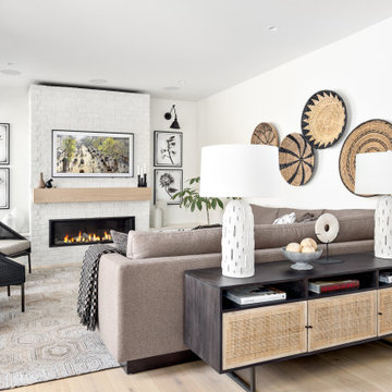
Fresh, bright, and comfortable, this living area has been transformed! We started with the fireplace as a focal point, selecting aged brick tiles for added texture and a crisp wood mantle. The taupe-coloured sectional infuses the room with visual warmth and serves the added purpose of separating the family room from the kitchen.
Emma and Vince were also keen on using non-toxic materials in their home, and we were happy to oblige. To meet their needs, we sourced natural wood elements and sought out Canadian-made products - that adhere to high health standards - whenever possible.
Look closer at the elements of this space, and you will find this stunning, honeycomb-patterned rug in earthy gold, beige, and charcoal tones. It’s plush to the touch and full of visual texture that brings this room’s colour palette together. We sourced these two-tone chairs with caning, petrified wood side table, black sconces, and botanical prints in greyscale from local artist, Heather Johnston.
We topped off the space with this dark wood and rattan console that offers storage facing the kitchen and presents an opportunity to display cherished items. The result is a cozy lounging space brimming with comfort and functionality. It’s perfect for enjoying quality family time, or Emma can simply slide the coffee table away to make room for her morning yoga practice.
Now, let’s turn around and give some attention to the kitchen. Do you remember what the original kitchen looked like? If not, scroll back up, because the transformation is shocking…
Moody & Welcoming Kitchen for Healthy Living:
This kitchen looks very different from how it started, right? Though we didn’t touch any walls, the kitchen has almost doubled in usable space! We created a long, extended island with storage, an outlet for small appliances, and seating for comfortable prep, after-school snacking, or mingling among friends.
On the other side of the island, the family has even more storage and an integrated dishwasher within easy reach of the sink, perfect for quick clean-up. From this angle, you can also see the expansive custom Shaker cabinetry in white and the integrated double ovens. These facilitate their cooking experience and gave us the opportunity to add an additional surprise…
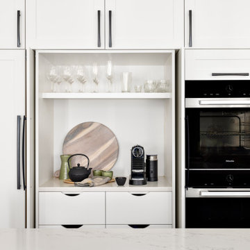
A coffee garage station and more hidden storage! Keeping these items located along the perimeter allows them to be accessed by the family or their guests without someone getting under the cook’s feet. These are the little details that make everyday life easier and more enjoyable.
Moving deeper into the kitchen, the seamless induction cooktop topped with a freestanding concealed hood fan commands attention in a soft yet prominent way. The natural wood accent mirrors the fireplace mantle, and the choice of off-black wood-grain cabinets not only continues our black-and-white colour palette but adds a sense of depth and contrast. The corner sink is located to the right and perfectly positioned with a view of their thriving backyard.
To invite more of this family’s character into the space, we mixed metals for interest — matte black, dark pewter, and warm brass — and created open shelves in white oak for their plants and decor. You can also glimpse the tumbled edge of the backsplash tile, which echoes the rustic brick of the fireplace. It adds that farmhouse charm while still feeling timeless and sophisticated.
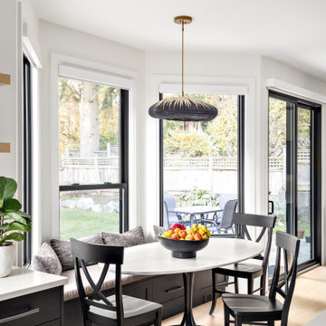
Last but not least, we designed this dining banquette in the bay window (with integrated bench storage, of course), where the family can share a meal together, the kids can do homework, or Emma and Vince can work and enjoy a change of scenery from their offices. Like the other spaces in the home, it was designed to be beautiful, multi-functional, and long-lasting.
Praise from Our Clients:
It is clear that we love this home, but what did our clients have to say?
“Lori is a visionary and masters execution to the finest detail all at the same time. When she first met us to know more about who we are and how we live, she could right away envision how we could use the space in our kitchen and living room…The results exceeded our expectations.
Lori and her team were also a delight to work with — coordination with all the trades, fast problem-solving, regular updates, professional and friendly attitude of her entire team — made it the dream team. Thank you SHD for making our space so beautiful!”
In turn, we are so grateful for this family’s trust, their open communication, and for being wonderful people with whom to work. (So, thank you!)
 Simply Home Decorating
This beautiful North Vancouver home belongs to a nature-loving and health-conscious couple, Emma and Vince (names changed), their two young children, and their dog, Jasper. When they contacted us about renovating and furnishing their kitchen and family room, we walked in and saw a world of potential waiting to be uncovered.
Before: Larkhall Crescent Home:
Like many original North Vancouver homes, the interior was definitely dated. We encountered late ‘80s finishes in powder pink and teal green, old carpet, and a kitchen that wasn’t maximized to suit this family’s modern-day lifestyle. However, the size of the rooms offered us a ton of space with which to get creative.
Knowing our clients’ love of cooking, need for work spaces (Emma and Vince both work remotely), and growing family, we developed a design concept that would increase usable space, optimize storage, and create intimacy in this large area. As for the style, we were inspired by their European roots, inventing a new and modern take on “Belgian Farmhouse” style. Now, the home is truly one-of-a-kind.
After: Warm & Cozy Family Room:
Fresh, bright, and comfortable, this living area has been transformed! We started with the fireplace as a focal point, selecting aged brick tiles for added texture and a crisp wood mantle. The taupe-coloured sectional infuses the room with visual warmth and serves the added purpose of separating the family room from the kitchen.
Emma and Vince were also keen on using non-toxic materials in their home, and we were happy to oblige. To meet their needs, we sourced natural wood elements and sought out Canadian-made products - that adhere to high health standards - whenever possible.
Look closer at the elements of this space, and you will find this stunning, honeycomb-patterned rug in earthy gold, beige, and charcoal tones. It’s plush to the touch and full of visual texture that brings this room’s colour palette together. We sourced these two-tone chairs with caning, petrified wood side table, black sconces, and botanical prints in greyscale from local artist, Heather Johnston.
We topped off the space with this dark wood and rattan console that offers storage facing the kitchen and presents an opportunity to display cherished items. The result is a cozy lounging space brimming with comfort and functionality. It’s perfect for enjoying quality family time, or Emma can simply slide the coffee table away to make room for her morning yoga practice.
Now, let’s turn around and give some attention to the kitchen. Do you remember what the original kitchen looked like? If not, scroll back up, because the transformation is shocking…
Moody & Welcoming Kitchen for Healthy Living:
This kitchen looks very different from how it started, right? Though we didn’t touch any walls, the kitchen has almost doubled in usable space! We created a long, extended island with storage, an outlet for small appliances, and seating for comfortable prep, after-school snacking, or mingling among friends.
On the other side of the island, the family has even more storage and an integrated dishwasher within easy reach of the sink, perfect for quick clean-up. From this angle, you can also see the expansive custom Shaker cabinetry in white and the integrated double ovens. These facilitate their cooking experience and gave us the opportunity to add an additional surprise…
A coffee garage station and more hidden storage! Keeping these items located along the perimeter allows them to be accessed by the family or their guests without someone getting under the cook’s feet. These are the little details that make everyday life easier and more enjoyable.
Moving deeper into the kitchen, the seamless induction cooktop topped with a freestanding concealed hood fan commands attention in a soft yet prominent way. The natural wood accent mirrors the fireplace mantle, and the choice of off-black wood-grain cabinets not only continues our black-and-white colour palette but adds a sense of depth and contrast. The corner sink is located to the right and perfectly positioned with a view of their thriving backyard.
To invite more of this family’s character into the space, we mixed metals for interest — matte black, dark pewter, and warm brass — and created open shelves in white oak for their plants and decor. You can also glimpse the tumbled edge of the backsplash tile, which echoes the rustic brick of the fireplace. It adds that farmhouse charm while still feeling timeless and sophisticated.
Last but not least, we designed this dining banquette in the bay window (with integrated bench storage, of course), where the family can share a meal together, the kids can do homework, or Emma and Vince can work and enjoy a change of scenery from their offices. Like the other spaces in the home, it was designed to be beautiful, multi-functional, and long-lasting.
Praise from Our Clients:
It is clear that we love this home, but what did our clients have to say?
“Lori is a visionary and masters execution to the finest detail all at the same time. When she first met us to know more about who we are and how we live, she could right away envision how we could use the space in our kitchen and living room…The results exceeded our expectations.
Lori and her team were also a delight to work with — coordination with all the trades, fast problem-solving, regular updates, professional and friendly attitude of her entire team — made it the dream team. Thank you SHD for making our space so beautiful!”
In turn, we are so grateful for this family’s trust, their open communication, and for being wonderful people with whom to work. (So, thank you!)
 Simply Home Decorating
This beautiful North Vancouver home belongs to a nature-loving and health-conscious couple, Emma and Vince (names changed), their two young children, and their dog, Jasper. When they contacted us about renovating and furnishing their kitchen and family room, we walked in and saw a world of potential waiting to be uncovered.
Before: Larkhall Crescent Home:
Like many original North Vancouver homes, the interior was definitely dated. We encountered late ‘80s finishes in powder pink and teal green, old carpet, and a kitchen that wasn’t maximized to suit this family’s modern-day lifestyle. However, the size of the rooms offered us a ton of space with which to get creative.
Knowing our clients’ love of cooking, need for work spaces (Emma and Vince both work remotely), and growing family, we developed a design concept that would increase usable space, optimize storage, and create intimacy in this large area. As for the style, we were inspired by their European roots, inventing a new and modern take on “Belgian Farmhouse” style. Now, the home is truly one-of-a-kind.
After: Warm & Cozy Family Room:
Fresh, bright, and comfortable, this living area has been transformed! We started with the fireplace as a focal point, selecting aged brick tiles for added texture and a crisp wood mantle. The taupe-coloured sectional infuses the room with visual warmth and serves the added purpose of separating the family room from the kitchen.
Emma and Vince were also keen on using non-toxic materials in their home, and we were happy to oblige. To meet their needs, we sourced natural wood elements and sought out Canadian-made products - that adhere to high health standards - whenever possible.
Look closer at the elements of this space, and you will find this stunning, honeycomb-patterned rug in earthy gold, beige, and charcoal tones. It’s plush to the touch and full of visual texture that brings this room’s colour palette together. We sourced these two-tone chairs with caning, petrified wood side table, black sconces, and botanical prints in greyscale from local artist, Heather Johnston.
We topped off the space with this dark wood and rattan console that offers storage facing the kitchen and presents an opportunity to display cherished items. The result is a cozy lounging space brimming with comfort and functionality. It’s perfect for enjoying quality family time, or Emma can simply slide the coffee table away to make room for her morning yoga practice.
Now, let’s turn around and give some attention to the kitchen. Do you remember what the original kitchen looked like? If not, scroll back up, because the transformation is shocking…
Moody & Welcoming Kitchen for Healthy Living:
This kitchen looks very different from how it started, right? Though we didn’t touch any walls, the kitchen has almost doubled in usable space! We created a long, extended island with storage, an outlet for small appliances, and seating for comfortable prep, after-school snacking, or mingling among friends.
On the other side of the island, the family has even more storage and an integrated dishwasher within easy reach of the sink, perfect for quick clean-up. From this angle, you can also see the expansive custom Shaker cabinetry in white and the integrated double ovens. These facilitate their cooking experience and gave us the opportunity to add an additional surprise…
A coffee garage station and more hidden storage! Keeping these items located along the perimeter allows them to be accessed by the family or their guests without someone getting under the cook’s feet. These are the little details that make everyday life easier and more enjoyable.
Moving deeper into the kitchen, the seamless induction cooktop topped with a freestanding concealed hood fan commands attention in a soft yet prominent way. The natural wood accent mirrors the fireplace mantle, and the choice of off-black wood-grain cabinets not only continues our black-and-white colour palette but adds a sense of depth and contrast. The corner sink is located to the right and perfectly positioned with a view of their thriving backyard.
To invite more of this family’s character into the space, we mixed metals for interest — matte black, dark pewter, and warm brass — and created open shelves in white oak for their plants and decor. You can also glimpse the tumbled edge of the backsplash tile, which echoes the rustic brick of the fireplace. It adds that farmhouse charm while still feeling timeless and sophisticated.
Last but not least, we designed this dining banquette in the bay window (with integrated bench storage, of course), where the family can share a meal together, the kids can do homework, or Emma and Vince can work and enjoy a change of scenery from their offices. Like the other spaces in the home, it was designed to be beautiful, multi-functional, and long-lasting.
Praise from Our Clients:
It is clear that we love this home, but what did our clients have to say?
“Lori is a visionary and masters execution to the finest detail all at the same time. When she first met us to know more about who we are and how we live, she could right away envision how we could use the space in our kitchen and living room…The results exceeded our expectations.
Lori and her team were also a delight to work with — coordination with all the trades, fast problem-solving, regular updates, professional and friendly attitude of her entire team — made it the dream team. Thank you SHD for making our space so beautiful!”
In turn, we are so grateful for this family’s trust, their open communication, and for being wonderful people with whom to work. (So, thank you!)
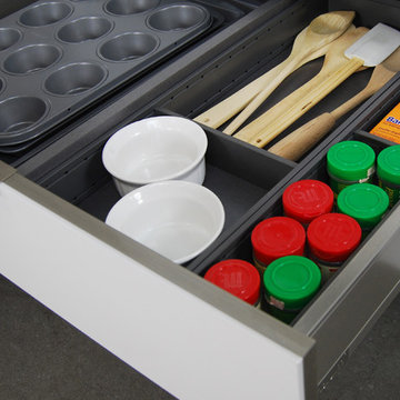
 Dura Supreme Cabinetry
This contemporary kitchen features the NEW Stainless Steel Drawers and Roll-Out Shelves from Dura Supreme Cabinetry. The Bria (frameless) cabinets in Dura Supreme's "White" and Wired-Foil cabinets in Dura Supreme's "Wired-Mercury" are a great combination of cabinetry for creating the clean sleek look of this modern two-tone kitchen design.
Dura Supreme Cabinetry is excited to introduce NEW Stainless Steel Drawers and Roll-Out Shelves for their Bria Cabinetry (Frameless / Full-Access product line). For a limited time, this new metal drawer system is available exclusively from Dura Supreme as they partnered with Blum to be the first American manufacturer to bring it to market.
Dura Supreme’s Stainless Steel Drawers and Roll-Out Shelves are an attractive option for any kitchen design. Sleek, double-wall, stainless steel sides are only ½” thick and work with many of Dura Supreme’s wood drawer accessories, as well as the coordinating gray metal accessories designed specifically for Stainless Steel drawers. Concealed, undermount glides are integrated into the sides and are self-closing with a soft-close feature.
Our new Stainless Steel drawer option provides a contemporary alternative to our classic Maple dovetailed drawer. For homeowners that favor Transitional or Contemporary styling, this sleek, high-performance drawer system will be ideal!
Request a FREE Dura Supreme Brochure:
http://www.durasupreme.com/request-brochure
Find a Dura Supreme Showroom in your area:
http://www.durasupreme.com/dealer-locator
Want to become a Dura Supreme Dealer? Go to:
http://www.durasupreme.com/new-dealer-inquiry
To view a video and more info about this product go to: http://www.durasupreme.com/storage-solutions/stainless-steel-drawers-roll-outs
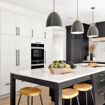 Simply Home Decorating
This beautiful North Vancouver home belongs to a nature-loving and health-conscious couple, Emma and Vince (names changed), their two young children, and their dog, Jasper. When they contacted us about renovating and furnishing their kitchen and family room, we walked in and saw a world of potential waiting to be uncovered.
Before: Larkhall Crescent Home:
Like many original North Vancouver homes, the interior was definitely dated. We encountered late ‘80s finishes in powder pink and teal green, old carpet, and a kitchen that wasn’t maximized to suit this family’s modern-day lifestyle. However, the size of the rooms offered us a ton of space with which to get creative.
Knowing our clients’ love of cooking, need for work spaces (Emma and Vince both work remotely), and growing family, we developed a design concept that would increase usable space, optimize storage, and create intimacy in this large area. As for the style, we were inspired by their European roots, inventing a new and modern take on “Belgian Farmhouse” style. Now, the home is truly one-of-a-kind.
After: Warm & Cozy Family Room:
Fresh, bright, and comfortable, this living area has been transformed! We started with the fireplace as a focal point, selecting aged brick tiles for added texture and a crisp wood mantle. The taupe-coloured sectional infuses the room with visual warmth and serves the added purpose of separating the family room from the kitchen.
Emma and Vince were also keen on using non-toxic materials in their home, and we were happy to oblige. To meet their needs, we sourced natural wood elements and sought out Canadian-made products - that adhere to high health standards - whenever possible.
Look closer at the elements of this space, and you will find this stunning, honeycomb-patterned rug in earthy gold, beige, and charcoal tones. It’s plush to the touch and full of visual texture that brings this room’s colour palette together. We sourced these two-tone chairs with caning, petrified wood side table, black sconces, and botanical prints in greyscale from local artist, Heather Johnston.
We topped off the space with this dark wood and rattan console that offers storage facing the kitchen and presents an opportunity to display cherished items. The result is a cozy lounging space brimming with comfort and functionality. It’s perfect for enjoying quality family time, or Emma can simply slide the coffee table away to make room for her morning yoga practice.
Now, let’s turn around and give some attention to the kitchen. Do you remember what the original kitchen looked like? If not, scroll back up, because the transformation is shocking…
Moody & Welcoming Kitchen for Healthy Living:
This kitchen looks very different from how it started, right? Though we didn’t touch any walls, the kitchen has almost doubled in usable space! We created a long, extended island with storage, an outlet for small appliances, and seating for comfortable prep, after-school snacking, or mingling among friends.
On the other side of the island, the family has even more storage and an integrated dishwasher within easy reach of the sink, perfect for quick clean-up. From this angle, you can also see the expansive custom Shaker cabinetry in white and the integrated double ovens. These facilitate their cooking experience and gave us the opportunity to add an additional surprise…
A coffee garage station and more hidden storage! Keeping these items located along the perimeter allows them to be accessed by the family or their guests without someone getting under the cook’s feet. These are the little details that make everyday life easier and more enjoyable.
Moving deeper into the kitchen, the seamless induction cooktop topped with a freestanding concealed hood fan commands attention in a soft yet prominent way. The natural wood accent mirrors the fireplace mantle, and the choice of off-black wood-grain cabinets not only continues our black-and-white colour palette but adds a sense of depth and contrast. The corner sink is located to the right and perfectly positioned with a view of their thriving backyard.
To invite more of this family’s character into the space, we mixed metals for interest — matte black, dark pewter, and warm brass — and created open shelves in white oak for their plants and decor. You can also glimpse the tumbled edge of the backsplash tile, which echoes the rustic brick of the fireplace. It adds that farmhouse charm while still feeling timeless and sophisticated.
Last but not least, we designed this dining banquette in the bay window (with integrated bench storage, of course), where the family can share a meal together, the kids can do homework, or Emma and Vince can work and enjoy a change of scenery from their offices. Like the other spaces in the home, it was designed to be beautiful, multi-functional, and long-lasting.
Praise from Our Clients:
It is clear that we love this home, but what did our clients have to say?
“Lori is a visionary and masters execution to the finest detail all at the same time. When she first met us to know more about who we are and how we live, she could right away envision how we could use the space in our kitchen and living room…The results exceeded our expectations.
Lori and her team were also a delight to work with — coordination with all the trades, fast problem-solving, regular updates, professional and friendly attitude of her entire team — made it the dream team. Thank you SHD for making our space so beautiful!”
In turn, we are so grateful for this family’s trust, their open communication, and for being wonderful people with whom to work. (So, thank you!)
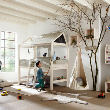
 Cuckooland
This beautifully crafted Limited Edition Life House Mid Sleeper Bed in Treehouse Style Design from Lifetime is made from the best solid knot free pine and hand crafted in Denmark. It features a whitewash finish applied to solid pine to preserve the natural beauty of the wood, treated with a combination of lacquer, wax and pigments. This luxury kids bed features a partially covered top cabin with open window, step ladder and an area below where you can add a mattress or use as a play, reading or study area. * Don't miss out * As these are a Limited Edition design from Lifetime, early pre-ordering is advised for 1st April 2015 delivery. This unique kids bed is perfect as a boys or girls beds with a reversible 'boys only' or 'girls only' sign.
Features and Benefits:
Made from knot free Scandinavian Pine from certified and sustainable forest.
Hand crafted in Denmark.
A Mid Sleeper Bed with Top Cabin open window.
Coloured panels as shown.
Open area at bottom: 73cm height.
Measures: Height: 230cm x Length: 207cm x Depth: 102cm.
Step ladder.
These unique children's beds are a limited edition and will be available for 1st April delivery.
These unique beds are made with robust joints, excellent stability, non-toxic paints to ensure safety is put first at all times.
Check out our unique range of boys beds here.
Mattresses not included - fits mattress 90 x 200 cm (Available on request).
7