
Search results for "Linen dated" in Home Design Ideas
 Precision Homecrafters, LLC
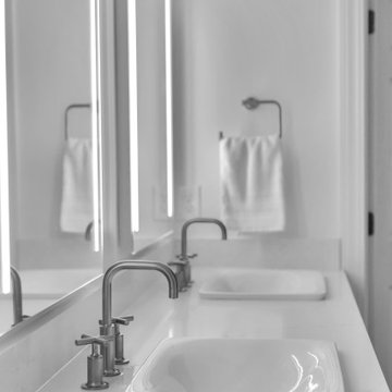
The project started by demoing the entire bathroom including a small office nook that was located next to it. This allowed more square footage to be added into the new plan. The original tub/shower combo was small and dated and therefore, had to be demoed. The bathroom was completely remodeled to include a new zero-threshold shower with a separate tub, a contemporary floating vanity with slab doors, a linen cabinet, and a new walk-in closet with vestibule built-ins on the other side of the bedroom. The custom walnut floating vanities, the linen cabinet and the 2 vestibule built-ins at the closet entry were created by a local craftsman. The central vanity is floating to create a more open concept and the walnut provides a more contemporary look. The vanity also has a seated area in the center in front of the window to maximize the most natural light. The materials palette is neutral in this bathroom, but with stunning elements like the walnut vanity, it really warms up the space and creates a welcoming environment.
The fixtures in this remodel add to the sophisticated style of the space. The Kohler purist series can be seen throughout this remodel in the shower fixtures, the lavatory faucets, the wall-mounted tub filler and all of the accessories. The lavatory sinks are Carillon wading pool vessel sinks. A smart feature of this bathroom is the modern wall-mounted towel warmer that allows the homeowners to have a warmed towel rack within reach of their shower and tub area. Another smart feature of this remodel is the mirrors that have a de-fogger feature and also built-in LED’s inside the mirror. The chandelier installed over the tub also provides a stunning contemporary aesthetic.
Along with the fixtures, the materials were chosen to give a more modern look to the space. For materials, a dramatic green subway tile installed in a straight/grid pattern is the feature of the shower area. A lighter gray 12” x 24” porcelain floor tile with subtle veining was used on the floor. The stunning white quartz with gray veining is on the tub deck, shower bench and top of vanities.

 Story Hill Renovations LLC
This was a dated and rough space when we began. The plumbing was leaking and the tub surround was failing. The client wanted a bathroom that complimented the era of the home without going over budget. We tastefully designed the space with an eye on the character of the home and budget. We save the sink and tub from the recycling bin and refinished them both. The floor was refreshed with a good cleaning and some grout touch ups and tile replacement using tiles from under the toilet.
 Sosna Inc
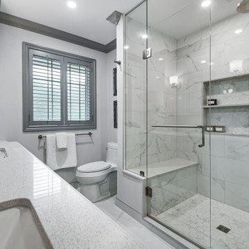
This exciting renovation improved both the look and functionality of our client’s Master Ensuite and Shared Bathroom. Both rooms had both dated aesthetics and dysfunctional layouts, but more importantly, they required updated plumbing due to an old renovation where the plumbing had been done incorrectly and had caused leaking and ceiling damage below.
To solve the leaks, and provide better function in both Bathrooms, fixtures in the Shared Bathroom were relocated, and the previously installed plumbing connections were corrected. This solved the leak issues and provided improved function in both Bathrooms.
A rarely used large corner tub in the Master Ensuite was eliminated to accommodate a spacious walk-in shower with a bench, and a custom wall-to-wall double vanity provided a nice aesthetic and lots of useful storage.
The tub and toilet in the Shared Bathroom were switched and new custom vanity and linen cabinets were installed.
Each Bathroom was given its own distinct look. Porcelain tiles made to look like marble, and mosaics accentuated with patterned floor tiles, luxurious marble knobs and handles, and beautiful jewel faucets gave the Master Ensuite a Transitional charm.
The Shared Bathroom was completed with large format black porcelain tiles with a marble look, glass accent mosaics, and modern plumbing fixtures gave the room an eclectic flair.
The project was finished on time, and our clients couldn’t be happier! They can now enjoy their personalized Shared Bathroom and Master Ensuite, with the comfort of knowing the plumbing is installed correctly.
Find the right local pro for your project

 TVL Creative Ltd.
This kitchen took a tired, 80’s builder kitchen and revamped it into a personalized gathering space for our wonderful client. The existing space was split up by the dated configuration of eat-in kitchen table area to one side and cramped workspace on the other. It didn’t just under-serve our client’s needs; it flat out discouraged them from using the space. Our client desired an open kitchen with a central gathering space where family and friends could connect. To open things up, we removed the half wall separating the kitchen from the dining room and the wall that blocked sight lines to the family room and created a narrow hallway to the kitchen. The old oak cabinets weren't maximizing storage and were dated and dark. We used Waypoint Living Spaces cabinets in linen white to brighten up the room. On the east wall, we created a hutch-like stack that features an appliance garage that keeps often used countertop appliance on hand but out of sight. The hutch also acts as a transition from the cooking zone to the coffee and wine area. We eliminated the north window that looked onto the entry walkway and activated this wall as storage with refrigerator enclosure and pantry. We opted to leave the east window as-is and incorporated it into the new kitchen layout by creating a window well for growing plants and herbs. The countertops are Pental Quartz in Carrara. The sleek cabinet hardware is from our friends at Amerock in a gorgeous satin champagne bronze. One of the most striking features in the space is the pattern encaustic tile from Tile Shop. The pop of blue in the backsplash adds personality and contrast to the champagne accents. The reclaimed wood cladding surrounding the large east-facing window introduces a quintessential Colorado vibe, and the natural texture balances the crisp white cabinetry and geometric patterned tile. Minimalist modern lighting fixtures from Mitzi by Hudson Valley Lighting provide task lighting over the sink and at the wine/ coffee station. The visual lightness of the sink pendants maintains the openness and visual connection between the kitchen and dining room. Together the elements make for a sophisticated yet casual vibe-- a comfortable chic kitchen. We love the way this space turned out and are so happy that our clients now have such a bright and welcoming gathering space as the heart of their home!
 TVL Creative Ltd.
This kitchen remodel in Lakewood has undergone such an amazing transformation from a dark, dated space to bright and functional! We experienced many obstacles in this tight space but was able to design around the challenges to create a beautiful and functional space. The original design intent was to bring the cabinets all the way to the ceiling but found out this wasn’t an option as all the soffits had interior mechanical systems and couldn’t be reconfigured. One solution was to raise the soffits on the range and sink walls to gain an extra 6” of cabinet space and build out the soffit above the refrigerator to create a custom built-in look. This extension of the soffit created the perfect opportunity for a narrow pantry cabinet facing the dining room which adds much needed storage space. By painting the soffits the same color as the cabinets, we were able to install the crown trim on top of the soffit in lieu of the cabinets to create the illusion of taller cabinets and lengthening the ceiling height. We omitted the wall cabinet to the left of the range to create a more open space both visibly and functionally. This provided the opportunity to install an accent pendant over the open counter which has been lowered to maintain one counter height throughout for a seamless look. Decorative door panels give the perfect finishing touches on the cabinetry and truly convey a custom look. The cabinets were finished in Waypoint’s Shaker style in Linen color and were paired with Amrock’s stunning gunmetal finish hardware. The existing floor tile was replaced with Daltile’s Forest Park Maple wood-look plank which now extends into the dining room creating a natural separation of kitchen/dining space to the adjacent Family room. The warmth of the floor tile compliments the Linen cabinetry color and Gunmetal finishes throughout. This beautiful kitchen offers a beautiful and functional design solution and we are thrilled our client can love their personalized kitchen for many years to come!

 TOC design & construction inc.
DESIGNED BY TOC design
CONSTRUCTION BY TOC design & Construction inc.
PHOTOS BY : Tania Scardellato
I was fortunate to have a young family approach me in desperate need to renovate there only 3 piece bathroom. This space was In dire need of a remodel, with old brown wall to wall tiles and a dated bulky yellow brown single sink vanity.
Storage was a must, lighting a necessity, and proper accessibility to the shower bath area.
We had a tight budget to respect, but a full gut of this bathroom was required. And a good thing too, once we started doing the demolition we noticed that mildew and rotting floors and walls had accumulated throughout the years. Doing it right the first time is no joke when dealing with water and electrical issues.
We discarded all reminisce of old and built from scratch, new walls, new plumbing, new electrical ,new insulation and a new window, a new fan that actually exhausted outside ( I say this laughing as you would be amazed at how many fans are installed but don’t exhaust outside, and you the client would never know unless you go inside the attic space.
Once all the hard stuff was done, the rest is just a matter of smart design. If you have a small bathroom here are some tips to guide you.
10 tips for making a small bathroom feel larger
Is your tiny bathroom cramping your functionality and style, leaving you longing for the enormous bathrooms gracing the pages of design magazines? Even if your bathroom is a fraction of the size, all it takes is some design savvy to make the most of the space you have. Consider these 10 smart tips that will help your bathroom look, feel and function like those larger contenders.
1-Get creative with corners
Space is at a premium in small bathrooms, so it's important to maximize every inch. Corners, for example, provide extra space for shelving, storage units and even hooks. Get creative and install unique design solutions that are not only functional, but also eye-catching. If you love the airiness of floating cabinets, add baskets or decorative boxes under for extra storage. If you are installing floating cabinets insure that they are installed securely to studs or plywood at wall.
2- Let solid colors shine
Busy patterns have a shrinking effect and make small bathrooms seem even smaller. Conversely, light natural hues make a space feel more open. If you're itching to get creative with design, experiment with textures but keep overpowering patterns to a minimum. Tone on tone is the best to achieve this.
3 - Maximize your bathtub
A bathtub takes up a significant portion of the room, but modern, compact options with curved basins, can make the tub feel larger when in use, all while conserving space.
4 - Select a smaller faucet
A faucet is jewelry for the bathroom. And just as accessories can overpower an outfit, a big bulky faucet isn't flattering in a small bath. Single-handle designs conserve counter space, while a wall-mount installation frees it up all together and can create quite the wow-factor, if the budget can accommodate the required changes to plumbing behind the wall.
5 - Make vanity storage simple
If you're in a storage war with your small bathroom, you're not alone in the battle. Toiletries and personal supplies without a place to call home only add clutter and chaos. Store smart with a space-saving vanity, the dual sink vanity shown here, looks quite simple, but in reality it has 4 sets of full extension drawers, and the vanity tower adds extra storage without overpowering the use of space.
6 - Show off the shower
Shower curtains may be pretty, but they interrupt the visual flow of a bathing space and make it feel significantly smaller. In bathrooms with small footprints, opt for a clear glass sliding shower door that doesn't require the clearance of one with a hinged design. Or as shown in this design and for fraction less expensive a half hinged panel installed on a fixed tempered glass panel. If you're embarking on a big remodel, create the illusion of more space by using same tile in the shower that's used throughout; instead of seeing them as two separate zones, the eye will read them as one.
7 - Discover the treasure of hidden storage
Work with a contractor, and you just might find some serious storage potential hidden behind your walls. Whether it's utilizing space between the studs for shallow shelving or a creating a small linen closet by annexing space from an adjacent room, even small additions can make a big difference.
8 - Focal Point
Tile is a beautiful, durable addition to any bathroom. For dainty spaces, consider installing tile at a diagonal to accentuate the focal point or as in this bathroom I used an oversized textured pattern to bring depth to the space at the window wall.
9 - Choose the right lights
Strategically install light to reflect and brighten a small bathroom to make it appear larger. Recessed lighting is an affordable solution for tiny rooms, offering ample light while taking up little space. Wall sconces alongside a mirror also reflect off the walls and make a room feel bright and airy. I always recommend going with LED lighting at 2800 to 3000K.
10 – Accessorize
This is your time to shine in your decorating skills, have fun with your towels, you can change the color scheme daily just by adding pops of color in your accessories, make sure to get items that serve a dual purpose, like baskets, boxes they can always be used as hampers, storing of towels and even a nice display for your guest.
 Sergei Chamovskikh
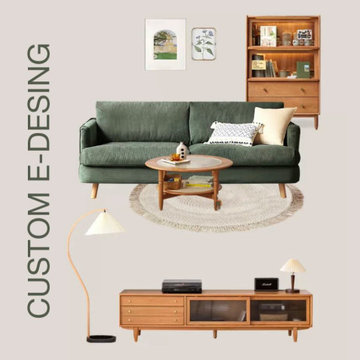
Transitional style furniture combines traditional and modern design elements to create a timeless look that is both classic and up-to-date. It often features a mix of textures and materials, such as wood, metal, and glass, and typically has clean lines, simple forms, and neutral color schemes. The transitional style furniture also includes some traditional details, such as curved lines or decorative moldings, while maintaining a modern, updated feel.
Transitional style furniture is a blend of traditional and contemporary design elements that offers a timeless look that is both classic and up-to-date. This style has its roots in the traditional style but incorporates elements of contemporary design to create a cohesive and harmonious look. Transitional style furniture is all about balance and harmony between traditional and modern design aesthetics.
The transitional style furniture often features a mix of textures and materials, such as wood, metal, and glass. It has clean lines, simple forms, and neutral color schemes. The furniture pieces are often streamlined and have a minimalistic look with minimal ornamentation. However, transitional style furniture also includes some traditional details, such as curved lines or decorative moldings, while maintaining a modern, updated feel.
Transitional style furniture pieces prioritize both function and form, and are designed to be practical, comfortable, and visually appealing. Upholstery is often made from durable and easy-to-clean fabrics, such as cotton, linen, or microfiber. Transitional style furniture also features natural materials, such as wood or stone, which add warmth and texture to a room.
One of the key features of transitional style furniture is its ability to seamlessly blend with other design styles. This versatility makes transitional style furniture a popular choice for homeowners who are looking to update their home decor while maintaining a classic, timeless look. Overall, transitional style furniture is a great option for those who want to create a comfortable, welcoming space that combines traditional elegance with modern simplicity.
Sponsored
Columbus, OH

Wannemacher Interiors
Customized Award-Winning Interior Design Solutions in Franklin Cnty OH
 TVL Creative Ltd.
This kitchen took a tired, 80’s builder kitchen and revamped it into a personalized gathering space for our wonderful client. The existing space was split up by the dated configuration of eat-in kitchen table area to one side and cramped workspace on the other. It didn’t just under-serve our client’s needs; it flat out discouraged them from using the space. Our client desired an open kitchen with a central gathering space where family and friends could connect. To open things up, we removed the half wall separating the kitchen from the dining room and the wall that blocked sight lines to the family room and created a narrow hallway to the kitchen. The old oak cabinets weren't maximizing storage and were dated and dark. We used Waypoint Living Spaces cabinets in linen white to brighten up the room. On the east wall, we created a hutch-like stack that features an appliance garage that keeps often used countertop appliance on hand but out of sight. The hutch also acts as a transition from the cooking zone to the coffee and wine area. We eliminated the north window that looked onto the entry walkway and activated this wall as storage with refrigerator enclosure and pantry. We opted to leave the east window as-is and incorporated it into the new kitchen layout by creating a window well for growing plants and herbs. The countertops are Pental Quartz in Carrara. The sleek cabinet hardware is from our friends at Amerock in a gorgeous satin champagne bronze. One of the most striking features in the space is the pattern encaustic tile from Tile Shop. The pop of blue in the backsplash adds personality and contrast to the champagne accents. The reclaimed wood cladding surrounding the large east-facing window introduces a quintessential Colorado vibe, and the natural texture balances the crisp white cabinetry and geometric patterned tile. Minimalist modern lighting fixtures from Mitzi by Hudson Valley Lighting provide task lighting over the sink and at the wine/ coffee station. The visual lightness of the sink pendants maintains the openness and visual connection between the kitchen and dining room. Together the elements make for a sophisticated yet casual vibe-- a comfortable chic kitchen. We love the way this space turned out and are so happy that our clients now have such a bright and welcoming gathering space as the heart of their home!
 TVL Creative Ltd.
This kitchen remodel in Lakewood has undergone such an amazing transformation from a dark, dated space to bright and functional! We experienced many obstacles in this tight space but was able to design around the challenges to create a beautiful and functional space. The original design intent was to bring the cabinets all the way to the ceiling but found out this wasn’t an option as all the soffits had interior mechanical systems and couldn’t be reconfigured. One solution was to raise the soffits on the range and sink walls to gain an extra 6” of cabinet space and build out the soffit above the refrigerator to create a custom built-in look. This extension of the soffit created the perfect opportunity for a narrow pantry cabinet facing the dining room which adds much needed storage space. By painting the soffits the same color as the cabinets, we were able to install the crown trim on top of the soffit in lieu of the cabinets to create the illusion of taller cabinets and lengthening the ceiling height. We omitted the wall cabinet to the left of the range to create a more open space both visibly and functionally. This provided the opportunity to install an accent pendant over the open counter which has been lowered to maintain one counter height throughout for a seamless look. Decorative door panels give the perfect finishing touches on the cabinetry and truly convey a custom look. The cabinets were finished in Waypoint’s Shaker style in Linen color and were paired with Amrock’s stunning gunmetal finish hardware. The existing floor tile was replaced with Daltile’s Forest Park Maple wood-look plank which now extends into the dining room creating a natural separation of kitchen/dining space to the adjacent Family room. The warmth of the floor tile compliments the Linen cabinetry color and Gunmetal finishes throughout. This beautiful kitchen offers a beautiful and functional design solution and we are thrilled our client can love their personalized kitchen for many years to come!

 Horizon Interior Design
A family of four with two young girls and cats needed a brand new master bath to accommodate a family member with MS. They tasked us with creating a luxurious master bath in a modern rustic style that was ADA-accessible and could accommodate the client's walker and wheelchair in the future.
Their key issues were that the shower was relatively small, with a curb the client had to step over. They also had a large jacuzzi tub with a tub deck built around it, but the couple never used it. The main bathroom only had one vanity with minimal counter space available, and the dated finishes and materials looked tired - so they were more than ready for a beautiful transformation.
To create an ADA-accessible main bath, we relocated the shower to an interior corner, allowing for the addition of a larger ADA-accessible shower with zero entry and a bench the client could easily transfer onto for bathing. The arrangement of this space would also allow for a walker and wheelchair to easily move through the walkways for access to the shower.
We moved the toilet to where the shower had been located originally with ADA accessibility features and installed luxurious double vanities along the entire vanity wall, with a modern linen tower cabinet for added storage. Since the client loved the modern rustic aesthetic, we incorporated their chosen style with elements like the Calacatta porcelain tile, cabinet hardware, mason jar lights, and wood-framed mirrors.
 Horizon Interior Design
A family of four with two young girls and cats needed a brand new master bath to accommodate a family member with MS. They tasked us with creating a luxurious master bath in a modern rustic style that was ADA-accessible and could accommodate the client's walker and wheelchair in the future.
Their key issues were that the shower was relatively small, with a curb the client had to step over. They also had a large jacuzzi tub with a tub deck built around it, but the couple never used it. The main bathroom only had one vanity with minimal counter space available, and the dated finishes and materials looked tired - so they were more than ready for a beautiful transformation.
To create an ADA-accessible main bath, we relocated the shower to an interior corner, allowing for the addition of a larger ADA-accessible shower with zero entry and a bench the client could easily transfer onto for bathing. The arrangement of this space would also allow for a walker and wheelchair to easily move through the walkways for access to the shower.
We moved the toilet to where the shower had been located originally with ADA accessibility features and installed luxurious double vanities along the entire vanity wall, with a modern linen tower cabinet for added storage. Since the client loved the modern rustic aesthetic, we incorporated their chosen style with elements like the Calacatta porcelain tile, cabinet hardware, mason jar lights, and wood-framed mirrors.Photo: Vivos Images

 Renovisions
These homeowners were anxiously ready to remodel their dated 80’s kitchen and reached out to Renovisions to handle the transformation. In this new undertaking we met to discuss plans to brighten the dark room with custom painted white inset cabinets, adding more functional storage, better task lighting and GE Monogram appliances, new hardwood flooring throughout and creating a better flow into the adjacent family room. In order to open up the space, Renovisions suggested creating an angle at the peninsula. Continuing with this approach we replaced the rear door with a new one-light door that swings out instead of in to accommodate new bar stools and a better flow of traffic in and out to the deck outside. Silestone’s quartz countertops in ‘Merope’ were the perfect choice adding a nice contrast yet truly durable and low maintenance. Creating a beautifully unique subway tile niche in linen color at cooktop area and backsplash added an elegant touch to the overall look and homeowners were thrilled with this refreshing look after the Renovision.
Now their newly renovated kitchen is a showcase and nicely outfitted for family and friends.
 Horizon Interior Design
A family of four with two young girls and cats needed a brand new master bath to accommodate a family member with MS. They tasked us with creating a luxurious master bath in a modern rustic style that was ADA-accessible and could accommodate the client's walker and wheelchair in the future.
Their key issues were that the shower was relatively small, with a curb the client had to step over. They also had a large jacuzzi tub with a tub deck built around it, but the couple never used it. The main bathroom only had one vanity with minimal counter space available, and the dated finishes and materials looked tired - so they were more than ready for a beautiful transformation.
To create an ADA-accessible main bath, we relocated the shower to an interior corner, allowing for the addition of a larger ADA-accessible shower with zero entry and a bench the client could easily transfer onto for bathing. The arrangement of this space would also allow for a walker and wheelchair to easily move through the walkways for access to the shower.
We moved the toilet to where the shower had been located originally with ADA accessibility features and installed luxurious double vanities along the entire vanity wall, with a modern linen tower cabinet for added storage. Since the client loved the modern rustic aesthetic, we incorporated their chosen style with elements like the Calacatta porcelain tile, cabinet hardware, mason jar lights, and wood-framed mirrors.
 Renovisions
These homeowners were anxiously ready to remodel their dated 80’s kitchen and reached out to Renovisions to handle the transformation. In this new undertaking we met to discuss plans to brighten the dark room with custom painted white inset cabinets, adding more functional storage, better task lighting and GE Monogram appliances, new hardwood flooring throughout and creating a better flow into the adjacent family room. In order to open up the space, Renovisions suggested creating an angle at the peninsula. Continuing with this approach we replaced the rear door with a new one-light door that swings out instead of in to accommodate new bar stools and a better flow of traffic in and out to the deck outside. Silestone’s quartz countertops in ‘Merope’ were the perfect choice adding a nice contrast yet truly durable and low maintenance. Creating a beautifully unique subway tile niche in linen color at cooktop area and backsplash added an elegant touch to the overall look and homeowners were thrilled with this refreshing look after the Renovision.
Now their newly renovated kitchen is a showcase and nicely outfitted for family and friends.

 Crystal Kitchen + Bath
A dated, all white bathroom gets a face lift. The client desired to remodel their Master Bathroom into a charming & relaxing space, while staying within the existing footprint. In this Golden Valley, MN bathroom remodel, the traditional style fixtures coordinate with other elements in the home and a warm color palette with accents of green was selected to coordinate with Master Bedroom.
Some of the client’s favorite features is the new vanity with a counter wall cabinet for storage of toiletries & make up. A make-up mirror is mounted on the side and folds back and out of the way. Brushed gold finishes on the plumbing & light fixtures blend nicely with the warm tones of the marble tile. A damask print wallcovering of green & gold along with the honed green granite counter top compliments the green color palette in the Master Bedroom. The raised granite ledge on the side of the tub is a great place set a candle or glass of wine while relaxing in the new bubble massage air bath by Kohler. A recessed niche above the toilet adds character to the toilet/tub room, while crown and tile base moulding finish off the room nicely.

 North Shore Kitchen & Bath
This original bathroom was a great size to begin with but just needed to be updated from it's dated, overwhelming tile and plain cabinets. By using lots of white finishes, we were able to make the space feel even larger, airier and calming. Instead of a large tub deck with a drop in tub that wasted space, we opted for a large, comfortable freestanding Victoria and Albert tub with free standing faucet. This helped open up the space as well as allowing for an additional storage cabinet. By using a porcelain tile that looks like marble, you have the beauty of marble with out the maintenance of it. Using remnants of marble slabs for the counter tops we were able to add in that additional touch of elegance to tie the look all together. The 3x6 subway tile lends to the traditional look of the house, but adding in a stone and glass mosaic makes it look updated, and adds just a bit of color. Having a rain dome and hand shower in the shower gives you a spa experience. There was also a rather large radiator that we had to deal with behind the tub, so we made our own custom radiator cover. Cabinets by Dura Supreme Cabinetry.

 Alair Homes Collingwood
This was a major full home renovation, transforming an old dated home with a strange layout into a modern custom space. Highlights are the brand new stylish kitchen with in-counter beer taps, cozy hot tub room, and outdoor bar, cooking and dining area.
 TVL Creative Ltd.
This kitchen took a tired, 80’s builder kitchen and revamped it into a personalized gathering space for our wonderful client. The existing space was split up by the dated configuration of eat-in kitchen table area to one side and cramped workspace on the other. It didn’t just under-serve our client’s needs; it flat out discouraged them from using the space. Our client desired an open kitchen with a central gathering space where family and friends could connect. To open things up, we removed the half wall separating the kitchen from the dining room and the wall that blocked sight lines to the family room and created a narrow hallway to the kitchen. The old oak cabinets weren't maximizing storage and were dated and dark. We used Waypoint Living Spaces cabinets in linen white to brighten up the room. On the east wall, we created a hutch-like stack that features an appliance garage that keeps often used countertop appliance on hand but out of sight. The hutch also acts as a transition from the cooking zone to the coffee and wine area. We eliminated the north window that looked onto the entry walkway and activated this wall as storage with refrigerator enclosure and pantry. We opted to leave the east window as-is and incorporated it into the new kitchen layout by creating a window well for growing plants and herbs. The countertops are Pental Quartz in Carrara. The sleek cabinet hardware is from our friends at Amerock in a gorgeous satin champagne bronze. One of the most striking features in the space is the pattern encaustic tile from Tile Shop. The pop of blue in the backsplash adds personality and contrast to the champagne accents. The reclaimed wood cladding surrounding the large east-facing window introduces a quintessential Colorado vibe, and the natural texture balances the crisp white cabinetry and geometric patterned tile. Minimalist modern lighting fixtures from Mitzi by Hudson Valley Lighting provide task lighting over the sink and at the wine/ coffee station. The visual lightness of the sink pendants maintains the openness and visual connection between the kitchen and dining room. Together the elements make for a sophisticated yet casual vibe-- a comfortable chic kitchen. We love the way this space turned out and are so happy that our clients now have such a bright and welcoming gathering space as the heart of their home!
 TVL Creative Ltd.
This kitchen remodel in Lakewood has undergone such an amazing transformation from a dark, dated space to bright and functional! We experienced many obstacles in this tight space but was able to design around the challenges to create a beautiful and functional space. The original design intent was to bring the cabinets all the way to the ceiling but found out this wasn’t an option as all the soffits had interior mechanical systems and couldn’t be reconfigured. One solution was to raise the soffits on the range and sink walls to gain an extra 6” of cabinet space and build out the soffit above the refrigerator to create a custom built-in look. This extension of the soffit created the perfect opportunity for a narrow pantry cabinet facing the dining room which adds much needed storage space. By painting the soffits the same color as the cabinets, we were able to install the crown trim on top of the soffit in lieu of the cabinets to create the illusion of taller cabinets and lengthening the ceiling height. We omitted the wall cabinet to the left of the range to create a more open space both visibly and functionally. This provided the opportunity to install an accent pendant over the open counter which has been lowered to maintain one counter height throughout for a seamless look. Decorative door panels give the perfect finishing touches on the cabinetry and truly convey a custom look. The cabinets were finished in Waypoint’s Shaker style in Linen color and were paired with Amrock’s stunning gunmetal finish hardware. The existing floor tile was replaced with Daltile’s Forest Park Maple wood-look plank which now extends into the dining room creating a natural separation of kitchen/dining space to the adjacent Family room. The warmth of the floor tile compliments the Linen cabinetry color and Gunmetal finishes throughout. This beautiful kitchen offers a beautiful and functional design solution and we are thrilled our client can love their personalized kitchen for many years to come!
 TVL Creative Ltd.
This kitchen took a tired, 80’s builder kitchen and revamped it into a personalized gathering space for our wonderful client. The existing space was split up by the dated configuration of eat-in kitchen table area to one side and cramped workspace on the other. It didn’t just under-serve our client’s needs; it flat out discouraged them from using the space. Our client desired an open kitchen with a central gathering space where family and friends could connect. To open things up, we removed the half wall separating the kitchen from the dining room and the wall that blocked sight lines to the family room and created a narrow hallway to the kitchen. The old oak cabinets weren't maximizing storage and were dated and dark. We used Waypoint Living Spaces cabinets in linen white to brighten up the room. On the east wall, we created a hutch-like stack that features an appliance garage that keeps often used countertop appliance on hand but out of sight. The hutch also acts as a transition from the cooking zone to the coffee and wine area. We eliminated the north window that looked onto the entry walkway and activated this wall as storage with refrigerator enclosure and pantry. We opted to leave the east window as-is and incorporated it into the new kitchen layout by creating a window well for growing plants and herbs. The countertops are Pental Quartz in Carrara. The sleek cabinet hardware is from our friends at Amerock in a gorgeous satin champagne bronze. One of the most striking features in the space is the pattern encaustic tile from Tile Shop. The pop of blue in the backsplash adds personality and contrast to the champagne accents. The reclaimed wood cladding surrounding the large east-facing window introduces a quintessential Colorado vibe, and the natural texture balances the crisp white cabinetry and geometric patterned tile. Minimalist modern lighting fixtures from Mitzi by Hudson Valley Lighting provide task lighting over the sink and at the wine/ coffee station. The visual lightness of the sink pendants maintains the openness and visual connection between the kitchen and dining room. Together the elements make for a sophisticated yet casual vibe-- a comfortable chic kitchen. We love the way this space turned out and are so happy that our clients now have such a bright and welcoming gathering space as the heart of their home!
34