
Search results for "Linen dated" in Home Design Ideas
 Phoenix Home Remodeling
Vance & Aubrie's guest bathroom showcased an era gone by. The centerpiece was an old vanity, wrapped in dated tile. They reached out to us to help achieve their goal of creating a beautiful and welcoming space for their guests.
They selected a new Kohler Archer tub to replace the outdated bathtub, pairing it with stylish Volakas Porcelain tile. For the wall niche, the Iceberg Blend Herringbone Mosaic adds a sophisticated contrast that compliments their new flooring, also installed in a herringbone pattern.
The decision to install a new Kohler Cimarron toilet and added a wall cabinet above it addressing the practical storage needs.
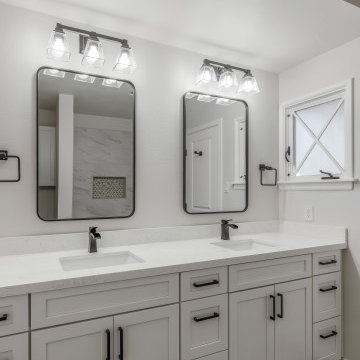
The lighting and vanity area was uninspiring, doing little to make the space welcoming or functional for guests. Vance and Aubrie went with Waypoint Painted Linen cabinetry, topped with a Forte Quartz countertop. Vilamonte bathroom faucets were chosen for their contemporary design and fantastic pairing with the Jeffrey Alexander Boswell cabinet handles.
The rectangular metal framed mirrors and Mencino black steel lights brought the whole design together, creating an inviting and elegant space.
Now, stepping into Vance & Aubrie's guest bathroom feels like entering a different world. The blend of modern fixtures, elegant finishes, and thoughtful details has created a space that's not only visually stunning but also highly functional.

 Claire Cavalieri
Danish Modern is one of the several types of Modern design style. Popularized in Denmark from the 1940s-1970s, Danish modern furniture design was a collaboration between the principles of modern architecture and the high-quality cabinetmaking for which the Danes were known. Simple, elegant, airy, and featuring clean, sweeping lines, the furnishings are inherently warm and beautiful.
This open dining room is a collection of vintage Danish modern furniture dating from the early 1970s. The authentic pieces were located at different auction houses and specialty consigners around the country to create a cohesive look the homeowners were seeking.
The solid teak sideboard features a lighted upper display cabinet (removable) showcasing the homeowners’ collection of art including Nambé, Murano, Vietri sul Mare, and Blenko.
The lower cabinet consists of two sliding doors on either end offering plentiful storage. In between are a bank of five felt-lined drawers for items such as silverware, trays and linens.
With graceful rounded corners and rich, warm teak woodgrain, the dining room table is a perfect match to the sideboard. Two leaves tightly drop in and enable expansion with seating capacity for 14 people.
Mixing up dining chairs adds interest and variety. The curvaceous and timeless Arne Jacobsen (the Danish designer) Series 7 chair in black is the perfect pairing for this dynamic design.
Crowning the space is the airy, translucent classic Nelson bubble lamp, keeping in line with the Modernist theme.
 Phoenix Home Remodeling
Vance & Aubrie's guest bathroom showcased an era gone by. The centerpiece was an old vanity, wrapped in dated tile. They reached out to us to help achieve their goal of creating a beautiful and welcoming space for their guests.
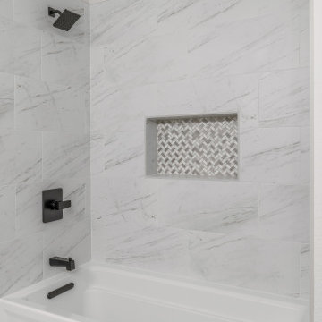
They selected a new Kohler Archer tub to replace the outdated bathtub, pairing it with stylish Volakas Porcelain tile. For the wall niche, the Iceberg Blend Herringbone Mosaic adds a sophisticated contrast that compliments their new flooring, also installed in a herringbone pattern.
The decision to install a new Kohler Cimarron toilet and added a wall cabinet above it addressing the practical storage needs.
The lighting and vanity area was uninspiring, doing little to make the space welcoming or functional for guests. Vance and Aubrie went with Waypoint Painted Linen cabinetry, topped with a Forte Quartz countertop. Vilamonte bathroom faucets were chosen for their contemporary design and fantastic pairing with the Jeffrey Alexander Boswell cabinet handles.
The rectangular metal framed mirrors and Mencino black steel lights brought the whole design together, creating an inviting and elegant space.
Now, stepping into Vance & Aubrie's guest bathroom feels like entering a different world. The blend of modern fixtures, elegant finishes, and thoughtful details has created a space that's not only visually stunning but also highly functional.
Find the right local pro for your project
 Phoenix Home Remodeling
Vance & Aubrie's guest bathroom showcased an era gone by. The centerpiece was an old vanity, wrapped in dated tile. They reached out to us to help achieve their goal of creating a beautiful and welcoming space for their guests.
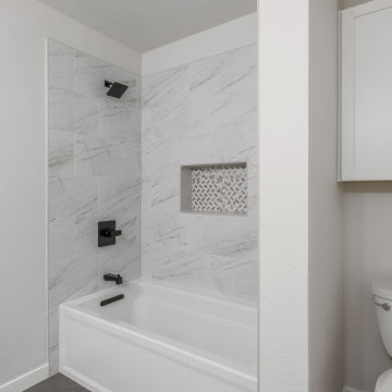
They selected a new Kohler Archer tub to replace the outdated bathtub, pairing it with stylish Volakas Porcelain tile. For the wall niche, the Iceberg Blend Herringbone Mosaic adds a sophisticated contrast that compliments their new flooring, also installed in a herringbone pattern.
The decision to install a new Kohler Cimarron toilet and added a wall cabinet above it addressing the practical storage needs.
The lighting and vanity area was uninspiring, doing little to make the space welcoming or functional for guests. Vance and Aubrie went with Waypoint Painted Linen cabinetry, topped with a Forte Quartz countertop. Vilamonte bathroom faucets were chosen for their contemporary design and fantastic pairing with the Jeffrey Alexander Boswell cabinet handles.
The rectangular metal framed mirrors and Mencino black steel lights brought the whole design together, creating an inviting and elegant space.
Now, stepping into Vance & Aubrie's guest bathroom feels like entering a different world. The blend of modern fixtures, elegant finishes, and thoughtful details has created a space that's not only visually stunning but also highly functional.
 Phoenix Home Remodeling
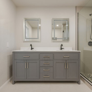
Fish & Beatrice purchased this 1980’s home and wanted to update the feel and look, starting with the master bathroom.
The bathroom was oddly shaped. The shower had a bump-out that made the shower smaller and there was wasted space behind the entry door. The dated lighting and the wasted space created dull and dark pockets.
The room had great bones but lacked in design.
Meeting with them, we learned that they wanted a classic modern style bathroom that was open and clean. We went to the drawing board and started collaborating on a design that we all loved.
In the shower we removed the bump-out, increasing the shower floor plan.
We also took the shower wall tile to the ceiling. By doing this the shower visually looked larger and custom.
By using two different shower wall tiles we created a soft juxtaposition of the soft and hard textures.
We used a fabric tile for the shower side walls. This tile is Touch Snow from Arizona Tile. The back wall tile is from Monterrey Tile called Stone Mood Silver.
These two tiles together create a calming effect as you noticed the creamy vein of the stone, compliments the Linen texture of the fabric. To compliment the walls, this pebble from Arizona Tile shows an array of colors that contrast and enhance the look.
 Sosna Inc
This exciting renovation improved both the look and functionality of our client’s Master Ensuite and Shared Bathroom. Both rooms had both dated aesthetics and dysfunctional layouts, but more importantly, they required updated plumbing due to an old renovation where the plumbing had been done incorrectly and had caused leaking and ceiling damage below.
To solve the leaks, and provide better function in both Bathrooms, fixtures in the Shared Bathroom were relocated, and the previously installed plumbing connections were corrected. This solved the leak issues and provided improved function in both Bathrooms.
A rarely used large corner tub in the Master Ensuite was eliminated to accommodate a spacious walk-in shower with a bench, and a custom wall-to-wall double vanity provided a nice aesthetic and lots of useful storage.
The tub and toilet in the Shared Bathroom were switched and new custom vanity and linen cabinets were installed.
Each Bathroom was given its own distinct look. Porcelain tiles made to look like marble, and mosaics accentuated with patterned floor tiles, luxurious marble knobs and handles, and beautiful jewel faucets gave the Master Ensuite a Transitional charm.
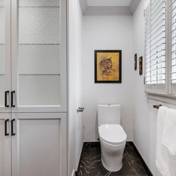
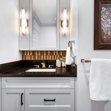
The Shared Bathroom was completed with large format black porcelain tiles with a marble look, glass accent mosaics, and modern plumbing fixtures gave the room an eclectic flair.
The project was finished on time, and our clients couldn’t be happier! They can now enjoy their personalized Shared Bathroom and Master Ensuite, with the comfort of knowing the plumbing is installed correctly.

 TVL Creative Ltd.
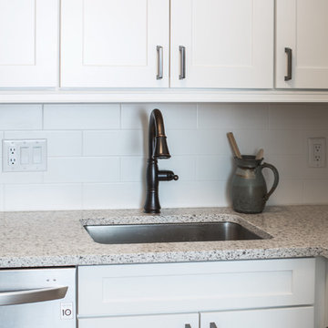
This kitchen took a tired, 80’s builder kitchen and revamped it into a personalized gathering space for our wonderful client. The existing space was split up by the dated configuration of eat-in kitchen table area to one side and cramped workspace on the other. It didn’t just under-serve our client’s needs; it flat out discouraged them from using the space. Our client desired an open kitchen with a central gathering space where family and friends could connect. To open things up, we removed the half wall separating the kitchen from the dining room and the wall that blocked sight lines to the family room and created a narrow hallway to the kitchen. The old oak cabinets weren't maximizing storage and were dated and dark. We used Waypoint Living Spaces cabinets in linen white to brighten up the room. On the east wall, we created a hutch-like stack that features an appliance garage that keeps often used countertop appliance on hand but out of sight. The hutch also acts as a transition from the cooking zone to the coffee and wine area. We eliminated the north window that looked onto the entry walkway and activated this wall as storage with refrigerator enclosure and pantry. We opted to leave the east window as-is and incorporated it into the new kitchen layout by creating a window well for growing plants and herbs. The countertops are Pental Quartz in Carrara. The sleek cabinet hardware is from our friends at Amerock in a gorgeous satin champagne bronze. One of the most striking features in the space is the pattern encaustic tile from Tile Shop. The pop of blue in the backsplash adds personality and contrast to the champagne accents. The reclaimed wood cladding surrounding the large east-facing window introduces a quintessential Colorado vibe, and the natural texture balances the crisp white cabinetry and geometric patterned tile. Minimalist modern lighting fixtures from Mitzi by Hudson Valley Lighting provide task lighting over the sink and at the wine/ coffee station. The visual lightness of the sink pendants maintains the openness and visual connection between the kitchen and dining room. Together the elements make for a sophisticated yet casual vibe-- a comfortable chic kitchen. We love the way this space turned out and are so happy that our clients now have such a bright and welcoming gathering space as the heart of their home!
Sponsored
Columbus, OH

Wannemacher Interiors
Customized Award-Winning Interior Design Solutions in Franklin Cnty OH
 TVL Creative Ltd.
This kitchen took a tired, 80’s builder kitchen and revamped it into a personalized gathering space for our wonderful client. The existing space was split up by the dated configuration of eat-in kitchen table area to one side and cramped workspace on the other. It didn’t just under-serve our client’s needs; it flat out discouraged them from using the space. Our client desired an open kitchen with a central gathering space where family and friends could connect. To open things up, we removed the half wall separating the kitchen from the dining room and the wall that blocked sight lines to the family room and created a narrow hallway to the kitchen. The old oak cabinets weren't maximizing storage and were dated and dark. We used Waypoint Living Spaces cabinets in linen white to brighten up the room. On the east wall, we created a hutch-like stack that features an appliance garage that keeps often used countertop appliance on hand but out of sight. The hutch also acts as a transition from the cooking zone to the coffee and wine area. We eliminated the north window that looked onto the entry walkway and activated this wall as storage with refrigerator enclosure and pantry. We opted to leave the east window as-is and incorporated it into the new kitchen layout by creating a window well for growing plants and herbs. The countertops are Pental Quartz in Carrara. The sleek cabinet hardware is from our friends at Amerock in a gorgeous satin champagne bronze. One of the most striking features in the space is the pattern encaustic tile from Tile Shop. The pop of blue in the backsplash adds personality and contrast to the champagne accents. The reclaimed wood cladding surrounding the large east-facing window introduces a quintessential Colorado vibe, and the natural texture balances the crisp white cabinetry and geometric patterned tile. Minimalist modern lighting fixtures from Mitzi by Hudson Valley Lighting provide task lighting over the sink and at the wine/ coffee station. The visual lightness of the sink pendants maintains the openness and visual connection between the kitchen and dining room. Together the elements make for a sophisticated yet casual vibe-- a comfortable chic kitchen. We love the way this space turned out and are so happy that our clients now have such a bright and welcoming gathering space as the heart of their home!
 Sosna Inc
This exciting renovation improved both the look and functionality of our client’s Master Ensuite and Shared Bathroom. Both rooms had both dated aesthetics and dysfunctional layouts, but more importantly, they required updated plumbing due to an old renovation where the plumbing had been done incorrectly and had caused leaking and ceiling damage below.
To solve the leaks, and provide better function in both Bathrooms, fixtures in the Shared Bathroom were relocated, and the previously installed plumbing connections were corrected. This solved the leak issues and provided improved function in both Bathrooms.
A rarely used large corner tub in the Master Ensuite was eliminated to accommodate a spacious walk-in shower with a bench, and a custom wall-to-wall double vanity provided a nice aesthetic and lots of useful storage.
The tub and toilet in the Shared Bathroom were switched and new custom vanity and linen cabinets were installed.
Each Bathroom was given its own distinct look. Porcelain tiles made to look like marble, and mosaics accentuated with patterned floor tiles, luxurious marble knobs and handles, and beautiful jewel faucets gave the Master Ensuite a Transitional charm.
The Shared Bathroom was completed with large format black porcelain tiles with a marble look, glass accent mosaics, and modern plumbing fixtures gave the room an eclectic flair.
The project was finished on time, and our clients couldn’t be happier! They can now enjoy their personalized Shared Bathroom and Master Ensuite, with the comfort of knowing the plumbing is installed correctly.
 TVL Creative Ltd.
This kitchen remodel in Lakewood has undergone such an amazing transformation from a dark, dated space to bright and functional! We experienced many obstacles in this tight space but was able to design around the challenges to create a beautiful and functional space. The original design intent was to bring the cabinets all the way to the ceiling but found out this wasn’t an option as all the soffits had interior mechanical systems and couldn’t be reconfigured. One solution was to raise the soffits on the range and sink walls to gain an extra 6” of cabinet space and build out the soffit above the refrigerator to create a custom built-in look. This extension of the soffit created the perfect opportunity for a narrow pantry cabinet facing the dining room which adds much needed storage space. By painting the soffits the same color as the cabinets, we were able to install the crown trim on top of the soffit in lieu of the cabinets to create the illusion of taller cabinets and lengthening the ceiling height. We omitted the wall cabinet to the left of the range to create a more open space both visibly and functionally. This provided the opportunity to install an accent pendant over the open counter which has been lowered to maintain one counter height throughout for a seamless look. Decorative door panels give the perfect finishing touches on the cabinetry and truly convey a custom look. The cabinets were finished in Waypoint’s Shaker style in Linen color and were paired with Amrock’s stunning gunmetal finish hardware. The existing floor tile was replaced with Daltile’s Forest Park Maple wood-look plank which now extends into the dining room creating a natural separation of kitchen/dining space to the adjacent Family room. The warmth of the floor tile compliments the Linen cabinetry color and Gunmetal finishes throughout. This beautiful kitchen offers a beautiful and functional design solution and we are thrilled our client can love their personalized kitchen for many years to come!

 Alair Homes Plano
Our clients came to us after purchasing their new home, wanting to update a few things to make it “theirs.” The master bathroom was very out of date, so that was their first priority and the largest part of the project. It had black galaxy granite with surrounding mirrors on all of the walls. They wanted to enlarge the shower, get rid of the huge step-up jacuzzi tub, and change the swing of the door to the closet and water closet. They also wanted all new cabinets and to create his and hers vanity sinks, if possible. We gutted the bathroom and started with a clean slate. Waypoint Shaker panel cabinets were installed and painted linen, with Super White Marble countertops. Payton Sconces in satin nickel were hung on either side of each vanity mirror. Mirabelle undermount vanity sinks were installed, finishing those off with sleek Brizo Virage faucets in brilliance brushed nickel. Capua Multi Perla ceramic tile was used on the shower walls, with the floor tile being Tesoro Nuvoloso Herringbone. A Mirabelle brushed nickel, square, custom showerhead and a Vilamonte brushed nickel handle were the hardware used in their new shower. The main flooring in the bathroom was IWould 6x24 glazed porcelain planks. Our clients love their new space!
Also see Lueders Lane Kitchen, Living Room and Powder Room.
Design/Remodel by Hatfield Builders & Remodelers | Photography by Versatile Imaging
 TVL Creative Ltd.
This kitchen took a tired, 80’s builder kitchen and revamped it into a personalized gathering space for our wonderful client. The existing space was split up by the dated configuration of eat-in kitchen table area to one side and cramped workspace on the other. It didn’t just under-serve our client’s needs; it flat out discouraged them from using the space. Our client desired an open kitchen with a central gathering space where family and friends could connect. To open things up, we removed the half wall separating the kitchen from the dining room and the wall that blocked sight lines to the family room and created a narrow hallway to the kitchen. The old oak cabinets weren't maximizing storage and were dated and dark. We used Waypoint Living Spaces cabinets in linen white to brighten up the room. On the east wall, we created a hutch-like stack that features an appliance garage that keeps often used countertop appliance on hand but out of sight. The hutch also acts as a transition from the cooking zone to the coffee and wine area. We eliminated the north window that looked onto the entry walkway and activated this wall as storage with refrigerator enclosure and pantry. We opted to leave the east window as-is and incorporated it into the new kitchen layout by creating a window well for growing plants and herbs. The countertops are Pental Quartz in Carrara. The sleek cabinet hardware is from our friends at Amerock in a gorgeous satin champagne bronze. One of the most striking features in the space is the pattern encaustic tile from Tile Shop. The pop of blue in the backsplash adds personality and contrast to the champagne accents. The reclaimed wood cladding surrounding the large east-facing window introduces a quintessential Colorado vibe, and the natural texture balances the crisp white cabinetry and geometric patterned tile. Minimalist modern lighting fixtures from Mitzi by Hudson Valley Lighting provide task lighting over the sink and at the wine/ coffee station. The visual lightness of the sink pendants maintains the openness and visual connection between the kitchen and dining room. Together the elements make for a sophisticated yet casual vibe-- a comfortable chic kitchen. We love the way this space turned out and are so happy that our clients now have such a bright and welcoming gathering space as the heart of their home!
 Sosna Inc
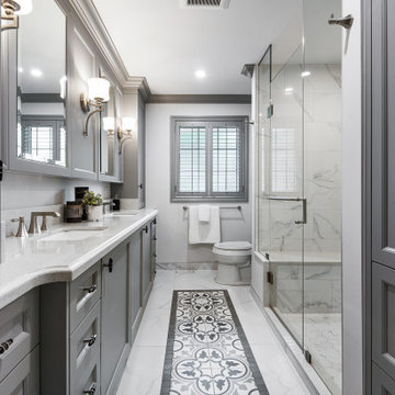
This exciting renovation improved both the look and functionality of our client’s Master Ensuite and Shared Bathroom. Both rooms had both dated aesthetics and dysfunctional layouts, but more importantly, they required updated plumbing due to an old renovation where the plumbing had been done incorrectly and had caused leaking and ceiling damage below.
To solve the leaks, and provide better function in both Bathrooms, fixtures in the Shared Bathroom were relocated, and the previously installed plumbing connections were corrected. This solved the leak issues and provided improved function in both Bathrooms.
A rarely used large corner tub in the Master Ensuite was eliminated to accommodate a spacious walk-in shower with a bench, and a custom wall-to-wall double vanity provided a nice aesthetic and lots of useful storage.
The tub and toilet in the Shared Bathroom were switched and new custom vanity and linen cabinets were installed.
Each Bathroom was given its own distinct look. Porcelain tiles made to look like marble, and mosaics accentuated with patterned floor tiles, luxurious marble knobs and handles, and beautiful jewel faucets gave the Master Ensuite a Transitional charm.
The Shared Bathroom was completed with large format black porcelain tiles with a marble look, glass accent mosaics, and modern plumbing fixtures gave the room an eclectic flair.
The project was finished on time, and our clients couldn’t be happier! They can now enjoy their personalized Shared Bathroom and Master Ensuite, with the comfort of knowing the plumbing is installed correctly.
 TVL Creative Ltd.
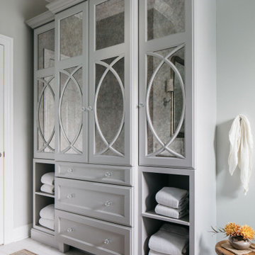
This kitchen took a tired, 80’s builder kitchen and revamped it into a personalized gathering space for our wonderful client. The existing space was split up by the dated configuration of eat-in kitchen table area to one side and cramped workspace on the other. It didn’t just under-serve our client’s needs; it flat out discouraged them from using the space. Our client desired an open kitchen with a central gathering space where family and friends could connect. To open things up, we removed the half wall separating the kitchen from the dining room and the wall that blocked sight lines to the family room and created a narrow hallway to the kitchen. The old oak cabinets weren't maximizing storage and were dated and dark. We used Waypoint Living Spaces cabinets in linen white to brighten up the room. On the east wall, we created a hutch-like stack that features an appliance garage that keeps often used countertop appliance on hand but out of sight. The hutch also acts as a transition from the cooking zone to the coffee and wine area. We eliminated the north window that looked onto the entry walkway and activated this wall as storage with refrigerator enclosure and pantry. We opted to leave the east window as-is and incorporated it into the new kitchen layout by creating a window well for growing plants and herbs. The countertops are Pental Quartz in Carrara. The sleek cabinet hardware is from our friends at Amerock in a gorgeous satin champagne bronze. One of the most striking features in the space is the pattern encaustic tile from Tile Shop. The pop of blue in the backsplash adds personality and contrast to the champagne accents. The reclaimed wood cladding surrounding the large east-facing window introduces a quintessential Colorado vibe, and the natural texture balances the crisp white cabinetry and geometric patterned tile. Minimalist modern lighting fixtures from Mitzi by Hudson Valley Lighting provide task lighting over the sink and at the wine/ coffee station. The visual lightness of the sink pendants maintains the openness and visual connection between the kitchen and dining room. Together the elements make for a sophisticated yet casual vibe-- a comfortable chic kitchen. We love the way this space turned out and are so happy that our clients now have such a bright and welcoming gathering space as the heart of their home!
 TKS Design Group
Download our free ebook, Creating the Ideal Kitchen. DOWNLOAD NOW
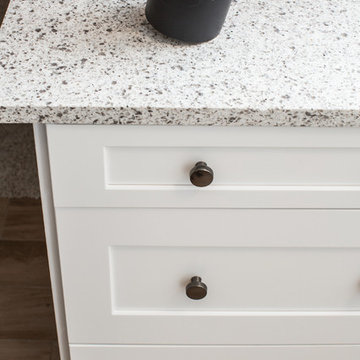
Our clients were in the market for an upgrade from builder grade in their Glen Ellyn bathroom! They came to us requesting a more spa like experience and a designer’s eye to create a more refined space.
A large steam shower, bench and rain head replaced a dated corner bathtub. In addition, we added heated floors for those cool Chicago months and several storage niches and built-in cabinets to keep extra towels and toiletries out of sight. The use of circles in the tile, cabinetry and new window in the shower give this primary bath the character it was lacking, while lowering and modifying the unevenly vaulted ceiling created symmetry in the space. The end result is a large luxurious spa shower, more storage space and improvements to the overall comfort of the room. A nice upgrade from the existing builder grade space!
Photography by @margaretrajic
Photo stylist @brandidevers
Do you have an older home that has great bones but needs an upgrade? Contact us here to see how we can help!
 TVL Creative Ltd.
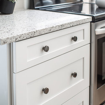
This kitchen remodel in Lakewood has undergone such an amazing transformation from a dark, dated space to bright and functional! We experienced many obstacles in this tight space but was able to design around the challenges to create a beautiful and functional space. The original design intent was to bring the cabinets all the way to the ceiling but found out this wasn’t an option as all the soffits had interior mechanical systems and couldn’t be reconfigured. One solution was to raise the soffits on the range and sink walls to gain an extra 6” of cabinet space and build out the soffit above the refrigerator to create a custom built-in look. This extension of the soffit created the perfect opportunity for a narrow pantry cabinet facing the dining room which adds much needed storage space. By painting the soffits the same color as the cabinets, we were able to install the crown trim on top of the soffit in lieu of the cabinets to create the illusion of taller cabinets and lengthening the ceiling height. We omitted the wall cabinet to the left of the range to create a more open space both visibly and functionally. This provided the opportunity to install an accent pendant over the open counter which has been lowered to maintain one counter height throughout for a seamless look. Decorative door panels give the perfect finishing touches on the cabinetry and truly convey a custom look. The cabinets were finished in Waypoint’s Shaker style in Linen color and were paired with Amrock’s stunning gunmetal finish hardware. The existing floor tile was replaced with Daltile’s Forest Park Maple wood-look plank which now extends into the dining room creating a natural separation of kitchen/dining space to the adjacent Family room. The warmth of the floor tile compliments the Linen cabinetry color and Gunmetal finishes throughout. This beautiful kitchen offers a beautiful and functional design solution and we are thrilled our client can love their personalized kitchen for many years to come!
 TVL Creative Ltd.
This kitchen remodel in Lakewood has undergone such an amazing transformation from a dark, dated space to bright and functional! We experienced many obstacles in this tight space but was able to design around the challenges to create a beautiful and functional space. The original design intent was to bring the cabinets all the way to the ceiling but found out this wasn’t an option as all the soffits had interior mechanical systems and couldn’t be reconfigured. One solution was to raise the soffits on the range and sink walls to gain an extra 6” of cabinet space and build out the soffit above the refrigerator to create a custom built-in look. This extension of the soffit created the perfect opportunity for a narrow pantry cabinet facing the dining room which adds much needed storage space. By painting the soffits the same color as the cabinets, we were able to install the crown trim on top of the soffit in lieu of the cabinets to create the illusion of taller cabinets and lengthening the ceiling height. We omitted the wall cabinet to the left of the range to create a more open space both visibly and functionally. This provided the opportunity to install an accent pendant over the open counter which has been lowered to maintain one counter height throughout for a seamless look. Decorative door panels give the perfect finishing touches on the cabinetry and truly convey a custom look. The cabinets were finished in Waypoint’s Shaker style in Linen color and were paired with Amrock’s stunning gunmetal finish hardware. The existing floor tile was replaced with Daltile’s Forest Park Maple wood-look plank which now extends into the dining room creating a natural separation of kitchen/dining space to the adjacent Family room. The warmth of the floor tile compliments the Linen cabinetry color and Gunmetal finishes throughout. This beautiful kitchen offers a beautiful and functional design solution and we are thrilled our client can love their personalized kitchen for many years to come!
 TKS Design Group
Download our free ebook, Creating the Ideal Kitchen. DOWNLOAD NOW
This client came to us in a bit of a panic when she realized that she really wanted her bathroom to be updated by March 1st due to having 2 daughters getting married in the spring and one graduating. We were only about 5 months out from that date, but decided we were up for the challenge.
The beautiful historical home was built in 1896 by an ornithologist (bird expert), so we took our cues from that as a starting point. The flooring is a vintage basket weave of marble and limestone, the shower walls of the tub shower conversion are clad in subway tile with a vintage feel. The lighting, mirror and plumbing fixtures all have a vintage vibe that feels both fitting and up to date. To give a little of an eclectic feel, we chose a custom green paint color for the linen cabinet, mushroom paint for the ship lap paneling that clads the walls and selected a vintage mirror that ties in the color from the existing door trim. We utilized some antique trim from the home for the wainscot cap for more vintage flavor.
The drama in the bathroom comes from the wallpaper and custom shower curtain, both in William Morris’s iconic “Strawberry Thief” print that tells the story of thrushes stealing fruit, so fitting for the home’s history. There is a lot of this pattern in a very small space, so we were careful to make sure the pattern on the wallpaper and shower curtain aligned.
A sweet little bird tie back for the shower curtain completes the story...
Designed by: Susan Klimala, CKD, CBD
Photography by: Michael Kaskel
For more information on kitchen and bath design ideas go to: www.kitchenstudio-ge.com

 Corinthian Fine Homes
These homeowners approached us with their design in mind which we were able to tweak for improved utilization of space. Their master bath was dated and required complete demolition to the studs, where we found some hidden space that we were able to use in the shower. By eliminating the tub, we were able to use that space for a large shower with custom handmade tile in a creative pattern utilizing mosaic, hexagon and accent tiles, and radiant floor heat was added to the bathroom floor for added comfort. By relocating the stool room, we were able to provide a custom extra deep linen cabinet for additional storage. His and Hers custom vanity’s in a painted Alpine finish with chocolate glaze and Cambria Windermere countertops book end the spacious shower, complete with a floating bench and niche for toiletries. Champagne Bronze plumbing fixtures and Visual Comfort sconces complement the geometric wallpaper and decorative beveled mirrors complete the eye-catching bathroom.
 Precision Homecrafters, LLC
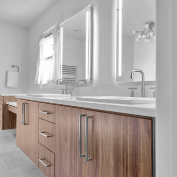
The project started by demoing the entire bathroom including a small office nook that was located next to it. This allowed more square footage to be added into the new plan. The original tub/shower combo was small and dated and therefore, had to be demoed. The bathroom was completely remodeled to include a new zero-threshold shower with a separate tub, a contemporary floating vanity with slab doors, a linen cabinet, and a new walk-in closet with vestibule built-ins on the other side of the bedroom. The custom walnut floating vanities, the linen cabinet and the 2 vestibule built-ins at the closet entry were created by a local craftsman. The central vanity is floating to create a more open concept and the walnut provides a more contemporary look. The vanity also has a seated area in the center in front of the window to maximize the most natural light. The materials palette is neutral in this bathroom, but with stunning elements like the walnut vanity, it really warms up the space and creates a welcoming environment.
The fixtures in this remodel add to the sophisticated style of the space. The Kohler purist series can be seen throughout this remodel in the shower fixtures, the lavatory faucets, the wall-mounted tub filler and all of the accessories. The lavatory sinks are Carillon wading pool vessel sinks. A smart feature of this bathroom is the modern wall-mounted towel warmer that allows the homeowners to have a warmed towel rack within reach of their shower and tub area. Another smart feature of this remodel is the mirrors that have a de-fogger feature and also built-in LED’s inside the mirror. The chandelier installed over the tub also provides a stunning contemporary aesthetic.
Along with the fixtures, the materials were chosen to give a more modern look to the space. For materials, a dramatic green subway tile installed in a straight/grid pattern is the feature of the shower area. A lighter gray 12” x 24” porcelain floor tile with subtle veining was used on the floor. The stunning white quartz with gray veining is on the tub deck, shower bench and top of vanities.
37