
Search results for "Literal" in Home Design Ideas
 Drury Design
THE SETUP
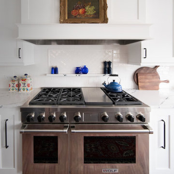
“You have to figure out how to rebuild a life worth living,” Basia Kozub’s client says. Her husband passed away suddenly three years ago. Holidays with family became more important, and she found herself struggling with a 37-year old kitchen that was falling apart. “I made a decision to move forward,” she says. “I went, ‘You know what? I’m redoing the kitchen.'”
The big task of getting started was as easy as having a conversation – literally. Basia was on the job, helping the client sort through priorities, wishes and ideas. Basia’s client is 5′ 4″, likes keeping an eye on the kiddoes in the backyard and wanted certain things to have their own place.
THE REMODEL
The objectives were:
Enlarge and open the space
Find a classic look that incorporates blues
Upgrade to easy-to-use appliances
Hide an office space within the space
Ample storage for dishes
Design challenges:
Uneven window alignment on the back wall
Original kitchen smaller than desired, stuctural concerns if walls to be moved
Keep folks close – figure out seating for entertaining
Main sink in corner is ideal, but windows are hard to reach
Lots of storage needed for dishes, glass collection, pantry items, bar bottles and office supplies
Specific storage needs for oft-used spices and utensils
THE RENEWED SPACE
Design solutions:
Replace back wall windows, establish window size continuity
Take out two walls to open up the space, tall shallow cabinet and a tall filler added to conceal a new header
Large island that seats six easily
Custom corner sink cabinet with recessed edge allows vertically challenged homeowner to reach the windows
Mindful storage planning features: plenty of cabinets, pull-out bar bottle storage, file drawers & cubbies with pocket doors for office appliances, magic corner pullouts, and appliance garages with pocket doors
Shelf behind range for easy access to daily-use spices and oils. Also: spice and utensil pullouts on either side of range
The clients says every priority and wish box got checked. The highly functional design absorbed everything that used to be in that area of the house, but now those things are out of the way.
“In the past, we were all spread out when we gathered for the holidays, because we had to spread out. Now, we’re all in here together, including my 92-year old mother. We’re visiting, cooking, laughing… everyone is here. And I’m really learning how to use these appliances. This kitchen has given me a whole new life.”

 High Plains Architects, P.C.
The Porch House sits perched overlooking a stretch of the Yellowstone River valley. With an expansive view of the majestic Beartooth Mountain Range and its close proximity to renowned fishing on Montana’s Stillwater River you have the beginnings of a great Montana retreat. This structural insulated panel (SIP) home effortlessly fuses its sustainable features with carefully executed design choices into a modest 1,200 square feet. The SIPs provide a robust, insulated envelope while maintaining optimal interior comfort with minimal effort during all seasons. A twenty foot vaulted ceiling and open loft plan aided by proper window and ceiling fan placement provide efficient cross and stack ventilation. A custom square spiral stair, hiding a wine cellar access at its base, opens onto a loft overlooking the vaulted living room through a glass railing with an apparent Nordic flare. The “porch” on the Porch House wraps 75% of the house affording unobstructed views in all directions. It is clad in rusted cold-rolled steel bands of varying widths with patterned steel “scales” at each gable end. The steel roof connects to a 3,600 gallon rainwater collection system in the crawlspace for site irrigation and added fire protection given the remote nature of the site. Though it is quite literally at the end of the road, the Porch House is the beginning of many new adventures for its owners.

 Planika Fires
It’s unique ellipse shape resembles a slim silhouette with a remarkable line of fire. Smart and stylish, the fireplace is a modern and luxurious element of the contemporary design. ZEN is available in either black or white colour, finished with fiberglass polyester, powered coated steel and tempered glass. In addition, the designer’s idea was to create a bio fireplace with optimal flexibility of the product’s height. Therefore, Zen includes both lower and slightly higher (ZEN High) version depending on one’s needs.
Thanks to the advanced BEV technology, the fireplace does not emit any smell and ash. Additionally, it also allows to regulate the height of natural colour flames. The user can adjust it up to one’s likings in order to create a perfect atmosphere.
ZEN is portable and its installation does not demand any hard connections. Therefore, the fireplace can be placed anywhere to fit even the most exquisite project. The fireplace is safe and user friendly. The intuitive system provides single button operation. Innovative and sophisticated, the fireplace works literally at the push of the button. ZEN is perfect for both commercial and private purposes. It is an ideal fire solution bringing the ambience of real fire wherever needed.
www.store.planikafires.com
www.planikafires.com
www.facebook.com/planikafire
photo: Michal Kugacz
Find the right local pro for your project

 Evok Design Co
. Evok Design Co. Here are the after photos of a great room redesign for a mountain retreat in the beautiful blue ridge mountains. Our challenge was to make this space feel warm and comfortable despite the amazing high ceilings. Before we got to it, this space felt cold and cavernous! But after we were done, it literally had a warm glow, and we hosted a party of 200 in this home for a wedding reception the night after the install was complete! (whew!) The owners of this home are a celebrity couple, who wish to remain unnamed, but they were thrilled with the results and so were we! The transition was AMAZING! We had the help of the best window treatment creators in town! We brought the ceiling down with some warm lighting, and used local photography. This is the couples third home, so the budget was not astronomical, but it sufficed. We used Bradington Young and Norwalk furniture, and luxury accessories from all over NC. We also had a custom mantle piece built after these photos were taken.

 abarnai
The IL-1 Beta table was a unique and personalized birthday gift for renowned scientist Charles DInarello. We were commissioned to build a custom gift to represent three defining elements of his life; the refining of IL-1 Beta, one of his first monumental scientific achievements; his love of gardening and outdoor living spaces; and his enthusiasm for entertaining guests and fitting as many people around his table as possible (both figuratively and literally). We combined these three defining elements, and designed an outdoor table, a courtyard centerpiece, that would represent IL-1 Beta and enhance the scientist’s garden parties.
One of the most important and challenging design aspects of the IL-1Beta table were the pedestal legs. The recipient of this beautiful gift, Dr. Dinarello, loves entertaining guests, introducing strangers, and encouraging conversation, so we designed a table that could sit many and then add more. The pedestals are each composed of seven pieces of wood that had to be assembled in a precise order for strength, stability and beauty. The table stands delicately with just the tips of the pedestal legs touching the ground, like a couple mid-waltz, poised and strong and light on the dance floor.

 Elle Peters Design
Hi friends! If you hadn’t put it together from the hashtag (#hansonranchoverhaul), this project was literally, quite the overhaul. This full-house renovation was so much fun to be a part of! Not only did we overhaul both the main and second levels, but we actually added square footage when we filled in a double-story volume to create an additional second floor bedroom (which in this case, will actually function as a home office). We also moved walls around on both the main level to open up the living/dining kitchen area, create a more functional powder room, and bring in more natural light at the entry. Upstairs, we altered the layout to accommodate two more spacious and modernized bathrooms, as well as larger bedrooms, one complete with a new walk-in-closet and one with a beautiful window seat built-in.
This client and I connected right away – she was looking to update her '90s home with a laid-back, fresh, transitional approach. As we got into the finish selections, we realized that our picks were taking us in a bit of a modern farmhouse direction, so we went with it, and am I ever glad we did! I love the new wide-plank distressed hardwood throughout and the new shaker-style built-ins in the kitchen and bathrooms. I custom designed the fireplace mantle and window seat to coordinate with the craftsman 3-panel doors, and we worked with the stair manufacturer to come up with a handrail, spindle and newel post design that was the perfect combination of traditional and modern. The 2-tone stair risers and treads perfectly accomplished the look we were going for!



 Expert Kitchen Designs, LLC
Inspiration for a small country l-shaped eat-in kitchen remodel in DC Metro with shaker cabinets, white cabinets, granite countertops and an island
 Elle Peters Design
Hi friends! If you hadn’t put it together from the hashtag (#hansonranchoverhaul), this project was literally, quite the overhaul. This full-house renovation was so much fun to be a part of! Not only did we overhaul both the main and second levels, but we actually added square footage when we filled in a double-story volume to create an additional second floor bedroom (which in this case, will actually function as a home office). We also moved walls around on both the main level to open up the living/dining kitchen area, create a more functional powder room, and bring in more natural light at the entry. Upstairs, we altered the layout to accommodate two more spacious and modernized bathrooms, as well as larger bedrooms, one complete with a new walk-in-closet and one with a beautiful window seat built-in.
This client and I connected right away – she was looking to update her '90s home with a laid-back, fresh, transitional approach. As we got into the finish selections, we realized that our picks were taking us in a bit of a modern farmhouse direction, so we went with it, and am I ever glad we did! I love the new wide-plank distressed hardwood throughout and the new shaker-style built-ins in the kitchen and bathrooms. I custom designed the fireplace mantle and window seat to coordinate with the craftsman 3-panel doors, and we worked with the stair manufacturer to come up with a handrail, spindle and newel post design that was the perfect combination of traditional and modern. The 2-tone stair risers and treads perfectly accomplished the look we were going for!

 Distinctive Kitchens
When we call this kitchen, dining area and bathroom "Tiny but Luxe," we mean it literally: this kitchen is a walk-through galley that's hardly more than 125 square feet, and the bathroom is quite small as well. So in order to make this tiny home feel more spacious, we opened the wall to the living room to allow light to flow through the living spaces to the dining nook, and over the new peninsula we designed a custom wine rack to create a differentiation of spaces.
With a carefully heightened archway between the nook and kitchen, and a new matching arched opening between kitchen and living space, there is a beautiful, and natural openness now even as we were careful to delineate the spaces.
A custom banquette in a beautiful hunter green and gorgeous wallpaper draw the eye to the dining area, and also create a feeling of a larger space.
By incorporating smaller appliances and custom-built pieces, the space feels larger and everything fits. The newly imagined spaces feel airy and light. We installed a Lacanche Cormatin and accented the black of the range with a slab of absolutely stunning Statuario marble with dramatic gray and black veining. Our built-in 24" fridge allows the working side of the kitchen to function as if it's twice as large--you'll see the built-in fridge to the left of the Lacanche.
 Distinctive Kitchens
When we call this kitchen, dining area and bathroom "Tiny but Luxe," we mean it literally: this kitchen is a walk-through galley that's hardly more than 125 square feet, and the bathroom is quite small as well. So in order to make this tiny home feel more spacious, we opened the wall to the living room to allow light to flow through the living spaces to the dining nook, and over the new peninsula we designed a custom wine rack to create a differentiation of spaces.
With a carefully heightened archway between the nook and kitchen, and a new matching arched opening between kitchen and living space, there is a beautiful, and natural openness now even as we were careful to delineate the spaces.
A custom banquette in a beautiful hunter green and gorgeous wallpaper draw the eye to the dining area, and also create a feeling of a larger space.
By incorporating smaller appliances and custom-built pieces, the space feels larger and everything fits. The newly imagined spaces feel airy and light. We installed a Lacanche Cormatin and accented the black of the range with a slab of absolutely stunning Statuario marble with dramatic gray and black veining. Our built-in 24" fridge allows the working side of the kitchen to function as if it's twice as large--you'll see the built-in fridge to the left of the Lacanche.
 Distinctive Kitchens
When we call this kitchen, dining area and bathroom "Tiny but Luxe," we mean it literally: this kitchen is a walk-through galley that's hardly more than 125 square feet, and the bathroom is quite small as well. So in order to make this tiny home feel more spacious, we opened the wall to the living room to allow light to flow through the living spaces to the dining nook, and over the new peninsula we designed a custom wine rack to create a differentiation of spaces.
With a carefully heightened archway between the nook and kitchen, and a new matching arched opening between kitchen and living space, there is a beautiful, and natural openness now even as we were careful to delineate the spaces.
A custom banquette in a beautiful hunter green and gorgeous wallpaper draw the eye to the dining area, and also create a feeling of a larger space.
By incorporating smaller appliances and custom-built pieces, the space feels larger and everything fits. The newly imagined spaces feel airy and light. We installed a Lacanche Cormatin and accented the black of the range with a slab of absolutely stunning Statuario marble with dramatic gray and black veining. Our built-in 24" fridge allows the working side of the kitchen to function as if it's twice as large--you'll see the built-in fridge to the left of the Lacanche.
 JUMA architects
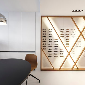
Optiek Herpol wanted to move to a better, more central location with plenty of parking space. A property that complied with these conditions was found on the Market in Deinze, and JUMA architects were subsequently asked to design a new interior for the store.
The property in question is very deep and narrow with little natural light entry. JUMA set to work despite these constraints in an attempt to transform these challenges into qualities.
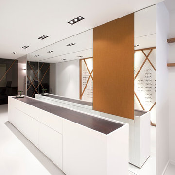
The architects positioned the sales counter right behind the shop window, so as to make optimum use of the available natural light. This also makes store activities visible from the outside, adding an extra element of attraction. At the narrowest section of the store, a large wall mirror was put in to visually double the space. The wall onto which the eyeglasses are displayed is located opposite the mirror and is literally the eye catcher in the store. A wooden lattice makes for an interesting play of diagonal lines behind which the glasses are presented. This unique concept animates the entire store without detracting from the fact that the glasses should remain the main focal point in the store. The workshop is located in the back, separated from the store by a wall in smoked grey glass. In this way, the optician can keep an eye on the store at all times.
The colour palette is predominantly white, to keep the interior as light as possible. As a counterpoint, warm wood accents are added. The chairs at the counter are upholstered in a colour that harmonizes perfectly with the wood.
Pictures © Thomas De Bruyne


 JUMA architects
Optiek Herpol wanted to move to a better, more central location with plenty of parking space. A property that complied with these conditions was found on the Market in Deinze, and JUMA architects were subsequently asked to design a new interior for the store.
The property in question is very deep and narrow with little natural light entry. JUMA set to work despite these constraints in an attempt to transform these challenges into qualities.
The architects positioned the sales counter right behind the shop window, so as to make optimum use of the available natural light. This also makes store activities visible from the outside, adding an extra element of attraction. At the narrowest section of the store, a large wall mirror was put in to visually double the space. The wall onto which the eyeglasses are displayed is located opposite the mirror and is literally the eye catcher in the store. A wooden lattice makes for an interesting play of diagonal lines behind which the glasses are presented. This unique concept animates the entire store without detracting from the fact that the glasses should remain the main focal point in the store. The workshop is located in the back, separated from the store by a wall in smoked grey glass. In this way, the optician can keep an eye on the store at all times.
The colour palette is predominantly white, to keep the interior as light as possible. As a counterpoint, warm wood accents are added. The chairs at the counter are upholstered in a colour that harmonizes perfectly with the wood.
Pictures © Thomas De Bruyne
 abarnai
The IL-1 Beta table was a unique and personalized birthday gift for renowned scientist Charles DInarello. We were commissioned to build a custom gift to represent three defining elements of his life; the refining of IL-1 Beta, one of his first monumental scientific achievements; his love of gardening and outdoor living spaces; and his enthusiasm for entertaining guests and fitting as many people around his table as possible (both figuratively and literally). We combined these three defining elements, and designed an outdoor table, a courtyard centerpiece, that would represent IL-1 Beta and enhance the scientist’s garden parties.
One of the most important and challenging design aspects of the IL-1Beta table were the pedestal legs. The recipient of this beautiful gift, Dr. Dinarello, loves entertaining guests, introducing strangers, and encouraging conversation, so we designed a table that could sit many and then add more. The pedestals are each composed of seven pieces of wood that had to be assembled in a precise order for strength, stability and beauty. The table stands delicately with just the tips of the pedestal legs touching the ground, like a couple mid-waltz, poised and strong and light on the dance floor.

 S Squared Design, LLC
This bright kitchen used to be anything but, had dark cabinets and floor tiles that the owner said must go! Lightening this working kitchen for this family was a must. Client had an idea of their dream kitchen for this house and we made that happen. The transformation is like night and day, literally! Refacing the existing cabinets with a shaker style door and modern pulls brought this outdated kitchen to the present times. Converted some of the base cabinets to deep fully extending drawers gave more functional storage space for those hard to reach back corners of base door cabinets. We removed some of the closed cabinets and opted for open custom wood shelves to displace everyday dishes and create a pleasing natural feeling area in this kitchen. Behind those shelves we took a skinny white matte finish tile and went to the ceiling with it to make the room feel taller. Using a waterfall edge on the two peninsulas. That creates a nice space to house these two mid century barstools. We built a custom pantry and catch all area with deep drawers, a surface to drop keys or mail at and a tall upper cabinet for those other pantry items. Next to that we did a bench in the breakfast area. The soft gray cushion adds some warmth to the space. The flooring we took through the majority of the house, a wide plank tile that looks like wood! It looks so real people even ask what kind of wood it is when they see it! A smooth walnut coloring and look was perfect for this style of the rest of the home. So happy to help this family love their kitchen and feel like it belongs with the rest of their home!

 GMI Design Group
This airy living room was conceived around the homeowners love of art and nature. A palette derived from sea and sand, natural elements were brought in both literally and figuratively.
Warm wood and earthen accents are countered by sleek, modern accent chairs. The embroidered linen draperies draw the eye up and serve as a dramatic backdrop to the serene conversation area. Oversized mirrors transfer the ambient light throughout the room.
The centerpiece of the room is a silk and copper aerial sculpture by artist Jan R. Carson (www.janrcarson.com) that is accented by a halogen spotlight. The lighting casts an ever-changing shadow, creating life and whimsy to the room. The homeowners have even been known to move the furniture back, spotlight the mobile, and use the room as a salsa dance floor!
A reclaimed hand-carved door was repurposed as a coffee table. Modern elements such as the lucite "Ghost" chair, the Gus rocker, and impressionist original oil painting balance out the rustic elements of the room.
Julie Austin Photography
 GMI Design Group
This airy living room was conceived around the homeowners love of art and nature. A palette derived from sea and sand, natural elements were brought in both literally and figuratively.
Warm wood and earthen accents are countered by sleek, modern accent chairs. The embroidered linen draperies draw the eye up and serve as a dramatic backdrop to the serene conversation area. Oversized mirrors transfer the ambient light throughout the room.
The centerpiece of the room is a silk and copper aerial sculpture by artist Jan R. Carson (www.janrcarson.com) that is accented by a halogen spotlight. The lighting casts an ever-changing shadow, creating life and whimsy to the room. The homeowners have even been known to move the furniture back, spotlight the mobile, and use the room as a salsa dance floor!
A reclaimed hand-carved door was repurposed as a coffee table. Modern elements such as the lucite "Ghost" chair, the Gus rocker, and impressionist original oil painting balance out the rustic elements of the room.
Julie Austin Photography

 Pro Dunk Hoops
Michael and his son loves their Pro Dunk Platinum Basketball System. His son and his son's friends say that because of the hoops, they feel like they're playing on a professional court. They are all on the court literally everyday! Michael have attached a bunch of photos. The dimensions of their half court in the backyard of their residence is 48' x 30'. It is located in Sacramento, California. This is a Pro Dunk Platinum Basketball System that was purchased in March of 2012. It was installed on a 48 ft wide by a 30 ft deep playing area in Sacramento, CA. Browse all of Michael L's photos navigate to: http://www.produnkhoops.com/photos/albums/michael-48x30-pro-dunk-platinum-basketball-system-470/
146