
Search results for "Literal" in Home Design Ideas
 Bilotta Kitchen & Home
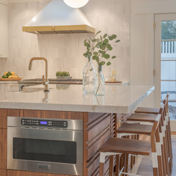
Lustrous walnut flooring literally lays the groundwork for this suburban renovation. Rutt Regency Cabinetry with Flat-panel doors give center stage to the starring features. Perimeter (Rutt Regency) cabinetry is a soft white, while a repetition of rich walnut dresses the island cabinets, the refrigerator framing as well as the stools and adjacent dining table with chairs. That contrast creates a point-counterpoint dialogue with the floors. Though the top trim is deceivingly simple, it’s actually a triple stack of moldings. Countertops are a mix of Caesarstone quartz on the perimeter and marble on the center island. Vertically-stacked subway tiles in assorted whites and off-whites add subtle shading and dimension. Viking’s white finish graces the refrigerator and range, while the dishwasher and wine cooler sport cabinetry panels. Conveniently located opposite the refrigerator, a stainless microwave drawer was placed in the island.
A delightful surprise designed by the architect is hidden behind the island: handcrafted panels and a storage cabinet faced in varied-width slats of walnut that speak to the attention to detail in this room.
Warm brass was chosen for pulls, faucet, and pendants. The brass strap on the white vent hood is punctuated by a single oversized pyramid-shaped rivet; another small detail that speaks volumes.
This project was designed by Architect Eva Bouhassira in collaboration with Tom Vecchio of Bilotta Kitchens. Photography by Tim Lee. Written by Paulette Gambacorta adapted for Houzz.

 Advance Design Studio, Ltd.
Jennifer and Dan have lived in their Deer Park Illinois home for 15 years, slowly making minor fixes like painting and decorating; but they had a new plan for their kitchen the entire time. An awkwardly placed garage door, and an island cooktop with a terrible downdraft made a full-scale kitchen remodel an absolute must. Jennifer had many ideas in mind and wanted to work with a company that could provide high-end work, while partnering with a designer that would tailor the kitchen to her ideas.
She was intrigued by the phrase “Common Sense Remodeling” in Advance Design’s feature she discovered while perusing an issue of the community’s Quintessential Barrington Magazine. Doing further research on the company’s website, as she looked through project profiles and read about Advance Design’s “Common Sense Remodeling” philosophy, she promptly scheduled an appointment to see if the people and ideas she read about were truly who they said they were. The more she read, the more she knew that the “Common Sense” approach to remodeling they described was exactly the type of company she was looking for.
The partnership was sealed after an initial consultation with Owner Todd Jurs and Project Designer Michelle Lecinski. They displayed a combination of friendliness, professionalism and respect that was unmatched by any of the other companies Jennifer talked to. She knew that with Advance Design, she would be able to retain the vision that she had in mind with high-quality craftsmanship.
“I reached out to Advance Design because of the ‘Common Sense Remodeling’ tagline,” Jennifer said. “That’s what lingered for me”. “Advance Design was the most respectful- of the house and of my design ideas, and the most professional of the handful of companies that looked at my project”.
Soon after the meeting Jennifer began working with Michelle on the project design. They quickly developed chemistry. Jennifer loved how Michelle researched and located every detail that Jennifer wanted for the kitchen. Between the two of them, every concept and idea was worked through and perfected. “Jennifer had definite ideas about what she wanted the new kitchen to look like, she just didn’t know how to bring it all together. We worked together really well to make her ideas into the practical reality necessary for a well-functioning kitchen, with the look and feel that she had envisioned”, says Michelle.
“Michelle was wonderful in using the CAD system she would show me new drawings every time we changed the layout while working through the design,” Jennifer said. “She was a really wonderful partner in execution, she made sure everything happened quickly and easily.”
The finished design drew out elements of Jennifer’s style and personality. The pair call the look “sophisticated farmhouse” to describe the kitchen renovation to family and friends. The result was a beautifully crafted, authentic-feeling space that satisfied Jennifer’s dreams 15 years in the making. The whole project consisted of a kitchen remodel, mudroom upgrade with powder room, and garage entry relocation. “The projects I personally like the best, are the ones that put the client’s dreams on display,” Project Designer Michelle said. “And this is one of those projects.”
The main focal point of the kitchen is custom zinc and brass ventilation hood with a vintage sheen, which was hand made to order by a small company in Indiana named Vogler Metalworking. “It’s like sculpture, a true work of art”, says Jennifer. Your eye is immediately drawn towards this elegant yet practical hood that eliminated the home’s downdraft problem and added a striking conversation piece at the same time. The carpenters had to use special gloves when transporting and installing it, so they didn’t smudge it with fingerprints. The beautiful hood centers proudly over the stunning black enamel and brass LaCornue Range. “I had a friend who had a LaCornue range and after learning how easy it was to cook perfect meals, I was convinced I wanted to have one”, says Jennifer. This unique, breathtaking combination anchors the entire kitchen and is apparent immediately as you walk into the great room the surrounds the space.
DuraSupreme Crestwood cabinets with a Kendall Panel add function and sophistication. A custom gray paint color paired with a storm blue was developed so that the new kitchen looked like it belonged to the existing space. Unlacquered brass faucets and hardware were important to Jennifer because she wanted the living finishes to age over time. Remarkable brass diamond mesh cabinet door inserts imported from the UK continue to add this one-of-a-kind kitchen renovation; giving it a “you won’t see this everywhere” quality. The use of old railcar flooring for the coffee bar countertop and reclaimed oak for the open shelving gives an authenticity to the space uncommon in kitchens today.
Jennifer and Michelle fell in love with the Limestone Grey Stone while they were investigating unique island countertop ideas. They liked the fact that the limestone as a living finish will age and change over time. Calcutta Miel Quartz countertops made for an excellent pairing around the perimeter, as it’s durable and perfect for cooking preparations. A textured white subway tile backsplash that runs to the ceiling keeps your eye moving towards the open shelving, and to the main focal point of the stunning range hood combination.
“The kitchen functions beautifully, and it’s gorgeous,” beams Jennifer as she gestures with both hands while smiling ear to ear. “The most important thing was I wanted a kitchen that had a wonderful flow, cooked beautiful meals and was a great gathering place for family and friends, and this space does that perfectly! Beauty wise, it turned out exactly how I had envisioned. I felt the function part was the hardest part, and that was nailed”!
Relocating the garage entry to the new mudroom was a huge priority and has finally separated the family’s arriving home functions from their kitchen. Now coats and shoes and bags have their own area for dropping once members arrive home. Matching gray DuraSupreme cabinetry helped create gorgeous, purposeful lockers for the family. A reclaimed vintage sink and custom wall paper were added to the tiny powder room to beautify the once previously only functional space. Advance Design was even able to create a custom space for their dog to sleep while the family is away.
“It was unbelievable that a project of this size was completed in such a short time, and I think that’s because of the large amount of planning and preparation that went into it,” Jennifer marveled, “When we started, we were ready, and everything was prepared”.
When it came to execution, Project Manager Justin Davis and his crew were quick, accessible, and organized. Projects like this kitchen are typically completed in as little as 8-10 weeks. Jennifer’s kitchen however despite the relocation of some challenging HVAC in a soffit and moving of an exterior door was completed remarkably fast in part because the team was working with an existing tile floor that ran throughout the first floor that the client really loved.
“You get to know these people really well because they’re living in your house while you’re living in your house. They were so fast and really good, it didn’t take as long as even planned” reported Jennifer. “I would text Justin and he always responded almost immediately. I got to know all the guys who were working in our house and they were all wonderful people”.
Details in a customized kitchen like this one require skill and care from the people who install it. “All the guys on the job were skilled at what the did. I wanted small details like little feet to look like furniture, that is where their carpentry skill came in to make these all perfect”, said Jennifer. “The tile guys were wonderful. They even let me determine how I wanted the texture with the grout to appear for a salt and pepper look; now that is a very skilled trade person making it custom”.
In Jennifer’s interview, she continued to reference Advance Design’s “Common Sense Remodeling”, so I took a minute to ask her exactly what that phrase meant to her and how it played out in her experience with her project and the Advance Design team. Here is what she said: “I was intrigued about Common Sense Remodeling and in my head that there would be clear costs and prices, great communication between the design team, the execution team and me”, said Jennifer. They did deliver on that, it was so clear about the cost breakdown, what I could expect from everyone who came to my house, and everything that we had ordered. That to me is the Common Sense”!
It’s great to see a client take literally our assertion that a well-planned remodeling project is simply “Common Sense”! She anticipated each step of the way would be clear, concise, and predictable, all the while protecting the outcome due to the careful upfront planning. “Advance Design delivered on their ‘Common Sense Remodeling’ promise,” Jennifer said. “From the design team, to the execution team - everything was straight forward like I imagined. The project turned out exactly how I envisioned, I enjoyed this process and absolutely would recommend Advance Design Studio to anyone.”
 Bilotta Kitchen & Home
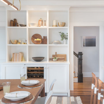
Lustrous walnut flooring literally lays the groundwork for this suburban renovation. Rutt Regency Cabinetry with Flat-panel doors give center stage to the starring features. Perimeter (Rutt Regency) cabinetry is a soft white, while a repetition of rich walnut dresses the island cabinets, the refrigerator framing as well as the stools and adjacent dining table with chairs. That contrast creates a point-counterpoint dialogue with the floors. Though the top trim is deceivingly simple, it’s actually a triple stack of moldings. Countertops are a mix of Caesarstone quartz on the perimeter and marble on the center island. Vertically-stacked subway tiles in assorted whites and off-whites add subtle shading and dimension. Viking’s white finish graces the refrigerator and range, while the dishwasher and wine cooler sport cabinetry panels. Conveniently located opposite the refrigerator, a stainless microwave drawer was placed in the island.
A delightful surprise designed by the architect is hidden behind the island: handcrafted panels and a storage cabinet faced in varied-width slats of walnut that speak to the attention to detail in this room.
Warm brass was chosen for pulls, faucet, and pendants. The brass strap on the white vent hood is punctuated by a single oversized pyramid-shaped rivet; another small detail that speaks volumes.
This project was designed by Architect Eva Bouhassira in collaboration with Tom Vecchio of Bilotta Kitchens. Photography by Tim Lee. Written by Paulette Gambacorta adapted for Houzz.
Find the right local pro for your project

 Tobin Dougherty Architects
The original structure at Yankee Point was a simple 1970s home with “good bones.” Unfortunately, it was also a case where less-than-poetic considerations threatened to eclipse design. Setbacks, height and footprint restrictions and other building regulations had boxed in the renovation to the point where there was literally nowhere left to build. Fortunately, the house sat 6' above grade on the ocean side. With some three-dimensional ingenuity, this ultimately provided ample space to add a new full height lower level without exceeding stringent lot coverage limitations. Today, upon entering the residence, you catch a quick glimpse of the ocean views and of the cascading roof lines designed to echo the motions of ocean waves beyond. The space opens up as you move toward the ocean to reveal a panoramic view.

 Distinctive Kitchens
When we call this kitchen, dining area and bathroom "Tiny but Luxe," we mean it literally: this kitchen is a walk-through galley that's hardly more than 125 square feet, and the bathroom is quite small as well. So in order to make this tiny home feel more spacious, we opened the wall to the living room to allow light to flow through the living spaces to the dining nook, and over the new peninsula we designed a custom wine rack to create a differentiation of spaces.
With a carefully heightened archway between the nook and kitchen, and a new matching arched opening between kitchen and living space, there is a beautiful, and natural openness now even as we were careful to delineate the spaces.
A custom banquette in a beautiful hunter green and gorgeous wallpaper draw the eye to the dining area, and also create a feeling of a larger space.
By incorporating smaller appliances and custom-built pieces, the space feels larger and everything fits. The newly imagined spaces feel airy and light. We installed a Lacanche Cormatin and accented the black of the range with a slab of absolutely stunning Statuario marble with dramatic gray and black veining. Our built-in 24" fridge allows the working side of the kitchen to function as if it's twice as large--you'll see the built-in fridge to the left of the Lacanche.

 Simply Home Decorating
Our goal on this project was to make the main floor of this lovely early 20th century home in a popular Vancouver neighborhood work for a growing family of four. We opened up the space, both literally and aesthetically, with windows and skylights, an efficient layout, some carefully selected furniture pieces and a soft colour palette that lends a light and playful feel to the space. Our clients can hardly believe that their once small, dark, uncomfortable main floor has become a bright, functional and beautiful space where they can now comfortably host friends and hang out as a family. Interior Design by Lori Steeves of Simply Home Decorating Inc. Photos by Tracey Ayton Photography.


 dRemodeling Design-Build
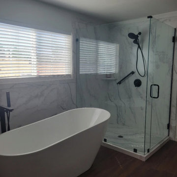
This master suite underwent a major transformation and the biggest part of that (literally and physically) was removing the large Jacuzzi tub sitting in the middle of the room. By reorienting the tub along the width of the room, it opened up the center of the space for a large modern double vanity. The shower combined with the tub feature into a nook that was bedecked in a beautiful shell mosaic. The mosaic lined all the interior walls including a built in shelving area, bench, and custom wall.
Easily the most special feature in this space is the resin panels that had been inserted into two partials walls positioned on opposite sides of the room. A mod floral pattern in a subdued lime green compliment the shell tiles and allows light to diffuse into the tub area. The opposite side provides a bit of privacy for the privy, and balances the composition as a whole. The white double vanity with a Carrera marble top and classic chrome fixtures adds a touch of class to the contemporary space. The ceramic wood plank floor tiles in a white washed finish add aesthetic warmth underfoot. Kiwi green walls sit above a staggered white subway tile wainscot that wraps around the perimeter, with a cool gray paint surround the resin panels.
A unique and fun space, our design team had a blast creating this design with the homeowner.
 Distinctive Kitchens
When we call this kitchen, dining area and bathroom "Tiny but Luxe," we mean it literally: this kitchen is a walk-through galley that's hardly more than 125 square feet, and the bathroom is quite small as well. So in order to make this tiny home feel more spacious, we opened the wall to the living room to allow light to flow through the living spaces to the dining nook, and over the new peninsula we designed a custom wine rack to create a differentiation of spaces.
With a carefully heightened archway between the nook and kitchen, and a new matching arched opening between kitchen and living space, there is a beautiful, and natural openness now even as we were careful to delineate the spaces.
A custom banquette in a beautiful hunter green and gorgeous wallpaper draw the eye to the dining area, and also create a feeling of a larger space.
By incorporating smaller appliances and custom-built pieces, the space feels larger and everything fits. The newly imagined spaces feel airy and light. We installed a Lacanche Cormatin and accented the black of the range with a slab of absolutely stunning Statuario marble with dramatic gray and black veining. Our built-in 24" fridge allows the working side of the kitchen to function as if it's twice as large--you'll see the built-in fridge to the left of the Lacanche.

 Renovisions
A work-smart kitchen layout was a must for this homeowner. That’s why she got together with the Renovisions team. In the old kitchen, lack of enough cabinet space and organized storage, created an overflowing situation with contents pushed to the countertops, making it hard to escape the clutter. Moreover, the inconvenient position of the refrigerator made entering and exiting the kitchen literally a squeeze. Redesigning the kitchen was a challenge but Ed envisioned a new spacious layout that naturally flowed between all work areas.
At the top of the must-have list was the addition of an Island with an electric cooktop and much needed deep drawer storage. To create a better flow, the work surfaces, storage and appliances were arranged in the most functional way. The microwave was built into the cabinetry with an adjacent pull-out spice rack and it is closer to the refrigerator making reheating food easier.
The key part of overhauling this kitchen was upgrading the cabinetry, countertops, and appliances as well as adding a unique backsplash tile. Renovisions suggested the gorgeous maple wood cabinetry with a light grey stain. The stainless steel appliances play off the grey cabinetry, colorful veining in the granite countertops and attractive glass subway tile, giving the kitchen a sleeker and more modern look.

 GMI Design Group
This airy living room was conceived around the homeowners love of art and nature. A palette derived from sea and sand, natural elements were brought in both literally and figuratively.
Warm wood and earthen accents are countered by sleek, modern accent chairs. The embroidered linen draperies draw the eye up and serve as a dramatic backdrop to the serene conversation area. Oversized mirrors transfer the ambient light throughout the room.
The centerpiece of the room is a silk and copper aerial sculpture by artist Jan R. Carson (www.janrcarson.com) that is accented by a halogen spotlight. The lighting casts an ever-changing shadow, creating life and whimsy to the room. The homeowners have even been known to move the furniture back, spotlight the mobile, and use the room as a salsa dance floor!
A reclaimed hand-carved door was repurposed as a coffee table. Modern elements such as the lucite "Ghost" chair, the Gus rocker, and impressionist original oil painting balance out the rustic elements of the room.
Julie Austin Photography

 Elle Peters Design
Hi friends! If you hadn’t put it together from the hashtag (#hansonranchoverhaul), this project was literally, quite the overhaul. This full-house renovation was so much fun to be a part of! Not only did we overhaul both the main and second levels, but we actually added square footage when we filled in a double-story volume to create an additional second floor bedroom (which in this case, will actually function as a home office). We also moved walls around on both the main level to open up the living/dining kitchen area, create a more functional powder room, and bring in more natural light at the entry. Upstairs, we altered the layout to accommodate two more spacious and modernized bathrooms, as well as larger bedrooms, one complete with a new walk-in-closet and one with a beautiful window seat built-in.
This client and I connected right away – she was looking to update her '90s home with a laid-back, fresh, transitional approach. As we got into the finish selections, we realized that our picks were taking us in a bit of a modern farmhouse direction, so we went with it, and am I ever glad we did! I love the new wide-plank distressed hardwood throughout and the new shaker-style built-ins in the kitchen and bathrooms. I custom designed the fireplace mantle and window seat to coordinate with the craftsman 3-panel doors, and we worked with the stair manufacturer to come up with a handrail, spindle and newel post design that was the perfect combination of traditional and modern. The 2-tone stair risers and treads perfectly accomplished the look we were going for!

 Housetrends Magazine
Since moving into her Dublin home two and a half years ago, Nancy Sanford has been peeling off the decades—quite literally. Built in the 1980s, the home was “very well-maintained, but very little had been done to it” in terms of updating the finishes or style, Sanford says. Plush white carpet ran from wall-to-wall-to-wall, almond-colored laminate coated the kitchen cabinets and wallpaper ran rampant—even covering some ceilings.
Despite her efforts, Sanford knew it was going to take more than cosmetic editing to shake the ‘80s and make the home her own. Although she lives in the traditional-leaning Muirfield community, Sanford adores a minimalist, contemporary style—and admits to devouring design magazines “ad nauseam.”
To implement her thoroughly modern vision, Sanford turned to Brigid Norton, an interior designer and family friend, and Kristi Youles, a kitchen designer with The JAE Company. Working together, the trio created a carefully considered contemporary design that’s easy on the eyes, and the body.
In addition to improving the flow of the kitchen—by removing a V-shaped peninsula that angled out into the room—and adding appliances like a stainless steel refrigerator, Sanford’s short list of must-haves included clean, uncluttered lines and no wall cabinets over the countertops. “I’ve found as I’ve aged, I’ve gotten shorter and just don’t use the upper cabinets,” Sanford explains.
Easy-access, smooth-slide drawers with clean slab fronts were the answer—resulting in strong visual lines, an open, airy feel and enhanced ergonomics. Starting with a “needs assessment,” Youles and Norton designed the space quite literally around Nancy. By looking at factors such as her height and which items she uses most frequently, they were able to determine the optimum placement for everything from canned goods in the pantry to cutlery, pans and plates in the customized drawers, all of which helped to achieve the ultimate kitchen organization.
But there’s more to the kitchen cabinets smooth façade than clean-lined storage. Walnut drawer fronts—found on the oven and the base of the island—are book-matched, allowing the grain to continue from drawer to drawer. And even in spaces where drawers weren’t feasible, beneath the sink and in a desk area, the designers continued the look with cabinet doors crafted to resemble drawers.
The visual continuity of these lines might not be as impactful if it weren’t for the careful selection of contrasting finishes. The designers filled the space with pure, glossy white—using a specific type of quartz, White Cliff by Cambria, to accent the bold rectangular design of the island. Then, to break up the expanse of accompanying white painted drawers, walnut was selected to bring the contrasting warmth and grain of wood without red undertones. It is commonly found in modern furniture design, as well as current productions of mid-century designs like the iconic Eames Lounge Chair from Herman Miller, Youles says.
 Manomin Resawn Timbers
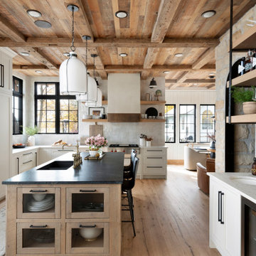
Weathered Antique Paneling and Beams from Manomin Resawn Timbers line the ceiling of this expansive modern farmhouse kitchen, showing off a naturally aged patina with unique sawn faces and a darker, moodier aesthetic. Weathered Antique Flooring runs throughout the space underfoot, tying together a large center island, dome pendant lighting, and a stone-walled wet bar with open shelving.
Our Weathered Antique products are sourced directly from 19th or early 20th century barns. As farmers moved from hand hewing logs to circle saw milling, a surplus of timbers became the literal building blocks of the second industrial revolution. After over a hundred years, these timbers still carry their unique sawn faces and naturally aged patina, giving this wood a look that can't be replicated. Through denailing, kiln drying, and precision milling, we prepare each board and beam for a prominent place in a home like this one.
Whether you are a homebuilder, a home remodeling contractor, or a homeowner shopping for ceiling paneling, beams, or flooring with real depth and history, Manomin Resawn Timbers has stunning reclaimed wood to suit your needs. Visit our showroom in Hugo, MN or reach out to us with a call or a message to discover the antique charm of reclaimed wood.

 Golden Eagle Log & Timber Homes
Live anywhere, build anything. The iconic Golden Eagle name is recognized the world over – forever tied to the freedom of customizing log homes around the world.
 Renovisions
A work-smart kitchen layout was a must for this homeowner. That’s why she got together with the Renovisions team. In the old kitchen, lack of enough cabinet space and organized storage, created an overflowing situation with contents pushed to the countertops, making it hard to escape the clutter. Moreover, the inconvenient position of the refrigerator made entering and exiting the kitchen literally a squeeze. Redesigning the kitchen was a challenge but Ed envisioned a new spacious layout that naturally flowed between all work areas.
At the top of the must-have list was the addition of an Island with an electric cooktop and much needed deep drawer storage. To create a better flow, the work surfaces, storage and appliances were arranged in the most functional way. The microwave was built into the cabinetry with an adjacent pull-out spice rack and it is closer to the refrigerator making reheating food easier.
The key part of overhauling this kitchen was upgrading the cabinetry, countertops, and appliances as well as adding a unique backsplash tile. Renovisions suggested the gorgeous maple wood cabinetry with a light grey stain. The stainless steel appliances play off the grey cabinetry, colorful veining in the granite countertops and attractive glass subway tile, giving the kitchen a sleeker and more modern look.
 KitchenLab Interiors
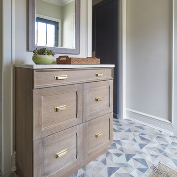
’ first, entirely new construction project in collaboration with GTH architects who designed the residence. KLI was responsible for all interior finishes, fixtures, furnishings, and design including the stairs, casework, interior doors, moldings and millwork. KLI also worked with the client on selecting the roof, exterior stucco and paint colors, stone, windows, and doors. The homeowners had purchased the existing home on a lakefront lot of the Valley Lo community in Glenview, thinking that it would be a gut renovation, but when they discovered a host of issues including mold, they decided to tear it down and start from scratch. The minute you look out the living room windows, you feel as though you're on a lakeside vacation in Wisconsin or Michigan. We wanted to help the homeowners achieve this feeling throughout the house - merging the causal vibe of a vacation home with the elegance desired for a primary residence. This project is unique and personal in many ways - Rebekah and the homeowner, Lorie, had grown up together in a small suburb of Columbus, Ohio. Lorie had been Rebekah's babysitter and was like an older sister growing up. They were both heavily influenced by the style of the late 70's and early 80's boho/hippy meets disco and 80's glam, and both credit their moms for an early interest in anything related to art, design, and style. One of the biggest challenges of doing a new construction project is that it takes so much longer to plan and execute and by the time tile and lighting is installed, you might be bored by the selections of feel like you've seen them everywhere already. “I really tried to pull myself, our team and the client away from the echo-chamber of Pinterest and Instagram. We fell in love with counter stools 3 years ago that I couldn't bring myself to pull the trigger on, thank god, because then they started showing up literally everywhere", Rebekah recalls. Lots of one of a kind vintage rugs and furnishings make the home feel less brand-spanking new. The best projects come from a team slightly outside their comfort zone. One of the funniest things Lorie says to Rebekah, "I gave you everything you wanted", which is pretty hilarious coming from a client to a designer.

 KN Designs
Inspiration for a large eclectic 3/4 beige tile and subway tile ceramic tile and black floor alcove bathtub remodel in Dallas
 David Heide Design Studio
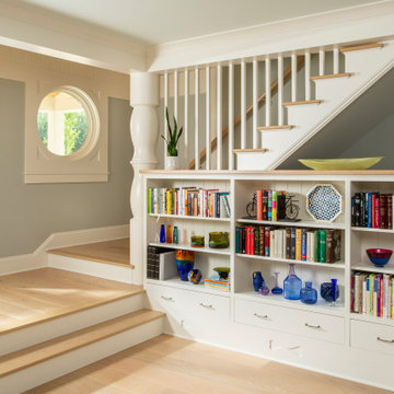
In coming to Minnesota from Iceland, the owners of Home 4 found themselves more than 3,000 miles away from home, hoping to build something new – literally and figuratively – that would feel like home for their family of five. They purchased a scenic piece of land in Rochester and identified a general idea of the spaces they would need, but they struggled with how to define a sense of character that would incorporate their culture and identity into the design. The architect-led design team was tasked with creating a house that would help establish the homeowners’ roots in a new country while still recalling familiar comforts of their heritage.
The result is a warm family home that combines elements of Nordic design with a touch of American farmhouse aesthetic. Gracious proportions, custom woodworking, and cheerful details create a welcoming atmosphere, while modern conveniences like a large mudroom and second-floor laundry help day-to-day life feel easy.
Around each corner, a new detail greets the eye, from the Lundie-inspired column at the staircase, to the double-heart detail inscribed in the woodwork, to the custom table designed for the breakfast nook. Each element is lovely individually, but experiencing the holistic effect as the details intentionally pair and play together helps to craft a house that feels like home.
Most important, the homeowners’ history, heritage, and hopes are melded together into a home that represents their family. Each unique element and carefully considered material combine to form a house that feels as if it could have belonged to this family for generations, even though it is brand new.

 Rain Garden Nursery LandscapeMakeoverDesignStaging
Scott & Catherine Buley, HTT&T, High Tech Turf & Trees, LandscapeMakeover.biz, Rain Garden Nursery. Renovated and new lawns, plus our Weeping Blue Atlas Cedar, Weeping Norway Spruce, and a Weeping Pussy Willow, on December 26th, 2015
145