
Search results for "Literal" in Home Design Ideas
 Solar Wind Designs
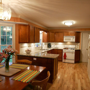
Our clients had one unusual priority for this kitchen remodel. They wanted a literal “catwalk” spanning the top of the entire kitchen that their 3 cats could enjoy. This dictated that the kitchen cabinets could not be more than 30” tall to make the catwalk functional. We added decorative upper shelving between cabinets to create a continuous walk way for the cats. In addition, to better utilize space and open up a major pinch point between multiple doors we integrated angled upper and lower end cabinets. It has been noted by everyone using this new kitchen space that the thoughtful cabinet design makes the entire kitchen space feels much larger. Continuing the flow of the existing flooring in the adjoining room and to provide warmth and solidity, red oak hardwood flooring was installed in the kitchen. To coordinate with the Cabernet colored shaker cabinets we chose an unusual “Gialllo Ornamental” granite pattern and the effect was stunning. To complete the look we installed a buff subway tile backsplash with a gorgeous crackled glass accent. Because our client wash and prepare a lot of veggies, an extra deep stainless steel 60/40 double sink and faucet with pull-down sprayer were great additions.
 Amy Pearson Design
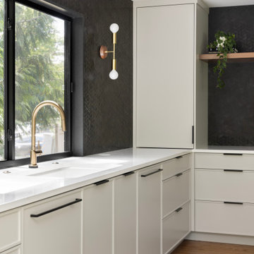
While the root of the scope stayed the same - open the kitchen to the dining and living rooms - this project grew into so much more than just reconfiguring spaces. The design team loved the creativity that comes from working with a trusting client and our opportunity to flex our design muscles in the mid century category. The goal was to not be literal with the design style, but to be respectful of the home’s original architecture and features while making it decidedly Pacific Northwest by letting it’s setting in the trees really shine!
We doubled the size of the kitchen, taking over an unused second eat-in space that sat immediately next to the homes dining room. We opened the walls between the dining/kitchen/and hallway creating an expansive open feel. Step in pantry closet that was lacking in efficiency and took up precious walk-way space was removed in favor of a custom pantry cabinet with roll-out shelves for easy use. The custom walnut stair railing is a welcomed greeting near the front door and ties all of the spaces together.

 Renovisions
A work-smart kitchen layout was a must for this homeowner. That’s why she got together with the Renovisions team. In the old kitchen, lack of enough cabinet space and organized storage, created an overflowing situation with contents pushed to the countertops, making it hard to escape the clutter. Moreover, the inconvenient position of the refrigerator made entering and exiting the kitchen literally a squeeze. Redesigning the kitchen was a challenge but Ed envisioned a new spacious layout that naturally flowed between all work areas.
At the top of the must-have list was the addition of an Island with an electric cooktop and much needed deep drawer storage. To create a better flow, the work surfaces, storage and appliances were arranged in the most functional way. The microwave was built into the cabinetry with an adjacent pull-out spice rack and it is closer to the refrigerator making reheating food easier.
The key part of overhauling this kitchen was upgrading the cabinetry, countertops, and appliances as well as adding a unique backsplash tile. Renovisions suggested the gorgeous maple wood cabinetry with a light grey stain. The stainless steel appliances play off the grey cabinetry, colorful veining in the granite countertops and attractive glass subway tile, giving the kitchen a sleeker and more modern look.
Find the right local pro for your project

 Interiors by Popov
This was a typical 50's era, dark, outdated house with low ceilings and prehistoric finishes. And, to top it all off, there was ONE pink bathroom on the main floor.
What did we change here? Let’s see… just about everything. We opened up the kitchen, added a large window above the sink. We installed new custom kitchen cabinets and an island. We created a multilevel ceiling for zone definition, and added various light fixtures to provide ambient, decorative and sufficient task lighting. We completely changed the fireplace and added a custom built cabinet to add storage space.
New windows, new floors, new pantry, new closets and new bathrooms. Yes, bathroomS, there is an “s” in there. We managed to give the homeowner a master ensuite bathroom in the space where no one thought it could be possible. We literally stretched the walls.
Yep, we can do that :)

 High Plains Architects, P.C.
The Porch House sits perched overlooking a stretch of the Yellowstone River valley. With an expansive view of the majestic Beartooth Mountain Range and its close proximity to renowned fishing on Montana’s Stillwater River you have the beginnings of a great Montana retreat. This structural insulated panel (SIP) home effortlessly fuses its sustainable features with carefully executed design choices into a modest 1,200 square feet. The SIPs provide a robust, insulated envelope while maintaining optimal interior comfort with minimal effort during all seasons. A twenty foot vaulted ceiling and open loft plan aided by proper window and ceiling fan placement provide efficient cross and stack ventilation. A custom square spiral stair, hiding a wine cellar access at its base, opens onto a loft overlooking the vaulted living room through a glass railing with an apparent Nordic flare. The “porch” on the Porch House wraps 75% of the house affording unobstructed views in all directions. It is clad in rusted cold-rolled steel bands of varying widths with patterned steel “scales” at each gable end. The steel roof connects to a 3,600 gallon rainwater collection system in the crawlspace for site irrigation and added fire protection given the remote nature of the site. Though it is quite literally at the end of the road, the Porch House is the beginning of many new adventures for its owners.

 dRemodeling Design-Build
This master suite underwent a major transformation and the biggest part of that (literally and physically) was removing the large Jacuzzi tub sitting in the middle of the room. By reorienting the tub along the width of the room, it opened up the center of the space for a large modern double vanity. The shower combined with the tub feature into a nook that was bedecked in a beautiful shell mosaic. The mosaic lined all the interior walls including a built in shelving area, bench, and custom wall.
Easily the most special feature in this space is the resin panels that had been inserted into two partials walls positioned on opposite sides of the room. A mod floral pattern in a subdued lime green compliment the shell tiles and allows light to diffuse into the tub area. The opposite side provides a bit of privacy for the privy, and balances the composition as a whole. The white double vanity with a Carrera marble top and classic chrome fixtures adds a touch of class to the contemporary space. The ceramic wood plank floor tiles in a white washed finish add aesthetic warmth underfoot. Kiwi green walls sit above a staggered white subway tile wainscot that wraps around the perimeter, with a cool gray paint surround the resin panels.
A unique and fun space, our design team had a blast creating this design with the homeowner.

 Deja Designs
This Caribbean kitchen is at Deja View Villa, a vacation rental villa in St. John USVI. With open ocean views from both kitchen windows and the 19' hurricane sliding glass door, it was a must to bring the Caribbean colors inside through paint, tile and glass. Blue glass bubble tile is used for the back splash while blue glass pendent lights and decor jars float above the kitchen to show off the height of the vaulted cypress, open beam ceilings. Two spacious granite covered islands provide lots of food prep space and seating. We love mixing the modern mahogany shaker style stained cabinets with the antiqued blue, country style, James Patterson inspired blue painted island. That's right, this custom island is a spin off of author James Patterson's kitchen island. There are three drawers on each side of this blue beauty. The middle drawer is only one window wide. The outer, two level island is literally two levels top and bottom. The seating side of this island is two steps lower than the kitchen side. (Please see other pictures of this project) This allows the island to be bar height on one side and table top height on the other. The 36" Signature Hardware apron front sink and bridge style faucet pull together the farmhouse Caribbean Style.
www.dejaviewvilla.com
www.signaturehardware.com
Steve Simonsen Photography
 Amy Pearson Design
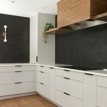
While the root of the scope stayed the same - open the kitchen to the dining and living rooms - this project grew into so much more than just reconfiguring spaces. The design team loved the creativity that comes from working with a trusting client and our opportunity to flex our design muscles in the mid century category. The goal was to not be literal with the design style, but to be respectful of the home’s original architecture and features while making it decidedly Pacific Northwest by letting it’s setting in the trees really shine!
We doubled the size of the kitchen, taking over an unused second eat-in space that sat immediately next to the homes dining room. We opened the walls between the dining/kitchen/and hallway creating an expansive open feel. Step in pantry closet that was lacking in efficiency and took up precious walk-way space was removed in favor of a custom pantry cabinet with roll-out shelves for easy use. The custom walnut stair railing is a welcomed greeting near the front door and ties all of the spaces together.
 Phoenix Home Remodeling
Lisa & Juan guest bathroom struggled to meet the needs of their children, guest, and became a problem with its age. The dated fixtures and the lack of space for organization was a big problem for them.
They hired us for a solution to improve and help to make the space more functional. First, we literally went to the drawing board to design a custom vanity that will help in the storage area.
The vanity is dark grey with a white quartz countertop. A rectangular undermount sink were installed. All plumbing fixtures are from Delta Faucet and in Matte Black.
New lighting and mirrors were also installed to modernize the room and support the overall design style.
After that shifted our focus to the tub and shower. They wanted a clean, contemporary, and functional space that was low maintenance but stylish.
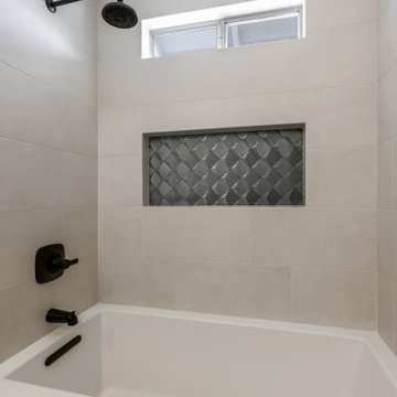
A new Kohler tub was installed. This tub is wider and taller for a better bathing experience. We installed a new floor as well which contrast nicely with the tub. The floor tile is called Unica Stone from Arizona Tile.
The Shower walls are called Cemento Rasato Bianco from Arizona Tile. The niche tile is a large format tile called Box Silver. This tile is 18X35 and is installed as one piece in the niche which eliminates any grout in the niche back wall.

 Elements Architectural Group
Situated in suburban residential neighborhood this home sits on wide lot atop a slight ridge of earth and is surrounded by mature trees. Built in 1959, the home requires update. A phased master plan was completed by Elements to update the home originally built in 1959. Phased construction is in process.
Bringing the natural world of stone, water and wood and light into the home to create places of rich experience is at the core of our design approach to this project.
Large windows are introduced at the exterior walls to allow the colors and tones of the garden to inform the interior spaces. The warm vistas of the garden draw the eye through the deep interior spaces of the home to connect to outdoor space.
Upstairs, life in the trees is enjoyed by creating a third level of the home to house a home office and outside terrace. A master suite is nestled in the back of the home. Custom furniture utilizes white oak to enhance the feeling of warmth and rest while also connecting the experience beyond to the burr oak grove in which the home is set.
At the main level an open floor plan is created and a new raised roof with exposed wood beams designed to unify once separate rooms into one large space. A back kitchen is replaced by a kitchen set in the living space and adjacent to the outdoors to encourage outdoor and indoor living. A large island table is centrally located in hopes to accentuate the values of companionship and community, literally building them right into the family’s living spaces.
 JUMA architects
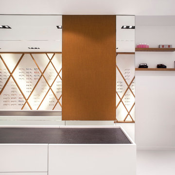
Optiek Herpol wanted to move to a better, more central location with plenty of parking space. A property that complied with these conditions was found on the Market in Deinze, and JUMA architects were subsequently asked to design a new interior for the store.
The property in question is very deep and narrow with little natural light entry. JUMA set to work despite these constraints in an attempt to transform these challenges into qualities.
The architects positioned the sales counter right behind the shop window, so as to make optimum use of the available natural light. This also makes store activities visible from the outside, adding an extra element of attraction. At the narrowest section of the store, a large wall mirror was put in to visually double the space. The wall onto which the eyeglasses are displayed is located opposite the mirror and is literally the eye catcher in the store. A wooden lattice makes for an interesting play of diagonal lines behind which the glasses are presented. This unique concept animates the entire store without detracting from the fact that the glasses should remain the main focal point in the store. The workshop is located in the back, separated from the store by a wall in smoked grey glass. In this way, the optician can keep an eye on the store at all times.
The colour palette is predominantly white, to keep the interior as light as possible. As a counterpoint, warm wood accents are added. The chairs at the counter are upholstered in a colour that harmonizes perfectly with the wood.
Pictures © Thomas De Bruyne

 Woodling Landscape Design
This gorgeous, walkable grass alternative is literally watered ONCE A MONTH folks!!! In the summertime! This is true water conservation!
Large, historic home from the 1930's overlooking downtown Santa Cruz. My clients are self-described "plantaholics" and tend to buy many plants, only to have them die. They have an extensive gardening area and low water budget. Our main goal was to make the overall design cohesive between various areas of the garden while utilizing interesting and unusual plant selections - a very fun project for me! We removed over 3,000 square feet of traditional grass and replaced it with several lawn alternatives. The first is a walkable groundcover that uses a fraction of the water of regular grass (and can be seen here in several seasons, one of which has tiny flowers); The second is a California native grass that grows long (or can be kept short) and can tolerate some shade. Both of these are excellent choices for clients with children or dogs who want a green patch without using excessive water. My clients love plants from Australia and South Africa so plants from the Proteacea and other Southern Hemisphere beauties are used predominantly throughout the project. Clean, flowing water is so important for wildlife and the beautiful stone fountain is a constant gathering spot for birds and other animals. My clients are beyond thrilled with their gorgeous, nature-filled garden and ever-expanding plant knowledge.

 Decorating Den Interiors-Barbara Tabak
The client’s goal for this makeover was to create a clean style with a contemporary vibe in her cold empty bedroom. The client’s main focus for the design was to block the morning sun that woke her up long before she wanted to begin her day.
Problem(s) addressed:
The room was void of furnishings, bedding and accessories. The décor consisted of a mattress, box spring, jewelry chest and an old comforter, and therefore had no inspirational piece from which to begin the design. We were literally starting from scratch. As for the morning sun dilemma, I was excited to come up with a better solution to the sun challenge than her temporary solution of stacking towels in the arch window.
Solution provided:
Furnishings were the first priority. Rich espresso-stained contemporary dresser, gentleman’s chest and nightstands began the design. Next, a leopard print upholstered chaise was selected to sit in front of the double arched window providing a place to read, work on a laptop, and listen to music or just lounge. Two faux leather ottomans were selected to perch at the end of the bed.
Custom bedding and color scheme was next on the list. The client had requested a restful color palette, which fell into place when we found the perfect heather-gray, gold and cream hued bed ensemble. With the bedding selected, a coordinating wall paint and gold velvet fabric was chosen for the upholstered headboard.
To solve the clients early morning wake up call, traversing draperies that are installed above the window arch were designed to shut out the morning sun. The inverted French pleat draperies, with their color block design, enhance the room’s clean contemporary style. Brushed silver hardware with cracked crystal finials coordinated the furniture hardware and added a touch of sophistication.
Finally, a combination of elegant lighting, mixed media art, an area rug and accessories finish the room’s contemporary design.
 David Heide Design Studio
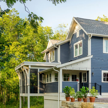
In coming to Minnesota from Iceland, the owners of Home 4 found themselves more than 3,000 miles away from home, hoping to build something new – literally and figuratively – that would feel like home for their family of five. They purchased a scenic piece of land in Rochester and identified a general idea of the spaces they would need, but they struggled with how to define a sense of character that would incorporate their culture and identity into the design. The architect-led design team was tasked with creating a house that would help establish the homeowners’ roots in a new country while still recalling familiar comforts of their heritage.
The result is a warm family home that combines elements of Nordic design with a touch of American farmhouse aesthetic. Gracious proportions, custom woodworking, and cheerful details create a welcoming atmosphere, while modern conveniences like a large mudroom and second-floor laundry help day-to-day life feel easy.
Around each corner, a new detail greets the eye, from the Lundie-inspired column at the staircase, to the double-heart detail inscribed in the woodwork, to the custom table designed for the breakfast nook. Each element is lovely individually, but experiencing the holistic effect as the details intentionally pair and play together helps to craft a house that feels like home.
Most important, the homeowners’ history, heritage, and hopes are melded together into a home that represents their family. Each unique element and carefully considered material combine to form a house that feels as if it could have belonged to this family for generations, even though it is brand new.

 Luxury Antonovich Design AE
Classical style does not lose its relevance for centuries. Particularly classics is able to fully reflect skills of an interior designer. Kateryna Antonovich offered a refined and sophisticated luxury motives for villas in the UAE. Interior literally attracts the eye, and it can be admired forever. The decor has all traditional elements. The ceilings are decorated with stucco, which plays wonderful light with crystal chandeliers. Restrained motives in the walls decoration are perfectly compensated with artists' pictures. Furniture plays a special role in this project. Luxury sofas upholstered in noble silk and supplemented with charming golden fringe. Furniture items of valuable species wood are inlaid with handmade carved decor with gold. Villa Design in the United Arab Emirates emphasizes kindness and hospitality of the owners. A spacious dining room was a continuation of a cozy living room. A large dining table is surrounded by chairs with noble backs, which are covered with textile with printed patterns. To zone the space and place accents, the interior designer uses floor and ceiling decoration. The floors are made of natural wood decorated with fanciful carved patterns of different species materials. Modern interior design from LUXURY ANTONOVICH DESIGN STUDIO combines traditions and the latest technology. 3D projects visualizations, which are created with the latest software allows in details to see the future luxurious interior.

 abarnai
The IL-1 Beta table was a unique and personalized birthday gift for renowned scientist Charles DInarello. We were commissioned to build a custom gift to represent three defining elements of his life; the refining of IL-1 Beta, one of his first monumental scientific achievements; his love of gardening and outdoor living spaces; and his enthusiasm for entertaining guests and fitting as many people around his table as possible (both figuratively and literally). We combined these three defining elements, and designed an outdoor table, a courtyard centerpiece, that would represent IL-1 Beta and enhance the scientist’s garden parties.
One of the most important and challenging design aspects of the IL-1Beta table were the pedestal legs. The recipient of this beautiful gift, Dr. Dinarello, loves entertaining guests, introducing strangers, and encouraging conversation, so we designed a table that could sit many and then add more. The pedestals are each composed of seven pieces of wood that had to be assembled in a precise order for strength, stability and beauty. The table stands delicately with just the tips of the pedestal legs touching the ground, like a couple mid-waltz, poised and strong and light on the dance floor.
 abarnai
The IL-1 Beta table was a unique and personalized birthday gift for renowned scientist Charles DInarello. We were commissioned to build a custom gift to represent three defining elements of his life; the refining of IL-1 Beta, one of his first monumental scientific achievements; his love of gardening and outdoor living spaces; and his enthusiasm for entertaining guests and fitting as many people around his table as possible (both figuratively and literally). We combined these three defining elements, and designed an outdoor table, a courtyard centerpiece, that would represent IL-1 Beta and enhance the scientist’s garden parties.
One of the most important and challenging design aspects of the IL-1Beta table were the pedestal legs. The recipient of this beautiful gift, Dr. Dinarello, loves entertaining guests, introducing strangers, and encouraging conversation, so we designed a table that could sit many and then add more. The pedestals are each composed of seven pieces of wood that had to be assembled in a precise order for strength, stability and beauty. The table stands delicately with just the tips of the pedestal legs touching the ground, like a couple mid-waltz, poised and strong and light on the dance floor.
 Amy Pearson Design
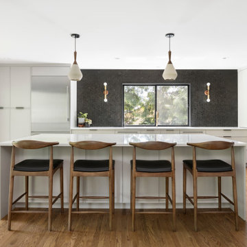
While the root of the scope stayed the same - open the kitchen to the dining and living rooms - this project grew into so much more than just reconfiguring spaces. The design team loved the creativity that comes from working with a trusting client and our opportunity to flex our design muscles in the mid century category. The goal was to not be literal with the design style, but to be respectful of the home’s original architecture and features while making it decidedly Pacific Northwest by letting it’s setting in the trees really shine!
We doubled the size of the kitchen, taking over an unused second eat-in space that sat immediately next to the homes dining room. We opened the walls between the dining/kitchen/and hallway creating an expansive open feel. Step in pantry closet that was lacking in efficiency and took up precious walk-way space was removed in favor of a custom pantry cabinet with roll-out shelves for easy use. The custom walnut stair railing is a welcomed greeting near the front door and ties all of the spaces together.
 Amy Pearson Design
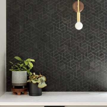
While the root of the scope stayed the same - open the kitchen to the dining and living rooms - this project grew into so much more than just reconfiguring spaces. The design team loved the creativity that comes from working with a trusting client and our opportunity to flex our design muscles in the mid century category. The goal was to not be literal with the design style, but to be respectful of the home’s original architecture and features while making it decidedly Pacific Northwest by letting it’s setting in the trees really shine!
We doubled the size of the kitchen, taking over an unused second eat-in space that sat immediately next to the homes dining room. We opened the walls between the dining/kitchen/and hallway creating an expansive open feel. Step in pantry closet that was lacking in efficiency and took up precious walk-way space was removed in favor of a custom pantry cabinet with roll-out shelves for easy use. The custom walnut stair railing is a welcomed greeting near the front door and ties all of the spaces together.
 Amy Pearson Design
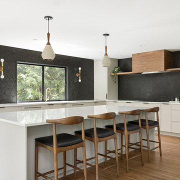
While the root of the scope stayed the same - open the kitchen to the dining and living rooms - this project grew into so much more than just reconfiguring spaces. The design team loved the creativity that comes from working with a trusting client and our opportunity to flex our design muscles in the mid century category. The goal was to not be literal with the design style, but to be respectful of the home’s original architecture and features while making it decidedly Pacific Northwest by letting it’s setting in the trees really shine!
We doubled the size of the kitchen, taking over an unused second eat-in space that sat immediately next to the homes dining room. We opened the walls between the dining/kitchen/and hallway creating an expansive open feel. Step in pantry closet that was lacking in efficiency and took up precious walk-way space was removed in favor of a custom pantry cabinet with roll-out shelves for easy use. The custom walnut stair railing is a welcomed greeting near the front door and ties all of the spaces together.
148