
Search results for "Litre difference" in Home Design Ideas
 Drury Design
THE SETUP
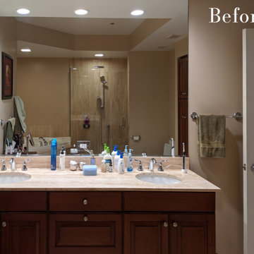
This client lives in a great high-rise condo in downtown Chicago. Alicia has already remodeled a few areas of her home, including her kitchen and home office. The bathroom is one of the last big places the client wanted to update. The existing bathroom had a large, outdated whirlpool tub in the corner. It was a darker space that had a lack of natural light. There are no windows (due to the bathroom’s location within the high-rise building). So, the idea was to brighten up the space and give the client an updated, elegant primary bathroom that is more her style and tailor-made for her routines.
Design Objectives:
- Make the space brighter.
- Create different daily routine stations to maximize functionality while keeping things clutter-free – a makeup station, a blow-dry station, and a sink-needs station.
- Achieve the client’s specific style and function needs while also keeping the look and design open to future possibilities: different users of the space/resale clients.
Design Challenges:
- Toilet cannot be moved. (In a high-rise, you can’t really move plumbing around too much when reimagining a space)
- Existing bathroom had a soffit that hid a lot of electrical wiring, so completely removing the soffit wasn’t an option.
- The blow-dry station needs to accommodate the client’s preference for standing up.
- Finding a place for the make-up station, which the client wants oriented for sitting.
- Create storage within the shower that can eliminate the clutter of personal care products that are actually needed every day. Do this, while keeping the client’s favorite things about the existing shower: the shower bench, a tub filler faucet (for rinsing shaving cream when shaving legs) and a low niche for placing her foot when shaving her legs.
THE RENEWED SPACE
Design Solutions:
- Extended a bit of wall near the toilet to give the commode its own area within the space, but without closing it off into a claustrophobic WC.
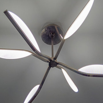
- Worked within the reality of the existing soffit situation, reshaping it to align with the new shower. Can lights were also added. Installed a beautiful ceiling light fixture that works within the new soffit shape, commanding attention and adding light, as if the sofit shape was chosen for it.
- Created a nice, furniture-looking 42”-high cabinet with pullout drawers to be the blow-dry station, complete with a mirror and a nice top. The pullout drawers are all powered, concealing a Dyson dryer and curling iron (and all the accoutrements) while keeping them plugged in, which is ideal for easy usage and put away. A stylish mirror on the wall above the cabinet, and proper lighting, make this the perfect blow-dry station. The top has a grommet that can accommodate a power cord should the client ever want to have a powered device on top of the cabinet.
- Put the sit-down makeup station where the tub used to be, putting the mirror back into a new recessed wall just a bit, allowing the area to have more room.
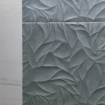
- Created a niche in the shower’s inner wall so that you can’t see it unless you are literally inside the shower. At the client’s request, it also has a hook so she can hang her loofa. Hiding the utility niche in this way allowed us to use the full main wall of the shower as a canvas for a beautiful accent stripe of raised decorative tile. The new shower has her old favorites, too: the tub filler, foot niche and bench.
Alicia’s client loves her new primary bathroom, especially the blow dry area. It is very accommodating for her, as a tall lady, while being very easy to use. The drawers store everything. Being powered, they make using already-plugged in appliances very easy to use and put away.
Her previous makeup station was a freestanding vanity with a single drawer, so beauty products were all over the surface top. With her new makeup station, everything is nicely tucked away and organized in drawers.
The new lighting is fantastic and the colors are light and soft. The clients loves the overall look and feel of her new bathroom and raves about how well the functionality-minded design makes her morning routine – and her life – easier and enjoyable!
 Drury Design
THE SETUP
This client lives in a great high-rise condo in downtown Chicago. Alicia has already remodeled a few areas of her home, including her kitchen and home office. The bathroom is one of the last big places the client wanted to update. The existing bathroom had a large, outdated whirlpool tub in the corner. It was a darker space that had a lack of natural light. There are no windows (due to the bathroom’s location within the high-rise building). So, the idea was to brighten up the space and give the client an updated, elegant primary bathroom that is more her style and tailor-made for her routines.
Design Objectives:
- Make the space brighter.
- Create different daily routine stations to maximize functionality while keeping things clutter-free – a makeup station, a blow-dry station, and a sink-needs station.
- Achieve the client’s specific style and function needs while also keeping the look and design open to future possibilities: different users of the space/resale clients.
Design Challenges:
- Toilet cannot be moved. (In a high-rise, you can’t really move plumbing around too much when reimagining a space)
- Existing bathroom had a soffit that hid a lot of electrical wiring, so completely removing the soffit wasn’t an option.
- The blow-dry station needs to accommodate the client’s preference for standing up.
- Finding a place for the make-up station, which the client wants oriented for sitting.
- Create storage within the shower that can eliminate the clutter of personal care products that are actually needed every day. Do this, while keeping the client’s favorite things about the existing shower: the shower bench, a tub filler faucet (for rinsing shaving cream when shaving legs) and a low niche for placing her foot when shaving her legs.
THE RENEWED SPACE
Design Solutions:
- Extended a bit of wall near the toilet to give the commode its own area within the space, but without closing it off into a claustrophobic WC.
- Worked within the reality of the existing soffit situation, reshaping it to align with the new shower. Can lights were also added. Installed a beautiful ceiling light fixture that works within the new soffit shape, commanding attention and adding light, as if the sofit shape was chosen for it.
- Created a nice, furniture-looking 42”-high cabinet with pullout drawers to be the blow-dry station, complete with a mirror and a nice top. The pullout drawers are all powered, concealing a Dyson dryer and curling iron (and all the accoutrements) while keeping them plugged in, which is ideal for easy usage and put away. A stylish mirror on the wall above the cabinet, and proper lighting, make this the perfect blow-dry station. The top has a grommet that can accommodate a power cord should the client ever want to have a powered device on top of the cabinet.
- Put the sit-down makeup station where the tub used to be, putting the mirror back into a new recessed wall just a bit, allowing the area to have more room.
- Created a niche in the shower’s inner wall so that you can’t see it unless you are literally inside the shower. At the client’s request, it also has a hook so she can hang her loofa. Hiding the utility niche in this way allowed us to use the full main wall of the shower as a canvas for a beautiful accent stripe of raised decorative tile. The new shower has her old favorites, too: the tub filler, foot niche and bench.
Alicia’s client loves her new primary bathroom, especially the blow dry area. It is very accommodating for her, as a tall lady, while being very easy to use. The drawers store everything. Being powered, they make using already-plugged in appliances very easy to use and put away.
Her previous makeup station was a freestanding vanity with a single drawer, so beauty products were all over the surface top. With her new makeup station, everything is nicely tucked away and organized in drawers.
The new lighting is fantastic and the colors are light and soft. The clients loves the overall look and feel of her new bathroom and raves about how well the functionality-minded design makes her morning routine – and her life – easier and enjoyable!
 Drury Design
THE SETUP
This client lives in a great high-rise condo in downtown Chicago. Alicia has already remodeled a few areas of her home, including her kitchen and home office. The bathroom is one of the last big places the client wanted to update. The existing bathroom had a large, outdated whirlpool tub in the corner. It was a darker space that had a lack of natural light. There are no windows (due to the bathroom’s location within the high-rise building). So, the idea was to brighten up the space and give the client an updated, elegant primary bathroom that is more her style and tailor-made for her routines.
Design Objectives:
- Make the space brighter.
- Create different daily routine stations to maximize functionality while keeping things clutter-free – a makeup station, a blow-dry station, and a sink-needs station.
- Achieve the client’s specific style and function needs while also keeping the look and design open to future possibilities: different users of the space/resale clients.
Design Challenges:
- Toilet cannot be moved. (In a high-rise, you can’t really move plumbing around too much when reimagining a space)
- Existing bathroom had a soffit that hid a lot of electrical wiring, so completely removing the soffit wasn’t an option.
- The blow-dry station needs to accommodate the client’s preference for standing up.
- Finding a place for the make-up station, which the client wants oriented for sitting.
- Create storage within the shower that can eliminate the clutter of personal care products that are actually needed every day. Do this, while keeping the client’s favorite things about the existing shower: the shower bench, a tub filler faucet (for rinsing shaving cream when shaving legs) and a low niche for placing her foot when shaving her legs.
THE RENEWED SPACE
Design Solutions:
- Extended a bit of wall near the toilet to give the commode its own area within the space, but without closing it off into a claustrophobic WC.
- Worked within the reality of the existing soffit situation, reshaping it to align with the new shower. Can lights were also added. Installed a beautiful ceiling light fixture that works within the new soffit shape, commanding attention and adding light, as if the sofit shape was chosen for it.
- Created a nice, furniture-looking 42”-high cabinet with pullout drawers to be the blow-dry station, complete with a mirror and a nice top. The pullout drawers are all powered, concealing a Dyson dryer and curling iron (and all the accoutrements) while keeping them plugged in, which is ideal for easy usage and put away. A stylish mirror on the wall above the cabinet, and proper lighting, make this the perfect blow-dry station. The top has a grommet that can accommodate a power cord should the client ever want to have a powered device on top of the cabinet.
- Put the sit-down makeup station where the tub used to be, putting the mirror back into a new recessed wall just a bit, allowing the area to have more room.
- Created a niche in the shower’s inner wall so that you can’t see it unless you are literally inside the shower. At the client’s request, it also has a hook so she can hang her loofa. Hiding the utility niche in this way allowed us to use the full main wall of the shower as a canvas for a beautiful accent stripe of raised decorative tile. The new shower has her old favorites, too: the tub filler, foot niche and bench.
Alicia’s client loves her new primary bathroom, especially the blow dry area. It is very accommodating for her, as a tall lady, while being very easy to use. The drawers store everything. Being powered, they make using already-plugged in appliances very easy to use and put away.
Her previous makeup station was a freestanding vanity with a single drawer, so beauty products were all over the surface top. With her new makeup station, everything is nicely tucked away and organized in drawers.
The new lighting is fantastic and the colors are light and soft. The clients loves the overall look and feel of her new bathroom and raves about how well the functionality-minded design makes her morning routine – and her life – easier and enjoyable!
Find the right local pro for your project
 Drury Design
THE SETUP
This client lives in a great high-rise condo in downtown Chicago. Alicia has already remodeled a few areas of her home, including her kitchen and home office. The bathroom is one of the last big places the client wanted to update. The existing bathroom had a large, outdated whirlpool tub in the corner. It was a darker space that had a lack of natural light. There are no windows (due to the bathroom’s location within the high-rise building). So, the idea was to brighten up the space and give the client an updated, elegant primary bathroom that is more her style and tailor-made for her routines.
Design Objectives:
- Make the space brighter.
- Create different daily routine stations to maximize functionality while keeping things clutter-free – a makeup station, a blow-dry station, and a sink-needs station.
- Achieve the client’s specific style and function needs while also keeping the look and design open to future possibilities: different users of the space/resale clients.
Design Challenges:
- Toilet cannot be moved. (In a high-rise, you can’t really move plumbing around too much when reimagining a space)
- Existing bathroom had a soffit that hid a lot of electrical wiring, so completely removing the soffit wasn’t an option.
- The blow-dry station needs to accommodate the client’s preference for standing up.
- Finding a place for the make-up station, which the client wants oriented for sitting.
- Create storage within the shower that can eliminate the clutter of personal care products that are actually needed every day. Do this, while keeping the client’s favorite things about the existing shower: the shower bench, a tub filler faucet (for rinsing shaving cream when shaving legs) and a low niche for placing her foot when shaving her legs.
THE RENEWED SPACE
Design Solutions:
- Extended a bit of wall near the toilet to give the commode its own area within the space, but without closing it off into a claustrophobic WC.
- Worked within the reality of the existing soffit situation, reshaping it to align with the new shower. Can lights were also added. Installed a beautiful ceiling light fixture that works within the new soffit shape, commanding attention and adding light, as if the sofit shape was chosen for it.
- Created a nice, furniture-looking 42”-high cabinet with pullout drawers to be the blow-dry station, complete with a mirror and a nice top. The pullout drawers are all powered, concealing a Dyson dryer and curling iron (and all the accoutrements) while keeping them plugged in, which is ideal for easy usage and put away. A stylish mirror on the wall above the cabinet, and proper lighting, make this the perfect blow-dry station. The top has a grommet that can accommodate a power cord should the client ever want to have a powered device on top of the cabinet.
- Put the sit-down makeup station where the tub used to be, putting the mirror back into a new recessed wall just a bit, allowing the area to have more room.
- Created a niche in the shower’s inner wall so that you can’t see it unless you are literally inside the shower. At the client’s request, it also has a hook so she can hang her loofa. Hiding the utility niche in this way allowed us to use the full main wall of the shower as a canvas for a beautiful accent stripe of raised decorative tile. The new shower has her old favorites, too: the tub filler, foot niche and bench.
Alicia’s client loves her new primary bathroom, especially the blow dry area. It is very accommodating for her, as a tall lady, while being very easy to use. The drawers store everything. Being powered, they make using already-plugged in appliances very easy to use and put away.
Her previous makeup station was a freestanding vanity with a single drawer, so beauty products were all over the surface top. With her new makeup station, everything is nicely tucked away and organized in drawers.
The new lighting is fantastic and the colors are light and soft. The clients loves the overall look and feel of her new bathroom and raves about how well the functionality-minded design makes her morning routine – and her life – easier and enjoyable!
 Drury Design
THE SETUP
This client lives in a great high-rise condo in downtown Chicago. Alicia has already remodeled a few areas of her home, including her kitchen and home office. The bathroom is one of the last big places the client wanted to update. The existing bathroom had a large, outdated whirlpool tub in the corner. It was a darker space that had a lack of natural light. There are no windows (due to the bathroom’s location within the high-rise building). So, the idea was to brighten up the space and give the client an updated, elegant primary bathroom that is more her style and tailor-made for her routines.
Design Objectives:
- Make the space brighter.
- Create different daily routine stations to maximize functionality while keeping things clutter-free – a makeup station, a blow-dry station, and a sink-needs station.
- Achieve the client’s specific style and function needs while also keeping the look and design open to future possibilities: different users of the space/resale clients.
Design Challenges:
- Toilet cannot be moved. (In a high-rise, you can’t really move plumbing around too much when reimagining a space)
- Existing bathroom had a soffit that hid a lot of electrical wiring, so completely removing the soffit wasn’t an option.
- The blow-dry station needs to accommodate the client’s preference for standing up.
- Finding a place for the make-up station, which the client wants oriented for sitting.
- Create storage within the shower that can eliminate the clutter of personal care products that are actually needed every day. Do this, while keeping the client’s favorite things about the existing shower: the shower bench, a tub filler faucet (for rinsing shaving cream when shaving legs) and a low niche for placing her foot when shaving her legs.
THE RENEWED SPACE
Design Solutions:
- Extended a bit of wall near the toilet to give the commode its own area within the space, but without closing it off into a claustrophobic WC.
- Worked within the reality of the existing soffit situation, reshaping it to align with the new shower. Can lights were also added. Installed a beautiful ceiling light fixture that works within the new soffit shape, commanding attention and adding light, as if the sofit shape was chosen for it.
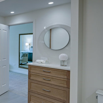
- Created a nice, furniture-looking 42”-high cabinet with pullout drawers to be the blow-dry station, complete with a mirror and a nice top. The pullout drawers are all powered, concealing a Dyson dryer and curling iron (and all the accoutrements) while keeping them plugged in, which is ideal for easy usage and put away. A stylish mirror on the wall above the cabinet, and proper lighting, make this the perfect blow-dry station. The top has a grommet that can accommodate a power cord should the client ever want to have a powered device on top of the cabinet.
- Put the sit-down makeup station where the tub used to be, putting the mirror back into a new recessed wall just a bit, allowing the area to have more room.
- Created a niche in the shower’s inner wall so that you can’t see it unless you are literally inside the shower. At the client’s request, it also has a hook so she can hang her loofa. Hiding the utility niche in this way allowed us to use the full main wall of the shower as a canvas for a beautiful accent stripe of raised decorative tile. The new shower has her old favorites, too: the tub filler, foot niche and bench.
Alicia’s client loves her new primary bathroom, especially the blow dry area. It is very accommodating for her, as a tall lady, while being very easy to use. The drawers store everything. Being powered, they make using already-plugged in appliances very easy to use and put away.
Her previous makeup station was a freestanding vanity with a single drawer, so beauty products were all over the surface top. With her new makeup station, everything is nicely tucked away and organized in drawers.
The new lighting is fantastic and the colors are light and soft. The clients loves the overall look and feel of her new bathroom and raves about how well the functionality-minded design makes her morning routine – and her life – easier and enjoyable!
 Drury Design
THE SETUP
This client lives in a great high-rise condo in downtown Chicago. Alicia has already remodeled a few areas of her home, including her kitchen and home office. The bathroom is one of the last big places the client wanted to update. The existing bathroom had a large, outdated whirlpool tub in the corner. It was a darker space that had a lack of natural light. There are no windows (due to the bathroom’s location within the high-rise building). So, the idea was to brighten up the space and give the client an updated, elegant primary bathroom that is more her style and tailor-made for her routines.
Design Objectives:
- Make the space brighter.
- Create different daily routine stations to maximize functionality while keeping things clutter-free – a makeup station, a blow-dry station, and a sink-needs station.
- Achieve the client’s specific style and function needs while also keeping the look and design open to future possibilities: different users of the space/resale clients.
Design Challenges:
- Toilet cannot be moved. (In a high-rise, you can’t really move plumbing around too much when reimagining a space)
- Existing bathroom had a soffit that hid a lot of electrical wiring, so completely removing the soffit wasn’t an option.
- The blow-dry station needs to accommodate the client’s preference for standing up.
- Finding a place for the make-up station, which the client wants oriented for sitting.
- Create storage within the shower that can eliminate the clutter of personal care products that are actually needed every day. Do this, while keeping the client’s favorite things about the existing shower: the shower bench, a tub filler faucet (for rinsing shaving cream when shaving legs) and a low niche for placing her foot when shaving her legs.
THE RENEWED SPACE
Design Solutions:
- Extended a bit of wall near the toilet to give the commode its own area within the space, but without closing it off into a claustrophobic WC.
- Worked within the reality of the existing soffit situation, reshaping it to align with the new shower. Can lights were also added. Installed a beautiful ceiling light fixture that works within the new soffit shape, commanding attention and adding light, as if the sofit shape was chosen for it.
- Created a nice, furniture-looking 42”-high cabinet with pullout drawers to be the blow-dry station, complete with a mirror and a nice top. The pullout drawers are all powered, concealing a Dyson dryer and curling iron (and all the accoutrements) while keeping them plugged in, which is ideal for easy usage and put away. A stylish mirror on the wall above the cabinet, and proper lighting, make this the perfect blow-dry station. The top has a grommet that can accommodate a power cord should the client ever want to have a powered device on top of the cabinet.
- Put the sit-down makeup station where the tub used to be, putting the mirror back into a new recessed wall just a bit, allowing the area to have more room.
- Created a niche in the shower’s inner wall so that you can’t see it unless you are literally inside the shower. At the client’s request, it also has a hook so she can hang her loofa. Hiding the utility niche in this way allowed us to use the full main wall of the shower as a canvas for a beautiful accent stripe of raised decorative tile. The new shower has her old favorites, too: the tub filler, foot niche and bench.
Alicia’s client loves her new primary bathroom, especially the blow dry area. It is very accommodating for her, as a tall lady, while being very easy to use. The drawers store everything. Being powered, they make using already-plugged in appliances very easy to use and put away.
Her previous makeup station was a freestanding vanity with a single drawer, so beauty products were all over the surface top. With her new makeup station, everything is nicely tucked away and organized in drawers.
The new lighting is fantastic and the colors are light and soft. The clients loves the overall look and feel of her new bathroom and raves about how well the functionality-minded design makes her morning routine – and her life – easier and enjoyable!

 Advance Design Studio, Ltd.
The couple who embarked on this Lake Zurich Illinois home renovation spent years planning a move from Virginia to the rolling hills of Northern Illinois when their first grandchild was born. Wanting to be closer to their grown children so they could enjoy their new role, they first embarked upon finding the right realtor and the right home. They settled on the “perfect” home; perfect that is to transform.
The seriously outdated 1,800 square foot ranch had a closed outdated kitchen, 3 bedrooms, a living room with a fireplace, a full basement and 2 baths. Although it had “good bones”, it was straight out of a builder’s catalog with wall to wall carpet, standard tile and honey oak everywhere you looked. But this couple had big plans for this home.
In tandem with their home purchase, they began the search for the just the right renovation company. The team they chose needed to be cohesive, as the whole house renovation would be designed hundreds of miles from their home several states away. She found Advance Design Studio, Ltd. online, and was quickly enamored by the team and by Common Sense Remodeling, simply by studying the website. Her decision to choose Advance Design to partner on this complete ranch renovation was confirmed quickly upon her first face to face meeting with owner Todd Jurs, and later by Advance’s designer, Nicole Ryan.
Three bedrooms were converted into a one master suite with ample bath and walk in closet, laundry, and a 2nd multi-purpose room designed for movies and entertainment, a home office, and a guest room all in one. A doorway leading to the garage was reconfigured to create a foyer area, and allowed for a better flow to an open modern kitchen complete with a large island for cooking and entertaining, which included a wide bench seat overlooking the back yard and opening onto an eating area flanked with a fireplace and TV.
The piece de resistance culminated with 3 walls of full glass anchored by a striking fireplace in the new four season’s room where the homeowners enjoy coffee every morning while gazing at the current day’s mid-western landscape. The open floorplan encourages living in “one space” throughout the day.
Ryan worked with the couple remotely, exchanging 3D color renderings and floorplans with detailed budget updates until the project took on the very image they had envisioned. “Working with them was a change from our normal meeting process since they were literally in a different state. We conducted meetings by phone, while reviewing materials and drawings via computer. It was a fun process that necessitated lots of detail and careful coordination, but we made it happen and the process was as smooth as if they were right here like normal”, says Nicole. During a stressful time planning their move, the constant interaction with Nicole assured the couple that all was being addressed by the Advance team and they could relax and focus on other important things (like moving cross country).
The new master bath incorporated heated flooring, a walk in shower with seating and custom shower niches, and an elegant double sink vanity with ample space for two. “The layout of each of the rooms is exactly what I envisioned,” the client said. “Advance’s attention to details such as light switch placement, electrical outlets, and many other minute details you wouldn’t even think of was the icing on the cake. If I didn’t think of it first, they certainly did,” said the happy homeowner. Small details like the crown molding, the custom designed fireplace mantle, the under-cabinet lighting and etched door glass, and even subtle rhinestones shimmering like delicate jewelry in the tile backsplash brought the whole project together. The clients were extremely happy with the way the Advance team made sure these small things were executed perfectly.
“It’s just gorgeous,” they said at a celebratory event in their home hosted shortly after completion for the entire Advance Design team that made it happen. “The entire crew at Advance Design was a pleasure to work with. We couldn’t have done this with a lesser team,” they concluded.


 Vintage Cellars & Saunas
This image shows the first area of the custom wine cellar that we expanded in San Diego. The racking originally had individual bottle openings at the top and diamond bins at the middle section.
We opened up more space to create openings for large-format bottles (including 9-liter bottles) below the diamond bins.
An existing wine cellar in a La Jolla, San Diego home was expanded to accommodate the growing collection of the owner.
We worked on this project twice. The first installation was completed in 2008. After about 5 years, the client requested us to double the capacity of their wine room, but maintain the contemporary design.
We added new sections to the existing racking to provide additional space for more wines. Stunning Wine Cellar for a Contemporary Home
We completed a wine cellar installation project in La Jolla, an affluent city of San Diego, California, where we had to match the contemporary design of the home. The beautiful residential space was originally built with glass and wood.
All the woodworking was constructed from Sapele Mahogany, which is common in many parts of the house. The cabinetry and furniture had to be the same tone and material.
We have worked on this project twice. The first time was in 2008 and the second one was in 2013. We needed to expand and double the size of the custom wine cellar.
A very integral part of this homeowner’s life is their wine and the collecting of wine. Our main goal was to create a racking design that consists of various orientations to allow the owner to store different sizes of bottles.
Racking Features of the La Jolla Custom Wine Cellar
The original room was constructed when the home was built. The architect, designing team, and contractor gave us a palette to match the existing cabinetry.
The owners didn’t know what their needs were going to be. When they buy cases of wine, for example, they just put some of the bottles in the diamond bins and some in individual bottle spaces.
In 2013, we tried to make the racking as universal as possible. The original capacity of the wine room was 1,100 bottles. It increased to 1,624 after the expansion of the space and adding more wine racks.
Elevation 1
The first area of the room consists of racking for individual storage at the top section, with a VC-style cover for concealing the evaporator. There are diamond bins in the middle that can store nine bottles in each opening.
We added many slots for large format bottles below the diamond bins because the owners stored bigger bottles in the first room, as big as 9 liters. What we did was to open up a couple of spaces to create a wider wine storage area.
The whole racking in this area has a solid end panel. We took out the vertical supports and put the beam supports across to bear the load.
We incorporated a coved tray feature to allow the owners to get a feel for the beautiful bottles in their collection. The large format bottles are stored in various heights, resulting in a cascading wine display. This style of racking allows for easy visibility of the wine labels. We installed LED lighting above this area to illuminate the space dramatically without emitting too much heat.
Elevation 2
The next racking is labeled Elevation 2, which is the left wall that you will pass by before you go into the other storage area. It consists of horizontal display racks that can store both standard and larger bottles. These display racks, which are 8 ¼” deep, were installed with lighting and mirror at the back.
The middle section has two glass shelves that provide an area for the client’s wine cellar accessories and mini car collection.
Elevation 3
On the 3rd Elevation, the top racking includes slots with twelve coved trays and six solid backs. We added new individual column wine racks, and custom cabinets with scalloped neck supports to the existing cabinetry. Now, the total capacity of the individual bottle racking is 384, and the custom cabinets can accommodate 34 bottles.
There is a double deep Sapele Mahogany tabletop where we installed very large steel supports under it. This will provide structural stability for bearing the weight of this big case storage area. The homeowner buys a lot of wine, so he wanted to have an area where he could stack all the boxes.
He didn’t want the boxes to occupy the area at the front. With this feature, he could just bring the wines directly to this storage area, without affecting the aesthetic appeal of the front entrance of his La Jolla custom wine cellar.
Elevations 4 and 5
The next wall is Elevation 4, which consists of wine racks for 98 magnum bottles. The top most section has a VC-style evaporator cover.
Elevation 5 (in front of elevation 3), had twelve coved trays, 16-bottle custom cabinets with scalloped neck supports, and one hundred eighty individual storage slots.
After adding new sections, we ended up having sixteen coved trays, 26-bottle custom cabinets, and 288 individual bottle racking.
Rolling Ladder for Easy Access of Wines
Another factor that we consider when designing a wine room is the convenience in accessing the bottles. Since the ceiling of this La Jolla custom wine cellar was tall (about 124” height), we added a hook rolling ladder.
A hook ladder has fixtures that allow it to slide along the rail and can be lifted off the rail if you want to transfer it to another section of the racking on a different wall.
Take a video tour of this project: https://www.youtube.com/watch?v=EVLCEgYlre8
Vintage Cellars has built gorgeous custom wine cellars and wine storage rooms across the United States and World for over 25 years. We are your go-to business for anything wine cellar and wine storage related! Whether you're interested in a wine closet, wine racking, custom wine racks, a custom wine cellar door, or a cooling system for your existing space, Vintage Cellars has you covered!
We carry all kinds of wine cellar cooling and refrigeration systems, incuding: Breezaire, CellarCool, WhisperKool, Wine Guardian, CellarPro and Commercial systems.
We also carry many types of Wine Refrigerators, Wine Cabinets, and wine racking types, including La Cache, Marvel, N'Finity, Transtherm, Vinotheque, Vintage Series, Credenza, Walk in wine rooms, Climadiff, Riedel, Fontenay, and VintageView.
Vintage Cellars also does work in many styles, including Contemporary and Modern, Rustic, Farmhouse, Traditional, Craftsman, Industrial, Mediterranean, Mid-Century, Industrial and Eclectic.
Some locations we cover often include: San Diego, Rancho Santa Fe, Corona Del Mar, Del Mar, La Jolla, Newport Beach, Newport Coast, Huntington Beach, Del Mar, Solana Beach, Carlsbad, Orange County, Beverly Hills, Malibu, Pacific Palisades, Santa Monica, Bel Air, Los Angeles, Encinitas, Cardiff, Coronado, Manhattan Beach, Palos Verdes, San Marino, Ladera Heights, Santa Monica, Brentwood, Westwood, Hancock Park, Laguna Beach, Crystal Cove, Laguna Niguel, Torrey Pines, Thousand Oaks, Coto De Caza, Coronado Island, San Francisco, Danville, Walnut Creek, Marin, Tiburon, Hillsborough, Berkeley, Oakland, Napa, Sonoma, Agoura Hills, Hollywood Hills, Laurel Canyon, Sausalito, Mill Valley, San Rafael, Piedmont, Paso Robles, Carmel, Pebble Beach
Contact Vintage Cellars today with any of your Wine Cellar needs!
(800) 876-8789
 Riddle Construction & Design
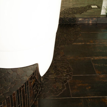
close up of pebble tile design around soaking tub.
Inspiration for a large asian master white tile and porcelain tile porcelain tile home design remodel in Seattle with a vessel sink, flat-panel cabinets, medium tone wood cabinets, quartz countertops, a two-piece toilet and beige walls
Inspiration for a large asian master white tile and porcelain tile porcelain tile home design remodel in Seattle with a vessel sink, flat-panel cabinets, medium tone wood cabinets, quartz countertops, a two-piece toilet and beige walls
 Advance Design Studio, Ltd.
After six years of living in their Huntley IL home, Chris and Meghan were tired of their dark, dingy, outdated kitchen and it was finally time for a long-anticipated change. “The kitchen is the place where we live, it’s where we do everything,” Meghan said. “It was important that it be a space where we wanted to be.” Meghan loves cooking and enjoys including their girls in healthy meal prepping, this led them to want a brighter, more enjoyable kitchen with increased functionality and improved storage.
For Chris especially, the laundry room was an entirely dysfunctional eyesore. “We had a washer and a dryer, but it was all kind-of cobbled together!” Chris said. “There were always laundry piles everywhere, we weren’t really sure what we wanted to do in there, but it was time for us to make a change.” The mess of the space was stressful every time they walked in the door from the garage each day. Kids’ backpacks and shoes piled up haphazardly in the makeshift boot-bench closet left the family feeling disorganized and stressed. They needed space for folding clothes and locker cubbies to help keep the family organized.
Having known Christine and Todd in the Huntley community for years, Chris and Meghan were familiar with their work. “We already trusted them personally and having seen their projects for years we knew they did top notch work. After we reviewed the initial round of designs, we knew that hiring them was definitely the right choice,” Meghan and Chris said. Although Chris had done a lot of work in their home himself, the kitchen and laundry room renovation was such a large undertaking that he didn’t want to steal time away from his family to spend what would surely be many long weekends doing the job himself. “That would not have been a wise choice for us,” Chris laughed.
“Our designer, Michelle was very, very, easy to work with; anything we wanted to see or weren’t sure about, she went above and beyond to make this easy for us. She was easy to get hold of and always quick to respond,” the couple said. Michelle pulled ideas that mirrored the couple’s taste and style and was adept at directing the couple to limited choices that didn’t overwhelm them and kept the process moving. “I have a hard time making decisions. Michelle made the decision-making process so easy. I loved how she listened to what I liked and then presented three great options for me to choose from,” Meghan said.
The main objectives for the kitchen were better storage solutions, they wanted the space to reflect their lifestyle and taste, and they wanted it to last for years with low maintenance. One of the first steps in creating a more functional kitchen was relocating the refrigerator, creating an improved workflow for the busy family.
“We didn’t know that we could even move the refrigerator to a new location where it is now, that was something that we never would have thought of,” Chris said. “The new refrigerator location makes the kitchen feel so much bigger. We didn’t add any space, but our whole kitchen with the new design just seems like it’s so much larger than before!” Meghan said.
The perimeter mist colored cabinets helped warm and brighten the entire room, while the graphite colored cabinets on the island added contrast. Using this fresh, clean color palette satisfied the couple’s desire for a bright space that was the exact opposite of what they had before. Organization accessories were also added to the cabinets such as a spice drawer tray and roll outs to create hidden convenience.
“I absolutely love the hidden spices – it makes cooking so much more enjoyable!” Chris said. “And all the pull outs, and the double trash bin, who would think you could get so excited about organization!” the couple said in unison.
One thing they hated in their original kitchen was how dark the space felt. Added lighting on the ceiling with the new light fixtures combined with the lighter cabinetry colors throughout solved this problem. “Our new kitchen has this warm, almost cozy feeling that our old kitchen never had, it’s just a space that I love spending my time in now,” Meghan said. The light airy feeling was accentuated with the use of floating white shelves on either side of the decorative range hood. “We have so much cabinetry space, the new design is amazing we actually have more storage space than we will ever need,” Meghan said.
The island was extended to create more work surface and added space for stool seating. “The new island changes how we live. Now the kids can be in the kitchen with us, doing homework, eating breakfast, and the three of us have special dinners there when Chris is working late,” Meghan said.
The Carrara Marmi Quartz countertops were chosen because they are, not only beautiful, but are made from hard-working material that doesn’t require maintenance. The white subway tile backsplash that wraps to the ceiling behind the focal point cooktop range/hood compliments the crisp white countertops perfectly, while brushed brass hardware and light fixtures keep the design fresh and new.
The couple had a few fears at the beginning of the project, as most homeowners do. Their biggest fear was being out of their kitchen and laundry room for an extended time. The crew made it very easy for the family to work in a limited space keeping the washer and dryer hooked up the majority of the time, and also getting appliances working with minimal downtime.
“They above and beyond accommodated us to get us through the process,” Meghan said. “They did a great job making sure we were as comfortable as possible throughout the process,” Chris added.
“Our project manager DJ did a great job. He was very good at updating us on schedule changes, getting guys in as quickly as possible. Everyone that stepped in the house was nice and did great work,” said Chris. They thought Advance’s carpenter was phenomenal and were impressed when he took a conceptual idea from a photograph and worked with designer Michelle to create a one of a kind range/hood that has become the topic of conversation with friends and family who visit the new kitchen. “He was in our house literally every day for several weeks. He was easy to work with and good at what he did,” Meghan and Chris said.
The focal point of the kitchen; a hand-crafted, custom-built ventilation hood was clad with handpicked reclaimed barnwood. Advance Design’s carpenter built the framework and the cladding to create a one-of-a-kind design element that the couple loves.
“I think it was especially fun for him to create something unique from scratch, showcasing his talent in this area,” Meghan said. “I love that my kitchen is not like everyone else’s. I got to pick out the wood on my hood and watch it being built and was able to choose what pieces of wood went where on it. It’s totally unique.”
Red Oak flooring was toothed-in throughout the kitchen and the rest of the first floor anywhere changes were made. Then the whole floor was refinished to tone down the orange undertones in the existing floor stain, ultimately changing the color complexion of the entire first floor. The result is a completely new feeling to the entire home.
Renovating the laundry room was extremely important to Meghan and Chris, but they had trouble visualizing what the possibilities were for the seemingly small space. Michelle produced beautiful 3D illustrations that helped them envision the space in a whole new way.
“I must have told Michelle 100 times that I am a visual person, seeing the designs in 3D made it so easy to make decisions and see what we could really do with our space,” Meghan said.
A dividing wall and doorway were removed between the existing laundry room and hallway formerly containing a coat closet, providing space to design specialized graphite colored cabinetry matching the kitchen island to house custom storage cubbies for each family member. Adding the tall utility cabinetry in the new laundry area helped solve the storage issue, tucking away cleaning supplies, household items, and even the cat got its own cubby.
“I love how everything is now hidden in its own space. I can’t tell you how much I hated coming home and seeing everything sitting around on counters,” Chris said.
Electrical outlets were planned for the inside of utility cabinets, so devices could charge in hidden locations. Stacking the washer and dryer allowed for wider countertop space to provide a folding area and a special space for clothes to hang. “The way I do laundry has been completely transformed! I can actually fold clothes and hang them now right out of the washer and dryer,” Meghan said.
“The end result in the kitchen and the laundry/mud room was an updated light and bright space, with a smarter work flow that better meets the needs of this family,” Michelle said.
“I would totally recommend Advance Design,” Meghan said. “Sometimes I sit and just look at my kitchen and laundry room and think ‘Wow, I can’t believe I get to live here!’ It’s an understatement to say we love our new space.”





Sponsored
Columbus, OH

Hope Restoration & General Contracting
Columbus Design-Build, Kitchen & Bath Remodeling, Historic Renovations
 Advance Design Studio, Ltd.
The couple who embarked on this Lake Zurich Illinois home renovation spent years planning a move from Virginia to the rolling hills of Northern Illinois when their first grandchild was born. Wanting to be closer to their grown children so they could enjoy their new role, they first embarked upon finding the right realtor and the right home. They settled on the “perfect” home; perfect that is to transform.
The seriously outdated 1,800 square foot ranch had a closed outdated kitchen, 3 bedrooms, a living room with a fireplace, a full basement and 2 baths. Although it had “good bones”, it was straight out of a builder’s catalog with wall to wall carpet, standard tile and honey oak everywhere you looked. But this couple had big plans for this home.
In tandem with their home purchase, they began the search for the just the right renovation company. The team they chose needed to be cohesive, as the whole house renovation would be designed hundreds of miles from their home several states away. She found Advance Design Studio, Ltd. online, and was quickly enamored by the team and by Common Sense Remodeling, simply by studying the website. Her decision to choose Advance Design to partner on this complete ranch renovation was confirmed quickly upon her first face to face meeting with owner Todd Jurs, and later by Advance’s designer, Nicole Ryan.
Three bedrooms were converted into a one master suite with ample bath and walk in closet, laundry, and a 2nd multi-purpose room designed for movies and entertainment, a home office, and a guest room all in one. A doorway leading to the garage was reconfigured to create a foyer area, and allowed for a better flow to an open modern kitchen complete with a large island for cooking and entertaining, which included a wide bench seat overlooking the back yard and opening onto an eating area flanked with a fireplace and TV.
The piece de resistance culminated with 3 walls of full glass anchored by a striking fireplace in the new four season’s room where the homeowners enjoy coffee every morning while gazing at the current day’s mid-western landscape. The open floorplan encourages living in “one space” throughout the day.
Ryan worked with the couple remotely, exchanging 3D color renderings and floorplans with detailed budget updates until the project took on the very image they had envisioned. “Working with them was a change from our normal meeting process since they were literally in a different state. We conducted meetings by phone, while reviewing materials and drawings via computer. It was a fun process that necessitated lots of detail and careful coordination, but we made it happen and the process was as smooth as if they were right here like normal”, says Nicole. During a stressful time planning their move, the constant interaction with Nicole assured the couple that all was being addressed by the Advance team and they could relax and focus on other important things (like moving cross country).
The new master bath incorporated heated flooring, a walk in shower with seating and custom shower niches, and an elegant double sink vanity with ample space for two. “The layout of each of the rooms is exactly what I envisioned,” the client said. “Advance’s attention to details such as light switch placement, electrical outlets, and many other minute details you wouldn’t even think of was the icing on the cake. If I didn’t think of it first, they certainly did,” said the happy homeowner. Small details like the crown molding, the custom designed fireplace mantle, the under-cabinet lighting and etched door glass, and even subtle rhinestones shimmering like delicate jewelry in the tile backsplash brought the whole project together. The clients were extremely happy with the way the Advance team made sure these small things were executed perfectly.
“It’s just gorgeous,” they said at a celebratory event in their home hosted shortly after completion for the entire Advance Design team that made it happen. “The entire crew at Advance Design was a pleasure to work with. We couldn’t have done this with a lesser team,” they concluded.


 T.A. French - Custom Builder
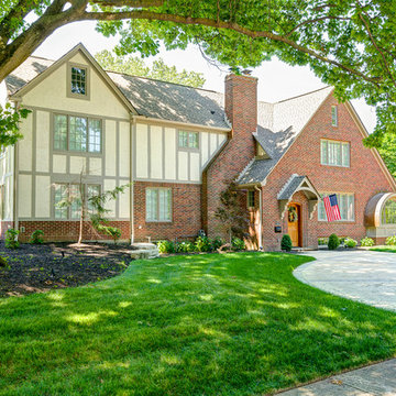
Example of a mid-sized transitional dark wood floor and brown floor double front door design in Austin with gray walls and a black front door

 Save home
A clean, white, and fresh look never cease to accentuate your kitchen’s interior.
Whether you have a small kitchen or a large one, it is highly unlikely to make a wrong decision with the white color. A white kitchen is a timeless addition to your entire décor, which always radiates more light, a bright look, and an aesthetically soothing aura.
However, although the color white has the power to uplift the look of your kitchen, it is not enough to just paint the walls white. You need to strike a chord between various textures and colors along with kitchen elements, like shaker kitchen cabinets, countertop, etc.
In the following section, we have compiled a list of modern kitchen cabinets ideas. Read on see some of the best white kitchen cabinet styles for your kitchen.
Top 10 Modern White Kitchen Ideas
There’s no doubt in the fact that a white kitchen and RTA cabinets can form the perfect base for your kitchen’s interior. You can add some plants, a pinch of gold, and or a simple black countertop for a different yet appealing look. Below we have discussed some of these ideas. Read on:
1. Airy and Light
The simplest way to design your modern white kitchen is to use a white and timber combination. This can include white cabinets, timber doors, and white wall tiles. Or you can choose timber RTA cabinets paired with white tiles, flooring, and countertop.
2. Sophisticated
Another way is to sophisticatedly turn around your white choices. Here’s an example:
Use white cabinets, steel fittings, and accessories paired with textured white tiles and marble countertop. The flooring can also be white, similar to the countertop. This would give a nice, clean, and refreshing look to your modern white kitchen
.
3. Stone Look
The stone look is always best paired with white cabinets. So, if you utilize shaker kitchen cabinets, which are white, and pair it with everything white stone-like look, then your kitchen would look mesmerizing. This means using marble countertop, marble flooring, and stone-looking back tiles.
4. Monochrome
Black and white appeals to a lot of homeowners. It is the best combination that is unlikely to go wrong. In fact, it helps you move ahead of the ordinary kitchen interior.
You can set your monochrome modern white kitchen in two ways:
Firstly, you have white cabinets paired with black countertop and black fittings. Too much black would reduce lighting and make your kitchen look smaller. So, add white flooring and white back tiles.
Secondly, you can keep the lower RTA cabinets black, and rest everything white, such as textured back tiles, white knobs, etc. You can also pair it with timber upper cabinets.
5. Grey Shade
Similar to monochrome, grey is also amazing. It looks much more sophisticated than monochrome, but a little less bold. So, you can keep your modern white kitchen in these two shades. For example, grey cabinets and white countertop, tiles, and flooring. Here, glossy back tiles can accentuate the look.
6. Brass Touch
Brass touch can literally light up any dull space. If you just add a brass lamp to your living room or kitchen, it can drastically enhance the look. You can use brass in the form of brass windows and lamps. You can also add copper stools and upper cabinets for the same effect.
7. White Countertop
One thing that can make your modern white kitchen look extremely beautiful is the attention to detail. This includes adding a white countertop that really improves the look. A lot of people add a white countertop but making it complement your cabinets can improve the interior a lot.
For example, marble countertop, wooden flooring, white cabinets, and copper knobs.
8. Wood Shelves
The color of wood and timber automatically adds a sense of warmth to your kitchen. So, you can also use either upper or lower timber cabinets. If you are using timber or wood for the upper cabinet and RTA cabinets for the lower cabinets, then you can keep upper cabinets as open shelves. This can also be a bar wood shelf.
9. White Tiles
Basic, old-school white tiles are also great. Earlier, we had small white tiles that used to go with everything. These tiles still complement your kitchen. Use white RTA cabinets, black countertop, and white tiles for a perfect contrast.
10. Light and Bright
Another amazing way to install shaker kitchen cabinets in a modern white kitchen is to keep everything white but add colorful chairs to your dining table. This will add life to your kitchen.
Conclusion
If you are redesigning your kitchen or re-structuring it, modern white kitchen themes are the best option. Simply take inspiration from the above examples and choose a versatile approach for remodeling your kitchen. There’s no shortage of options that you can choose from, such as monochrome, black cabinets, etc. Just remember to check the kitchen size, your budget, and lighting in your kitchen to ensure that you are moving in the right direction.
Whether you have a small kitchen or a large one, it is highly unlikely to make a wrong decision with the white color. A white kitchen is a timeless addition to your entire décor, which always radiates more light, a bright look, and an aesthetically soothing aura.
However, although the color white has the power to uplift the look of your kitchen, it is not enough to just paint the walls white. You need to strike a chord between various textures and colors along with kitchen elements, like shaker kitchen cabinets, countertop, etc.
In the following section, we have compiled a list of modern kitchen cabinets ideas. Read on see some of the best white kitchen cabinet styles for your kitchen.
Top 10 Modern White Kitchen Ideas
There’s no doubt in the fact that a white kitchen and RTA cabinets can form the perfect base for your kitchen’s interior. You can add some plants, a pinch of gold, and or a simple black countertop for a different yet appealing look. Below we have discussed some of these ideas. Read on:
1. Airy and Light
The simplest way to design your modern white kitchen is to use a white and timber combination. This can include white cabinets, timber doors, and white wall tiles. Or you can choose timber RTA cabinets paired with white tiles, flooring, and countertop.
2. Sophisticated
Another way is to sophisticatedly turn around your white choices. Here’s an example:
Use white cabinets, steel fittings, and accessories paired with textured white tiles and marble countertop. The flooring can also be white, similar to the countertop. This would give a nice, clean, and refreshing look to your modern white kitchen
.
3. Stone Look
The stone look is always best paired with white cabinets. So, if you utilize shaker kitchen cabinets, which are white, and pair it with everything white stone-like look, then your kitchen would look mesmerizing. This means using marble countertop, marble flooring, and stone-looking back tiles.
4. Monochrome
Black and white appeals to a lot of homeowners. It is the best combination that is unlikely to go wrong. In fact, it helps you move ahead of the ordinary kitchen interior.
You can set your monochrome modern white kitchen in two ways:
Firstly, you have white cabinets paired with black countertop and black fittings. Too much black would reduce lighting and make your kitchen look smaller. So, add white flooring and white back tiles.
Secondly, you can keep the lower RTA cabinets black, and rest everything white, such as textured back tiles, white knobs, etc. You can also pair it with timber upper cabinets.
5. Grey Shade
Similar to monochrome, grey is also amazing. It looks much more sophisticated than monochrome, but a little less bold. So, you can keep your modern white kitchen in these two shades. For example, grey cabinets and white countertop, tiles, and flooring. Here, glossy back tiles can accentuate the look.
6. Brass Touch
Brass touch can literally light up any dull space. If you just add a brass lamp to your living room or kitchen, it can drastically enhance the look. You can use brass in the form of brass windows and lamps. You can also add copper stools and upper cabinets for the same effect.
7. White Countertop
One thing that can make your modern white kitchen look extremely beautiful is the attention to detail. This includes adding a white countertop that really improves the look. A lot of people add a white countertop but making it complement your cabinets can improve the interior a lot.
For example, marble countertop, wooden flooring, white cabinets, and copper knobs.
8. Wood Shelves
The color of wood and timber automatically adds a sense of warmth to your kitchen. So, you can also use either upper or lower timber cabinets. If you are using timber or wood for the upper cabinet and RTA cabinets for the lower cabinets, then you can keep upper cabinets as open shelves. This can also be a bar wood shelf.
9. White Tiles
Basic, old-school white tiles are also great. Earlier, we had small white tiles that used to go with everything. These tiles still complement your kitchen. Use white RTA cabinets, black countertop, and white tiles for a perfect contrast.
10. Light and Bright
Another amazing way to install shaker kitchen cabinets in a modern white kitchen is to keep everything white but add colorful chairs to your dining table. This will add life to your kitchen.
Conclusion
If you are redesigning your kitchen or re-structuring it, modern white kitchen themes are the best option. Simply take inspiration from the above examples and choose a versatile approach for remodeling your kitchen. There’s no shortage of options that you can choose from, such as monochrome, black cabinets, etc. Just remember to check the kitchen size, your budget, and lighting in your kitchen to ensure that you are moving in the right direction.

 Custom Surface Solutions
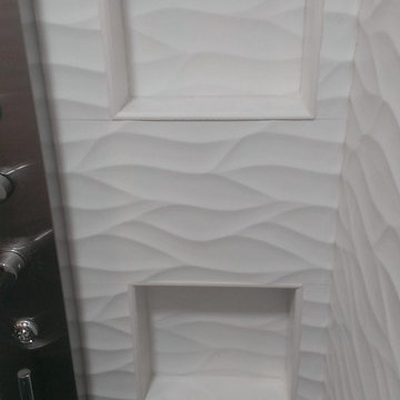
 (www.css-tile.com) - Owner Craig Thompson (512) 430-1215. This project shows a master bathroom remodel. It includes a Porcelanosa large panel tile shower walls, pebble tile shower floor, penny tile wainscot and backsplash, 24 x 12 porcelain tile floor, and IKEA and custom cabinets.
 Advance Design Studio, Ltd.
The major kitchen renovation of this old country farmhouse was a task of love, one that had been planned for many years by these Barrington seasoned homeowners. After interviewing no less than five companies, the homeowners chose the design team at Advance Design Studio to make the transformation they had long planned for.
“They had an understanding of the right design for the space almost from the instant they walked in the room”, says Sharon Scott of the design team of Nicole Ryan at Todd Jurs at Advance Design Studio. “They were the only designers who laid out ideas in the first meeting at the house that we really loved”, she says. “It was obvious that they understood the house, and understood us - and from then on the decision to hire them literally made itself”.
The original kitchen had a dividing “wall” of cabinetry…that made the rather large space seem very small, and cut off the kitchen from the eating area that has a beautiful garden view completely hidden from the main kitchen. Circulation was poor, leaving family members on top of one another when entertaining family and friends.
The new kitchen design nearly doubles the kitchen size within the original space; opening it up completely and enjoying an expansive island containing a new Kohler Whitehaven Smart Divide farm sink, a dishwasher, and pull out double trash receptacle. The great new gathering space accommodates four pull out stools beckoning grandchildren and friends alike. Removing the range from the island and relocating it to create a dramatic “feature” wall, completely out of the way of guests; it is now crowned with a beautiful completely customized wood hood designed to ventilate much more efficiently than the original island range containing a limited downdraft system.
The much more efficient use of the space after removing a pantry closet made way for a fully functional “tall wall” housing a double oven and refrigerator, out of the way of guests. Removing the restrictive cabinetry wall now allowed for an expansive floor to ceiling pantry cabinet with full extension pull out shelving, and an elegant display area complete with a beautiful furniture detailed buffet.
Fitting perfectly into the farmhouse charm of the old estate, Medallion Silver Lancaster cabinetry was chosen in a soft white Maple Divinity paint finish lining the perimeter. The stunning island hints to this old home’s past with Medallion Gold’s Maple Devonshire style graced with a Carriage Black Heirloom painted finish. The rubbed off black paint finish reveals the soft wood tones beneath, mimicking furniture you’d see in your grandmother’s home that has lovingly been polished for years to reveal a soft, subtly rubbed-off sheen.
Counter tops reverse contrast with perimeter tops of black “Raven” granite possessing a subtle honed finish, and a shift to Quartz Difinity Viareggio - resembling white Carrera marble on the island. A simple herringbone detail completes the decorative range wall, and subtle porcelain subway tiles grace the backsplash throughout.
The design is finished off with crisp Thermador and Bosch stainless steel appliances, and bright brushed cup pull and handle combination hardware. A pull down Kohler Bellaria faucet makes cleanup a breeze, and soft under-cabinet LED lighting throughout makes every work surface shine softly, and highlights the cabinetry display area with grace.
One special detail was created to make the dramatic ceiling transition to a vaulted area above the breakfast nook extra special. A tongue and groove solid wood ceiling was hung above, and a subtle greenish-grey distressed paint finish was hand developed on site by the talented crew, complementing the new kitchen with a completely unique surface that appears as if it’s been there for many, many years. It’s just one standout feature in the amazing new space that is sure to be in every conversation as newcomers enjoy the newest best hangout in this old home renewed!
After 30 years of renovating homes, this now content homeowner sips a cup of tea enjoying her new garden view, and reminisces projects of past – and lastly reports their experience with Advance Design Studio culminating with their amazing new kitchen to be the most enjoyable and satisfying home experience yet.
Designer: Nicole Ryan
Photographer: Joe Nowak

25