
Search results for "Litre difference" in Home Design Ideas
 Drury Design
THE SETUP
This client lives in a great high-rise condo in downtown Chicago. Alicia has already remodeled a few areas of her home, including her kitchen and home office. The bathroom is one of the last big places the client wanted to update. The existing bathroom had a large, outdated whirlpool tub in the corner. It was a darker space that had a lack of natural light. There are no windows (due to the bathroom’s location within the high-rise building). So, the idea was to brighten up the space and give the client an updated, elegant primary bathroom that is more her style and tailor-made for her routines.
Design Objectives:
- Make the space brighter.
- Create different daily routine stations to maximize functionality while keeping things clutter-free – a makeup station, a blow-dry station, and a sink-needs station.
- Achieve the client’s specific style and function needs while also keeping the look and design open to future possibilities: different users of the space/resale clients.
Design Challenges:
- Toilet cannot be moved. (In a high-rise, you can’t really move plumbing around too much when reimagining a space)
- Existing bathroom had a soffit that hid a lot of electrical wiring, so completely removing the soffit wasn’t an option.
- The blow-dry station needs to accommodate the client’s preference for standing up.
- Finding a place for the make-up station, which the client wants oriented for sitting.
- Create storage within the shower that can eliminate the clutter of personal care products that are actually needed every day. Do this, while keeping the client’s favorite things about the existing shower: the shower bench, a tub filler faucet (for rinsing shaving cream when shaving legs) and a low niche for placing her foot when shaving her legs.
THE RENEWED SPACE
Design Solutions:
- Extended a bit of wall near the toilet to give the commode its own area within the space, but without closing it off into a claustrophobic WC.
- Worked within the reality of the existing soffit situation, reshaping it to align with the new shower. Can lights were also added. Installed a beautiful ceiling light fixture that works within the new soffit shape, commanding attention and adding light, as if the sofit shape was chosen for it.
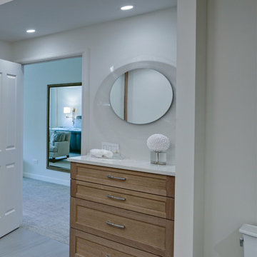
- Created a nice, furniture-looking 42”-high cabinet with pullout drawers to be the blow-dry station, complete with a mirror and a nice top. The pullout drawers are all powered, concealing a Dyson dryer and curling iron (and all the accoutrements) while keeping them plugged in, which is ideal for easy usage and put away. A stylish mirror on the wall above the cabinet, and proper lighting, make this the perfect blow-dry station. The top has a grommet that can accommodate a power cord should the client ever want to have a powered device on top of the cabinet.
- Put the sit-down makeup station where the tub used to be, putting the mirror back into a new recessed wall just a bit, allowing the area to have more room.
- Created a niche in the shower’s inner wall so that you can’t see it unless you are literally inside the shower. At the client’s request, it also has a hook so she can hang her loofa. Hiding the utility niche in this way allowed us to use the full main wall of the shower as a canvas for a beautiful accent stripe of raised decorative tile. The new shower has her old favorites, too: the tub filler, foot niche and bench.
Alicia’s client loves her new primary bathroom, especially the blow dry area. It is very accommodating for her, as a tall lady, while being very easy to use. The drawers store everything. Being powered, they make using already-plugged in appliances very easy to use and put away.
Her previous makeup station was a freestanding vanity with a single drawer, so beauty products were all over the surface top. With her new makeup station, everything is nicely tucked away and organized in drawers.
The new lighting is fantastic and the colors are light and soft. The clients loves the overall look and feel of her new bathroom and raves about how well the functionality-minded design makes her morning routine – and her life – easier and enjoyable!

 AMLD INTERIOR INC
AM3001 ESTADIO RING
FEATURED:
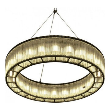
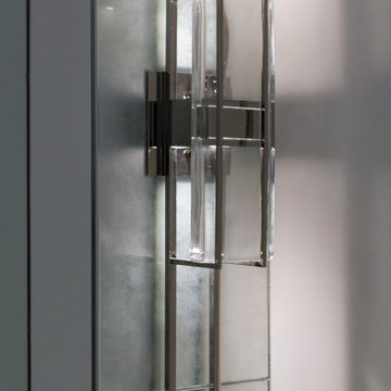
Ring of Light forms a tubular structure of which the inner and outer shades are made from glass block sections that disperse the light by means of vertical light and shade streaks. The fixture literally draws in your sense of touch with its soft flowing light, originally conceived for the 1992 Barcelona Olympic stadium, its concept predecessor is found in the ironwork luminaries used to hold up candles, the traditional depiction of mediaeval chandeliers in palaces and cathedrals.
DESCRIPTION:
Collection: COMMERCIAL
Size: 42” Dia x 10" Depth x 14.2" Height (Custom sizes also available)
Shape: Ring
Frame Finish: Grey Iron (Different finish options available at no additional cost)
Materials: Stainless Steel, Glass Block
Weight: 205 lbs (42”)
Extension: Adjustable cables for a customizable length up to 12 ft.
Bulbs: 12 x LED bulb Max. 75 W Bulb Socket: E27
Assembly: Fully Assembled
Dimmer Switch Compatible: Optional
Shipping: Free Door-To-Door Shipping Worldwide
Rush Order: 3-4 Weeks; 15% added to total
Regular Lead Time: 6-8 Weeks
Warranty: 5 Years Full Coverage (includes parts replacement)
SIZE OPTIONS:
SIZE: PRICE:
30” Dia x 8" Depth x 14.2" Height
$4,260.00
36” Dia x 8" Depth x 14.2" Height
$5,898.00
42” Dia x 10" Depth x 14.2" Height (as shown)
$7,158.00
60” Dia x 10" Depth x 14.2" Height
$8,248.00
98” Dia x 10" Depth x 14.2" Height $11,166.00
128” Dia x 10" Depth x 14.2" Height $14,460.00
166” Dia x 10" Depth x 14.2" Height $17,880.00
CUSTOM SIZES, FINISHES, COLORS AVAILABLE UPON REQUEST
Find the right local pro for your project
 Tile Doctor Ltd
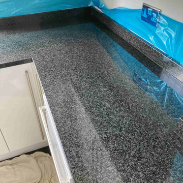
Although expensive Granite makes the most beautiful and practical stone worktop you can install in your kitchen. It gives real wow factor to a room and this kitchen in Folkestone was no different. Normally granite needs little maintenance however Folkestone has very hard water (often referred to as limescale) containing high levels of calcium and over time the calcium in the water gets deposited on nearby surfaces. According to the Affinity Water website the water in Folkestone contains 287.5 mg of calcium per litre which is classed as hard.
The owner of the property contacted us explaining that due to this problem the build-up of calcium deposits had overtaken her sink and countertop to a degree that she couldn`t deal with it through normal cleaning and a restoration was required. There are several household products on the market that can remove limescale however you need to be very careful when using these on natural stone as they use acids to break down the calcium and this can etch stone making the problem worse (always read the label). I went and had a look at the problem and gave her a quote for resolving the problem, which she was happy to accept.
Before starting the renovation, I protected the floor with dust sheets and the walls with a blue film that is easy to remove. Then to tackle the limescale I carefully went over each part of the Granite counter using a set of six-inch Tile Doctor Burnishing pads applying them in sequence from coarse to extra fine. To give extra cleaning power the coarser pads were applied with Tile Doctor Oxy-Gel which is an alkaline cleaning gel. The pads were fitted to a hand buffer and the soil generated by the abrasive pads was rinsed off between pads with water. For the finer detail such as the groves in the granite draining board, I used diamond encrusted handheld burnishing blocks of various grits. With the combination of diamond tooling and lots of elbow grease the job took around five hours to complete and the granite now has the polished look it deserves.
The granite worksurface does not require an actual sealer to be applied. However, maintenance is the key to keeping the stone in great condition so for aftercare I left the owner with a bottle of Tile Doctor Stone Patina Spray. This product is designed for cleaning stone worktops and contains a special ingredient that maintains the lustre. This should ensure the Limescale becomes manageable and can be cleaned more easily.
I made a striking difference to the appearance of the Granite Worktop and the owner was over the moon with the result.
Michael Conlon
South Kent Tile Doctor
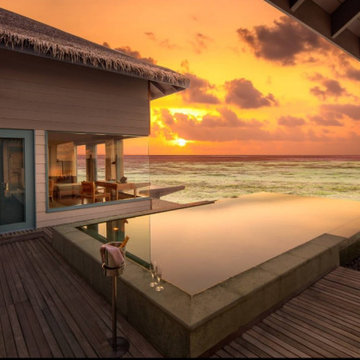
 Holiday Maldives
Combine ancient temples with overwater villas for the trip of a lifetime
There's a reason savvy travellers are increasingly looking beyond single-destination holidays. The Sri Lanka Maldives multi-centre trip has emerged as one of the most sought-after combinations in tropical travel—and it's easy to understand why. These two Indian Ocean neighbours couldn't be more different, yet together they create a holiday experience that satisfies every type of wanderlust.
Why Combine Sri Lanka and the Maldives?
Sri Lanka offers what the Maldives doesn't: lush highlands carpeted in tea plantations, ancient cities steeped in 2,500 years of history, wildlife safaris where leopards roam free, and a culinary scene that'll have you dreaming of hoppers and kottu for years to come. The Maldives, meanwhile, delivers what Sri Lanka can't: those iconic overwater bungalows, some of the planet's most pristine coral reefs, and the kind of barefoot luxury where your biggest decision is whether to have your massage on the beach or in your private villa.
A Sri Lanka and Maldives twin centre holiday lets you experience the thrill of exploration followed by pure, unadulterated relaxation. It's the best of both worlds—literally.
The Perfect Itinerary Balance
Most travellers find that spending 7-10 days in Sri Lanka followed by 4-7 days in the Maldives creates the ideal rhythm. Sri Lanka demands more time because there's simply so much ground to cover. You might start in Colombo, travel through the Cultural Triangle to explore Sigiriya's ancient rock fortress and Dambulla's cave temples, wind through the tea country around Ella, and perhaps end with a safari in Yala National Park before catching your flight to Malé.
Then comes the reward: touching down in the Maldives, boarding a speedboat or seaplane, and watching the stress of everyday life disappear as those famous turquoise lagoons come into view. After days of early morning temple visits and winding mountain roads, there's nothing quite like sinking into a lounger with nothing on the agenda but deciding which shade of blue you're looking at.
Logistics Made Simple
One of the best aspects of this combination is how geographically convenient it is. Colombo and Malé are just over an hour apart by air, with multiple daily flights connecting the two capitals. This proximity means minimal travel fatigue and maximum time enjoying your destinations.Find More here https://holiday.com.mv/sri-lanka-and-maldives-twin-centre-holidays/
For those considering expanding their Indian Ocean adventure even further, Maldives multi-centre holidays open up possibilities beyond Sri Lanka. Dubai, Singapore, and various Indian cities all serve as excellent add-on destinations, turning an already incredible trip into a true odyssey.
Planning Considerations for 2026
Timing matters with this combination. The Maldives enjoys fairly consistent weather year-round, but Sri Lanka has two distinct monsoon seasons affecting different coasts at different times. Generally speaking, December through April works beautifully for both destinations, making it the peak season for this twin-centre route.
Budget-wise, expect Sri Lanka to be significantly more affordable than the Maldives. Many travellers use this to their advantage, opting for boutique hotels and authentic local experiences in Sri Lanka, then splurging on a premium resort for their Maldives finale. It's a strategy that delivers exceptional value without sacrificing that once-in-a-lifetime overwater villa experience.
The Verdict
A Sri Lanka Maldives multi-centre holiday isn't just about ticking two countries off a list. It's about crafting a journey with genuine contrast and emotional arc—adventure followed by serenity, cultural immersion followed by indulgent escape. For couples, honeymooners, families, and solo travellers alike, this combination consistently ranks among the most satisfying itineraries the Indian Ocean has to offer.
If you've been dreaming of ancient ruins at sunrise and sunset cocktails on a private deck over crystalline waters, this might just be your year to make it happen.
Ready to start planning your twin-centre adventure? Work with specialists who know both destinations intimately to create an itinerary that matches your travel style and budget.Find More here https://holiday.com.mv/maldives-multi-centre-holidays/
 Home Advertising
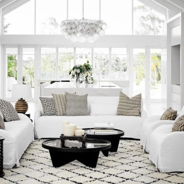
A Hampton style sofa has become a necessity in home decor as people become more familiar with the Hampton interior style. Hampton style sofas are a good choice for timeless design if you are replacing or buying a new one. When you are uncertain of what you want, buying a sofa can seem challenging. If you're trying to select La maison hampton furniture for one of your home's most important rooms, you have a lot to take into account. It maust suit your taste and function.
Couches require thought and consideration. It is important that you choose a style and a color that goes well with your living area, along with a durable material that meets your needs. The front door must also be able to accommodate the rug. So, don't forget to familiarize yourself with the different sizes, fillings, and textures before creating your budget. You don't have to spend a lot of money on a new sofa, but while there are some places where you can save money, there are others where you should invest.
First, Let's Talk about the Vibe of sofa style
First and foremost, you should consider the style of your sofa. Choose a sofa whose style fits the current theme of your home. It may seem very obvious, but many people simply buy whatever suits their fancy, and unfortunately, the style of the room is a lot of the time different from what suits their fancy.
If the rug or the art above the sofa don't go together, it might not work in the room. It's imperative to get the look right before adding the rest of these elements. Make sure you consider how you wish the room to feel when you're in it. If you're looking for something more colorful, or you have a particular style in mind, such as mid-century (then googling 'Hampton style sofas' will prove valuable). A sofa that looks great but is super-comfy might end up looking completely out of place if you skip this step.
Next, We will Discuss Functionality of sofas
It is important to consider what you will be doing with the sofa. Although I am convinced that the answer is "to sit on", we need to dig deeper. Can you, for instance, sit down for drinks in this formal sitting room when company comes over? Do you watch television in this room every day? There is a rumpus room upstairs for the kids to interact with their friends and eat and drink on it? There might be Hampton style sofas in the guest room.
For your convenience, I have compiled a full list of Hampton style sofas here. Depending on the situation, each sofa style needs to be different. Typically, formal couches tend to be less comfortable. They're usually more rigid and upright. Couches for watching TV should be cushier; they should be comfortable. We know that many teens are not concerned about Hampton style sofas maintenance, so kids zones need sofas that are able to withstand more wear and tear. This is something high schools should teach.
This story shows you the importance of not skipping this important ‘how will it be used? At this point, you should have an idea of how you'll use the Hampton style sofas. Consider, for instance, a sofa with a bold color and a formal feel for your living room. If you want a couch with a relaxed feel, choose a neutral shade with a cushy feel.
Dimensions of an ideal hamptons style sofa
Before you buy a Hampton style sofa, you must measure the size of your current living room. You will probably not fit it if you don't do this. A large one will either overwhelm the room and leave no room for a coffee table, or a small one will look dwarfed in comparison. When a pandemic strikes, scale is everything.
You should be able to fit the sofa into the room comfortably without it feeling too large or small. Measure the width of your La maison hampton furniture style sofas first with a tape measure. Consider if you'd like side tables beside your sofa. In that case, you would need to measure the width of either side of your sofa and add around 50cm to either side (most decent side tables have a width of about 50cm).
In addition to measuring Hampton style sofas depth, you should also measure the width. There are some sofas that can be as deep as a metre (from the front of the sofa cushion to its back). Since your sofa will need an allowance of 50cm from the edge of the coffee table to the front of the sofa, and a minimum of 50cm on the other side of the coffee table, you might want to measure your current coffee table to ensure it matches.
Another Important Factor is Height
In an open-plan living room, this element is particularly important if your sofa crosses the space. When you have a sectional sofa, for example, one of the ends will likely cut across the room, so the back should be low so your eye can still pass over the back.
One of the top 10 living room design mistakes I make is to place tall-backed Hampton style sofas across the room, a mistake that really cramps the style of the whole space. It happens way too often.
Although the height won't be a major issue if the sofa is backed up against a wall, it is still worth considering the size of the art you want to hang above it. If you want neck support whilst watching TV, a low-back sofa might not be for you. My neck tends to become less and less flexible as I get older. It's a sad fact, but true nonetheless. If you find yourself in the same situation, you should consider high-back Hampton style sofas.
Sofa Cushions: How Low are They?
Many people don't think about this dimension when purchasing a sofa online, especially if they're doing so for the first time. If you're road-testing the sofa in-store, you'll know if it's too low for you right away, but an online purchase is something else. Low-profile sofas have a seat height of 40 cm or less. The sofa's 60cm seat height will make it much more difficult to get up and out of it. The importance of this factor increases as we age or if we have mobility problems.
The seat you're sitting in should allow you to stand up comfortably, without feeling like you need assistance. Additionally, the height of your coffee table should not be higher than the seat cushions on the sofa, because the table should never be higher than the seat cushions on the sofa. They should never be higher than each other. Make sure you take notes!
What Else is There in the Room?
A good idea when choosing a sofa is to consider what other elements will be in the room. For a well-designed, elegantly-resolved living room, you'll need a sofa, rug, coffee table, side table/s, lamp, TV unit, and wall art. The room will not feel right if you buy a massive sectional sofa that takes up the entire room and leaves no space for a coffee table or side tables.
You should measure out your sofa, keeping in mind that the other pieces La maison hampton furniture and decor will also need to fit into the space. All pieces of furniture need to have enough space to breathe. It's best not to have all the furniture crammed into the point where sitting down means hitting your legs or feet against pieces. You probably now understand that choosing a couch is more about the couch itself than with how to choose it. So think of the big picture whenever you choose something.
Two Two-Seaters, or a Sectional Sofa?
People often have to wrestle with the question of whether they should buy two sofas or one sectional when figuring out how to choose a sofa. Sectionals are usually preferable to two separate two-seater sofas. However, the corner piece is rarely occupied anyway. Often, the corner piece of a sectional is so tiny that it is impossible for a person to sit there comfortably. Therefore, think about whether you actually need this over getting two x two-seater sofas and arranging them into an L-shape.
If you don't have a large living room, you might prefer 2 x two-seater sofas instead. Sectional sofas are best for larger rooms. With the visual break of all that fabric dominating the corner, it will do the room a world of good. Furthermore, you can use the space between your sofas to put a side table so you can place drinks, or a table lamp, there.
You may want to consider getting 1 x two-seater sofa and an armchair instead, if you have a really small living room. Even though you want to seat as many people as possible, you should let the room determine how many people the sofa can accommodate.
A Guide to Picking the Right Material
The material of the sofa is obviously very important when it comes to picking out the right one. The best advice I can offer is to consider who will use the sofa and how that will impact maintenance.
Leather sofas are easier to clean than fabric ones when kids or pets are present. Leather has the disadvantage of retaining heat in the winter and being cold in the summer. Cushions work well with leather sofas, but velvet ones work better with leather sofas. Leather will show up claw marks more easily on some pets (like my cats).
It is true that fabric sofas are softer and cozier, but they can also be more difficult to clean. Having a slipcover sofa is a godsend if you have pets or toddlers, but they're not too easy to maintain.
You should consider how much patience you have to keep the sofa clean and who uses it. That will make it easier to decide what material to use. I work with a sofa supplier who has bomb-proof fabric that is so easy to clean that you can literally serve dinner right onto the cushions without making an utter mess.
 Holiday Maldives
Combine ancient temples with overwater villas for the trip of a lifetime
There's a reason savvy travellers are increasingly looking beyond single-destination holidays. The Sri Lanka Maldives multi-centre trip has emerged as one of the most sought-after combinations in tropical travel—and it's easy to understand why. These two Indian Ocean neighbours couldn't be more different, yet together they create a holiday experience that satisfies every type of wanderlust.
Why Combine Sri Lanka and the Maldives?
Sri Lanka offers what the Maldives doesn't: lush highlands carpeted in tea plantations, ancient cities steeped in 2,500 years of history, wildlife safaris where leopards roam free, and a culinary scene that'll have you dreaming of hoppers and kottu for years to come. The Maldives, meanwhile, delivers what Sri Lanka can't: those iconic overwater bungalows, some of the planet's most pristine coral reefs, and the kind of barefoot luxury where your biggest decision is whether to have your massage on the beach or in your private villa.
A Sri Lanka and Maldives twin centre holiday lets you experience the thrill of exploration followed by pure, unadulterated relaxation. It's the best of both worlds—literally.
The Perfect Itinerary Balance
Most travellers find that spending 7-10 days in Sri Lanka followed by 4-7 days in the Maldives creates the ideal rhythm. Sri Lanka demands more time because there's simply so much ground to cover. You might start in Colombo, travel through the Cultural Triangle to explore Sigiriya's ancient rock fortress and Dambulla's cave temples, wind through the tea country around Ella, and perhaps end with a safari in Yala National Park before catching your flight to Malé.
Then comes the reward: touching down in the Maldives, boarding a speedboat or seaplane, and watching the stress of everyday life disappear as those famous turquoise lagoons come into view. After days of early morning temple visits and winding mountain roads, there's nothing quite like sinking into a lounger with nothing on the agenda but deciding which shade of blue you're looking at.
Logistics Made Simple
One of the best aspects of this combination is how geographically convenient it is. Colombo and Malé are just over an hour apart by air, with multiple daily flights connecting the two capitals. This proximity means minimal travel fatigue and maximum time enjoying your destinations.
For those considering expanding their Indian Ocean adventure even further, Maldives multi-centre holidays open up possibilities beyond Sri Lanka. Dubai, Singapore, and various Indian cities all serve as excellent add-on destinations, turning an already incredible trip into a true odyssey.
Planning Considerations for 2026
Timing matters with this combination. The Maldives enjoys fairly consistent weather year-round, but Sri Lanka has two distinct monsoon seasons affecting different coasts at different times. Generally speaking, December through April works beautifully for both destinations, making it the peak season for this twin-centre route.
Budget-wise, expect Sri Lanka to be significantly more affordable than the Maldives. Many travellers use this to their advantage, opting for boutique hotels and authentic local experiences in Sri Lanka, then splurging on a premium resort for their Maldives finale. It's a strategy that delivers exceptional value without sacrificing that once-in-a-lifetime overwater villa experience.
The Verdict
A Sri Lanka Maldives multi-centre holiday isn't just about ticking two countries off a list. It's about crafting a journey with genuine contrast and emotional arc—adventure followed by serenity, cultural immersion followed by indulgent escape. For couples, honeymooners, families, and solo travellers alike, this combination consistently ranks among the most satisfying itineraries the Indian Ocean has to offer.
If you've been dreaming of ancient ruins at sunrise and sunset cocktails on a private deck over crystalline waters, this might just be your year to make it happen.
Ready to start planning your twin-centre adventure? Work with specialists who know both destinations intimately to create an itinerary that matches your travel style and budget.Find more https://holiday.com.mv/sri-lanka-and-maldives-twin-centre-holidays/

 Drury Design
THE SETUP
This client lives in a great high-rise condo in downtown Chicago. Alicia has already remodeled a few areas of her home, including her kitchen and home office. The bathroom is one of the last big places the client wanted to update. The existing bathroom had a large, outdated whirlpool tub in the corner. It was a darker space that had a lack of natural light. There are no windows (due to the bathroom’s location within the high-rise building). So, the idea was to brighten up the space and give the client an updated, elegant primary bathroom that is more her style and tailor-made for her routines.
Design Objectives:
- Make the space brighter.
- Create different daily routine stations to maximize functionality while keeping things clutter-free – a makeup station, a blow-dry station, and a sink-needs station.
- Achieve the client’s specific style and function needs while also keeping the look and design open to future possibilities: different users of the space/resale clients.
Design Challenges:
- Toilet cannot be moved. (In a high-rise, you can’t really move plumbing around too much when reimagining a space)
- Existing bathroom had a soffit that hid a lot of electrical wiring, so completely removing the soffit wasn’t an option.
- The blow-dry station needs to accommodate the client’s preference for standing up.
- Finding a place for the make-up station, which the client wants oriented for sitting.
- Create storage within the shower that can eliminate the clutter of personal care products that are actually needed every day. Do this, while keeping the client’s favorite things about the existing shower: the shower bench, a tub filler faucet (for rinsing shaving cream when shaving legs) and a low niche for placing her foot when shaving her legs.
THE RENEWED SPACE
Design Solutions:
- Extended a bit of wall near the toilet to give the commode its own area within the space, but without closing it off into a claustrophobic WC.
- Worked within the reality of the existing soffit situation, reshaping it to align with the new shower. Can lights were also added. Installed a beautiful ceiling light fixture that works within the new soffit shape, commanding attention and adding light, as if the sofit shape was chosen for it.
- Created a nice, furniture-looking 42”-high cabinet with pullout drawers to be the blow-dry station, complete with a mirror and a nice top. The pullout drawers are all powered, concealing a Dyson dryer and curling iron (and all the accoutrements) while keeping them plugged in, which is ideal for easy usage and put away. A stylish mirror on the wall above the cabinet, and proper lighting, make this the perfect blow-dry station. The top has a grommet that can accommodate a power cord should the client ever want to have a powered device on top of the cabinet.
- Put the sit-down makeup station where the tub used to be, putting the mirror back into a new recessed wall just a bit, allowing the area to have more room.
- Created a niche in the shower’s inner wall so that you can’t see it unless you are literally inside the shower. At the client’s request, it also has a hook so she can hang her loofa. Hiding the utility niche in this way allowed us to use the full main wall of the shower as a canvas for a beautiful accent stripe of raised decorative tile. The new shower has her old favorites, too: the tub filler, foot niche and bench.
Alicia’s client loves her new primary bathroom, especially the blow dry area. It is very accommodating for her, as a tall lady, while being very easy to use. The drawers store everything. Being powered, they make using already-plugged in appliances very easy to use and put away.
Her previous makeup station was a freestanding vanity with a single drawer, so beauty products were all over the surface top. With her new makeup station, everything is nicely tucked away and organized in drawers.
The new lighting is fantastic and the colors are light and soft. The clients loves the overall look and feel of her new bathroom and raves about how well the functionality-minded design makes her morning routine – and her life – easier and enjoyable!
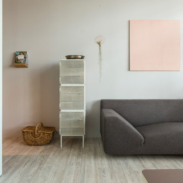
 Vij5
Vij5 A series of distinctive cupboards, specially designed around the material NewspaperWood, characterized by a sound and finely detailed construction.
NewspaperWood is a new material invented by Mieke Meijer, developed together with the Dutch design label Vij5 and now produced and distributed by a new NewspaperWood company. It returns newspapers, which are made from wood, into wood again. When a NewspaperWood log is cut, the layers of paper appear like lines of a wood grain or the rings of a tree and therefore resemble the aesthetic of real wood.
Breg Hanssen, the designer of the Framed cabinet, was fascinated especially by the indeterminable but distinct colour of the NewspaperWood material. To emphasize this quality he decided to incorporate NewspaperWood into a piece of furniture by combining it with contrasting colours. With this he literally ‘frames’ the material in coated steel. The cabinets are build out of a solid steel frame which can be delivered in different variations and colours.
design by Breg Hanssen
photo credits by Jeroen van der Wielen
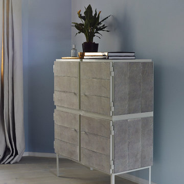 Vij5
Vij5A series of distinctive cupboards, specially designed around the material NewspaperWood, characterized by a sound and finely detailed construction.
NewspaperWood is a new material invented by Mieke Meijer, developed together with the Dutch design label Vij5 and now produced and distributed by a new NewspaperWood company. It returns newspapers, which are made from wood, into wood again. When a NewspaperWood log is cut, the layers of paper appear like lines of a wood grain or the rings of a tree and therefore resemble the aesthetic of real wood.
Breg Hanssen, the designer of the Framed cabinet, was fascinated especially by the indeterminable but distinct colour of the NewspaperWood material. To emphasize this quality he decided to incorporate NewspaperWood into a piece of furniture by combining it with contrasting colours. With this he literally ‘frames’ the material in coated steel. The cabinets are build out of a solid steel frame which can be delivered in different variations and colours.
design by Breg Hanssen
photo credits by 19 Greek Street, photography by Jamie McGregor Smith
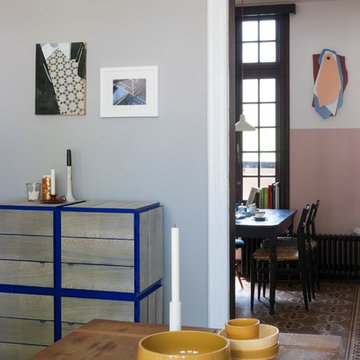 Vij5
Vij5A series of distinctive cupboards, specially designed around the material NewspaperWood, characterized by a sound and finely detailed construction.
NewspaperWood is a new material invented by Mieke Meijer, developed together with the Dutch design label Vij5 and now produced and distributed by a new NewspaperWood company. It returns newspapers, which are made from wood, into wood again. When a NewspaperWood log is cut, the layers of paper appear like lines of a wood grain or the rings of a tree and therefore resemble the aesthetic of real wood.
Breg Hanssen, the designer of the Framed cabinet, was fascinated especially by the indeterminable but distinct colour of the NewspaperWood material. To emphasize this quality he decided to incorporate NewspaperWood into a piece of furniture by combining it with contrasting colours. With this he literally ‘frames’ the material in coated steel. The cabinets are build out of a solid steel frame which can be delivered in different variations and colours.
design by Breg Hanssen
photo credits by Helder, photography by Liesbet Goetschalckx
 Well Arranged Home
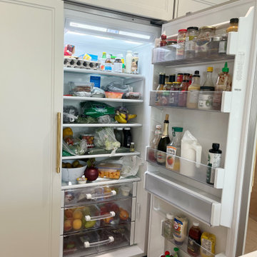
This fridge was a classic case of chaos: groceries stacked without rhyme or reason, forgotten items buried in the back, and no clear zones for different categories. Finding what you need (before it expired) was a daily struggle. It was time for a fresh start—literally!

 Luxury Antonovich Design AE
Classical style does not lose its relevance for centuries. Particularly classics is able to fully reflect skills of an interior designer. Kateryna Antonovich offered a refined and sophisticated luxury motives for villas in the UAE. Interior literally attracts the eye, and it can be admired forever. The decor has all traditional elements. The ceilings are decorated with stucco, which plays wonderful light with crystal chandeliers. Restrained motives in the walls decoration are perfectly compensated with artists' pictures. Furniture plays a special role in this project. Luxury sofas upholstered in noble silk and supplemented with charming golden fringe. Furniture items of valuable species wood are inlaid with handmade carved decor with gold. Villa Design in the United Arab Emirates emphasizes kindness and hospitality of the owners. A spacious dining room was a continuation of a cozy living room. A large dining table is surrounded by chairs with noble backs, which are covered with textile with printed patterns. To zone the space and place accents, the interior designer uses floor and ceiling decoration. The floors are made of natural wood decorated with fanciful carved patterns of different species materials. Modern interior design from LUXURY ANTONOVICH DESIGN STUDIO combines traditions and the latest technology. 3D projects visualizations, which are created with the latest software allows in details to see the future luxurious interior.

Sponsored
Columbus, OH

Hope Restoration & General Contracting
Columbus Design-Build, Kitchen & Bath Remodeling, Historic Renovations
 Drury Design
THE SETUP
This client lives in a great high-rise condo in downtown Chicago. Alicia has already remodeled a few areas of her home, including her kitchen and home office. The bathroom is one of the last big places the client wanted to update. The existing bathroom had a large, outdated whirlpool tub in the corner. It was a darker space that had a lack of natural light. There are no windows (due to the bathroom’s location within the high-rise building). So, the idea was to brighten up the space and give the client an updated, elegant primary bathroom that is more her style and tailor-made for her routines.
Design Objectives:
- Make the space brighter.
- Create different daily routine stations to maximize functionality while keeping things clutter-free – a makeup station, a blow-dry station, and a sink-needs station.
- Achieve the client’s specific style and function needs while also keeping the look and design open to future possibilities: different users of the space/resale clients.
Design Challenges:
- Toilet cannot be moved. (In a high-rise, you can’t really move plumbing around too much when reimagining a space)
- Existing bathroom had a soffit that hid a lot of electrical wiring, so completely removing the soffit wasn’t an option.
- The blow-dry station needs to accommodate the client’s preference for standing up.
- Finding a place for the make-up station, which the client wants oriented for sitting.
- Create storage within the shower that can eliminate the clutter of personal care products that are actually needed every day. Do this, while keeping the client’s favorite things about the existing shower: the shower bench, a tub filler faucet (for rinsing shaving cream when shaving legs) and a low niche for placing her foot when shaving her legs.
THE RENEWED SPACE
Design Solutions:
- Extended a bit of wall near the toilet to give the commode its own area within the space, but without closing it off into a claustrophobic WC.
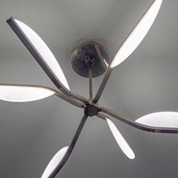
- Worked within the reality of the existing soffit situation, reshaping it to align with the new shower. Can lights were also added. Installed a beautiful ceiling light fixture that works within the new soffit shape, commanding attention and adding light, as if the sofit shape was chosen for it.
- Created a nice, furniture-looking 42”-high cabinet with pullout drawers to be the blow-dry station, complete with a mirror and a nice top. The pullout drawers are all powered, concealing a Dyson dryer and curling iron (and all the accoutrements) while keeping them plugged in, which is ideal for easy usage and put away. A stylish mirror on the wall above the cabinet, and proper lighting, make this the perfect blow-dry station. The top has a grommet that can accommodate a power cord should the client ever want to have a powered device on top of the cabinet.
- Put the sit-down makeup station where the tub used to be, putting the mirror back into a new recessed wall just a bit, allowing the area to have more room.
- Created a niche in the shower’s inner wall so that you can’t see it unless you are literally inside the shower. At the client’s request, it also has a hook so she can hang her loofa. Hiding the utility niche in this way allowed us to use the full main wall of the shower as a canvas for a beautiful accent stripe of raised decorative tile. The new shower has her old favorites, too: the tub filler, foot niche and bench.
Alicia’s client loves her new primary bathroom, especially the blow dry area. It is very accommodating for her, as a tall lady, while being very easy to use. The drawers store everything. Being powered, they make using already-plugged in appliances very easy to use and put away.
Her previous makeup station was a freestanding vanity with a single drawer, so beauty products were all over the surface top. With her new makeup station, everything is nicely tucked away and organized in drawers.
The new lighting is fantastic and the colors are light and soft. The clients loves the overall look and feel of her new bathroom and raves about how well the functionality-minded design makes her morning routine – and her life – easier and enjoyable!
 Oleg Klodt Architecture & Design
Frank Herfort
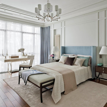
Inspiration for a transitional guest dark wood floor and brown floor bedroom remodel in Moscow with beige walls
Inspiration for a transitional guest dark wood floor and brown floor bedroom remodel in Moscow with beige walls

 Murphy Bros. Design | Build | Remodel
This remodel started out as a simple deck replacement. Most, strike that, ALL remodels have a tendency to start out with a conclusion. They tell us they want a new this or that. Simple right? And insufficient for the task at hand. That's when we start digging. We started asking why. And we keep asking. We do that to uncover the real motivation and desires that need to be satisfied. It’s how we define a meaningful scope of work.
Almost anyone can slap on a new countertop or replace an old deck. But if you want a new space that literally changes the way you live, that’s on a whole different level.
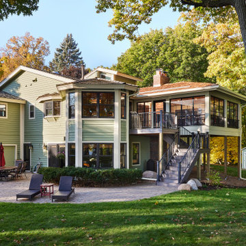
After several lengthy conversations, these homeowners realized they wanted something that was more of a living space they could use most of the year. But they also wanted it to be integrated into the surrounding nature and reflect the unique eclectic architecture of the house. And of course, they love to entertain, so it had to be inviting, comfortable, and mosquito-free.
Initial conclusion: we want a new deck. Final scope and design: we gave them a 3 ½ season bug-free porch with a panoramic view, a breeze on command, and a tree house to entertain in.
The Sunspace venting panels (not glass) provide unobstructed views with collapsible screens in multiple configurations to control the amount of airflow into the porch. The 18 x 20 footprint is large enough for large gatherings. The decking inside is Dektek concrete tiles with a beautiful stunning glaze and remarkable durability. On the outside, it's Wolf synthetic decking made of 94% recycled materials.
Sponsored
Sunbury, OH

J.Holderby - Renovations
Franklin County's Leading General Contractors - 2X Best of Houzz!
 Drury Design
THE SETUP
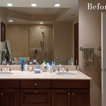
This client lives in a great high-rise condo in downtown Chicago. Alicia has already remodeled a few areas of her home, including her kitchen and home office. The bathroom is one of the last big places the client wanted to update. The existing bathroom had a large, outdated whirlpool tub in the corner. It was a darker space that had a lack of natural light. There are no windows (due to the bathroom’s location within the high-rise building). So, the idea was to brighten up the space and give the client an updated, elegant primary bathroom that is more her style and tailor-made for her routines.
Design Objectives:
- Make the space brighter.
- Create different daily routine stations to maximize functionality while keeping things clutter-free – a makeup station, a blow-dry station, and a sink-needs station.
- Achieve the client’s specific style and function needs while also keeping the look and design open to future possibilities: different users of the space/resale clients.
Design Challenges:
- Toilet cannot be moved. (In a high-rise, you can’t really move plumbing around too much when reimagining a space)
- Existing bathroom had a soffit that hid a lot of electrical wiring, so completely removing the soffit wasn’t an option.
- The blow-dry station needs to accommodate the client’s preference for standing up.
- Finding a place for the make-up station, which the client wants oriented for sitting.
- Create storage within the shower that can eliminate the clutter of personal care products that are actually needed every day. Do this, while keeping the client’s favorite things about the existing shower: the shower bench, a tub filler faucet (for rinsing shaving cream when shaving legs) and a low niche for placing her foot when shaving her legs.
THE RENEWED SPACE
Design Solutions:
- Extended a bit of wall near the toilet to give the commode its own area within the space, but without closing it off into a claustrophobic WC.
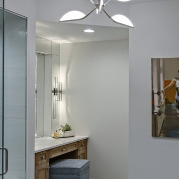
- Worked within the reality of the existing soffit situation, reshaping it to align with the new shower. Can lights were also added. Installed a beautiful ceiling light fixture that works within the new soffit shape, commanding attention and adding light, as if the sofit shape was chosen for it.
- Created a nice, furniture-looking 42”-high cabinet with pullout drawers to be the blow-dry station, complete with a mirror and a nice top. The pullout drawers are all powered, concealing a Dyson dryer and curling iron (and all the accoutrements) while keeping them plugged in, which is ideal for easy usage and put away. A stylish mirror on the wall above the cabinet, and proper lighting, make this the perfect blow-dry station. The top has a grommet that can accommodate a power cord should the client ever want to have a powered device on top of the cabinet.
- Put the sit-down makeup station where the tub used to be, putting the mirror back into a new recessed wall just a bit, allowing the area to have more room.
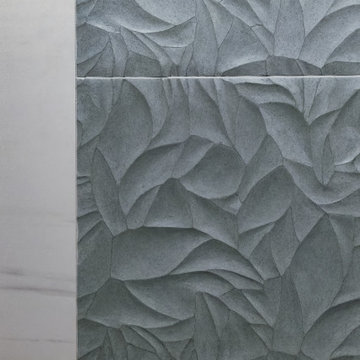
- Created a niche in the shower’s inner wall so that you can’t see it unless you are literally inside the shower. At the client’s request, it also has a hook so she can hang her loofa. Hiding the utility niche in this way allowed us to use the full main wall of the shower as a canvas for a beautiful accent stripe of raised decorative tile. The new shower has her old favorites, too: the tub filler, foot niche and bench.
Alicia’s client loves her new primary bathroom, especially the blow dry area. It is very accommodating for her, as a tall lady, while being very easy to use. The drawers store everything. Being powered, they make using already-plugged in appliances very easy to use and put away.
Her previous makeup station was a freestanding vanity with a single drawer, so beauty products were all over the surface top. With her new makeup station, everything is nicely tucked away and organized in drawers.
The new lighting is fantastic and the colors are light and soft. The clients loves the overall look and feel of her new bathroom and raves about how well the functionality-minded design makes her morning routine – and her life – easier and enjoyable!
 Drury Design
THE SETUP
This client lives in a great high-rise condo in downtown Chicago. Alicia has already remodeled a few areas of her home, including her kitchen and home office. The bathroom is one of the last big places the client wanted to update. The existing bathroom had a large, outdated whirlpool tub in the corner. It was a darker space that had a lack of natural light. There are no windows (due to the bathroom’s location within the high-rise building). So, the idea was to brighten up the space and give the client an updated, elegant primary bathroom that is more her style and tailor-made for her routines.
Design Objectives:
- Make the space brighter.
- Create different daily routine stations to maximize functionality while keeping things clutter-free – a makeup station, a blow-dry station, and a sink-needs station.
- Achieve the client’s specific style and function needs while also keeping the look and design open to future possibilities: different users of the space/resale clients.
Design Challenges:
- Toilet cannot be moved. (In a high-rise, you can’t really move plumbing around too much when reimagining a space)
- Existing bathroom had a soffit that hid a lot of electrical wiring, so completely removing the soffit wasn’t an option.
- The blow-dry station needs to accommodate the client’s preference for standing up.
- Finding a place for the make-up station, which the client wants oriented for sitting.
- Create storage within the shower that can eliminate the clutter of personal care products that are actually needed every day. Do this, while keeping the client’s favorite things about the existing shower: the shower bench, a tub filler faucet (for rinsing shaving cream when shaving legs) and a low niche for placing her foot when shaving her legs.
THE RENEWED SPACE
Design Solutions:
- Extended a bit of wall near the toilet to give the commode its own area within the space, but without closing it off into a claustrophobic WC.
- Worked within the reality of the existing soffit situation, reshaping it to align with the new shower. Can lights were also added. Installed a beautiful ceiling light fixture that works within the new soffit shape, commanding attention and adding light, as if the sofit shape was chosen for it.
- Created a nice, furniture-looking 42”-high cabinet with pullout drawers to be the blow-dry station, complete with a mirror and a nice top. The pullout drawers are all powered, concealing a Dyson dryer and curling iron (and all the accoutrements) while keeping them plugged in, which is ideal for easy usage and put away. A stylish mirror on the wall above the cabinet, and proper lighting, make this the perfect blow-dry station. The top has a grommet that can accommodate a power cord should the client ever want to have a powered device on top of the cabinet.
- Put the sit-down makeup station where the tub used to be, putting the mirror back into a new recessed wall just a bit, allowing the area to have more room.
- Created a niche in the shower’s inner wall so that you can’t see it unless you are literally inside the shower. At the client’s request, it also has a hook so she can hang her loofa. Hiding the utility niche in this way allowed us to use the full main wall of the shower as a canvas for a beautiful accent stripe of raised decorative tile. The new shower has her old favorites, too: the tub filler, foot niche and bench.
Alicia’s client loves her new primary bathroom, especially the blow dry area. It is very accommodating for her, as a tall lady, while being very easy to use. The drawers store everything. Being powered, they make using already-plugged in appliances very easy to use and put away.
Her previous makeup station was a freestanding vanity with a single drawer, so beauty products were all over the surface top. With her new makeup station, everything is nicely tucked away and organized in drawers.
The new lighting is fantastic and the colors are light and soft. The clients loves the overall look and feel of her new bathroom and raves about how well the functionality-minded design makes her morning routine – and her life – easier and enjoyable!
 Drury Design
THE SETUP
This client lives in a great high-rise condo in downtown Chicago. Alicia has already remodeled a few areas of her home, including her kitchen and home office. The bathroom is one of the last big places the client wanted to update. The existing bathroom had a large, outdated whirlpool tub in the corner. It was a darker space that had a lack of natural light. There are no windows (due to the bathroom’s location within the high-rise building). So, the idea was to brighten up the space and give the client an updated, elegant primary bathroom that is more her style and tailor-made for her routines.
Design Objectives:
- Make the space brighter.
- Create different daily routine stations to maximize functionality while keeping things clutter-free – a makeup station, a blow-dry station, and a sink-needs station.
- Achieve the client’s specific style and function needs while also keeping the look and design open to future possibilities: different users of the space/resale clients.
Design Challenges:
- Toilet cannot be moved. (In a high-rise, you can’t really move plumbing around too much when reimagining a space)
- Existing bathroom had a soffit that hid a lot of electrical wiring, so completely removing the soffit wasn’t an option.
- The blow-dry station needs to accommodate the client’s preference for standing up.
- Finding a place for the make-up station, which the client wants oriented for sitting.
- Create storage within the shower that can eliminate the clutter of personal care products that are actually needed every day. Do this, while keeping the client’s favorite things about the existing shower: the shower bench, a tub filler faucet (for rinsing shaving cream when shaving legs) and a low niche for placing her foot when shaving her legs.
THE RENEWED SPACE
Design Solutions:
- Extended a bit of wall near the toilet to give the commode its own area within the space, but without closing it off into a claustrophobic WC.
- Worked within the reality of the existing soffit situation, reshaping it to align with the new shower. Can lights were also added. Installed a beautiful ceiling light fixture that works within the new soffit shape, commanding attention and adding light, as if the sofit shape was chosen for it.
- Created a nice, furniture-looking 42”-high cabinet with pullout drawers to be the blow-dry station, complete with a mirror and a nice top. The pullout drawers are all powered, concealing a Dyson dryer and curling iron (and all the accoutrements) while keeping them plugged in, which is ideal for easy usage and put away. A stylish mirror on the wall above the cabinet, and proper lighting, make this the perfect blow-dry station. The top has a grommet that can accommodate a power cord should the client ever want to have a powered device on top of the cabinet.
- Put the sit-down makeup station where the tub used to be, putting the mirror back into a new recessed wall just a bit, allowing the area to have more room.
- Created a niche in the shower’s inner wall so that you can’t see it unless you are literally inside the shower. At the client’s request, it also has a hook so she can hang her loofa. Hiding the utility niche in this way allowed us to use the full main wall of the shower as a canvas for a beautiful accent stripe of raised decorative tile. The new shower has her old favorites, too: the tub filler, foot niche and bench.
Alicia’s client loves her new primary bathroom, especially the blow dry area. It is very accommodating for her, as a tall lady, while being very easy to use. The drawers store everything. Being powered, they make using already-plugged in appliances very easy to use and put away.
Her previous makeup station was a freestanding vanity with a single drawer, so beauty products were all over the surface top. With her new makeup station, everything is nicely tucked away and organized in drawers.
The new lighting is fantastic and the colors are light and soft. The clients loves the overall look and feel of her new bathroom and raves about how well the functionality-minded design makes her morning routine – and her life – easier and enjoyable!
9