
Search results for "Litre difference" in Home Design Ideas
 Robin's Nest Interiors
Updated Spec Home: Basement Living Area
I promised you there would be a Season 2 of our series Updated Spec Home and here it is – Basement Family Room. My mom and sister found themselves spending more and more time in this room because it was a great open space to watch television and hang out with my sister’s two border collies.
Color Scheme
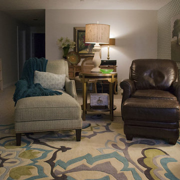
We pulled our color scheme from a floral fabric that they saw on a chair at my store, and we used it to reupholster their existing wood accent chairs. We used pops of turquoise and green throughout the space including the long back wall which was perfect to make a feature with this vibrant wallpaper in a geometric design.
Defining the Space
The room was so large that we needed to define different areas. The large rug in the oversized pattern was perfect for the seating area.
Lighting
Since there is only one small window bringing natural light into the space, we painted the remaining walls a light warm gray (Sherwin Williams’ City Loft SW7631) and added several table lamps and a floor lamp for task lighting.
Reusing Existing Furniture
Fortunately the space was large enough so my sister could keep her fabulous worn leather chair and ottoman and my mom could have an upholstered chair and ottoman in a subtle blue and green tweed.
The large hallway leading to the storage area was the perfect place for these small bookcases which house family photos in various silver frames. The bookcases have a special place in our hearts – they belonged to my grandparents. We accessorized with a long painted box which was the perfect scale for the bookcases and a grouping of vibrant botanical prints.
In lieu of a conventional media cabinet, my mom and sister found this one with a built-in fireplace. It brings a lot of warmth into the space – literally!
Painted Furniture
We had Kelly Sisler of Kelly Faux Creations paint their existing glass front cabinet this awesome apple green. Accessories include turquoise floral vases, a metallic circular vase, and a beautiful floral print.
Reading Nook
We positioned this original oil painting in the landing so it would be visible from the seating area. The landing was the perfect spot to display my sister’s collection of art glass. I love the small reading nook created with this rattan wooden accent chair and lantern floor lamp. We were able to make good use of the ledge in the stairwell by leaning these vibrant watercolors.
The dogs even have their own space. Meet my two “nephews” – Dill and Atticus (the one with his back to us pouting). We used this colorful oversized canvas to define their space and break up the long wall.
As you know, one good thing leads to another. Be sure to tune in next week for a surprise addition to this Updated Spec Home. In the meantime, check out this Basement Family Room designed by Robin’s Nest Interiors. Enjoy!
 Advance Design Studio, Ltd.
The couple who embarked on this Lake Zurich Illinois home renovation spent years planning a move from Virginia to the rolling hills of Northern Illinois when their first grandchild was born. Wanting to be closer to their grown children so they could enjoy their new role, they first embarked upon finding the right realtor and the right home. They settled on the “perfect” home; perfect that is to transform.
The seriously outdated 1,800 square foot ranch had a closed outdated kitchen, 3 bedrooms, a living room with a fireplace, a full basement and 2 baths. Although it had “good bones”, it was straight out of a builder’s catalog with wall to wall carpet, standard tile and honey oak everywhere you looked. But this couple had big plans for this home.
In tandem with their home purchase, they began the search for the just the right renovation company. The team they chose needed to be cohesive, as the whole house renovation would be designed hundreds of miles from their home several states away. She found Advance Design Studio, Ltd. online, and was quickly enamored by the team and by Common Sense Remodeling, simply by studying the website. Her decision to choose Advance Design to partner on this complete ranch renovation was confirmed quickly upon her first face to face meeting with owner Todd Jurs, and later by Advance’s designer, Nicole Ryan.
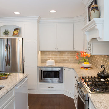
Three bedrooms were converted into a one master suite with ample bath and walk in closet, laundry, and a 2nd multi-purpose room designed for movies and entertainment, a home office, and a guest room all in one. A doorway leading to the garage was reconfigured to create a foyer area, and allowed for a better flow to an open modern kitchen complete with a large island for cooking and entertaining, which included a wide bench seat overlooking the back yard and opening onto an eating area flanked with a fireplace and TV.
The piece de resistance culminated with 3 walls of full glass anchored by a striking fireplace in the new four season’s room where the homeowners enjoy coffee every morning while gazing at the current day’s mid-western landscape. The open floorplan encourages living in “one space” throughout the day.
Ryan worked with the couple remotely, exchanging 3D color renderings and floorplans with detailed budget updates until the project took on the very image they had envisioned. “Working with them was a change from our normal meeting process since they were literally in a different state. We conducted meetings by phone, while reviewing materials and drawings via computer. It was a fun process that necessitated lots of detail and careful coordination, but we made it happen and the process was as smooth as if they were right here like normal”, says Nicole. During a stressful time planning their move, the constant interaction with Nicole assured the couple that all was being addressed by the Advance team and they could relax and focus on other important things (like moving cross country).
The new master bath incorporated heated flooring, a walk in shower with seating and custom shower niches, and an elegant double sink vanity with ample space for two. “The layout of each of the rooms is exactly what I envisioned,” the client said. “Advance’s attention to details such as light switch placement, electrical outlets, and many other minute details you wouldn’t even think of was the icing on the cake. If I didn’t think of it first, they certainly did,” said the happy homeowner. Small details like the crown molding, the custom designed fireplace mantle, the under-cabinet lighting and etched door glass, and even subtle rhinestones shimmering like delicate jewelry in the tile backsplash brought the whole project together. The clients were extremely happy with the way the Advance team made sure these small things were executed perfectly.
“It’s just gorgeous,” they said at a celebratory event in their home hosted shortly after completion for the entire Advance Design team that made it happen. “The entire crew at Advance Design was a pleasure to work with. We couldn’t have done this with a lesser team,” they concluded.
 TKS Design Group
Free ebook, Creating the Ideal Kitchen. DOWNLOAD NOW
Collaborations are typically so fruitful and this one was no different. The homeowners started by hiring an architect to develop a vision and plan for transforming their very traditional brick home into a contemporary family home full of modern updates. The Kitchen Studio of Glen Ellyn was hired to provide kitchen design expertise and to bring the vision to life.
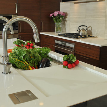
The bamboo cabinetry and white Ceasarstone countertops provide contrast that pops while the white oak floors and limestone tile bring warmth to the space. A large island houses a Galley Sink which provides a multi-functional work surface fantastic for summer entertaining. And speaking of summer entertaining, a new Nana Wall system — a large glass wall system that creates a large exterior opening and can literally be opened and closed with one finger – brings the outdoor in and creates a very unique flavor to the space.
Matching bamboo cabinetry and panels were also installed in the adjoining family room, along with aluminum doors with frosted glass and a repeat of the limestone at the newly designed fireplace.
Designed by: Susan Klimala, CKD, CBD
Photography by: Carlos Vergara
For more information on kitchen and bath design ideas go to: www.kitchenstudio-ge.com
Find the right local pro for your project
 AMLD INTERIOR INC
AM4244 LUSTROUS AURA
FEATURED:
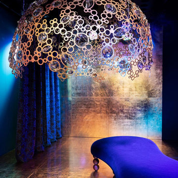
The jewel in the crown—quite literally—of Tord Boontje’s Luminous Reflections chandelier collection., Lustrous Aura was inspired by a spectacular piece created for Mrs Hari. This huge (nearly 1.60 meters) domed chandelier echoes the bejeweled headdress created as a costume piece for a Mata Hari performance. Said to have used her feminine wiles to aid her work as a WWI spy, the fabled exotic dancer and courtesan was the embodiment of dazzling glamour. A selection of Boontje’s new crystal components is suspended in its filigree frame (available in polished gold or matt silver LDF) to give the appearance of an outsize piece of jewelry. Like its inspiration, Lustrous Aura is breathtaking in both its daring and its beauty. The charismatic presence and dramatic proportions of this signature piece make it ideally suited to larger spaces. And the neutral white light (4000K) is dimmable, all while throwing out myriad dancing shards around a room. Another standout feature is its innovative LED solution, where the technology integrates the electrical conductors into the structural suspension system, providing power without the need for a dedicated, visible electrical cable.
SPECIFICATIONS:
Collection: Contemporary
Size: 62” Wide x 40” Height (Custom sizes also available)
Shape: Crown
Frame Finish: Polished Gold (Different finish options available at no additional cost)
Extension: Adjustable cables for a customizable length up to 12 ft
Materials: Metal, Crystal
Weight: 110lbs
Bulbs: Ballast: 220-240 V 50/60 Hz, 63 W
Assembly: Fully assembled
Dimmer Switch Compatible: Optional
Shipping: LTL
Rush Order: 4-6 Weeks; 15% added to the total
Regular Lead Time: 6-10 Weeks
Warranty: 5 Years Full Coverage (includes replacement parts)
SIZE OPTIONS:
Size: Price:
18” Wide x 14” Height 1,903.00
24” Wide x 16” Height $2,628.00
32” Wide x 18” Height $3,337.00
42” Wide x 20” Height $4,852.00
52” Wide x 30” Height $6,131.00
62” Wide x 40” Height $8,485.00
72” Wide x 50” Height $10,405.00
CUSTOM SIZES, FINISHES, COLORS AVAILABLE UPON REQUEST
Custom Sizes, Finishes, Colors available upon request
 Vintage Cellars & Saunas
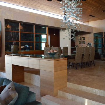
This is the contemporary home in San Diego where we installed the custom wine cellar. We were able to create a design that matched woodwork and glass of the space.
An existing wine cellar in a La Jolla, San Diego home was expanded to accommodate the growing collection of the owner.
We worked on this project twice. The first installation was completed in 2008. After about 5 years, the client requested us to double the capacity of their wine room, but maintain the contemporary design.
We added new sections to the existing racking to provide additional space for more wines. Stunning Wine Cellar for a Contemporary Home
We completed a wine cellar installation project in La Jolla, an affluent city of San Diego, California, where we had to match the contemporary design of the home. The beautiful residential space was originally built with glass and wood.
All the woodworking was constructed from Sapele Mahogany, which is common in many parts of the house. The cabinetry and furniture had to be the same tone and material.
We have worked on this project twice. The first time was in 2008 and the second one was in 2013. We needed to expand and double the size of the custom wine cellar.
A very integral part of this homeowner’s life is their wine and the collecting of wine. Our main goal was to create a racking design that consists of various orientations to allow the owner to store different sizes of bottles.
Racking Features of the La Jolla Custom Wine Cellar
The original room was constructed when the home was built. The architect, designing team, and contractor gave us a palette to match the existing cabinetry.
The owners didn’t know what their needs were going to be. When they buy cases of wine, for example, they just put some of the bottles in the diamond bins and some in individual bottle spaces.
In 2013, we tried to make the racking as universal as possible. The original capacity of the wine room was 1,100 bottles. It increased to 1,624 after the expansion of the space and adding more wine racks.
Elevation 1
The first area of the room consists of racking for individual storage at the top section, with a VC-style cover for concealing the evaporator. There are diamond bins in the middle that can store nine bottles in each opening.
We added many slots for large format bottles below the diamond bins because the owners stored bigger bottles in the first room, as big as 9 liters. What we did was to open up a couple of spaces to create a wider wine storage area.
The whole racking in this area has a solid end panel. We took out the vertical supports and put the beam supports across to bear the load.
We incorporated a coved tray feature to allow the owners to get a feel for the beautiful bottles in their collection. The large format bottles are stored in various heights, resulting in a cascading wine display. This style of racking allows for easy visibility of the wine labels. We installed LED lighting above this area to illuminate the space dramatically without emitting too much heat.
Elevation 2
The next racking is labeled Elevation 2, which is the left wall that you will pass by before you go into the other storage area. It consists of horizontal display racks that can store both standard and larger bottles. These display racks, which are 8 ¼” deep, were installed with lighting and mirror at the back.
The middle section has two glass shelves that provide an area for the client’s wine cellar accessories and mini car collection.
Elevation 3
On the 3rd Elevation, the top racking includes slots with twelve coved trays and six solid backs. We added new individual column wine racks, and custom cabinets with scalloped neck supports to the existing cabinetry. Now, the total capacity of the individual bottle racking is 384, and the custom cabinets can accommodate 34 bottles.
There is a double deep Sapele Mahogany tabletop where we installed very large steel supports under it. This will provide structural stability for bearing the weight of this big case storage area. The homeowner buys a lot of wine, so he wanted to have an area where he could stack all the boxes.
He didn’t want the boxes to occupy the area at the front. With this feature, he could just bring the wines directly to this storage area, without affecting the aesthetic appeal of the front entrance of his La Jolla custom wine cellar.
Elevations 4 and 5
The next wall is Elevation 4, which consists of wine racks for 98 magnum bottles. The top most section has a VC-style evaporator cover.
Elevation 5 (in front of elevation 3), had twelve coved trays, 16-bottle custom cabinets with scalloped neck supports, and one hundred eighty individual storage slots.
After adding new sections, we ended up having sixteen coved trays, 26-bottle custom cabinets, and 288 individual bottle racking.
Rolling Ladder for Easy Access of Wines
Another factor that we consider when designing a wine room is the convenience in accessing the bottles. Since the ceiling of this La Jolla custom wine cellar was tall (about 124” height), we added a hook rolling ladder.
A hook ladder has fixtures that allow it to slide along the rail and can be lifted off the rail if you want to transfer it to another section of the racking on a different wall.
Vintage Cellars has built gorgeous custom wine cellars and wine storage rooms across the United States and World for over 25 years. We are your go-to business for anything wine cellar and wine storage related! Whether you're interested in a wine closet, wine racking, custom wine racks, a custom wine cellar door, or a cooling system for your existing space, Vintage Cellars has you covered!
We carry all kinds of wine cellar cooling and refrigeration systems, incuding: Breezaire, CellarCool, WhisperKool, Wine Guardian, CellarPro and Commercial systems.
We also carry many types of Wine Refrigerators, Wine Cabinets, and wine racking types, including La Cache, Marvel, N'Finity, Transtherm, Vinotheque, Vintage Series, Credenza, Walk in wine rooms, Climadiff, Riedel, Fontenay, and VintageView.
Vintage Cellars also does work in many styles, including Contemporary and Modern, Rustic, Farmhouse, Traditional, Craftsman, Industrial, Mediterranean, Mid-Century, Industrial and Eclectic.
Some locations we cover often include: San Diego, Rancho Santa Fe, Corona Del Mar, Del Mar, La Jolla, Newport Beach, Newport Coast, Huntington Beach, Del Mar, Solana Beach, Carlsbad, Orange County, Beverly Hills, Malibu, Pacific Palisades, Santa Monica, Bel Air, Los Angeles, Encinitas, Cardiff, Coronado, Manhattan Beach, Palos Verdes, San Marino, Ladera Heights, Santa Monica, Brentwood, Westwood, Hancock Park, Laguna Beach, Crystal Cove, Laguna Niguel, Torrey Pines, Thousand Oaks, Coto De Caza, Coronado Island, San Francisco, Danville, Walnut Creek, Marin, Tiburon, Hillsborough, Berkeley, Oakland, Napa, Sonoma, Agoura Hills, Hollywood Hills, Laurel Canyon, Sausalito, Mill Valley, San Rafael, Piedmont, Paso Robles, Carmel, Pebble Beach
Contact Vintage Cellars today with any of your Wine Cellar needs!
(800) 876-8789
 Bilotta Kitchen & Home
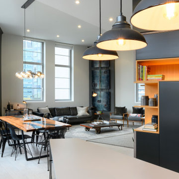
A daring combination of forms and finishes yielded an exciting contemporary/industrial hybrid. In a converted wedge-shaped factory building, this loft’s quirky shape was celebrated, not disguised. Contrasting flooring demarcates what is, in fact, a literal work triangle. The island’s unusual five-sided shape proudly reiterates the room’s footprint; the three waterfall ends accentuate its one-of-a-kind geometry. Four different materials were chosen to establish a playful dialogue between light, dark, and texture: caramel-stained rift cut oak on open cabinets; matte charcoal gray paint on tall and wall cabinets; brushed bronze oil-rubbed wire mesh inserts for bases; and panels in a laminate resembling knotty weathered wood. White quartz countertops provide a unifying feature. Open cabinets are singular for their asymmetrical placement and, in some spots, open-ended configuration within the tall units.
The breathtaking dining table was fashioned from two free-form live edge planks, joined by a ribbon of clear epoxy resin, thus creating the illusion of a stream meandering through fallen trees. Black elements contribute an industrial edge: an open-framed metal wall shelf over the sink; iron table legs; a mix of dining chairs in mid-century wire mesh, molded plastic, and retro aluminum; and machinery castors on the low-slung coffee table.
This project was designed by Bilotta Designer Daniel Popescu in collaboration with MeldNYC. Photography is by Nico Arellano.
 Drury Design
THE SETUP
This client lives in a great high-rise condo in downtown Chicago. Alicia has already remodeled a few areas of her home, including her kitchen and home office. The bathroom is one of the last big places the client wanted to update. The existing bathroom had a large, outdated whirlpool tub in the corner. It was a darker space that had a lack of natural light. There are no windows (due to the bathroom’s location within the high-rise building). So, the idea was to brighten up the space and give the client an updated, elegant primary bathroom that is more her style and tailor-made for her routines.
Design Objectives:
- Make the space brighter.
- Create different daily routine stations to maximize functionality while keeping things clutter-free – a makeup station, a blow-dry station, and a sink-needs station.
- Achieve the client’s specific style and function needs while also keeping the look and design open to future possibilities: different users of the space/resale clients.
Design Challenges:
- Toilet cannot be moved. (In a high-rise, you can’t really move plumbing around too much when reimagining a space)
- Existing bathroom had a soffit that hid a lot of electrical wiring, so completely removing the soffit wasn’t an option.
- The blow-dry station needs to accommodate the client’s preference for standing up.
- Finding a place for the make-up station, which the client wants oriented for sitting.
- Create storage within the shower that can eliminate the clutter of personal care products that are actually needed every day. Do this, while keeping the client’s favorite things about the existing shower: the shower bench, a tub filler faucet (for rinsing shaving cream when shaving legs) and a low niche for placing her foot when shaving her legs.
THE RENEWED SPACE
Design Solutions:
- Extended a bit of wall near the toilet to give the commode its own area within the space, but without closing it off into a claustrophobic WC.
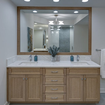
- Worked within the reality of the existing soffit situation, reshaping it to align with the new shower. Can lights were also added. Installed a beautiful ceiling light fixture that works within the new soffit shape, commanding attention and adding light, as if the sofit shape was chosen for it.
- Created a nice, furniture-looking 42”-high cabinet with pullout drawers to be the blow-dry station, complete with a mirror and a nice top. The pullout drawers are all powered, concealing a Dyson dryer and curling iron (and all the accoutrements) while keeping them plugged in, which is ideal for easy usage and put away. A stylish mirror on the wall above the cabinet, and proper lighting, make this the perfect blow-dry station. The top has a grommet that can accommodate a power cord should the client ever want to have a powered device on top of the cabinet.
- Put the sit-down makeup station where the tub used to be, putting the mirror back into a new recessed wall just a bit, allowing the area to have more room.
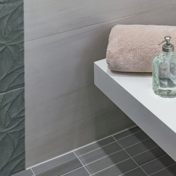
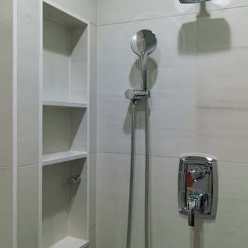
- Created a niche in the shower’s inner wall so that you can’t see it unless you are literally inside the shower. At the client’s request, it also has a hook so she can hang her loofa. Hiding the utility niche in this way allowed us to use the full main wall of the shower as a canvas for a beautiful accent stripe of raised decorative tile. The new shower has her old favorites, too: the tub filler, foot niche and bench.
Alicia’s client loves her new primary bathroom, especially the blow dry area. It is very accommodating for her, as a tall lady, while being very easy to use. The drawers store everything. Being powered, they make using already-plugged in appliances very easy to use and put away.
Her previous makeup station was a freestanding vanity with a single drawer, so beauty products were all over the surface top. With her new makeup station, everything is nicely tucked away and organized in drawers.
The new lighting is fantastic and the colors are light and soft. The clients loves the overall look and feel of her new bathroom and raves about how well the functionality-minded design makes her morning routine – and her life – easier and enjoyable!

 Drury Design
THE SETUP
This client lives in a great high-rise condo in downtown Chicago. Alicia has already remodeled a few areas of her home, including her kitchen and home office. The bathroom is one of the last big places the client wanted to update. The existing bathroom had a large, outdated whirlpool tub in the corner. It was a darker space that had a lack of natural light. There are no windows (due to the bathroom’s location within the high-rise building). So, the idea was to brighten up the space and give the client an updated, elegant primary bathroom that is more her style and tailor-made for her routines.
Design Objectives:
- Make the space brighter.
- Create different daily routine stations to maximize functionality while keeping things clutter-free – a makeup station, a blow-dry station, and a sink-needs station.
- Achieve the client’s specific style and function needs while also keeping the look and design open to future possibilities: different users of the space/resale clients.
Design Challenges:
- Toilet cannot be moved. (In a high-rise, you can’t really move plumbing around too much when reimagining a space)
- Existing bathroom had a soffit that hid a lot of electrical wiring, so completely removing the soffit wasn’t an option.
- The blow-dry station needs to accommodate the client’s preference for standing up.
- Finding a place for the make-up station, which the client wants oriented for sitting.
- Create storage within the shower that can eliminate the clutter of personal care products that are actually needed every day. Do this, while keeping the client’s favorite things about the existing shower: the shower bench, a tub filler faucet (for rinsing shaving cream when shaving legs) and a low niche for placing her foot when shaving her legs.
THE RENEWED SPACE
Design Solutions:
- Extended a bit of wall near the toilet to give the commode its own area within the space, but without closing it off into a claustrophobic WC.
- Worked within the reality of the existing soffit situation, reshaping it to align with the new shower. Can lights were also added. Installed a beautiful ceiling light fixture that works within the new soffit shape, commanding attention and adding light, as if the sofit shape was chosen for it.
- Created a nice, furniture-looking 42”-high cabinet with pullout drawers to be the blow-dry station, complete with a mirror and a nice top. The pullout drawers are all powered, concealing a Dyson dryer and curling iron (and all the accoutrements) while keeping them plugged in, which is ideal for easy usage and put away. A stylish mirror on the wall above the cabinet, and proper lighting, make this the perfect blow-dry station. The top has a grommet that can accommodate a power cord should the client ever want to have a powered device on top of the cabinet.
- Put the sit-down makeup station where the tub used to be, putting the mirror back into a new recessed wall just a bit, allowing the area to have more room.
- Created a niche in the shower’s inner wall so that you can’t see it unless you are literally inside the shower. At the client’s request, it also has a hook so she can hang her loofa. Hiding the utility niche in this way allowed us to use the full main wall of the shower as a canvas for a beautiful accent stripe of raised decorative tile. The new shower has her old favorites, too: the tub filler, foot niche and bench.
Alicia’s client loves her new primary bathroom, especially the blow dry area. It is very accommodating for her, as a tall lady, while being very easy to use. The drawers store everything. Being powered, they make using already-plugged in appliances very easy to use and put away.
Her previous makeup station was a freestanding vanity with a single drawer, so beauty products were all over the surface top. With her new makeup station, everything is nicely tucked away and organized in drawers.
The new lighting is fantastic and the colors are light and soft. The clients loves the overall look and feel of her new bathroom and raves about how well the functionality-minded design makes her morning routine – and her life – easier and enjoyable!
 Robin's Nest Interiors
Updated Spec Home: Basement Living Area
I promised you there would be a Season 2 of our series Updated Spec Home and here it is – Basement Family Room. My mom and sister found themselves spending more and more time in this room because it was a great open space to watch television and hang out with my sister’s two border collies.
Color Scheme
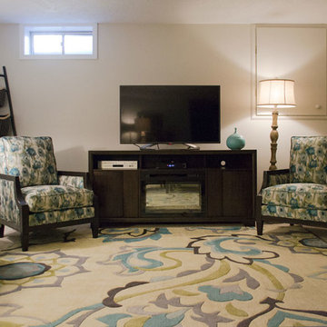
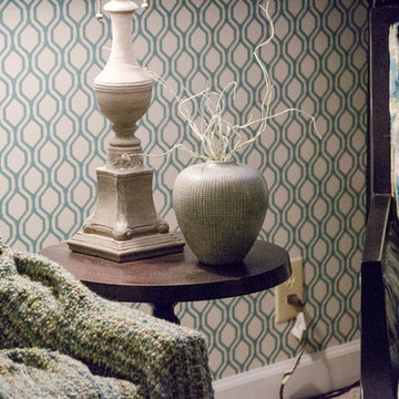
We pulled our color scheme from a floral fabric that they saw on a chair at my store, and we used it to reupholster their existing wood accent chairs. We used pops of turquoise and green throughout the space including the long back wall which was perfect to make a feature with this vibrant wallpaper in a geometric design.
Defining the Space
The room was so large that we needed to define different areas. The large rug in the oversized pattern was perfect for the seating area.
Lighting
Since there is only one small window bringing natural light into the space, we painted the remaining walls a light warm gray (Sherwin Williams’ City Loft SW7631) and added several table lamps and a floor lamp for task lighting.
Reusing Existing Furniture
Fortunately the space was large enough so my sister could keep her fabulous worn leather chair and ottoman and my mom could have an upholstered chair and ottoman in a subtle blue and green tweed.
The large hallway leading to the storage area was the perfect place for these small bookcases which house family photos in various silver frames. The bookcases have a special place in our hearts – they belonged to my grandparents. We accessorized with a long painted box which was the perfect scale for the bookcases and a grouping of vibrant botanical prints.
In lieu of a conventional media cabinet, my mom and sister found this one with a built-in fireplace. It brings a lot of warmth into the space – literally!
Painted Furniture
We had Kelly Sisler of Kelly Faux Creations paint their existing glass front cabinet this awesome apple green. Accessories include turquoise floral vases, a metallic circular vase, and a beautiful floral print.
Reading Nook
We positioned this original oil painting in the landing so it would be visible from the seating area. The landing was the perfect spot to display my sister’s collection of art glass. I love the small reading nook created with this rattan wooden accent chair and lantern floor lamp. We were able to make good use of the ledge in the stairwell by leaning these vibrant watercolors.
The dogs even have their own space. Meet my two “nephews” – Dill and Atticus (the one with his back to us pouting). We used this colorful oversized canvas to define their space and break up the long wall.
As you know, one good thing leads to another. Be sure to tune in next week for a surprise addition to this Updated Spec Home. In the meantime, check out this Basement Family Room designed by Robin’s Nest Interiors. Enjoy!
 Robin's Nest Interiors
Updated Spec Home: Basement Living Area
I promised you there would be a Season 2 of our series Updated Spec Home and here it is – Basement Family Room. My mom and sister found themselves spending more and more time in this room because it was a great open space to watch television and hang out with my sister’s two border collies.
Color Scheme
We pulled our color scheme from a floral fabric that they saw on a chair at my store, and we used it to reupholster their existing wood accent chairs. We used pops of turquoise and green throughout the space including the long back wall which was perfect to make a feature with this vibrant wallpaper in a geometric design.
Defining the Space
The room was so large that we needed to define different areas. The large rug in the oversized pattern was perfect for the seating area.
Lighting
Since there is only one small window bringing natural light into the space, we painted the remaining walls a light warm gray (Sherwin Williams’ City Loft SW7631) and added several table lamps and a floor lamp for task lighting.
Reusing Existing Furniture
Fortunately the space was large enough so my sister could keep her fabulous worn leather chair and ottoman and my mom could have an upholstered chair and ottoman in a subtle blue and green tweed.
The large hallway leading to the storage area was the perfect place for these small bookcases which house family photos in various silver frames. The bookcases have a special place in our hearts – they belonged to my grandparents. We accessorized with a long painted box which was the perfect scale for the bookcases and a grouping of vibrant botanical prints.
In lieu of a conventional media cabinet, my mom and sister found this one with a built-in fireplace. It brings a lot of warmth into the space – literally!
Painted Furniture
We had Kelly Sisler of Kelly Faux Creations paint their existing glass front cabinet this awesome apple green. Accessories include turquoise floral vases, a metallic circular vase, and a beautiful floral print.
Reading Nook
We positioned this original oil painting in the landing so it would be visible from the seating area. The landing was the perfect spot to display my sister’s collection of art glass. I love the small reading nook created with this rattan wooden accent chair and lantern floor lamp. We were able to make good use of the ledge in the stairwell by leaning these vibrant watercolors.
The dogs even have their own space. Meet my two “nephews” – Dill and Atticus (the one with his back to us pouting). We used this colorful oversized canvas to define their space and break up the long wall.
As you know, one good thing leads to another. Be sure to tune in next week for a surprise addition to this Updated Spec Home. In the meantime, check out this Basement Family Room designed by Robin’s Nest Interiors. Enjoy!
 Outdoor Lighting Design by Preferred Properties
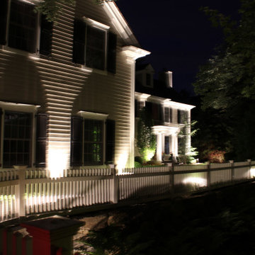
Landscape Lighting defines space and here the Outdoor Lighting design plays a big role in night time orientation. The most gratifying challenge that worked out to the homeowner's benefits. The frontal of the home and the interface to the entering neighborhood and driveway space during the day plays against the house layout on the plot. The difference is that during the day you can see the house and connect the driveway to the home and actually put together where to go and how to navigate to the front door all because you literally see all the Home elements, landscaping and driveway direction. At night these features and characteristics of the home disappear unless brought back into play by Light. It is in the dark that the situation presents itself the ability to light and highlight the features, walkways, driveway entrances and parts of the Landscape and Home that you choose. It takes a Landscape Lighting Professional to depict the right elements to light without overlighting. An outdoor Lighting design in paramount here as you can see the results. It is even prettier when there are a few interior lights on.
 Drury Design
THE SETUP
This client lives in a great high-rise condo in downtown Chicago. Alicia has already remodeled a few areas of her home, including her kitchen and home office. The bathroom is one of the last big places the client wanted to update. The existing bathroom had a large, outdated whirlpool tub in the corner. It was a darker space that had a lack of natural light. There are no windows (due to the bathroom’s location within the high-rise building). So, the idea was to brighten up the space and give the client an updated, elegant primary bathroom that is more her style and tailor-made for her routines.
Design Objectives:
- Make the space brighter.
- Create different daily routine stations to maximize functionality while keeping things clutter-free – a makeup station, a blow-dry station, and a sink-needs station.
- Achieve the client’s specific style and function needs while also keeping the look and design open to future possibilities: different users of the space/resale clients.
Design Challenges:
- Toilet cannot be moved. (In a high-rise, you can’t really move plumbing around too much when reimagining a space)
- Existing bathroom had a soffit that hid a lot of electrical wiring, so completely removing the soffit wasn’t an option.
- The blow-dry station needs to accommodate the client’s preference for standing up.
- Finding a place for the make-up station, which the client wants oriented for sitting.
- Create storage within the shower that can eliminate the clutter of personal care products that are actually needed every day. Do this, while keeping the client’s favorite things about the existing shower: the shower bench, a tub filler faucet (for rinsing shaving cream when shaving legs) and a low niche for placing her foot when shaving her legs.
THE RENEWED SPACE
Design Solutions:
- Extended a bit of wall near the toilet to give the commode its own area within the space, but without closing it off into a claustrophobic WC.
- Worked within the reality of the existing soffit situation, reshaping it to align with the new shower. Can lights were also added. Installed a beautiful ceiling light fixture that works within the new soffit shape, commanding attention and adding light, as if the sofit shape was chosen for it.
- Created a nice, furniture-looking 42”-high cabinet with pullout drawers to be the blow-dry station, complete with a mirror and a nice top. The pullout drawers are all powered, concealing a Dyson dryer and curling iron (and all the accoutrements) while keeping them plugged in, which is ideal for easy usage and put away. A stylish mirror on the wall above the cabinet, and proper lighting, make this the perfect blow-dry station. The top has a grommet that can accommodate a power cord should the client ever want to have a powered device on top of the cabinet.
- Put the sit-down makeup station where the tub used to be, putting the mirror back into a new recessed wall just a bit, allowing the area to have more room.
- Created a niche in the shower’s inner wall so that you can’t see it unless you are literally inside the shower. At the client’s request, it also has a hook so she can hang her loofa. Hiding the utility niche in this way allowed us to use the full main wall of the shower as a canvas for a beautiful accent stripe of raised decorative tile. The new shower has her old favorites, too: the tub filler, foot niche and bench.
Alicia’s client loves her new primary bathroom, especially the blow dry area. It is very accommodating for her, as a tall lady, while being very easy to use. The drawers store everything. Being powered, they make using already-plugged in appliances very easy to use and put away.
Her previous makeup station was a freestanding vanity with a single drawer, so beauty products were all over the surface top. With her new makeup station, everything is nicely tucked away and organized in drawers.
The new lighting is fantastic and the colors are light and soft. The clients loves the overall look and feel of her new bathroom and raves about how well the functionality-minded design makes her morning routine – and her life – easier and enjoyable!
 Advance Design Studio, Ltd.
The couple who embarked on this Lake Zurich Illinois home renovation spent years planning a move from Virginia to the rolling hills of Northern Illinois when their first grandchild was born. Wanting to be closer to their grown children so they could enjoy their new role, they first embarked upon finding the right realtor and the right home. They settled on the “perfect” home; perfect that is to transform.
The seriously outdated 1,800 square foot ranch had a closed outdated kitchen, 3 bedrooms, a living room with a fireplace, a full basement and 2 baths. Although it had “good bones”, it was straight out of a builder’s catalog with wall to wall carpet, standard tile and honey oak everywhere you looked. But this couple had big plans for this home.
In tandem with their home purchase, they began the search for the just the right renovation company. The team they chose needed to be cohesive, as the whole house renovation would be designed hundreds of miles from their home several states away. She found Advance Design Studio, Ltd. online, and was quickly enamored by the team and by Common Sense Remodeling, simply by studying the website. Her decision to choose Advance Design to partner on this complete ranch renovation was confirmed quickly upon her first face to face meeting with owner Todd Jurs, and later by Advance’s designer, Nicole Ryan.
Three bedrooms were converted into a one master suite with ample bath and walk in closet, laundry, and a 2nd multi-purpose room designed for movies and entertainment, a home office, and a guest room all in one. A doorway leading to the garage was reconfigured to create a foyer area, and allowed for a better flow to an open modern kitchen complete with a large island for cooking and entertaining, which included a wide bench seat overlooking the back yard and opening onto an eating area flanked with a fireplace and TV.
The piece de resistance culminated with 3 walls of full glass anchored by a striking fireplace in the new four season’s room where the homeowners enjoy coffee every morning while gazing at the current day’s mid-western landscape. The open floorplan encourages living in “one space” throughout the day.
Ryan worked with the couple remotely, exchanging 3D color renderings and floorplans with detailed budget updates until the project took on the very image they had envisioned. “Working with them was a change from our normal meeting process since they were literally in a different state. We conducted meetings by phone, while reviewing materials and drawings via computer. It was a fun process that necessitated lots of detail and careful coordination, but we made it happen and the process was as smooth as if they were right here like normal”, says Nicole. During a stressful time planning their move, the constant interaction with Nicole assured the couple that all was being addressed by the Advance team and they could relax and focus on other important things (like moving cross country).
The new master bath incorporated heated flooring, a walk in shower with seating and custom shower niches, and an elegant double sink vanity with ample space for two. “The layout of each of the rooms is exactly what I envisioned,” the client said. “Advance’s attention to details such as light switch placement, electrical outlets, and many other minute details you wouldn’t even think of was the icing on the cake. If I didn’t think of it first, they certainly did,” said the happy homeowner. Small details like the crown molding, the custom designed fireplace mantle, the under-cabinet lighting and etched door glass, and even subtle rhinestones shimmering like delicate jewelry in the tile backsplash brought the whole project together. The clients were extremely happy with the way the Advance team made sure these small things were executed perfectly.
“It’s just gorgeous,” they said at a celebratory event in their home hosted shortly after completion for the entire Advance Design team that made it happen. “The entire crew at Advance Design was a pleasure to work with. We couldn’t have done this with a lesser team,” they concluded.
Sponsored
Columbus, OH

Hope Restoration & General Contracting
Columbus Design-Build, Kitchen & Bath Remodeling, Historic Renovations
 Art Drenched Life
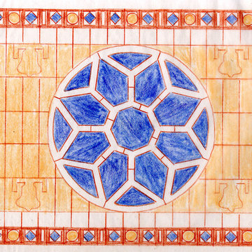
This image shows the original design drawing. Our clients came to us with a request for an exterior entry wall tile installation that strongly evoked a sense of place. They requested a piece that included references to the historic Mission, showed the famous swallows and bells, and strongly reflected the historic character of the town. We toured the location for iconic images to capture. Hundreds of photographs of the town and the mission yielded at least one surprise: no two images of swallows looked the same! The skyline was dominated by the dome of the Mission and palm trees. We created 2 designs for our clients. In our first design, we offered them a very literal interpretation of their requirements: a very painterly tile scene of the Mission itself. But we weren’t satisfied that this was a sufficiently original concept. Our second concept took a more intensely graphic approach, focusing on the strongly geometric Mission window as the centerpiece of a more mathematical design. Around this center we placed bells, delineated only in relief rather than different colors, with the entire design framed by the geometric forms found in the wooden doors of the Mission itself, anchored by 4 flying swallows at each corner. We presented both designs to the clients and explained that while we thought both were both good executions of their concepts, we believed that the second design was much stronger, more original, and more impactful. Happily, they agreed. In fact, at the end of the installation process, as they watched, holding their wine glasses, they said, “this is so much better than we even imagined!”. Photo by Michael Linsley
 Drury Design
THE SETUP
This client lives in a great high-rise condo in downtown Chicago. Alicia has already remodeled a few areas of her home, including her kitchen and home office. The bathroom is one of the last big places the client wanted to update. The existing bathroom had a large, outdated whirlpool tub in the corner. It was a darker space that had a lack of natural light. There are no windows (due to the bathroom’s location within the high-rise building). So, the idea was to brighten up the space and give the client an updated, elegant primary bathroom that is more her style and tailor-made for her routines.
Design Objectives:
- Make the space brighter.
- Create different daily routine stations to maximize functionality while keeping things clutter-free – a makeup station, a blow-dry station, and a sink-needs station.
- Achieve the client’s specific style and function needs while also keeping the look and design open to future possibilities: different users of the space/resale clients.
Design Challenges:
- Toilet cannot be moved. (In a high-rise, you can’t really move plumbing around too much when reimagining a space)
- Existing bathroom had a soffit that hid a lot of electrical wiring, so completely removing the soffit wasn’t an option.
- The blow-dry station needs to accommodate the client’s preference for standing up.
- Finding a place for the make-up station, which the client wants oriented for sitting.
- Create storage within the shower that can eliminate the clutter of personal care products that are actually needed every day. Do this, while keeping the client’s favorite things about the existing shower: the shower bench, a tub filler faucet (for rinsing shaving cream when shaving legs) and a low niche for placing her foot when shaving her legs.
THE RENEWED SPACE
Design Solutions:
- Extended a bit of wall near the toilet to give the commode its own area within the space, but without closing it off into a claustrophobic WC.
- Worked within the reality of the existing soffit situation, reshaping it to align with the new shower. Can lights were also added. Installed a beautiful ceiling light fixture that works within the new soffit shape, commanding attention and adding light, as if the sofit shape was chosen for it.
- Created a nice, furniture-looking 42”-high cabinet with pullout drawers to be the blow-dry station, complete with a mirror and a nice top. The pullout drawers are all powered, concealing a Dyson dryer and curling iron (and all the accoutrements) while keeping them plugged in, which is ideal for easy usage and put away. A stylish mirror on the wall above the cabinet, and proper lighting, make this the perfect blow-dry station. The top has a grommet that can accommodate a power cord should the client ever want to have a powered device on top of the cabinet.
- Put the sit-down makeup station where the tub used to be, putting the mirror back into a new recessed wall just a bit, allowing the area to have more room.
- Created a niche in the shower’s inner wall so that you can’t see it unless you are literally inside the shower. At the client’s request, it also has a hook so she can hang her loofa. Hiding the utility niche in this way allowed us to use the full main wall of the shower as a canvas for a beautiful accent stripe of raised decorative tile. The new shower has her old favorites, too: the tub filler, foot niche and bench.
Alicia’s client loves her new primary bathroom, especially the blow dry area. It is very accommodating for her, as a tall lady, while being very easy to use. The drawers store everything. Being powered, they make using already-plugged in appliances very easy to use and put away.
Her previous makeup station was a freestanding vanity with a single drawer, so beauty products were all over the surface top. With her new makeup station, everything is nicely tucked away and organized in drawers.
The new lighting is fantastic and the colors are light and soft. The clients loves the overall look and feel of her new bathroom and raves about how well the functionality-minded design makes her morning routine – and her life – easier and enjoyable!
 User
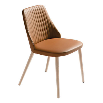
UserThe Break chair literally breaks free from all the preconceived notions of the usual home furniture and portrays a better and a bigger picture of classiness and perfection. The striking color combination is well complemented with the strong wooden legs which not only make sure of its sturdiness but adds an edgy finishing to this décor. The Break masterpiece is perfect for both residential and official purposes, bringing a posh makeover of the space. The different types of metal bases are of superior quality, while the upholstery work is done extensively throughout the furniture
Sponsored
Columbus, OH
Hope Restoration & General Contracting
Columbus Design-Build, Kitchen & Bath Remodeling, Historic Renovations
 Advance Design Studio, Ltd.
The couple who embarked on this Lake Zurich Illinois home renovation spent years planning a move from Virginia to the rolling hills of Northern Illinois when their first grandchild was born. Wanting to be closer to their grown children so they could enjoy their new role, they first embarked upon finding the right realtor and the right home. They settled on the “perfect” home; perfect that is to transform.
The seriously outdated 1,800 square foot ranch had a closed outdated kitchen, 3 bedrooms, a living room with a fireplace, a full basement and 2 baths. Although it had “good bones”, it was straight out of a builder’s catalog with wall to wall carpet, standard tile and honey oak everywhere you looked. But this couple had big plans for this home.
In tandem with their home purchase, they began the search for the just the right renovation company. The team they chose needed to be cohesive, as the whole house renovation would be designed hundreds of miles from their home several states away. She found Advance Design Studio, Ltd. online, and was quickly enamored by the team and by Common Sense Remodeling, simply by studying the website. Her decision to choose Advance Design to partner on this complete ranch renovation was confirmed quickly upon her first face to face meeting with owner Todd Jurs, and later by Advance’s designer, Nicole Ryan.
Three bedrooms were converted into a one master suite with ample bath and walk in closet, laundry, and a 2nd multi-purpose room designed for movies and entertainment, a home office, and a guest room all in one. A doorway leading to the garage was reconfigured to create a foyer area, and allowed for a better flow to an open modern kitchen complete with a large island for cooking and entertaining, which included a wide bench seat overlooking the back yard and opening onto an eating area flanked with a fireplace and TV.
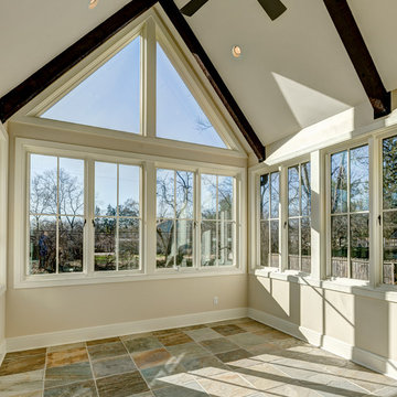
The piece de resistance culminated with 3 walls of full glass anchored by a striking fireplace in the new four season’s room where the homeowners enjoy coffee every morning while gazing at the current day’s mid-western landscape. The open floorplan encourages living in “one space” throughout the day.
Ryan worked with the couple remotely, exchanging 3D color renderings and floorplans with detailed budget updates until the project took on the very image they had envisioned. “Working with them was a change from our normal meeting process since they were literally in a different state. We conducted meetings by phone, while reviewing materials and drawings via computer. It was a fun process that necessitated lots of detail and careful coordination, but we made it happen and the process was as smooth as if they were right here like normal”, says Nicole. During a stressful time planning their move, the constant interaction with Nicole assured the couple that all was being addressed by the Advance team and they could relax and focus on other important things (like moving cross country).
The new master bath incorporated heated flooring, a walk in shower with seating and custom shower niches, and an elegant double sink vanity with ample space for two. “The layout of each of the rooms is exactly what I envisioned,” the client said. “Advance’s attention to details such as light switch placement, electrical outlets, and many other minute details you wouldn’t even think of was the icing on the cake. If I didn’t think of it first, they certainly did,” said the happy homeowner. Small details like the crown molding, the custom designed fireplace mantle, the under-cabinet lighting and etched door glass, and even subtle rhinestones shimmering like delicate jewelry in the tile backsplash brought the whole project together. The clients were extremely happy with the way the Advance team made sure these small things were executed perfectly.
“It’s just gorgeous,” they said at a celebratory event in their home hosted shortly after completion for the entire Advance Design team that made it happen. “The entire crew at Advance Design was a pleasure to work with. We couldn’t have done this with a lesser team,” they concluded.
 Teakwoodcentral
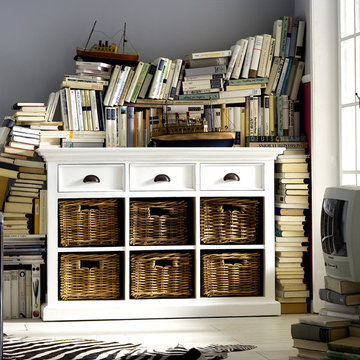
A favorite in this line of white painted mahogany furniture is this gorgeous buffet with three drawers and six shelves with fitting rattan baskets.
This buffet is literally made for any home as there are so many possibilities to place it.
The first image shows an obviously well populated library which can only look better once the books will be organized and stored.
Another room in almost every home where this buffet will be welcome is the bedroom. From linens to books there is no limit in how to use this nice sideboard.
Next to kitchen and dining area this furniture would also be perfect for the kid’s playroom, for a hobby room and of course for a large bathroom where towels can be stored and each family member can get its own storage space.
Halifax furniture is made out of plantation mahogany wood and perfectly kiln-dried for low moisture manufacturing conditions.
The quality and craftsmanship of this product is excellent as only high grade material and machinery is used to ensure consistency and quality.
The combination of antique hardware look and the smooth layer of semi-gloss white paint is easy to maintain and delivers a classy feel and ambience to every home. The rattan baskets give it that cozy look which can be combined with any décor.
Fully assembled and ready to use, this furniture set will live up to and exceed your highest expectations.
• Solid Plantation Mahogany Wood
• White Distressed Finish
• Classy, cozy and yet modern
• Combine with many different interior designs
• Easy assembly, just connect the legs to the table top
• Premium Hardware
• Strong and durable construction
Dimensions: L: 49.25" W: 19.6" H: 33.5"
 Rain Garden Nursery LandscapeMakeoverDesignStaging
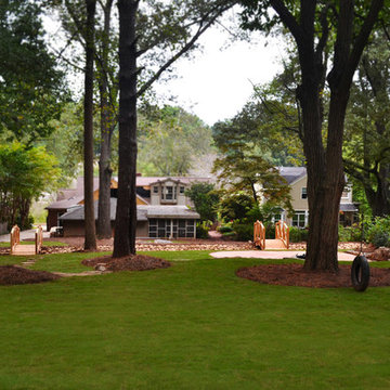
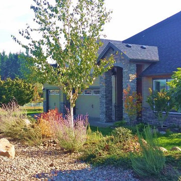
Scott & Catherine Buley, HTT&T. High Tech Turf & Trees, LandscapeMakeover.biz, Rain Garden Nursery. This very savvy couple planned this new home literally from the ground up. They contacted us thru Houzz.com, impressed by our photos of country landscapes with our High Tech Turf & Trees. Working with qualified, experienced landscape design-build contractors makes all the difference. They wanted us to bring our golf course grow-in experience to this special site. We love that we were able to help them thru challenging conditions, to create precisely what they desired. The Don Egolf flowering Redbud to the right, has wonderful compact form and lush leaves all season long.
7