
Search results for "Litre difference" in Home Design Ideas
 INSPIRED KITCHEN DESIGN
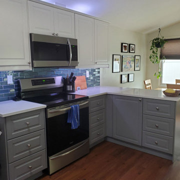
According to Liz, the biggest obstacle was coming up with a layout that worked to meet her design wish list.
She explains: “The refrigerator used to open up next to the column. The area between the fridge and the column was the primary traffic pattern from the kitchen to the living room. When the fridge door was opened it would block that access path entirely.”
This also limited the style of refrigerator that would fit the space. For instance, a French Door refrigerator with freezer wasn’t an option because the freezer drawer wouldn’t open all the way. This is another reason she opted to keep her existing Whirlpool refrigerator.
“Correcting this traffic pattern was a big challenge for me,” she adds. “I actually spent years trying to figure out how to correct it. Plus, because the column was just sitting out in the middle of the room, it was very disconnected and detracted from the rest of the space.”
She adds that previously all of the counter space were literally swaths of counter every two feet or so. Not very conducive to food prep or work flow!
To remedy this, Liz had added an island cart years ago in the hopes of creating more space. However like the column, that too began to feel disconnected and not cohesive.
She explains: “We had to walk around it to get from the fridge to the pantry, oven, and stove. The pantry was also on the opposite side of the kitchen from the fridge and made meal preparation cumbersome.”
With IKD’s help, the solution presented itself.
She explains: “By moving the pantry next to the fridge and extending the corner and adding the peninsula, we gained large areas of counter space as well as correcting the cumbersome traffic pattern. Baking and meal prep is now so efficient! All of the food is right next to each other. We have dedicated baking and prep areas, and a dedicated cooking area. Previously all of the food, prep, and cooking was all broken up throughout the space.”
“As for installation, the only issue was that I gave an incorrect dimension to IKD on the location of the window over the sink. I ended up needing to get different dimension cabinets on both sides of the sink and window. Thankfully I noticed this at the very beginning and we were able to recover really easily from the mistake,” she concludes.
 Rain Garden Nursery LandscapeMakeoverDesignStaging
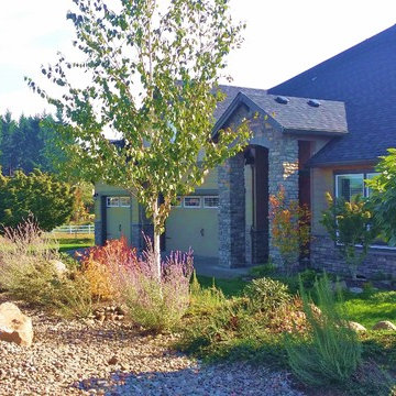
Scott & Catherine Buley, HTT&T. High Tech Turf & Trees, LandscapeMakeover.biz, Rain Garden Nursery. This very savvy couple planned this new home literally from the ground up. They contacted us thru Houzz.com, impressed by our photos of country landscapes with our High Tech Turf & Trees. Working with qualified, experienced landscape design-build contractors makes all the difference. They wanted us to bring our golf course grow-in experience to this special site. We love that we were able to help them thru challenging conditions, to create precisely what they desired. The Don Egolf flowering Redbud to the right, has wonderful compact form and lush leaves all season long.
 Robin's Nest Interiors
Updated Spec Home: Basement Living Area
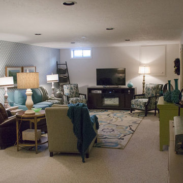
I promised you there would be a Season 2 of our series Updated Spec Home and here it is – Basement Family Room. My mom and sister found themselves spending more and more time in this room because it was a great open space to watch television and hang out with my sister’s two border collies.
Color Scheme
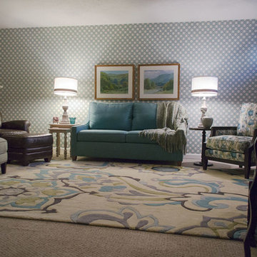
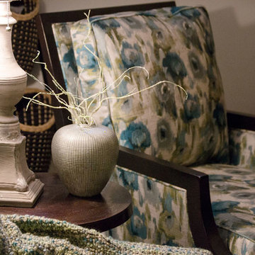
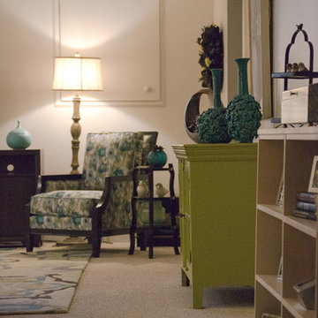
We pulled our color scheme from a floral fabric that they saw on a chair at my store, and we used it to reupholster their existing wood accent chairs. We used pops of turquoise and green throughout the space including the long back wall which was perfect to make a feature with this vibrant wallpaper in a geometric design.
Defining the Space
The room was so large that we needed to define different areas. The large rug in the oversized pattern was perfect for the seating area.
Lighting
Since there is only one small window bringing natural light into the space, we painted the remaining walls a light warm gray (Sherwin Williams’ City Loft SW7631) and added several table lamps and a floor lamp for task lighting.
Reusing Existing Furniture
Fortunately the space was large enough so my sister could keep her fabulous worn leather chair and ottoman and my mom could have an upholstered chair and ottoman in a subtle blue and green tweed.
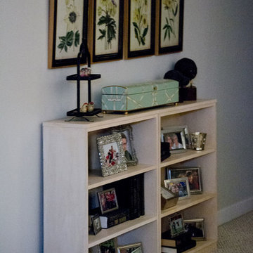
The large hallway leading to the storage area was the perfect place for these small bookcases which house family photos in various silver frames. The bookcases have a special place in our hearts – they belonged to my grandparents. We accessorized with a long painted box which was the perfect scale for the bookcases and a grouping of vibrant botanical prints.
In lieu of a conventional media cabinet, my mom and sister found this one with a built-in fireplace. It brings a lot of warmth into the space – literally!
Painted Furniture
We had Kelly Sisler of Kelly Faux Creations paint their existing glass front cabinet this awesome apple green. Accessories include turquoise floral vases, a metallic circular vase, and a beautiful floral print.
Reading Nook
We positioned this original oil painting in the landing so it would be visible from the seating area. The landing was the perfect spot to display my sister’s collection of art glass. I love the small reading nook created with this rattan wooden accent chair and lantern floor lamp. We were able to make good use of the ledge in the stairwell by leaning these vibrant watercolors.
The dogs even have their own space. Meet my two “nephews” – Dill and Atticus (the one with his back to us pouting). We used this colorful oversized canvas to define their space and break up the long wall.
As you know, one good thing leads to another. Be sure to tune in next week for a surprise addition to this Updated Spec Home. In the meantime, check out this Basement Family Room designed by Robin’s Nest Interiors. Enjoy!
Find the right local pro for your project
 Robin's Nest Interiors
Updated Spec Home: Basement Living Area
I promised you there would be a Season 2 of our series Updated Spec Home and here it is – Basement Family Room. My mom and sister found themselves spending more and more time in this room because it was a great open space to watch television and hang out with my sister’s two border collies.
Color Scheme
We pulled our color scheme from a floral fabric that they saw on a chair at my store, and we used it to reupholster their existing wood accent chairs. We used pops of turquoise and green throughout the space including the long back wall which was perfect to make a feature with this vibrant wallpaper in a geometric design.
Defining the Space
The room was so large that we needed to define different areas. The large rug in the oversized pattern was perfect for the seating area.
Lighting
Since there is only one small window bringing natural light into the space, we painted the remaining walls a light warm gray (Sherwin Williams’ City Loft SW7631) and added several table lamps and a floor lamp for task lighting.
Reusing Existing Furniture
Fortunately the space was large enough so my sister could keep her fabulous worn leather chair and ottoman and my mom could have an upholstered chair and ottoman in a subtle blue and green tweed.
The large hallway leading to the storage area was the perfect place for these small bookcases which house family photos in various silver frames. The bookcases have a special place in our hearts – they belonged to my grandparents. We accessorized with a long painted box which was the perfect scale for the bookcases and a grouping of vibrant botanical prints.
In lieu of a conventional media cabinet, my mom and sister found this one with a built-in fireplace. It brings a lot of warmth into the space – literally!
Painted Furniture
We had Kelly Sisler of Kelly Faux Creations paint their existing glass front cabinet this awesome apple green. Accessories include turquoise floral vases, a metallic circular vase, and a beautiful floral print.
Reading Nook
We positioned this original oil painting in the landing so it would be visible from the seating area. The landing was the perfect spot to display my sister’s collection of art glass. I love the small reading nook created with this rattan wooden accent chair and lantern floor lamp. We were able to make good use of the ledge in the stairwell by leaning these vibrant watercolors.
The dogs even have their own space. Meet my two “nephews” – Dill and Atticus (the one with his back to us pouting). We used this colorful oversized canvas to define their space and break up the long wall.
As you know, one good thing leads to another. Be sure to tune in next week for a surprise addition to this Updated Spec Home. In the meantime, check out this Basement Family Room designed by Robin’s Nest Interiors. Enjoy!
 AMLD INTERIOR INC
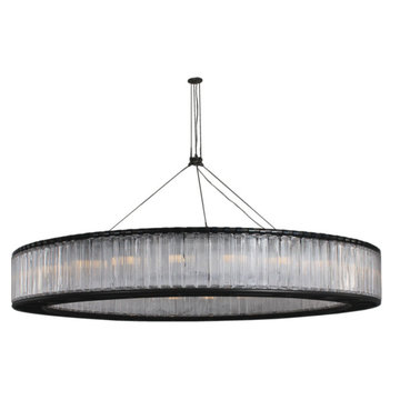
AM3001 ESTADIO RING
FEATURED:
Ring of Light forms a tubular structure of which the inner and outer shades are made from glass block sections that disperse the light by means of vertical light and shade streaks. The fixture literally draws in your sense of touch with its soft flowing light, originally conceived for the 1992 Barcelona Olympic stadium, its concept predecessor is found in the ironwork luminaries used to hold up candles, the traditional depiction of mediaeval chandeliers in palaces and cathedrals.
DESCRIPTION:
Collection: COMMERCIAL
Size: 42” Dia x 10" Depth x 14.2" Height (Custom sizes also available)
Shape: Ring
Frame Finish: Grey Iron (Different finish options available at no additional cost)
Materials: Stainless Steel, Glass Block
Weight: 205 lbs (42”)
Extension: Adjustable cables for a customizable length up to 12 ft.
Bulbs: 12 x LED bulb Max. 75 W Bulb Socket: E27
Assembly: Fully Assembled
Dimmer Switch Compatible: Optional
Shipping: Free Door-To-Door Shipping Worldwide
Rush Order: 3-4 Weeks; 15% added to total
Regular Lead Time: 6-8 Weeks
Warranty: 5 Years Full Coverage (includes parts replacement)
SIZE OPTIONS:
SIZE: PRICE:
30” Dia x 8" Depth x 14.2" Height
$4,260.00
36” Dia x 8" Depth x 14.2" Height
$5,898.00
42” Dia x 10" Depth x 14.2" Height (as shown)
$7,158.00
60” Dia x 10" Depth x 14.2" Height
$8,248.00
98” Dia x 10" Depth x 14.2" Height $11,166.00
128” Dia x 10" Depth x 14.2" Height $14,460.00
166” Dia x 10" Depth x 14.2" Height $17,880.00
CUSTOM SIZES, FINISHES, COLORS AVAILABLE UPON REQUEST
 Sans Soucie Art Glass
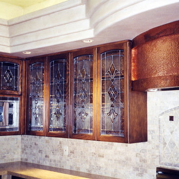
Decorative frosted and etched cabinet glass by Sans Soucie is hand-crafted, sandblast frosted and 3D carved. Cabinet glass can be created in any size or glass thickness, but will typically be 3/16" thick unless otherwise specified. The glass will have seamed edges (not polished, but rough sanded so the edges are not sharp) and will be tempered for strength and safety. Sans Soucie designs are sandblasted different ways, creating different effects for different levels of price and obscurity, depending on the need. The two most popular effects for cabinet glass are what's known as solid frosted glass: negative and positive effects. Solid frosted means that the sandblasted design elements are solid white, and have no varying sandblast density or depths. Positive is where the design elements are frosted and the background is clear. Negative is just the opposite: The design elements are clear glass and the background is frosted. Of the Sans Soucie Art Glass effects, these two are the lowest in price. Next up is 2D surface etched. 2D features "shaded" areas where the sandblast density will vary from solid frost, then fades back out to clear glass, creating a dimensional effect. The sandblasting is on the top surface only and is not cut deep into the glass like 3D carved glass. 3D carved glass is our most popular, trademark effect. Along with the shading or varying density in the sandblasting, 3D carving features a sculpted, relief texture of varying depths. The sandblast artist literally cuts deep into the glass. The edges of the carving illuminate bright as they pick up and reflect the surrounding light. If color is desired, the 3D carved glass is airbrushed with color, creating our 3D carved and painted glass. Sans Soucie has hundreds of designs available in our archives, from simple to extravagant. Let Sans Soucie Art Glass create the perfect cabinet glass to compliment and coordinate with your kitchen decor!
 Drury Design
THE SETUP
This client lives in a great high-rise condo in downtown Chicago. Alicia has already remodeled a few areas of her home, including her kitchen and home office. The bathroom is one of the last big places the client wanted to update. The existing bathroom had a large, outdated whirlpool tub in the corner. It was a darker space that had a lack of natural light. There are no windows (due to the bathroom’s location within the high-rise building). So, the idea was to brighten up the space and give the client an updated, elegant primary bathroom that is more her style and tailor-made for her routines.
Design Objectives:
- Make the space brighter.
- Create different daily routine stations to maximize functionality while keeping things clutter-free – a makeup station, a blow-dry station, and a sink-needs station.
- Achieve the client’s specific style and function needs while also keeping the look and design open to future possibilities: different users of the space/resale clients.
Design Challenges:
- Toilet cannot be moved. (In a high-rise, you can’t really move plumbing around too much when reimagining a space)
- Existing bathroom had a soffit that hid a lot of electrical wiring, so completely removing the soffit wasn’t an option.
- The blow-dry station needs to accommodate the client’s preference for standing up.
- Finding a place for the make-up station, which the client wants oriented for sitting.
- Create storage within the shower that can eliminate the clutter of personal care products that are actually needed every day. Do this, while keeping the client’s favorite things about the existing shower: the shower bench, a tub filler faucet (for rinsing shaving cream when shaving legs) and a low niche for placing her foot when shaving her legs.
THE RENEWED SPACE
Design Solutions:
- Extended a bit of wall near the toilet to give the commode its own area within the space, but without closing it off into a claustrophobic WC.
- Worked within the reality of the existing soffit situation, reshaping it to align with the new shower. Can lights were also added. Installed a beautiful ceiling light fixture that works within the new soffit shape, commanding attention and adding light, as if the sofit shape was chosen for it.
- Created a nice, furniture-looking 42”-high cabinet with pullout drawers to be the blow-dry station, complete with a mirror and a nice top. The pullout drawers are all powered, concealing a Dyson dryer and curling iron (and all the accoutrements) while keeping them plugged in, which is ideal for easy usage and put away. A stylish mirror on the wall above the cabinet, and proper lighting, make this the perfect blow-dry station. The top has a grommet that can accommodate a power cord should the client ever want to have a powered device on top of the cabinet.
- Put the sit-down makeup station where the tub used to be, putting the mirror back into a new recessed wall just a bit, allowing the area to have more room.
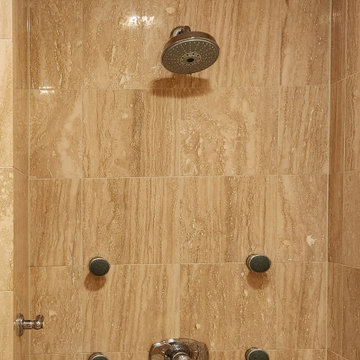
- Created a niche in the shower’s inner wall so that you can’t see it unless you are literally inside the shower. At the client’s request, it also has a hook so she can hang her loofa. Hiding the utility niche in this way allowed us to use the full main wall of the shower as a canvas for a beautiful accent stripe of raised decorative tile. The new shower has her old favorites, too: the tub filler, foot niche and bench.
Alicia’s client loves her new primary bathroom, especially the blow dry area. It is very accommodating for her, as a tall lady, while being very easy to use. The drawers store everything. Being powered, they make using already-plugged in appliances very easy to use and put away.
Her previous makeup station was a freestanding vanity with a single drawer, so beauty products were all over the surface top. With her new makeup station, everything is nicely tucked away and organized in drawers.
The new lighting is fantastic and the colors are light and soft. The clients loves the overall look and feel of her new bathroom and raves about how well the functionality-minded design makes her morning routine – and her life – easier and enjoyable!

Sponsored
Columbus, OH

Hope Restoration & General Contracting
Columbus Design-Build, Kitchen & Bath Remodeling, Historic Renovations
 Robin's Nest Interiors
Updated Spec Home: Basement Living Area
I promised you there would be a Season 2 of our series Updated Spec Home and here it is – Basement Family Room. My mom and sister found themselves spending more and more time in this room because it was a great open space to watch television and hang out with my sister’s two border collies.
Color Scheme
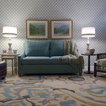
We pulled our color scheme from a floral fabric that they saw on a chair at my store, and we used it to reupholster their existing wood accent chairs. We used pops of turquoise and green throughout the space including the long back wall which was perfect to make a feature with this vibrant wallpaper in a geometric design.
Defining the Space
The room was so large that we needed to define different areas. The large rug in the oversized pattern was perfect for the seating area.
Lighting
Since there is only one small window bringing natural light into the space, we painted the remaining walls a light warm gray (Sherwin Williams’ City Loft SW7631) and added several table lamps and a floor lamp for task lighting.
Reusing Existing Furniture
Fortunately the space was large enough so my sister could keep her fabulous worn leather chair and ottoman and my mom could have an upholstered chair and ottoman in a subtle blue and green tweed.
The large hallway leading to the storage area was the perfect place for these small bookcases which house family photos in various silver frames. The bookcases have a special place in our hearts – they belonged to my grandparents. We accessorized with a long painted box which was the perfect scale for the bookcases and a grouping of vibrant botanical prints.
In lieu of a conventional media cabinet, my mom and sister found this one with a built-in fireplace. It brings a lot of warmth into the space – literally!
Painted Furniture
We had Kelly Sisler of Kelly Faux Creations paint their existing glass front cabinet this awesome apple green. Accessories include turquoise floral vases, a metallic circular vase, and a beautiful floral print.
Reading Nook
We positioned this original oil painting in the landing so it would be visible from the seating area. The landing was the perfect spot to display my sister’s collection of art glass. I love the small reading nook created with this rattan wooden accent chair and lantern floor lamp. We were able to make good use of the ledge in the stairwell by leaning these vibrant watercolors.
The dogs even have their own space. Meet my two “nephews” – Dill and Atticus (the one with his back to us pouting). We used this colorful oversized canvas to define their space and break up the long wall.
As you know, one good thing leads to another. Be sure to tune in next week for a surprise addition to this Updated Spec Home. In the meantime, check out this Basement Family Room designed by Robin’s Nest Interiors. Enjoy!
 NanaWall
The Harmonious Blending of Inside to Out with Wood Framed Patio Doors
By NanaWall Systems, September 3, 2025
Wood framed patio doors
Some homes are designed to impress from the outside. This one was reimagined to breathe from the inside out with wood framed patio doors. For a family of music lovers and outdoor enthusiasts, the goal was about connection. Connection to each other, to the seasons, to nature, to sound, and to their lush backyard space for daily life and family gatherings.
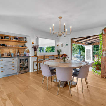
Designed by Jason Hanrahan of Mode Architects, the home features a thoughtfully placed NanaWall kitchen pass-through window and, later, wide bifold doors in the family sunroom. The design evolved in two phases to fit the family’s indoor-outdoor lifestyle perfectly. The result is a renovation defined by openness, light, and laid-back living.
A Home Shaped by Light, Music, Wood Framed Patio Doors, and a Pass-Through Window
Kitchen Renovation Opens Space to Light and Entertaining with a Pass-Through Window
During phase one of the renovation, the existing kitchen was reimagined to replace a restrictive floor plan and outdated appliances. Central to its new design is a three-panel NanaWall SL60 folding window system—sized at counter height to serve as a flexible pass-through window for alfresco dining and entertaining. Custom divided lites were added to complement the home’s existing window styles.
The window frames were finished in a warm, off-white on both interior and exterior, tying the kitchen seamlessly to the rest of the home and its façade. The result is a transitional space that connects the kitchen directly to the outdoor dining area, a seamless connection across spaces.
“The countertop-height NanaWall system made the kitchen fit better into the family’s lifestyle,” says Hanrahan. “It supports hosting and day-to-day use without turning the kitchen into a full opening.”
Designed for Living: Home Reimagined Around How the Family Connects
After phase one introduced a NanaWall pass-through window in the kitchen, making serving, conversation, and time outside effortless, the homeowners returned to MODE to reimagine their older sunroom. The goal: a living room and music lounge that could open completely to the backyard. The solution was incorporating a full-height, five-panel NW Clad 740 wood framed patio doors. The Generation 4 folding glass wall offered the slimmest aluminum clad frames available, and therefore, was the ideal solution to achieve seamless connectivity.
Outside, the frames were finished in a warm off-white to match the façade. Inside, solid wood frames seamlessly integrate with the mushroom wood paneling and millwork. The nearly 15-foot-wide system was customized with divided lites placed high up to add rhythm while preserving unobstructed views and keeping transitions seamless.
“We wanted to maximize the opening size,” says Jason. “Not just to maximize light, but literally the opening as well. The family sunroom space became more useful.”
A Living Sunroom That Folds Open to the Garden
MODE centered the second half of the home renovation on the family sunroom, featuring wood framed patio doors to create a seamless transition from the interior to the garden. It’s the difference between “a room with a view” and a room that becomes the view. With the nearly 8-foot-tall system open, music spills outside; with it closed, daylight, acoustics, and comfort remain finely tuned.
“You are sitting in the house with the family. The opening frames the view of the pond and the trees,” describes Architect Jason Hanrahan. “They liked how it connected them with their family when they were outside… it made it more cohesive.”
Choosing Materials that Reflect Nature and Serenity
According to the architect, the design aims to bring the outdoors in with an organic material approach. Inside, the room is wrapped in mushroom wood reclaimed boards, whose textured grain warms the acoustics and steadies the eye. Large-format tiles keep lines calm and maintenance easy.
Outside, a long concrete tread and natural stone hold the grade without hard edges. Nothing shouts; everything contributes to a single idea: bring the outdoors in and the indoors out.
Energy Efficiency Meets Everyday Living
The systems’ energy-efficient and performance engineering make the sunroom a four-season retreat. The architect chose NanaWall wood framed patio doors to maximize the existing exterior opening, provide intuitive and easy daily operation, and create a threshold that feels like part of the floor rather than a barrier. T hese are hallmarks of NanaWall wood framed patio doors: engineered for durability and frequent use, precision-gliding panels, and performance-tested.
To ensure year-round comfort, the NanaWall wood framed patio doors and pass-through window were specified with double glazed panels for optimal performance regardless of weather. Paired with the thermally broken Low Profile Saddle Sill, the bifold door not only offers energy efficiency but also a seamless, barefoot-friendly threshold to the outdoors.
Final Thoughts
From weeknight dinners to weekend music sessions, this is now a home that meets the family at the place they actually live, gather, and connect in. The kitchen pass-through window keeps everyday hosting effortless. The music room turns into a garden room in seconds, inviting breezes and conversation across one continuous plane.
Here, NanaWall wood framed patio doors added versatile usable square footage and extended the soul of the home outdoors. By focusing on how the family truly lives, this home now opens in all the right ways: to light, to laughter, to nature, and to each other.
Visit the NanaWall inspiration gallery to explore more homes like this, designed for connection, built for modern living!
 Robin's Nest Interiors
Updated Spec Home: Basement Living Area
I promised you there would be a Season 2 of our series Updated Spec Home and here it is – Basement Family Room. My mom and sister found themselves spending more and more time in this room because it was a great open space to watch television and hang out with my sister’s two border collies.
Color Scheme
We pulled our color scheme from a floral fabric that they saw on a chair at my store, and we used it to reupholster their existing wood accent chairs. We used pops of turquoise and green throughout the space including the long back wall which was perfect to make a feature with this vibrant wallpaper in a geometric design.
Defining the Space
The room was so large that we needed to define different areas. The large rug in the oversized pattern was perfect for the seating area.
Lighting
Since there is only one small window bringing natural light into the space, we painted the remaining walls a light warm gray (Sherwin Williams’ City Loft SW7631) and added several table lamps and a floor lamp for task lighting.
Reusing Existing Furniture
Fortunately the space was large enough so my sister could keep her fabulous worn leather chair and ottoman and my mom could have an upholstered chair and ottoman in a subtle blue and green tweed.
The large hallway leading to the storage area was the perfect place for these small bookcases which house family photos in various silver frames. The bookcases have a special place in our hearts – they belonged to my grandparents. We accessorized with a long painted box which was the perfect scale for the bookcases and a grouping of vibrant botanical prints.
In lieu of a conventional media cabinet, my mom and sister found this one with a built-in fireplace. It brings a lot of warmth into the space – literally!
Painted Furniture
We had Kelly Sisler of Kelly Faux Creations paint their existing glass front cabinet this awesome apple green. Accessories include turquoise floral vases, a metallic circular vase, and a beautiful floral print.
Reading Nook
We positioned this original oil painting in the landing so it would be visible from the seating area. The landing was the perfect spot to display my sister’s collection of art glass. I love the small reading nook created with this rattan wooden accent chair and lantern floor lamp. We were able to make good use of the ledge in the stairwell by leaning these vibrant watercolors.
The dogs even have their own space. Meet my two “nephews” – Dill and Atticus (the one with his back to us pouting). We used this colorful oversized canvas to define their space and break up the long wall.
As you know, one good thing leads to another. Be sure to tune in next week for a surprise addition to this Updated Spec Home. In the meantime, check out this Basement Family Room designed by Robin’s Nest Interiors. Enjoy!
 Robin's Nest Interiors
Updated Spec Home: Basement Living Area
I promised you there would be a Season 2 of our series Updated Spec Home and here it is – Basement Family Room. My mom and sister found themselves spending more and more time in this room because it was a great open space to watch television and hang out with my sister’s two border collies.
Color Scheme
We pulled our color scheme from a floral fabric that they saw on a chair at my store, and we used it to reupholster their existing wood accent chairs. We used pops of turquoise and green throughout the space including the long back wall which was perfect to make a feature with this vibrant wallpaper in a geometric design.
Defining the Space
The room was so large that we needed to define different areas. The large rug in the oversized pattern was perfect for the seating area.
Lighting
Since there is only one small window bringing natural light into the space, we painted the remaining walls a light warm gray (Sherwin Williams’ City Loft SW7631) and added several table lamps and a floor lamp for task lighting.
Reusing Existing Furniture
Fortunately the space was large enough so my sister could keep her fabulous worn leather chair and ottoman and my mom could have an upholstered chair and ottoman in a subtle blue and green tweed.
The large hallway leading to the storage area was the perfect place for these small bookcases which house family photos in various silver frames. The bookcases have a special place in our hearts – they belonged to my grandparents. We accessorized with a long painted box which was the perfect scale for the bookcases and a grouping of vibrant botanical prints.
In lieu of a conventional media cabinet, my mom and sister found this one with a built-in fireplace. It brings a lot of warmth into the space – literally!
Painted Furniture
We had Kelly Sisler of Kelly Faux Creations paint their existing glass front cabinet this awesome apple green. Accessories include turquoise floral vases, a metallic circular vase, and a beautiful floral print.
Reading Nook
We positioned this original oil painting in the landing so it would be visible from the seating area. The landing was the perfect spot to display my sister’s collection of art glass. I love the small reading nook created with this rattan wooden accent chair and lantern floor lamp. We were able to make good use of the ledge in the stairwell by leaning these vibrant watercolors.
The dogs even have their own space. Meet my two “nephews” – Dill and Atticus (the one with his back to us pouting). We used this colorful oversized canvas to define their space and break up the long wall.
As you know, one good thing leads to another. Be sure to tune in next week for a surprise addition to this Updated Spec Home. In the meantime, check out this Basement Family Room designed by Robin’s Nest Interiors. Enjoy!
 Robin's Nest Interiors
Updated Spec Home: Basement Living Area
I promised you there would be a Season 2 of our series Updated Spec Home and here it is – Basement Family Room. My mom and sister found themselves spending more and more time in this room because it was a great open space to watch television and hang out with my sister’s two border collies.
Color Scheme
We pulled our color scheme from a floral fabric that they saw on a chair at my store, and we used it to reupholster their existing wood accent chairs. We used pops of turquoise and green throughout the space including the long back wall which was perfect to make a feature with this vibrant wallpaper in a geometric design.
Defining the Space
The room was so large that we needed to define different areas. The large rug in the oversized pattern was perfect for the seating area.
Lighting
Since there is only one small window bringing natural light into the space, we painted the remaining walls a light warm gray (Sherwin Williams’ City Loft SW7631) and added several table lamps and a floor lamp for task lighting.
Reusing Existing Furniture
Fortunately the space was large enough so my sister could keep her fabulous worn leather chair and ottoman and my mom could have an upholstered chair and ottoman in a subtle blue and green tweed.
The large hallway leading to the storage area was the perfect place for these small bookcases which house family photos in various silver frames. The bookcases have a special place in our hearts – they belonged to my grandparents. We accessorized with a long painted box which was the perfect scale for the bookcases and a grouping of vibrant botanical prints.
In lieu of a conventional media cabinet, my mom and sister found this one with a built-in fireplace. It brings a lot of warmth into the space – literally!
Painted Furniture
We had Kelly Sisler of Kelly Faux Creations paint their existing glass front cabinet this awesome apple green. Accessories include turquoise floral vases, a metallic circular vase, and a beautiful floral print.
Reading Nook
We positioned this original oil painting in the landing so it would be visible from the seating area. The landing was the perfect spot to display my sister’s collection of art glass. I love the small reading nook created with this rattan wooden accent chair and lantern floor lamp. We were able to make good use of the ledge in the stairwell by leaning these vibrant watercolors.
The dogs even have their own space. Meet my two “nephews” – Dill and Atticus (the one with his back to us pouting). We used this colorful oversized canvas to define their space and break up the long wall.
As you know, one good thing leads to another. Be sure to tune in next week for a surprise addition to this Updated Spec Home. In the meantime, check out this Basement Family Room designed by Robin’s Nest Interiors. Enjoy!
 Drury Design
THE SETUP
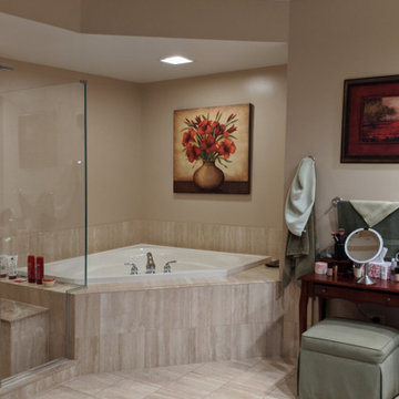
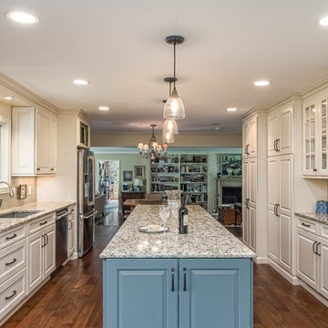
This client lives in a great high-rise condo in downtown Chicago. Alicia has already remodeled a few areas of her home, including her kitchen and home office. The bathroom is one of the last big places the client wanted to update. The existing bathroom had a large, outdated whirlpool tub in the corner. It was a darker space that had a lack of natural light. There are no windows (due to the bathroom’s location within the high-rise building). So, the idea was to brighten up the space and give the client an updated, elegant primary bathroom that is more her style and tailor-made for her routines.
Design Objectives:
- Make the space brighter.
- Create different daily routine stations to maximize functionality while keeping things clutter-free – a makeup station, a blow-dry station, and a sink-needs station.
- Achieve the client’s specific style and function needs while also keeping the look and design open to future possibilities: different users of the space/resale clients.
Design Challenges:
- Toilet cannot be moved. (In a high-rise, you can’t really move plumbing around too much when reimagining a space)
- Existing bathroom had a soffit that hid a lot of electrical wiring, so completely removing the soffit wasn’t an option.
- The blow-dry station needs to accommodate the client’s preference for standing up.
- Finding a place for the make-up station, which the client wants oriented for sitting.
- Create storage within the shower that can eliminate the clutter of personal care products that are actually needed every day. Do this, while keeping the client’s favorite things about the existing shower: the shower bench, a tub filler faucet (for rinsing shaving cream when shaving legs) and a low niche for placing her foot when shaving her legs.
THE RENEWED SPACE
Design Solutions:
- Extended a bit of wall near the toilet to give the commode its own area within the space, but without closing it off into a claustrophobic WC.
- Worked within the reality of the existing soffit situation, reshaping it to align with the new shower. Can lights were also added. Installed a beautiful ceiling light fixture that works within the new soffit shape, commanding attention and adding light, as if the sofit shape was chosen for it.
- Created a nice, furniture-looking 42”-high cabinet with pullout drawers to be the blow-dry station, complete with a mirror and a nice top. The pullout drawers are all powered, concealing a Dyson dryer and curling iron (and all the accoutrements) while keeping them plugged in, which is ideal for easy usage and put away. A stylish mirror on the wall above the cabinet, and proper lighting, make this the perfect blow-dry station. The top has a grommet that can accommodate a power cord should the client ever want to have a powered device on top of the cabinet.
- Put the sit-down makeup station where the tub used to be, putting the mirror back into a new recessed wall just a bit, allowing the area to have more room.
- Created a niche in the shower’s inner wall so that you can’t see it unless you are literally inside the shower. At the client’s request, it also has a hook so she can hang her loofa. Hiding the utility niche in this way allowed us to use the full main wall of the shower as a canvas for a beautiful accent stripe of raised decorative tile. The new shower has her old favorites, too: the tub filler, foot niche and bench.
Alicia’s client loves her new primary bathroom, especially the blow dry area. It is very accommodating for her, as a tall lady, while being very easy to use. The drawers store everything. Being powered, they make using already-plugged in appliances very easy to use and put away.
Her previous makeup station was a freestanding vanity with a single drawer, so beauty products were all over the surface top. With her new makeup station, everything is nicely tucked away and organized in drawers.
The new lighting is fantastic and the colors are light and soft. The clients loves the overall look and feel of her new bathroom and raves about how well the functionality-minded design makes her morning routine – and her life – easier and enjoyable!
Sponsored
Columbus, OH

Trish Takacs Design
Award Winning & Highly Skilled Kitchen & Bath Designer in Columbus
 Drury Design
THE SETUP
This client lives in a great high-rise condo in downtown Chicago. Alicia has already remodeled a few areas of her home, including her kitchen and home office. The bathroom is one of the last big places the client wanted to update. The existing bathroom had a large, outdated whirlpool tub in the corner. It was a darker space that had a lack of natural light. There are no windows (due to the bathroom’s location within the high-rise building). So, the idea was to brighten up the space and give the client an updated, elegant primary bathroom that is more her style and tailor-made for her routines.
Design Objectives:
- Make the space brighter.
- Create different daily routine stations to maximize functionality while keeping things clutter-free – a makeup station, a blow-dry station, and a sink-needs station.
- Achieve the client’s specific style and function needs while also keeping the look and design open to future possibilities: different users of the space/resale clients.
Design Challenges:
- Toilet cannot be moved. (In a high-rise, you can’t really move plumbing around too much when reimagining a space)
- Existing bathroom had a soffit that hid a lot of electrical wiring, so completely removing the soffit wasn’t an option.
- The blow-dry station needs to accommodate the client’s preference for standing up.
- Finding a place for the make-up station, which the client wants oriented for sitting.
- Create storage within the shower that can eliminate the clutter of personal care products that are actually needed every day. Do this, while keeping the client’s favorite things about the existing shower: the shower bench, a tub filler faucet (for rinsing shaving cream when shaving legs) and a low niche for placing her foot when shaving her legs.
THE RENEWED SPACE
Design Solutions:
- Extended a bit of wall near the toilet to give the commode its own area within the space, but without closing it off into a claustrophobic WC.
- Worked within the reality of the existing soffit situation, reshaping it to align with the new shower. Can lights were also added. Installed a beautiful ceiling light fixture that works within the new soffit shape, commanding attention and adding light, as if the sofit shape was chosen for it.
- Created a nice, furniture-looking 42”-high cabinet with pullout drawers to be the blow-dry station, complete with a mirror and a nice top. The pullout drawers are all powered, concealing a Dyson dryer and curling iron (and all the accoutrements) while keeping them plugged in, which is ideal for easy usage and put away. A stylish mirror on the wall above the cabinet, and proper lighting, make this the perfect blow-dry station. The top has a grommet that can accommodate a power cord should the client ever want to have a powered device on top of the cabinet.
- Put the sit-down makeup station where the tub used to be, putting the mirror back into a new recessed wall just a bit, allowing the area to have more room.
- Created a niche in the shower’s inner wall so that you can’t see it unless you are literally inside the shower. At the client’s request, it also has a hook so she can hang her loofa. Hiding the utility niche in this way allowed us to use the full main wall of the shower as a canvas for a beautiful accent stripe of raised decorative tile. The new shower has her old favorites, too: the tub filler, foot niche and bench.
Alicia’s client loves her new primary bathroom, especially the blow dry area. It is very accommodating for her, as a tall lady, while being very easy to use. The drawers store everything. Being powered, they make using already-plugged in appliances very easy to use and put away.
Her previous makeup station was a freestanding vanity with a single drawer, so beauty products were all over the surface top. With her new makeup station, everything is nicely tucked away and organized in drawers.
The new lighting is fantastic and the colors are light and soft. The clients loves the overall look and feel of her new bathroom and raves about how well the functionality-minded design makes her morning routine – and her life – easier and enjoyable!
 Robin's Nest Interiors
Updated Spec Home: Basement Living Area
I promised you there would be a Season 2 of our series Updated Spec Home and here it is – Basement Family Room. My mom and sister found themselves spending more and more time in this room because it was a great open space to watch television and hang out with my sister’s two border collies.
Color Scheme
We pulled our color scheme from a floral fabric that they saw on a chair at my store, and we used it to reupholster their existing wood accent chairs. We used pops of turquoise and green throughout the space including the long back wall which was perfect to make a feature with this vibrant wallpaper in a geometric design.
Defining the Space
The room was so large that we needed to define different areas. The large rug in the oversized pattern was perfect for the seating area.
Lighting
Since there is only one small window bringing natural light into the space, we painted the remaining walls a light warm gray (Sherwin Williams’ City Loft SW7631) and added several table lamps and a floor lamp for task lighting.
Reusing Existing Furniture
Fortunately the space was large enough so my sister could keep her fabulous worn leather chair and ottoman and my mom could have an upholstered chair and ottoman in a subtle blue and green tweed.
The large hallway leading to the storage area was the perfect place for these small bookcases which house family photos in various silver frames. The bookcases have a special place in our hearts – they belonged to my grandparents. We accessorized with a long painted box which was the perfect scale for the bookcases and a grouping of vibrant botanical prints.
In lieu of a conventional media cabinet, my mom and sister found this one with a built-in fireplace. It brings a lot of warmth into the space – literally!
Painted Furniture
We had Kelly Sisler of Kelly Faux Creations paint their existing glass front cabinet this awesome apple green. Accessories include turquoise floral vases, a metallic circular vase, and a beautiful floral print.
Reading Nook
We positioned this original oil painting in the landing so it would be visible from the seating area. The landing was the perfect spot to display my sister’s collection of art glass. I love the small reading nook created with this rattan wooden accent chair and lantern floor lamp. We were able to make good use of the ledge in the stairwell by leaning these vibrant watercolors.
The dogs even have their own space. Meet my two “nephews” – Dill and Atticus (the one with his back to us pouting). We used this colorful oversized canvas to define their space and break up the long wall.
As you know, one good thing leads to another. Be sure to tune in next week for a surprise addition to this Updated Spec Home. In the meantime, check out this Basement Family Room designed by Robin’s Nest Interiors. Enjoy!
 Drury Design
THE SETUP
This client lives in a great high-rise condo in downtown Chicago. Alicia has already remodeled a few areas of her home, including her kitchen and home office. The bathroom is one of the last big places the client wanted to update. The existing bathroom had a large, outdated whirlpool tub in the corner. It was a darker space that had a lack of natural light. There are no windows (due to the bathroom’s location within the high-rise building). So, the idea was to brighten up the space and give the client an updated, elegant primary bathroom that is more her style and tailor-made for her routines.
Design Objectives:
- Make the space brighter.
- Create different daily routine stations to maximize functionality while keeping things clutter-free – a makeup station, a blow-dry station, and a sink-needs station.
- Achieve the client’s specific style and function needs while also keeping the look and design open to future possibilities: different users of the space/resale clients.
Design Challenges:
- Toilet cannot be moved. (In a high-rise, you can’t really move plumbing around too much when reimagining a space)
- Existing bathroom had a soffit that hid a lot of electrical wiring, so completely removing the soffit wasn’t an option.
- The blow-dry station needs to accommodate the client’s preference for standing up.
- Finding a place for the make-up station, which the client wants oriented for sitting.
- Create storage within the shower that can eliminate the clutter of personal care products that are actually needed every day. Do this, while keeping the client’s favorite things about the existing shower: the shower bench, a tub filler faucet (for rinsing shaving cream when shaving legs) and a low niche for placing her foot when shaving her legs.
THE RENEWED SPACE
Design Solutions:
- Extended a bit of wall near the toilet to give the commode its own area within the space, but without closing it off into a claustrophobic WC.
- Worked within the reality of the existing soffit situation, reshaping it to align with the new shower. Can lights were also added. Installed a beautiful ceiling light fixture that works within the new soffit shape, commanding attention and adding light, as if the sofit shape was chosen for it.
- Created a nice, furniture-looking 42”-high cabinet with pullout drawers to be the blow-dry station, complete with a mirror and a nice top. The pullout drawers are all powered, concealing a Dyson dryer and curling iron (and all the accoutrements) while keeping them plugged in, which is ideal for easy usage and put away. A stylish mirror on the wall above the cabinet, and proper lighting, make this the perfect blow-dry station. The top has a grommet that can accommodate a power cord should the client ever want to have a powered device on top of the cabinet.
- Put the sit-down makeup station where the tub used to be, putting the mirror back into a new recessed wall just a bit, allowing the area to have more room.
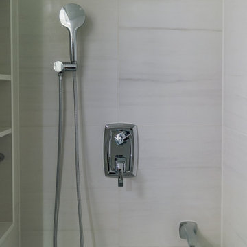
- Created a niche in the shower’s inner wall so that you can’t see it unless you are literally inside the shower. At the client’s request, it also has a hook so she can hang her loofa. Hiding the utility niche in this way allowed us to use the full main wall of the shower as a canvas for a beautiful accent stripe of raised decorative tile. The new shower has her old favorites, too: the tub filler, foot niche and bench.
Alicia’s client loves her new primary bathroom, especially the blow dry area. It is very accommodating for her, as a tall lady, while being very easy to use. The drawers store everything. Being powered, they make using already-plugged in appliances very easy to use and put away.
Her previous makeup station was a freestanding vanity with a single drawer, so beauty products were all over the surface top. With her new makeup station, everything is nicely tucked away and organized in drawers.
The new lighting is fantastic and the colors are light and soft. The clients loves the overall look and feel of her new bathroom and raves about how well the functionality-minded design makes her morning routine – and her life – easier and enjoyable!
 Drury Design
THE SETUP
This client lives in a great high-rise condo in downtown Chicago. Alicia has already remodeled a few areas of her home, including her kitchen and home office. The bathroom is one of the last big places the client wanted to update. The existing bathroom had a large, outdated whirlpool tub in the corner. It was a darker space that had a lack of natural light. There are no windows (due to the bathroom’s location within the high-rise building). So, the idea was to brighten up the space and give the client an updated, elegant primary bathroom that is more her style and tailor-made for her routines.
Design Objectives:
- Make the space brighter.
- Create different daily routine stations to maximize functionality while keeping things clutter-free – a makeup station, a blow-dry station, and a sink-needs station.
- Achieve the client’s specific style and function needs while also keeping the look and design open to future possibilities: different users of the space/resale clients.
Design Challenges:
- Toilet cannot be moved. (In a high-rise, you can’t really move plumbing around too much when reimagining a space)
- Existing bathroom had a soffit that hid a lot of electrical wiring, so completely removing the soffit wasn’t an option.
- The blow-dry station needs to accommodate the client’s preference for standing up.
- Finding a place for the make-up station, which the client wants oriented for sitting.
- Create storage within the shower that can eliminate the clutter of personal care products that are actually needed every day. Do this, while keeping the client’s favorite things about the existing shower: the shower bench, a tub filler faucet (for rinsing shaving cream when shaving legs) and a low niche for placing her foot when shaving her legs.
THE RENEWED SPACE
Design Solutions:
- Extended a bit of wall near the toilet to give the commode its own area within the space, but without closing it off into a claustrophobic WC.
- Worked within the reality of the existing soffit situation, reshaping it to align with the new shower. Can lights were also added. Installed a beautiful ceiling light fixture that works within the new soffit shape, commanding attention and adding light, as if the sofit shape was chosen for it.
- Created a nice, furniture-looking 42”-high cabinet with pullout drawers to be the blow-dry station, complete with a mirror and a nice top. The pullout drawers are all powered, concealing a Dyson dryer and curling iron (and all the accoutrements) while keeping them plugged in, which is ideal for easy usage and put away. A stylish mirror on the wall above the cabinet, and proper lighting, make this the perfect blow-dry station. The top has a grommet that can accommodate a power cord should the client ever want to have a powered device on top of the cabinet.
- Put the sit-down makeup station where the tub used to be, putting the mirror back into a new recessed wall just a bit, allowing the area to have more room.
- Created a niche in the shower’s inner wall so that you can’t see it unless you are literally inside the shower. At the client’s request, it also has a hook so she can hang her loofa. Hiding the utility niche in this way allowed us to use the full main wall of the shower as a canvas for a beautiful accent stripe of raised decorative tile. The new shower has her old favorites, too: the tub filler, foot niche and bench.
Alicia’s client loves her new primary bathroom, especially the blow dry area. It is very accommodating for her, as a tall lady, while being very easy to use. The drawers store everything. Being powered, they make using already-plugged in appliances very easy to use and put away.
Her previous makeup station was a freestanding vanity with a single drawer, so beauty products were all over the surface top. With her new makeup station, everything is nicely tucked away and organized in drawers.
The new lighting is fantastic and the colors are light and soft. The clients loves the overall look and feel of her new bathroom and raves about how well the functionality-minded design makes her morning routine – and her life – easier and enjoyable!
Sponsored
Columbus, OH
Hope Restoration & General Contracting
Columbus Design-Build, Kitchen & Bath Remodeling, Historic Renovations
 Vintage Cellars & Saunas
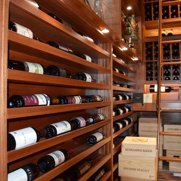
The horizontal display racks store the bottles horizontally, with the labels facing out. The space below the tabletop provides storage for the wine boxes.
An existing wine cellar in a La Jolla, San Diego home was expanded to accommodate the growing collection of the owner.
We worked on this project twice. The first installation was completed in 2008. After about 5 years, the client requested us to double the capacity of their wine room, but maintain the contemporary design.
We added new sections to the existing racking to provide additional space for more wines. Stunning Wine Cellar for a Contemporary Home
We completed a wine cellar installation project in La Jolla, an affluent city of San Diego, California, where we had to match the contemporary design of the home. The beautiful residential space was originally built with glass and wood.
All the woodworking was constructed from Sapele Mahogany, which is common in many parts of the house. The cabinetry and furniture had to be the same tone and material.
We have worked on this project twice. The first time was in 2008 and the second one was in 2013. We needed to expand and double the size of the custom wine cellar.
A very integral part of this homeowner’s life is their wine and the collecting of wine. Our main goal was to create a racking design that consists of various orientations to allow the owner to store different sizes of bottles.
Racking Features of the La Jolla Custom Wine Cellar
The original room was constructed when the home was built. The architect, designing team, and contractor gave us a palette to match the existing cabinetry.
The owners didn’t know what their needs were going to be. When they buy cases of wine, for example, they just put some of the bottles in the diamond bins and some in individual bottle spaces.
In 2013, we tried to make the racking as universal as possible. The original capacity of the wine room was 1,100 bottles. It increased to 1,624 after the expansion of the space and adding more wine racks.
Elevation 1
The first area of the room consists of racking for individual storage at the top section, with a VC-style cover for concealing the evaporator. There are diamond bins in the middle that can store nine bottles in each opening.
We added many slots for large format bottles below the diamond bins because the owners stored bigger bottles in the first room, as big as 9 liters. What we did was to open up a couple of spaces to create a wider wine storage area.
The whole racking in this area has a solid end panel. We took out the vertical supports and put the beam supports across to bear the load.
We incorporated a coved tray feature to allow the owners to get a feel for the beautiful bottles in their collection. The large format bottles are stored in various heights, resulting in a cascading wine display. This style of racking allows for easy visibility of the wine labels. We installed LED lighting above this area to illuminate the space dramatically without emitting too much heat.
Elevation 2
The next racking is labeled Elevation 2, which is the left wall that you will pass by before you go into the other storage area. It consists of horizontal display racks that can store both standard and larger bottles. These display racks, which are 8 ¼” deep, were installed with lighting and mirror at the back.
The middle section has two glass shelves that provide an area for the client’s wine cellar accessories and mini car collection.
Elevation 3
On the 3rd Elevation, the top racking includes slots with twelve coved trays and six solid backs. We added new individual column wine racks, and custom cabinets with scalloped neck supports to the existing cabinetry. Now, the total capacity of the individual bottle racking is 384, and the custom cabinets can accommodate 34 bottles.
There is a double deep Sapele Mahogany tabletop where we installed very large steel supports under it. This will provide structural stability for bearing the weight of this big case storage area. The homeowner buys a lot of wine, so he wanted to have an area where he could stack all the boxes.
He didn’t want the boxes to occupy the area at the front. With this feature, he could just bring the wines directly to this storage area, without affecting the aesthetic appeal of the front entrance of his La Jolla custom wine cellar.
Elevations 4 and 5
The next wall is Elevation 4, which consists of wine racks for 98 magnum bottles. The top most section has a VC-style evaporator cover.
Elevation 5 (in front of elevation 3), had twelve coved trays, 16-bottle custom cabinets with scalloped neck supports, and one hundred eighty individual storage slots.
After adding new sections, we ended up having sixteen coved trays, 26-bottle custom cabinets, and 288 individual bottle racking.
Rolling Ladder for Easy Access of Wines
Another factor that we consider when designing a wine room is the convenience in accessing the bottles. Since the ceiling of this La Jolla custom wine cellar was tall (about 124” height), we added a hook rolling ladder.
A hook ladder has fixtures that allow it to slide along the rail and can be lifted off the rail if you want to transfer it to another section of the racking on a different wall.
Vintage Cellars has built gorgeous custom wine cellars and wine storage rooms across the United States and World for over 25 years. We are your go-to business for anything wine cellar and wine storage related! Whether you're interested in a wine closet, wine racking, custom wine racks, a custom wine cellar door, or a cooling system for your existing space, Vintage Cellars has you covered!
We carry all kinds of wine cellar cooling and refrigeration systems, incuding: Breezaire, CellarCool, WhisperKool, Wine Guardian, CellarPro and Commercial systems.
We also carry many types of Wine Refrigerators, Wine Cabinets, and wine racking types, including La Cache, Marvel, N'Finity, Transtherm, Vinotheque, Vintage Series, Credenza, Walk in wine rooms, Climadiff, Riedel, Fontenay, and VintageView.
Vintage Cellars also does work in many styles, including Contemporary and Modern, Rustic, Farmhouse, Traditional, Craftsman, Industrial, Mediterranean, Mid-Century, Industrial and Eclectic.
Some locations we cover often include: San Diego, Rancho Santa Fe, Corona Del Mar, Del Mar, La Jolla, Newport Beach, Newport Coast, Huntington Beach, Del Mar, Solana Beach, Carlsbad, Orange County, Beverly Hills, Malibu, Pacific Palisades, Santa Monica, Bel Air, Los Angeles, Encinitas, Cardiff, Coronado, Manhattan Beach, Palos Verdes, San Marino, Ladera Heights, Santa Monica, Brentwood, Westwood, Hancock Park, Laguna Beach, Crystal Cove, Laguna Niguel, Torrey Pines, Thousand Oaks, Coto De Caza, Coronado Island, San Francisco, Danville, Walnut Creek, Marin, Tiburon, Hillsborough, Berkeley, Oakland, Napa, Sonoma, Agoura Hills, Hollywood Hills, Laurel Canyon, Sausalito, Mill Valley, San Rafael, Piedmont, Paso Robles, Carmel, Pebble Beach
Contact Vintage Cellars today with any of your Wine Cellar needs!
(800) 876-8789
 Innovate Building Solutions
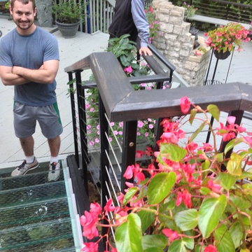
Glass stairs can really make a difference in a landscape design! This project literally put the floating glass steps over water!
Inspiration for a mid-sized timeless glass straight open staircase remodel in Columbus
Inspiration for a mid-sized timeless glass straight open staircase remodel in Columbus
 Woody's Home
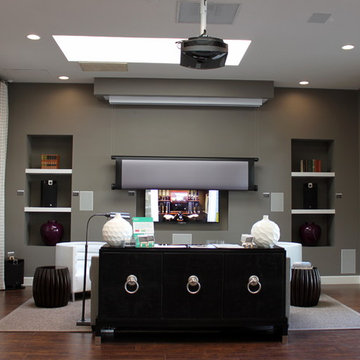
Motorized projector screen transforms your living room into a home theater instantly without sacrificing space. 3 different 5.1 sound systems: bookshelf, in-wall, invisible (which is behind the dry wall, and literally invisible)
8