
Search results for "Litre difference" in Home Design Ideas

 TKS Design Group
Free ebook, Creating the Ideal Kitchen. DOWNLOAD NOW
One of my favorite things to work on is older homes with a bit of history because I find it an interesting challenge to marry the historical architectural features of a home with modern design elements that work well for my client’s current lifestyle.
This home was particularly fun because it was the second kitchen we had done for this family and was quite a departure from the style of the first kitchen.
The before shot of the kitchen shows a view from the family room. See the dropped ceiling? We were curious, was this just part of the design or was the dropped ceiling there to hide mechanicals? Well we soon found out that it was mostly decorative (yay!), and with the exception of a little bit of work to some plumbing from an upstairs bathroom and rerouting of the ventilation system within the original floor joists, we were in the clear, phew! The shot of the completed kitchen from roughly the same vantage point shows how much taller the ceilings are. It makes a huge difference in the feel of the space. Dark and gloomy turned fresh and light!
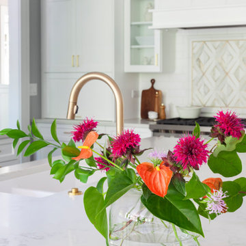
Another serious consideration was what do we do with the skinny transom window above the refrigerator. After much back and forth, we decided to eliminate it and do some open shelving instead. This ended up being one of the nicest areas in the room. I am calling it the “fun zone” because it houses all the barware, wine cubbies and a bar fridge — the perfect little buffet spot for entertaining. It is flanked on either side by pull out pantries that I’m sure will get a ton of use. Since the neighboring room has literally three walls of almost full height windows, the kitchen gets plenty of light.
The gold shelving brackets, large pendant fixtures over the island and the tile mural behind the range all pay subtle homage to the home’s prairie style architecture and bring a bit of sparkle to the room.
Even though the room is quite large, the work triangle is very tight with the large Subzero fridge, sink and range all nearby for easy maneuvering during meal prep. There is seating for four at the island, and work aisles are generous.
Designed by: Susan Klimala, CKD, CBD
Photography by: LOMA Studios
For more information on kitchen and bath design ideas go to: www.kitchenstudio-ge.com
 The Cousins
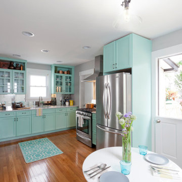
The new kitchen is not only more open and airy, but a window was knocked out to put in a dutch door that leads to the new deck.
Inspiration for a craftsman u-shaped eat-in kitchen remodel in New York with an undermount sink, glass-front cabinets, blue cabinets, quartzite countertops, mirror backsplash and stainless steel appliances
Inspiration for a craftsman u-shaped eat-in kitchen remodel in New York with an undermount sink, glass-front cabinets, blue cabinets, quartzite countertops, mirror backsplash and stainless steel appliances

Find the right local pro for your project
 Trestlewood
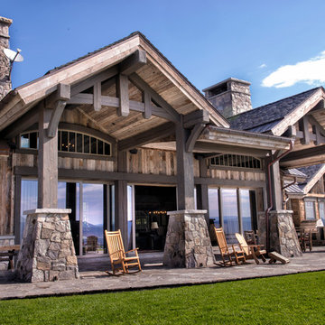
Antique Barnwood Siding is one of the most popular rustic siding options available. It is available in random or specific widths and various colors and textures. Available Configurations: Board-and-Bat, Board-on-Board, Board-to-Board, Shiplap, Wedgelap.
We sort our Antique Barnwood into three general categories: Gray Rough, Brown Rough and Smooth Brown/Gray (heavier to browns). You are, of course, welcome to mix and match any of the colors/textures for your particular application.
 Ginkgo Leaf Studio
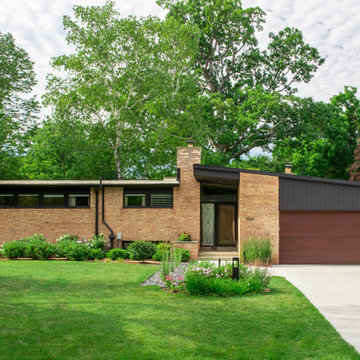
Overall front photo of this 1955 Leenhouts designed mid-century modern home in Fox Point, Wisconsin.
Renn Kuhnen Photography
Mid-sized 1960s two-story brick house exterior idea in Milwaukee with a butterfly roof and a mixed material roof
Mid-sized 1960s two-story brick house exterior idea in Milwaukee with a butterfly roof and a mixed material roof
 Robin's Nest Interiors
Updated Spec Home: Basement Living Area
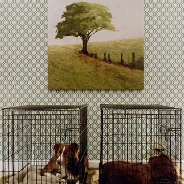
I promised you there would be a Season 2 of our series Updated Spec Home and here it is – Basement Family Room. My mom and sister found themselves spending more and more time in this room because it was a great open space to watch television and hang out with my sister’s two border collies.
Color Scheme
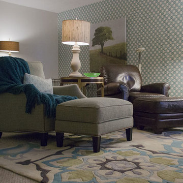
We pulled our color scheme from a floral fabric that they saw on a chair at my store, and we used it to reupholster their existing wood accent chairs. We used pops of turquoise and green throughout the space including the long back wall which was perfect to make a feature with this vibrant wallpaper in a geometric design.
Defining the Space
The room was so large that we needed to define different areas. The large rug in the oversized pattern was perfect for the seating area.
Lighting
Since there is only one small window bringing natural light into the space, we painted the remaining walls a light warm gray (Sherwin Williams’ City Loft SW7631) and added several table lamps and a floor lamp for task lighting.
Reusing Existing Furniture
Fortunately the space was large enough so my sister could keep her fabulous worn leather chair and ottoman and my mom could have an upholstered chair and ottoman in a subtle blue and green tweed.
The large hallway leading to the storage area was the perfect place for these small bookcases which house family photos in various silver frames. The bookcases have a special place in our hearts – they belonged to my grandparents. We accessorized with a long painted box which was the perfect scale for the bookcases and a grouping of vibrant botanical prints.
In lieu of a conventional media cabinet, my mom and sister found this one with a built-in fireplace. It brings a lot of warmth into the space – literally!
Painted Furniture
We had Kelly Sisler of Kelly Faux Creations paint their existing glass front cabinet this awesome apple green. Accessories include turquoise floral vases, a metallic circular vase, and a beautiful floral print.
Reading Nook
We positioned this original oil painting in the landing so it would be visible from the seating area. The landing was the perfect spot to display my sister’s collection of art glass. I love the small reading nook created with this rattan wooden accent chair and lantern floor lamp. We were able to make good use of the ledge in the stairwell by leaning these vibrant watercolors.
The dogs even have their own space. Meet my two “nephews” – Dill and Atticus (the one with his back to us pouting). We used this colorful oversized canvas to define their space and break up the long wall.
As you know, one good thing leads to another. Be sure to tune in next week for a surprise addition to this Updated Spec Home. In the meantime, check out this Basement Family Room designed by Robin’s Nest Interiors. Enjoy!
 TKS Design Group
Free ebook, Creating the Ideal Kitchen. DOWNLOAD NOW
One of my favorite things to work on is older homes with a bit of history because I find it an interesting challenge to marry the historical architectural features of a home with modern design elements that work well for my client’s current lifestyle.
This home was particularly fun because it was the second kitchen we had done for this family and was quite a departure from the style of the first kitchen.
The before shot of the kitchen shows a view from the family room. See the dropped ceiling? We were curious, was this just part of the design or was the dropped ceiling there to hide mechanicals? Well we soon found out that it was mostly decorative (yay!), and with the exception of a little bit of work to some plumbing from an upstairs bathroom and rerouting of the ventilation system within the original floor joists, we were in the clear, phew! The shot of the completed kitchen from roughly the same vantage point shows how much taller the ceilings are. It makes a huge difference in the feel of the space. Dark and gloomy turned fresh and light!
Another serious consideration was what do we do with the skinny transom window above the refrigerator. After much back and forth, we decided to eliminate it and do some open shelving instead. This ended up being one of the nicest areas in the room. I am calling it the “fun zone” because it houses all the barware, wine cubbies and a bar fridge — the perfect little buffet spot for entertaining. It is flanked on either side by pull out pantries that I’m sure will get a ton of use. Since the neighboring room has literally three walls of almost full height windows, the kitchen gets plenty of light.
The gold shelving brackets, large pendant fixtures over the island and the tile mural behind the range all pay subtle homage to the home’s prairie style architecture and bring a bit of sparkle to the room.
Even though the room is quite large, the work triangle is very tight with the large Subzero fridge, sink and range all nearby for easy maneuvering during meal prep. There is seating for four at the island, and work aisles are generous.
Designed by: Susan Klimala, CKD, CBD
Photography by: LOMA Studios
For more information on kitchen and bath design ideas go to: www.kitchenstudio-ge.com


 Drury Design
THE SETUP
This client lives in a great high-rise condo in downtown Chicago. Alicia has already remodeled a few areas of her home, including her kitchen and home office. The bathroom is one of the last big places the client wanted to update. The existing bathroom had a large, outdated whirlpool tub in the corner. It was a darker space that had a lack of natural light. There are no windows (due to the bathroom’s location within the high-rise building). So, the idea was to brighten up the space and give the client an updated, elegant primary bathroom that is more her style and tailor-made for her routines.
Design Objectives:
- Make the space brighter.
- Create different daily routine stations to maximize functionality while keeping things clutter-free – a makeup station, a blow-dry station, and a sink-needs station.
- Achieve the client’s specific style and function needs while also keeping the look and design open to future possibilities: different users of the space/resale clients.
Design Challenges:
- Toilet cannot be moved. (In a high-rise, you can’t really move plumbing around too much when reimagining a space)
- Existing bathroom had a soffit that hid a lot of electrical wiring, so completely removing the soffit wasn’t an option.
- The blow-dry station needs to accommodate the client’s preference for standing up.
- Finding a place for the make-up station, which the client wants oriented for sitting.
- Create storage within the shower that can eliminate the clutter of personal care products that are actually needed every day. Do this, while keeping the client’s favorite things about the existing shower: the shower bench, a tub filler faucet (for rinsing shaving cream when shaving legs) and a low niche for placing her foot when shaving her legs.
THE RENEWED SPACE
Design Solutions:
- Extended a bit of wall near the toilet to give the commode its own area within the space, but without closing it off into a claustrophobic WC.
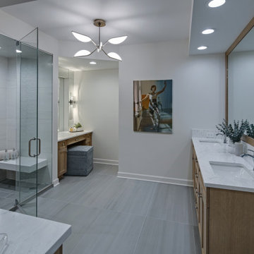
- Worked within the reality of the existing soffit situation, reshaping it to align with the new shower. Can lights were also added. Installed a beautiful ceiling light fixture that works within the new soffit shape, commanding attention and adding light, as if the sofit shape was chosen for it.
- Created a nice, furniture-looking 42”-high cabinet with pullout drawers to be the blow-dry station, complete with a mirror and a nice top. The pullout drawers are all powered, concealing a Dyson dryer and curling iron (and all the accoutrements) while keeping them plugged in, which is ideal for easy usage and put away. A stylish mirror on the wall above the cabinet, and proper lighting, make this the perfect blow-dry station. The top has a grommet that can accommodate a power cord should the client ever want to have a powered device on top of the cabinet.
- Put the sit-down makeup station where the tub used to be, putting the mirror back into a new recessed wall just a bit, allowing the area to have more room.
- Created a niche in the shower’s inner wall so that you can’t see it unless you are literally inside the shower. At the client’s request, it also has a hook so she can hang her loofa. Hiding the utility niche in this way allowed us to use the full main wall of the shower as a canvas for a beautiful accent stripe of raised decorative tile. The new shower has her old favorites, too: the tub filler, foot niche and bench.
Alicia’s client loves her new primary bathroom, especially the blow dry area. It is very accommodating for her, as a tall lady, while being very easy to use. The drawers store everything. Being powered, they make using already-plugged in appliances very easy to use and put away.
Her previous makeup station was a freestanding vanity with a single drawer, so beauty products were all over the surface top. With her new makeup station, everything is nicely tucked away and organized in drawers.
The new lighting is fantastic and the colors are light and soft. The clients loves the overall look and feel of her new bathroom and raves about how well the functionality-minded design makes her morning routine – and her life – easier and enjoyable!
 TKS Design Group
Free ebook, Creating the Ideal Kitchen. DOWNLOAD NOW
Collaborations are typically so fruitful and this one was no different. The homeowners started by hiring an architect to develop a vision and plan for transforming their very traditional brick home into a contemporary family home full of modern updates. The Kitchen Studio of Glen Ellyn was hired to provide kitchen design expertise and to bring the vision to life.
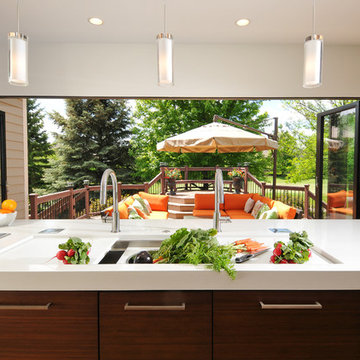
The bamboo cabinetry and white Ceasarstone countertops provide contrast that pops while the white oak floors and limestone tile bring warmth to the space. A large island houses a Galley Sink which provides a multi-functional work surface fantastic for summer entertaining. And speaking of summer entertaining, a new Nana Wall system — a large glass wall system that creates a large exterior opening and can literally be opened and closed with one finger – brings the outdoor in and creates a very unique flavor to the space.
Matching bamboo cabinetry and panels were also installed in the adjoining family room, along with aluminum doors with frosted glass and a repeat of the limestone at the newly designed fireplace.
Designed by: Susan Klimala, CKD, CBD
Photography by: Carlos Vergara
For more information on kitchen and bath design ideas go to: www.kitchenstudio-ge.com
 TKS Design Group
Free ebook, Creating the Ideal Kitchen. DOWNLOAD NOW
One of my favorite things to work on is older homes with a bit of history because I find it an interesting challenge to marry the historical architectural features of a home with modern design elements that work well for my client’s current lifestyle.
This home was particularly fun because it was the second kitchen we had done for this family and was quite a departure from the style of the first kitchen.
The before shot of the kitchen shows a view from the family room. See the dropped ceiling? We were curious, was this just part of the design or was the dropped ceiling there to hide mechanicals? Well we soon found out that it was mostly decorative (yay!), and with the exception of a little bit of work to some plumbing from an upstairs bathroom and rerouting of the ventilation system within the original floor joists, we were in the clear, phew! The shot of the completed kitchen from roughly the same vantage point shows how much taller the ceilings are. It makes a huge difference in the feel of the space. Dark and gloomy turned fresh and light!
Another serious consideration was what do we do with the skinny transom window above the refrigerator. After much back and forth, we decided to eliminate it and do some open shelving instead. This ended up being one of the nicest areas in the room. I am calling it the “fun zone” because it houses all the barware, wine cubbies and a bar fridge — the perfect little buffet spot for entertaining. It is flanked on either side by pull out pantries that I’m sure will get a ton of use. Since the neighboring room has literally three walls of almost full height windows, the kitchen gets plenty of light.
The gold shelving brackets, large pendant fixtures over the island and the tile mural behind the range all pay subtle homage to the home’s prairie style architecture and bring a bit of sparkle to the room.
Even though the room is quite large, the work triangle is very tight with the large Subzero fridge, sink and range all nearby for easy maneuvering during meal prep. There is seating for four at the island, and work aisles are generous.
Designed by: Susan Klimala, CKD, CBD
Photography by: LOMA Studios
For more information on kitchen and bath design ideas go to: www.kitchenstudio-ge.com
 Robin's Nest Interiors
Updated Spec Home: Basement Living Area
I promised you there would be a Season 2 of our series Updated Spec Home and here it is – Basement Family Room. My mom and sister found themselves spending more and more time in this room because it was a great open space to watch television and hang out with my sister’s two border collies.
Color Scheme
We pulled our color scheme from a floral fabric that they saw on a chair at my store, and we used it to reupholster their existing wood accent chairs. We used pops of turquoise and green throughout the space including the long back wall which was perfect to make a feature with this vibrant wallpaper in a geometric design.
Defining the Space
The room was so large that we needed to define different areas. The large rug in the oversized pattern was perfect for the seating area.
Lighting
Since there is only one small window bringing natural light into the space, we painted the remaining walls a light warm gray (Sherwin Williams’ City Loft SW7631) and added several table lamps and a floor lamp for task lighting.
Reusing Existing Furniture
Fortunately the space was large enough so my sister could keep her fabulous worn leather chair and ottoman and my mom could have an upholstered chair and ottoman in a subtle blue and green tweed.
The large hallway leading to the storage area was the perfect place for these small bookcases which house family photos in various silver frames. The bookcases have a special place in our hearts – they belonged to my grandparents. We accessorized with a long painted box which was the perfect scale for the bookcases and a grouping of vibrant botanical prints.
In lieu of a conventional media cabinet, my mom and sister found this one with a built-in fireplace. It brings a lot of warmth into the space – literally!
Painted Furniture
We had Kelly Sisler of Kelly Faux Creations paint their existing glass front cabinet this awesome apple green. Accessories include turquoise floral vases, a metallic circular vase, and a beautiful floral print.
Reading Nook
We positioned this original oil painting in the landing so it would be visible from the seating area. The landing was the perfect spot to display my sister’s collection of art glass. I love the small reading nook created with this rattan wooden accent chair and lantern floor lamp. We were able to make good use of the ledge in the stairwell by leaning these vibrant watercolors.
The dogs even have their own space. Meet my two “nephews” – Dill and Atticus (the one with his back to us pouting). We used this colorful oversized canvas to define their space and break up the long wall.
As you know, one good thing leads to another. Be sure to tune in next week for a surprise addition to this Updated Spec Home. In the meantime, check out this Basement Family Room designed by Robin’s Nest Interiors. Enjoy!
 TKS Design Group
Free ebook, Creating the Ideal Kitchen. DOWNLOAD NOW
Collaborations are typically so fruitful and this one was no different. The homeowners started by hiring an architect to develop a vision and plan for transforming their very traditional brick home into a contemporary family home full of modern updates. The Kitchen Studio of Glen Ellyn was hired to provide kitchen design expertise and to bring the vision to life.
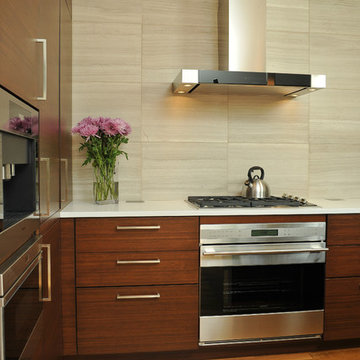
The bamboo cabinetry and white Ceasarstone countertops provide contrast that pops while the white oak floors and limestone tile bring warmth to the space. A large island houses a Galley Sink which provides a multi-functional work surface fantastic for summer entertaining. And speaking of summer entertaining, a new Nana Wall system — a large glass wall system that creates a large exterior opening and can literally be opened and closed with one finger – brings the outdoor in and creates a very unique flavor to the space.
Matching bamboo cabinetry and panels were also installed in the adjoining family room, along with aluminum doors with frosted glass and a repeat of the limestone at the newly designed fireplace.
Designed by: Susan Klimala, CKD, CBD
Photography by: Carlos Vergara
For more information on kitchen and bath design ideas go to: www.kitchenstudio-ge.com
 Heirloom Wood Studio
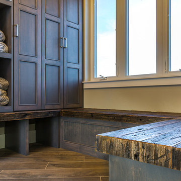
One of the more coveted modern-day luxuries, a well-appointed laundry room can make all the difference between drudgery and downright dreamy. While we’re certainly still talking about a chore that’s a bore, Colorado Fine Woodworks has designed custom laundry room layouts with elegant elements that alleviate the irritation and increase the efficiencies. You can save space, time and energy as you go about the business of sorting, cleaning, washing, drying, pressing, folding and then - doing it all over again the next week or the next day.
Some of our more creative laundry room projects have included:
- storage galore, including plenty of sensible places for stashing baskets
- a blend of easily accessible open and hidden cupboards, cubbies and cabinets
- handy handles and hardware carefully selected to increase convenience
- pull-out doors and drawers that keep detergents and dryer sheets within reach
- ample sink and countertop space for rinsing, folding and dealing with delicates
- brilliant built-ins, including a perfectly integrated concealed laundry chute
We’ve got literally loads of ideas for your laundry room, and we’d love to help make your household duties less difficult. Contact Colorado Fine Woodworks to start planning your project right away!

Sponsored
Columbus, OH

Hope Restoration & General Contracting
Columbus Design-Build, Kitchen & Bath Remodeling, Historic Renovations
 Moonshine Lamp
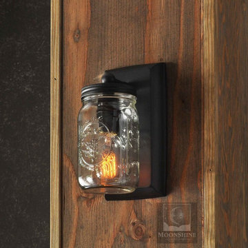
This is a wall sconce made from a 1 liter canning jar. The brass hardware and wall plate can all be left in unfinished brass or can be finished in black, copper, or oil rubbed bronze. Included is an old fashioned style Radio Bulb, 40 watts. I do have a huge inventory of bottles, so if you have a different one in mind, please let me know.
Dimensions:
9" H
4.5 W (Backing Plate)
5" Depth from wall
Rob
www.moonshinelamp.com
818-621-4089
 Robin's Nest Interiors
Updated Spec Home: Basement Living Area
I promised you there would be a Season 2 of our series Updated Spec Home and here it is – Basement Family Room. My mom and sister found themselves spending more and more time in this room because it was a great open space to watch television and hang out with my sister’s two border collies.
Color Scheme
We pulled our color scheme from a floral fabric that they saw on a chair at my store, and we used it to reupholster their existing wood accent chairs. We used pops of turquoise and green throughout the space including the long back wall which was perfect to make a feature with this vibrant wallpaper in a geometric design.
Defining the Space
The room was so large that we needed to define different areas. The large rug in the oversized pattern was perfect for the seating area.
Lighting
Since there is only one small window bringing natural light into the space, we painted the remaining walls a light warm gray (Sherwin Williams’ City Loft SW7631) and added several table lamps and a floor lamp for task lighting.
Reusing Existing Furniture
Fortunately the space was large enough so my sister could keep her fabulous worn leather chair and ottoman and my mom could have an upholstered chair and ottoman in a subtle blue and green tweed.
The large hallway leading to the storage area was the perfect place for these small bookcases which house family photos in various silver frames. The bookcases have a special place in our hearts – they belonged to my grandparents. We accessorized with a long painted box which was the perfect scale for the bookcases and a grouping of vibrant botanical prints.
In lieu of a conventional media cabinet, my mom and sister found this one with a built-in fireplace. It brings a lot of warmth into the space – literally!
Painted Furniture
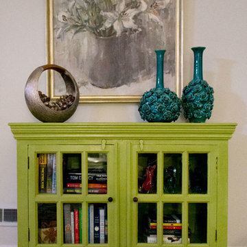
We had Kelly Sisler of Kelly Faux Creations paint their existing glass front cabinet this awesome apple green. Accessories include turquoise floral vases, a metallic circular vase, and a beautiful floral print.
Reading Nook
We positioned this original oil painting in the landing so it would be visible from the seating area. The landing was the perfect spot to display my sister’s collection of art glass. I love the small reading nook created with this rattan wooden accent chair and lantern floor lamp. We were able to make good use of the ledge in the stairwell by leaning these vibrant watercolors.
The dogs even have their own space. Meet my two “nephews” – Dill and Atticus (the one with his back to us pouting). We used this colorful oversized canvas to define their space and break up the long wall.
As you know, one good thing leads to another. Be sure to tune in next week for a surprise addition to this Updated Spec Home. In the meantime, check out this Basement Family Room designed by Robin’s Nest Interiors. Enjoy!
 Vintage Cellars & Saunas
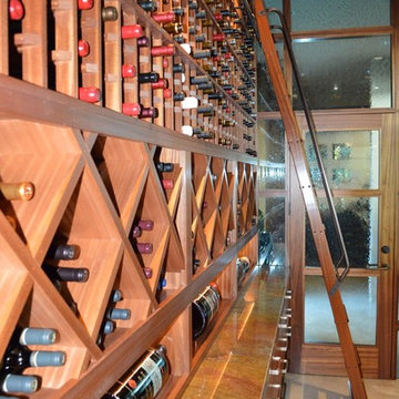
The wine racks installed in this elegant residential wine cellar in San Diego was constructed from Sapele Mahogany.
We added a rolling ladder to allow for easy access of wine that are located in hard-to-reach areas of the racking.
An existing wine cellar in a La Jolla, San Diego home was expanded to accommodate the growing collection of the owner.
We worked on this project twice. The first installation was completed in 2008. After about 5 years, the client requested us to double the capacity of their wine room, but maintain the contemporary design.
We added new sections to the existing racking to provide additional space for more wines. Stunning Wine Cellar for a Contemporary Home
We completed a wine cellar installation project in La Jolla, an affluent city of San Diego, California, where we had to match the contemporary design of the home. The beautiful residential space was originally built with glass and wood.
All the woodworking was constructed from Sapele Mahogany, which is common in many parts of the house. The cabinetry and furniture had to be the same tone and material.
We have worked on this project twice. The first time was in 2008 and the second one was in 2013. We needed to expand and double the size of the custom wine cellar.
A very integral part of this homeowner’s life is their wine and the collecting of wine. Our main goal was to create a racking design that consists of various orientations to allow the owner to store different sizes of bottles.
Racking Features of the La Jolla Custom Wine Cellar
The original room was constructed when the home was built. The architect, designing team, and contractor gave us a palette to match the existing cabinetry.
The owners didn’t know what their needs were going to be. When they buy cases of wine, for example, they just put some of the bottles in the diamond bins and some in individual bottle spaces.
In 2013, we tried to make the racking as universal as possible. The original capacity of the wine room was 1,100 bottles. It increased to 1,624 after the expansion of the space and adding more wine racks.
Elevation 1
The first area of the room consists of racking for individual storage at the top section, with a VC-style cover for concealing the evaporator. There are diamond bins in the middle that can store nine bottles in each opening.
We added many slots for large format bottles below the diamond bins because the owners stored bigger bottles in the first room, as big as 9 liters. What we did was to open up a couple of spaces to create a wider wine storage area.
The whole racking in this area has a solid end panel. We took out the vertical supports and put the beam supports across to bear the load.
We incorporated a coved tray feature to allow the owners to get a feel for the beautiful bottles in their collection. The large format bottles are stored in various heights, resulting in a cascading wine display. This style of racking allows for easy visibility of the wine labels. We installed LED lighting above this area to illuminate the space dramatically without emitting too much heat.
Elevation 2
The next racking is labeled Elevation 2, which is the left wall that you will pass by before you go into the other storage area. It consists of horizontal display racks that can store both standard and larger bottles. These display racks, which are 8 ¼” deep, were installed with lighting and mirror at the back.
The middle section has two glass shelves that provide an area for the client’s wine cellar accessories and mini car collection.
Elevation 3
On the 3rd Elevation, the top racking includes slots with twelve coved trays and six solid backs. We added new individual column wine racks, and custom cabinets with scalloped neck supports to the existing cabinetry. Now, the total capacity of the individual bottle racking is 384, and the custom cabinets can accommodate 34 bottles.
There is a double deep Sapele Mahogany tabletop where we installed very large steel supports under it. This will provide structural stability for bearing the weight of this big case storage area. The homeowner buys a lot of wine, so he wanted to have an area where he could stack all the boxes.
He didn’t want the boxes to occupy the area at the front. With this feature, he could just bring the wines directly to this storage area, without affecting the aesthetic appeal of the front entrance of his La Jolla custom wine cellar.
Elevations 4 and 5
The next wall is Elevation 4, which consists of wine racks for 98 magnum bottles. The top most section has a VC-style evaporator cover.
Elevation 5 (in front of elevation 3), had twelve coved trays, 16-bottle custom cabinets with scalloped neck supports, and one hundred eighty individual storage slots.
After adding new sections, we ended up having sixteen coved trays, 26-bottle custom cabinets, and 288 individual bottle racking.
Rolling Ladder for Easy Access of Wines
Another factor that we consider when designing a wine room is the convenience in accessing the bottles. Since the ceiling of this La Jolla custom wine cellar was tall (about 124” height), we added a hook rolling ladder.
A hook ladder has fixtures that allow it to slide along the rail and can be lifted off the rail if you want to transfer it to another section of the racking on a different wall.
Take a video tour of this project: https://www.youtube.com/watch?v=EVLCEgYlre8
Vintage Cellars has built gorgeous custom wine cellars and wine storage rooms across the United States and World for over 25 years. We are your go-to business for anything wine cellar and wine storage related! Whether you're interested in a wine closet, wine racking, custom wine racks, a custom wine cellar door, or a cooling system for your existing space, Vintage Cellars has you covered!
We carry all kinds of wine cellar cooling and refrigeration systems, incuding: Breezaire, CellarCool, WhisperKool, Wine Guardian, CellarPro and Commercial systems.
We also carry many types of Wine Refrigerators, Wine Cabinets, and wine racking types, including La Cache, Marvel, N'Finity, Transtherm, Vinotheque, Vintage Series, Credenza, Walk in wine rooms, Climadiff, Riedel, Fontenay, and VintageView.
Vintage Cellars also does work in many styles, including Contemporary and Modern, Rustic, Farmhouse, Traditional, Craftsman, Industrial, Mediterranean, Mid-Century, Industrial and Eclectic.
Some locations we cover often include: San Diego, Rancho Santa Fe, Corona Del Mar, Del Mar, La Jolla, Newport Beach, Newport Coast, Huntington Beach, Del Mar, Solana Beach, Carlsbad, Orange County, Beverly Hills, Malibu, Pacific Palisades, Santa Monica, Bel Air, Los Angeles, Encinitas, Cardiff, Coronado, Manhattan Beach, Palos Verdes, San Marino, Ladera Heights, Santa Monica, Brentwood, Westwood, Hancock Park, Laguna Beach, Crystal Cove, Laguna Niguel, Torrey Pines, Thousand Oaks, Coto De Caza, Coronado Island, San Francisco, Danville, Walnut Creek, Marin, Tiburon, Hillsborough, Berkeley, Oakland, Napa, Sonoma, Agoura Hills, Hollywood Hills, Laurel Canyon, Sausalito, Mill Valley, San Rafael, Piedmont, Paso Robles, Carmel, Pebble Beach
Contact Vintage Cellars today with any of your Wine Cellar needs!
(800) 876-8789
 TKS Design Group
Free ebook, Creating the Ideal Kitchen. DOWNLOAD NOW
One of my favorite things to work on is older homes with a bit of history because I find it an interesting challenge to marry the historical architectural features of a home with modern design elements that work well for my client’s current lifestyle.
This home was particularly fun because it was the second kitchen we had done for this family and was quite a departure from the style of the first kitchen.
The before shot of the kitchen shows a view from the family room. See the dropped ceiling? We were curious, was this just part of the design or was the dropped ceiling there to hide mechanicals? Well we soon found out that it was mostly decorative (yay!), and with the exception of a little bit of work to some plumbing from an upstairs bathroom and rerouting of the ventilation system within the original floor joists, we were in the clear, phew! The shot of the completed kitchen from roughly the same vantage point shows how much taller the ceilings are. It makes a huge difference in the feel of the space. Dark and gloomy turned fresh and light!
Another serious consideration was what do we do with the skinny transom window above the refrigerator. After much back and forth, we decided to eliminate it and do some open shelving instead. This ended up being one of the nicest areas in the room. I am calling it the “fun zone” because it houses all the barware, wine cubbies and a bar fridge — the perfect little buffet spot for entertaining. It is flanked on either side by pull out pantries that I’m sure will get a ton of use. Since the neighboring room has literally three walls of almost full height windows, the kitchen gets plenty of light.
The gold shelving brackets, large pendant fixtures over the island and the tile mural behind the range all pay subtle homage to the home’s prairie style architecture and bring a bit of sparkle to the room.
Even though the room is quite large, the work triangle is very tight with the large Subzero fridge, sink and range all nearby for easy maneuvering during meal prep. There is seating for four at the island, and work aisles are generous.
Designed by: Susan Klimala, CKD, CBD
Photography by: LOMA Studios
For more information on kitchen and bath design ideas go to: www.kitchenstudio-ge.com

 Pool & Hot Tub Alliance
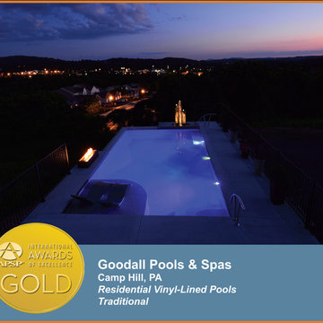
This project was exceedingly challenging because of several factors. For starters, the lot itself, and all access points, were very small and cramped, requiring close management of in and out with equipment, materials, etc. Next it was also challenging because our customer wanted a very clean, classy look with many extras and details but also had only a very modest budget to work with. Finally, however, the greatest challenge was that over 80% of the space dedicated for the pool was only air. The customer literally wanted the pool situated over a cliff. Indeed, they even had another person from a different pool company tell them this couldnt be done in this part of the country; People only do this stuff in California! To overcome these obstacles, we made three very important decisions. We worked with a local engineer to design a poured-concrete wall system that would be both secure and able to become a portion of the pool wall; this then allowed us to put the wall right at the lot set-back line, which maximized every bit of available space. Next we chose to construct the remainder of the pool walls, steps, bench seat and tanning ledge with steel, and finish with a vinyl liner, in order to reduce overall costs and stay within their budget. Finally, a vanishing edge would have been ideal for this site, but again spatial and budget constraints made this a non-option. However, to try to create a strong focal point at the far corner of the pool we dropped the wall (tricky with vinyl!) and used glass block (with a Bright-white sanded grout joint) as coping material. The fountain at the end of the pool was custom-built on site with Basalt stone from the state of Washington and is completely self-contained. The fire feature on the far side completed the work of leading ones eye truly off into the sunset. Our customers were quite pleased with the result. They were able to accomplish practically everything they had wanted to do from the beginning, they were able to stay within their budget, and they were able to do all this right here in the hills of Pennsylvania.
 Drury Design
THE SETUP
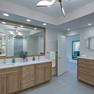
This client lives in a great high-rise condo in downtown Chicago. Alicia has already remodeled a few areas of her home, including her kitchen and home office. The bathroom is one of the last big places the client wanted to update. The existing bathroom had a large, outdated whirlpool tub in the corner. It was a darker space that had a lack of natural light. There are no windows (due to the bathroom’s location within the high-rise building). So, the idea was to brighten up the space and give the client an updated, elegant primary bathroom that is more her style and tailor-made for her routines.
Design Objectives:
- Make the space brighter.
- Create different daily routine stations to maximize functionality while keeping things clutter-free – a makeup station, a blow-dry station, and a sink-needs station.
- Achieve the client’s specific style and function needs while also keeping the look and design open to future possibilities: different users of the space/resale clients.
Design Challenges:
- Toilet cannot be moved. (In a high-rise, you can’t really move plumbing around too much when reimagining a space)
- Existing bathroom had a soffit that hid a lot of electrical wiring, so completely removing the soffit wasn’t an option.
- The blow-dry station needs to accommodate the client’s preference for standing up.
- Finding a place for the make-up station, which the client wants oriented for sitting.
- Create storage within the shower that can eliminate the clutter of personal care products that are actually needed every day. Do this, while keeping the client’s favorite things about the existing shower: the shower bench, a tub filler faucet (for rinsing shaving cream when shaving legs) and a low niche for placing her foot when shaving her legs.
THE RENEWED SPACE
Design Solutions:
- Extended a bit of wall near the toilet to give the commode its own area within the space, but without closing it off into a claustrophobic WC.
- Worked within the reality of the existing soffit situation, reshaping it to align with the new shower. Can lights were also added. Installed a beautiful ceiling light fixture that works within the new soffit shape, commanding attention and adding light, as if the sofit shape was chosen for it.
- Created a nice, furniture-looking 42”-high cabinet with pullout drawers to be the blow-dry station, complete with a mirror and a nice top. The pullout drawers are all powered, concealing a Dyson dryer and curling iron (and all the accoutrements) while keeping them plugged in, which is ideal for easy usage and put away. A stylish mirror on the wall above the cabinet, and proper lighting, make this the perfect blow-dry station. The top has a grommet that can accommodate a power cord should the client ever want to have a powered device on top of the cabinet.
- Put the sit-down makeup station where the tub used to be, putting the mirror back into a new recessed wall just a bit, allowing the area to have more room.
- Created a niche in the shower’s inner wall so that you can’t see it unless you are literally inside the shower. At the client’s request, it also has a hook so she can hang her loofa. Hiding the utility niche in this way allowed us to use the full main wall of the shower as a canvas for a beautiful accent stripe of raised decorative tile. The new shower has her old favorites, too: the tub filler, foot niche and bench.
Alicia’s client loves her new primary bathroom, especially the blow dry area. It is very accommodating for her, as a tall lady, while being very easy to use. The drawers store everything. Being powered, they make using already-plugged in appliances very easy to use and put away.
Her previous makeup station was a freestanding vanity with a single drawer, so beauty products were all over the surface top. With her new makeup station, everything is nicely tucked away and organized in drawers.
The new lighting is fantastic and the colors are light and soft. The clients loves the overall look and feel of her new bathroom and raves about how well the functionality-minded design makes her morning routine – and her life – easier and enjoyable!
 User
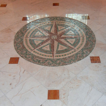
UserThis beautiful custom-made mosaic was literally removed (with much effort) and replace with radiant heat and new Cream Pearl marble and Persian Red 4 x 4 accent pieces. A different placement with square accent on diamond 12 x 12 with high gloss gave my client the new flooring desired. What a great way to welcome guest into the entry which flows to the elegant living room!
6