
Search results for "Locket close up" in Home Design Ideas
 Josh Blanc
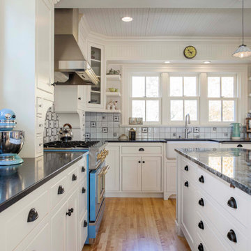
This image shows off our hand-carved and hand-painted Medieval Floral Tiles in the color combination Helsinki. This close up image shows off our hand-carved and hand-painted Medieval Floral Tiles in the color combination Helsinki. Here the there are 4x4" tiles in our Marshmallow as well as 4x4" Medievals in Helsinki and 2x2" Medievals with L-Cut Outs.
 TKS Design Group
Download our free ebook, Creating the Ideal Kitchen. DOWNLOAD NOW
Lakefront property in the northwest suburbs of Chicago is hard to come by, so when we were hired by this young family with exactly that, we were immediately inspired by not just the unusually large footprint of this 1950’s colonial revival but also the lovely views of the manmade lake it was sited on. The large 5-bedroom home was solidly stuck in the 1980’s, but we saw tons of potential. We started out by updating the existing staircase with a fresh coat of paint and adding new herringbone slate to the entry hall.
The powder room off the entryway also got a refresh - new flooring, new cabinets and fixtures. We ran the new slate right through into this space for some consistency. A fun wallpaper and shiplap trim add a welcoming feel and set the tone for the home.
Next, we tackled the kitchen. Located away from the rest of the first floor, the kitchen felt a little isolated, so we immediately began planning for how to better connect it to the rest of the first floor. We landed on removing the wall between the kitchen and dining room and designed a modified galley style space with separate cooking and clean up zones. The cooking zone consists of the refrigerator, prep sink and cooktop, along with a nice long run of prep space at the island. The cleanup side of the kitchen consists of the main sink and dishwasher. Both areas are situated so that the user can view the lake during prep work and cleanup!
One of the home’s main puzzles was how to incorporate the mudroom and area in front of the patio doors at the back of the house. We already had a breakfast table area, so the space by the patio doors was a bit of a no man’s land. We decided to separate the kitchen proper from what became the new mudroom with a large set of barn doors. That way you can quickly hide any mudroom messes but have easy access to the light coming in through the patio doors as well as the outdoor grilling station. We also love the impact the barn doors add to the overall space.
The homeowners’ first words to us were “it’s time to ditch the brown,” so we did! We chose a lovely blue pallet that reflects the home’s location on the lake which is also vibrant yet easy on the eye. Countertops are white quartz, and the natural oak floor works well with the other honey accents. The breakfast table was given a refresh with new chairs, chandelier and window treatments that frame the gorgeous views of the lake out the back.
We coordinated the slate mudroom flooring with that used in the home’s main entrance for a consistent feel. The storage area consists of open and closed storage to allow for some clutter control as needed.
Next on our “to do” list was revamping the dated brown bar area in the neighboring dining room. We eliminated the clutter by adding some closed cabinets and did some easy updates to help the space feel more current. One snag we ran into here was the discovery of a beam above the existing open shelving that had to be modified with a smaller structural beam to allow for our new design to work. This was an unexpected surprise, but in the end we think it was well worth it!
We kept the colors here a bit more muted to blend with the homeowner’s existing furnishings. Open shelving and polished nickel hardware add some simple detail to the new entertainment zone which also looks out onto the lake!
Next we tackled the upstairs starting with the homeowner’s son’s bath. The bath originally had both a tub shower and a separate shower, so we decided to swap out the shower for a new laundry area. This freed up some space downstairs in what used to be the mudroom/laundry room and is much more convenient for daily laundry needs.
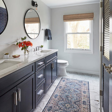
We continued the blue palette here with navy cabinetry and the navy tile in the shower. Porcelain floor tile and chrome fixtures keep maintenance to a minimum while matte black mirrors and lighting add some depth the design. A low maintenance runner adds some warmth underfoot and ties the whole space together.
We added a pocket door to the bathroom to minimize interference with the door swings. The left door of the laundry closet is on a 180 degree hinge to allow for easy full access to the machines. Next we tackled the master bath which is an en suite arrangement. The original was typical of the 1980’s with the vanity outside of the bathroom, situated near the master closet. And the brown theme continued here with multiple shades of brown.
Our first move was to segment off the bath and the closet from the master bedroom. We created a short hall from the bedroom to the bathroom with his and hers walk-in closets on the left and right as well as a separate toilet closet outside of the main bathroom for privacy and flexibility.
The original bathroom had a giant soaking tub with steps (dangerous!) as well as a small shower that did not work well for our homeowner who is 6’3”. With other bathtubs in the home, they decided to eliminate the tub and create an oversized shower which takes up the space where the old tub was located. The double vanity is on the opposite wall and a bench is located under the window for morning conversations and a place to set a couple of towels.
The pallet in here is light and airy with a mix of blond wood, creamy porcelain and marble tile, and brass accents. A simple roman shade adds some texture and it’s top-down mechanism allows for light and privacy.
This large whole house remodel gave our homeowners not only the ability to maximize the potential of their home but also created a lovely new frame from which to view their fabulous lake views.
Designed by: Susan Klimala, CKD, CBD
Photography by: Michael Kaskel
For more information on kitchen and bath design ideas go to: www.kitchenstudio-ge.com
 Envision Web
Becky Hulsey, Envision Virtual Tours
The Lodge at Gold Mine Falls
A Once in a Lifetime Opportunity Awaits….
Have you dreamed of owning your own spectacular waterfall, a serene trout pond, or a one of a kind mountain lodge filled with high end touches, all near Lake Burton? If the answer is yes…..then “The Lodge at Gold Mine Falls” is for you!
Located just off HW 76 .3 miles to Anchorage Marina, this unique 2.8 acre property borders the National Forest, boasts a fully remodeled 3 bedroom, 3 bath, 2000+ square foot rock lodge that is adjacent to its own private, spectacular 60 foot waterfall all surrounded by native landscape such as rhododendron and mountain laurel. Tumbling under the 40 foot suspension bridge, the pristine, crystal clear water continues to ramble on its way to large pond ready to be stocked with trout. Picture yourself fly fishing for a trout dinner right at your front door, or delight your friends or family while entertaining on your new porch or extensive, multi-level deck that connects your new home to your own waterfall. The kids or grandkids will be entertained for hours wading in the pool at the base of the waterfall, exploring the crooks and crannies among the stream’s boulders while looking for salamanders, or panning for “fool’s gold” in the stream. Just imagine….The Lodge at Gold Mine Falls has all this and more!
As you walk up the front steps to The Lodge at Gold Mine Falls, you will notice the craftsmanship of this uniquely one of a kind home made from local stone and granite from a period gone by. If you look closely at some of the stones, you will find raw garnets, some the size of a nail head. Upon opening the front door constructed of solid oak and a tasteful piece of leaded glass, you will be amazed at the spaciousness of the lodge room. Once upon a time, the 20 x 30 foot room with 10 foot ceilings was the entire home. The focal piece of the room is the new floor to ceiling field stone fireplace, hand honed solid maple mantel, rounded hearth, accentuated by a hand-cut keystone, and flanked by raw cedar columns. The new gas logs can be remotely controlled with programmable heat. A built-in floor to ceiling cherry wood wall unit, with granite serving surface, highlights a side wall and is topped off with a large piece of stained glass from an English pub. The mood lighting behind the stained glass and the antique library ladder really highlights this unique bookcase. Distinctive lighting fixtures and fans provide dining area lighting and circulation from the cool breezes off of Lake Burton. On the bottom, the solid oak 1.5 inch flooring is a remnant of the past on the top, the height of the ceilings is enhanced by double crown moldings throughout and a touch of the outdoors is brought indoors by the three new skylights. Surrounded by rustic cedar window boxes, additional ambient light streams through the four windows facing south, and the new French doors.
As you open the French doors to the new porch, you are immediately struck by the sights and sound produced by the rushing water as it cascades over the spectacular multilevel waterfall. You will also notice that the mountain has literally been carved away as you view the layers and striations in the granite that surround the back of the porch. The peaked cathedral ceiling sports a glass apex and the bead board on the ceiling accentuated by the raw cedar plank framing and the five cedar trees used as cornerstones all bring the outdoors within your reach. The addition of “E-Z Breeze” vinyl windows along with the cast iron gas stove will allow you and your family to enjoy the beauty and continually changing scenery at The Lodge at Gold Mine Fall during all four seasons.
Opening the Adirondack style door on the other side of the lodge room allows you to step into the Lodge’s addition built at a later date. The four foot wide hallway boasts stained glass light fixtures and an architectural feature from the new stairwell that divides the living and the bedroom spaces. Knowing that the east wall in the kitchen and study were once on the home’s exterior allowed us to investigate and reveal the true character of these walls by removing the two layers of drywall and 4 inches of plaster exposing a striking addition to both rooms…… beautiful granite rock walls. The hallway flows into the granite breakfast bar which fully complements the newly exposed granite wall. From the Viking SS refrigerator to gas Jenn Air ceramic cooktop and microwave the appliances are a chef’s delight. Lighting is a critical component in a gourmet kitchen and the light from the double window is enhanced by two spotlights over the cooking area, LED task lighting under the cabinets, mood lighting over the top cabinets, and four “Murano” hand blown glass pendant lights over the sink and bar area. Scoring points in the design category, the full wood “Thomasville” two tone glazed cabinets that are country white and palomino scream style and sophistication, and are accentuated by the cool copper glass backsplash and refined stainless steel hardware. The porcelain, two bowl farmhouse sink is large enough for your biggest pots while the stainless steel sink guards will protect it from scratches. The SS faucet is professional quality and the Insinkerator will help the chef in the house save time with instant 190 degree water. An eight foot long exposed cedar tree trunk hangs over the cooking area allowing the chef to hang his/her favorite utensils and pots or pans in full lodge style. And who wouldn’t crave a large walk in pantry with commercial grade slides that will up to 120 pounds. With all these features, the cook/cooks in the family will love spending time in this room.
Across from the kitchen is a study/office area which can be closed off from the hallway by a double barn door. Except for the remarkable exposed granite rock wall mentioned earlier, the entire room has been paneled with raw cedar boards treated with Australian Tree Oil for true lodge feel. The triple crank out window provides a superb view of the pond and blazing Japanese maple trees in the fall. Outside, the hallway leads to the utility room which has been fully upgraded with all the modern amenities. The oak cabinetry with granite tops also has an extra deep sink with commercial kitchen sprayer. The sink area is surrounded by white subway tile while slate and green glass mini tile accents bring the outdoor colors inside. The doggy door, new exterior door and crank out window provide access to the back yard and additional light. From the new “Rinnai” point of use, gas hot water heater to the new “LG” full size, stackable washer and dryer, this utility room delivers.
The master bedroom has four windows which provide outstanding light and air circulation. To take the chill off of nippy evenings, this bedroom also has its own romantic fireplace with travertine marble surround, remote controlled gas logs, and a beautiful antique oak and mirror mantle. To top it off, the en-suite bath contains high end fixtures, a spacious vanity, and floor to ceiling rain shower with independent valves allowing you to turn on the shower and not get wet. Multiple safety handrails and a fold down shower seat give bathers assurance and provide an additional measure of safety. The earthy color tiles, glass tile accents and hand blown light fixtures continue the lodge theme in this end of the house. Located across the hall, the guest bedroom is light and airy with its white window boxes and double crown molding, and also has an attached bathroom. This bathroom also has an entrance door leading to the hallway and doubles as the guest bathroom for the house. Its antique oak vanity and mirror, stained glass lights and wrought iron accents remind me of a past era while the vessel sink, modern fixtures, and floor to ceiling travertine and glass tile rain shower all bring the bathroom up to modern standards.
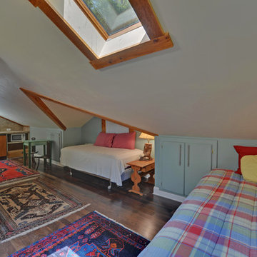
Located at the end of the hallway, and next to the guest bathroom, is the handcrafted stairwell leading to the sleeping loft. The distinctive maple stair treads with their grain and raw edge being displayed, were milled locally in Clayton and then installed from underneath so that no screw or nail heads are visible. The staircase was completed with wrought iron spindles, raw cedar handrail and floor to ceiling end post. Upon your entry into the sleeping loft, you will notice the amount of light that enters through the two skylights and large window facing the pond. The sound of water rushing over the pond’s spillway is a delightful addition to this large sleeping loft. Finished with engineered hardwood flooring and two built in double beds with tree trunks for legs, the room can accommodate four additional twin beds. The sleeping loft is also equipped with a kitchenette and a distinctive cedar and rock walled bathroom. The bath features an antique dresser vanity with marble vessel sink, distinctive fixtures and a floor to ceiling polished travertine marble shower with rain head. This bathroom also has an exterior door leading to a secondary upstairs staircase in the back yard. Just envision the great sleepovers the kids or grandkids will have here or how your out of town friends or family will just love this special area designed with their comfort and needs in mind.
Originally constructed in 1925 by “off Broadway” star Rose Grant, this property is rich in history. In the early years, this home was one of the first in Rabun County to generate its own electric from the waterfall. Several small cabins were also built on the property and rented out to guests who came for the waterfall, swim in the pond and connect with nature. Other notable residents were Mrs. and Doctor Fowler who was a local pediatrician. According to an aged newspaper article, Mrs. Fowler was very interested in the indigenous flora and fauna and grew a variety of native plants on the property including some that were rare or endangered. Many metal name tags still remain along the various paths on the property thus reminding you of times gone by and the true beauty of property.
Lastly, this solidly built home has just been structurally solidified, become more energy efficient, and reconfigured to further usable space all while retaining the Lodge’s original charm. After removing the flooring in the kitchen, hall and both bathrooms, the home’s structure and roof were fortified with numerous concrete footers to support both bathrooms, kitchen, and stairwell walls that extend from floor to roof. To make this home more comfortable, energy efficient, and bring it up to modern standards, the electrical system was upgraded to 220 service with the wiring, outlets, electrical panels and fixtures replaced throughout the entire home. A whole house surge protector was also installed to protect against damage that may occur with lightning strikes. Speaking of electric…..the pond’s newly poured formed concrete wall contains a pipe enabling you to install your own hydro-electric system. And whether you might decide to tie into the grid or store you energy in a battery system, you could generate your own electric 24/7. The homes plumbing was also replaced with new pipes, energy/water efficient fixtures in each bathroom (including three Toto toilets), and a new cistern was installed behind the garage with a laboratory grade water filtration system. The task of water heating was completed by a gas Rinnai point of use hot water heater in the utility room and all windows were replaced with Anderson thermal pane and 6 Velux skylights were mounted to bring the outdoors inside. The home’s HVAC system was top of the line several years ago and both sets of new gas logs are controlled with remotes. Formerly a summer home, all exterior walls were studded out with insulation added, and whole house fans were installed in the attic and upstairs bathroom. Although many of these upgrades may not be visible, they allow the home to be more energy efficient and more comfortable……allowing The Lodge at Gold Mine Falls to become your four season retreat.
Find the right local pro for your project
 Worthington Design & Remodeling
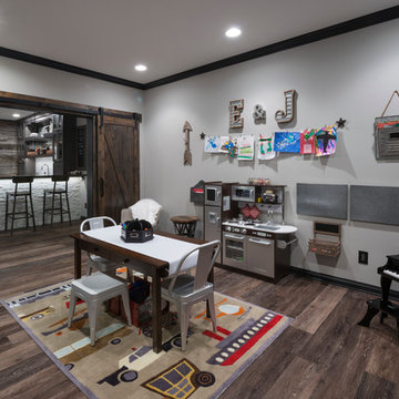
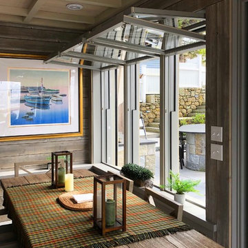
The homeowners wanted to be able to close off the bar and have their own space separate from the kid's playroom. Our designers came up with sliding bar doors to give the space definition.
Photo Credit: Chris Whonsetler

 Valentini Kids Furniture Brooklyn NY
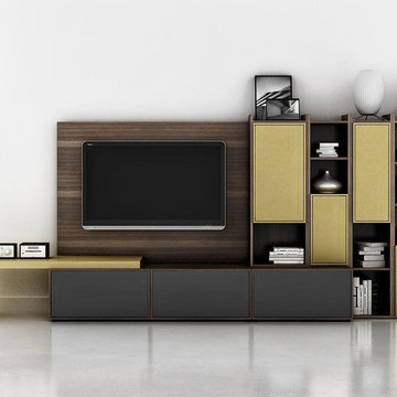
Modern Wall Unit Lyrics 14 by Up Huppe
Made in Canada
The Lyrics by Up Huppe is a modular line of wall units made out of a specially selected American walnut veneer and lacquered in a blend of micro-textured lacquer. The collection is equipped with the highest quality hardware, and the drawers, which are specially treated and stained to match the exterior, are able to close gently and silently due to the invisible, self-closing slow-motion slides. All the modules within the Lyric line can be set on a base, placed on the floor or hung on a wall to allow for the creation of unique configurations, with plenty of storage space within the modules to make them functional as well. The black smoked glass front of the TV base units are made so that they do not interrupt any wireless device signal, and the cut-outs on the back and the adjustable shelves of each unit help provide maximum ventilation for any electronics. Designed by Joel Dupras and manufactured in Canada by a passionate and professional team, the Lyrics line guarantees the highest build quality for each of its units. The Lyrics line offers flexibility with its design, providing you with the option to create your own composition through the many different units available, or giving you the option to choose from the many different pre-designed compositions available.
Features:
Designed by Joel Dupras
Modular line which allows for unique composition building
Veneered wood structure available in a natural, smoky, chocolate, espresso or tobacco walnut finish
TV base units feature cut-outs for wires and a black smoked glass front to prevent wireless device disruption
Front of the closed units and the T-shaped Top available in several lacquered finishes
Drawers are fully finished and equipped with invisible self-closing slow-motion slides
Optional LED Light can be ordered for the TV back panel (for the extra charge)
The starting price is for the Lyrics Wall Unit Composition 14 in a Tobacco Walnut and Amber Lacquered finish as shown in the main picture. (Glass Front TV Base W60" + Glass Front TV Base W30" + T-shaped Sliding Top W60" + TV Back Panel + 9046B Bookcase + 9046C Bookcase + 9061A Bookcase + 9061D Bookcase).
Dimensions:
Wall Unit: W132" x D21.5" x H61.5"
Individual Components:
TV Base W60": W60" x D21.5" x H15.5"
Glass Front TV Base W30" W30" x D21.5" x H15.5"
T-shaped Sliding Top: W60" x D17" x H17.6"
TV Back Panel: W60" x D2" x H44"
9046B Bookcase: W17.2" x D15.7" x H46"
9046C Bookcase: W12.7" x D15.7" x H46"
9061A Bookcase: W12.7" x D15.7" x H61.5"
9061D Bookcase: W17.0" x D15.7" x H61.5"
 Valentini Kids Furniture Brooklyn NY
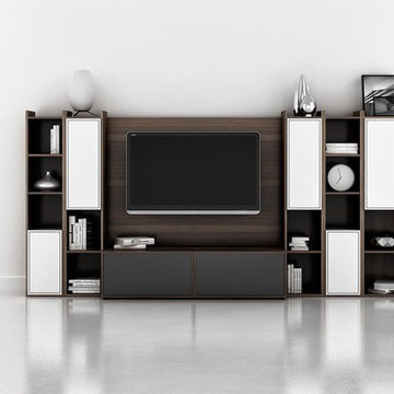
Modern Wall Unit Lyrics 22 by Up Huppe
Made in Canada
The Lyrics by Up Huppe is a modular line of wall units made of specially selected American walnut veneer and a blend of micro-textured lacquer. The collection is equipped with top quality hardware and the drawers, specially treated and stained to match the exterior and equipped with invisible self-closing slow-motion slides, shut gently and silently. All the modules of the Lyrics line can be set on a base, placed on the floor or hung on a wall in unique configurations and ambiances while providing functional storage space. Black smoked glass fronts of the TV base units let remote control rays through and cut-outs on the backs and on the adjustable shelves of each unit provide maximum ventilation. Designed by Joel Dupras and manufactured in Canada by a passionate team, the customer is ensured that his products are unique, authentic and of top quality. Lyrics by Huppe provides you with unlimited design flexibility, you can choose from one of our pre-designed compositions or build your own composition according to your taste and needs.
Features:
Designed by Joel Dupras
Modular line that allows to built your own unique composition
Structure in a veneered wood available in a natural, smoky, chocolate, espresso or tobacco walnut finish
TV base units feature cut-outs for wires and black smoked glass front letting the remote control rays through
Fronts of the closed units and a T-shaped Top available in several lacquered finishes
Drawers are fully finished and equipped with invisible self-closing slow-motion slides
Optional LED Light can be ordered for a TV back panel (for the extra charge)
The starting price is for the Lyrics Wall Unit Composition 22 in Smoky Walnut and White Lacquered finishes as shown in the main picture. (Glass Front TV Base W60" + TV Back Panel + Two 9061C Bookcases + Two 9061A Bookcases + 9061B Bookcase).
Dimensions:
Wall Unit: W128" x D21.5" x H61.5"
Individual Components:
TV Base W60": W60" x D21.5" x H15.5"
TV Back Panel: W60" x D2" x H44"
9061B Bookcase: W17.2" x D15.7" x H61.5"
9061A Bookcase (each): W12.7" x D15.7" x H61.5"
9061C Bookcase (each): W12.7" x D15.7" x H61.5"

 restyle design, llc
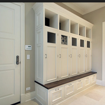
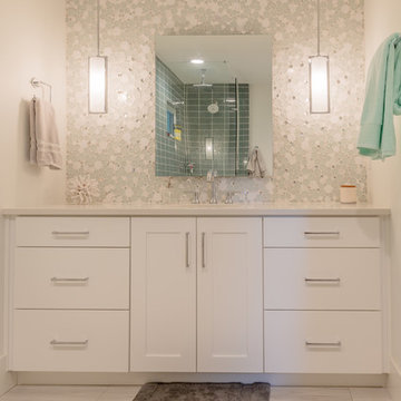
This ranch was a complete renovation! We took it down to the studs and redesigned the space for this young family. We opened up the main floor to create a large kitchen with two islands and seating for a crowd and a dining nook that looks out on the beautiful front yard. We created two seating areas, one for TV viewing and one for relaxing in front of the bar area. We added a new mudroom with lots of closed storage cabinets, a pantry with a sliding barn door and a powder room for guests. We raised the ceilings by a foot and added beams for definition of the spaces. We gave the whole home a unified feel using lots of white and grey throughout with pops of orange to keep it fun.
 Valentini Kids Furniture Brooklyn NY
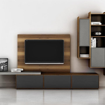
Modern Wall Unit Lyrics 17 by Up Huppe
Made in Canada
The Lyrics by Up Huppe is a modular line of wall units made out of a specially selected American walnut veneer and lacquered in a blend of micro-textured lacquer. The collection is equipped with the highest quality hardware, and the drawers, which are specially treated and stained to match the exterior, are able to close gently and silently due to the invisible, self-closing slow-motion slides. All the modules within the Lyric line can be set on a base, placed on the floor or hung on a wall to allow for the creation of unique configurations, with plenty of storage space within the modules to make them functional as well. The black smoked glass front of the TV base units are made so that they do not interrupt any wireless device signal, and the cut-outs on the back and the adjustable shelves of each unit help provide maximum ventilation for any electronics. Designed by Joel Dupras and manufactured in Canada by a passionate and professional team, the Lyrics line guarantees the highest build quality for each of its units. The Lyrics line offers flexibility with its design, providing you with the option to create your own composition through the many different units available, or giving you the option to choose from the many different pre-designed compositions available.
Features:
Designed by Joel Dupras
Modular line which allows for unique composition building
Veneered wood structure available in a natural, smoky, chocolate, espresso or tobacco walnut finish
TV base units feature cut-outs for wires and a black smoked glass front to prevent wireless device disruption
Front of the closed units and the T-shaped Top available in several lacquered finishes
Drawers are fully finished and equipped with invisible self-closing slow-motion slides
Optional LED Light can be ordered for the TV back panel (for the extra charge)
The starting price is for the Lyrics Wall Unit Composition 17 in a Natural Walnut and Fog Lacquered finish as shown in the main picture. (Glass Front TV Base W60" + Glass Front TV Base W30" + T-shaped Sliding Top W60" + TV Back Panel + 9046A Bookcase + 9061D Bookcase + 9046C Bookcase).
Dimensions:
Wall Unit: W124" x D21.5" x H85"
Individual Components:
TV Base W60": W60" x D21.5" x H15.5"
Glass Front TV Base W30" W30" x D21.5" x H15.5"
T-shaped Sliding Top: W60" x D17" x H17.6"
Back Panel: W60" x D2" x H44"
9046A Bookcase: W12.7" x D15.7" x H46"
9046C Bookcase: W12.7" x D15.7" x H46"
9061D Bookcase: W17.2" x D15.7" x H61.5"
 TKS Design Group
Download our free ebook, Creating the Ideal Kitchen. DOWNLOAD NOW
As with most projects, it all started with the kitchen layout. The home owners came to us wanting to upgrade their kitchen and overall aesthetic in their suburban home, with a combination of fresh paint, updated finishes, and improved flow for more ease when doing everyday activities.
A monochromatic, earth-toned palette left the kitchen feeling uninspired. It lacked the brightness they wanted from their space. An eat-in table underutilized the available square footage. The butler’s pantry was out of the way and hard to access, and the dining room felt detached from the kitchen.
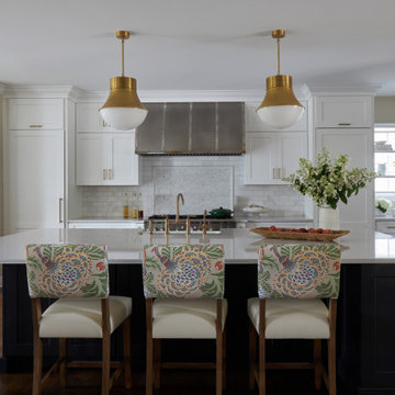
Lead Designer, Stephanie Cole, saw an improved layout for the spaces that were no longer working for this family. By eliminating an existing wall between the kitchen and dining room, and relocating the bar area to the dining room, we opened up the kitchen, providing all the space we needed to create a dreamy and functional layout. A new perimeter configuration promoted circulation while also making space for a large and functional island loaded with seating – a must for any family. Because an island that isn’t big enough for everyone (and a few more) is a recipe for disaster. The light white cabinetry is fresh and contrasts with the deeper tones in the wood flooring, creating a modern aesthetic that is elevated, yet approachable for everyday living.
With better flow as the overarching goal, we made some structural changes too. To remove a bottleneck in the entryway, we angled one of the dining room walls to create more natural separation between rooms and facilitate ease of movement throughout the large space.
At The Kitchen Studio, we believe a well-designed kitchen uses every square inch to the fullest. By starting from scratch, it was possible to rethink the entire kitchen layout and design the space according to how it is used, because the kitchen shouldn’t make it harder to feed the family. A new location for the existing range, flanked by a new column refrigerator and freezer on each side, worked to anchor the space. The very large and very spacious island (a dream island if we do say so ourselves) now houses the primary sink and provides ample space for food prep and family gathering.
The new kitchen table and coordinating banquette seating provide a cozy nook for quick breakfasts before school or work, and evening homework sessions. Elegant gold details catch the natural light, elevating the aesthetic.
The dining room was transformed into one of this client’s favorite spaces and we couldn’t agree more. We saw an opportunity to give the dining room a more distinguished identity by closing off the entrance from the foyer. The relocated wet bar enhances the sophisticated vibe of this gathering space, complete with beautiful antique mirror tiles and open shelving encased by moody built-in cabinets.
Updated furnishings add warmth. A rich walnut table is paired with custom chairs in a muted coral fabric. The large, transitional chandelier grounds the room, pairing beautifully with the gold finishes prevalent in the faucet and cabinet hardware. Linen-inspired wallpaper and cream-toned window treatments add to the glamorous feel of this entertainment space.
There is no way around it. The laundry room was cramped. The large washer and dryer blocked access to the sink and left little room for the space to serve its other essential function – as a mudroom. Because we reworked the kitchen layout to create more space overall, we could rethink the mudroom too – an essential for any busy family. The first step was moving the washer and dryer to an existing area on the second floor, where most of the family’s laundry lives (no one wants to carry laundry up and down the stairs if they don’t have to anyway). This is a more functional solution and opened up the space for all the mudroom necessities – including the existing kitchen refrigerator, loads of built-in cubbies, and a bench.
It’s hard to not fall in love with every detail of a new space, especially when it serves your day-to-day life. But that doesn’t mean the clients didn’t have their favorite features they use on the daily. This remodel was focused largely on function with a new kitchen layout. And it’s the functional features that have the biggest impact. The large island provides much needed workspace in the kitchen and is a spot where everyone gathers together – it grounds the space and the family. And the custom counter stools are the icing on the cake. The nearby mudroom has everything their previous space was lacking – ample storage, space for everyone’s essentials, and the beloved cement floor tiles that are both durable and artistic.
 Adrienne DeRosa
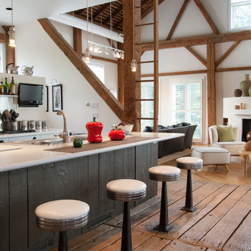
Tucked neatly into an existing bay of the barn, the open kitchen is a comfortable hub of the home. Rather than create a solid division between the kitchen and the children's TV area, Franklin finished only the lower portion of the post-and-beam supports.
The ladder is one of the original features of the barn that Franklin could not imagine ever removing. Cleverly integrated into the support post, its original function allowed workers to climb above large haystacks and pick and toss hay down a chute to the feeding area below. Franklin's children, 10 and 14, also enjoy this aspect of their home. "The kids and their friends run, slide, climb up the ladder and have a ton of fun," he explains, "It’s a barn! It is a place to share with friends and family."
Adrienne DeRosa Photography
 Morey Remodeling Group
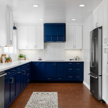
A bold transformation from an outdated Seal Beach kitchen that felt very closed off from the rest of the home. The owners of this home sought to modernize and open up to the dining room. We created a brighter, transitional space by installing Showplace lower shaker cabinets in Indigo and upper cabinets in White and undermount sink. The owners selected Calacatta Vicenza Quartz countertops with Artisan Frost subway porcelain tile backsplash. Yacht Club Cockpit Glazed Porcelain tile flooring was installed to tie in with the rest of the hardwood flooring throughout home.
 Wall Bed Place
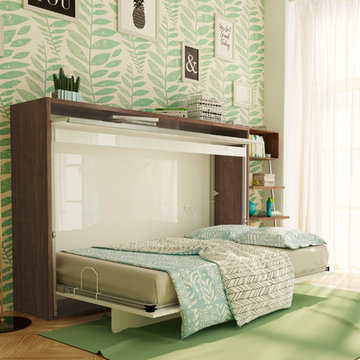
Do you have a small apartment or studio and need space saving furniture ideas? Do you have a den or office that needs to double as a guestroom? A Murphy Bed system might be just what you’re looking for! This style looks like a glossy lacquered wall in your room and when closed takes up very little space. When you want to study or work on your computer, just open the cabinet and drop down a desk! There’s plenty of room for office work, study books or even craft projects to fit on this roomy desk. When you’re tired and want to get some sleep, just open it all the way and the desk drops down, instantly giving you a twin bed ready to crawl into! In the morning, it all closes up, giving you an uncluttered, open area for your studio or apartment. If you’re using it in a study, you can keep the desk open and just open the bed for guests when they sleep over. This Murphy Bed system is constructed from the highest quality materials and the mechanism is technologically new gas springs, that open and close with no effort. Having a Murphy Bed System is like having a room in a box.


 Twelve Stones Designs, LLC
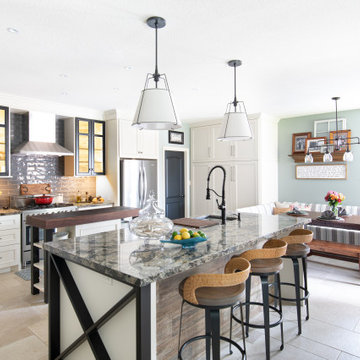
The owners of this kitchen had spent the money to upgrade the finishes in their kitchen upon building the home 12 years ago, but after living in the space for several years they realized how nonfunctional the layout really was. The (then) two preschool aged children had grown into busy, hungry teenagers with many friends who also liked to hang out at the house. So the family needed a more functional kitchen with better traffic flow, space for daily activities revolving around the kitchen at different times of day, and a kitchen that could accommodate cooking for and serving large groups. Furthermore, the dark, traditional finishes no longer reflected the homeowners’ style. They requested a brighter, more relaxed, coastal style that reflected their love of the seaside cities they like to visit.
Originally, the kitchen was U-shaped with a narrow island in the middle. The island created narrow aisles that bottle-necked at the dishwasher, refrigerator, and cooktop areas. There was a pass-through from the foyer into the kitchen, but the owners never liked that the pass-through was also located so close to the powder room. The awkward proximity was unappealing and made guests feel uncomfortable.
The kitchen’s storage was made up of lots of narrow cabinets, apothecary drawers, clipped corner units, and very few drawers. It lacked useful storage for the larger items the family used on a daily basis. And the kitchen’s only pantry was small closet that had only builder-grade, narrow shelving with no illumination to be able to see the contents inside.
Overall, the kitchen’s lighting plan was poorly executed. Only six recessed cans illuminated the entire kitchen and nook areas. The under cabinet lighting was not evenly distributed either. In fact, the builder had mis-placed the under cabinet lighting around the decorative pilasters which made for choppy, dark cubbies. Further, the builder didn’t include any lighting over the sink or the bar area, which meant whoever was doing the dishes was always in their own shadow. That, coupled with the steep overhang of the game room above made the bar area feel like a dim, cavernous space that wasn’t inviting or task oriented. The kitchen looked out into the main living space, but the raised bar and a narrow wall (which held the only large cabinet in the kitchen) created more of a barrier than a relationship to the living room or breakfast nook. In fact, one couldn’t even see the breakfast nook from the cooktop or sink areas due to its orientation. The raised bar top was too narrow to comfortably sit to either dine at or chat from due to the lack of knee space. The the homeowners confided that the kitchen felt more like a dark, dirty prison than place where the family, or their guests, wanted to gather and commune.
The clients' needs and desires were:
➢ to create a kitchen that would be a space the family loved to be in; to relate to the adjacent spaces all around, and to have better flow for entertaining large groups
➢ to remove the walls between the breakfast nook and living area and to be able to utilize the natural light from the windows in both those areas
➢ to incorporate a functional chopping block for prepping fresh food for home cooked meals, an island with a large sink and drain board, 2 pull out trash cans, and seating for at least the 2 teens to eat or do homework
➢ to design a kitchen and breakfast nook with an airy, coastal, relaxed vibe that blended with the rest of the house's coastal theme
➢ to integrate a layered lighting plan which would include ample general illumination, specific task lighting, decorative lighting, and lots of illuminated storage
➢ to design a kitchen with not only more storage for all the husband’s kitchen gadgets and collection of oils and spices, but smart storage, including a coffee/breakfast bar and a place to store and conceal the toaster oven and microwave
➢ to find a way to utilize the large open space between the kitchen, pantry area, and breakfast nook
Twelve Stones Designs achieved the owner's goals by:
➢ removing the walls between the kitchen and living room to allow the natural light to filter in from the adjacent rooms and to create a connection between the kitchen, nook, and living spaces for a sense of unity and communion
➢ removing the existing pantry and designing 3 large pantry style cabinets with LED tape lights and rollout drawers to house lots of kitchen appliances, gadgets, and tons of groceries. We also took the cabinets all the way up to the 9’ ceiling for additional storage for seasonal items and bulk storage.
➢ designing 2 islands - 1 with a gorgeous black walnut chopping block that houses a drawer for chopping and carving knives and a custom double pull out trash unit for point of use utilization - and 1 that houses the dishwasher, a large Blanco Gourmet sink with integrated drain board, woven baskets for fresh root vegetables and kitchen towels, plenty of drawer storage for kitchen items, and bar seating for up to 4 diners.
➢ closing off the space between the kitchen and the powder room to create a beautiful new private alcove for the powder room as well as adding some decorative storage. This also gave us space to include more tall storage near the new range for precision placement of the husband’s extensive oil and spice collection as well as a location for a combo-steam oven the wife wanted for baking and cooking healthy meals.
The project is enhanced functionally by:
➢ incorporated USB and standard receptacles for the kids’ laptops and phone charging in the large island
➢ designing the small island to include additional open shelving for items used on a daily basis such as a variety of bowls, plates, and colanders. This set up also works well for the husband who prefers to “plate” his dinners in restaurant-style fashion before presenting them to the table.
➢ the integration of specific storage units, such as double stacked cutlery drawers, a custom spice pull-out, a Kuerig coffee and tea pod drawer, and custom double stacked utensil drawers
➢ moving the refrigerator to the old oven location - this eliminated the bottle neck as well as created a better relationship to the eating table. It also utilizes the floor space between the pantry, nook, and kitchen
➢ creating a banquet style breakfast nook - this banquette seating not only doubles the amount of seating for large gatherings but it better utilizes the odd space between the kitchen and the previous nook area. It also helps to create a distinct pathway from the mudroom room through the pantry area, kitchen, nook, and living room.
➢ the coffee/breakfast bar area which includes the perfect location for the concealed microwave and toaster oven, convenient storage for the coffee pods and tea accoutrements. Roll-out drawers below also house the smoothie maker, hot water kettle, and a plethora of smoothie-making ingredients such as protein powders, smoothie additives, etc. Furthermore, the drawers below the Keurig house measuring utensil, cutlery, baking supplies and tupperware storage.
➢ incorporating lots of wide drawers and pullouts to accommodate large cookware.
➢ utilizing as much vertical space as possible by building storage to the ceiling which accommodates the family’s abundant amount of serving platters, baking sheets, bakeware, casserole dishes, and additional cutting boards.
The project is enhanced aesthetically by:
➢ new 5-piece Versailles pattern porcelain tile that now seamlessly joins the entire down stairs area together creating a bright, cohesiveness feeling instead of choppy separated spaces - it also adds a coastal feeling
➢ designing a cabinet to conceal the microwave and toaster oven
➢ the coastal influenced light fixtures over the nook table and island
➢ the sandy colors of the Langdon Cambria countertops. The swirling pattern and sparkling quartz pieces remind the homeowner of black-and-tan sandy beaches
➢ the striped banquet seating whose creamy white background and blue-green stripes were the inspiration for the cabinet and wall colors.
➢ All the interior doors were painted black to coordinate with the blacks and grays in the backsplash tile and countertop. This also adds a hint of tailored formality to an otherwise casual space.
➢ the use of WAC's Oculux small aperture LED units for the overhead lighting complimented with Diode LED strips for task lighting under the cabinets and inside the pantry and glass wall cabinets. All of the lighting applications are on separate dimmer switches.
Innovative uses of materials or construction methods by Realty Restoration LLC:
➢ Each 1-1/2” x 3” block of reclaimed end-grain black walnut that makes up the center island chopping block was hand milled and built in the shop. It was designed to look substantial and proportional to the surrounding elements, executed by creating the 4 inch tall top with a solid wood chamfered edge band.
➢ The metal doors on either side of the vent hood were also custom designed for this project and built in the Realty Restoration LLC shop. They are made 1x2, 11-gauge mild steel with ribbed glass. Weighing 60 lbs a piece, heavy duty cabinet hinges were added to support the weight of the door and keep them from sagging.
➢ Under-cabinet receptacles were added along the range wall in order to have a clean, uninterrupted backsplash.
Design obstacles to overcome:
➢ Because we were removing the demising walls between the kitchen and living room, we had to find a way to plumb and vent the new island. We did this by tunneling through the slab (the slab had post tension cables which prevented us from just trenching) to run a new wet vent through a nearby structural wall. We pulled the existing hot and cold lines between upper floor joists and ran them down the structural wall as well and up through a conduit in the tunnel.
➢ Since we were converting from wall overs to a gas range it allowed us to utilize the 220 feed for the wall ovens to provide a new sub panel for all the new kitchen circuits
➢ Due to framing deficiencies inherited from the original build there was a 1-1/2” differential in the floor-to-ceiling height over a 20 foot span; by utilizing the process of cutting and furring coupled with the crown moulding details on the cabinet elevations we were able to mask the problem and provide seamless transitions between the cabinet components.
Evidence of superior craftsmanship:
➢ uniquely designed, one-of-a-kind metal “X” end panels on the large island. The end panels were custom made in the Realty Restoration LLC shop and fitted to the exact dimensions of the island. The welding seams are completely indistinguishable - the posts look like they are cut from a single sheet of metal
➢ square metal posts on the small island were also custom made and designed to compliment and carry through the metal element s throughout the kitchen
➢ the beautiful, oversized end panels on the pantry cabinets which give the breakfast nook a tailored look
➢ integrating a large format 5 piece Versailles tile pattern to seamlessly flow from the existing spaces into the new kitchen space
➢ By constructing a custom cabinet that jogged around a corner we could not remodel (housing the entry way coat closet) we were able to camouflage the adjacent wall offset within the upper and lower cabinets. By designing around the existing jog in the structural walls we accomplished a few things: we were able to find the space to house, and hide, the microwave and toaster oven yet still have a clean cohesive appearance from the kitchen side. Additionally, the owners were able to keep their much needed coat closet and we didn’t have to increase the budget with unnecessary structural work.
 Dura Supreme Cabinetry
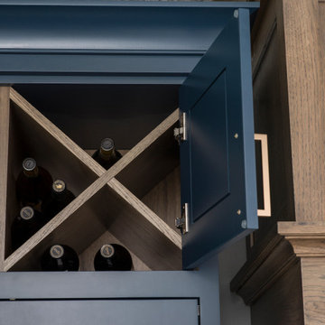
This modern farmhouse kitchen features a beautiful combination of Navy Blue painted and gray stained Hickory cabinets that’s sure to be an eye-catcher. The elegant “Morel” stain blends and harmonizes the natural Hickory wood grain while emphasizing the grain with a subtle gray tone that beautifully coordinated with the cool, deep blue paint.
The “Gale Force” SW 7605 blue paint from Sherwin-Williams is a stunning deep blue paint color that is sophisticated, fun, and creative. It’s a stunning statement-making color that’s sure to be a classic for years to come and represents the latest in color trends. It’s no surprise this beautiful navy blue has been a part of Dura Supreme’s Curated Color Collection for several years, making the top 6 colors for 2017 through 2020.
Beyond the beautiful exterior, there is so much well-thought-out storage and function behind each and every cabinet door. The two beautiful blue countertop towers that frame the modern wood hood and cooktop are two intricately designed larder cabinets built to meet the homeowner’s exact needs.
The larder cabinet on the left is designed as a beverage center with apothecary drawers designed for housing beverage stir sticks, sugar packets, creamers, and other misc. coffee and home bar supplies. A wine glass rack and shelves provides optimal storage for a full collection of glassware while a power supply in the back helps power coffee & espresso (machines, blenders, grinders and other small appliances that could be used for daily beverage creations. The roll-out shelf makes it easier to fill clean and operate each appliance while also making it easy to put away. Pocket doors tuck out of the way and into the cabinet so you can easily leave open for your household or guests to access, but easily shut the cabinet doors and conceal when you’re ready to tidy up.
Beneath the beverage center larder is a drawer designed with 2 layers of multi-tasking storage for utensils and additional beverage supplies storage with space for tea packets, and a full drawer of K-Cup storage. The cabinet below uses powered roll-out shelves to create the perfect breakfast center with power for a toaster and divided storage to organize all the daily fixings and pantry items the household needs for their morning routine.
On the right, the second larder is the ultimate hub and center for the homeowner’s baking tasks. A wide roll-out shelf helps store heavy small appliances like a KitchenAid Mixer while making them easy to use, clean, and put away. Shelves and a set of apothecary drawers help house an assortment of baking tools, ingredients, mixing bowls and cookbooks. Beneath the counter a drawer and a set of roll-out shelves in various heights provides more easy access storage for pantry items, misc. baking accessories, rolling pins, mixing bowls, and more.
The kitchen island provides a large worktop, seating for 3-4 guests, and even more storage! The back of the island includes an appliance lift cabinet used for a sewing machine for the homeowner’s beloved hobby, a deep drawer built for organizing a full collection of dishware, a waste recycling bin, and more!
All and all this kitchen is as functional as it is beautiful!
Request a FREE Dura Supreme Brochure Packet:
http://www.durasupreme.com/request-brochure
 Alair Homes Plano
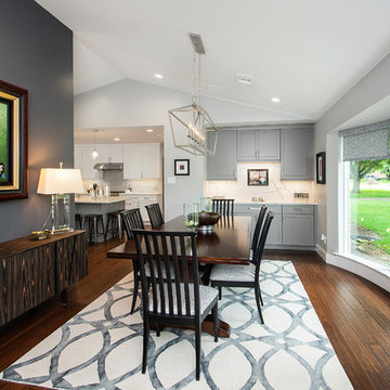
Our clients purchased a 1963 home that had never been updated! They wanted to redesign the central living area, which included the kitchen, formal dining and living room/den. Their original kitchen was small and completely closed off from the rest of the house. They wanted to repurpose the formal living room into the new formal dining room and open up the kitchen to the den and add a large island with seating for casual dining. The original den was now a nice living room, open to the kitchen, but also with a great view to their new pool! They wanted to keep some walls for their fun New Orleans one-of-a-kind artwork. They also did not want to be able to see the kitchen from the entryway. They also wanted a bar area built in somewhere, they just weren’t sure where. Our designers did an amazing job on this project, figuring out where to cut walls, where to keep them, replaced windows with doors, bringing the outdoors in and really brightening up the entire space.
Design/Remodel by Hatfield Builders & Remodelers | Photography by Versatile Imaging
 TKS Design Group
Free ebook, Creating the Ideal Kitchen. DOWNLOAD NOW
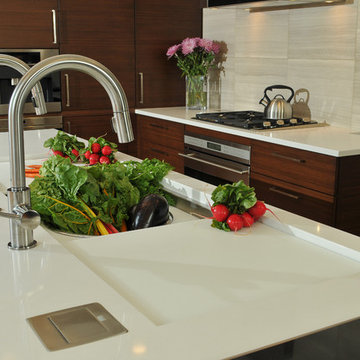
Collaborations are typically so fruitful and this one was no different. The homeowners started by hiring an architect to develop a vision and plan for transforming their very traditional brick home into a contemporary family home full of modern updates. The Kitchen Studio of Glen Ellyn was hired to provide kitchen design expertise and to bring the vision to life.
The bamboo cabinetry and white Ceasarstone countertops provide contrast that pops while the white oak floors and limestone tile bring warmth to the space. A large island houses a Galley Sink which provides a multi-functional work surface fantastic for summer entertaining. And speaking of summer entertaining, a new Nana Wall system — a large glass wall system that creates a large exterior opening and can literally be opened and closed with one finger – brings the outdoor in and creates a very unique flavor to the space.
Matching bamboo cabinetry and panels were also installed in the adjoining family room, along with aluminum doors with frosted glass and a repeat of the limestone at the newly designed fireplace.
Designed by: Susan Klimala, CKD, CBD
Photography by: Carlos Vergara
For more information on kitchen and bath design ideas go to: www.kitchenstudio-ge.com

Sponsored
Columbus, OH
Free consultation for landscape design!

Peabody Landscape Group
Columbus' Reliable Landscape Design & Contracting
 StudioLAB
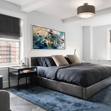
Across from Hudson River Park, the Classic 7 pre-war apartment had not renovated in over 50 years. The new owners, a young family with two kids, desired to open up the existing closed in spaces while keeping some of the original, classic pre-war details. Dark, dimly-lit corridors and clustered rooms that were a detriment to the brilliant natural light and expansive views the existing apartment inherently possessed, were demolished to create a new open plan for a more functional style of living. Custom charcoal stained white oak herringbone floors were laid throughout the space. The dark blue lacquered kitchen cabinets provide a sharp contrast to the otherwise neutral colored space. A wall unit in the same blue lacquer floats on the wall in the Den.
 Advance Design Studio, Ltd.
Jackie and Sean loved the Algonquin neighborhood they lived in with the peaceful neighborhood and the close proximity to work and school. What they didn’t love was how outdated their home had become. With a cramped kitchen and an unused dining room, they decided a remodel was the perfect solution to their problem. They would be able to continue to live in the area they loved, while at the same time they could have the dream home they envisioned.
After a thorough search, Jackie came across Advance Design Studio. She was impressed by all of the positive reviews she saw on the internet and saw herself identifying with all of the project stories she saw on the website. Once they met with designer Scott Christensen and owner Todd Jurs, they knew Advance Design was the right company to make their dreams a reality.
The project consisted of four main areas: the kitchen/dining/powder room, the laundry room, the master bathroom, and the kid’s bathroom. They wanted to expand the kitchen into the seldom used dining room and add a large island for hosting parties and family gatherings. They also wanted new hardwood flooring throughout the first level. The laundry room needed to be more functional, and all three bathrooms were in dire need of updating.
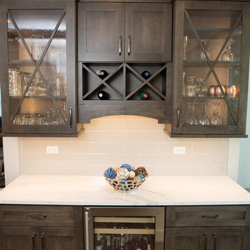
The closed off kitchen was opened up to create a sweeping space between the new eating area and the much larger kitchen. A handsome dry bar complete with a beverage refrigerator and lighted glass door cabinetry makes an elegant transition across from a peninsula area filled with storage. An additional decorative cabinet lighting up elegant dishware through the mullioned glass sits directly across from the drybar.
An expansive island was critical to the kitchen plans. Jackie, Sean and Scott worked closely together to create just the right details for their design. They wanted the island to be functional in addition to being the centerpiece of the room. Added storage for the kid’s school supplies was hidden behind cabinet doors so the children could do their schoolwork right at the island, and a microwave drawer glides open with the touch of a finger hidden inconspicuously within the island space. The easy to care for Cambria Britannica Quartz island top with its sweeping grey and white marble look perched atop hand-carved Craftsman corbels was absolutely what they were hoping for, blending both beauty and function perfectly.
Adding a nice contrast to the brightness of the quartz and the white cabinetry, Kodiak - Leather granite countertops were used to balance the light and dark tones of the space. Dura Supreme Classic White painted cabinets grace the perimeter, while Maple Poppy Seed stained cabinets with a beautiful soft grey woodgrain were used in the beverage center and island. The two tones compliment the large space balancing it out nicely creating interest and elegance with the simple Craftsman style full overlay doors.
A deep warm Barnwood White Oak flooring was added throughout the lower level. The new floor brings additional contrast to the bright kitchen and provides unity with the now open floorplan as it rolls in to the foyer and family room. Final details like the show-stopping lunar like duo light fixtures complete the space and intermix expertly with crisscross details of the glass door mullions, the island bar seating and even accessories in the space.
The small cluttered laundry room needed more space and more storage. With a busy family it seemed to overflow daily and did not have anywhere to hide the families “in and out stuff.” Scott designed the new space with a stackable washer and dryer and much more efficiently organized cabinetry. Doing laundry is now (almost!) a pleasure and keeping everyone’s “stuff” hidden, but readily accessible is now a snap.
The master bath was not a place where the couple enjoyed spending time getting ready for their day. The tub almost never was used, so removing it made it possible to build an extra-large shower, replacing the small cramped cube of the previous shower they hated. Clean, horizontal lines softly draw your eye around the space with porcelain tile called Driftwood Sea spray. Full overlay cabinetry in a soft white vanity with double sinks makes getting ready for the day much more convenient for the busy couple.
Long floor planks made of porcelain tile mimic real hardwood floors in a soft grey to compliment the shower, but with the ease and care of a tile surface. Cambrian Black Granite counters with a matte finish and under mount porcelain sinks with handsome brushed chrome hardware complete the handsome space. A real bonus in any master bath; a custom built in storage nook was tucked in the corner of the space for linens and heavenly storage.
The kid’s bath was in sad shape because it was original to the house. To keep the budget in control, the tub which was in great condition was retained, but focus was on the new large brick style porcelain charcoal tile on the floor, crisp white new Craftsman style cabinetry with pretty furniture details on the corner base, a striking granite top with white under mount porcelain sinks and fresh hardware and faucets. Some beautiful soft grey wood mirrors to match mom and dads were custom sized and placed under new lighting, and 4 hooks were smartly arranged down the wall for kids’ towels.
This couple was determined not to move, and made their house their dream home. Not only does their home function greatly now, but Jackie says, “When the neighbors come to visit, they’re asking if they can “steal” the design”! The added functionality, elegance, and open floor plan were exactly what this family needed in order to stay.
Advance Design Studio, Joe Nowak
 Twelve Stones Designs, LLC
The owners of this kitchen had spent the money to upgrade the finishes in their kitchen upon building the home 12 years ago, but after living in the space for several years they realized how nonfunctional the layout really was. The (then) two preschool aged children had grown into busy, hungry teenagers with many friends who also liked to hang out at the house. So the family needed a more functional kitchen with better traffic flow, space for daily activities revolving around the kitchen at different times of day, and a kitchen that could accommodate cooking for and serving large groups. Furthermore, the dark, traditional finishes no longer reflected the homeowners’ style. They requested a brighter, more relaxed, coastal style that reflected their love of the seaside cities they like to visit.
Originally, the kitchen was U-shaped with a narrow island in the middle. The island created narrow aisles that bottle-necked at the dishwasher, refrigerator, and cooktop areas. There was a pass-through from the foyer into the kitchen, but the owners never liked that the pass-through was also located so close to the powder room. The awkward proximity was unappealing and made guests feel uncomfortable.
The kitchen’s storage was made up of lots of narrow cabinets, apothecary drawers, clipped corner units, and very few drawers. It lacked useful storage for the larger items the family used on a daily basis. And the kitchen’s only pantry was small closet that had only builder-grade, narrow shelving with no illumination to be able to see the contents inside.
Overall, the kitchen’s lighting plan was poorly executed. Only six recessed cans illuminated the entire kitchen and nook areas. The under cabinet lighting was not evenly distributed either. In fact, the builder had mis-placed the under cabinet lighting around the decorative pilasters which made for choppy, dark cubbies. Further, the builder didn’t include any lighting over the sink or the bar area, which meant whoever was doing the dishes was always in their own shadow. That, coupled with the steep overhang of the game room above made the bar area feel like a dim, cavernous space that wasn’t inviting or task oriented. The kitchen looked out into the main living space, but the raised bar and a narrow wall (which held the only large cabinet in the kitchen) created more of a barrier than a relationship to the living room or breakfast nook. In fact, one couldn’t even see the breakfast nook from the cooktop or sink areas due to its orientation. The raised bar top was too narrow to comfortably sit to either dine at or chat from due to the lack of knee space. The the homeowners confided that the kitchen felt more like a dark, dirty prison than place where the family, or their guests, wanted to gather and commune.
The clients' needs and desires were:
➢ to create a kitchen that would be a space the family loved to be in; to relate to the adjacent spaces all around, and to have better flow for entertaining large groups
➢ to remove the walls between the breakfast nook and living area and to be able to utilize the natural light from the windows in both those areas
➢ to incorporate a functional chopping block for prepping fresh food for home cooked meals, an island with a large sink and drain board, 2 pull out trash cans, and seating for at least the 2 teens to eat or do homework
➢ to design a kitchen and breakfast nook with an airy, coastal, relaxed vibe that blended with the rest of the house's coastal theme
➢ to integrate a layered lighting plan which would include ample general illumination, specific task lighting, decorative lighting, and lots of illuminated storage
➢ to design a kitchen with not only more storage for all the husband’s kitchen gadgets and collection of oils and spices, but smart storage, including a coffee/breakfast bar and a place to store and conceal the toaster oven and microwave
➢ to find a way to utilize the large open space between the kitchen, pantry area, and breakfast nook
Twelve Stones Designs achieved the owner's goals by:
➢ removing the walls between the kitchen and living room to allow the natural light to filter in from the adjacent rooms and to create a connection between the kitchen, nook, and living spaces for a sense of unity and communion
➢ removing the existing pantry and designing 3 large pantry style cabinets with LED tape lights and rollout drawers to house lots of kitchen appliances, gadgets, and tons of groceries. We also took the cabinets all the way up to the 9’ ceiling for additional storage for seasonal items and bulk storage.
➢ designing 2 islands - 1 with a gorgeous black walnut chopping block that houses a drawer for chopping and carving knives and a custom double pull out trash unit for point of use utilization - and 1 that houses the dishwasher, a large Blanco Gourmet sink with integrated drain board, woven baskets for fresh root vegetables and kitchen towels, plenty of drawer storage for kitchen items, and bar seating for up to 4 diners.
➢ closing off the space between the kitchen and the powder room to create a beautiful new private alcove for the powder room as well as adding some decorative storage. This also gave us space to include more tall storage near the new range for precision placement of the husband’s extensive oil and spice collection as well as a location for a combo-steam oven the wife wanted for baking and cooking healthy meals.
The project is enhanced functionally by:
➢ incorporated USB and standard receptacles for the kids’ laptops and phone charging in the large island
➢ designing the small island to include additional open shelving for items used on a daily basis such as a variety of bowls, plates, and colanders. This set up also works well for the husband who prefers to “plate” his dinners in restaurant-style fashion before presenting them to the table.
➢ the integration of specific storage units, such as double stacked cutlery drawers, a custom spice pull-out, a Kuerig coffee and tea pod drawer, and custom double stacked utensil drawers
➢ moving the refrigerator to the old oven location - this eliminated the bottle neck as well as created a better relationship to the eating table. It also utilizes the floor space between the pantry, nook, and kitchen
➢ creating a banquet style breakfast nook - this banquette seating not only doubles the amount of seating for large gatherings but it better utilizes the odd space between the kitchen and the previous nook area. It also helps to create a distinct pathway from the mudroom room through the pantry area, kitchen, nook, and living room.
➢ the coffee/breakfast bar area which includes the perfect location for the concealed microwave and toaster oven, convenient storage for the coffee pods and tea accoutrements. Roll-out drawers below also house the smoothie maker, hot water kettle, and a plethora of smoothie-making ingredients such as protein powders, smoothie additives, etc. Furthermore, the drawers below the Keurig house measuring utensil, cutlery, baking supplies and tupperware storage.
➢ incorporating lots of wide drawers and pullouts to accommodate large cookware.
➢ utilizing as much vertical space as possible by building storage to the ceiling which accommodates the family’s abundant amount of serving platters, baking sheets, bakeware, casserole dishes, and additional cutting boards.
The project is enhanced aesthetically by:
➢ new 5-piece Versailles pattern porcelain tile that now seamlessly joins the entire down stairs area together creating a bright, cohesiveness feeling instead of choppy separated spaces - it also adds a coastal feeling
➢ designing a cabinet to conceal the microwave and toaster oven
➢ the coastal influenced light fixtures over the nook table and island
➢ the sandy colors of the Langdon Cambria countertops. The swirling pattern and sparkling quartz pieces remind the homeowner of black-and-tan sandy beaches
➢ the striped banquet seating whose creamy white background and blue-green stripes were the inspiration for the cabinet and wall colors.
➢ All the interior doors were painted black to coordinate with the blacks and grays in the backsplash tile and countertop. This also adds a hint of tailored formality to an otherwise casual space.
➢ the use of WAC's Oculux small aperture LED units for the overhead lighting complimented with Diode LED strips for task lighting under the cabinets and inside the pantry and glass wall cabinets. All of the lighting applications are on separate dimmer switches.
Innovative uses of materials or construction methods by Realty Restoration LLC:
➢ Each 1-1/2” x 3” block of reclaimed end-grain black walnut that makes up the center island chopping block was hand milled and built in the shop. It was designed to look substantial and proportional to the surrounding elements, executed by creating the 4 inch tall top with a solid wood chamfered edge band.
➢ The metal doors on either side of the vent hood were also custom designed for this project and built in the Realty Restoration LLC shop. They are made 1x2, 11-gauge mild steel with ribbed glass. Weighing 60 lbs a piece, heavy duty cabinet hinges were added to support the weight of the door and keep them from sagging.
➢ Under-cabinet receptacles were added along the range wall in order to have a clean, uninterrupted backsplash.
Design obstacles to overcome:
➢ Because we were removing the demising walls between the kitchen and living room, we had to find a way to plumb and vent the new island. We did this by tunneling through the slab (the slab had post tension cables which prevented us from just trenching) to run a new wet vent through a nearby structural wall. We pulled the existing hot and cold lines between upper floor joists and ran them down the structural wall as well and up through a conduit in the tunnel.
➢ Since we were converting from wall overs to a gas range it allowed us to utilize the 220 feed for the wall ovens to provide a new sub panel for all the new kitchen circuits
➢ Due to framing deficiencies inherited from the original build there was a 1-1/2” differential in the floor-to-ceiling height over a 20 foot span; by utilizing the process of cutting and furring coupled with the crown moulding details on the cabinet elevations we were able to mask the problem and provide seamless transitions between the cabinet components.
Evidence of superior craftsmanship:
➢ uniquely designed, one-of-a-kind metal “X” end panels on the large island. The end panels were custom made in the Realty Restoration LLC shop and fitted to the exact dimensions of the island. The welding seams are completely indistinguishable - the posts look like they are cut from a single sheet of metal
➢ square metal posts on the small island were also custom made and designed to compliment and carry through the metal element s throughout the kitchen
➢ the beautiful, oversized end panels on the pantry cabinets which give the breakfast nook a tailored look
➢ integrating a large format 5 piece Versailles tile pattern to seamlessly flow from the existing spaces into the new kitchen space
➢ By constructing a custom cabinet that jogged around a corner we could not remodel (housing the entry way coat closet) we were able to camouflage the adjacent wall offset within the upper and lower cabinets. By designing around the existing jog in the structural walls we accomplished a few things: we were able to find the space to house, and hide, the microwave and toaster oven yet still have a clean cohesive appearance from the kitchen side. Additionally, the owners were able to keep their much needed coat closet and we didn’t have to increase the budget with unnecessary structural work.
10