
Search results for "Logical" in Home Design Ideas

 RBL Architects
The layout of this new home is loosely based on the principles of Vastu, which consists of precepts dealing with the orientation of elements within the structure. Working within this framework provided a logical layout of the interior elements both in terms of function as well as placement to optimize daylight and views. Since the owner entertains on a regular basis, the house is equipped with both a large main kitchen as well as prep kitchen. In addition, the large patio incorporates an outside covered grille area to allow for cooking in inclement weather. Other elements in the house include a central pyramid skylight at the stairs, media room and yoga/workout studio.
 RBL Architects
The layout of this new home is loosely based on the principles of Vastu, which consists of precepts dealing with the orientation of elements within the structure. Working within this framework provided a logical layout of the interior elements both in terms of function as well as placement to optimize daylight and views. Since the owner entertains on a regular basis, the house is equipped with both a large main kitchen as well as prep kitchen. In addition, the large patio incorporates an outside covered grille area to allow for cooking in inclement weather. Other elements in the house include a central pyramid skylight at the stairs, media room and yoga/workout studio.

 Coburn Design Build
Living room - modern open concept light wood floor living room idea in Denver with white walls
Find the right local pro for your project
 RBL Architects
The layout of this new home is loosely based on the principles of Vastu, which consists of precepts dealing with the orientation of elements within the structure. Working within this framework provided a logical layout of the interior elements both in terms of function as well as placement to optimize daylight and views. Since the owner entertains on a regular basis, the house is equipped with both a large main kitchen as well as prep kitchen. In addition, the large patio incorporates an outside covered grille area to allow for cooking in inclement weather. Other elements in the house include a central pyramid skylight at the stairs, media room and yoga/workout studio.

 Laidlaw Schultz architects
The project’s starting point was to understand the building’s original post and beam structure and to use that internal logic to formulate a sympathetic remodel. With an emphasis on the upper back unit, the owner’s private residence within this recently purchased Edward Killingsworth triplex, the first order of business was to strip the excess out and to return the complex to something that resembled the original. With a limited budget, the tact was to restore where possible, and to insert where needed, but always with a sympathetic eye. The kitchen quickly became the primary focus and it was soon realized that by removing the division between the existing galley and family room that the essence of the structural system could be revealed. Once opened the datum of the layered beams was adhered to with the kitchen reinforcing this overhead water line. The primary internal wall was then highlighted with a new wood veneer with the refrigerator recessed (borrowing a bit of space from the master closet) and the existing heater chromed.
 RBL Architects
The layout of this new home is loosely based on the principles of Vastu, which consists of precepts dealing with the orientation of elements within the structure. Working within this framework provided a logical layout of the interior elements both in terms of function as well as placement to optimize daylight and views. Since the owner entertains on a regular basis, the house is equipped with both a large main kitchen as well as prep kitchen. In addition, the large patio incorporates an outside covered grille area to allow for cooking in inclement weather. Other elements in the house include a central pyramid skylight at the stairs, media room and yoga/workout studio.
 RBL Architects
The layout of this new home is loosely based on the principles of Vastu, which consists of precepts dealing with the orientation of elements within the structure. Working within this framework provided a logical layout of the interior elements both in terms of function as well as placement to optimize daylight and views. Since the owner entertains on a regular basis, the house is equipped with both a large main kitchen as well as prep kitchen. In addition, the large patio incorporates an outside covered grille area to allow for cooking in inclement weather. Other elements in the house include a central pyramid skylight at the stairs, media room and yoga/workout studio.
 RBL Architects
The layout of this new home is loosely based on the principles of Vastu, which consists of precepts dealing with the orientation of elements within the structure. Working within this framework provided a logical layout of the interior elements both in terms of function as well as placement to optimize daylight and views. Since the owner entertains on a regular basis, the house is equipped with both a large main kitchen as well as prep kitchen. In addition, the large patio incorporates an outside covered grille area to allow for cooking in inclement weather. Other elements in the house include a central pyramid skylight at the stairs, media room and yoga/workout studio.
 RBL Architects
The layout of this new home is loosely based on the principles of Vastu, which consists of precepts dealing with the orientation of elements within the structure. Working within this framework provided a logical layout of the interior elements both in terms of function as well as placement to optimize daylight and views. Since the owner entertains on a regular basis, the house is equipped with both a large main kitchen as well as prep kitchen. In addition, the large patio incorporates an outside covered grille area to allow for cooking in inclement weather. Other elements in the house include a central pyramid skylight at the stairs, media room and yoga/workout studio.
 RR Redesign
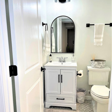
This is the 4th space that we have designed for this great couple. I was elated to find out that they have a new member to their family and they needed help designing their new family space! Their unfinished walkout basement was the logical space to remodel. We maximized every inch of this unfinished space. Our clients goal was to add additional living space and full bathroom- mission accomplished! I worked with my client and their contractor designing and space planning. The results are: two new home offices, a workout space, closed storage area, kids space ,lounging area and full bath! The beautifully designed Pottery barn furniture, Sherwin Williams whites on the walls, modern farmhouse accents and minimalist decor allows for this family to use every inch of their home.. The additional usable and beautifully designed square footage is priceless.
 RBL Architects
The layout of this new home is loosely based on the principles of Vastu, which consists of precepts dealing with the orientation of elements within the structure. Working within this framework provided a logical layout of the interior elements both in terms of function as well as placement to optimize daylight and views. Since the owner entertains on a regular basis, the house is equipped with both a large main kitchen as well as prep kitchen. In addition, the large patio incorporates an outside covered grille area to allow for cooking in inclement weather. Other elements in the house include a central pyramid skylight at the stairs, media room and yoga/workout studio.
 Laidlaw Schultz architects
The project’s starting point was to understand the building’s original post and beam structure and to use that internal logic to formulate a sympathetic remodel. With an emphasis on the upper back unit, the owner’s private residence within this recently purchased Edward Killingsworth triplex, the first order of business was to strip the excess out and to return the complex to something that resembled the original. With a limited budget, the tact was to restore where possible, and to insert where needed, but always with a sympathetic eye. The kitchen quickly became the primary focus and it was soon realized that by removing the division between the existing galley and family room that the essence of the structural system could be revealed. Once opened the datum of the layered beams was adhered to with the kitchen reinforcing this overhead water line. The primary internal wall was then highlighted with a new wood veneer with the refrigerator recessed (borrowing a bit of space from the master closet) and the existing heater chromed.
 Laidlaw Schultz architects
The project’s starting point was to understand the building’s original post and beam structure and to use that internal logic to formulate a sympathetic remodel. With an emphasis on the upper back unit, the owner’s private residence within this recently purchased Edward Killingsworth triplex, the first order of business was to strip the excess out and to return the complex to something that resembled the original. With a limited budget, the tact was to restore where possible, and to insert where needed, but always with a sympathetic eye. The kitchen quickly became the primary focus and it was soon realized that by removing the division between the existing galley and family room that the essence of the structural system could be revealed. Once opened the datum of the layered beams was adhered to with the kitchen reinforcing this overhead water line. The primary internal wall was then highlighted with a new wood veneer with the refrigerator recessed (borrowing a bit of space from the master closet) and the existing heater chromed.
 Lindy Architect
This project was never really about the architecture. It was about a family that collects — art, ceramics, books, ideas — and needed a home that could hold all of that without turning into a museum.
The existing unit had good bones: generous ceiling heights, a floating stair, and enough square footage to work with. What it lacked was a coherent logic — a way of moving through the space that felt intentional, where each transition earned its moment.
We rebuilt that logic from the ground up.
The ground floor is organized around a single corridor that runs from the kitchen island through to the living room, with the staircase serving as the spine of the whole sequence. Rather than treating the stair as purely functional, we kept the glass balustrade open and lit the treads from below, so it reads as a light source as much as a passage. The console beneath it became a natural landing for ceramics and found objects — not styled, just placed.
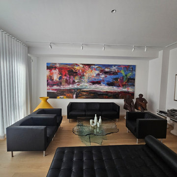
In the living room, the brief was simple: make room for a very large painting without the room feeling like a gallery. The answer was to keep everything else quiet — a white built-in that does its job, sheer linen curtains that diffuse the light, black leather chairs that anchor the space without competing. The painting does the rest.
Upstairs, the landing is lit by a skylight that washes the hallway in natural light through most of the day. We lined one side with a burl wood console and let the ceramics and framed works speak for themselves. The mix of abstract prints, a bold red canvas, and handmade vessels gives the corridor a rhythm that feels accumulated over time rather than installed all at once — because it was.
Throughout, the material palette is deliberately restrained: white oak floors, white walls, white millwork. The restraint isn't minimalism for its own sake — it's a backdrop. The owners bring the color, texture, and personality. Our job was to give them the right walls to hang things on.
 RR Redesign
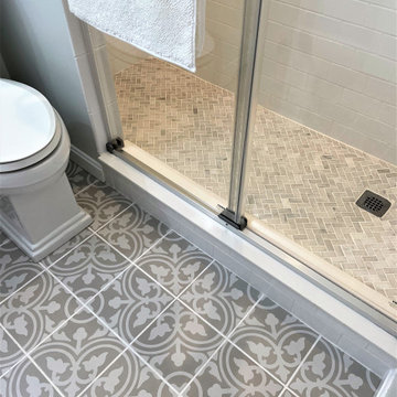
This is the 4th space that we have designed for this great couple. I was elated to find out that they have a new member to their family and they needed help designing their new family space! Their unfinished walkout basement was the logical space to remodel. We maximized every inch of this unfinished space. Our clients goal was to add additional living space and full bathroom- mission accomplished! I worked with my client and their contractor designing and space planning. The results are: two new home offices, a workout space, closed storage area, kids space ,lounging area and full bath! The beautifully designed Pottery barn furniture, Sherwin Williams whites on the walls, modern farmhouse accents and minimalist decor allows for this family to use every inch of their home.. The additional usable and beautifully designed square footage is priceless.
 Laidlaw Schultz architects
The project’s starting point was to understand the building’s original post and beam structure and to use that internal logic to formulate a sympathetic remodel. With an emphasis on the upper back unit, the owner’s private residence within this recently purchased Edward Killingsworth triplex, the first order of business was to strip the excess out and to return the complex to something that resembled the original. With a limited budget, the tact was to restore where possible, and to insert where needed, but always with a sympathetic eye. The kitchen quickly became the primary focus and it was soon realized that by removing the division between the existing galley and family room that the essence of the structural system could be revealed. Once opened the datum of the layered beams was adhered to with the kitchen reinforcing this overhead water line. The primary internal wall was then highlighted with a new wood veneer with the refrigerator recessed (borrowing a bit of space from the master closet) and the existing heater chromed.
 Laidlaw Schultz architects
The project’s starting point was to understand the building’s original post and beam structure and to use that internal logic to formulate a sympathetic remodel. With an emphasis on the upper back unit, the owner’s private residence within this recently purchased Edward Killingsworth triplex, the first order of business was to strip the excess out and to return the complex to something that resembled the original. With a limited budget, the tact was to restore where possible, and to insert where needed, but always with a sympathetic eye. The kitchen quickly became the primary focus and it was soon realized that by removing the division between the existing galley and family room that the essence of the structural system could be revealed. Once opened the datum of the layered beams was adhered to with the kitchen reinforcing this overhead water line. The primary internal wall was then highlighted with a new wood veneer with the refrigerator recessed (borrowing a bit of space from the master closet) and the existing heater chromed.

 Schwartz and Architecture
The proposal analyzes the site as a series of existing flows or “routes” across the landscape. The negotiation of both constructed and natural systems establishes the logic of the site plan and the orientation and organization of the new home. Conceptually, the project becomes a highly choreographed knot at the center of these routes, drawing strands in, engaging them with others, and propelling them back out again. The project’s intent is to capture and harness the physical and ephemeral sense of these latent natural movements as a way to promote in the architecture the wanderlust the surrounding landscape inspires. At heart, the client’s initial family agenda--a home as antidote to the city and basecamp for exploration--establishes the ethos and design objectives of the work.
Photography - Bruce Damonte
 Lindy Architect
This project was never really about the architecture. It was about a family that collects — art, ceramics, books, ideas — and needed a home that could hold all of that without turning into a museum.
The existing unit had good bones: generous ceiling heights, a floating stair, and enough square footage to work with. What it lacked was a coherent logic — a way of moving through the space that felt intentional, where each transition earned its moment.
We rebuilt that logic from the ground up.
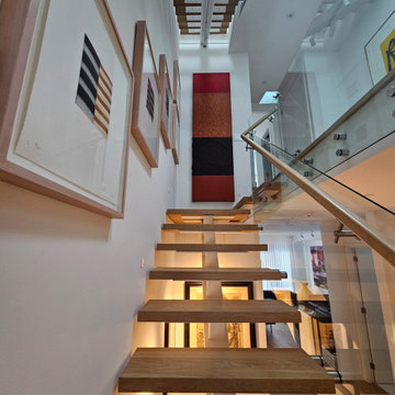
The ground floor is organized around a single corridor that runs from the kitchen island through to the living room, with the staircase serving as the spine of the whole sequence. Rather than treating the stair as purely functional, we kept the glass balustrade open and lit the treads from below, so it reads as a light source as much as a passage. The console beneath it became a natural landing for ceramics and found objects — not styled, just placed.
In the living room, the brief was simple: make room for a very large painting without the room feeling like a gallery. The answer was to keep everything else quiet — a white built-in that does its job, sheer linen curtains that diffuse the light, black leather chairs that anchor the space without competing. The painting does the rest.
Upstairs, the landing is lit by a skylight that washes the hallway in natural light through most of the day. We lined one side with a burl wood console and let the ceramics and framed works speak for themselves. The mix of abstract prints, a bold red canvas, and handmade vessels gives the corridor a rhythm that feels accumulated over time rather than installed all at once — because it was.
Throughout, the material palette is deliberately restrained: white oak floors, white walls, white millwork. The restraint isn't minimalism for its own sake — it's a backdrop. The owners bring the color, texture, and personality. Our job was to give them the right walls to hang things on.

 Rob Wellington Quigley Faia
Torr Kaelan Mixed Use / San Diego, California
This five-story, zero energy mixed-use building sits in the shadow of the new Central Library and houses the Quigley Architectural offices. The "juicy joint" block is animated by San Diego's bright sun and protects a series of balconies and bay windows meant to encourage an interactive "conversation" with the street.
42' wide and constructed of fireproof materials, a penthouse rental unit perches above the offices and faces 13th street. Unusual in a dense urban situation, the top floor living/dining area has light from the ceiling and three sides allowing the path of the sun to continually alter the mood of the space.
Archaic California and City laws prohibited logical grey water recycling. The unusual roof form provides the proper angle for solar collectors and guides rain water to the back of the site where it is channeled and filtered through gardens and stones before it reaches the street.
The unique penthouse is the counterpoint that allows you to observe the city’s East Village below as it evolves.
Rob Wellington Quigley, FAIA
Photo Credit: Darren Bradley Photography
90