
Search results for "Logical" in Home Design Ideas
 RR Redesign
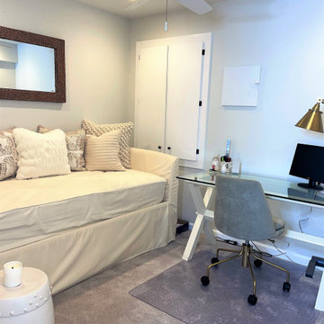
This is the 4th space that we have designed for this great couple. I was elated to find out that they have a new member to their family and they needed help designing their new family space! Their unfinished walkout basement was the logical space to remodel. We maximized every inch of this unfinished space. Our clients goal was to add additional living space and full bathroom- mission accomplished! I worked with my client and their contractor designing and space planning. The results are: two new home offices, a workout space, closed storage area, kids space ,lounging area and full bath! The beautifully designed Pottery barn furniture, Sherwin Williams whites on the walls, modern farmhouse accents and minimalist decor allows for this family to use every inch of their home.. The additional usable and beautifully designed square footage is priceless.

 FA Design Build
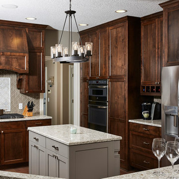
To stay or to go? This is the question our clients are still pondering. Yet, as their youngest child heads off to college, they are ready to enjoy their new kitchen or feature it in a real estate listing. Since they were unsure of their plans, we decided a pull and replace renovation was the logical — and most economical—choice. While all appliances remain in their same locations, we were able to make easy adjustments with cabinetry to update the space: convert a desk to a beverage center; increase the size of the island; install an island countertop with overhang for seating; and lengthen the perimeter cabinetry and add a tip-up, on-counter cabinet to house small appliances. The color palette was based on introducing warm grays to the space while ensuring the existing Brazilian cherry floor remained compatible with the new design. A combination of light gray and dark gray painted cabinetry (Medallion, Irish Crème and Frappe) updates the space, along with bronze finishes. A unique hex-patterned white tile backsplash with contrasting gray grout on the perimeter adds interest yet keeps the focus on the island. We installed the understated Cambria Whitehall on the perimeter with the vivid Cambria Skara Brae on the island. We worked closely with the stone fabricator to ensure the Skara Brae’s veining pattern matched the client’s vision. Above the island countertop, we installed two oversized pendants to add intensity and beauty as you enter the room.

 Medina Exteriors & Remodeling
Mary came to us looking to update her kitchen utilizing the same layout. She wanted to create a lighter and brighter feel, while highlighting unique features. We were able to achieve this by installing 2 tone colored cabinets using Grabill custom cabinets. For the base cabinets and pantry cabinet Mary selected true blue glaze as the color, and super white for her wall cabinets. Also, in the wall angled cabinet, Mary wanted a glass enhancement to showcase certain items. For the countertop, Cambria’s Seagrove was used. The look was tied together with Emer’s Logic gray gloss 3” x 6” subway tile. Other materials used include; Blanco’s Ikon apron front sink in metallic gray, delta’s hand free esque kitchen faucet, and Lydia t-shape knobs (wall and upper pantry doors) and Lydia pulls (base and lower pantry doors).
Find the right local pro for your project
 Medina Exteriors & Remodeling
Mary came to us looking to update her kitchen utilizing the same layout. She wanted to create a lighter and brighter feel, while highlighting unique features. We were able to achieve this by installing 2 tone colored cabinets using Grabill custom cabinets. For the base cabinets and pantry cabinet Mary selected true blue glaze as the color, and super white for her wall cabinets. Also, in the wall angled cabinet, Mary wanted a glass enhancement to showcase certain items. For the countertop, Cambria’s Seagrove was used. The look was tied together with Emer’s Logic gray gloss 3” x 6” subway tile. Other materials used include; Blanco’s Ikon apron front sink in metallic gray, delta’s hand free esque kitchen faucet, and Lydia t-shape knobs (wall and upper pantry doors) and Lydia pulls (base and lower pantry doors).
 Medina Exteriors & Remodeling
Mary came to us looking to update her kitchen utilizing the same layout. She wanted to create a lighter and brighter feel, while highlighting unique features. We were able to achieve this by installing 2 tone colored cabinets using Grabill custom cabinets. For the base cabinets and pantry cabinet Mary selected true blue glaze as the color, and super white for her wall cabinets. Also, in the wall angled cabinet, Mary wanted a glass enhancement to showcase certain items. For the countertop, Cambria’s Seagrove was used. The look was tied together with Emer’s Logic gray gloss 3” x 6” subway tile. Other materials used include; Blanco’s Ikon apron front sink in metallic gray, delta’s hand free esque kitchen faucet, and Lydia t-shape knobs (wall and upper pantry doors) and Lydia pulls (base and lower pantry doors).
 Medina Exteriors & Remodeling
Mary came to us looking to update her kitchen utilizing the same layout. She wanted to create a lighter and brighter feel, while highlighting unique features. We were able to achieve this by installing 2 tone colored cabinets using Grabill custom cabinets. For the base cabinets and pantry cabinet Mary selected true blue glaze as the color, and super white for her wall cabinets. Also, in the wall angled cabinet, Mary wanted a glass enhancement to showcase certain items. For the countertop, Cambria’s Seagrove was used. The look was tied together with Emer’s Logic gray gloss 3” x 6” subway tile. Other materials used include; Blanco’s Ikon apron front sink in metallic gray, delta’s hand free esque kitchen faucet, and Lydia t-shape knobs (wall and upper pantry doors) and Lydia pulls (base and lower pantry doors).
 Pinnacle Design & Remodeling
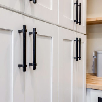
Referred by our client across the street, this project was one for the books!
It started out just as a laundry room, that then included the back garage entry, that migrated to the owner's suite, that then logically had to include the remaining powder that was located between the spaces.
For the laundry we removed the second powder bath on the main level, as well as a closet and rearranged the layout so that the once tiny room was double in size with storage and a refrigerator.
For the mudroom we removed the classic bifold closet and made it a built-in locker unit.
We tied the two spaces together with a tiled floor and pocket door.
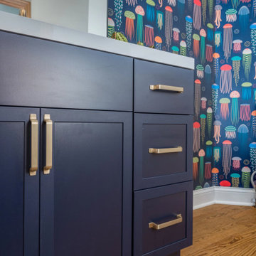
For the powder we just did cosmetic updates, including a bold navy vanity and fun wallpaper.
 RR Redesign
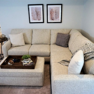
This is the 4th space that we have designed for this great couple. I was elated to find out that they have a new member to their family and they needed help designing their new family space! Their unfinished walkout basement was the logical space to remodel. We maximized every inch of this unfinished space. Our clients goal was to add additional living space and full bathroom- mission accomplished! I worked with my client and their contractor designing and space planning. The results are: two new home offices, a workout space, closed storage area, kids space ,lounging area and full bath! The beautifully designed Pottery barn furniture, Sherwin Williams whites on the walls, modern farmhouse accents and minimalist decor allows for this family to use every inch of their home.. The additional usable and beautifully designed square footage is priceless.
 Pinnacle Design & Remodeling
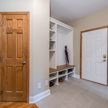
Referred by our client across the street, this project was one for the books!
It started out just as a laundry room, that then included the back garage entry, that migrated to the owner's suite, that then logically had to include the remaining powder that was located between the spaces.
For the laundry we removed the second powder bath on the main level, as well as a closet and rearranged the layout so that the once tiny room was double in size with storage and a refrigerator.
For the mudroom we removed the classic bifold closet and made it a built-in locker unit.
We tied the two spaces together with a tiled floor and pocket door.
For the powder we just did cosmetic updates, including a bold navy vanity and fun wallpaper.


 Donald Lococo Architects
©️Maxwell MacKenzie THE HOME, ESSENTIALLY A RUIN WAS PRESERVED THROUGH NEGLECT. A CLARIFIED HISTORIC RENOVATION REMOVES BAY WINDOWS AND 1950’S WINDOWS FROM THE MAIN FAÇADE. TWO WINGS AND A THIRD FLOOR AND A SYMPATHETIC STAIRWAY ACCOMMODATE MODERN LIFE. MASONS WERE TASKED TO MAKE THE STONE WORK LOOK AS THOUGH “A FARMER BUILT THE WALLS DURING THE NON-PLANTING SEASON,” THE FINAL DESIGN SIMPLIFIES THE FIRST FLOOR PLAN AND LEAVES LOGICAL LOCATIONS FOR EXPANSION INTO COMING DECADES. AMONG OTHER AWARDS, THIS TRADITIONAL YET HISTORIC RENOVATION LOCATED IN MIDDLEBURG, VA HAS RECEIVED 2 AWARDS FROM THE AMERICAN INSTITUTE OF ARCHITECTURE.. AND A NATIONAL PRIVATE AWARD FROM VETTE WINDOWS
WASHINGTON DC ARCHITECT DONALD LOCOCO UPDATED THIS HISTORIC STONE HOUSE IN MIDDLEBURG, VA.lauded by the American Institute of Architects with an Award of Excellence for Historic Architecture, as well as an Award of Merit for Residential Architecture

 Linden L.A.N.D. Group
With an open floor plan, the white kitchen cabinets blend into the back of the room, which helps the three distinct spaces feel cohesive. The local yellow birch flooring runs up the side of the island, and is finished with a clear Rubio Monocoat oil. photo: Rebecca Lindenmeyr
 Pinnacle Design & Remodeling
Referred by our client across the street, this project was one for the books!
It started out just as a laundry room, that then included the back garage entry, that migrated to the owner's suite, that then logically had to include the remaining powder that was located between the spaces.
For the laundry we removed the second powder bath on the main level, as well as a closet and rearranged the layout so that the once tiny room was double in size with storage and a refrigerator.
For the mudroom we removed the classic bifold closet and made it a built-in locker unit.
We tied the two spaces together with a tiled floor and pocket door.
For the powder we just did cosmetic updates, including a bold navy vanity and fun wallpaper.

 Audio Video Design
A 75 inch 4K Sony TV with a custom Leon LCR soundbar hangs above the fireplace. On the right wall under the art is a Totem Acoustic in-wall sub-woofer.
Photo by Greg Premru

 Pearl Remodeling
Building a new block wall and fence in Los Angeles
Small elegant one-story exterior home photo in Los Angeles
Small elegant one-story exterior home photo in Los Angeles

 TKS Design Group
Free ebook, Creating the Ideal Kitchen. DOWNLOAD NOW
This Glen Ellyn couple wanted to transform their dated kitchen into a more family-friendly space to use on a daily basis for cooking family meals and for entertaining friends. The existing kitchen was quite chopped up with strange soffits and different ceiling heights. To make the space flow in a more logical manner, we borrowed an unused desk area from the adjoining hallway and reconfigured a neighboring bath. Getting it to work on paper was fairly straightforward, but there was a bit of complicated beam work involved as the new kitchen flows through what was an old exterior wall. The new ceiling is now completely flush as we were able to hide the support in the ceiling joists.
A new, larger window was added at the sink, the doorway to the room was widened and the resulting space creates a more easy flow from dining room to family room.
The clients chose white inset cabinets, white marble tops and an apron sink to keep the space feeling simple yet original to the home's Colonial styling.
Ship lap siding on the back of the island and at the pantry storage ceiling, a walnut butcher block, and antique brass details give the space an updated look.
Professional stainless appliances are functional and beautiful. In addition to a large built-in fridge and 36" range, a second oven is housed in the island for flexibility.
The pantry area has a convenience station that houses the family's espresso machine along with the microwave drawer. Another large bank of cabinets in the same area serves as pantry storage for dry goods.
The bathroom was also remodeled as part of this project. The full bath has a vanity, shower and convenient baby changing area.
The floor is encaustic tile, a type of concrete tile recognizable by its bold graphics. The mirror and lighting add a few modern touches to keep it in line with the Owner's personal style.
Designed by: Susan Klimala, CKD, CBD
Photography by: Carlos Vergara
For more information on kitchen and bath design ideas go to: www.kitchenstudio-ge.com
 TKS Design Group
Free ebook, Creating the Ideal Kitchen. DOWNLOAD NOW
This Glen Ellyn couple wanted to transform their dated kitchen into a more family-friendly space to use on a daily basis for cooking family meals and for entertaining friends. The existing kitchen was quite chopped up with strange soffits and different ceiling heights. To make the space flow in a more logical manner, we borrowed an unused desk area from the adjoining hallway and reconfigured a neighboring bath. Getting it to work on paper was fairly straightforward, but there was a bit of complicated beam work involved as the new kitchen flows through what was an old exterior wall. The new ceiling is now completely flush as we were able to hide the support in the ceiling joists.
A new, larger window was added at the sink, the doorway to the room was widened and the resulting space creates a more easy flow from dining room to family room.
The clients chose white inset cabinets, white marble tops and an apron sink to keep the space feeling simple yet original to the home's Colonial styling.
Ship lap siding on the back of the island and at the pantry storage ceiling, a walnut butcher block, and antique brass details give the space an updated look.
Professional stainless appliances are functional and beautiful. In addition to a large built-in fridge and 36" range, a second oven is housed in the island for flexibility.
The pantry area has a convenience station that houses the family's espresso machine along with the microwave drawer. Another large bank of cabinets in the same area serves as pantry storage for dry goods.
The bathroom was also remodeled as part of this project. The full bath has a vanity, shower and convenient baby changing area.
The floor is encaustic tile, a type of concrete tile recognizable by its bold graphics. The mirror and lighting add a few modern touches to keep it in line with the Owner's personal style.
Designed by: Susan Klimala, CKD, CBD
Photography by: Carlos Vergara
For more information on kitchen and bath design ideas go to: www.kitchenstudio-ge.com
 Murphy Bros. Design | Build | Remodel
Sometimes the reason for a remodel seems to defy logic or common sense. “When I first met with this young couple who purchased the home from a larger family, I looked at their beautiful cherry kitchen cabinets and wondered why change it,” recalled Nadia Glynn, Murphy Bros. design/build consultant
“It’s a good reminder that ugly oak or insufficient storage aren’t the only reasons for a remodel, “ explains Glynn, “You’ve got to look at lifestyle too, and the functionality that follows what people really care about.”
“In this case, it was about the couple’s desire for a more functional kitchen that worked better for two people instead of 4 and featured the view, which is spectacular,” says Glynn.
Murphy Bros. removed the existing cabinets, which were repurposed in the garage and changed the color scheme to a more earthy tone. We removed the cooktop from the island, changed out the countertops, repositioned refrigerator for improved functionality, and moved the sink to take advantage of the view. We also hid some unsightly mechanicals behind the essential coffee bar.
 Jay Sifford
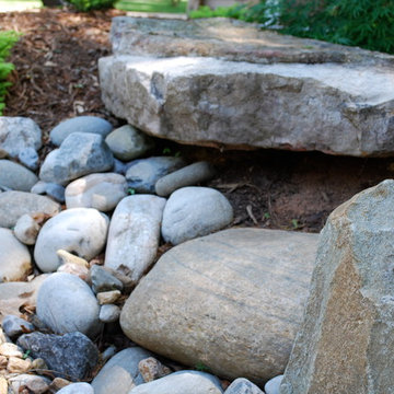
We use a minimum of 4 different sizes of stone to simulate a natural creek. Photo by Jay Sifford.
Home design - transitional home design idea in Charlotte
Home design - transitional home design idea in Charlotte
 Pinnacle Design & Remodeling
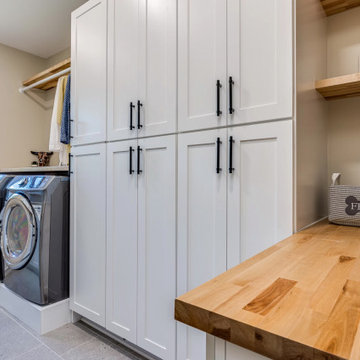
Referred by our client across the street, this project was one for the books!
It started out just as a laundry room, that then included the back garage entry, that migrated to the owner's suite, that then logically had to include the remaining powder that was located between the spaces.
For the laundry we removed the second powder bath on the main level, as well as a closet and rearranged the layout so that the once tiny room was double in size with storage and a refrigerator.
For the mudroom we removed the classic bifold closet and made it a built-in locker unit.
We tied the two spaces together with a tiled floor and pocket door.
For the powder we just did cosmetic updates, including a bold navy vanity and fun wallpaper.
93