
Search results for "Longer time" in Home Design Ideas

 Progressive Design Build
Challenge
This 2001 riverfront home was purchased by the owners in 2015 and immediately renovated. Progressive Design Build was hired at that time to remodel the interior, with tentative plans to remodel their outdoor living space as a second phase design/build remodel. True to their word, after completing the interior remodel, this young family turned to Progressive Design Build in 2017 to address known zoning regulations and restrictions in their backyard and build an outdoor living space that was fit for entertaining and everyday use.
The homeowners wanted a pool and spa, outdoor living room, kitchen, fireplace and covered patio. They also wanted to stay true to their home’s Old Florida style architecture while also adding a Jamaican influence to the ceiling detail, which held sentimental value to the homeowners who honeymooned in Jamaica.
Solution
To tackle the known zoning regulations and restrictions in the backyard, the homeowners researched and applied for a variance. With the variance in hand, Progressive Design Build sat down with the homeowners to review several design options. These options included:
Option 1) Modifications to the original pool design, changing it to be longer and narrower and comply with an existing drainage easement
Option 2) Two different layouts of the outdoor living area
Option 3) Two different height elevations and options for the fire pit area
Option 4) A proposed breezeway connecting the new area with the existing home
After reviewing the options, the homeowners chose the design that placed the pool on the backside of the house and the outdoor living area on the west side of the home (Option 1).
It was important to build a patio structure that could sustain a hurricane (a Southwest Florida necessity), and provide substantial sun protection. The new covered area was supported by structural columns and designed as an open-air porch (with no screens) to allow for an unimpeded view of the Caloosahatchee River. The open porch design also made the area feel larger, and the roof extension was built with substantial strength to survive severe weather conditions.
The pool and spa were connected to the adjoining patio area, designed to flow seamlessly into the next. The pool deck was designed intentionally in a 3-color blend of concrete brick with freeform edge detail to mimic the natural river setting. Bringing the outdoors inside, the pool and fire pit were slightly elevated to create a small separation of space.
Result
All of the desirable amenities of a screened porch were built into an open porch, including electrical outlets, a ceiling fan/light kit, TV, audio speakers, and a fireplace. The outdoor living area was finished off with additional storage for cushions, ample lighting, an outdoor dining area, a smoker, a grill, a double-side burner, an under cabinet refrigerator, a major ventilation system, and water supply plumbing that delivers hot and cold water to the sinks.
Because the porch is under a roof, we had the option to use classy woods that would give the structure a natural look and feel. We chose a dark cypress ceiling with a gloss finish, replicating the same detail that the homeowners experienced in Jamaica. This created a deep visceral and emotional reaction from the homeowners to their new backyard.
The family now spends more time outdoors enjoying the sights, sounds and smells of nature. Their professional lives allow them to take a trip to paradise right in their backyard—stealing moments that reflect on the past, but are also enjoyed in the present.
 KitchenLab Interiors
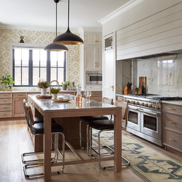
’ first, entirely new construction project in collaboration with GTH architects who designed the residence. KLI was responsible for all interior finishes, fixtures, furnishings, and design including the stairs, casework, interior doors, moldings and millwork. KLI also worked with the client on selecting the roof, exterior stucco and paint colors, stone, windows, and doors. The homeowners had purchased the existing home on a lakefront lot of the Valley Lo community in Glenview, thinking that it would be a gut renovation, but when they discovered a host of issues including mold, they decided to tear it down and start from scratch. The minute you look out the living room windows, you feel as though you're on a lakeside vacation in Wisconsin or Michigan. We wanted to help the homeowners achieve this feeling throughout the house - merging the causal vibe of a vacation home with the elegance desired for a primary residence. This project is unique and personal in many ways - Rebekah and the homeowner, Lorie, had grown up together in a small suburb of Columbus, Ohio. Lorie had been Rebekah's babysitter and was like an older sister growing up. They were both heavily influenced by the style of the late 70's and early 80's boho/hippy meets disco and 80's glam, and both credit their moms for an early interest in anything related to art, design, and style. One of the biggest challenges of doing a new construction project is that it takes so much longer to plan and execute and by the time tile and lighting is installed, you might be bored by the selections of feel like you've seen them everywhere already. “I really tried to pull myself, our team and the client away from the echo-chamber of Pinterest and Instagram. We fell in love with counter stools 3 years ago that I couldn't bring myself to pull the trigger on, thank god, because then they started showing up literally everywhere", Rebekah recalls. Lots of one of a kind vintage rugs and furnishings make the home feel less brand-spanking new. The best projects come from a team slightly outside their comfort zone. One of the funniest things Lorie says to Rebekah, "I gave you everything you wanted", which is pretty hilarious coming from a client to a designer.

 Flooret
Part of the Modin Vinyl Plank Collection, Available Exclusively From www.Flooret.com
$3.49 / sq ft, 22.08 sq ft per box
50% WIDER. 25% LONGER. TWICE AS DURABLE
Luxury Vinyl Plank, 5 mm x 9" x 60" (1.0 mm / 40 mil wear-layer)
Lifetime Residential Warranty, 20 year Commercial Warranty
Sleek and chic. In terms of high-impact, going with a dark wire-brush pattern is a sure way to quickly define a space. Never boring, this modern pattern will set the mood immediately.
The most important specification for determining the durability of vinyl flooring is the thickness of the wear-layer. The best wear-layers are made of thick, clear virgin PVC, which covers the paper print-film that gives the floor its unique appearance. Once the wear-layer wears through, the paper is damaged and the floor will need replacement.
Most vinyl floors come with a 8-12 mil wear-layer (0.2-3 mm). The top commercial specs in the industry are higher, at 20-22 mil (0.5 mm). A select few manufacturers offer a “super” commercial spec of 28 mil (0.7 mm).
For Modin, we decided to set a new standard: 40 mil (1.0 mm) of premium virgin PVC. This allows us to offer an industry-leading 20 year Commercial Warranty (Lifetime Residential), compared to nearly all other commercial vinyl floors’ 10 year Commercial Warranty.
Beyond our superior wear-layer, we also use a patented click mechanism for superior hold, and a ceramic-bead coating.
SIZE MATTERS
Wider and longer planks create a sense of space and luxury. Most vinyl floors come in 6” or 7” widths, and 36” or 48” lengths.
For Modin, we designed our planks to be 9” wide, and 60” long. This extra large size allows our gorgeous designs to be fully expressed.
DETAILS THAT COUNT
We made sure to get all the details right. Real texture, to create the feel of wire-brushed wood. Low sheen level, to ensure a natural look that wears well over time. 4-sided bevels, to more accurately emulate the look of real planks. When added together they help create the unique look that is Modin.
DESIGNS THAT INSPIRE
We spent nearly a year just focusing on our designs, to ensure they provide the right mix of color and depth. Focusing on timeless wire-brush and European Oak styles, as well as more contemporary modern washes, our collection offers truly beautiful design that is both functional and inspiring.
Find the right local pro for your project
 Pinnacle Design & Remodeling
Sometimes things just happen organically. This client reached out to me in a professional capacity to see if I wanted to advertise in his new magazine. I declined at that time because as team we have chosen to be referral based, not advertising based.
Even with turning him down, he and his wife decided to sign on with us for their basement... which then upon completion rolled into their main floor (part 2).
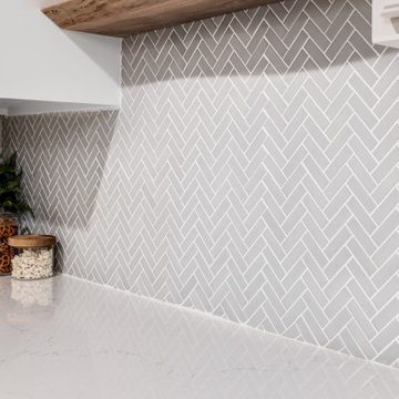
They wanted a very distinct style and already had a pretty good idea of what they wanted. We just helped bring it all to life. They wanted a kid friendly space that still had an adult vibe that no longer was based off of furniture from college hand-me-down years.
Since they loved modern farmhouse style we had to make sure there was shiplap and also some stained wood elements to warm up the space.
This space is a great example of a very nice finished basement done cost-effectively without sacrificing some comforts or features.
 Pinnacle Design & Remodeling
Sometimes things just happen organically. This client reached out to me in a professional capacity to see if I wanted to advertise in his new magazine. I declined at that time because as team we have chosen to be referral based, not advertising based.
Even with turning him down, he and his wife decided to sign on with us for their basement... which then upon completion rolled into their main floor (part 2).
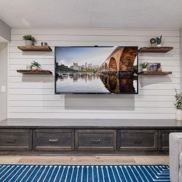
They wanted a very distinct style and already had a pretty good idea of what they wanted. We just helped bring it all to life. They wanted a kid friendly space that still had an adult vibe that no longer was based off of furniture from college hand-me-down years.
Since they loved modern farmhouse style we had to make sure there was shiplap and also some stained wood elements to warm up the space.
This space is a great example of a very nice finished basement done cost-effectively without sacrificing some comforts or features.
 Pinnacle Design & Remodeling
Sometimes things just happen organically. This client reached out to me in a professional capacity to see if I wanted to advertise in his new magazine. I declined at that time because as team we have chosen to be referral based, not advertising based.
Even with turning him down, he and his wife decided to sign on with us for their basement... which then upon completion rolled into their main floor (part 2).
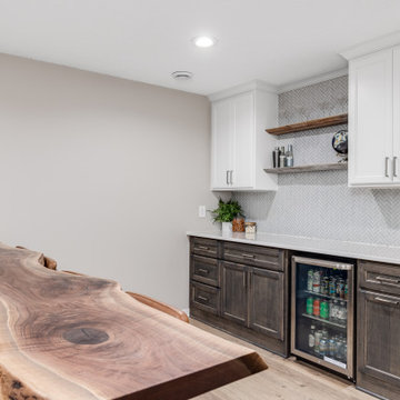
They wanted a very distinct style and already had a pretty good idea of what they wanted. We just helped bring it all to life. They wanted a kid friendly space that still had an adult vibe that no longer was based off of furniture from college hand-me-down years.
Since they loved modern farmhouse style we had to make sure there was shiplap and also some stained wood elements to warm up the space.
This space is a great example of a very nice finished basement done cost-effectively without sacrificing some comforts or features.
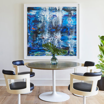 KitchenLab Interiors
’ first, entirely new construction project in collaboration with GTH architects who designed the residence. KLI was responsible for all interior finishes, fixtures, furnishings, and design including the stairs, casework, interior doors, moldings and millwork. KLI also worked with the client on selecting the roof, exterior stucco and paint colors, stone, windows, and doors. The homeowners had purchased the existing home on a lakefront lot of the Valley Lo community in Glenview, thinking that it would be a gut renovation, but when they discovered a host of issues including mold, they decided to tear it down and start from scratch. The minute you look out the living room windows, you feel as though you're on a lakeside vacation in Wisconsin or Michigan. We wanted to help the homeowners achieve this feeling throughout the house - merging the causal vibe of a vacation home with the elegance desired for a primary residence. This project is unique and personal in many ways - Rebekah and the homeowner, Lorie, had grown up together in a small suburb of Columbus, Ohio. Lorie had been Rebekah's babysitter and was like an older sister growing up. They were both heavily influenced by the style of the late 70's and early 80's boho/hippy meets disco and 80's glam, and both credit their moms for an early interest in anything related to art, design, and style. One of the biggest challenges of doing a new construction project is that it takes so much longer to plan and execute and by the time tile and lighting is installed, you might be bored by the selections of feel like you've seen them everywhere already. “I really tried to pull myself, our team and the client away from the echo-chamber of Pinterest and Instagram. We fell in love with counter stools 3 years ago that I couldn't bring myself to pull the trigger on, thank god, because then they started showing up literally everywhere", Rebekah recalls. Lots of one of a kind vintage rugs and furnishings make the home feel less brand-spanking new. The best projects come from a team slightly outside their comfort zone. One of the funniest things Lorie says to Rebekah, "I gave you everything you wanted", which is pretty hilarious coming from a client to a designer.
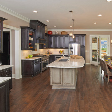


 Renovisions
This kitchen had not been renovated since the salt box colonial house was built in the 1960’s. The new owner felt it was time for a complete refresh with some traditional details and adding in the owner’s contemporary tastes.
At initial observation, we determined the house had good bones; including high ceilings and abundant natural light from a double-hung window and three skylights overhead recently installed by our client. Mixing the homeowners desires required the skillful eyes of Cathy and Ed from Renovisions. The original kitchen had dark stained, worn cabinets, in-adequate lighting and a non-functional coat closet off the kitchen space. In order to achieve a true transitional look, Renovisions incorporated classic details with subtle, simple and cleaner line touches. For example, the backsplash mix of honed and polished 2” x 3” stone-look subway tile is outlined in brushed stainless steel strips creating an edgy feel, especially at the niche above the range. Removing the existing wall that shared the coat closet opened up the kitchen to allow adding an island for seating and entertaining guests.
We chose natural maple, shaker style flat panel cabinetry with longer stainless steel pulls instead of knobs, keeping in line with the clients desire for a sleeker design. This kitchen had to be gutted to accommodate the new layout featuring an island with pull-out trash and recycling and deeper drawers for utensils. Spatial constraints were top of mind and incorporating a convection microwave above the slide-in range made the most sense. Our client was thrilled with the ability to bake, broil and microwave from GE’s advantium oven – how convenient! A custom pull-out cabinet was built for his extensive array of spices and oils. The sink base cabinet provides plenty of area for the large rectangular stainless steel sink, single-lever multi-sprayer faucet and matching filtered water dispenser faucet. The natural, yet sleek green soapstone countertop with distinct white veining created a dynamic visual and principal focal point for the now open space.
While oak wood flooring existed in the entire first floor, as an added element of color and interest we installed multi-color slate-look porcelain tiles in the kitchen area. We also installed a fully programmable floor heating system for those chilly New England days. Overall, out client was thrilled with his Mission Transition.

 Spark Modern Fires
Within a modest, wood-framed house- was a dark, under accessed and overworked kitchen. On the adjacent wall- was a small, yet well-lit living room that opened onto a patio via sliding doors. The client wanted to spend more time in the kitchen entertaining and cooking. Our solution was to create a unified area to make both spaces simultaneously usable. By removing the wall between the kitchen and the living room, in addition to designing uniform cabinetry that would work for both the kitchen and the social space, we were able to do so. The client agreed to this but did not want a fully exposed kitchen. To this end, we designed not only a wide, dividing counter and bar, but an 'inverted' skylight hood dropping from the ceiling. This device limits view into the kitchen from counter to head height as well as bringing all-day light into this northern sided room and glows green with artificial light reflecting off paint at night. The kitchen is now the main heart of the house, with subordinate, orbiting dining and living areas which are no longer separate rooms. The Spark fireplace replaced an older brick wood fireplace in the approximate location. It is located low to the floor, wrapped in ¼ gunmetal finished steel that wraps around wall corners as well as being recessed from the face of the drywall. It creates an elemental, sparse backdrop for the magic of flame. The metal is slightly reflective, expanding the broadcast of the shimmering fire.
Architect: Hughes Umbanhowar Architects
Photographer: Nick Springett
Spark Direct Vent 3ft Model 88
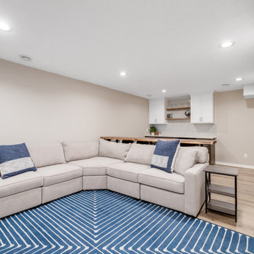 Pinnacle Design & Remodeling
Sometimes things just happen organically. This client reached out to me in a professional capacity to see if I wanted to advertise in his new magazine. I declined at that time because as team we have chosen to be referral based, not advertising based.
Even with turning him down, he and his wife decided to sign on with us for their basement... which then upon completion rolled into their main floor (part 2).
They wanted a very distinct style and already had a pretty good idea of what they wanted. We just helped bring it all to life. They wanted a kid friendly space that still had an adult vibe that no longer was based off of furniture from college hand-me-down years.
Since they loved modern farmhouse style we had to make sure there was shiplap and also some stained wood elements to warm up the space.
This space is a great example of a very nice finished basement done cost-effectively without sacrificing some comforts or features.
 Spark Modern Fires
Within a modest, wood-framed house- was a dark, under accessed and overworked kitchen. On the adjacent wall- was a small, yet well-lit living room that opened onto a patio via sliding doors. The client wanted to spend more time in the kitchen entertaining and cooking. Our solution was to create a unified area to make both spaces simultaneously usable. By removing the wall between the kitchen and the living room, in addition to designing uniform cabinetry that would work for both the kitchen and the social space, we were able to do so. The client agreed to this but did not want a fully exposed kitchen. To this end, we designed not only a wide, dividing counter and bar, but an 'inverted' skylight hood dropping from the ceiling. This device limits view into the kitchen from counter to head height as well as bringing all-day light into this northern sided room and glows green with artificial light reflecting off paint at night. The kitchen is now the main heart of the house, with subordinate, orbiting dining and living areas which are no longer separate rooms. The Spark fireplace replaced an older brick wood fireplace in the approximate location. It is located low to the floor, wrapped in ¼ gunmetal finished steel that wraps around wall corners as well as being recessed from the face of the drywall. It creates an elemental, sparse backdrop for the magic of flame. The metal is slightly reflective, expanding the broadcast of the shimmering fire.
Architect: Hughes Umbanhowar Architects
Photographer: Nick Springett
Spark Direct Vent 3ft Model 88
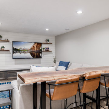 Pinnacle Design & Remodeling
Sometimes things just happen organically. This client reached out to me in a professional capacity to see if I wanted to advertise in his new magazine. I declined at that time because as team we have chosen to be referral based, not advertising based.
Even with turning him down, he and his wife decided to sign on with us for their basement... which then upon completion rolled into their main floor (part 2).
They wanted a very distinct style and already had a pretty good idea of what they wanted. We just helped bring it all to life. They wanted a kid friendly space that still had an adult vibe that no longer was based off of furniture from college hand-me-down years.
Since they loved modern farmhouse style we had to make sure there was shiplap and also some stained wood elements to warm up the space.
This space is a great example of a very nice finished basement done cost-effectively without sacrificing some comforts or features.

 Rapoza Landscape, Inc.
Rapoza Landscape
The shadier end of the back yard was turned into a shade garden and children's play area, with more accent boulders, shade plants, and plenty of room for play equipment. Sun loving plants such as catmint, grasses, and coreopsis divide the patio from the play area, but are low growing to allow for clear visibility into the children's play area.
 Spark Modern Fires
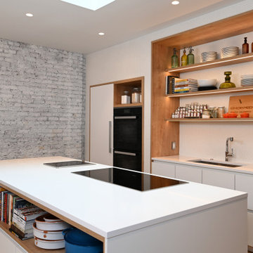
Within a modest, wood-framed house- was a dark, under accessed and overworked kitchen. On the adjacent wall- was a small, yet well-lit living room that opened onto a patio via sliding doors. The client wanted to spend more time in the kitchen entertaining and cooking. Our solution was to create a unified area to make both spaces simultaneously usable. By removing the wall between the kitchen and the living room, in addition to designing uniform cabinetry that would work for both the kitchen and the social space, we were able to do so. The client agreed to this but did not want a fully exposed kitchen. To this end, we designed not only a wide, dividing counter and bar, but an 'inverted' skylight hood dropping from the ceiling. This device limits view into the kitchen from counter to head height as well as bringing all-day light into this northern sided room and glows green with artificial light reflecting off paint at night. The kitchen is now the main heart of the house, with subordinate, orbiting dining and living areas which are no longer separate rooms. The Spark fireplace replaced an older brick wood fireplace in the approximate location. It is located low to the floor, wrapped in ¼ gunmetal finished steel that wraps around wall corners as well as being recessed from the face of the drywall. It creates an elemental, sparse backdrop for the magic of flame. The metal is slightly reflective, expanding the broadcast of the shimmering fire.
Architect: Hughes Umbanhowar Architects
Photographer: Nick Springett
Spark Direct Vent 3ft Model 88
 Pinnacle Design & Remodeling
Sometimes things just happen organically. This client reached out to me in a professional capacity to see if I wanted to advertise in his new magazine. I declined at that time because as team we have chosen to be referral based, not advertising based.
Even with turning him down, he and his wife decided to sign on with us for their basement... which then upon completion rolled into their main floor (part 2).
They wanted a very distinct style and already had a pretty good idea of what they wanted. We just helped bring it all to life. They wanted a kid friendly space that still had an adult vibe that no longer was based off of furniture from college hand-me-down years.
Since they loved modern farmhouse style we had to make sure there was shiplap and also some stained wood elements to warm up the space.
This space is a great example of a very nice finished basement done cost-effectively without sacrificing some comforts or features.

 KitchenLab Interiors
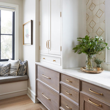
’ first, entirely new construction project in collaboration with GTH architects who designed the residence. KLI was responsible for all interior finishes, fixtures, furnishings, and design including the stairs, casework, interior doors, moldings and millwork. KLI also worked with the client on selecting the roof, exterior stucco and paint colors, stone, windows, and doors. The homeowners had purchased the existing home on a lakefront lot of the Valley Lo community in Glenview, thinking that it would be a gut renovation, but when they discovered a host of issues including mold, they decided to tear it down and start from scratch. The minute you look out the living room windows, you feel as though you're on a lakeside vacation in Wisconsin or Michigan. We wanted to help the homeowners achieve this feeling throughout the house - merging the causal vibe of a vacation home with the elegance desired for a primary residence. This project is unique and personal in many ways - Rebekah and the homeowner, Lorie, had grown up together in a small suburb of Columbus, Ohio. Lorie had been Rebekah's babysitter and was like an older sister growing up. They were both heavily influenced by the style of the late 70's and early 80's boho/hippy meets disco and 80's glam, and both credit their moms for an early interest in anything related to art, design, and style. One of the biggest challenges of doing a new construction project is that it takes so much longer to plan and execute and by the time tile and lighting is installed, you might be bored by the selections of feel like you've seen them everywhere already. “I really tried to pull myself, our team and the client away from the echo-chamber of Pinterest and Instagram. We fell in love with counter stools 3 years ago that I couldn't bring myself to pull the trigger on, thank god, because then they started showing up literally everywhere", Rebekah recalls. Lots of one of a kind vintage rugs and furnishings make the home feel less brand-spanking new. The best projects come from a team slightly outside their comfort zone. One of the funniest things Lorie says to Rebekah, "I gave you everything you wanted", which is pretty hilarious coming from a client to a designer.
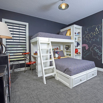
 Spark Modern Fires
Within a modest, wood-framed house- was a dark, under accessed and overworked kitchen. On the adjacent wall- was a small, yet well-lit living room that opened onto a patio via sliding doors. The client wanted to spend more time in the kitchen entertaining and cooking. Our solution was to create a unified area to make both spaces simultaneously usable. By removing the wall between the kitchen and the living room, in addition to designing uniform cabinetry that would work for both the kitchen and the social space, we were able to do so. The client agreed to this but did not want a fully exposed kitchen. To this end, we designed not only a wide, dividing counter and bar, but an 'inverted' skylight hood dropping from the ceiling. This device limits view into the kitchen from counter to head height as well as bringing all-day light into this northern sided room and glows green with artificial light reflecting off paint at night. The kitchen is now the main heart of the house, with subordinate, orbiting dining and living areas which are no longer separate rooms. The Spark fireplace replaced an older brick wood fireplace in the approximate location. It is located low to the floor, wrapped in ¼ gunmetal finished steel that wraps around wall corners as well as being recessed from the face of the drywall. It creates an elemental, sparse backdrop for the magic of flame. The metal is slightly reflective, expanding the broadcast of the shimmering fire.
Architect: Hughes Umbanhowar Architects
Photographer: Nick Springett
Spark Direct Vent 3ft Model 88
 Joanne Heintzberger
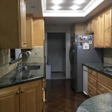
Here was our kitchen: dated, dark and tunnel-like. Although we updated it 15 years ago, the effort was half-hearted at best. We refaced the cabinets, got rid of the 1990's florescent light fixture, and installed new granite and backsplash. This time we wanted to start over from scratch and upgrade most items.
We decided early on that the huge refrigerator had to go. It stuck out into the room, taking up so much visual space. Plus it is just the two of us and we don't need that large a refrigerator. We also knew we had to replace the original 27" wall oven across from the fridge. The white trash compactor no longer compacted, so that was going. We kept the newish dishwasher, cooktop, and exhaust fan. Our hardwood floor was still in decent shape and we love its herringbone pattern, so we kept it, too.
The green granite matched the granite in the bar that is on the other side of the pass-through window. It works well in the bar, but for this kitchen, it is just too dark.
Now that we knew what we wanted to change, what we wanted to add, and what we wanted it to look like, we took our inspiration photos and started shopping.
 H2D Architecture + Design
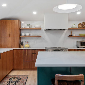
When a well loved home is maxed out on space and no longer working for a family’s needs, it’s time to expand! Located in the Loyal Heights neighborhood of North Seattle, this home was a great candidate for an addition. The kitchen will be bumped out toward the backyard in order to allow for more storage and cooking space, and the ceiling will be vaulted with skylights for a light & airy feel. Shifting the kitchen also makes room for a larger dining area, which is ideal for entertaining. A new primary suite with ensuite bathroom will also be added at the rear. There is a bit of reworking needed in order to add a hallway to access the primary suite, but otherwise the layout at the front end of the house could remain mostly unchanged.
+ Architecture: H2D Architecture + Design
+ Interior Design: H2D Architecture + Design
www.h2darchitects.com
+ Builder: GT Residential Contracting
+ Photography: Anastasiya Homes
63