
Search results for "Longer time" in Home Design Ideas
 KitchenLab Interiors
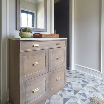
’ first, entirely new construction project in collaboration with GTH architects who designed the residence. KLI was responsible for all interior finishes, fixtures, furnishings, and design including the stairs, casework, interior doors, moldings and millwork. KLI also worked with the client on selecting the roof, exterior stucco and paint colors, stone, windows, and doors. The homeowners had purchased the existing home on a lakefront lot of the Valley Lo community in Glenview, thinking that it would be a gut renovation, but when they discovered a host of issues including mold, they decided to tear it down and start from scratch. The minute you look out the living room windows, you feel as though you're on a lakeside vacation in Wisconsin or Michigan. We wanted to help the homeowners achieve this feeling throughout the house - merging the causal vibe of a vacation home with the elegance desired for a primary residence. This project is unique and personal in many ways - Rebekah and the homeowner, Lorie, had grown up together in a small suburb of Columbus, Ohio. Lorie had been Rebekah's babysitter and was like an older sister growing up. They were both heavily influenced by the style of the late 70's and early 80's boho/hippy meets disco and 80's glam, and both credit their moms for an early interest in anything related to art, design, and style. One of the biggest challenges of doing a new construction project is that it takes so much longer to plan and execute and by the time tile and lighting is installed, you might be bored by the selections of feel like you've seen them everywhere already. “I really tried to pull myself, our team and the client away from the echo-chamber of Pinterest and Instagram. We fell in love with counter stools 3 years ago that I couldn't bring myself to pull the trigger on, thank god, because then they started showing up literally everywhere", Rebekah recalls. Lots of one of a kind vintage rugs and furnishings make the home feel less brand-spanking new. The best projects come from a team slightly outside their comfort zone. One of the funniest things Lorie says to Rebekah, "I gave you everything you wanted", which is pretty hilarious coming from a client to a designer.
 Tile Doctor Ltd
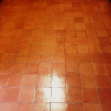
Not too long ago I visited a client who had just moved into a lovely old cottage in Milton, Oxfordshire. She wanted to restore many of the antique features of the building, including a fantastic Quarry tiled floor in the kitchen.
Quarry is typically a robust, hard wearing stone, but in a high traffic area like a kitchen, the tiles will need regular maintenance. These tiles clearly hadn’t seen a thorough clean and fresh seal in a long time, and so I was called in to provide just that.
On the first day of work, I gave the Quarry tiles a deep clean using a strong solution of Tile Doctor Pro-Clean and water. Pro-Clean is a versatile alkaline cleaner that also helps to break down any old and no longer effectual sealer remaining on the tiles.
The solution was applied evenly to the floor and left to dwell for half an hour, allowing time for it to seep into the stone to get underneath and lift out the ingrained dirt. I then removed the dirt by agitating the solution with a scrubbing pad fitted to a rotary floor scrubber. I worked in small sections at first, and gradually finished the entire floor.
After completing the initial clean, I rinsed away the soiled solution and vacuumed up the excess moisture using a wet-vac machine. I then scrubbed the floor an acid wash using a dilution of Tile Doctor Grout Clean-Up to remove grout smears and other mineral type deposits. The resulting solution was then removed in a similar fashion using a wet-vac.
The final step in the cleaning process was to rinse the floor with Tile Doctor pH Neutral Cleaner to remove any trace of product helps to tackle any remaining dirt and reset the pH balance of the tiles before sealing.
After leaving the floor to dry overnight, I returned the next day to the house to seal the floor with Tile Doctor Seal & Go, a water-based topical sealer which gives the floor an aesthetically pleasing sheen and a robust surface seal.
The photos demonstrate the results better than this short account can, needless to say the floor is now transformed.
Barry Woodward
Oxfordshire Tile Doctor
 Drury Design
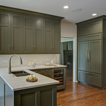
Design objectives for the remodel were aimed at maximizing the flow and functionality of a foodie-level kitchen with multiple cooks, while enhancing the family’s preferences for spending time in the space together:
Create a better workflow
Space out the appliances for better use of the kitchen area
Make the space feel larger visually
Update all materials so the kitchen isn’t all wood
No seating at an island or peninsula
Larger walkways
Brighten up the space with more lights and lighter colors
THE REMODEL
Design challenges to be solved:
The idea was to work within the current walls of the kitchen. Without removing walls, it was more of a challenge to give the kitchen a larger, new feel.
An island in the middle area was part of the original vision. Could a different countertop arrangement incorporate the same purpose?
The homeowners are big cooks so creating room for a larger refrigerator and more countertop space by the range were musts!
The sink and range were originally right next to each other, making things tough for two cooks to work at the same time. How could the new space allow for two work areas while minimizing traffic jams?
THE RENEWED SPACE
Design solutions fell into place once the overall layout was revamped to improve flow and functionality:
The refrigerator was originally in the middle of the main walkway. To gain more walk space and room for a larger refrigerator, we moved this appliance to the back wall.
The final design still has a peninsula but we flipped it to the opposite wall. This way, the walkway is more accommodating for traffic entering and exiting through the back garage door. This also gave way to a longer run of countertop space along the cooking wall.
To take cooking to another level, we implemented a speed oven!
The large window by the eating area is also nice for cooks to see, so we kept the sink in the peninsula.
To gain space for storage and make the kitchen feel larger, we brought the wall cabinets all the way to the ceiling. What once felt tight now feels grand!
Find the right local pro for your project

 CITYDESKSTUDIO, Inc.
So often our task as residential architects is not to create something out of nothing. Instead, it is to help evolve, or bring forward something that is already there; to see with new eyes the best of what exists and to clarify and expand it, so that the house supports and celebrates how the client lives, and hopes to live, in the home.
So was the case with our House of Blues. The house was already wonderful. There was plenty of space, good views, a functioning floor plan, and the home was in overall good condition. The best features however, were embedded in the time it was built – mid 1960’s. The views were good, but too small. The kitchen location worked well, but is was closed off, cramped, and lacking counter space. The dining room was elegant, but too large and isolated. The graceful central hallway remained the homes most unique feature, but it was dark and the entry to the rooms on either side were accessed via small doorways. The bathrooms were large enough, and in the right locations, but they were tired and dated, and there was no mudroom.
We created something out of something. Beautiful shades of blue permeated the owner’s things and became a central theme in new elements. Daylight was expanded and brought deeper into the space. Doorways were widened and walls removed. The central hallway was fully opened at the end with two-story glass to improve on an already good idea. The kitchen was wholly new and expanded by borrowing space from the dining room. A mudroom was carved out of the garage. All the bathrooms were remodeled with fresh materials and new features. The gracious concrete stoop was reclad in stone and the front door was changed out for a splash of color. Light now permeates all the rooms and spaces flow together without losing their identity or function. The owners no longer feel blue in their House of Blues!
Location: St Paul, MN
Project Team:
Ben Awes, AIA, Principal- in -Charge
Nate Dodge

 Cure Design Group
CURE Senior Designer, Cori Dyer's personal home. Takes you through a home tour of her exquisitely designed spaces. Recently Renovated Kitchen, here is what Cori has to say about that process...Initially, I had to have the "upgrade" of thermafoil cabinets, but that was 25 years ago...it was time to bring my trendy kitchen space up to my current design standards! Ann Sachs.... Kelly Wearstler tile were the inspiration for the entire space. Eliminating walls between cabinetry, appliances, and a desk no longer necessary, were just the beginning. Adding a warm morel wood tone to these new cabinets and integrating a wine/coffee station were just some of the updates. I decided to keep the "White Kitchen" on the north side and add the same warm wood tone to the hood. A fresh version of the traditional farmhouse sink, Grohe faucet and Rio Blanc Quartzite were all part of the design. To keep the space open I added floating shelves both on the north side of the white kitchen and again above the wine refrigerator. A great spot in incorporate my love of artwork and travel!
Cure Design Group (636) 294-2343 https://curedesigngroup.com/

 Flooret
Part of the Modin Vinyl Plank Collection, Available Exclusively From www.Flooret.com
$3.49 / sq ft, 22.08 sq ft per box
50% WIDER. 25% LONGER. TWICE AS DURABLE
Luxury Vinyl Plank, 5 mm x 9" x 60" (1.0 mm / 40 mil wear-layer)
Lifetime Residential Warranty, 20 year Commercial Warranty
Classic Oak Elegance. Arden provides a timeless template with which to define your space. We designed the grain pattern to have just a hint of rustic, but it is still clean enough that you can convincingly use it in a modern setting.
REDEFINING DURABILITY
The most important specification for determining the durability of vinyl flooring is the thickness of the wear-layer. The best wear-layers are made of thick, clear virgin PVC, which covers the paper print-film that gives the floor its unique appearance. Once the wear-layer wears through, the paper is damaged and the floor will need replacement.
Most vinyl floors come with a 8-12 mil wear-layer (0.2-3 mm). The top commercial specs in the industry are higher, at 20-22 mil (0.5 mm). A select few manufacturers offer a "super" commercial spec of 28 mil (0.7 mm).
For Modin, we decided to set a new standard: 40 mil (1.0 mm) of premium virgin PVC. This allows us to offer an industry-leading 20 year Commercial Warranty (Lifetime Residential), compared to nearly all other commercial vinyl floors' 10 year Commercial Warranty.
Beyond our superior wear-layer, we also use a patented click mechanism for superior hold, and a ceramic-bead coating.
SIZE MATTERS
Wider and longer planks create a sense of space and luxury. Most vinyl floors come in 6" or 7" widths, and 36" or 48" lengths.
For Modin, we designed our planks to be 9" wide, and 60" long. This extra large size allows our gorgeous designs to be fully expressed.
DETAILS THAT COUNT
We made sure to get all the details right. Real texture, to create the feel of wire-brushed wood. Low sheen level, to ensure a natural look that wears well over time. 4-sided bevels, to more accurately emulate the look of real planks. When added together they help create the unique look that is Modin.
DESIGNS THAT INSPIRE
We spent nearly a year just focusing on our designs, to ensure they provide the right mix of color and depth. Focusing on timeless wire-brush and European Oak styles, as well as more contemporary modern washes, our collection offers truly beautiful design that is both functional and inspiring.
 TKS Design Group
Download our free ebook, Creating the Ideal Kitchen. DOWNLOAD NOW
For many, extra time at home during COVID left them wanting more from their homes. Whether you realized the shortcomings of your space or simply wanted to combat boredom, a well-designed and functional home was no longer a want, it became a need. Tina found herself wanting more from her Old Irving Park home and reached out to The Kitchen Studio about adding function to her kitchen to make the most of the available real estate.
At the end of the day, there is nothing better than returning home to a bright and happy space you love. And this kitchen wasn’t that for Tina. Dark and dated, with a palette from the past and features that didn’t make the most of the available square footage, this remodel required vision and a fresh approach to the space. Lead designer, Stephanie Cole’s main design goal was better flow, while adding greater functionality with organized storage, accessible open shelving, and an overall sense of cohesion with the adjoining family room.
The original kitchen featured a large pizza oven, which was rarely used, yet its footprint limited storage space. The nearby pantry had become a catch-all, lacking the organization needed in the home. The initial plan was to keep the pizza oven, but eventually Tina realized she preferred the design possibilities that came from removing this cumbersome feature, with the goal of adding function throughout the upgraded and elevated space. Eliminating the pantry added square footage and length to the kitchen for greater function and more storage. This redesigned space reflects how she lives and uses her home, as well as her love for entertaining.
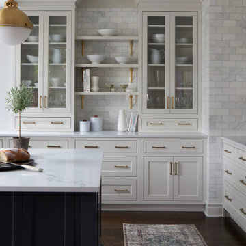
The kitchen features a classic, clean, and timeless palette. White cabinetry, with brass and bronze finishes, contrasts with rich wood flooring, and lets the large, deep blue island in Woodland’s custom color Harbor – a neutral, yet statement color – draw your eye.
The kitchen was the main priority. In addition to updating and elevating this space, Tina wanted to maximize what her home had to offer. From moving the location of the patio door and eliminating a window to removing an existing closet in the mudroom and the cluttered pantry, the kitchen footprint grew. Once the floorplan was set, it was time to bring cohesion to her home, creating connection between the kitchen and surrounding spaces.
The color palette carries into the mudroom, where we added beautiful new cabinetry, practical bench seating, and accessible hooks, perfect for guests and everyday living. The nearby bar continues the aesthetic, with stunning Carrara marble subway tile, hints of brass and bronze, and a design that further captures the vibe of the kitchen.
Every home has its unique design challenges. But with a fresh perspective and a bit of creativity, there is always a way to give the client exactly what they want [and need]. In this particular kitchen, the existing soffits and high slanted ceilings added a layer of complexity to the lighting layout and upper perimeter cabinets.
While a space needs to look good, it also needs to function well. This meant making the most of the height of the room and accounting for the varied ceiling features, while also giving Tina everything she wanted and more. Pendants and task lighting paired with an abundance of natural light amplify the bright aesthetic. The cabinetry layout and design compliments the soffits with subtle profile details that bring everything together. The tile selections add visual interest, drawing the eye to the focal area above the range. Glass-doored cabinets further customize the space and give the illusion of even more height within the room.
While her family may be grown and out of the house, Tina was focused on adding function without sacrificing a stunning aesthetic and dreamy finishes that make the kitchen the gathering place of any home. It was time to love her kitchen again, and if you’re wondering what she loves most, it’s the niche with glass door cabinetry and open shelving for display paired with the marble mosaic backsplash over the range and complimenting hood. Each of these features is a stunning point of interest within the kitchen – both brag-worthy additions to a perimeter layout that previously felt limited and lacking.
Whether your remodel is the result of special needs in your home or simply the excitement of focusing your energy on creating a fun new aesthetic, we are here for it. We love a good challenge because there is always a way to make a space better – adding function and beauty simultaneously.
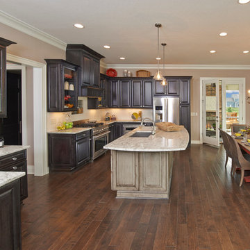

 CITYDESKSTUDIO, Inc.
So often our task as residential architects is not to create something out of nothing. Instead, it is to help evolve, or bring forward something that is already there; to see with new eyes the best of what exists and to clarify and expand it, so that the house supports and celebrates how the client lives, and hopes to live, in the home.
So was the case with our House of Blues. The house was already wonderful. There was plenty of space, good views, a functioning floor plan, and the home was in overall good condition. The best features however, were embedded in the time it was built – mid 1960’s. The views were good, but too small. The kitchen location worked well, but is was closed off, cramped, and lacking counter space. The dining room was elegant, but too large and isolated. The graceful central hallway remained the homes most unique feature, but it was dark and the entry to the rooms on either side were accessed via small doorways. The bathrooms were large enough, and in the right locations, but they were tired and dated, and there was no mudroom.
We created something out of something. Beautiful shades of blue permeated the owner’s things and became a central theme in new elements. Daylight was expanded and brought deeper into the space. Doorways were widened and walls removed. The central hallway was fully opened at the end with two-story glass to improve on an already good idea. The kitchen was wholly new and expanded by borrowing space from the dining room. A mudroom was carved out of the garage. All the bathrooms were remodeled with fresh materials and new features. The gracious concrete stoop was reclad in stone and the front door was changed out for a splash of color. Light now permeates all the rooms and spaces flow together without losing their identity or function. The owners no longer feel blue in their House of Blues!
Location: St Paul, MN
Project Team:
Ben Awes, AIA, Principal- in -Charge
Nate Dodge

 Roundtree Landscaping, Inc
Bram joined Roundtree as our Lead Landscape Design & Sales team member in 2018. An avid traveler and mountain backpacker, Bram takes inspiration both from nature and architecture from around the world when creating new designs. When it comes to Bram’s favorite part of his job with Roundtree, he will tell you it is his connection and relationships with our customers. His goal is to get to know you and listen; to discover the root of your landscape dreams and blend them with plants and techniques that work in our Dallas climate.
In fact, it might seem like Bram is getting a little nosy with you when you start the design process with him! But asking questions about where you grew up, your favorite places to travel, and your day to day lifestyle is crucial for Bram when it comes to creating your perfect outdoor living landscape. In fact, the overall caring and cooperative spirit of the Roundtree Landscape team is a big reason why Bram feels like he fits right in with our company.
Better understanding you – and caring about your needs - is how Bram brings your best landscape to life.
A green industry veteran, Bram has more than 44 years of hands on experience. He started his career by learning greenhouse plant production, which fueled his passion for plants and landscape design. Further study in landscape architecture and botany informed his development as a skilled designer. Bram loves creating beautiful landscapes that are also highly functional; with a keen focus on creating outdoor spaces you can enjoy all year-round.
Fun facts about Bram: Around the office Bram is a “Stupid Dad Jokes” expert! You can count on Bram to post a new Stupid Dad Joke at his desk daily. Bad jokes aside, Bram is also famous for his homemade salad dressings and salad creations. He can also hold his breath longer than anyone he knows, so be sure to ask for a demonstration the next time you see him!
In addition to backpacking a different mountain range each year, Bram also loves snow skiing and water sports. Bram spends much of his time doing volunteer work for the Boy Scouts of America, The Crape Myrtle Trails of McKinney, as well as the Gardens & Grounds Committee at the Dallas Arboretum. Giving is receiving.
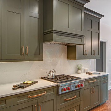 Drury Design
Design objectives for the remodel were aimed at maximizing the flow and functionality of a foodie-level kitchen with multiple cooks, while enhancing the family’s preferences for spending time in the space together:
Create a better workflow
Space out the appliances for better use of the kitchen area
Make the space feel larger visually
Update all materials so the kitchen isn’t all wood
No seating at an island or peninsula
Larger walkways
Brighten up the space with more lights and lighter colors
THE REMODEL
Design challenges to be solved:
The idea was to work within the current walls of the kitchen. Without removing walls, it was more of a challenge to give the kitchen a larger, new feel.
An island in the middle area was part of the original vision. Could a different countertop arrangement incorporate the same purpose?
The homeowners are big cooks so creating room for a larger refrigerator and more countertop space by the range were musts!
The sink and range were originally right next to each other, making things tough for two cooks to work at the same time. How could the new space allow for two work areas while minimizing traffic jams?
THE RENEWED SPACE
Design solutions fell into place once the overall layout was revamped to improve flow and functionality:
The refrigerator was originally in the middle of the main walkway. To gain more walk space and room for a larger refrigerator, we moved this appliance to the back wall.
The final design still has a peninsula but we flipped it to the opposite wall. This way, the walkway is more accommodating for traffic entering and exiting through the back garage door. This also gave way to a longer run of countertop space along the cooking wall.
To take cooking to another level, we implemented a speed oven!
The large window by the eating area is also nice for cooks to see, so we kept the sink in the peninsula.
To gain space for storage and make the kitchen feel larger, we brought the wall cabinets all the way to the ceiling. What once felt tight now feels grand!
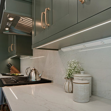 Drury Design
Design objectives for the remodel were aimed at maximizing the flow and functionality of a foodie-level kitchen with multiple cooks, while enhancing the family’s preferences for spending time in the space together:
Create a better workflow
Space out the appliances for better use of the kitchen area
Make the space feel larger visually
Update all materials so the kitchen isn’t all wood
No seating at an island or peninsula
Larger walkways
Brighten up the space with more lights and lighter colors
THE REMODEL
Design challenges to be solved:
The idea was to work within the current walls of the kitchen. Without removing walls, it was more of a challenge to give the kitchen a larger, new feel.
An island in the middle area was part of the original vision. Could a different countertop arrangement incorporate the same purpose?
The homeowners are big cooks so creating room for a larger refrigerator and more countertop space by the range were musts!
The sink and range were originally right next to each other, making things tough for two cooks to work at the same time. How could the new space allow for two work areas while minimizing traffic jams?
THE RENEWED SPACE
Design solutions fell into place once the overall layout was revamped to improve flow and functionality:
The refrigerator was originally in the middle of the main walkway. To gain more walk space and room for a larger refrigerator, we moved this appliance to the back wall.
The final design still has a peninsula but we flipped it to the opposite wall. This way, the walkway is more accommodating for traffic entering and exiting through the back garage door. This also gave way to a longer run of countertop space along the cooking wall.
To take cooking to another level, we implemented a speed oven!
The large window by the eating area is also nice for cooks to see, so we kept the sink in the peninsula.
To gain space for storage and make the kitchen feel larger, we brought the wall cabinets all the way to the ceiling. What once felt tight now feels grand!
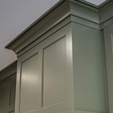 Drury Design
Design objectives for the remodel were aimed at maximizing the flow and functionality of a foodie-level kitchen with multiple cooks, while enhancing the family’s preferences for spending time in the space together:
Create a better workflow
Space out the appliances for better use of the kitchen area
Make the space feel larger visually
Update all materials so the kitchen isn’t all wood
No seating at an island or peninsula
Larger walkways
Brighten up the space with more lights and lighter colors
THE REMODEL
Design challenges to be solved:
The idea was to work within the current walls of the kitchen. Without removing walls, it was more of a challenge to give the kitchen a larger, new feel.
An island in the middle area was part of the original vision. Could a different countertop arrangement incorporate the same purpose?
The homeowners are big cooks so creating room for a larger refrigerator and more countertop space by the range were musts!
The sink and range were originally right next to each other, making things tough for two cooks to work at the same time. How could the new space allow for two work areas while minimizing traffic jams?
THE RENEWED SPACE
Design solutions fell into place once the overall layout was revamped to improve flow and functionality:
The refrigerator was originally in the middle of the main walkway. To gain more walk space and room for a larger refrigerator, we moved this appliance to the back wall.
The final design still has a peninsula but we flipped it to the opposite wall. This way, the walkway is more accommodating for traffic entering and exiting through the back garage door. This also gave way to a longer run of countertop space along the cooking wall.
To take cooking to another level, we implemented a speed oven!
The large window by the eating area is also nice for cooks to see, so we kept the sink in the peninsula.
To gain space for storage and make the kitchen feel larger, we brought the wall cabinets all the way to the ceiling. What once felt tight now feels grand!
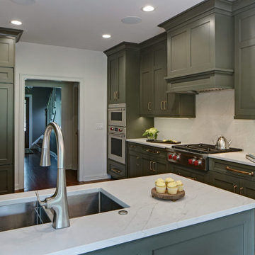 Drury Design
Design objectives for the remodel were aimed at maximizing the flow and functionality of a foodie-level kitchen with multiple cooks, while enhancing the family’s preferences for spending time in the space together:
Create a better workflow
Space out the appliances for better use of the kitchen area
Make the space feel larger visually
Update all materials so the kitchen isn’t all wood
No seating at an island or peninsula
Larger walkways
Brighten up the space with more lights and lighter colors
THE REMODEL
Design challenges to be solved:
The idea was to work within the current walls of the kitchen. Without removing walls, it was more of a challenge to give the kitchen a larger, new feel.
An island in the middle area was part of the original vision. Could a different countertop arrangement incorporate the same purpose?
The homeowners are big cooks so creating room for a larger refrigerator and more countertop space by the range were musts!
The sink and range were originally right next to each other, making things tough for two cooks to work at the same time. How could the new space allow for two work areas while minimizing traffic jams?
THE RENEWED SPACE
Design solutions fell into place once the overall layout was revamped to improve flow and functionality:
The refrigerator was originally in the middle of the main walkway. To gain more walk space and room for a larger refrigerator, we moved this appliance to the back wall.
The final design still has a peninsula but we flipped it to the opposite wall. This way, the walkway is more accommodating for traffic entering and exiting through the back garage door. This also gave way to a longer run of countertop space along the cooking wall.
To take cooking to another level, we implemented a speed oven!
The large window by the eating area is also nice for cooks to see, so we kept the sink in the peninsula.
To gain space for storage and make the kitchen feel larger, we brought the wall cabinets all the way to the ceiling. What once felt tight now feels grand!
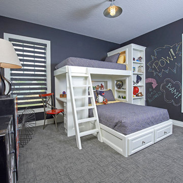
 Flooret
Classic color with refined texture. Picking up on the natural blonde tones of oak, but adding in a light wire brush. Santal can either dress up a space or just create a comfortable canvas. The range of color allows a lot of versatility with furniture and complimenting elements.
REDEFINING DURABILITY
The most important specification for determining the durability of vinyl flooring is the thickness of the wear-layer. The best wear-layers are made of thick, clear virgin PVC, which covers the paper print-film that gives the floor its unique appearance. Once the wear-layer wears through, the paper is damaged and the floor will need replacement.
Most vinyl floors come with a 8-12 mil wear-layer (0.2-3 mm). The top commercial specs in the industry are higher, at 20-22 mil (0.5 mm). A select few manufacturers offer a “super” commercial spec of 28 mil (0.7 mm).
For Modin, we decided to set a new standard: 40 mil (1.0 mm) of premium virgin PVC. This allows us to offer an industry-leading 20 year Commercial Warranty (Lifetime Residential), compared to nearly all other commercial vinyl floors’ 10 year Commercial Warranty.
Beyond our superior wear-layer, we also use a patented click mechanism for superior hold, and a ceramic-bead coating.
SIZE MATTERS
Wider and longer planks create a sense of space and luxury. Most vinyl floors come in 6” or 7” widths, and 36” or 48” lengths.
For Modin, we designed our planks to be 9” wide, and 60” long. This extra large size allows our gorgeous designs to be fully expressed.
DETAILS THAT COUNT
We made sure to get all the details right. Real texture, to create the feel of wire-brushed wood. Low sheen level, to ensure a natural look that wears well over time. 4-sided bevels, to more accurately emulate the look of real planks. When added together they help create the unique look that is Modin.
DESIGNS THAT INSPIRE
We spent nearly a year just focusing on our designs, to ensure they provide the right mix of color and depth. Focusing on timeless wire-brush and European Oak styles, as well as more contemporary modern washes, our collection offers truly beautiful design that is both functional and inspiring.

 Columbia Roofing Inc.
Mr. Mescher – Home Owner Shares Story
“I wanted to take this opportunity to tell you that I am extremely pleased with the work that Columbia Roofing did in replacing the roof on our Kent Island home. The house has a complicated roof structure with multiple gables and a quarter round conical roof which spans between two vertical walls in the back. We choose a 50 year Owens Corning shingle and to assure a good job, we only obtained quotes from roofing companies that received outstanding reviews.
We were pleased when the Columbia production crew roofed the house without issue and brought the full visual effect of slate using the 4 tab asphalt shingle with its distinctive keyway.
When it came to the conical roof, we were faced with the possibility of having to install a metal roof in lieu of maintaining the slate like appearance that was so prominent on the other roof sections of the house. Our preference was to maintain the appearance of slate on the conical section similar to that seen on the old slate roof cathedrals. While this is easy to say, I can now appreciate how difficult it is to do.
To honor our wishes, Ben Alsop came to the house and worked through the complicated layout necessary to use the same 4 tab shingles on the conical section. To do the job properly, every single 4 tab shingle had to be cut into individual tabs.
Each tab was then taken up on the roof where the keyway was aligned to vertical through a system of straight lines drawn from the point of the conical roof to the starter shingle at the roof’s edge. Each tab had to be cut again (often multiple times) after the tab alignment was complete. To assure the accuracy necessary to maintain the visual effect, Ben took it upon himself to personally perform the roofing of the conical section.
Ben is a manager for Columbia Roofing who no longer performs the physical roofing work after coming up through the ranks of the roofing trade. His personal dedication to getting this job done for us in a way that is simply stellar could not go without acknowledgement. Ben is not only a craftsman, he is an artisan whose skill set can clearly be seen in the pictures that I have attached.
I want to thank Columbia Roofing for a job well done and particularly I want to thank Ben for taking the time and putting in the effort to truly make this a stellar installation.”
 Cure Design Group
CURE Senior Designer, Cori Dyer's personal home. Takes you through a home tour of her exquisitely designed spaces. Recently Renovated Kitchen, here is what Cori has to say about that process...Initially, I had to have the "upgrade" of thermafoil cabinets, but that was 25 years ago...it was time to bring my trendy kitchen space up to my current design standards! Ann Sachs.... Kelly Wearstler tile were the inspiration for the entire space. Eliminating walls between cabinetry, appliances, and a desk no longer necessary, were just the beginning. Adding a warm morel wood tone to these new cabinets and integrating a wine/coffee station were just some of the updates. I decided to keep the "White Kitchen" on the north side and add the same warm wood tone to the hood. A fresh version of the traditional farmhouse sink, Grohe faucet and Rio Blanc Quartzite were all part of the design. To keep the space open I added floating shelves both on the north side of the white kitchen and again above the wine refrigerator. A great spot in incorporate my love of artwork and travel!
Cure Design Group (636) 294-2343 https://curedesigngroup.com/
 Columbia Roofing Inc.
Mr. Mescher – Home Owner Shares Story
“I wanted to take this opportunity to tell you that I am extremely pleased with the work that Columbia Roofing did in replacing the roof on our Kent Island home. The house has a complicated roof structure with multiple gables and a quarter round conical roof which spans between two vertical walls in the back. We choose a 50 year Owens Corning shingle and to assure a good job, we only obtained quotes from roofing companies that received outstanding reviews.
We were pleased when the Columbia production crew roofed the house without issue and brought the full visual effect of slate using the 4 tab asphalt shingle with its distinctive keyway.
When it came to the conical roof, we were faced with the possibility of having to install a metal roof in lieu of maintaining the slate like appearance that was so prominent on the other roof sections of the house. Our preference was to maintain the appearance of slate on the conical section similar to that seen on the old slate roof cathedrals. While this is easy to say, I can now appreciate how difficult it is to do.
To honor our wishes, Ben Alsop came to the house and worked through the complicated layout necessary to use the same 4 tab shingles on the conical section. To do the job properly, every single 4 tab shingle had to be cut into individual tabs.
Each tab was then taken up on the roof where the keyway was aligned to vertical through a system of straight lines drawn from the point of the conical roof to the starter shingle at the roof’s edge. Each tab had to be cut again (often multiple times) after the tab alignment was complete. To assure the accuracy necessary to maintain the visual effect, Ben took it upon himself to personally perform the roofing of the conical section.
Ben is a manager for Columbia Roofing who no longer performs the physical roofing work after coming up through the ranks of the roofing trade. His personal dedication to getting this job done for us in a way that is simply stellar could not go without acknowledgement. Ben is not only a craftsman, he is an artisan whose skill set can clearly be seen in the pictures that I have attached.
I want to thank Columbia Roofing for a job well done and particularly I want to thank Ben for taking the time and putting in the effort to truly make this a stellar installation.”
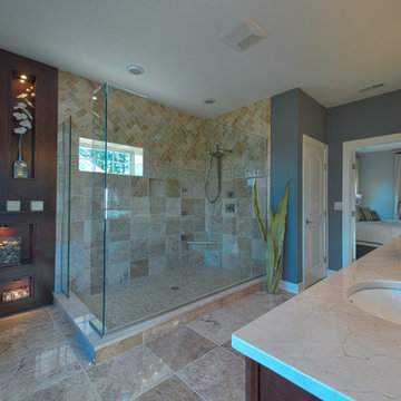
 Cure Design Group
CURE Senior Designer, Cori Dyer's personal home. Takes you through a home tour of her exquisitely designed spaces. Recently Renovated Kitchen, here is what Cori has to say about that process...Initially, I had to have the "upgrade" of thermafoil cabinets, but that was 25 years ago...it was time to bring my trendy kitchen space up to my current design standards! Ann Sachs.... Kelly Wearstler tile were the inspiration for the entire space. Eliminating walls between cabinetry, appliances, and a desk no longer necessary, were just the beginning. Adding a warm morel wood tone to these new cabinets and integrating a wine/coffee station were just some of the updates. I decided to keep the "White Kitchen" on the north side and add the same warm wood tone to the hood. A fresh version of the traditional farmhouse sink, Grohe faucet and Rio Blanc Quartzite were all part of the design. To keep the space open I added floating shelves both on the north side of the white kitchen and again above the wine refrigerator. A great spot in incorporate my love of artwork and travel!
Cure Design Group (636) 294-2343 https://curedesigngroup.com/

 Maykke
67" Tisbury Acrylic Freestanding Bathtub in White by Maykke
Description:
Wrap yourself in the tranquility of the Tisbury freestanding bathtub in white. The smooth interior and exterior combined with the curved ends help transport you to a calm and relaxing place. Our high quality Acrylic construction is both strong and light. Due to the insulation of acrylic, this tub will stay warmer longer than other tub materials. The included drain allows for fast and easy drainage. A freestanding tub filler will complete the look.
Features:
* Premium quality acrylic construction for strength and durability
* Modern oval design
* Smooth interior and exterior finish
* Overall dimensions: 66.19" Length x 30.94" Width x 23.25" Height
* Drain and overflow assembly with polished chrome trim included
* Additional Information:
Collection: Tisbury
* Model: XDA1411002
* Manufacturer provides a 1-year limited warranty
About Maykke:
Maykke brings high quality and stylish home furnishings direct from our partner factories around the world to your home. It is our goal to make great products accessible and affordable to everyone. We work tirelessly to ensure that every product offered on our store has been manufactured to meet our high standards and yours. We save you time and hassle so you can relax while we do the heavy lifting for you.
 Cure Design Group
CURE Senior Designer, Cori Dyer's personal home. Takes you through a home tour of her exquisitely designed spaces. Recently Renovated Kitchen, here is what Cori has to say about that process...Initially, I had to have the "upgrade" of thermafoil cabinets, but that was 25 years ago...it was time to bring my trendy kitchen space up to my current design standards! Ann Sachs.... Kelly Wearstler tile were the inspiration for the entire space. Eliminating walls between cabinetry, appliances, and a desk no longer necessary, were just the beginning. Adding a warm morel wood tone to these new cabinets and integrating a wine/coffee station were just some of the updates. I decided to keep the "White Kitchen" on the north side and add the same warm wood tone to the hood. A fresh version of the traditional farmhouse sink, Grohe faucet and Rio Blanc Quartzite were all part of the design. To keep the space open I added floating shelves both on the north side of the white kitchen and again above the wine refrigerator. A great spot in incorporate my love of artwork and travel!
Cure Design Group (636) 294-2343 https://curedesigngroup.com/
66