
Search results for "Love therefore" in Home Design Ideas

 O’Hara Interiors
Martha O'Hara Interiors, Interior Design & Photo Styling | Thomas Kuoh Photography
Please Note: All “related,” “similar,” and “sponsored” products tagged or listed by Houzz are not actual products pictured. They have not been approved by Martha O’Hara Interiors nor any of the professionals credited. For information about our work, please contact design@oharainteriors.com.

 Crystal Kitchen + Bath
The bookcases in this room needed to be the same size as the bookcase in my previous home. I love decorating for Christmas and I have hundreds of Santa’s and a large village. My husband made Styrofoam scenes for each shelf, which made setting up the houses and lighting so much easier. I wanted to replicate the bookshelves so he didn’t need to remake the entire scene, but again I didn’t want the same look-more contemporary. The design ended up with floating shelves of walnut wood. Each shelf has its own outlet and puck light to a switch (a lesson learned about how to get everything plugged in without cords between the shelves.) Below with cabinets for storage.

 Pollination Press LLC
A female mining bee on American plum (Prunus americana). This photo illustrates where mining bee females collect pollen: on the lower part of the hind leg, as well as higher up on the hind leg and the side of the thorax, giving the appearance that pollen is collected in their ‘armpit’.
Find the right local pro for your project

 Robin's Nest Interiors
Updated Spec Home: Foyer and Great Room
In our last post, we introduced you to my mom and sister’s Updated Spec Home; the Foyer and Great Room will be featured in this post.
Foyer
As you enter their home, to the right is a hall closet and a french door which leads to the Basement. To the left is a long wall which was perfect for an extra long console table in a rustic finish that served as a sofa table in their previous home. I love repositioning furniture, and by using this table in the entry, it makes it feel new.
Additionally, we placed a vibrant piece of art previously used in my sister’s Bedroom above the table. This piece not only sets the tone for our color palette, it also makes the kind of statement you want in your Foyer – Wow! We added accessories and an unique lamp to complete the space.
Great Room
In the Great Room which is open to the Foyer, we installed our inspiration artwork in the place of honor over the mantel. Since the piece was vertical, it did not take up enough space. I do not like a “fussy” mantel with lots of accessories so we found these two vases in a silver leaf finish. They were perfect because they were large enough, but not too deep. Accessorizing mantels can be tricky because the majority of them are not deep. We went to Jan’s Floral Design to add vibrant color and interesting textures to the vases.
The original mantel was too small and uninspired. Therefore, we had our contractor Brad Anderson built a new one based on a photo of a mantel we liked. The new mantel has lots of great detail and is the appropriate proportion for the fireplace. We replaced beige 12×12 ceramic tiles with gorgeous large pieces of smoked carrara marble for a striking fireplace surround. Check out this other mantel that we updated.
For furniture, we purchased a shorter sofa in a gray tweed fabric. Typically, two throw pillows come with a sofa.We added a fun fringe to the pillows that came with the sofa. I recommend ordering pillows that match your sofa fabric and layering with custom pillows that support your color palette. We added a patterned custom pillow and a striped throw.
Next, we got a small scale recliner in a yummy gray leather for my mom and a chair and ottoman in a small scale mint and gray geometric pattern for my sister. We added an accent chair in a fun small scale stripe to fill a corner and add additional seating – which is always a good thing.
Remember that this was a Spec Home so there were no built-ins. As a result, we needed a media cabinet for the television and some bookcases to display my mom’s decorative box collection and my sister’s collection of blown colored glass. This set from Ballard Designs fit the bill perfectly. The back is open and airy with nice detail. The wood finish also adds a richness to the space.
My mom needed a space for her computer, and this small writing desk fit the space perfectly.
Finally, for finishing touches, we added a patterned rug, cornice boards in a mint leaf fabric, and great lamps for ambient lighting. These two rooms are stunning, vibrant and livable. Can’t wait to show you more in our next post! Enjoy!
Photo by Tim Furlong Jr.

 TVL Creative Ltd.
Cramped kitchen be gone! That was the project motto and top priority. The goal was to transform the current layout from multiple smaller spaces into a connected whole that would activate the main level for our clients, a young family of four.
The biggest obstacle was the wall dividing the kitchen and the dining room. Removing this wall was central to opening up and integrating the main living spaces, but the existing ductwork that ran right through the center of the wall posed a design challenge, er design opportunity. The resulting design solution features a central pantry that captures the ductwork and provides valuable storage- especially when compared to the original kitchen's 18" wide pantry cabinet. The pantry also anchors the kitchen island and serves as a visual separation of space between the kitchen and homework area.
Through our design development process, we learned the formal living room was of no service to their lifestyle and therefore space they rarely spent time in. With that in mind, we proposed to eliminate the unused living room and make it the new dining room. Relocating the dining room to this space inherently felt right given the soaring ceiling and ample room for holiday dinners and celebrations. The new dining room was spacious enough for us to incorporate a conversational seating area in the warm, south-facing window alcove.
Now what to do with the old dining room?! To answer that question we took inspiration from our clients' shared profession in education and developed a craft area/homework station for both of their boys. The semi-custom cabinetry of the desk area carries over to the adjacent wall and forms window bench base with storage that we topped with butcher block for a touch of warmth. While the boys are young, the bench drawers are the perfect place for a stash of toys close to the kitchen.
The kitchen begins just beyond the window seat with their refrigerator enclosure. Opposite the refrigerator is the new pantry with twenty linear feet of shelving and space for brooms and a stick vacuum. Extending from the backside of the pantry the kitchen island design incorporates counter seating on the family room side and a cabinetry configuration on the kitchen side with drawer storage, a trashcan center, farmhouse sink, and dishwasher.
We took careful time in design and execution to align the range and sink because while it might seem like a small detail, it plays an important role in supporting the symmetrical configuration of the back wall of the kitchen. The rear wall design utilizes an appliance garage mirrors the visual impact of the refrigerator enclosure and helps keep the now open kitchen tidy. Between the appliance garage and refrigerator enclosure is the cooking zone with 30" of cabinetry and work surface on either side of the range, a chimney style vent hood, and a bold graphic tile backsplash.
The backsplash is just one of many personal touches we added to the space to reflect our client's modern eclectic style and love of color. Swooping lines of the mid-mod style barstools compliment the pendants and backsplash pattern. A pop of vibrant green on the frame of the pantry door adds a fresh wash of color to an otherwise neutral space. The big show stopper is the custom charcoal gray and copper chevron wall installation in the dining room. This was an idea our clients softly suggested, and we excitedly embraced the opportunity. It is also a kickass solution to the head-scratching design dilemma of how to fill a large and lofty wall.
We are so grateful to bring this design to life for our clients and now dear friends.


 J Design Group - Interior Designers Miami - Modern
Modern Interior Designs in Miami FL. by J Design Group in Miami.
Home is an incredible or lovely place where most of the people feel comfortable. Yes..! After a long and hectic day, house is the one place where you can relax. Gone are the days, when a “home” meant just a ceiling with four walls. Yes..! That's true, but nowadays a “house” is something beyond your expectation. Therefore, most of the people hire “premises decoration” services.
Nowadays, unlike old-age properties, various new apartments and homes are built to optimize the comfort of modern housing. Yes...! Everyone knows that “Home Decoration” is considered to be one of the most important and hottest trends all over the world. This is an amazing process of using creativity, imaginations and skills. Through this, you can make your house and any other building interesting and amazing. However, if you are looking for these kinds of services for your premises, then “J Design Group” is here just for you.
We are the one that provides renovation services to you so that you can make a building actually look like a house. Yes..! Other ordinary organizations who actually focus on the colors and other decorative items of any space, but we provide all these solutions efficiently. Creative and talented Contemporary Interior Designer under each and every requirement of our precious clients and provide different solutions accordingly. We provide all these services in commercial, residential and industrial sector like homes, restaurants, hotels, corporate facilities and financial institutions remodeling service.
Everyone knows that renovation is the one that makes a building actually look like a house. That's true “design” is the one that complement each and every section of a particular space. So, if you want to change the look of your interior within your budget, then Miami Interior Designers are here just for you. Our experts carefully understand your needs and design an outline plan before rendering outstanding solutions to you.
Interior design decorators of our firm have the potential and appropriate knowledge to decorate any kind of building. We render various reliable and credible solutions to our esteemed customers so that they can easily change the entire ambiance of their premises.
J Design Group – Miami Interior Designers Firm – Modern – Contemporary
Contact us: 305-444-4611
www.JDesignGroup.com
“Home Interior Designers”
"Miami modern"
“Contemporary Interior Designers”
“Modern Interior Designers”
“House Interior Designers”
“Coco Plum Interior Designers”
“Sunny Isles Interior Designers”
“Pinecrest Interior Designers”
"J Design Group interiors"
"South Florida designers"
“Best Miami Designers”
"Miami interiors"
"Miami decor"
“Miami Beach Designers”
“Best Miami Interior Designers”
“Miami Beach Interiors”
“Luxurious Design in Miami”
"Top designers"
"Deco Miami"
"Luxury interiors"
“Miami Beach Luxury Interiors”
“Miami Interior Design”
“Miami Interior Design Firms”
"Beach front"
“Top Interior Designers”
"top decor"
“Top Miami Decorators”
"Miami luxury condos"
"modern interiors"
"Modern”
"Pent house design"
"white interiors"
“Top Miami Interior Decorators”
“Top Miami Interior Designers”
“Modern Designers in Miami”
225 Malaga Ave.
Coral Gable, FL 33134
http://www.JDesignGroup.com
Call us at: 305.444.4611
Your friendly professional Interior design firm in Miami Florida.
Sponsored
Fredericksburg, OH

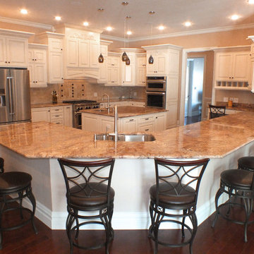
High Point Cabinets
Columbus' Experienced Custom Cabinet Builder | 4x Best of Houzz Winner


 Tile Doctor Ltd
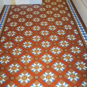
This beautiful Victorian tiled hallway was in desperate need of some TLC. The house had recently changed hands and the new owners of the house were having the entire property renovated. The last part of the renovation plan was to have the Victorian hallway tiles restoring back to their former glory. Floors are always best left until last, especially hallways as last as workmen don’t usually take a lot of care in my experience.
The house was built in the early 1900’s and was situated close to Doncaster town centre a couple of streets away in fact from the famous Doncaster Racecourse which dates to the late 1500’s.
There were a few areas of damage to the floor that would need dealing with first. This is not surprising given the age of the floor which must have seen a lot of comings and goings over the years. Our first task therefore was to repair the damage using replica tiles sourced to be as close a match to the originals as possible. We usually find any slight differences disappear once the floor has been deep cleaned and sealed. Once removing the damaged tile and cleaning the base we use a fast setting adhesive to fix the replacement tiles in place so we can get on with the cleaning as soon as possible.
Once the replacement tiles had set, we unloaded our slow speed rotary floor machine and large wet vacuum which would be used during the cleaning. To start the cleaning the floor was sprayed with Tile Doctor Remove & Go and this was left to dwell on the tiles for twenty minutes. This gives time for the product to break down old floor coatings and grime, this was followed by scrubbing the tiles with a 200-grit diamond pad fitted to the floor machine and assisted with the addition of more water to help lubricate the process. This process generates a lot of slurry as the dirt and old sealers etc are released from the tiles and this is extracted from the surface of the floor using the wet vacuum.
The next step was to give the floor an acid wash using Tile Doctor Acid Gel which is applied to the tiles and left to dwell for fifteen minutes and scrubbed in again with the floor buffer and 200-grit diamond pad. Once done the floor was rinsed with water and then dried using the wet vacuum to extract as much moisture as possible. This last process is designed to counter any alkaline salts that may be present in the floor which may cause efflorescence to appear later. It also removes old mineral deposits and generally get the tiles looking much brighter. Once complete the floor was left to dry off naturally overnight.
I came back the next day to seal the tiles first checking the floor was dry using a moisture meter. Satisfied that the floor was ready for sealing I started to seal the tiles using multiple coats of Tile Doctor Seal and Go Extra which is a fully breathable sealer which is important for old floors like this. Seal and Go Extra also leaves a lovely satin finish which works well on Victorian tiles and brings the floor alive.
This was the last step in this properties renovation, and I think you will agree that the floor responded really well to the restoration process and the colours in the tiles are now very vibrant.
Matthew Lovett
South Yorkshire Tile Doctor
 Robin's Nest Interiors
Updated Spec Home: Foyer and Great Room
In our last post, we introduced you to my mom and sister’s Updated Spec Home; the Foyer and Great Room will be featured in this post.
Foyer
As you enter their home, to the right is a hall closet and a french door which leads to the Basement. To the left is a long wall which was perfect for an extra long console table in a rustic finish that served as a sofa table in their previous home. I love repositioning furniture, and by using this table in the entry, it makes it feel new.
Additionally, we placed a vibrant piece of art previously used in my sister’s Bedroom above the table. This piece not only sets the tone for our color palette, it also makes the kind of statement you want in your Foyer – Wow! We added accessories and an unique lamp to complete the space.
Great Room
In the Great Room which is open to the Foyer, we installed our inspiration artwork in the place of honor over the mantel. Since the piece was vertical, it did not take up enough space. I do not like a “fussy” mantel with lots of accessories so we found these two vases in a silver leaf finish. They were perfect because they were large enough, but not too deep. Accessorizing mantels can be tricky because the majority of them are not deep. We went to Jan’s Floral Design to add vibrant color and interesting textures to the vases.
The original mantel was too small and uninspired. Therefore, we had our contractor Brad Anderson built a new one based on a photo of a mantel we liked. The new mantel has lots of great detail and is the appropriate proportion for the fireplace. We replaced beige 12×12 ceramic tiles with gorgeous large pieces of smoked carrara marble for a striking fireplace surround. Check out this other mantel that we updated.
For furniture, we purchased a shorter sofa in a gray tweed fabric. Typically, two throw pillows come with a sofa.We added a fun fringe to the pillows that came with the sofa. I recommend ordering pillows that match your sofa fabric and layering with custom pillows that support your color palette. We added a patterned custom pillow and a striped throw.
Next, we got a small scale recliner in a yummy gray leather for my mom and a chair and ottoman in a small scale mint and gray geometric pattern for my sister. We added an accent chair in a fun small scale stripe to fill a corner and add additional seating – which is always a good thing.
Remember that this was a Spec Home so there were no built-ins. As a result, we needed a media cabinet for the television and some bookcases to display my mom’s decorative box collection and my sister’s collection of blown colored glass. This set from Ballard Designs fit the bill perfectly. The back is open and airy with nice detail. The wood finish also adds a richness to the space.
My mom needed a space for her computer, and this small writing desk fit the space perfectly.
Finally, for finishing touches, we added a patterned rug, cornice boards in a mint leaf fabric, and great lamps for ambient lighting. These two rooms are stunning, vibrant and livable. Can’t wait to show you more in our next post! Enjoy!


 Robin's Nest Interiors
Updated Spec Home: Foyer and Great Room
In our last post, we introduced you to my mom and sister’s Updated Spec Home; the Foyer and Great Room will be featured in this post.
Foyer
As you enter their home, to the right is a hall closet and a french door which leads to the Basement. To the left is a long wall which was perfect for an extra long console table in a rustic finish that served as a sofa table in their previous home. I love repositioning furniture, and by using this table in the entry, it makes it feel new.
Additionally, we placed a vibrant piece of art previously used in my sister’s Bedroom above the table. This piece not only sets the tone for our color palette, it also makes the kind of statement you want in your Foyer – Wow! We added accessories and an unique lamp to complete the space.
Great Room
In the Great Room which is open to the Foyer, we installed our inspiration artwork in the place of honor over the mantel. Since the piece was vertical, it did not take up enough space. I do not like a “fussy” mantel with lots of accessories so we found these two vases in a silver leaf finish. They were perfect because they were large enough, but not too deep. Accessorizing mantels can be tricky because the majority of them are not deep. We went to Jan’s Floral Design to add vibrant color and interesting textures to the vases.
The original mantel was too small and uninspired. Therefore, we had our contractor Brad Anderson built a new one based on a photo of a mantel we liked. The new mantel has lots of great detail and is the appropriate proportion for the fireplace. We replaced beige 12×12 ceramic tiles with gorgeous large pieces of smoked carrara marble for a striking fireplace surround. Check out this other mantel that we updated.
For furniture, we purchased a shorter sofa in a gray tweed fabric. Typically, two throw pillows come with a sofa.We added a fun fringe to the pillows that came with the sofa. I recommend ordering pillows that match your sofa fabric and layering with custom pillows that support your color palette. We added a patterned custom pillow and a striped throw.
Next, we got a small scale recliner in a yummy gray leather for my mom and a chair and ottoman in a small scale mint and gray geometric pattern for my sister. We added an accent chair in a fun small scale stripe to fill a corner and add additional seating – which is always a good thing.
Remember that this was a Spec Home so there were no built-ins. As a result, we needed a media cabinet for the television and some bookcases to display my mom’s decorative box collection and my sister’s collection of blown colored glass. This set from Ballard Designs fit the bill perfectly. The back is open and airy with nice detail. The wood finish also adds a richness to the space.
My mom needed a space for her computer, and this small writing desk fit the space perfectly.
Finally, for finishing touches, we added a patterned rug, cornice boards in a mint leaf fabric, and great lamps for ambient lighting. These two rooms are stunning, vibrant and livable. Can’t wait to show you more in our next post! Enjoy!
 Robin's Nest Interiors
Updated Spec Home: Foyer and Great Room
In our last post, we introduced you to my mom and sister’s Updated Spec Home; the Foyer and Great Room will be featured in this post.
Foyer
As you enter their home, to the right is a hall closet and a french door which leads to the Basement. To the left is a long wall which was perfect for an extra long console table in a rustic finish that served as a sofa table in their previous home. I love repositioning furniture, and by using this table in the entry, it makes it feel new.
Additionally, we placed a vibrant piece of art previously used in my sister’s Bedroom above the table. This piece not only sets the tone for our color palette, it also makes the kind of statement you want in your Foyer – Wow! We added accessories and an unique lamp to complete the space.
Great Room
In the Great Room which is open to the Foyer, we installed our inspiration artwork in the place of honor over the mantel. Since the piece was vertical, it did not take up enough space. I do not like a “fussy” mantel with lots of accessories so we found these two vases in a silver leaf finish. They were perfect because they were large enough, but not too deep. Accessorizing mantels can be tricky because the majority of them are not deep. We went to Jan’s Floral Design to add vibrant color and interesting textures to the vases.
The original mantel was too small and uninspired. Therefore, we had our contractor Brad Anderson built a new one based on a photo of a mantel we liked. The new mantel has lots of great detail and is the appropriate proportion for the fireplace. We replaced beige 12×12 ceramic tiles with gorgeous large pieces of smoked carrara marble for a striking fireplace surround. Check out this other mantel that we updated.
For furniture, we purchased a shorter sofa in a gray tweed fabric. Typically, two throw pillows come with a sofa.We added a fun fringe to the pillows that came with the sofa. I recommend ordering pillows that match your sofa fabric and layering with custom pillows that support your color palette. We added a patterned custom pillow and a striped throw.
Next, we got a small scale recliner in a yummy gray leather for my mom and a chair and ottoman in a small scale mint and gray geometric pattern for my sister. We added an accent chair in a fun small scale stripe to fill a corner and add additional seating – which is always a good thing.
Remember that this was a Spec Home so there were no built-ins. As a result, we needed a media cabinet for the television and some bookcases to display my mom’s decorative box collection and my sister’s collection of blown colored glass. This set from Ballard Designs fit the bill perfectly. The back is open and airy with nice detail. The wood finish also adds a richness to the space.
My mom needed a space for her computer, and this small writing desk fit the space perfectly.
Finally, for finishing touches, we added a patterned rug, cornice boards in a mint leaf fabric, and great lamps for ambient lighting. These two rooms are stunning, vibrant and livable. Can’t wait to show you more in our next post! Enjoy!

Sponsored
Sunbury, OH

J.Holderby - Renovations
Franklin County's Leading General Contractors - 2X Best of Houzz!
 TVL Creative Ltd.
Cramped kitchen be gone! That was the project motto and top priority. The goal was to transform the current layout from multiple smaller spaces into a connected whole that would activate the main level for our clients, a young family of four.
The biggest obstacle was the wall dividing the kitchen and the dining room. Removing this wall was central to opening up and integrating the main living spaces, but the existing ductwork that ran right through the center of the wall posed a design challenge, er design opportunity. The resulting design solution features a central pantry that captures the ductwork and provides valuable storage- especially when compared to the original kitchen's 18" wide pantry cabinet. The pantry also anchors the kitchen island and serves as a visual separation of space between the kitchen and homework area.
Through our design development process, we learned the formal living room was of no service to their lifestyle and therefore space they rarely spent time in. With that in mind, we proposed to eliminate the unused living room and make it the new dining room. Relocating the dining room to this space inherently felt right given the soaring ceiling and ample room for holiday dinners and celebrations. The new dining room was spacious enough for us to incorporate a conversational seating area in the warm, south-facing window alcove.
Now what to do with the old dining room?! To answer that question we took inspiration from our clients' shared profession in education and developed a craft area/homework station for both of their boys. The semi-custom cabinetry of the desk area carries over to the adjacent wall and forms window bench base with storage that we topped with butcher block for a touch of warmth. While the boys are young, the bench drawers are the perfect place for a stash of toys close to the kitchen.
The kitchen begins just beyond the window seat with their refrigerator enclosure. Opposite the refrigerator is the new pantry with twenty linear feet of shelving and space for brooms and a stick vacuum. Extending from the backside of the pantry the kitchen island design incorporates counter seating on the family room side and a cabinetry configuration on the kitchen side with drawer storage, a trashcan center, farmhouse sink, and dishwasher.
We took careful time in design and execution to align the range and sink because while it might seem like a small detail, it plays an important role in supporting the symmetrical configuration of the back wall of the kitchen. The rear wall design utilizes an appliance garage mirrors the visual impact of the refrigerator enclosure and helps keep the now open kitchen tidy. Between the appliance garage and refrigerator enclosure is the cooking zone with 30" of cabinetry and work surface on either side of the range, a chimney style vent hood, and a bold graphic tile backsplash.
The backsplash is just one of many personal touches we added to the space to reflect our client's modern eclectic style and love of color. Swooping lines of the mid-mod style barstools compliment the pendants and backsplash pattern. A pop of vibrant green on the frame of the pantry door adds a fresh wash of color to an otherwise neutral space. The big show stopper is the custom charcoal gray and copper chevron wall installation in the dining room. This was an idea our clients softly suggested, and we excitedly embraced the opportunity. It is also a kickass solution to the head-scratching design dilemma of how to fill a large and lofty wall.
We are so grateful to bring this design to life for our clients and now dear friends.
 Eve Castles Design
South Monroe Sanctuary
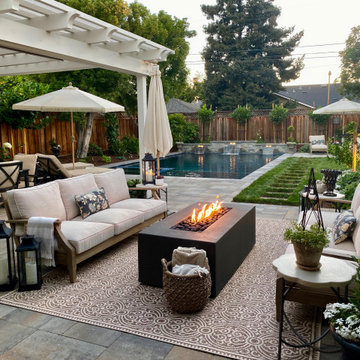
These delightful homeowners wanted to increase their usable patio space, create privacy from pesky neighbors, have a new uniform patio surface (they had aggregate concrete and sandset flagstone), to mask freeway noise and create much needed shade.
We started by suggesting they move the hot tub into the body of the pool and relocating the pool equipment to the remote right corner of the yard so you could actually hear people talk while relaxing. Unfortunately, the pool contractor hired by the client turned out to be an absolute nightmare. He went off the air completely for weeks at a time with no communication, creating huge project delays. There appeared to be some issue between him and his subcontractors. The pool contractor installed the pool and pool coping for this project, therefore they are not part of our contract with the homeowner.
Despite the challenges and delays with the pool contractor, we were able to move the project forward. We installed drainage, re-graded the property and laid the pavers for the two patios. The existing patio was funky as there was a step down in an awkward location, creating a tripping hazard. We adjusted the step location by making a step up from the infrequently used garage door. Now the patio and walk are all at the same level. We removed some of the existing concrete along the sidewalk so you see a cohesive flow of pavers once you are through the side yard, rather than a mishmash of materials.
Installing five 24” box laurels helped with the visual privacy from the pesky neighbors. The water features installed in the pool and the standalone fountain help eliminate the sound of the freeway noise.
The focal point of the yard is the wall at the base of the pool, constructed out of cinderblock, finished with beautiful 2” and 3” pieces of K2 Full Range Ashlar stone and a bluestone cap, and water weirs. We added visual green by placing the stepping stones into the lawn, which also draws your attention to the other side of the yard and makes the yard look larger.
Reducing the lawn footprint a bit, reducing the patio footprint from 1430 SF to 1140 SF, while increasing the planting beds, all made the yard seem more spacious and lush. We recommended increasing the coping size to 18” wide so there would be enough space to around the pool.
Many existing plants and trees remained so we had to match and plan for the future since some existing trees look to be nearing end of life. The owner wanted an all white plant palette and loves shade plants like hydrangeas so we had to find full sun, white flowering plants which met with her approval.
Providing much needed shade for this uber hot backyard, the oversized pergola allows for expansion of shaded seating for large parties. The fan helps keep guests cool on hot days and the heaters keep them warm during the fall and spring shoulder seasons. Their budget did not allow for a built in BBQ at the moment so we helped them source a sleek looking MontAlpi BBQ island at a reasonable price point.
 TVL Creative Ltd.
Cramped kitchen be gone! That was the project motto and top priority. The goal was to transform the current layout from multiple smaller spaces into a connected whole that would activate the main level for our clients, a young family of four.
The biggest obstacle was the wall dividing the kitchen and the dining room. Removing this wall was central to opening up and integrating the main living spaces, but the existing ductwork that ran right through the center of the wall posed a design challenge, er design opportunity. The resulting design solution features a central pantry that captures the ductwork and provides valuable storage- especially when compared to the original kitchen's 18" wide pantry cabinet. The pantry also anchors the kitchen island and serves as a visual separation of space between the kitchen and homework area.
Through our design development process, we learned the formal living room was of no service to their lifestyle and therefore space they rarely spent time in. With that in mind, we proposed to eliminate the unused living room and make it the new dining room. Relocating the dining room to this space inherently felt right given the soaring ceiling and ample room for holiday dinners and celebrations. The new dining room was spacious enough for us to incorporate a conversational seating area in the warm, south-facing window alcove.
Now what to do with the old dining room?! To answer that question we took inspiration from our clients' shared profession in education and developed a craft area/homework station for both of their boys. The semi-custom cabinetry of the desk area carries over to the adjacent wall and forms window bench base with storage that we topped with butcher block for a touch of warmth. While the boys are young, the bench drawers are the perfect place for a stash of toys close to the kitchen.
The kitchen begins just beyond the window seat with their refrigerator enclosure. Opposite the refrigerator is the new pantry with twenty linear feet of shelving and space for brooms and a stick vacuum. Extending from the backside of the pantry the kitchen island design incorporates counter seating on the family room side and a cabinetry configuration on the kitchen side with drawer storage, a trashcan center, farmhouse sink, and dishwasher.
We took careful time in design and execution to align the range and sink because while it might seem like a small detail, it plays an important role in supporting the symmetrical configuration of the back wall of the kitchen. The rear wall design utilizes an appliance garage mirrors the visual impact of the refrigerator enclosure and helps keep the now open kitchen tidy. Between the appliance garage and refrigerator enclosure is the cooking zone with 30" of cabinetry and work surface on either side of the range, a chimney style vent hood, and a bold graphic tile backsplash.
The backsplash is just one of many personal touches we added to the space to reflect our client's modern eclectic style and love of color. Swooping lines of the mid-mod style barstools compliment the pendants and backsplash pattern. A pop of vibrant green on the frame of the pantry door adds a fresh wash of color to an otherwise neutral space. The big show stopper is the custom charcoal gray and copper chevron wall installation in the dining room. This was an idea our clients softly suggested, and we excitedly embraced the opportunity. It is also a kickass solution to the head-scratching design dilemma of how to fill a large and lofty wall.
We are so grateful to bring this design to life for our clients and now dear friends.
 Robin's Nest Interiors
Updated Spec Home: Foyer and Great Room
In our last post, we introduced you to my mom and sister’s Updated Spec Home; the Foyer and Great Room will be featured in this post.
Foyer
As you enter their home, to the right is a hall closet and a french door which leads to the Basement. To the left is a long wall which was perfect for an extra long console table in a rustic finish that served as a sofa table in their previous home. I love repositioning furniture, and by using this table in the entry, it makes it feel new.
Additionally, we placed a vibrant piece of art previously used in my sister’s Bedroom above the table. This piece not only sets the tone for our color palette, it also makes the kind of statement you want in your Foyer – Wow! We added accessories and an unique lamp to complete the space.
Great Room
In the Great Room which is open to the Foyer, we installed our inspiration artwork in the place of honor over the mantel. Since the piece was vertical, it did not take up enough space. I do not like a “fussy” mantel with lots of accessories so we found these two vases in a silver leaf finish. They were perfect because they were large enough, but not too deep. Accessorizing mantels can be tricky because the majority of them are not deep. We went to Jan’s Floral Design to add vibrant color and interesting textures to the vases.
The original mantel was too small and uninspired. Therefore, we had our contractor Brad Anderson built a new one based on a photo of a mantel we liked. The new mantel has lots of great detail and is the appropriate proportion for the fireplace. We replaced beige 12×12 ceramic tiles with gorgeous large pieces of smoked carrara marble for a striking fireplace surround. Check out this other mantel that we updated.
For furniture, we purchased a shorter sofa in a gray tweed fabric. Typically, two throw pillows come with a sofa.We added a fun fringe to the pillows that came with the sofa. I recommend ordering pillows that match your sofa fabric and layering with custom pillows that support your color palette. We added a patterned custom pillow and a striped throw.
Next, we got a small scale recliner in a yummy gray leather for my mom and a chair and ottoman in a small scale mint and gray geometric pattern for my sister. We added an accent chair in a fun small scale stripe to fill a corner and add additional seating – which is always a good thing.
Remember that this was a Spec Home so there were no built-ins. As a result, we needed a media cabinet for the television and some bookcases to display my mom’s decorative box collection and my sister’s collection of blown colored glass. This set from Ballard Designs fit the bill perfectly. The back is open and airy with nice detail. The wood finish also adds a richness to the space.
My mom needed a space for her computer, and this small writing desk fit the space perfectly.
Finally, for finishing touches, we added a patterned rug, cornice boards in a mint leaf fabric, and great lamps for ambient lighting. These two rooms are stunning, vibrant and livable. Can’t wait to show you more in our next post! Enjoy!

Sponsored
Columbus, OH

Snider & Metcalf Interior Design, LTD
Leading Interior Designers in Columbus, Ohio & Ponte Vedra, Florida
 Robin's Nest Interiors
Updated Spec Home: Foyer and Great Room
In our last post, we introduced you to my mom and sister’s Updated Spec Home; the Foyer and Great Room will be featured in this post.
Foyer
As you enter their home, to the right is a hall closet and a french door which leads to the Basement. To the left is a long wall which was perfect for an extra long console table in a rustic finish that served as a sofa table in their previous home. I love repositioning furniture, and by using this table in the entry, it makes it feel new.
Additionally, we placed a vibrant piece of art previously used in my sister’s Bedroom above the table. This piece not only sets the tone for our color palette, it also makes the kind of statement you want in your Foyer – Wow! We added accessories and an unique lamp to complete the space.
Great Room
In the Great Room which is open to the Foyer, we installed our inspiration artwork in the place of honor over the mantel. Since the piece was vertical, it did not take up enough space. I do not like a “fussy” mantel with lots of accessories so we found these two vases in a silver leaf finish. They were perfect because they were large enough, but not too deep. Accessorizing mantels can be tricky because the majority of them are not deep. We went to Jan’s Floral Design to add vibrant color and interesting textures to the vases.
The original mantel was too small and uninspired. Therefore, we had our contractor Brad Anderson built a new one based on a photo of a mantel we liked. The new mantel has lots of great detail and is the appropriate proportion for the fireplace. We replaced beige 12×12 ceramic tiles with gorgeous large pieces of smoked carrara marble for a striking fireplace surround. Check out this other mantel that we updated.
For furniture, we purchased a shorter sofa in a gray tweed fabric. Typically, two throw pillows come with a sofa.We added a fun fringe to the pillows that came with the sofa. I recommend ordering pillows that match your sofa fabric and layering with custom pillows that support your color palette. We added a patterned custom pillow and a striped throw.
Next, we got a small scale recliner in a yummy gray leather for my mom and a chair and ottoman in a small scale mint and gray geometric pattern for my sister. We added an accent chair in a fun small scale stripe to fill a corner and add additional seating – which is always a good thing.
Remember that this was a Spec Home so there were no built-ins. As a result, we needed a media cabinet for the television and some bookcases to display my mom’s decorative box collection and my sister’s collection of blown colored glass. This set from Ballard Designs fit the bill perfectly. The back is open and airy with nice detail. The wood finish also adds a richness to the space.
My mom needed a space for her computer, and this small writing desk fit the space perfectly.
Finally, for finishing touches, we added a patterned rug, cornice boards in a mint leaf fabric, and great lamps for ambient lighting. These two rooms are stunning, vibrant and livable. Can’t wait to show you more in our next post! Enjoy!
 J Design Group - Interior Designers Miami - Modern
Modern Interior Designs in Miami FL. by J Design Group in Miami.
Home is an incredible or lovely place where most of the people feel comfortable. Yes..! After a long and hectic day, house is the one place where you can relax. Gone are the days, when a “home” meant just a ceiling with four walls. Yes..! That's true, but nowadays a “house” is something beyond your expectation. Therefore, most of the people hire “premises decoration” services.
Nowadays, unlike old-age properties, various new apartments and homes are built to optimize the comfort of modern housing. Yes...! Everyone knows that “Home Decoration” is considered to be one of the most important and hottest trends all over the world. This is an amazing process of using creativity, imaginations and skills. Through this, you can make your house and any other building interesting and amazing. However, if you are looking for these kinds of services for your premises, then “J Design Group” is here just for you.
We are the one that provides renovation services to you so that you can make a building actually look like a house. Yes..! Other ordinary organizations who actually focus on the colors and other decorative items of any space, but we provide all these solutions efficiently. Creative and talented Contemporary Interior Designer under each and every requirement of our precious clients and provide different solutions accordingly. We provide all these services in commercial, residential and industrial sector like homes, restaurants, hotels, corporate facilities and financial institutions remodeling service.
Everyone knows that renovation is the one that makes a building actually look like a house. That's true “design” is the one that complement each and every section of a particular space. So, if you want to change the look of your interior within your budget, then Miami Interior Designers are here just for you. Our experts carefully understand your needs and design an outline plan before rendering outstanding solutions to you.
Interior design decorators of our firm have the potential and appropriate knowledge to decorate any kind of building. We render various reliable and credible solutions to our esteemed customers so that they can easily change the entire ambiance of their premises.
J Design Group – Miami Interior Designers Firm – Modern – Contemporary
Contact us: 305-444-4611
www.JDesignGroup.com
“Home Interior Designers”
"Miami modern"
“Contemporary Interior Designers”
“Modern Interior Designers”
“House Interior Designers”
“Coco Plum Interior Designers”
“Sunny Isles Interior Designers”
“Pinecrest Interior Designers”
"J Design Group interiors"
"South Florida designers"
“Best Miami Designers”
"Miami interiors"
"Miami decor"
“Miami Beach Designers”
“Best Miami Interior Designers”
“Miami Beach Interiors”
“Luxurious Design in Miami”
"Top designers"
"Deco Miami"
"Luxury interiors"
“Miami Beach Luxury Interiors”
“Miami Interior Design”
“Miami Interior Design Firms”
"Beach front"
“Top Interior Designers”
"top decor"
“Top Miami Decorators”
"Miami luxury condos"
"modern interiors"
"Modern”
"Pent house design"
"white interiors"
“Top Miami Interior Decorators”
“Top Miami Interior Designers”
“Modern Designers in Miami”
225 Malaga Ave.
Coral Gable, FL 33134
http://www.JDesignGroup.com
Call us at: 305.444.4611
Your friendly professional Interior design firm in Miami Florida.
 Tile Doctor Ltd
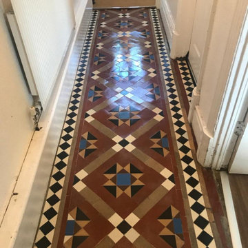
I recently worked on the restoration of a Victorian tiled hallway in Cwmbran Wales which is six miles North of Newport. As you can see from the photographs the floor was in quite a neglected dirty state and many of the the black and white border tiles needed removing and replacing. The worst part was the area by the front door where most of the tiles had been removed and then backfilled with concrete. I can only assume at some point in the past it was deemed to difficult or expensive to restore the floor, so they simply covered it up.
After visiting to survey the floor I did offer to source replacements for the concreted section and restore that as part of the work however my client’s budget would not stretch to that at the time. My quote was therefore focused on the main section of flooring and included replacing border tiles, deep cleaning the whole floor and then sealing the tiles to add protection. Although I did need to check that I could indeed source the replacement tiles before being able to provide the quote which as it turned out would not be an issue.
They were happy to go ahead and we arranged a suitable time to carry out the work which would enable me to work in the property whilst minimising contact with the owners due to the Covid-19 situation.
I spend the first day sorting out the black and white border tiles which needed to be gently prised out of position without upsetting the main part of the floor. The exposed subfloor was then cleaned up to remove old adhesive and replacements were fitted where required and secured into place. The floor would need to be solid before cleaning so that was left for day two so the new adhesive could go off overnight.
On day two I gave the floor an initial clean using a combination of Tile Doctor Pro-Clean and Remove and Go diluted with water. This produces a strong cleaner/stripper that will tackle dirt and remove coatings such as previous sealers. The old tiles had accumulated years of ingrained dirt, so I needed this extra power to remove the years of dirt and contaminates from the tile. It was sprayed onto the tiles and then left to soak in for ten minutes before being actively scrubbed into the tile using a rotary machine fitted with a black scrubbing pad. The soil was then rinsed off with water and extracted with a wet vacuum. The floor was inspected, and the process repeated on the tough stains until I was satisfied all the dirt had been removed.
Next the floor was treated to an acid wash using Tile Doctor Acid Gel using a similar method as before. This is an important treatment for these old Victorian floors that have no damp proof course as it neutralises efflorescent salts trapped in the tile which can appear as white salt deposits later. Once I was happy with the condition of the floor it was given a final rinse and left to dry off. I use a wet vacuum to remove liquids from the floor and on this last extraction I spent extra time to remove as much moisture from the tiles as possible.
I came back a few days later and after checking the tiles were dry using a damp meter, I started the application of the sealer. For this floor I applied seven coats of Tile Doctor Seal and Go for a satin finish. Tile Doctor Seal and Go is a specially formulated water-based sealer that provides both stain resistance and a durable low-sheen finish. It is perfect on a floor of this age where it leaves a lovely finish and will remain durable in what is a essentially a high traffic area.
Although we didn’t manage to sort out the area by the front door the client managed to fit a made to measure coir door mat along with carpet bar which was quite practical and looked fine so they were able to resolve that problem without blowing their budget.
The client was over the moon with results, the floor had a lovely pattern and the colours now shone through. I suggested the use of Tile Doctor Neutral Tile Cleaner to keep the floor clean and in good condition. It is neutral in pH so will ensure that the newly applied sealer stays in place and will ensure maintenance is nice and easy for them.
Paul Wales
Monmouthshire Tile Doctor
40