
Search results for "Made up term" in Home Design Ideas
 Albert, Righter & Tittmann Architects, Inc.
Our client, with whom we had worked on a number of projects over the years, enlisted our help in transforming her family’s beloved but deteriorating rustic summer retreat, built by her grandparents in the mid-1920’s, into a house that would be livable year-‘round. It had served the family well but needed to be renewed for the decades to come without losing the flavor and patina they were attached to.
The house was designed by Ruth Adams, a rare female architect of the day, who also designed in a similar vein a nearby summer colony of Vassar faculty and alumnae.
To make Treetop habitable throughout the year, the whole house had to be gutted and insulated. The raw homosote interior wall finishes were replaced with plaster, but all the wood trim was retained and reused, as were all old doors and hardware. The old single-glazed casement windows were restored, and removable storm panels fitted into the existing in-swinging screen frames. New windows were made to match the old ones where new windows were added. This approach was inherently sustainable, making the house energy-efficient while preserving most of the original fabric.
Changes to the original design were as seamless as possible, compatible with and enhancing the old character. Some plan modifications were made, and some windows moved around. The existing cave-like recessed entry porch was enclosed as a new book-lined entry hall and a new entry porch added, using posts made from an oak tree on the site.
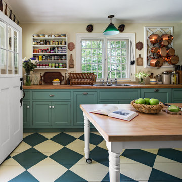
The kitchen and bathrooms are entirely new but in the spirit of the place. All the bookshelves are new.
A thoroughly ramshackle garage couldn’t be saved, and we replaced it with a new one built in a compatible style, with a studio above for our client, who is a writer.
 Haustech
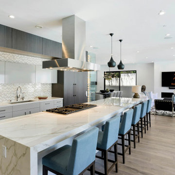
This 4 bedroom, 8 bathroom 5,800 square foot house was built from the ground up on a 9,600 square foot lot. Designed for California living with wide open entertaining spaces, the house boasts a full Savant System featuring integration of audio/video, lighting, comfort, surveillance with everything seamlessly tied into a central equipment location. Whether it’s the 65” outdoor TV and landscape audio system or the multiple media rooms scattered throughout the house with speakers in 12 zones, this home is made for easy connected living.
 Cape Associates, Inc.
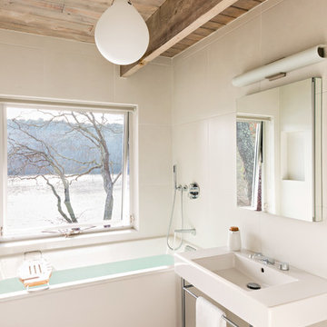
Overthinking a situation isn’t always a bad thing, particularly when the home in question is one in which the past is suddenly meeting the present. Originally designed by Finnish architect Olav Hammarstrom in 1952 for fellow architect Eero Saarinen, this unique home recently received its first transformation in decades. Still in its 1950s skin, it was completely gutted, inside and out. It was a serious undertaking, as the homeowner wanted modern upgrades, while keeping an eye toward retaining the home’s 1950s charm. She had a vision for her home, and she stuck to it from beginning to end.
Perched on a rise of land and overlooking the tranquil Wellfleet Herring Pond, the home initially appears split, with the guest house on the left, and the main house of the right, but both ends are connected with a breezeway. The original home’s bones were in good shape, but many upgrades and replacements were necessary to bring the house up to date.
New siding, roofing, gutters, insulation and mechanical systems were all replaced. Doors and windows with metal frames were custom made by a company in Long Island that fabricates doors for office buildings. Modern heating and cooling systems were added, and the three bathrooms were all updated. The footprint of the home remained unchanged. Inside, the only expansion was more closet space.
The attention to detail in retaining the 50s-style look took a lot of online searching, from handles and knobs to lighting fixtures, with bits and pieces arriving from all over the world, including a doorstop from New Zealand. The homeowner selected many of the fixtures herself, while a very detail-oriented foreman exhaustively researched as well, looking for just the right piece for each and every location.
High-end appliances were purchased to modernize the kitchen and all of the old cabinetry was removed, replaced and refaced with NUVACOR, a versatile surfacing material that not only provided a sleek, modern look, but added convenience and ease of use.
Bare, wood-beamed ceilings throughout give a nod to the home’s natural surroundings, while the main living area (formerly a fisherman’s cabin), with a brick fireplace, was completely trimmed in walnut, while multiple windows of varying sizes welcome sunlight to brighten the home. Here, the sheetrock ceiling with faux rafters provides an interesting and room-brightening feature.
Behind the house sits the serene pond, which can now be enjoyed from the stunning new deck. Here, decking material was not laid out side by side, as it typically is but, instead, meticulously laid out on edge, creating an unusual and eye-catching effect. A railing of tempered glass panels allows unobstructed views of the surrounding natural beauty, and keeps consistent with the open, airy feel of the place. A new outdoor shower is accessible via the deck and left open to the wilderness and the pond below, completing the bold yet sophisticated feeling of this retro-modern home.
Find the right local pro for your project
 Haus of Blaylock | Award-Winning Designer
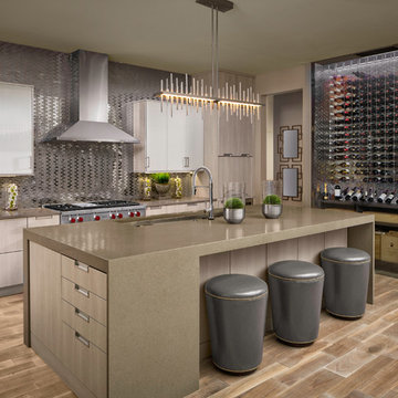
The La Cantera Kitchen is a bright, open concept kitchen looking into the living room with easy access to the dining room. The backsplash is made up of stainless steel tiles which accents the stainless steel appliances. The painted glass cabinetry gives the kitchen a sleek, modern feel.
 SDG | Schlosser Design Group, LLC.
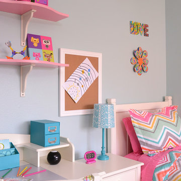
Light and airy with a mix of bright and soft tones livens up this tween girls room. Custom made cornice with custom black out shade mixes it up. Whimsical wall decor keeps the room fun without being too young so she can grow in to a young adult
Michael Hunter, Photographer
 Interiors Joan and Associates
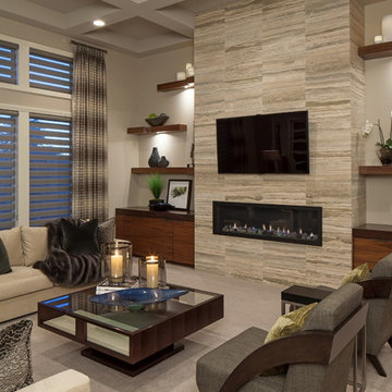
Example of a trendy carpeted living room design in Omaha with a ribbon fireplace, a wall-mounted tv and beige walls
 Beverly Brown
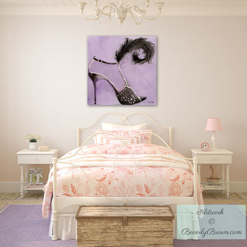
Fashionable girl's bedroom featuring "Black High Heel Shoe with Feather" custom giclee print (30"x30" on canvas) of an original watercolor painting by Beverly Brown. Prints are made to order in sizes from 8"x8" up to 48"x48" on fine art paper with custom framing; or on canvas, metal or acrylic. Artwork © Beverly Brown
Sponsored
Fredericksburg, OH

High Point Cabinets
Columbus' Experienced Custom Cabinet Builder | 4x Best of Houzz Winner
 Mantis Design + Build, LLC
Photography by Paul Linnebach
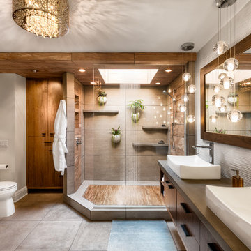
Inspiration for a large tropical master gray tile and ceramic tile gray floor and ceramic tile bathroom remodel in Minneapolis with flat-panel cabinets, dark wood cabinets, a one-piece toilet, white walls, a vessel sink and concrete countertops
Inspiration for a large tropical master gray tile and ceramic tile gray floor and ceramic tile bathroom remodel in Minneapolis with flat-panel cabinets, dark wood cabinets, a one-piece toilet, white walls, a vessel sink and concrete countertops
 Metropolis Drafting and Construction Inc
Creation of a new master bathroom, kids’ bathroom, toilet room and a WIC from a mid. size bathroom was a challenge but the results were amazing.
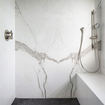
The master bathroom has a huge 5.5'x6' shower with his/hers shower heads.
The main wall of the shower is made from 2 book matched porcelain slabs, the rest of the walls are made from Thasos marble tile and the floors are slate stone.
The vanity is a double sink custom made with distress wood stain finish and its almost 10' long.
The vanity countertop and backsplash are made from the same porcelain slab that was used on the shower wall.
The two pocket doors on the opposite wall from the vanity hide the WIC and the water closet where a $6k toilet/bidet unit is warmed up and ready for her owner at any given moment.
Notice also the huge 100" mirror with built-in LED light, it is a great tool to make the relatively narrow bathroom to look twice its size.
 Advance Design Studio, Ltd.
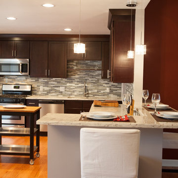
Like most homes built in the 1980’s this combined entry, living room, eating area, and kitchen were completely compartmentalized with walls. They loved the idea of opening up the spaces to accommodate more of a great room feeling. Advance Design accomplished this by opening up the corner of the kitchen to not only make the space flow, but to let light into the dark eating nook and living room.
Working on a budget, opening up the space and installing new hardwood flooring was a priority, so a more expansive kitchen had to be economical. Wanting a clean, contemporary feel; tall espresso shaker cabinets replaced old soffits, and River White granite made an impressive and clean lined contrast. A drywall pantry was replaced with an efficient roll out pantry, and stylish long stainless steel pulls tie the whole look together.
Photo Credits- Joe Nowak
 Advance Design Studio, Ltd.
After six years of living in their Huntley IL home, Chris and Meghan were tired of their dark, dingy, outdated kitchen and it was finally time for a long-anticipated change. “The kitchen is the place where we live, it’s where we do everything,” Meghan said. “It was important that it be a space where we wanted to be.” Meghan loves cooking and enjoys including their girls in healthy meal prepping, this led them to want a brighter, more enjoyable kitchen with increased functionality and improved storage.
For Chris especially, the laundry room was an entirely dysfunctional eyesore. “We had a washer and a dryer, but it was all kind-of cobbled together!” Chris said. “There were always laundry piles everywhere, we weren’t really sure what we wanted to do in there, but it was time for us to make a change.” The mess of the space was stressful every time they walked in the door from the garage each day. Kids’ backpacks and shoes piled up haphazardly in the makeshift boot-bench closet left the family feeling disorganized and stressed. They needed space for folding clothes and locker cubbies to help keep the family organized.
Having known Christine and Todd in the Huntley community for years, Chris and Meghan were familiar with their work. “We already trusted them personally and having seen their projects for years we knew they did top notch work. After we reviewed the initial round of designs, we knew that hiring them was definitely the right choice,” Meghan and Chris said. Although Chris had done a lot of work in their home himself, the kitchen and laundry room renovation was such a large undertaking that he didn’t want to steal time away from his family to spend what would surely be many long weekends doing the job himself. “That would not have been a wise choice for us,” Chris laughed.
“Our designer, Michelle was very, very, easy to work with; anything we wanted to see or weren’t sure about, she went above and beyond to make this easy for us. She was easy to get hold of and always quick to respond,” the couple said. Michelle pulled ideas that mirrored the couple’s taste and style and was adept at directing the couple to limited choices that didn’t overwhelm them and kept the process moving. “I have a hard time making decisions. Michelle made the decision-making process so easy. I loved how she listened to what I liked and then presented three great options for me to choose from,” Meghan said.
The main objectives for the kitchen were better storage solutions, they wanted the space to reflect their lifestyle and taste, and they wanted it to last for years with low maintenance. One of the first steps in creating a more functional kitchen was relocating the refrigerator, creating an improved workflow for the busy family.
“We didn’t know that we could even move the refrigerator to a new location where it is now, that was something that we never would have thought of,” Chris said. “The new refrigerator location makes the kitchen feel so much bigger. We didn’t add any space, but our whole kitchen with the new design just seems like it’s so much larger than before!” Meghan said.
The perimeter mist colored cabinets helped warm and brighten the entire room, while the graphite colored cabinets on the island added contrast. Using this fresh, clean color palette satisfied the couple’s desire for a bright space that was the exact opposite of what they had before. Organization accessories were also added to the cabinets such as a spice drawer tray and roll outs to create hidden convenience.
“I absolutely love the hidden spices – it makes cooking so much more enjoyable!” Chris said. “And all the pull outs, and the double trash bin, who would think you could get so excited about organization!” the couple said in unison.
One thing they hated in their original kitchen was how dark the space felt. Added lighting on the ceiling with the new light fixtures combined with the lighter cabinetry colors throughout solved this problem. “Our new kitchen has this warm, almost cozy feeling that our old kitchen never had, it’s just a space that I love spending my time in now,” Meghan said. The light airy feeling was accentuated with the use of floating white shelves on either side of the decorative range hood. “We have so much cabinetry space, the new design is amazing we actually have more storage space than we will ever need,” Meghan said.
The island was extended to create more work surface and added space for stool seating. “The new island changes how we live. Now the kids can be in the kitchen with us, doing homework, eating breakfast, and the three of us have special dinners there when Chris is working late,” Meghan said.
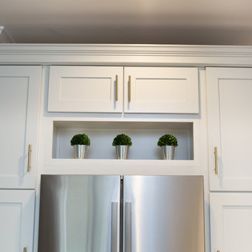
The Carrara Marmi Quartz countertops were chosen because they are, not only beautiful, but are made from hard-working material that doesn’t require maintenance. The white subway tile backsplash that wraps to the ceiling behind the focal point cooktop range/hood compliments the crisp white countertops perfectly, while brushed brass hardware and light fixtures keep the design fresh and new.
The couple had a few fears at the beginning of the project, as most homeowners do. Their biggest fear was being out of their kitchen and laundry room for an extended time. The crew made it very easy for the family to work in a limited space keeping the washer and dryer hooked up the majority of the time, and also getting appliances working with minimal downtime.
“They above and beyond accommodated us to get us through the process,” Meghan said. “They did a great job making sure we were as comfortable as possible throughout the process,” Chris added.
“Our project manager DJ did a great job. He was very good at updating us on schedule changes, getting guys in as quickly as possible. Everyone that stepped in the house was nice and did great work,” said Chris. They thought Advance’s carpenter was phenomenal and were impressed when he took a conceptual idea from a photograph and worked with designer Michelle to create a one of a kind range/hood that has become the topic of conversation with friends and family who visit the new kitchen. “He was in our house literally every day for several weeks. He was easy to work with and good at what he did,” Meghan and Chris said.
The focal point of the kitchen; a hand-crafted, custom-built ventilation hood was clad with handpicked reclaimed barnwood. Advance Design’s carpenter built the framework and the cladding to create a one-of-a-kind design element that the couple loves.
“I think it was especially fun for him to create something unique from scratch, showcasing his talent in this area,” Meghan said. “I love that my kitchen is not like everyone else’s. I got to pick out the wood on my hood and watch it being built and was able to choose what pieces of wood went where on it. It’s totally unique.”
Red Oak flooring was toothed-in throughout the kitchen and the rest of the first floor anywhere changes were made. Then the whole floor was refinished to tone down the orange undertones in the existing floor stain, ultimately changing the color complexion of the entire first floor. The result is a completely new feeling to the entire home.
Renovating the laundry room was extremely important to Meghan and Chris, but they had trouble visualizing what the possibilities were for the seemingly small space. Michelle produced beautiful 3D illustrations that helped them envision the space in a whole new way.
“I must have told Michelle 100 times that I am a visual person, seeing the designs in 3D made it so easy to make decisions and see what we could really do with our space,” Meghan said.
A dividing wall and doorway were removed between the existing laundry room and hallway formerly containing a coat closet, providing space to design specialized graphite colored cabinetry matching the kitchen island to house custom storage cubbies for each family member. Adding the tall utility cabinetry in the new laundry area helped solve the storage issue, tucking away cleaning supplies, household items, and even the cat got its own cubby.
“I love how everything is now hidden in its own space. I can’t tell you how much I hated coming home and seeing everything sitting around on counters,” Chris said.
Electrical outlets were planned for the inside of utility cabinets, so devices could charge in hidden locations. Stacking the washer and dryer allowed for wider countertop space to provide a folding area and a special space for clothes to hang. “The way I do laundry has been completely transformed! I can actually fold clothes and hang them now right out of the washer and dryer,” Meghan said.
“The end result in the kitchen and the laundry/mud room was an updated light and bright space, with a smarter work flow that better meets the needs of this family,” Michelle said.
“I would totally recommend Advance Design,” Meghan said. “Sometimes I sit and just look at my kitchen and laundry room and think ‘Wow, I can’t believe I get to live here!’ It’s an understatement to say we love our new space.”
 Klopf Architecture
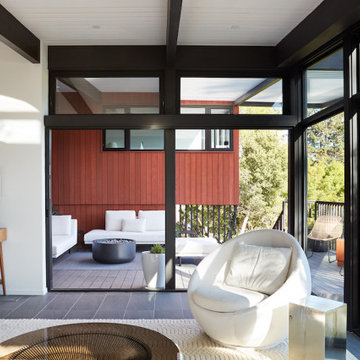
The Roger Lee designed house from 1962 was purchased by the current homeowners in almost original condition, as the previous owners elected to defer most maintenance projects over the years. The clients were able to see beyond the dated materials and finishes, single-paned glass and uninsulated walls and they approached Klopf Architecture to help them expand and update the entire home, one the family could settle into and enjoy for years to come. It was important that the new designs were aligned with Lee's original intent not only because of the client's appreciation for mid-century modern architecture, but also because the house was deemed historical. The Stanford Real Estate Office requires a stringent design review which safeguards the integrity of the community, which Klopf Architecture was happy to oblige going into their updated designs.
As with many original mid-century modern homes, the house was scaled to the 1960s lifestyle where rooms were smaller and openings to views were limited and tightly framed. The original conditions defined the direction the family of four would take in updating the house and making it comfortable for their modern lifestyle. Klopf designed a full gut remodel and major addition to bring the house into the 21st century and provide the living area needed for the client's family. The newly expanded house added just about 1,100 sf to create an airy, comfortable and family friendly house, taking full advantage of the beautiful southwestern views that extend out to the hills beyond. The enclosed garage created an additional 240 sf of covered space for long-term storage.
A cracked swimming pool created an eyesore taking up a majority of the backyard landscape, so it was one of the first elements to go during the transformation. Working with Outer Space Landscape Architects, the family asked for a mix of relaxing outdoor patio spaces that eventually blend into the native landscaping, extending their views outward toward the natural greenery of the trees beyond their property. Filling in the old pool was a smart way to expand the living spaces outward. The orientation of the house was designed to enjoy the views, but the original architecture provided the first homeowners with mere glimpses of the landscape outside.
Klopf was able to broaden those views, continuing and extending on the original architecture to take full advantage of the unobstructed natural views across the rear facade of the house. Small horizontal openings in the primary bedroom and office were replaced with much taller windows that now follow the angled roof line upward, extending across almost all of the facade. We worked with Western Windows, whose designs included an oblique-shaped, operable casement that allowed our design to rise with the slope. A new corner office added to the primary suite, offers a bright and functional work-from-home solution that looks out at the distant views and added natural light from the expanded window configuration that now wraps around the corner.
The existing lower level was designed by Lee as a utilitarian space, serving as a wet pool room with a drain in the center of the floor, bathroom, laundry and storage areas. Without the need for a pool room, Klopf was able to convert the area into a much more comfortable and functional living space with a new family room and guest suite. The new spaces enjoy easy access to a new outdoor patio through floor to ceiling, full-width glass sliders.
Continuing along the rear facade, a previously exposed deck extending from the living room and hallway provided access to the backyard through a single set of stairs leading toward the side of the house which made sense when the pool was in place. The new deck was re-envisioned as an extension of the main living room and now serves as a second outdoor living room. A new slatted pergola above provides the homeowners welcome relief from the hot afternoon sun. A second set of stairs now creates a better connection to the redesigned lower level. Klopf was able to reconfigure the spaces, extending the living room outward toward the views, where the family now claims it as the heart of the home, spending a large majority of their time outdoors.
Back inside, the original wood-burning Malm fireplace was beautifully restored and a gas burner installed to comply with California's strict air standards. It now rests in front of a wall of Heath accent tiles where a dated red brick wall used to stand. A new taller window brings more light and views into the refreshed interior living room. The original glass doors opposite the fireplace were replaced by larger sliders that when fully opened, create a seamless transition to the new outdoor living area so the two spaces feel like one connected space. The original utilitarian kitchen was needlessly tucked into the far back corner and closed-off, out of sight from the living room, so the clients asked Klopf to open it up and expand the kitchen forward so it felt more connected. Today the much larger kitchen is connected to the living area where a short wall with a cutout offers a visual glimpse into the kitchen and a handy pass-through counter for serving guests. A new breakfast nook was also added to create another spot where the family can gather for casual meals. Just outside, a new built-in outdoor grill and prep area extends the kitchen outside and connects to a new outdoor dining spot nestled amongst the trees, taking advantage of the views out back.
Klopf was able to expand the other two bedrooms, add a new laundry room and half-bath and convert the carport to an enclosed garage to add more storage areas which was lost when the pool house was converted to the family and guest room.
To maintain a historical connection to the original designs, the exterior siding was repeated on all exterior walls, a full-height stained glass window at the front entryway restored, and an interior slatted screen element repeated outside at the exterior entry courtyard and over the new outdoor living room to create a shade trellis. The new house stands proudly and shines against it's new landscaping features, while respecting and expanding on the original intent of Roger Lee's designs epitomizing the comforts of indoor-outdoor living in Northern California.
Completion year: 2020
Klopf Architecture project team: John Klopf, Klara Kevane, Noel Andrade
Contractor: ORB Construction, Brendan O'Reilly
Structural engineer: Sezen and Moon
Landscape architect: Outer space
Furnishings and decoration: Urbanism Designs
Photographer: Mariko Reed
 TKS Design Group
Free ebook, Creating the Ideal Kitchen. DOWNLOAD NOW
The Klimala’s and their three kids are no strangers to moving, this being their fifth house in the same town over the 20-year period they have lived there. “It must be the 7-year itch, because every seven years, we seem to find ourselves antsy for a new project or a new environment. I think part of it is being a designer, I see my own taste evolve and I want my environment to reflect that. Having easy access to wonderful tradesmen and a knowledge of the process makes it that much easier”.
This time, Klimala’s fell in love with a somewhat unlikely candidate. The 1950’s ranch turned cape cod was a bit of a mutt, but it’s location 5 minutes from their design studio and backing up to the high school where their kids can roll out of bed and walk to school, coupled with the charm of its location on a private road and lush landscaping made it an appealing choice for them.
“The bones of the house were really charming. It was typical 1,500 square foot ranch that at some point someone added a second floor to. Its sloped roofline and dormered bedrooms gave it some charm.” With the help of architect Maureen McHugh, Klimala’s gutted and reworked the layout to make the house work for them. An open concept kitchen and dining room allows for more frequent casual family dinners and dinner parties that linger. A dingy 3-season room off the back of the original house was insulated, given a vaulted ceiling with skylights and now opens up to the kitchen. This room now houses an 8’ raw edge white oak dining table and functions as an informal dining room. “One of the challenges with these mid-century homes is the 8’ ceilings. I had to have at least one room that had a higher ceiling so that’s how we did it” states Klimala.
The kitchen features a 10’ island which houses a 5’0” Galley Sink. The Galley features two faucets, and double tiered rail system to which accessories such as cutting boards and stainless steel bowls can be added for ease of cooking. Across from the large sink is an induction cooktop. “My two teen daughters and I enjoy cooking, and the Galley and induction cooktop make it so easy.” A wall of tall cabinets features a full size refrigerator, freezer, double oven and built in coffeemaker. The area on the opposite end of the kitchen features a pantry with mirrored glass doors and a beverage center below.
The rest of the first floor features an entry way, a living room with views to the front yard’s lush landscaping, a family room where the family hangs out to watch TV, a back entry from the garage with a laundry room and mudroom area, one of the home’s four bedrooms and a full bath. There is a double sided fireplace between the family room and living room. The home features pops of color from the living room’s peach grass cloth to purple painted wall in the family room. “I’m definitely a traditionalist at heart but because of the home’s Midcentury roots, I wanted to incorporate some of those elements into the furniture, lighting and accessories which also ended up being really fun. We are not formal people so I wanted a house that my kids would enjoy, have their friends over and feel comfortable.”
The second floor houses the master bedroom suite, two of the kids’ bedrooms and a back room nicknamed “the library” because it has turned into a quiet get away area where the girls can study or take a break from the rest of the family. The area was originally unfinished attic, and because the home was short on closet space, this Jack and Jill area off the girls’ bedrooms houses two large walk-in closets and a small sitting area with a makeup vanity. “The girls really wanted to keep the exposed brick of the fireplace that runs up the through the space, so that’s what we did, and I think they feel like they are in their own little loft space in the city when they are up there” says Klimala.
Designed by: Susan Klimala, CKD, CBD
Photography by: Carlos Vergara
For more information on kitchen and bath design ideas go to: www.kitchenstudio-ge.com

Sponsored
Delaware, OH

Buckeye Basements, Inc.
Central Ohio's Basement Finishing ExpertsBest Of Houzz '13-'21
 Above All Masonry Design, Inc
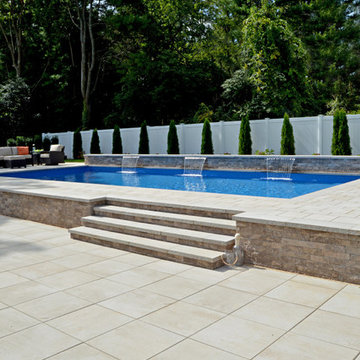
Evoking a sense of calm and equilibrium for all who visit, this symmetrical poolscape provides a haven in a Hauppauge, NY backyard. Unilock Beacon Hill Smooth pavers, with custom-made 2'x2' slabs, provide a smooth transition from the side walkway and up the stairs to the elevated, geometric pool. As guests and family gather on the expansive poolside patio, they can take in plenty of sun while listening to the calming rush of three nearby waterfalls. The stone-like design weaves its way around the property, leading right up to the front door for ultimate curb appeal and elegance. From the front yard to the back patio, clean lines and a delicate balance encompass both the paver and pool design, while incorporating lush gardens and symmetrical hedges.
 Clawson Cabinets
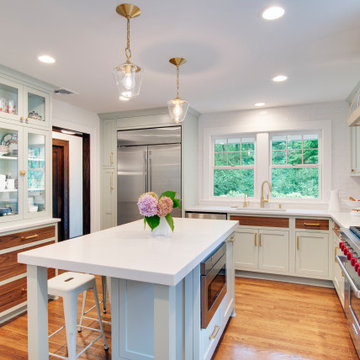
The existing kitchen had seen it’s day come and go. Relocating the hall closet and widening the connection to the dining room made room for an island and opened up the flow.
Window locations remained the same. The hall closet and existing cupboard/butlers pantry were removed to gain space for an island. New Custom Stainless hood with brass strapping pull the stainless appliances and brass details together.
Details for the original home like the original butlers pantry inspired the vision for the new look of glass cabinets over storage drawers.
Woodharbor cabinets custom made for Clawson Cabinets feature painted inset cabinets with contrasting walnut slab drawer heads. Brass hardware finishes the look.
 Drury Design
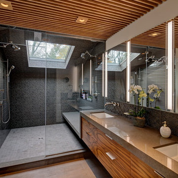
The homeowners were seeking a major renovation from their original master bath. The young family had completed several remodeling projects on the first floor of their 1980’s era home and the time had finally come where they wanted to focus on the second floor, particularly their master bath which was cramped and overpowered by a Jacuzzi-style tub.
After multiple design meetings spent choosing the right hardware and materials, everything was set, and the transformation began! Drury designer, Diana Burton, began by borrowing some space from the bedroom this way they were able to reconfigure the whole layout, which made a big difference to the homeowner. The floating vanity cabinets paired with quartz counters, wall-mounted fixtures, and mirrors featuring built-in lighting enhance the room’s sleek, clean look.
 MultiTable
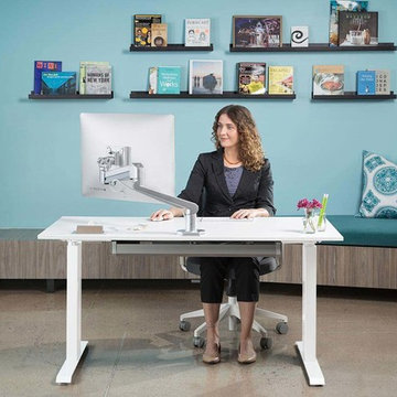
The MultiTable FlexTable Height Adjustable sit Stand Desk.
https://www.multitable.com/product/flextable-height-adjustable-standing-desk/
The FlexTable by MultiTable is uniquely designed from the ground up to be the most steadfast, versatile and adaptable height adjustable standing desk made for today’s modern workspace.
Now the power is in your hands to sit or stand with an affordable height adjustable desk that can be ordered with an electric up-down switch or a hand crank – you get to choose how to raise and lower your desk surface. Best part is you can easily and quickly convert the FlexTable from a manual hand crank to an electric switch at any time with the FlexTable Electric Upgrade Kit.
Offering impressive height adjustability from 27 ⅝” to 45 ⅞”, the FlexTable is made from quality-grade aluminum and steel components that can support standard desk tops ranging from 40” to 72” wide. Our most affordable standing desk yet, FlexTable achieves the ultimate in functionality, comfort and flexibility.
With MultiTable, you decide how you accomplish your best work.
FEATURES:
Affordable, high-quality design in a variety of standard colors
Powder-coated premium aluminum and steel desk frame
Expansive height adjustability from 27 ⅝” to 45 ⅞”
Adjustable width range from: 43” to 67”
Adjustable desk frame width supports desk tops up to 72”
Wide desk frame leg structure for improved stability and durability
Flexible conversion from manual hand crank to electric switch with FlexTable Electric Conversion Kit
30-day return guarantee
5-year limited warranty

Sponsored
Columbus, OH
Free consultation for landscape design!

Peabody Landscape Group
Columbus' Reliable Landscape Design & Contracting
 Kitchen Design Concepts
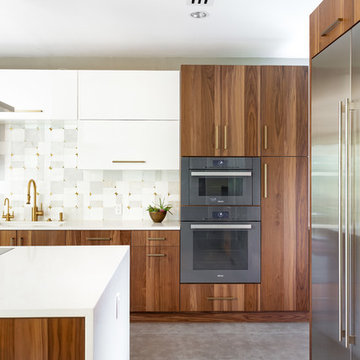
In our world of kitchen design, it’s lovely to see all the varieties of styles come to life. From traditional to modern, and everything in between, we love to design a broad spectrum. Here, we present a two-tone modern kitchen that has used materials in a fresh and eye-catching way. With a mix of finishes, it blends perfectly together to create a space that flows and is the pulsating heart of the home.
With the main cooking island and gorgeous prep wall, the cook has plenty of space to work. The second island is perfect for seating – the three materials interacting seamlessly, we have the main white material covering the cabinets, a short grey table for the kids, and a taller walnut top for adults to sit and stand while sipping some wine! I mean, who wouldn’t want to spend time in this kitchen?!
Cabinetry
With a tuxedo trend look, we used Cabico Elmwood New Haven door style, walnut vertical grain in a natural matte finish. The white cabinets over the sink are the Ventura MDF door in a White Diamond Gloss finish.
Countertops
The white counters on the perimeter and on both islands are from Caesarstone in a Frosty Carrina finish, and the added bar on the second countertop is a custom walnut top (made by the homeowner!) with a shorter seated table made from Caesarstone’s Raw Concrete.
Backsplash
The stone is from Marble Systems from the Mod Glam Collection, Blocks – Glacier honed, in Snow White polished finish, and added Brass.
Fixtures
A Blanco Precis Silgranit Cascade Super Single Bowl Kitchen Sink in White works perfect with the counters. A Waterstone transitional pulldown faucet in New Bronze is complemented by matching water dispenser, soap dispenser, and air switch. The cabinet hardware is from Emtek – their Trinity pulls in brass.
Appliances
The cooktop, oven, steam oven and dishwasher are all from Miele. The dishwashers are paneled with cabinetry material (left/right of the sink) and integrate seamlessly Refrigerator and Freezer columns are from SubZero and we kept the stainless look to break up the walnut some. The microwave is a counter sitting Panasonic with a custom wood trim (made by Cabico) and the vent hood is from Zephyr.
 Dimensions in Wood Inc
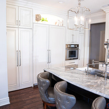
This client’s vision for their kitchen/hearth room remodel was to create a harmonious space for gathering and socializing with family and friends. Without the before and after photos, you would scarcely believe this was the same home.
This huge home renovation perfectly illustrates that Dimensions In Wood’s expert team can handle every aspect of your remodeling project. Plumbing, flooring, electrical wiring, custom cabinets, structural engineering, appliances, windows, interior and exterior doors, entertainment and more. Contact us today to discuss Translating Your Visions into Reality
The client was interested in new appliance technology, cabinetry to the ceiling, and an Island large enough to seat 3. They also wanted a built-in breakfast nook, improved pantry space, more functional storage on either side of their fireplace, and a built-in appearance for the TV above the mantel. The original built-in desk was not used, and they preferred for that space to serve as a small bar area with refrigeration and a place to store their printer. We designed several plans for the space before selecting the final layout.
The new design required the removal of the soffit over the old sink, as well as a small wall beside the old refrigerator. The wall beside the stairwell had to be shortened 13 inches and a new beam installed to carry the load of the home’s 2nd story to gain enough space for the large central island. The existing closet pantry walls were also reconfigured as per the new plan.
This serves as a great reminder that Dimensions In Wood is much more than just custom cabinets.
Central to the entire custom kitchen is an 8-foot Walnut island. The huge island, which comfortably seats three, is topped with Essenza Blue quartzite. The stone’s natural striations are beautiful. Quartzite is harder than granite, and less likely to stain than other stones because of its density. The couple had to look through multiple slabs to find a piece they LOVED. The island’s custom Walnut cabinetry, built to resemble a piece of custom furniture, was stained Bronzed Walnut by Sherwin Williams.
The 4-foot Galley Workstation in the island, handles all the kitchen’s prep, serving, and cleanup needs. The Galley’s culinary tools include an upper tier cutting board, upper tier drying rack, 2 lower tier platforms, 11″ colander with non-slip handles, and 11” mixing bowl with lid and non-slip bottom. Learn more about the amazing Galley Workstation here. A Waterstone gantry faucet in a pewter finish combines a pull-down sprayer for maximum mobility and a articulated swivel spout. A water tap with reverse osmosis filter provides the highest quality drinking water. To keep a clean and sleek counter we installed a raised air switch for the garbage disposal and integrated soap dispenser. The island also houses the Thermador Sapphire 7-Program Dishwasher with a hidden touch control panel and a custom Walnut wood front. The cabinetry under the Galley Workstation features a trash roll out, as well as storage for the culinary tools.
Shortening the stairwell wall, and reframing around the stairs, which included shortening the handrail, also made room for a bi-fold door walk-in pantry with extra roll out storage and space for a small microwave. Above the panty doors is a remote controlled, electric motor powered, lift up cabinet door which hides a flat screen TV, used while the family is cooking.
To the right of the walk-in pantry is cold food storage. The Thermador, 30-inch Freedom Collection refrigerator and 24-inch built-in freezer column with internal ice maker are covered with matching cabinetry fronts. An open display space was designed above the units, creating an aesthetically beautiful wall. To the right of the refrigerator & freezer columns is a tall cabinet designed for the built-in Thermador steam and convection oven. The convention steam oven is a relatively new technology for homes, but its versatility and food quality is amazing. To the right of this is a pull-out appliance pantry which provides easy access and storage for a stand mixer, blender, and any other appliance you do not want to clutter the counter.
The most visible wall of the kitchen features the 36-inch Thermador Professional Series Harmony Gas Range with Griddle. Between the range and custom designed wood hood, a framed mosaic tile accent in the backsplash, creates a focal point. To clear the air, the Professional Series Thermador 42-inch ventilation insert provides excellent exhaust capabilities, as well as providing multi-level, vivid LED lights for beautiful illumination.
The wall cabinetry symmetrically flanks the custom hood, utilizing deeper wall cabinetry on each end, allowing for storage of oversized dishware. The base cabinetry on this wall is made up of drawers, except for the corner, which is a Kesseböhmer LeMans II. This specially designed shelf system allows ease of access in underutilized blind corners. The dual action articulation system with soft close mechanism ensures a smooth open and close.
Rounding the corner to the outside wall, the base cabinetry was built to a narrower depth, providing additional space for the island, as well as easier access to the new larger pass-thru window which serves the screen porch. The client selected Black Vermont granite countertops with an ogee edge to contrast the Linen White painted cabinetry.
The door to the screen porch was replaced with a Marvin Exterior Door with a raised panel at the bottom of the 3⁄4 glass door.
Marvin Windows replaced the other windows in the space increasing the energy efficiency and value of the home. To establish the breakfast nook, a bench with drawers and an upholstered seat was built into the bay area of the room.
Custom bookshelves were built with open shelves, cabinet doors, and drawers on either side of the fireplace. A new stone hearth and fireplace surround were installed. Above the existing mantel we built a recessed space for the flat screen television hiding all wiring inside the walls for a completely clean look.
The space that was once a desk was transformed into a bar area. The glass shelves and glass cabinet front liquor cabinet stand out. But this bar area has hidden secrets. Tucked beneath the black granite is a Thermador under-counter double drawer refrigerator with matching wood front panels. They blend in perfectly with the cabinets. A wireless printer is easily accessed on a slide out drawer. Plus, what looks like merely wooden panels on the wall are concealing recessed storage for more bottles and glasses!
Overhead recessed lighting and speaker system provide illumination and entertainment through the entire space.
This luxury home had original, solid oak flooring through most of the first floor which the homeowner obviously wanted to keep but were in desperate need of repair and refinishing. Our master craftsmen wove in new wood flooring to match the old where needed, particularly where walls had been changed and where the floor was damaged. We sanded the floors, smoothing away years of wear and tear. The entire wood floor was then uniformly stained, making it impossible to differentiate where any repairs were made.
If this renovation has inspired you, then contact us today! There is no limit to our Dimensions.
 Custom Design & Construction
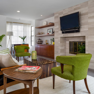
Our homeowners approached us for design help shortly after purchasing a fixer upper. They wanted to redesign the home into an open concept plan. Their goal was something that would serve multiple functions: allow them to entertain small groups while accommodating their two small children not only now but into the future as they grow up and have social lives of their own. They wanted the kitchen opened up to the living room to create a Great Room. The living room was also in need of an update including the bulky, existing brick fireplace. They were interested in an aesthetic that would have a mid-century flair with a modern layout. We added built-in cabinetry on either side of the fireplace mimicking the wood and stain color true to the era. The adjacent Family Room, needed minor updates to carry the mid-century flavor throughout.
45