
Search results for "Main aim" in Home Design Ideas

 Ashton Renovations
This kitchen renovation was part of a whole house project that involved the entire first floor, including the mud room, and an upstairs and downstairs bathroom. Our primary aim was to make the kitchen the main focal point of the house, and take advantage of the natural light in the back. To do this we removed the partition wall, and all the elements of the back mud room. Existing exterior doors were replaced and this significantly helped bring in the natural light and make the entrance 1st floor more inviting. Our clients opted for Shaker White cabinetry with accented black finishes and an industrial glass styled backsplash.
We improved the comfort of the space with spray foam insulation that included space heating in the mudroom and heated floors in the kitchen. The sink was also moved to the peninsula to free up countertop space and allow for a better work triangular arrangement.
Our favourite is the new RED FRONT DOOR! We love it…
 Ashton Renovations
This kitchen renovation was part of a whole house project that involved the entire first floor, including the mud room, and an upstairs and downstairs bathroom. Our primary aim was to make the kitchen the main focal point of the house, and take advantage of the natural light in the back. To do this we removed the partition wall, and all the elements of the back mud room. Existing exterior doors were replaced and this significantly helped bring in the natural light and make the entrance 1st floor more inviting. Our clients opted for Shaker White cabinetry with accented black finishes and an industrial glass styled backsplash.
We improved the comfort of the space with spray foam insulation that included space heating in the mudroom and heated floors in the kitchen. The sink was also moved to the peninsula to free up countertop space and allow for a better work triangular arrangement.
Our favourite is the new RED FRONT DOOR! We love it…

Find the right local pro for your project

 Cape Associates, Inc.
Photographed by Dan Cutrona
Large minimalist open concept carpeted family room photo in Boston with beige walls, a standard fireplace and a tile fireplace
Large minimalist open concept carpeted family room photo in Boston with beige walls, a standard fireplace and a tile fireplace

 Blinds.com
Customer Shelley of Crazy Wonderful said:
“Before we had the bamboo blinds up it was not only exhibitionist central, but the windows looked SO blah.
We went with Blinds.com Budget Woven Wood Shades in Antigua Natural. The color is EXACTLY what I was after, and the fit is perfection. We had our bamboo blinds made with a light filtering privacy liners in the main living areas and blackout liners in the bedrooms. Hello sweet, sweet sleep.”
Read More: http://blog.blinds.com/crazy-wonderful-woven-wood-shades/#sthash.CJ0wVPSB.dpbs

 Nicholson Companies
This warm contemporary residence embodies the comfort and allure of the coastal lifestyle.
Family room - large contemporary single-wall and open concept light wood floor and beige floor family room idea in Orange County with an undermount sink, flat-panel cabinets, white cabinets, quartz countertops, multicolored backsplash, marble backsplash and white countertops
Family room - large contemporary single-wall and open concept light wood floor and beige floor family room idea in Orange County with an undermount sink, flat-panel cabinets, white cabinets, quartz countertops, multicolored backsplash, marble backsplash and white countertops

 Tomecek Studio Architecture
Photography by John Gibbons
Project by Studio H:T principal in charge Brad Tomecek (now with Tomecek Studio Architecture). This contemporary custom home forms itself based on specific view vectors to Long's Peak and the mountains of the front range combined with the influence of a morning and evening court to facilitate exterior living. Roof forms undulate to allow clerestory light into the space, while providing intimate scale for the exterior areas. A long stone wall provides a reference datum that links public and private and inside and outside into a cohesive whole.


 D&P Associates
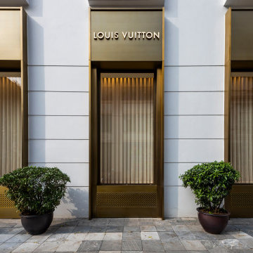
Located at the crossroads of Ngo Quyen and Trang Tien street, International Center owns a prime spot in the heart of Hanoi's central business district, surrounded by the city's iconic cultural heritages, such as, Sword Lake, Hanoi Opera House, Metropole Hotel, and Trang Tien Plaza. Consisting 8-stories of office space and two basements for parking, International Center underwent a facade and interior renovation to bring it to a full Grade A standard and blend well with the older buildings in the area. The project's overall design, by D&P Associates, takes its inspiration from the area's heritage look and seeks a modern-classic style in which the past aligns harmoniously with the present.
Aiming to respect its historical values, we preserved the original building's familiar French colonial structure. However, instead of being arranged separately, the existing windows were combined into 3-window columns, spread symmetrically on both facades to bring a sense of elegance to the building. We also used simple decorative molding and the combination of white and bronze colors to give a soft, yet luxurious look with classical architectural accents for the project.
To strike a balance between past and present, we implemented modern and high-class materials wherever possible. An extensive use of bronze steel imported from Taiwan and genuine 2-layer Schuco glass imported from Germany for the cladding, helped to make a striking facade while minimizing solar and noise gain.
Another statement of our exterior design is the canopies which are located at the main entrance of both facades. Extending 3 meters from the building’s face, they’re reminiscent of a pair of wings that float above the entrance hall providing a sense of lightness, and soften the building’s monolithic appearance.
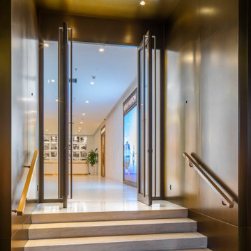
For the interior, the emphasis was on the reception hall, which is considered as the building's face. Our ultimate goal was to create a seamless fusion of interior and exterior architecture and a profound visual effect for its visitors. We achieved this by covering the entire ceiling and walls of the 3-meter long lobby with luxurious bronze steel to make a strong impression for passersby. In contrast, the combination of white walls, high-grade marble floors, reception desk, and black and white paintings of the old Hanoi provides an elegant monochrome look for the main hall. This style was also applied to the corridors and other public areas.
For the restrooms, we introduced green for the doors and skirtings combined with white walls and marble floors. The green is inspired by the distinctive green wooden doors of the Metropole hotel - a symbol of the French colonial architectural style.
Overall, with the nostalgia trend blooming in Asian culture, D&P Associates's design team aimed to express past local cultural values in a contemporary manner for the new International Center office building.

 Alair Homes - Salt Lake
Brad Montgomery tym Homes
Huge transitional backyard outdoor kitchen deck photo in Salt Lake City with a roof extension
Huge transitional backyard outdoor kitchen deck photo in Salt Lake City with a roof extension
 Dutton Architects Inc.
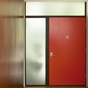
A modern mid-century house in the Los Feliz neighborhood of the Hollywood Hills, this was an extensive renovation. The house was brought down to its studs, new foundations poured, and many walls and rooms relocated and resized. The aim was to improve the flow through the house, to make if feel more open and light, and connected to the outside, both literally through a new stair leading to exterior sliding doors, and through new windows along the back that open up to canyon views. photos by Undine Prohl
 D&P Associates
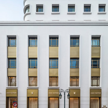
Located at the crossroads of Ngo Quyen and Trang Tien street, International Center owns a prime spot in the heart of Hanoi's central business district, surrounded by the city's iconic cultural heritages, such as, Sword Lake, Hanoi Opera House, Metropole Hotel, and Trang Tien Plaza. Consisting 8-stories of office space and two basements for parking, International Center underwent a facade and interior renovation to bring it to a full Grade A standard and blend well with the older buildings in the area. The project's overall design, by D&P Associates, takes its inspiration from the area's heritage look and seeks a modern-classic style in which the past aligns harmoniously with the present.
Aiming to respect its historical values, we preserved the original building's familiar French colonial structure. However, instead of being arranged separately, the existing windows were combined into 3-window columns, spread symmetrically on both facades to bring a sense of elegance to the building. We also used simple decorative molding and the combination of white and bronze colors to give a soft, yet luxurious look with classical architectural accents for the project.
To strike a balance between past and present, we implemented modern and high-class materials wherever possible. An extensive use of bronze steel imported from Taiwan and genuine 2-layer Schuco glass imported from Germany for the cladding, helped to make a striking facade while minimizing solar and noise gain.
Another statement of our exterior design is the canopies which are located at the main entrance of both facades. Extending 3 meters from the building’s face, they’re reminiscent of a pair of wings that float above the entrance hall providing a sense of lightness, and soften the building’s monolithic appearance.
For the interior, the emphasis was on the reception hall, which is considered as the building's face. Our ultimate goal was to create a seamless fusion of interior and exterior architecture and a profound visual effect for its visitors. We achieved this by covering the entire ceiling and walls of the 3-meter long lobby with luxurious bronze steel to make a strong impression for passersby. In contrast, the combination of white walls, high-grade marble floors, reception desk, and black and white paintings of the old Hanoi provides an elegant monochrome look for the main hall. This style was also applied to the corridors and other public areas.
For the restrooms, we introduced green for the doors and skirtings combined with white walls and marble floors. The green is inspired by the distinctive green wooden doors of the Metropole hotel - a symbol of the French colonial architectural style.
Overall, with the nostalgia trend blooming in Asian culture, D&P Associates's design team aimed to express past local cultural values in a contemporary manner for the new International Center office building.
 D&P Associates
Located at the crossroads of Ngo Quyen and Trang Tien street, International Center owns a prime spot in the heart of Hanoi's central business district, surrounded by the city's iconic cultural heritages, such as, Sword Lake, Hanoi Opera House, Metropole Hotel, and Trang Tien Plaza. Consisting 8-stories of office space and two basements for parking, International Center underwent a facade and interior renovation to bring it to a full Grade A standard and blend well with the older buildings in the area. The project's overall design, by D&P Associates, takes its inspiration from the area's heritage look and seeks a modern-classic style in which the past aligns harmoniously with the present.
Aiming to respect its historical values, we preserved the original building's familiar French colonial structure. However, instead of being arranged separately, the existing windows were combined into 3-window columns, spread symmetrically on both facades to bring a sense of elegance to the building. We also used simple decorative molding and the combination of white and bronze colors to give a soft, yet luxurious look with classical architectural accents for the project.
To strike a balance between past and present, we implemented modern and high-class materials wherever possible. An extensive use of bronze steel imported from Taiwan and genuine 2-layer Schuco glass imported from Germany for the cladding, helped to make a striking facade while minimizing solar and noise gain.
Another statement of our exterior design is the canopies which are located at the main entrance of both facades. Extending 3 meters from the building’s face, they’re reminiscent of a pair of wings that float above the entrance hall providing a sense of lightness, and soften the building’s monolithic appearance.
For the interior, the emphasis was on the reception hall, which is considered as the building's face. Our ultimate goal was to create a seamless fusion of interior and exterior architecture and a profound visual effect for its visitors. We achieved this by covering the entire ceiling and walls of the 3-meter long lobby with luxurious bronze steel to make a strong impression for passersby. In contrast, the combination of white walls, high-grade marble floors, reception desk, and black and white paintings of the old Hanoi provides an elegant monochrome look for the main hall. This style was also applied to the corridors and other public areas.
For the restrooms, we introduced green for the doors and skirtings combined with white walls and marble floors. The green is inspired by the distinctive green wooden doors of the Metropole hotel - a symbol of the French colonial architectural style.
Overall, with the nostalgia trend blooming in Asian culture, D&P Associates's design team aimed to express past local cultural values in a contemporary manner for the new International Center office building.

 Blackband Design
AFTER: DINING ROOM | We removed the etched glass windows that ran throughout the main floor. We completely redesigned the staircase getting rid of the faux bamboo handrails and replacing them with solid maple handrails and hand forged iron detailing. New dark hardwood floors replace the previous travertine flooring. We replaced the existing lighting with double coco bead chandeliers and added custom drapery for a pop of color. | Renovations + Design by Blackband Design | Photography by Tessa Neustadt

 The Rinfret Group
Example of a mid-sized transitional freestanding desk dark wood floor and brown floor study room design in New York with beige walls and no fireplace

 Axis Mundi | Chicago
Good design must reflect the personality of the client. So when siblings purchased studios in Downtown by Philippe Starck, one of the first buildings to herald the revitalization of Manhattan’s Financial District, the aim was to create environments that were truly bespoke. The brother’s tastes jibed synchronously with the insouciant idea of France’s most popular prankster converting a building that once housed the buttoned-up offices of JP Morgan Chase. His collection of Takashi Murakami works, the gallery-like centerpiece of the main area, announces his boldness and flair up front, as do furnishings by Droog, Moooi and, of course Starck, as well as hide rugs and upholstery, and a predominantly red palette. His sister was after something soothing and discreet. So Axis Mundi responded with a neutrals and used glass to carve out a bedroom surrounded by drapes that transform it into a golden cocoon. Hide (albeit less flamboyantly applied) evokes a familial commonality, and built-in furniture and cabinetry optimize space restrictions inherent in studio apartments.
Design Team: John Beckmann, with Richard Rosenbloom
Photography: Mikiko Kikuyama
© Axis Mundi Design LLC
 AIA Pittsburgh
HISTORIC PRESERVATION: Award of Excellence
PROJECT: Hotel Monaco
CLIENT: PMC Property Group and Kimpton Real Estate Investment Funds
ARCHITECTURE FIRM: Strada Architecture, LLC with Gensler
ENGINEERS: Atlantic Engineering Services
CONTRACTORS: Fastrack Construction, Inc.
PHOTOGRAPHER: Dennis Marsico
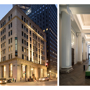
DESCRIPTION: The Hotel Monaco reinvigorates the original 1903 Duquesne Light Company Building, creating 248 guest rooms, 13 suites, 11,300 sf of meeting space, a restaurant/bar, and a rooftop garden. The project aimed to inhabit the building seamlessly while bringing it (the historic building) back to life; repairing and restoring the exterior facades were an important part of this. Additionally, grand ballrooms on the main floor take advantage of the original two-story lobby, where windows and columns have been restored, while a basement mailroom has been converted into a new restaurant.
JURY COMMENTS: The finished product has allowed the historic parts to shine through. The improvements are compatible with the buildings original design and beautifully executed.
 Axis Mundi | Chicago
Good design must reflect the personality of the client. So when siblings purchased studios in Downtown by Philippe Starck, one of the first buildings to herald the revitalization of Manhattan’s Financial District, the aim was to create environments that were truly bespoke. The brother’s tastes jibed synchronously with the insouciant idea of France’s most popular prankster converting a building that once housed the buttoned-up offices of JP Morgan Chase. His collection of Takashi Murakami works, the gallery-like centerpiece of the main area, announces his boldness and flair up front, as do furnishings by Droog, Moooi and, of course Starck, as well as hide rugs and upholstery, and a predominantly red palette. His sister was after something soothing and discreet. So Axis Mundi responded with a neutrals and used glass to carve out a bedroom surrounded by drapes that transform it into a golden cocoon. Hide (albeit less flamboyantly applied) evokes a familial commonality, and built-in furniture and cabinetry optimize space restrictions inherent in studio apartments.
Design Team: John Beckmann, with Richard Rosenbloom
Photography: Mikiko Kikuyama
© Axis Mundi Design LLC

 JRP Design & Remodel
Our client had been living in her beautiful lakeside retreat for about 3 years. All around were stunning views of the lake and mountains, but the view from inside was minimal. It felt dark and closed off from the gorgeous waterfront mere feet away. She desired a bigger kitchen, natural light, and a contemporary look. Referred to JRP by a subcontractor our client walked into the showroom one day, took one look at the modern kitchen in our design center, and was inspired!
After talking about the frustrations of dark spaces and limitations when entertaining groups of friends, the homeowner and the JRP design team emerged with a new vision. Two walls between the living room and kitchen would be eliminated and structural revisions were needed for a common wall shared a wall with a neighbor. With the wall removals and the addition of multiple slider doors, the main level now has an open layout.
Everything in the home went from dark to luminous as sunlight could now bounce off white walls to illuminate both spaces. Our aim was to create a beautiful modern kitchen which fused the necessities of a functional space with the elegant form of the contemporary aesthetic. The kitchen playfully mixes frameless white upper with horizontal grain oak lower cabinets and a fun diagonal white tile backsplash. Gorgeous grey Cambria quartz with white veining meets them both in the middle. The large island with integrated barstool area makes it functional and a great entertaining space.
The master bedroom received a mini facelift as well. White never fails to give your bedroom a timeless look. The beautiful, bright marble shower shows what's possible when mixing tile shape, size, and color. The marble mosaic tiles in the shower pan are especially bold paired with black matte plumbing fixtures and gives the shower a striking visual.
Layers, light, consistent intention, and fun! - paired with beautiful, unique designs and a personal touch created this beautiful home that does not go unnoticed.
PROJECT DETAILS:
• Style: Contemporary
• Colors: Neutrals
• Countertops: Cambria Quartz, Luxury Series, Queen Anne
• Kitchen Cabinets: Slab, Overlay Frameless
Uppers: Blanco
Base: Horizontal Grain Oak
• Hardware/Plumbing Fixture Finish: Kitchen – Stainless Steel
• Lighting Fixtures:
• Flooring:
Hardwood: Siberian Oak with Fossil Stone finish
• Tile/Backsplash:
Kitchen Backsplash: White/Clear Glass
Master Bath Floor: Ann Sacks Benton Mosaics Marble
Master Bath Surround: Ann Sacks White Thassos Marble
Photographer: Andrew – Open House VC

 BLANCO
BLANCO IKON™ - the first apron front sink of its kind, now in BLANCO's patented SILGRANIT® material. Featuring the perfect combination of design, function and durability, the IKON™ is the personal design statement that sets your kitchen apart. Available in 3 colors: anthracite, white and cafe brown.
50