
Search results for "Main earnings" in Home Design Ideas

 Drewett Works
The genesis of design for this desert retreat was the informal dining area in which the clients, along with family and friends, would gather.
Located in north Scottsdale’s prestigious Silverleaf, this ranch hacienda offers 6,500 square feet of gracious hospitality for family and friends. Focused around the informal dining area, the home’s living spaces, both indoor and outdoor, offer warmth of materials and proximity for expansion of the casual dining space that the owners envisioned for hosting gatherings to include their two grown children, parents, and many friends.
The kitchen, adjacent to the informal dining, serves as the functioning heart of the home and is open to the great room, informal dining room, and office, and is mere steps away from the outdoor patio lounge and poolside guest casita. Additionally, the main house master suite enjoys spectacular vistas of the adjacent McDowell mountains and distant Phoenix city lights.
The clients, who desired ample guest quarters for their visiting adult children, decided on a detached guest casita featuring two bedroom suites, a living area, and a small kitchen. The guest casita’s spectacular bedroom mountain views are surpassed only by the living area views of distant mountains seen beyond the spectacular pool and outdoor living spaces.
Project Details | Desert Retreat, Silverleaf – Scottsdale, AZ
Architect: C.P. Drewett, AIA, NCARB; Drewett Works, Scottsdale, AZ
Builder: Sonora West Development, Scottsdale, AZ
Photographer: Dino Tonn
Featured in Phoenix Home and Garden, May 2015, “Sporting Style: Golf Enthusiast Christie Austin Earns Top Scores on the Home Front”
See more of this project here: http://drewettworks.com/desert-retreat-at-silverleaf/
 WPL Interior Design
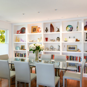
An open plan dining room in a modern bi-level condominium.
Mid-sized trendy medium tone wood floor and brown floor dining room photo in Philadelphia with white walls
Mid-sized trendy medium tone wood floor and brown floor dining room photo in Philadelphia with white walls

 Dana King Design Build Remodeling
A fun, hip kitchen with a mid-century modern vibe. The homeowners wanted a kitchen to make them happy. We think you can't help but smile!
NEXT Project Studio
Jerry Voloski
Find the right local pro for your project
 Walczak Design And Build
When our clients came to us, their master bathroom was doing them no favors. An awkwardly oversized corner tub that hadn't seen a bubble bath in years, a shower barely large enough to turn around in, and a color palette best described as "contractor default." The bones were there — a generously sized footprint — but the space had zero personality and even less function.
Our first move was rethinking how the square footage was being used. Out went the hulking corner tub, and in its place: a spa-worthy walk-in shower that finally earns the space it occupies. Classic white subway tile with soft gray grout lines gives it a timeless foundation, while dual showerheads — a traditional wall-mount and a ceiling-mounted rain shower — turn every morning into something worth waking up for. Built-in niches keep everything organized without interrupting the clean aesthetic.
The commode room got a full character transplant. Wainscoting grounds the space with architectural detail, while a custom nautical map wallcovering wraps the room in something deeply personal — a curated cartographic love letter to the waterways and places that matter most to this family. The addition of a traditional pedestal bidet elevates both the function and the feeling of the space.
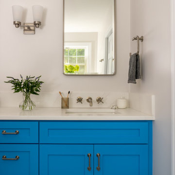
Back in the main bathroom, the clients' personality finally has a place to live. A bold, saturated blue on the custom double vanity cabinetry makes an unapologetic statement — the kind that makes you smile every time you walk in. Wall-mounted brushed nickel faucets and coordinating hardware keep the look polished and cohesive throughout. A heated towel rack and radiant heated floors are the quiet luxuries that tip this bathroom from "really nice" into "I never want to leave."
New windows flood the space with natural light, making the already generous footprint feel even more expansive and bringing out the best in every finish and material choice.
The result is a bathroom that works as hard as it looks good — and one that finally, unmistakably, feels like them.
 Walczak Design And Build
When our clients came to us, their master bathroom was doing them no favors. An awkwardly oversized corner tub that hadn't seen a bubble bath in years, a shower barely large enough to turn around in, and a color palette best described as "contractor default." The bones were there — a generously sized footprint — but the space had zero personality and even less function.
Our first move was rethinking how the square footage was being used. Out went the hulking corner tub, and in its place: a spa-worthy walk-in shower that finally earns the space it occupies. Classic white subway tile with soft gray grout lines gives it a timeless foundation, while dual showerheads — a traditional wall-mount and a ceiling-mounted rain shower — turn every morning into something worth waking up for. Built-in niches keep everything organized without interrupting the clean aesthetic.
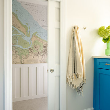
The commode room got a full character transplant. Wainscoting grounds the space with architectural detail, while a custom nautical map wallcovering wraps the room in something deeply personal — a curated cartographic love letter to the waterways and places that matter most to this family. The addition of a traditional pedestal bidet elevates both the function and the feeling of the space.
Back in the main bathroom, the clients' personality finally has a place to live. A bold, saturated blue on the custom double vanity cabinetry makes an unapologetic statement — the kind that makes you smile every time you walk in. Wall-mounted brushed nickel faucets and coordinating hardware keep the look polished and cohesive throughout. A heated towel rack and radiant heated floors are the quiet luxuries that tip this bathroom from "really nice" into "I never want to leave."
New windows flood the space with natural light, making the already generous footprint feel even more expansive and bringing out the best in every finish and material choice.
The result is a bathroom that works as hard as it looks good — and one that finally, unmistakably, feels like them.
 Walczak Design And Build
When our clients came to us, their master bathroom was doing them no favors. An awkwardly oversized corner tub that hadn't seen a bubble bath in years, a shower barely large enough to turn around in, and a color palette best described as "contractor default." The bones were there — a generously sized footprint — but the space had zero personality and even less function.
Our first move was rethinking how the square footage was being used. Out went the hulking corner tub, and in its place: a spa-worthy walk-in shower that finally earns the space it occupies. Classic white subway tile with soft gray grout lines gives it a timeless foundation, while dual showerheads — a traditional wall-mount and a ceiling-mounted rain shower — turn every morning into something worth waking up for. Built-in niches keep everything organized without interrupting the clean aesthetic.
The commode room got a full character transplant. Wainscoting grounds the space with architectural detail, while a custom nautical map wallcovering wraps the room in something deeply personal — a curated cartographic love letter to the waterways and places that matter most to this family. The addition of a traditional pedestal bidet elevates both the function and the feeling of the space.
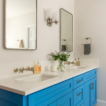
Back in the main bathroom, the clients' personality finally has a place to live. A bold, saturated blue on the custom double vanity cabinetry makes an unapologetic statement — the kind that makes you smile every time you walk in. Wall-mounted brushed nickel faucets and coordinating hardware keep the look polished and cohesive throughout. A heated towel rack and radiant heated floors are the quiet luxuries that tip this bathroom from "really nice" into "I never want to leave."
New windows flood the space with natural light, making the already generous footprint feel even more expansive and bringing out the best in every finish and material choice.
The result is a bathroom that works as hard as it looks good — and one that finally, unmistakably, feels like them.
 Walczak Design And Build
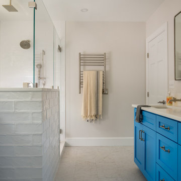
When our clients came to us, their master bathroom was doing them no favors. An awkwardly oversized corner tub that hadn't seen a bubble bath in years, a shower barely large enough to turn around in, and a color palette best described as "contractor default." The bones were there — a generously sized footprint — but the space had zero personality and even less function.
Our first move was rethinking how the square footage was being used. Out went the hulking corner tub, and in its place: a spa-worthy walk-in shower that finally earns the space it occupies. Classic white subway tile with soft gray grout lines gives it a timeless foundation, while dual showerheads — a traditional wall-mount and a ceiling-mounted rain shower — turn every morning into something worth waking up for. Built-in niches keep everything organized without interrupting the clean aesthetic.
The commode room got a full character transplant. Wainscoting grounds the space with architectural detail, while a custom nautical map wallcovering wraps the room in something deeply personal — a curated cartographic love letter to the waterways and places that matter most to this family. The addition of a traditional pedestal bidet elevates both the function and the feeling of the space.
Back in the main bathroom, the clients' personality finally has a place to live. A bold, saturated blue on the custom double vanity cabinetry makes an unapologetic statement — the kind that makes you smile every time you walk in. Wall-mounted brushed nickel faucets and coordinating hardware keep the look polished and cohesive throughout. A heated towel rack and radiant heated floors are the quiet luxuries that tip this bathroom from "really nice" into "I never want to leave."
New windows flood the space with natural light, making the already generous footprint feel even more expansive and bringing out the best in every finish and material choice.
The result is a bathroom that works as hard as it looks good — and one that finally, unmistakably, feels like them.
 Walczak Design And Build
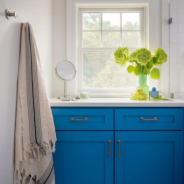
When our clients came to us, their master bathroom was doing them no favors. An awkwardly oversized corner tub that hadn't seen a bubble bath in years, a shower barely large enough to turn around in, and a color palette best described as "contractor default." The bones were there — a generously sized footprint — but the space had zero personality and even less function.
Our first move was rethinking how the square footage was being used. Out went the hulking corner tub, and in its place: a spa-worthy walk-in shower that finally earns the space it occupies. Classic white subway tile with soft gray grout lines gives it a timeless foundation, while dual showerheads — a traditional wall-mount and a ceiling-mounted rain shower — turn every morning into something worth waking up for. Built-in niches keep everything organized without interrupting the clean aesthetic.
The commode room got a full character transplant. Wainscoting grounds the space with architectural detail, while a custom nautical map wallcovering wraps the room in something deeply personal — a curated cartographic love letter to the waterways and places that matter most to this family. The addition of a traditional pedestal bidet elevates both the function and the feeling of the space.
Back in the main bathroom, the clients' personality finally has a place to live. A bold, saturated blue on the custom double vanity cabinetry makes an unapologetic statement — the kind that makes you smile every time you walk in. Wall-mounted brushed nickel faucets and coordinating hardware keep the look polished and cohesive throughout. A heated towel rack and radiant heated floors are the quiet luxuries that tip this bathroom from "really nice" into "I never want to leave."
New windows flood the space with natural light, making the already generous footprint feel even more expansive and bringing out the best in every finish and material choice.
The result is a bathroom that works as hard as it looks good — and one that finally, unmistakably, feels like them.
 Walczak Design And Build
When our clients came to us, their master bathroom was doing them no favors. An awkwardly oversized corner tub that hadn't seen a bubble bath in years, a shower barely large enough to turn around in, and a color palette best described as "contractor default." The bones were there — a generously sized footprint — but the space had zero personality and even less function.
Our first move was rethinking how the square footage was being used. Out went the hulking corner tub, and in its place: a spa-worthy walk-in shower that finally earns the space it occupies. Classic white subway tile with soft gray grout lines gives it a timeless foundation, while dual showerheads — a traditional wall-mount and a ceiling-mounted rain shower — turn every morning into something worth waking up for. Built-in niches keep everything organized without interrupting the clean aesthetic.
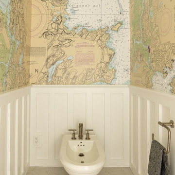
The commode room got a full character transplant. Wainscoting grounds the space with architectural detail, while a custom nautical map wallcovering wraps the room in something deeply personal — a curated cartographic love letter to the waterways and places that matter most to this family. The addition of a traditional pedestal bidet elevates both the function and the feeling of the space.
Back in the main bathroom, the clients' personality finally has a place to live. A bold, saturated blue on the custom double vanity cabinetry makes an unapologetic statement — the kind that makes you smile every time you walk in. Wall-mounted brushed nickel faucets and coordinating hardware keep the look polished and cohesive throughout. A heated towel rack and radiant heated floors are the quiet luxuries that tip this bathroom from "really nice" into "I never want to leave."
New windows flood the space with natural light, making the already generous footprint feel even more expansive and bringing out the best in every finish and material choice.
The result is a bathroom that works as hard as it looks good — and one that finally, unmistakably, feels like them.
 Walczak Design And Build
When our clients came to us, their master bathroom was doing them no favors. An awkwardly oversized corner tub that hadn't seen a bubble bath in years, a shower barely large enough to turn around in, and a color palette best described as "contractor default." The bones were there — a generously sized footprint — but the space had zero personality and even less function.
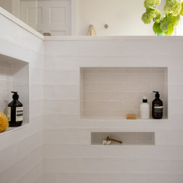
Our first move was rethinking how the square footage was being used. Out went the hulking corner tub, and in its place: a spa-worthy walk-in shower that finally earns the space it occupies. Classic white subway tile with soft gray grout lines gives it a timeless foundation, while dual showerheads — a traditional wall-mount and a ceiling-mounted rain shower — turn every morning into something worth waking up for. Built-in niches keep everything organized without interrupting the clean aesthetic.
The commode room got a full character transplant. Wainscoting grounds the space with architectural detail, while a custom nautical map wallcovering wraps the room in something deeply personal — a curated cartographic love letter to the waterways and places that matter most to this family. The addition of a traditional pedestal bidet elevates both the function and the feeling of the space.
Back in the main bathroom, the clients' personality finally has a place to live. A bold, saturated blue on the custom double vanity cabinetry makes an unapologetic statement — the kind that makes you smile every time you walk in. Wall-mounted brushed nickel faucets and coordinating hardware keep the look polished and cohesive throughout. A heated towel rack and radiant heated floors are the quiet luxuries that tip this bathroom from "really nice" into "I never want to leave."
New windows flood the space with natural light, making the already generous footprint feel even more expansive and bringing out the best in every finish and material choice.
The result is a bathroom that works as hard as it looks good — and one that finally, unmistakably, feels like them.
 Walczak Design And Build
When our clients came to us, their master bathroom was doing them no favors. An awkwardly oversized corner tub that hadn't seen a bubble bath in years, a shower barely large enough to turn around in, and a color palette best described as "contractor default." The bones were there — a generously sized footprint — but the space had zero personality and even less function.
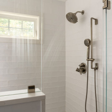
Our first move was rethinking how the square footage was being used. Out went the hulking corner tub, and in its place: a spa-worthy walk-in shower that finally earns the space it occupies. Classic white subway tile with soft gray grout lines gives it a timeless foundation, while dual showerheads — a traditional wall-mount and a ceiling-mounted rain shower — turn every morning into something worth waking up for. Built-in niches keep everything organized without interrupting the clean aesthetic.
The commode room got a full character transplant. Wainscoting grounds the space with architectural detail, while a custom nautical map wallcovering wraps the room in something deeply personal — a curated cartographic love letter to the waterways and places that matter most to this family. The addition of a traditional pedestal bidet elevates both the function and the feeling of the space.
Back in the main bathroom, the clients' personality finally has a place to live. A bold, saturated blue on the custom double vanity cabinetry makes an unapologetic statement — the kind that makes you smile every time you walk in. Wall-mounted brushed nickel faucets and coordinating hardware keep the look polished and cohesive throughout. A heated towel rack and radiant heated floors are the quiet luxuries that tip this bathroom from "really nice" into "I never want to leave."
New windows flood the space with natural light, making the already generous footprint feel even more expansive and bringing out the best in every finish and material choice.
The result is a bathroom that works as hard as it looks good — and one that finally, unmistakably, feels like them.

 Village Home Stores
Full-overlay Rustic Beech cabinets in the "Charleston" door style and "Briarwood" finish.
Village Home Stores
Example of a large mountain style kitchen design in Chicago
Example of a large mountain style kitchen design in Chicago

 Elegant Hardwood Floors
maple hardwood floor, water-popped, and stained with 50% rosewood and 50% neutral stains.
Inspiration for a timeless medium tone wood floor living room remodel in Salt Lake City
Inspiration for a timeless medium tone wood floor living room remodel in Salt Lake City
 Dura Supreme Cabinetry
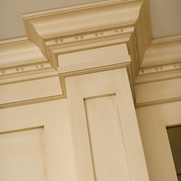
Enjoy the view from your own breathtaking kitchen. Despite the scenic view outside the kitchen window, it’s your Dura Supreme Crestwood Cabinetry kitchen that takes your breath away. A panoramic mantel hood soars over the stainless steel range creating a stunning architectural focal point. Beveled glass cabinet doors twinkle in the early morning sunlight. A picturesque kitchen island stands amid the stream of family activities as you begin and end each day in the heart of your home – your Dura Supreme kitchen. Although Dura Supreme Cabinetry is crafted with quality materials and construction, it was the bounty of delicious design details that cemented your decision. Of course the delicate dent it made on your pocket book was a nice surprise as well.
Request a FREE Dura Supreme Brochure Packet:
http://www.durasupreme.com/request-brochure
Find a dealer near you today:
http://www.durasupreme.com/dealer-locator

 DHD Architecture and Interior Design
Emily Andrews
Living room - contemporary open concept dark wood floor living room idea in New York with a music area, a standard fireplace and no tv
Living room - contemporary open concept dark wood floor living room idea in New York with a music area, a standard fireplace and no tv
 Suzanne Christie - Decorating Den Interiors
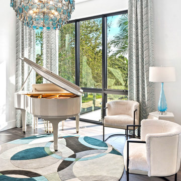
Suzanne’s Clearwater music room earned her two awards in the 2023 Dream Room competition. It was a 3rd place winner in the overall competition, and it also won 2nd place in the People’s Choice category, which allows for public voting. The room impressed judges and voters alike with its beauty and functionality as a space for making and enjoying music.
2023 Dream Room Winner and 2023 People's Choice Award.
Suzanne’s client wanted a place to show off her baby grand piano. She also wanted to incorporate color and loves shades of blues and greens. The windows provided plenty of light but left almost no usable wall space as the room was open to a walkway, the main great room and the front door. The client wanted the space to have a WOW factor!
Since the piano is the focal point, it was positioned with the open end facing out into the room. This highlighted the design and shape of the baby grand. Two side chairs in bronzed metal with white faux bunny fur and leather were placed together to provide seating for guests listening to the pianist. A contemporary pentagon end table with a mother of pearl top was placed between the chairs.
Now for the WOW factor — a 43" triple tiered glass and metal chandelier in clear and cerulean-blue was hung over the area becoming an anchoring focal point for the space. A teal, turquoise and lime green round area rug repeating the circle design of the chandelier was chosen and placed center of the room.
An embroidered turquoise wavy pattern fabric was selected for custom window treatments to frame the large windows and soften the space. To control the early morning east exposure from the sun, neutral motorized solar shades were selected and installed into the ceiling.
Suzanne’s client loves this surprise as you enter the front door of her home.


 Plaistow Cabinet
Shiloh Cabinetry. Polar White, Inset
Kitchen - transitional kitchen idea in Manchester with white cabinets, beaded inset cabinets, marble countertops, white backsplash, marble backsplash and stainless steel appliances
Kitchen - transitional kitchen idea in Manchester with white cabinets, beaded inset cabinets, marble countertops, white backsplash, marble backsplash and stainless steel appliances

 Ehrlich Yanai Rhee Chaney Architects
The ground floor volumes wrapped in an elongated hand-fired brick, emphasizing the horizontality of the architecture that lays solidly on the land.
(Photography by: Matthew Millman)

 Living Gardens Landscape Design
Inspiration for a small contemporary full sun front yard gravel landscaping in Orange County for spring.
10