
Search results for "Main issue" in Home Design Ideas
 TVL Creative Ltd.
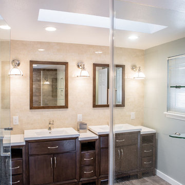
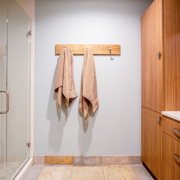
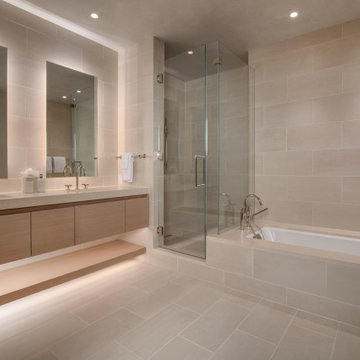
This project included a massive renovation to nearly all spaces in the home: the entry, living room, family room, dining room, kitchen, staircase, and master bathroom. Each space underwent a massive transformation in order to create the elegant & traditional aesthetic that our clients love. On the main level of the home, the original space layout was extremely compartmentalized and dark. Our clients wanted to open up and brighten the space as much as possible. In addition to this, a major goal was to increase function and to create a welcoming environment for guests and the clients alike. We started by opening up the space plan significantly. This allows for flowing space between the kitchen, front living room, and rear family room. Light is better carried through these spaces, and further emphasized with airy colors, light cabinetry, and a better lighting plan overall. We removed the old decorative ceiling beams and reworked closets and hallways to create a more open and functional main level. The kitchen offers a large amount of counter space and storage opportunity, but also welcomes guests at a sizable island and secondary peninsula. Beyond the kitchen, we designed a work nook where display storage and functional workspace are both present. We reworked both fireplaces in the home to create warm nooks for gathering: both fireplaces feature large format stone and are flanked with display shelving. The master bathroom upstairs was completely reworked as well. We eliminated the oversized drop-in tub and in-wall fireplace, and took away the steam shower that had been causing water and mildew issues for years. We relocated the toilet and developed a gorgeous vanity area in the space where the old bathtub and fireplace used to be. We then created a massive shower room in lieu of a tub/shower combination. The bathroom is adorned with warm tones and natural textures: marble subway tile runs up the entire wall behind the vanity, wood-look porcelain covers the floor and back wall of the shower, and simple artisan subway tiles in a creamy vanilla tone cover the shower walls. These spaces completely transformed the look and feel of the house, and we are so happy our amazing clients get to enjoy this home with their family for years to come!
 Advance Design Studio, Ltd.
Jennifer and Dan have lived in their Deer Park Illinois home for 15 years, slowly making minor fixes like painting and decorating; but they had a new plan for their kitchen the entire time. An awkwardly placed garage door, and an island cooktop with a terrible downdraft made a full-scale kitchen remodel an absolute must. Jennifer had many ideas in mind and wanted to work with a company that could provide high-end work, while partnering with a designer that would tailor the kitchen to her ideas.
She was intrigued by the phrase “Common Sense Remodeling” in Advance Design’s feature she discovered while perusing an issue of the community’s Quintessential Barrington Magazine. Doing further research on the company’s website, as she looked through project profiles and read about Advance Design’s “Common Sense Remodeling” philosophy, she promptly scheduled an appointment to see if the people and ideas she read about were truly who they said they were. The more she read, the more she knew that the “Common Sense” approach to remodeling they described was exactly the type of company she was looking for.
The partnership was sealed after an initial consultation with Owner Todd Jurs and Project Designer Michelle Lecinski. They displayed a combination of friendliness, professionalism and respect that was unmatched by any of the other companies Jennifer talked to. She knew that with Advance Design, she would be able to retain the vision that she had in mind with high-quality craftsmanship.
“I reached out to Advance Design because of the ‘Common Sense Remodeling’ tagline,” Jennifer said. “That’s what lingered for me”. “Advance Design was the most respectful- of the house and of my design ideas, and the most professional of the handful of companies that looked at my project”.
Soon after the meeting Jennifer began working with Michelle on the project design. They quickly developed chemistry. Jennifer loved how Michelle researched and located every detail that Jennifer wanted for the kitchen. Between the two of them, every concept and idea was worked through and perfected. “Jennifer had definite ideas about what she wanted the new kitchen to look like, she just didn’t know how to bring it all together. We worked together really well to make her ideas into the practical reality necessary for a well-functioning kitchen, with the look and feel that she had envisioned”, says Michelle.
“Michelle was wonderful in using the CAD system she would show me new drawings every time we changed the layout while working through the design,” Jennifer said. “She was a really wonderful partner in execution, she made sure everything happened quickly and easily.”
The finished design drew out elements of Jennifer’s style and personality. The pair call the look “sophisticated farmhouse” to describe the kitchen renovation to family and friends. The result was a beautifully crafted, authentic-feeling space that satisfied Jennifer’s dreams 15 years in the making. The whole project consisted of a kitchen remodel, mudroom upgrade with powder room, and garage entry relocation. “The projects I personally like the best, are the ones that put the client’s dreams on display,” Project Designer Michelle said. “And this is one of those projects.”
The main focal point of the kitchen is custom zinc and brass ventilation hood with a vintage sheen, which was hand made to order by a small company in Indiana named Vogler Metalworking. “It’s like sculpture, a true work of art”, says Jennifer. Your eye is immediately drawn towards this elegant yet practical hood that eliminated the home’s downdraft problem and added a striking conversation piece at the same time. The carpenters had to use special gloves when transporting and installing it, so they didn’t smudge it with fingerprints. The beautiful hood centers proudly over the stunning black enamel and brass LaCornue Range. “I had a friend who had a LaCornue range and after learning how easy it was to cook perfect meals, I was convinced I wanted to have one”, says Jennifer. This unique, breathtaking combination anchors the entire kitchen and is apparent immediately as you walk into the great room the surrounds the space.
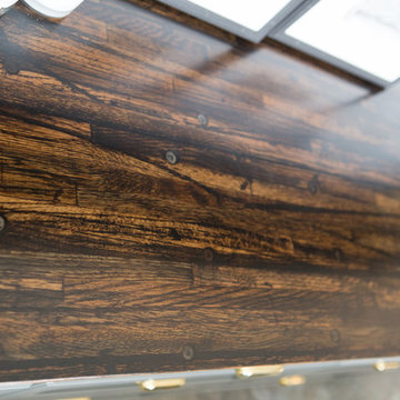
DuraSupreme Crestwood cabinets with a Kendall Panel add function and sophistication. A custom gray paint color paired with a storm blue was developed so that the new kitchen looked like it belonged to the existing space. Unlacquered brass faucets and hardware were important to Jennifer because she wanted the living finishes to age over time. Remarkable brass diamond mesh cabinet door inserts imported from the UK continue to add this one-of-a-kind kitchen renovation; giving it a “you won’t see this everywhere” quality. The use of old railcar flooring for the coffee bar countertop and reclaimed oak for the open shelving gives an authenticity to the space uncommon in kitchens today.
Jennifer and Michelle fell in love with the Limestone Grey Stone while they were investigating unique island countertop ideas. They liked the fact that the limestone as a living finish will age and change over time. Calcutta Miel Quartz countertops made for an excellent pairing around the perimeter, as it’s durable and perfect for cooking preparations. A textured white subway tile backsplash that runs to the ceiling keeps your eye moving towards the open shelving, and to the main focal point of the stunning range hood combination.
“The kitchen functions beautifully, and it’s gorgeous,” beams Jennifer as she gestures with both hands while smiling ear to ear. “The most important thing was I wanted a kitchen that had a wonderful flow, cooked beautiful meals and was a great gathering place for family and friends, and this space does that perfectly! Beauty wise, it turned out exactly how I had envisioned. I felt the function part was the hardest part, and that was nailed”!
Relocating the garage entry to the new mudroom was a huge priority and has finally separated the family’s arriving home functions from their kitchen. Now coats and shoes and bags have their own area for dropping once members arrive home. Matching gray DuraSupreme cabinetry helped create gorgeous, purposeful lockers for the family. A reclaimed vintage sink and custom wall paper were added to the tiny powder room to beautify the once previously only functional space. Advance Design was even able to create a custom space for their dog to sleep while the family is away.
“It was unbelievable that a project of this size was completed in such a short time, and I think that’s because of the large amount of planning and preparation that went into it,” Jennifer marveled, “When we started, we were ready, and everything was prepared”.
When it came to execution, Project Manager Justin Davis and his crew were quick, accessible, and organized. Projects like this kitchen are typically completed in as little as 8-10 weeks. Jennifer’s kitchen however despite the relocation of some challenging HVAC in a soffit and moving of an exterior door was completed remarkably fast in part because the team was working with an existing tile floor that ran throughout the first floor that the client really loved.
“You get to know these people really well because they’re living in your house while you’re living in your house. They were so fast and really good, it didn’t take as long as even planned” reported Jennifer. “I would text Justin and he always responded almost immediately. I got to know all the guys who were working in our house and they were all wonderful people”.
Details in a customized kitchen like this one require skill and care from the people who install it. “All the guys on the job were skilled at what the did. I wanted small details like little feet to look like furniture, that is where their carpentry skill came in to make these all perfect”, said Jennifer. “The tile guys were wonderful. They even let me determine how I wanted the texture with the grout to appear for a salt and pepper look; now that is a very skilled trade person making it custom”.
In Jennifer’s interview, she continued to reference Advance Design’s “Common Sense Remodeling”, so I took a minute to ask her exactly what that phrase meant to her and how it played out in her experience with her project and the Advance Design team. Here is what she said: “I was intrigued about Common Sense Remodeling and in my head that there would be clear costs and prices, great communication between the design team, the execution team and me”, said Jennifer. They did deliver on that, it was so clear about the cost breakdown, what I could expect from everyone who came to my house, and everything that we had ordered. That to me is the Common Sense”!
It’s great to see a client take literally our assertion that a well-planned remodeling project is simply “Common Sense”! She anticipated each step of the way would be clear, concise, and predictable, all the while protecting the outcome due to the careful upfront planning. “Advance Design delivered on their ‘Common Sense Remodeling’ promise,” Jennifer said. “From the design team, to the execution team - everything was straight forward like I imagined. The project turned out exactly how I envisioned, I enjoyed this process and absolutely would recommend Advance Design Studio to anyone.”
 Edgewater Design Group
Our clients already had a cottage on Torch Lake that they loved to visit. It was a 1960s ranch that worked just fine for their needs. However, the lower level walkout became entirely unusable due to water issues. After purchasing the lot next door, they hired us to design a new cottage. Our first task was to situate the home in the center of the two parcels to maximize the view of the lake while also accommodating a yard area. Our second task was to take particular care to divert any future water issues. We took necessary precautions with design specifications to water proof properly, establish foundation and landscape drain tiles / stones, set the proper elevation of the home per ground water height and direct the water flow around the home from natural grade / drive. Our final task was to make appealing, comfortable, living spaces with future planning at the forefront. An example of this planning is placing a master suite on both the main level and the upper level. The ultimate goal of this home is for it to one day be at least a 3/4 of the year home and designed to be a multi-generational heirloom.
- Jacqueline Southby Photography
Find the right local pro for your project
 TVL Creative Ltd.
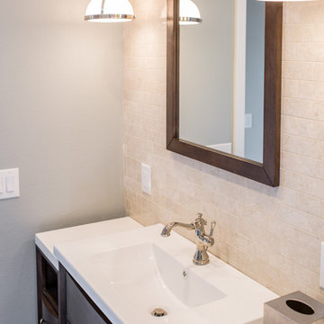
This project included a massive renovation to nearly all spaces in the home: the entry, living room, family room, dining room, kitchen, staircase, and master bathroom. Each space underwent a massive transformation in order to create the elegant & traditional aesthetic that our clients love. On the main level of the home, the original space layout was extremely compartmentalized and dark. Our clients wanted to open up and brighten the space as much as possible. In addition to this, a major goal was to increase function and to create a welcoming environment for guests and the clients alike. We started by opening up the space plan significantly. This allows for flowing space between the kitchen, front living room, and rear family room. Light is better carried through these spaces, and further emphasized with airy colors, light cabinetry, and a better lighting plan overall. We removed the old decorative ceiling beams and reworked closets and hallways to create a more open and functional main level. The kitchen offers a large amount of counter space and storage opportunity, but also welcomes guests at a sizable island and secondary peninsula. Beyond the kitchen, we designed a work nook where display storage and functional workspace are both present. We reworked both fireplaces in the home to create warm nooks for gathering: both fireplaces feature large format stone and are flanked with display shelving. The master bathroom upstairs was completely reworked as well. We eliminated the oversized drop-in tub and in-wall fireplace, and took away the steam shower that had been causing water and mildew issues for years. We relocated the toilet and developed a gorgeous vanity area in the space where the old bathtub and fireplace used to be. We then created a massive shower room in lieu of a tub/shower combination. The bathroom is adorned with warm tones and natural textures: marble subway tile runs up the entire wall behind the vanity, wood-look porcelain covers the floor and back wall of the shower, and simple artisan subway tiles in a creamy vanilla tone cover the shower walls. These spaces completely transformed the look and feel of the house, and we are so happy our amazing clients get to enjoy this home with their family for years to come!
 RAJ Kitchen and Bath, LLC
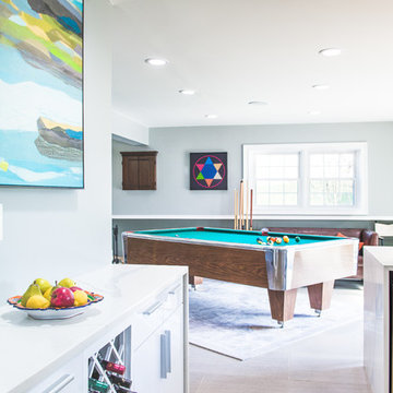
This family throws some mean parties where large crowds usually sit at the poolside. There’s an entire section of this walk out second level that is dedicated to entertaining which also gives access to the pool in the backyard. This place comes alive at night with built in surround sounds and LED lights. There was just one issue. The kitchen.
The kitchen did not fit in. It was old, outdated, out-styled and nonfunctional. They knew the kitchen had to be address eventually but they just didn’t want to redo the kitchen. They wanted to revamp the kitchen, so they asked us to come in and look at the space to see how we can design this second floor kitchen in their New Rochelle home.
It was a small kitchen, strategically located where it could be the hub that the family wanted it to be. It held its own amongst everything that was in the open space like the big screen TV, fireplace and pool table. That is exactly what we did in the design and here is how we did it.
First, we got rid of the kitchen table and by doing so we created a peninsular. This eventually sets up the space for a couple of really cool pendant lights, some unique counter chairs and a wine cooler that was purchased before but never really had a home. We then turned our attention to the range and hood. This was not the main kitchen, so wall storage wasn’t the main goal here. We wanted to create a more open feel interaction while in the kitchen, hence we designed the free standing chimney hood alone to the left of the window.
We then looked at how we can make it more entertaining. We did that by adding a Wine rack on a buffet style type area. This wall was free and would have remained empty had we not find a way to add some more glitz.
Finally came the counter-top. Every detail was crucial because the view of the kitchen can be seen from when you enter the front door even if it was on the second floor walk out. The use of the space called for a waterfall edge counter-top and more importantly, the stone selection to further accentuate the effect. It was crucial that there was movement in the stone which connects to the 45 degree waterfall edge so it would be very dramatic.
Nothing was overlooked in this space. It had to be done this way if it was going to have a fighting chance to take command of its territory.
Have a look at some before and after photos on the left and see a brief video transformation of this lovely small kitchen.
See more photos and vidoe of this transformation on our website @ http://www.rajkitchenandbath.com/portfolio-items/kitchen-remodel-new-rochelle-ny-10801/
 TVL Creative Ltd.
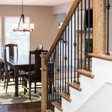
This project included a massive renovation to nearly all spaces in the home: the entry, living room, family room, dining room, kitchen, staircase, and master bathroom. Each space underwent a massive transformation in order to create the elegant & traditional aesthetic that our clients love. On the main level of the home, the original space layout was extremely compartmentalized and dark. Our clients wanted to open up and brighten the space as much as possible. In addition to this, a major goal was to increase function and to create a welcoming environment for guests and the clients alike. We started by opening up the space plan significantly. This allows for flowing space between the kitchen, front living room, and rear family room. Light is better carried through these spaces, and further emphasized with airy colors, light cabinetry, and a better lighting plan overall. We removed the old decorative ceiling beams and reworked closets and hallways to create a more open and functional main level. The kitchen offers a large amount of counter space and storage opportunity, but also welcomes guests at a sizable island and secondary peninsula. Beyond the kitchen, we designed a work nook where display storage and functional workspace are both present. We reworked both fireplaces in the home to create warm nooks for gathering: both fireplaces feature large format stone and are flanked with display shelving. The master bathroom upstairs was completely reworked as well. We eliminated the oversized drop-in tub and in-wall fireplace, and took away the steam shower that had been causing water and mildew issues for years. We relocated the toilet and developed a gorgeous vanity area in the space where the old bathtub and fireplace used to be. We then created a massive shower room in lieu of a tub/shower combination. The bathroom is adorned with warm tones and natural textures: marble subway tile runs up the entire wall behind the vanity, wood-look porcelain covers the floor and back wall of the shower, and simple artisan subway tiles in a creamy vanilla tone cover the shower walls. These spaces completely transformed the look and feel of the house, and we are so happy our amazing clients get to enjoy this home with their family for years to come!
 TVL Creative Ltd.
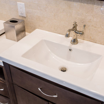
This project included a massive renovation to nearly all spaces in the home: the entry, living room, family room, dining room, kitchen, staircase, and master bathroom. Each space underwent a massive transformation in order to create the elegant & traditional aesthetic that our clients love. On the main level of the home, the original space layout was extremely compartmentalized and dark. Our clients wanted to open up and brighten the space as much as possible. In addition to this, a major goal was to increase function and to create a welcoming environment for guests and the clients alike. We started by opening up the space plan significantly. This allows for flowing space between the kitchen, front living room, and rear family room. Light is better carried through these spaces, and further emphasized with airy colors, light cabinetry, and a better lighting plan overall. We removed the old decorative ceiling beams and reworked closets and hallways to create a more open and functional main level. The kitchen offers a large amount of counter space and storage opportunity, but also welcomes guests at a sizable island and secondary peninsula. Beyond the kitchen, we designed a work nook where display storage and functional workspace are both present. We reworked both fireplaces in the home to create warm nooks for gathering: both fireplaces feature large format stone and are flanked with display shelving. The master bathroom upstairs was completely reworked as well. We eliminated the oversized drop-in tub and in-wall fireplace, and took away the steam shower that had been causing water and mildew issues for years. We relocated the toilet and developed a gorgeous vanity area in the space where the old bathtub and fireplace used to be. We then created a massive shower room in lieu of a tub/shower combination. The bathroom is adorned with warm tones and natural textures: marble subway tile runs up the entire wall behind the vanity, wood-look porcelain covers the floor and back wall of the shower, and simple artisan subway tiles in a creamy vanilla tone cover the shower walls. These spaces completely transformed the look and feel of the house, and we are so happy our amazing clients get to enjoy this home with their family for years to come!

 Gallery KBNY
This brownstone renovation was a full gut project in every sense of the word. On top of installing new floors, a kitchen and bath renovation, and all the typical restoration and refinishing involved in a brownstone built in 1899, we also completely updated the exterior, constructed a balcony that was not originally there, and converted the space from a single-family home into an an owner’s triplex. A newly separated studio rental on the garden level offers the opportunity for supplemental income, an uncommon and welcome addition to a New York brownstone.
A TRANSITIONAL GEM
The result is a two-family brownstone that perfectly combines classic townhouse living with today’s modern needs, including SmartHome technology that we installed to control Bluetooth speakers, Nest thermostats, and the security system.
The overall aesthetic goal was to pay homage to the historical periods the brownstone has lived through in a cohesive way that is the hallmark of modern transitional style.
In the kitchen, white Shaker-style cabinetry, a subway tile backsplash, and marble rather than quartz countertops bring a classically upscale sensibility. To modernize the space further, we opened up the back wall to create floor-to-ceiling windows that are also doors, opening up into the newly built balcony.
TIMELY TOUCHES
This brownstone renovation included many quintessential elements, such as millwork like the ceiling medallions. We restored some and custom built others, perfectly recreating their original appearance.
The heated master bathroom is now serene, with a walk-in shower featuring a subtly modern linear drain. A herringbone Carrera marble tiled floor and marble slab sink complete the scene. In the powder room, we embraced a contemporary look by pairing dark hexagonal floors with light chevron tiles, accented with dramatic navy blue wallpaper. With its clear-cut 1920s-style, we selected the wall sconce to reference one of the brownstone’s earlier eras.
DESIGN DETAILS
Natural oak herringbone floors we installed throughout the entire home bring a modern yet warm touch. We restored the wood-burning marble fireplace, which is fully functioning. An elegant staircase with a custom-crafted black wooden banister and white balusters winds up and down alongside a real brick interior wall that we restored and refinished.
In this brownstone renovation, we were also able to create ceiling height, an unexpected yet aesthetically pleasing side benefit. When working on the joists and beams to level out the floors (a common issue in pre-war renovations) we added ceiling height in the main parlor floor by taking the second floor and raising the ceiling an entire foot. The end result is a main floor with stunning 9-foot ceilings.
SOME HIGHLIGHTS
- Solid natural oak herringbone floors throughout
- A fully restored, refinished, and functioning wood burning fireplace with a marble mantle
- Complete exterior renovation of the facade, cornices, windows, mouldings, and even the ironwork, including the railings leading up to the stoop and those facing the street
- A brand new central air and heating system with uniquely modern vents – look above the couch in the living room with the fuzzy rug and large painting
Considering a brownstone renovation? Contact us today! We specialize in brownstone renovations in New York as well as all pre-war apartments. When you work with a design-and-build firm like Gallery to renovate your brownstone, you get the full range of our expertise in working with all the finest details and pre-war architectural elements of these classic New York spaces. We also handle every step of the process, from filing permits and organizing schedules to sourcing custom pieces and building entirely new rooms (or even balconies). Call us for a free initial consultation when you’re ready.
 Dana Bass Designs
WINNER - ASID Design Ovation Award 2019 - First Place Residential Powder Room
Click here for a before and after image: https://www.houzz.com/hznb/photos/before-and-after-pinehurst-powder-bath-dallas-phvw-vp~143281756
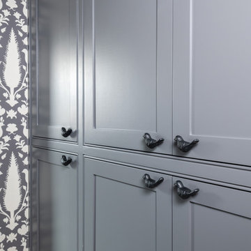
Concept: To create a Pool Powder Room with privacy from the kitchen and living room with additional storage. The client desired a Wow! feeling that was fully explosive with pattern and color. Birds and butterflies were requested as a nod to the client’s favorite hobby, gardening. The main challenge for this design was to keep the existing foot print, yet make a more private and useable bath with better storage. Closing off the two existing doorways and creating one pocket door off the main hallway solved the privacy issues from the kitchen and second living room, in addition to giving more usable square footage for storage. A larger vanity with storage drawers along with floor to ceiling wall cabinets provide for the additional storage needed for pool towels and gardening items. Layering strong color and stimulating patterns created a visually stunning space that was personalized to the client’s specific request, Wow! The strong use of color and pattern play well with each other. The antique vanity mirror has been recycled from the previous bath and given a fresh coat of bold, cobalt blue paint, which is the client’s all-time favorite color. The requested bird motif is reflected in the wall covering as well as the details of the hardware. The combination of bird and feather shaped hardware gives the Powder Room a fun flair and unique style.
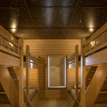 Edgewater Design Group
Our clients already had a cottage on Torch Lake that they loved to visit. It was a 1960s ranch that worked just fine for their needs. However, the lower level walkout became entirely unusable due to water issues. After purchasing the lot next door, they hired us to design a new cottage. Our first task was to situate the home in the center of the two parcels to maximize the view of the lake while also accommodating a yard area. Our second task was to take particular care to divert any future water issues. We took necessary precautions with design specifications to water proof properly, establish foundation and landscape drain tiles / stones, set the proper elevation of the home per ground water height and direct the water flow around the home from natural grade / drive. Our final task was to make appealing, comfortable, living spaces with future planning at the forefront. An example of this planning is placing a master suite on both the main level and the upper level. The ultimate goal of this home is for it to one day be at least a 3/4 of the year home and designed to be a multi-generational heirloom.
- Jacqueline Southby Photography
 Misiaszek Turpin pllc
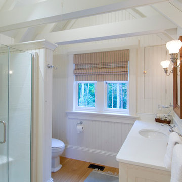
This 4,800 square-foot guesthouse is a three-story residence consisting of a main-level master suite, upper-level guest suite, and a large bunkroom. The exterior finishes were selected for their durability and low-maintenance characteristics, as well as to provide a unique, complementary element to the site. Locally quarried granite and a sleek slate roof have been united with cement fiberboard shingles, board-and-batten siding, and rustic brackets along the eaves.
The public spaces are located on the north side of the site in order to communicate with the public spaces of a future main house. With interior details picking up on the picturesque cottage style of architecture, this space becomes ideal for both large and small gatherings. Through a similar material dialogue, an exceptional boathouse is formed along the water’s edge, extending the outdoor recreational space to encompass the lake.
Photographer: Bob Manley
 RAJ Kitchen and Bath, LLC
This family throws some mean parties where large crowds usually sit at the poolside. There’s an entire section of this walk out second level that is dedicated to entertaining which also gives access to the pool in the backyard. This place comes alive at night with built in surround sounds and LED lights. There was just one issue. The kitchen.
The kitchen did not fit in. It was old, outdated, out-styled and nonfunctional. They knew the kitchen had to be address eventually but they just didn’t want to redo the kitchen. They wanted to revamp the kitchen, so they asked us to come in and look at the space to see how we can design this second floor kitchen in their New Rochelle home.
It was a small kitchen, strategically located where it could be the hub that the family wanted it to be. It held its own amongst everything that was in the open space like the big screen TV, fireplace and pool table. That is exactly what we did in the design and here is how we did it.
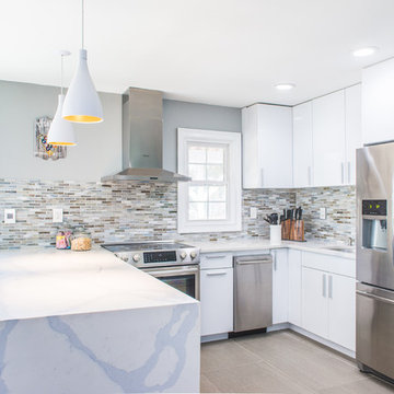
First, we got rid of the kitchen table and by doing so we created a peninsular. This eventually sets up the space for a couple of really cool pendant lights, some unique counter chairs and a wine cooler that was purchased before but never really had a home. We then turned our attention to the range and hood. This was not the main kitchen, so wall storage wasn’t the main goal here. We wanted to create a more open feel interaction while in the kitchen, hence we designed the free standing chimney hood alone to the left of the window.
We then looked at how we can make it more entertaining. We did that by adding a Wine rack on a buffet style type area. This wall was free and would have remained empty had we not find a way to add some more glitz.
Finally came the counter-top. Every detail was crucial because the view of the kitchen can be seen from when you enter the front door even if it was on the second floor walk out. The use of the space called for a waterfall edge counter-top and more importantly, the stone selection to further accentuate the effect. It was crucial that there was movement in the stone which connects to the 45 degree waterfall edge so it would be very dramatic.
Nothing was overlooked in this space. It had to be done this way if it was going to have a fighting chance to take command of its territory.
Have a look at some before and after photos on the left and see a brief video transformation of this lovely small kitchen.
See more photos and vidoe of this transformation on our website @ http://www.rajkitchenandbath.com/portfolio-items/kitchen-remodel-new-rochelle-ny-10801/
 Ferriss - Architectural Renderings
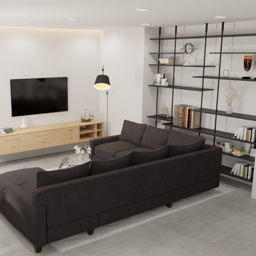
Here are some practical tips for creating a beautiful, comfortable and thoughtful living room design.
The living room in the house is the place where, as the name suggests, receives guests. However, the owners themselves relax here, spending time in front of the TV or a book, with drinks, pleasant conversation and other activities. Therefore, the living room should be the most comfortable place in your home.
The place of the sofa in the design of the living room
The sofa does not need to be placed in a draft. This means that it should not be on an imaginary line from window to door - if you drew a floor plan, it will just be easy to trace.
1. The sofa in front of the TV, diagonally from the door, is a great location. As if inviting you to sit down :)
2. Sofa near the door. A good solution if you often have overnight guests.
3. Corner sofa in the living room. Best placed in the farthest corner from the door. This will make the room look more spacious.
Correct opening of the door in the living room. Inward or outward?
Open inward or outward? There is no clear rule here, because everything depends on the layout and on the furniture placed. The main thing is that the door leaf opens freely and does not interfere with entering and exiting the room. Also, the door should not interfere with free access to the closet or dressing room.
TV in living room size and location. Location.
The TV is placed on the wall opposite to the sofa - this is the most logical and reasonable place for it in the living room. Moreover, the distance to it does not really matter: modern TV models can be placed close to the sofa.
Cabinet or bracket? To your taste. The main thing is that the television zone looks neat and presentable. Provide in advance a cable channel in which all the wires and numerous sockets for the receiver, modem, set-top box, sound bar will hide. Nothing spoils a design like sticking wires!
Height from the floor. It is optimal to place the TV 1 m from the floor to the middle of the screen - this is exactly the level of the eyes of a seated person.
Diagonal size. If there is a financial opportunity, consider options from 50 inches - smaller screens look lonely and lonely on an empty wall.
Living room furniture.
Armchair. Often the chair becomes an accent item in the interior, then its shade, and sometimes its shape, differ from the rest of the furniture. When choosing a chair, be guided also by your habits: for example, it will be more convenient to climb up with your feet and read a book in an armchair with dimensions of 90x90 cm, and you can “just sit comfortably” in a fireplace chair with a high back, comfortable armrests and with a seat 80x80 cm.
TV stand. Large TV stands are no longer as relevant as they used to be, when it was necessary to store a player, cassettes and discs there. For now, a console table or a narrow elegant pedestal is enough.
Coffee table. Nice piece of furniture that creates a cozy atmosphere. Some models, if necessary, can be transformed into a more spacious table for receiving guests - however, finding comfortable and beautiful specimens is not easy, plus they usually cost a lot.
Rack. An extremely useful type of furniture. :) Firstly, a large number of decor items can be beautifully placed on the rack. And secondly, it can also play the role of a light through partition, which divides the room into zones and does not select light at the same time. This is a very big plus for small apartments.
Fireplace. Here we are talking about electric fireplaces. Some of them come with a humidifier and heated, so 3-in-1 models can be very helpful. Fireplace portals have different styles: classic, antique, modern. Inconsistency with the general style of the living room can greatly spoil the impression of the room, so be careful with creativity. Sizing is an important issue. A large wall with a high ceiling also needs a proportionate fireplace; in horror, a small portal will look lonely and ridiculous.
What do you think about our new living room project?
https://www.ferriss.co
#ferriss #We_bring_objects_to_life #3drendering #architecture #San_Francisco
 Natural Stone Institute
Gallegos was contacted by a client about a project where stone was not just to be an accent material, but the main visual and perceived structural element to create a timeless architectural composition. To further the endeavor: all veneers and dimension stone must be locally sourced and sustainably quarried. The design called for a moss rock veneer with cut stone trim. Sourcing the sandstone moss rock was simple because there were several local quarries to use. The problem
was with the trim pieces.
Gallegos selected Colorado Buff sandstone for the trim since the buff body was a good contrast to the moss rock and it is a stone that can be cut to size. One main concern with any sedimentary stone is hitting what is known as a “dry” layer in the ledge. This is an area in the stone between sedimentary layers that has not solidified or cemented. It is still granular and can lead to future stone failure as water penetrates these layers and creates freeze/thaw issues. To avoid this, they used
an epoxy injected into the dry layers to help solidify the material and prevent any future failures.
The client also wanted sustainable materials for their countertops and bathrooms. Many of the interior stones were either reclaimed materials or were sourced from Colorado quarries – Calacatta Lincoln was used extensively.
Gallegos sourced tiles from reclamation projects in Europe and Asia for use in the master bath and front entry areas. For many of the countertops, the owner’s interior designer spent hours looking through remnants and applied several throughout the residence.
Willow Court is a spectacular and dramatic nod to stone masonry, something the owner, architect, and builder can be proud of and, for the most part, was built with the environment in mind.
 Tile Doctor Ltd
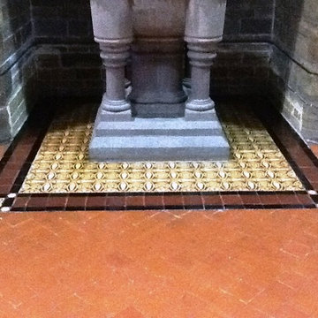
The following job was a bit different from the kitchen and hallway restorations we normally get asked to do, in fact this request came from the vicar of St. Mary’s Church in Far Cotton who wanted us to restore some beautiful old Quarry tiles which lead up to the main aisle. The church dates back to 1885 and given the wear on some of the tiles I can only assume they date back to the same Victorian period; the church is a really welcoming, community-focused place, so it was a pleasure for me to be asked to complete the work.
The vicar’s main concern was the large amount of melted candle wax around the font – so much so that this his normal cleaners had been unable to remove it. He also wanted to know if the floors could be sealed to make ongoing maintenance easier – and this was certainly something we would be able to provide. The following photos show the condition of the floor before we started.
The next photo shows the work in progress from halfway down the aisle. We started by breaking down any old sealer and the troublesome candle wax, using a black stripping pad in combination of Tile Doctor Pro Clean to deep clean the floor. Since Pro Clean, a high alkaline cleaner, is highly versatile and can be used on all kinds of natural stone and tile.
While the church has cleaners that come in regularly to keep the building tidy for the parishioners, the old tiles really benefitted from a deep clean which tackled the stubborn ingrained dirt and staining that had built up over many years.
Once I was satisfied that the tiles had been cleaned to the best of my abilities, they were then left for two weeks to fully dry as it is an old church and, understandably, there were some inherent damp issues. As aforementioned, the vicar was keen to have the tiles sealed to make them easier to keep clean and protect them against ingrained dirt and staining for the future. There are only a few situations in which we wouldn’t recommend sealing tiles, such as if they are patio tiles which will already be under constant exposure to the weather.
The best choice of sealer for this particular situation was Tile Doctor Colour Grow, which is an impregnating, breathable sealer that won’t trap moisture in the floor and will provide great protection against further staining. Additionally, as an impregnating sealer, Colour Grow penetrates into the pores of the tile protecting it from within and with the added benefit of enhancing the natural colours and restoring the life and character back in the old, dull tiles. I applied it using a paint pad, before polishing it off.
I’m pleased to report that the restoration was a great success. The vicar was very impressed with the work, and I’m sure the church community will also be very happy with the new, vibrant tiles.
Phil Vissian
Northamptonshire Tile Doctor
 TVL Creative Ltd.
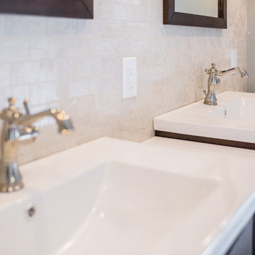
This project included a massive renovation to nearly all spaces in the home: the entry, living room, family room, dining room, kitchen, staircase, and master bathroom. Each space underwent a massive transformation in order to create the elegant & traditional aesthetic that our clients love. On the main level of the home, the original space layout was extremely compartmentalized and dark. Our clients wanted to open up and brighten the space as much as possible. In addition to this, a major goal was to increase function and to create a welcoming environment for guests and the clients alike. We started by opening up the space plan significantly. This allows for flowing space between the kitchen, front living room, and rear family room. Light is better carried through these spaces, and further emphasized with airy colors, light cabinetry, and a better lighting plan overall. We removed the old decorative ceiling beams and reworked closets and hallways to create a more open and functional main level. The kitchen offers a large amount of counter space and storage opportunity, but also welcomes guests at a sizable island and secondary peninsula. Beyond the kitchen, we designed a work nook where display storage and functional workspace are both present. We reworked both fireplaces in the home to create warm nooks for gathering: both fireplaces feature large format stone and are flanked with display shelving. The master bathroom upstairs was completely reworked as well. We eliminated the oversized drop-in tub and in-wall fireplace, and took away the steam shower that had been causing water and mildew issues for years. We relocated the toilet and developed a gorgeous vanity area in the space where the old bathtub and fireplace used to be. We then created a massive shower room in lieu of a tub/shower combination. The bathroom is adorned with warm tones and natural textures: marble subway tile runs up the entire wall behind the vanity, wood-look porcelain covers the floor and back wall of the shower, and simple artisan subway tiles in a creamy vanilla tone cover the shower walls. These spaces completely transformed the look and feel of the house, and we are so happy our amazing clients get to enjoy this home with their family for years to come!
 TVL Creative Ltd.
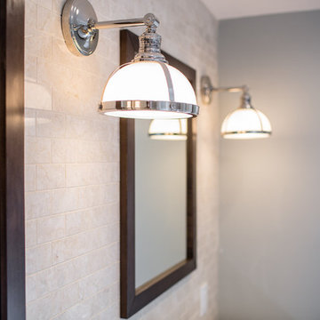
This project included a massive renovation to nearly all spaces in the home: the entry, living room, family room, dining room, kitchen, staircase, and master bathroom. Each space underwent a massive transformation in order to create the elegant & traditional aesthetic that our clients love. On the main level of the home, the original space layout was extremely compartmentalized and dark. Our clients wanted to open up and brighten the space as much as possible. In addition to this, a major goal was to increase function and to create a welcoming environment for guests and the clients alike. We started by opening up the space plan significantly. This allows for flowing space between the kitchen, front living room, and rear family room. Light is better carried through these spaces, and further emphasized with airy colors, light cabinetry, and a better lighting plan overall. We removed the old decorative ceiling beams and reworked closets and hallways to create a more open and functional main level. The kitchen offers a large amount of counter space and storage opportunity, but also welcomes guests at a sizable island and secondary peninsula. Beyond the kitchen, we designed a work nook where display storage and functional workspace are both present. We reworked both fireplaces in the home to create warm nooks for gathering: both fireplaces feature large format stone and are flanked with display shelving. The master bathroom upstairs was completely reworked as well. We eliminated the oversized drop-in tub and in-wall fireplace, and took away the steam shower that had been causing water and mildew issues for years. We relocated the toilet and developed a gorgeous vanity area in the space where the old bathtub and fireplace used to be. We then created a massive shower room in lieu of a tub/shower combination. The bathroom is adorned with warm tones and natural textures: marble subway tile runs up the entire wall behind the vanity, wood-look porcelain covers the floor and back wall of the shower, and simple artisan subway tiles in a creamy vanilla tone cover the shower walls. These spaces completely transformed the look and feel of the house, and we are so happy our amazing clients get to enjoy this home with their family for years to come!
 ING Construction
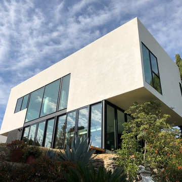
This Accessory Dwelling Unit was completed in 2019.
It's modern architectural design is both expansive and creative.
Upon it's completion, this work of art was a featured in the 2019 Los Angeles Design Festival Showcase House Tour.
https://www.dwell.com/article/backyard-cottage-adu-los-angeles-dac353a2
 Drewett Works
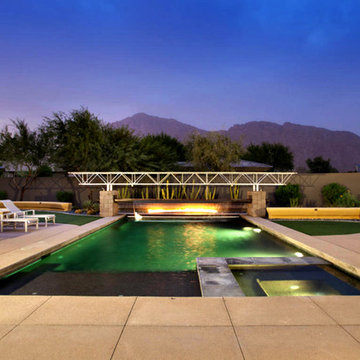
Featured in the November 2008 issue of Phoenix Home & Garden, this "magnificently modern" home is actually a suburban loft located in Arcadia, a neighborhood formerly occupied by groves of orange and grapefruit trees in Phoenix, Arizona. The home, designed by architect C.P. Drewett, offers breathtaking views of Camelback Mountain from the entire main floor, guest house, and pool area. These main areas "loft" over a basement level featuring 4 bedrooms, a guest room, and a kids' den. Features of the house include white-oak ceilings, exposed steel trusses, Eucalyptus-veneer cabinetry, honed Pompignon limestone, concrete, granite, and stainless steel countertops. The owners also enlisted the help of Interior Designer Sharon Fannin. The project was built by Sonora West Development of Scottsdale, AZ.
 Alloy Architecture & Construction
Originally built in 1859 by Justice William J. Robertson and listed on the National Register of Historic Places in 1999, this home has elements of both the Italianate and Gothic Revival styles which were taken into consideration during the design process.
The project consisted of three main components: a basement renovation, a new screened in porch and a new two car garage.
For the basement renovation we removed the original brick floor which was causing moisture issues and replaced them with an insulated, colored concrete slab. The end result: a previously unusable space was transformed into a family room with a complete guest suite and an exercise room.
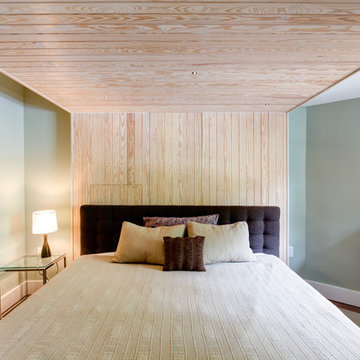
In the guest bedroom, low ceilings due to existing duct work were strategically wrapped with stained pine tongue and groove creating a cozy sleeping nook. In the bathroom, subway tiles and lightly stained wood are the background to a livelier tile accent in the shower and around the vanity.
The family room features floor to ceiling millwork piece that has several storage cubbies; some with doors to conceal and others open for display.
The screened porch is located at the back of the house overlooking a new stone patio at the lower level yard. The new porch takes cues from the existing sun room by matching materials, colors, and proportion. The new porch off the living room allows the clients to sit and relax while staying close to their children when inside or playing in the yard.
The garage was built using the same material palette and style of the house but set back so as to not to detract from the main house. With large sliding barn doors on the back, it opens up to a manicured lawn allowing the garage to double as a pavilion for outdoor entertaining and yard parties. Alloy worked with Water Street Studio, a local architectural landscaping firm, to create more inviting and usable spaces for the children and adults to enjoy.
Andrea Hubbel Photography
33