
Search results for "Main priority" in Home Design Ideas

 User
Located in one of the Ritz residential towers in Boston, the project was a complete renovation. The design and scope of work included the entire residence from marble flooring throughout, to movement of walls, new kitchen, bathrooms, all furnishings, lighting, closets, artwork and accessories. Smart home sound and wifi integration throughout including concealed electronic window treatments.
The challenge for the final project design was multifaceted. First and foremost to maintain a light, sheer appearance in the main open areas, while having a considerable amount of seating for living, dining and entertaining purposes. All the while giving an inviting peaceful feel,
and never interfering with the view which was of course the piece de resistance throughout.
Bringing a unique, individual feeling to each of the private rooms to surprise and stimulate the eye while navigating through the residence was also a priority and great pleasure to work on, while incorporating small details within each room to bind the flow from area to area which would not be necessarily obvious to the eye, but palpable in our minds in a very suttle manner. The combination of luxurious textures throughout brought a third dimension into the environments, and one of the many aspects that made the project so exceptionally unique, and a true pleasure to have created. Reach us www.themorsoncollection.com
Photography by Elevin Studio.
 H2D Architecture + Design
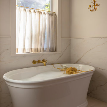
 developed a comprehensive vision for the renovation of this Bellevue residence, creating a cohesive master plan that can be implemented in phased construction to align with the homeowners' priorities, budget, and timeline. The first phase reimagined the primary suite, including a redesigned bathroom, reconfigured closet and bedroom. Strategic space planning enhanced the functionality and flow of each space while creating a serene, spa-inspired retreat tailored to the homeowners' lifestyle. Future phases will transform the home's main living areas through a complete reconfiguration of the kitchen, dining room, entry, and living room. The design will improve circulation, increase functionality, and create light-filled, beautifully connected spaces.
Architecture: H2D Architecture + Design
www.h2darchitects.com
Interiors: Kat Lawton Interiors
Photos by: John Granen
 Kate Roos Design LLC
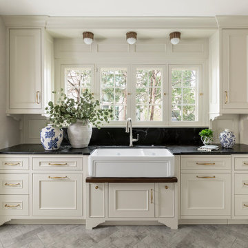
This 1930’s gem did not have a functional, beautiful kitchen. In fact, many cabinets barely opened, and some appliances didn’t even work.
The top priority was to replace the cabinetry, appliances, and finishes in the main kitchen and butler’s pantry for better functionality. The original footprint was kept mostly intact, with only minor adjustments to improve flow, connectivity, and layout. Custom cabinetry was designed to enhance storage, and a suite of high-performance appliances was installed. Finishes like a herringbone tile floor and soapstone countertops were chosen for longevity and durability.
The secondary goal was to match the beauty of the rest of the home, with traditional elements, symmetry, and warmth. Details like fluting on the range hood and a unique corbel shape mirror original moldings. Stained oak accents were color-matched to the home’s existing woodwork. White oak cabinet interiors and custom inserts create a furniture-like feel.
The finished design blends seamlessly into the historic home, and also enhances functionality for day-to-day living, hosting, and gathering.
Find the right local pro for your project

 Thinkterior LLC
THEME There are two priorities in this
room: Hockey (in this case, Washington
Capitals hockey) and FUN.
FOCUS The room is broken into two
main sections (one for kids and one
for adults); and divided by authentic
hockey boards, complete with yellow
kickplates and half-inch plexiglass. Like
a true hockey arena, the room pays
homage to star players with two fully
autographed team jerseys preserved in
cases, as well as team logos positioned
throughout the room on custom-made
pillows, accessories and the floor.
The back half of the room is made just
for kids. Swings, a dart board, a ball
pit, a stage and a hidden playhouse
under the stairs ensure fun for all.
STORAGE A large storage unit at
the rear of the room makes use of an
odd-shaped nook, adds support and
accommodates large shelves, toys and
boxes. Storage space is cleverly placed
near the ballpit, and will eventually
transition into a full storage area once
the pit is no longer needed. The back
side of the hockey boards hold two
small refrigerators (one for adults and
one for kids), as well as the base for the
audio system.
GROWTH The front half of the room
lasts as long as the family’s love for the
team. The back half of the room grows
with the children, and eventually will
provide a useable, wide open space as
well as storage.
SAFETY A plexiglass wall separates the
two main areas of the room, minimizing
the noise created by kids playing and
hockey fans cheering. It also protects
the big screen TV from balls, pucks and
other play objects that occasionally fly
by. The ballpit door has a double safety
lock to ensure supervised use.


 ZeroEnergy Design
This modern green home offers both a vacation destination on Cape Cod near local family members and an opportunity for rental income.
FAMILY ROOTS. A West Coast couple living in the San Francisco Bay Area sought a permanent East Coast vacation home near family members living on Cape Cod. As academic professionals focused on sustainability, they sought a green, energy efficient home that was well-aligned with their values. With no green homes available for sale on Cape Cod, they decided to purchase land near their family and build their own.
SLOPED SITE. Comprised of a 3/4 acre lot nestled in the pines, the steeply sloping terrain called for a plan that embraced and took advantage of the slope. Of equal priority was optimizing solar exposure, preserving privacy from abutters, and creating outdoor living space. The design accomplished these goals with a simple, rectilinear form, offering living space on the both entry and lower/basement levels. The stepped foundation allows for a walk-out basement level with light-filled living space on the down-hill side of the home. The traditional basement on the eastern, up-hill side houses mechanical equipment and a home gym. The house welcomes natural light throughout, captures views of the forest, and delivers entertainment space that connects indoor living space to outdoor deck and dining patio.
MODERN VISION. The clean building form and uncomplicated finishes pay homage to the modern architectural legacy on the outer Cape. Durable and economical fiber cement panels, fixed with aluminum channels, clad the primary form. Cedar clapboards provide a visual accent at the south-facing living room, which extends a single roof plane to cover the entry porch.
SMART USE OF SPACE. On the entry level, the “L”-shaped living, dining, and kitchen space connects to the exterior living, dining, and grilling spaces to effectively double the home’s summertime entertainment area. Placed at the western end of the entry level (where it can retain privacy but still claim expansive downhill views) is the master suite with a built-in study. The lower level has two guest bedrooms, a second full bathroom, and laundry. The flexibility of the space—crucial in a house with a modest footprint—emerges in one of the guest bedrooms, which doubles as home office by opening the barn-style double doors to connect it to the bright, airy open stair leading up to the entry level. Thoughtful design, generous ceiling heights and large windows transform the modest 1,100 sf* footprint into a well-lit, spacious home. *(total finished space is 1800 sf)
RENTAL INCOME. The property works for its owners by netting rental income when the owners are home in San Francisco. The house especially caters to vacationers bound for nearby Mayo Beach and includes an outdoor shower adjacent to the lower level entry door. In contrast to the bare bones cottages that are typically available on the Cape, this home offers prospective tenants a modern aesthetic, paired with luxurious and green features. Durable finishes inside and out will ensure longevity with the heavier use that comes with a rental property.
COMFORT YEAR-ROUND. The home is super-insulated and air-tight, with mechanical ventilation to provide continuous fresh air from the outside. High performance triple-paned windows complement the building enclosure and maximize passive solar gain while ensuring a warm, draft-free winter, even when sitting close to the glass. A properly sized air source heat pump offers efficient heating & cooling, and includes a carefully designed the duct distribution system to provide even comfort throughout the house. The super-insulated envelope allows us to significantly reduce the equipment capacity, duct size, and airflow quantities, while maintaining unparalleled thermal comfort.
ENERGY EFFICIENT. The building’s shell and mechanical systems play instrumental roles in the home’s exceptional performance. The building enclosure reduces the most significant energy glutton: heating. Continuous super-insulation, thorough air sealing, triple-pane windows, and passive solar gain work together to yield a miniscule heating load. All active energy consumers are extremely efficient: an air source heat pump for heating and cooling, a heat pump hot water heater, LED lighting, energy recovery ventilation (ERV), and high efficiency appliances. The result is a home that uses 70% less energy than a similar new home built to code requirements.
OVERALL. The home embodies the owners’ goals and values while comprehensively enabling thermal comfort, energy efficiency, a vacation respite, and supplementary income.
PROJECT TEAM
ZeroEnergy Design - Architect & Mechanical Designer
A.F. Hultin & Co. - Contractor
Pamet Valley Landscape Design - Landscape & Masonry
Lisa Finch - Original Artwork
European Architectural Supply - Windows
Eric Roth Photography - Photography

 leveluphomebuilders
This particular project is a Beautiful custom made two tone Kitchen Remodeling
and home remodeling project. The most important priority for this homeowner was to bring her 1960s vinyl flooring, outdated bathroom and rundown kitchen cabinets to a more modern and chic kitchen.
The potential in this project always reminds us that no job is finished until the final details are put. Adding Modern amenities which mix brilliantly with classic finishes in this Project. As seen in the photo, notice how the colors keep the natural flow throughout the kitchen.
The clients had wanted a Uilitarian Island, an additional prep farm sink, and wine cooler. The client also was requesting much needed stools. We went with an eccentric piece for the stools as shown in our photos. The perimeter cabinets are in a soft gray which allows the warm toned island to stand out as a grounding feature.
For lighting we chose Skylights. Skylights offer ample lighting, we also chose to use lights along the under mount and island pendants.
When we consulted about the remodeling of the dining room and kitchen floors , we agreed on it receiving a fresh look with all new flooring . We chose from the Hallmark Modern Collection, which now flows from the kitchen through to the welcoming entry and living room.
This project also included a bedroom and bathroom addition, all new doors, electrical & lighting, flooring and master bath renovation.
As for the suite bathroom, the main priority for the clients was to have a bathroom where they could disconnect and feel like at some sort of retreat.
The suite bath now screams elegance and retreat with a large soaker tub, expansive glass enclosed shower and dual vanities. We agreed on a neutral yet eccentric tile using a surf linear blue mosaic touch that brings a soothing feel to the retreat.
We hope you enjoyed the photos please message us with any questions!
 Sew Beautiful
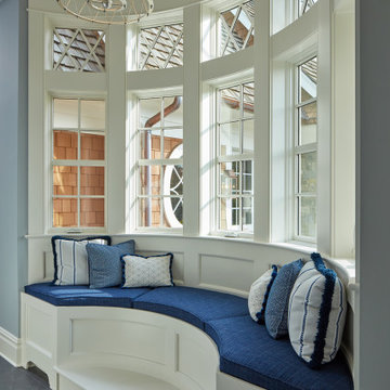
A collaborative project with an Annapolis architect firm, the design team came to us with two main priorities for this project: first, preserve their majestic waterfront views and second, create comfortable rooms to entertain their family and guests.
Soft, ethereal draperies anchor the picturesque bay window in the master bedroom. Motorized traversing panels in the second floor bedrooms stack off the windows to expose the scenic waterfront, and when closed, darken the rooms for peaceful sleeping. A stage coach valance in a casual stripe pattern, complete with nautical rope ties, provides a fun finish to the well appointed grandchild’s room. Familiar family heirloom furniture pieces were updated and upholstered with welcoming fabrics. Seat cushions and pillows for the rotunda’s custom bench create a cozy place to sit, relax and read a book.
 Bennett Contracting, Inc.
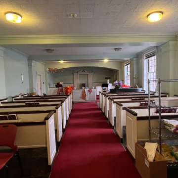
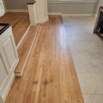
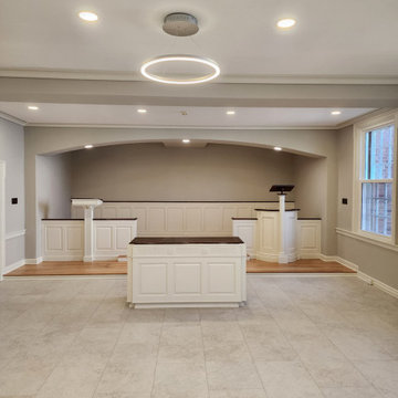
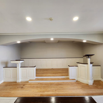
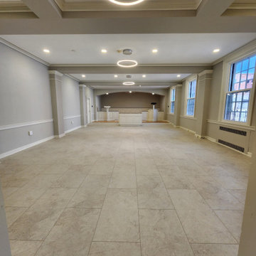
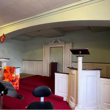
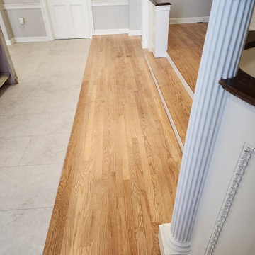
We are so proud to show you some incredible Before and After photos of a recent renovation we completed at a local church. Our main priority was to make this a more welcoming space for parishioners and also for those who visit the food pantry. It had been decades since the last update, but we breathed new life into it. Our team worked diligently to refinish the flooring near the alter, seamlessly matching them with the new flooring laid throughout the rest of the space. The old alter piece was lovingly replaced with wainscoting, perfectly matching the rest of the wall. It’s a job so well done, you can’t even see where the original meets the new construction. Our commitment to detail shines through. As a finishing touch, we added new modern lighting and adorned the space with fresh coats of paint, one aptly named “Sanctuary” by Sherwin Williams which added a touch of serenity and warmth to the atmosphere. The church looks forward to welcoming everyone with open arms in this renewed space.
 Bennett Contracting, Inc.
We are so proud to show you some incredible Before and After photos of a recent renovation we completed at a local church. Our main priority was to make this a more welcoming space for parishioners and also for those who visit the food pantry. It had been decades since the last update, but we breathed new life into it. Our team worked diligently to refinish the flooring near the alter, seamlessly matching them with the new flooring laid throughout the rest of the space. The old alter piece was lovingly replaced with wainscoting, perfectly matching the rest of the wall. It’s a job so well done, you can’t even see where the original meets the new construction. Our commitment to detail shines through. As a finishing touch, we added new modern lighting and adorned the space with fresh coats of paint, one aptly named “Sanctuary” by Sherwin Williams which added a touch of serenity and warmth to the atmosphere. The church looks forward to welcoming everyone with open arms in this renewed space.
 Bennett Contracting, Inc.
We are so proud to show you some incredible Before and After photos of a recent renovation we completed at a local church. Our main priority was to make this a more welcoming space for parishioners and also for those who visit the food pantry. It had been decades since the last update, but we breathed new life into it. Our team worked diligently to refinish the flooring near the alter, seamlessly matching them with the new flooring laid throughout the rest of the space. The old alter piece was lovingly replaced with wainscoting, perfectly matching the rest of the wall. It’s a job so well done, you can’t even see where the original meets the new construction. Our commitment to detail shines through. As a finishing touch, we added new modern lighting and adorned the space with fresh coats of paint, one aptly named “Sanctuary” by Sherwin Williams which added a touch of serenity and warmth to the atmosphere. The church looks forward to welcoming everyone with open arms in this renewed space.
 Bennett Contracting, Inc.
We are so proud to show you some incredible Before and After photos of a recent renovation we completed at a local church. Our main priority was to make this a more welcoming space for parishioners and also for those who visit the food pantry. It had been decades since the last update, but we breathed new life into it. Our team worked diligently to refinish the flooring near the alter, seamlessly matching them with the new flooring laid throughout the rest of the space. The old alter piece was lovingly replaced with wainscoting, perfectly matching the rest of the wall. It’s a job so well done, you can’t even see where the original meets the new construction. Our commitment to detail shines through. As a finishing touch, we added new modern lighting and adorned the space with fresh coats of paint, one aptly named “Sanctuary” by Sherwin Williams which added a touch of serenity and warmth to the atmosphere. The church looks forward to welcoming everyone with open arms in this renewed space.
 Bennett Contracting, Inc.
We are so proud to show you some incredible Before and After photos of a recent renovation we completed at a local church. Our main priority was to make this a more welcoming space for parishioners and also for those who visit the food pantry. It had been decades since the last update, but we breathed new life into it. Our team worked diligently to refinish the flooring near the alter, seamlessly matching them with the new flooring laid throughout the rest of the space. The old alter piece was lovingly replaced with wainscoting, perfectly matching the rest of the wall. It’s a job so well done, you can’t even see where the original meets the new construction. Our commitment to detail shines through. As a finishing touch, we added new modern lighting and adorned the space with fresh coats of paint, one aptly named “Sanctuary” by Sherwin Williams which added a touch of serenity and warmth to the atmosphere. The church looks forward to welcoming everyone with open arms in this renewed space.
 Bennett Contracting, Inc.
We are so proud to show you some incredible Before and After photos of a recent renovation we completed at a local church. Our main priority was to make this a more welcoming space for parishioners and also for those who visit the food pantry. It had been decades since the last update, but we breathed new life into it. Our team worked diligently to refinish the flooring near the alter, seamlessly matching them with the new flooring laid throughout the rest of the space. The old alter piece was lovingly replaced with wainscoting, perfectly matching the rest of the wall. It’s a job so well done, you can’t even see where the original meets the new construction. Our commitment to detail shines through. As a finishing touch, we added new modern lighting and adorned the space with fresh coats of paint, one aptly named “Sanctuary” by Sherwin Williams which added a touch of serenity and warmth to the atmosphere. The church looks forward to welcoming everyone with open arms in this renewed space.
 Bennett Contracting, Inc.
We are so proud to show you some incredible Before and After photos of a recent renovation we completed at a local church. Our main priority was to make this a more welcoming space for parishioners and also for those who visit the food pantry. It had been decades since the last update, but we breathed new life into it. Our team worked diligently to refinish the flooring near the alter, seamlessly matching them with the new flooring laid throughout the rest of the space. The old alter piece was lovingly replaced with wainscoting, perfectly matching the rest of the wall. It’s a job so well done, you can’t even see where the original meets the new construction. Our commitment to detail shines through. As a finishing touch, we added new modern lighting and adorned the space with fresh coats of paint, one aptly named “Sanctuary” by Sherwin Williams which added a touch of serenity and warmth to the atmosphere. The church looks forward to welcoming everyone with open arms in this renewed space.
 Just the Thing
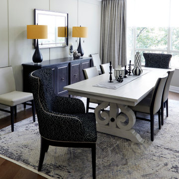
The large main area of this condo is divided into living room and dining room. With a common wall measuring 35', adding architectural detail was a priority. We installed 1/4" thick MDF strips between the existing crown and baseboard mouldings and painted them the same colour as the walls, creating a subtle panelled look.
In the dining room area, a farmhouse table is surrounded by upholstered wood-frame chairs with simple lines, while the captain's chairs are comfy, curvy, and glammed up with shiny nailheads and a black velvet abstract fabric. The white table is contrasted with an elegant charcoal buffet with silver details and topped by a vignette of curated vases and candlesticks in black and white. The area is delineated by an abstract cream and grey rug. Yellow lampshades are an unexpected jolt of colour, and harken back to the accents in the living room.
 Thinkterior LLC
THEME There are two priorities in this
room: Hockey (in this case, Washington
Capitals hockey) and FUN.
FOCUS The room is broken into two
main sections (one for kids and one
for adults); and divided by authentic
hockey boards, complete with yellow
kickplates and half-inch plexiglass. Like
a true hockey arena, the room pays
homage to star players with two fully
autographed team jerseys preserved in
cases, as well as team logos positioned
throughout the room on custom-made
pillows, accessories and the floor.
The back half of the room is made just
for kids. Swings, a dart board, a ball
pit, a stage and a hidden playhouse
under the stairs ensure fun for all.
STORAGE A large storage unit at
the rear of the room makes use of an
odd-shaped nook, adds support and
accommodates large shelves, toys and
boxes. Storage space is cleverly placed
near the ballpit, and will eventually
transition into a full storage area once
the pit is no longer needed. The back
side of the hockey boards hold two
small refrigerators (one for adults and
one for kids), as well as the base for the
audio system.
GROWTH The front half of the room
lasts as long as the family’s love for the
team. The back half of the room grows
with the children, and eventually will
provide a useable, wide open space as
well as storage.
SAFETY A plexiglass wall separates the
two main areas of the room, minimizing
the noise created by kids playing and
hockey fans cheering. It also protects
the big screen TV from balls, pucks and
other play objects that occasionally fly
by. The ballpit door has a double safety
lock to ensure supervised use.
 Kate Roos Design LLC
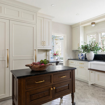
This 1930’s gem did not have a functional, beautiful kitchen. In fact, many cabinets barely opened, and some appliances didn’t even work.
The top priority was to replace the cabinetry, appliances, and finishes in the main kitchen and butler’s pantry for better functionality. The original footprint was kept mostly intact, with only minor adjustments to improve flow, connectivity, and layout. Custom cabinetry was designed to enhance storage, and a suite of high-performance appliances was installed. Finishes like a herringbone tile floor and soapstone countertops were chosen for longevity and durability.
The secondary goal was to match the beauty of the rest of the home, with traditional elements, symmetry, and warmth. Details like fluting on the range hood and a unique corbel shape mirror original moldings. Stained oak accents were color-matched to the home’s existing woodwork. White oak cabinet interiors and custom inserts create a furniture-like feel.
The finished design blends seamlessly into the historic home, and also enhances functionality for day-to-day living, hosting, and gathering.

 Agate Architecture, LLC
Terri and Jim loved many things about their home, but the outdated, poorly designed kitchen, laundry room that was shoved into the corner of the kitchen, and loft that was annexed from other living spaces needed a complete makeover. The house is nestled on a large lot filled with mature trees that offer filtered morning and afternoon light. Establishing a strong visual link from the front yard through the house and into the back yard was a high design priority, as well as connecting the living spaces with an open floor plan, all without increasing the overall footprint of the home. Agate Architecture's completed remodel includes a full kitchen and dining room renovation, a new mud/laundry room, renovation of the second-floor loft, a new staircase, and exterior improvements. The use of Douglas Fir as a main unifying material and simple clean lines lends a bright Pacific Northwest style, with natural light in abundance. Terri and Jim’s home is now a truly exceptional space for everyday use and family entertaining.
13