
Search results for "Maintaining existing" in Home Design Ideas
 Constantine Design Group, Inc.
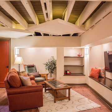
This early 20th century Indianapolis, IN basement remodel was in desperate need of help. The original and still operating hydronic radiant heating system had its plumbing configured without regard to any other use of the space. Fearful of harming the aged system and the high cost of doing so, these Clients were adamant that the existing system remain intact. Architect Lee Constantine developed a design that maintained the existing heating system while creating "niches" around the perimeter that would conceal the unsightly plumbing. Additionally, by removing free-standing structural supporting posts, amore flexible and inviting space was achieved. Because of an already low ceiling condition, the floor-ceiling structure above was kept exposed, painted and highlighted with indirect lighting to avoid further reducing the ceiling height. Constantine incorporated "clouds" on this ceiling to conceal certain existing components that either were cost prohibitive to relocate or couldn't be relocated. These "clouds"become a "visual element" through their geometry and hidden "indirect" light source rather than an undesirable complication. Now this family entertains frequently in the basement and reports "it doesn't feel like we're in a basement anymore"
 Dawn Christine, Architect PLLC
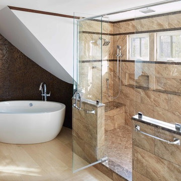
The existing master bath was functional but lacked artistry. With an eye toward maximizing the client’s budget, the existing vanities were only replaced instead of being completely redesigned. The client’s goal was to have a large shower, yet maintain space for a tub. The new expanded shower was placed where the bathtub used to be. The luxury shower features a five-head shower system, including a body spray, a rain head, and two adjustable shower heads. Custom tiled shelves and new awning windows were designed to seamlessly integrate into the geometry of the Cappuccino marble tile. Dark Emperador marble is an accent stone placed on the shelves, the wall cap, the shower seat, and the shower curb. A stone trim band adds detail around the new windows. Square footage was added to the master bath by carving out an area within the existing attic to capture space for the freestanding tub.
Photo Credit: Keith Issacs Photo, LLC
Dawn Christine Architect
 Katie Hutchison Studio
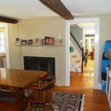
With two small children and a third on the way, the owners of an original eighteenth century Cape were quickly out-growing it, but they had no desire to move away from the Cape Cod home and location they loved. They simply needed a reconfigured layout and more space. Their goals included repurposing some existing rooms, adding a new kitchen/family area plus screen porch on the first level, and creating a master suite and roof deck with an outdoor shower on the second level, connected by a new stair.
Our challenge was to improve the flow between existing spaces, and design the two-story addition without overwhelming the pint-sized original Cape. We took advantage of the lower grade at the rear of the property to step the first floor of the addition down two steps from the existing main level. This allowed us to align the second floor in the addition with the existing second floor, while gaining ceiling height in the new first-floor kitchen/family area. We composed a cross-gabled form for the addition to improve the second floor headroom, while maintaining the existing eave line. We then extended some existing shed dormers to gain headroom and enhance function. We also expanded the outdoor living area with privacy walls along the roof deck.
New, larger, double–hung windows that match the lite configuration of the existing windows, along with new side-wall shingles and trim which resemble the existing exterior treatment help to tie the new addition to the old Cape. Though there’s no mistaking the new for the old, the two are simpatico.
Katie Hutchison Studio collaborated with Geoffrey Koper Architect of Yarmouth Port, Mass. on the Yarmouth Port Antique Cape Renovation and Addition. Kitchen fit-out and interior finishes, fixtures, and furnishings by others.
photo by Katie Hutchison
Find the right local pro for your project
 Katie Hutchison Studio
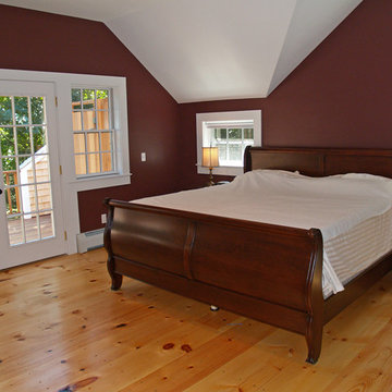
With two small children and a third on the way, the owners of an original eighteenth century Cape were quickly out-growing it, but they had no desire to move away from the Cape Cod home and location they loved. They simply needed a reconfigured layout and more space. Their goals included repurposing some existing rooms, adding a new kitchen/family area plus screen porch on the first level, and creating a master suite and roof deck with an outdoor shower on the second level, connected by a new stair.
Our challenge was to improve the flow between existing spaces, and design the two-story addition without overwhelming the pint-sized original Cape. We took advantage of the lower grade at the rear of the property to step the first floor of the addition down two steps from the existing main level. This allowed us to align the second floor in the addition with the existing second floor, while gaining ceiling height in the new first-floor kitchen/family area. We composed a cross-gabled form for the addition to improve the second floor headroom, while maintaining the existing eave line. We then extended some existing shed dormers to gain headroom and enhance function. We also expanded the outdoor living area with privacy walls along the roof deck.
New, larger, double–hung windows that match the lite configuration of the existing windows, along with new side-wall shingles and trim which resemble the existing exterior treatment help to tie the new addition to the old Cape. Though there’s no mistaking the new for the old, the two are simpatico.
Katie Hutchison Studio collaborated with Geoffrey Koper Architect of Yarmouth Port, Mass. on the Yarmouth Port Antique Cape Renovation and Addition. Kitchen fit-out and interior finishes, fixtures, and furnishings by others.
photo by Katie Hutchison
 Nathan Fell Architecture
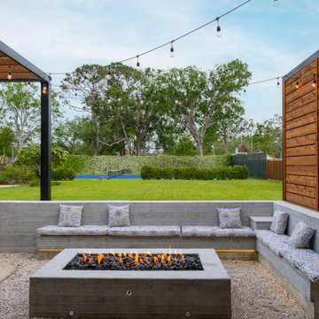
The owners knew they wanted to create spaces in their backyard that be useful and encourage them to be outside more often, but because their backyard space is so massive the scope and size of the project was initially difficult to define. After a few initial rounds of design, the project ended up creating a series of spaces near their house and pool rather than try to utilize the entirety of their yard.
The existing pool was situated in proximity (and almost entirely aligned) to a detached garage. The garage was perfectly useful for parking cars, but nothing special Architecturally and certainly not functionally associated with the pool. The cabana would have been too far away from the main home if it were located on the opposite side of pool and would have been too large and visually obtrusive if arrange to the side of the pool. The design of the cabana was conceived as an addition to the garage that more appropriately capped the end of the pool with an openable space that could be used for cooking, lounging in the shade poolside, or playing games in with the space itself. There wasn’t enough space between the garage and pool to contain all the uses they wanted, so an additional shade structure with a dining space and a fire pit with build-in benches was included to the project, located near their existing living room.
Board formed concrete walls were used as a common element between the shade structure and the cabana. The base used as a planter wall and back to the bench in the shade structure is maintained in the base of cabana to develop aesthetic cohesion between the two spaces. The cabana engages a build in bar to a series of folding glass walls for compact efficient use. The interior of the cabana had to maintain the existing garage roofline for structural stability, but the interior is vaulted to the highest extent possible. The interior of the vault is lined with wood to frame the space for visual clarity enhancing transparency.
A goal of the project was to make a vast backyard more useful at a walkable scale by creating outdoor spaces close to each other and the existing living areas in and around the home. Rather than attempt to encapsulate the entire backyard it creates density around the edges that look onto the backyard. Because the spaces engage with the existing conditions the space has become a much-used outdoor living space.
(Photos of After Construction Conditions by Sara Essex Bradley)
 Katie Hutchison Studio
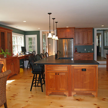
With two small children and a third on the way, the owners of an original eighteenth century Cape were quickly out-growing it, but they had no desire to move away from the Cape Cod home and location they loved. They simply needed a reconfigured layout and more space. Their goals included repurposing some existing rooms, adding a new kitchen/family area plus screen porch on the first level, and creating a master suite and roof deck with an outdoor shower on the second level, connected by a new stair.
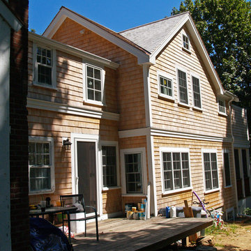
Our challenge was to improve the flow between existing spaces, and design the two-story addition without overwhelming the pint-sized original Cape. We took advantage of the lower grade at the rear of the property to step the first floor of the addition down two steps from the existing main level. This allowed us to align the second floor in the addition with the existing second floor, while gaining ceiling height in the new first-floor kitchen/family area. We composed a cross-gabled form for the addition to improve the second floor headroom, while maintaining the existing eave line. We then extended some existing shed dormers to gain headroom and enhance function. We also expanded the outdoor living area with privacy walls along the roof deck.
New, larger, double–hung windows that match the lite configuration of the existing windows, along with new side-wall shingles and trim which resemble the existing exterior treatment help to tie the new addition to the old Cape. Though there’s no mistaking the new for the old, the two are simpatico.
Katie Hutchison Studio collaborated with Geoffrey Koper Architect of Yarmouth Port, Mass. on the Yarmouth Port Antique Cape Renovation and Addition. Kitchen fit-out and interior finishes, fixtures, and furnishings by others.
photo by Katie Hutchison
 Katie Hutchison Studio
With two small children and a third on the way, the owners of an original eighteenth century Cape were quickly out-growing it, but they had no desire to move away from the Cape Cod home and location they loved. They simply needed a reconfigured layout and more space. Their goals included repurposing some existing rooms, adding a new kitchen/family area plus screen porch on the first level, and creating a master suite and roof deck with an outdoor shower on the second level, connected by a new stair.
Our challenge was to improve the flow between existing spaces, and design the two-story addition without overwhelming the pint-sized original Cape. We took advantage of the lower grade at the rear of the property to step the first floor of the addition down two steps from the existing main level. This allowed us to align the second floor in the addition with the existing second floor, while gaining ceiling height in the new first-floor kitchen/family area. We composed a cross-gabled form for the addition to improve the second floor headroom, while maintaining the existing eave line. We then extended some existing shed dormers to gain headroom and enhance function. We also expanded the outdoor living area with privacy walls along the roof deck.
New, larger, double–hung windows that match the lite configuration of the existing windows, along with new side-wall shingles and trim which resemble the existing exterior treatment help to tie the new addition to the old Cape. Though there’s no mistaking the new for the old, the two are simpatico.
Katie Hutchison Studio collaborated with Geoffrey Koper Architect of Yarmouth Port, Mass. on the Yarmouth Port Antique Cape Renovation and Addition. Kitchen fit-out and interior finishes, fixtures, and furnishings by others.
photo by Katie Hutchison

Sponsored
Columbus, OH

Hope Restoration & General Contracting
Columbus Design-Build, Kitchen & Bath Remodeling, Historic Renovations
 Klopf Architecture
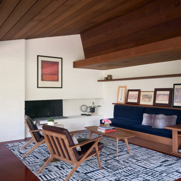
Nestled in the hills of Orinda, California, this 1951 residence is one of only seven extant homes, now known as “The Magnificent Seven”, designed by architect Olof Dahlstrand, a protégé of Frank Lloyd Wright. With its low-slung rooflines, natural materials, and deep integration with the sloping landscape, the home is a pristine example of mid-century modern design inspired by Wright’s organic principles. Over the years, prior homeowners have emphasized preservation, ensuring that the house remained relatively untouched. Each owner has respected the original architecture and stayed true to Dahlstrand’s intent. When a family of five—two college-aged sons and a middle school-aged daughter—acquired the property, they were captivated by its history, legacy of care, and architectural significance. While they appreciated Dahlstrand’s original vision, they also recognized the need to adapt the home for contemporary living while preserving its design integrity.
The remodel was conceived as a thoughtful response to the past—an effort to bring the house into the 21st century without compromising its soul. The primary mandate was to maintain architectural continuity while improving the functionality, comfort, and livability for a modern family. The design team—architects and contractor alike—worked with a shared reverence for the original architecture, allowing that mindset to guide even the most technical or pragmatic decisions.
A key objective was to increase natural light in the kitchen—a departure from Wrightian principles of enclosed, intimate cooking spaces—while maintaining the home’s architectural language. The kitchen was reconfigured to foster a stronger connection to adjacent living spaces while retaining the underlying concept of spatial separation. One of the most transformative architectural changes was the removal of a ridge beam that was originally planned to remain visible through the kitchen. During construction, the team collaborated on a better solution: a wide-flanged steel beam concealed within the roof envelope. This subtle move preserved the clean lines and ceiling continuity, a modern update carried out with utmost respect for the existing framework.
The home’s original powder room, previously accessible only through the kitchen, was relocated for better flow and privacy. A new powder room was carved out of former kitchen cabinetry—a narrow, interior space that could have felt dark and enclosed. To avoid this, the design extended the line of original transom windows into the new powder room and added a skylight above the vanity. The result is a bright and airy space that feels consistent with the rest of the home. Other updates included the installation of new solid-core interior doors with veneers carefully matched to the original mahogany, enhancing the continuity of the interiors. Even smaller decisions, such as placing the door knobs at 42 inches high, mirrored the original proportions. Every choice reflected a shared belief between the architect, contractor, and client: that new work should serve the integrity of the old.
The home’s extensive interior redwood millwork and paneling was meticulously restored. Where new materials were introduced—such as the replacement redwood soffit paneling—the contractor took pains to find finish nails that matched the original, rather than using modern equivalents. This level of craftsmanship and collaboration defined the project. It extended even to the detailing of a blind door to the new powder room, which had to disappear into the existing redwood board-and-batten wall. It was a team effort: the owner found a suitable handle, the architects devised the custom in-swing mechanism, and the contractor executed it so the door aligned precisely with the battens. Throughout, the homeowners were deeply engaged in the design process. One, a meticulous design enthusiast, focused on aesthetic integrity and historic detail. The other brought a practical and function-driven perspective, ensuring that new fixtures and materials would be durable and require minimal maintenance.
While the home’s location posed no major site challenges, sustainability was a key concern. The team upgraded the roof insulation, installed solar panels with battery storage, and added ductless mini-split cooling systems. Lighting was another area where modern technology was woven into a historic framework: new square LED fixtures echo the original custom perimeter soffit lights, maintaining the design language while offering advanced performance.
A planned expansion of a bedroom into suite with a bathroom had to be shelved due to budget constraints and the high cost of below-grade foundation work. Still, the team focused their efforts on making the most of the existing footprint, resolving constraints through design ingenuity rather than adding square footage. This renovation represents a collaborative achievement in preserving and evolving a historically significant home. Every decision was shaped by a shared ethos among clients, architects, and contractor: to maintain the home’s architectural soul while updating it for contemporary life. The result is a timeless modernist residence that continues Olof Dahlstrand’s legacy, remaining grounded in nature, craftsmanship, and human-scale design.
Klopf Architecture Team: John Klopf, AIA, Klara Kevane, Fernanda Bernardes
Interior Architectural Design: Klopf Architecture
Structural Engineer: Daniel Bastiao
Contractor: Don Larwood, Larwood Construction
Photography: Mariko Reed
Year Completed: 2022
 Katie Hutchison Studio
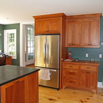
With two small children and a third on the way, the owners of an original eighteenth century Cape were quickly out-growing it, but they had no desire to move away from the Cape Cod home and location they loved. They simply needed a reconfigured layout and more space. Their goals included repurposing some existing rooms, adding a new kitchen/family area plus screen porch on the first level, and creating a master suite and roof deck with an outdoor shower on the second level, connected by a new stair.
Our challenge was to improve the flow between existing spaces, and design the two-story addition without overwhelming the pint-sized original Cape. We took advantage of the lower grade at the rear of the property to step the first floor of the addition down two steps from the existing main level. This allowed us to align the second floor in the addition with the existing second floor, while gaining ceiling height in the new first-floor kitchen/family area. We composed a cross-gabled form for the addition to improve the second floor headroom, while maintaining the existing eave line. We then extended some existing shed dormers to gain headroom and enhance function. We also expanded the outdoor living area with privacy walls along the roof deck.
New, larger, double–hung windows that match the lite configuration of the existing windows, along with new side-wall shingles and trim which resemble the existing exterior treatment help to tie the new addition to the old Cape. Though there’s no mistaking the new for the old, the two are simpatico.
Katie Hutchison Studio collaborated with Geoffrey Koper Architect of Yarmouth Port, Mass. on the Yarmouth Port Antique Cape Renovation and Addition. Kitchen fit-out and interior finishes, fixtures, and furnishings by others.
photo by Katie Hutchison
 Thompson Remodeling
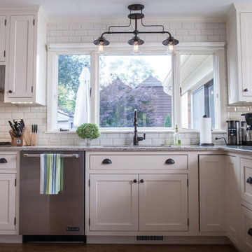
The kitchen in this 1950’s home needed a complete overhaul. It was dark, outdated and inefficient.
The homeowners wanted to give the space a modern feel without losing the 50’s vibe that is consistent throughout the rest of the home.
The homeowner’s needs included:
- Working within a fixed space, though reconfiguring or moving walls was okay
- Incorporating work space for two chefs
- Creating a mudroom
- Maintaining the existing laundry chute
- A concealed trash receptacle
The new kitchen makes use of every inch of space. To maximize counter and cabinet space, we closed in a second exit door and removed a wall between the kitchen and family room. This allowed us to create two L shaped workspaces and an eat-in bar space. A new mudroom entrance was gained by capturing space from an existing closet next to the main exit door.
The industrial lighting fixtures and wrought iron hardware bring a modern touch to this retro space. Inset doors on cabinets and beadboard details replicate details found throughout the rest of this 50’s era house.
 Clawson Architects, LLC
Humble and unassuming, this small cottage was built in 1960 for one of the children of the adjacent mansions. This well sited two bedroom cape is nestled into the landscape on a small brook. The owners a young couple with two little girls called us about expanding their screened porch to take advantage of this feature. The clients shifted their priorities when the existing roof began to leak and the area of the screened porch was deemed to require NJDEP review and approval.
When asked to help with replacing the roof, we took a chance and sketched out the possibilities for expanding and reshaping the roof of the home while maintaining the existing ridge beam to create a master suite with private bathroom and walk in closet from the one large existing master bedroom and two additional bedrooms and a home office from the other bedroom.
The design elements like deeper overhangs, the double brackets and the curving walls from the gable into the center shed roof help create an animated façade with shade and shadow. The house maintains its quiet presence on the block…it has a new sense of pride on the block as the AIA NJ NS Gold Medal Winner for design Excellence!
 Katie Hutchison Studio
With two small children and a third on the way, the owners of an original eighteenth century Cape were quickly out-growing it, but they had no desire to move away from the Cape Cod home and location they loved. They simply needed a reconfigured layout and more space. Their goals included repurposing some existing rooms, adding a new kitchen/family area plus screen porch on the first level, and creating a master suite and roof deck with an outdoor shower on the second level, connected by a new stair.
Our challenge was to improve the flow between existing spaces, and design the two-story addition without overwhelming the pint-sized original Cape. We took advantage of the lower grade at the rear of the property to step the first floor of the addition down two steps from the existing main level. This allowed us to align the second floor in the addition with the existing second floor, while gaining ceiling height in the new first-floor kitchen/family area. We composed a cross-gabled form for the addition to improve the second floor headroom, while maintaining the existing eave line. We then extended some existing shed dormers to gain headroom and enhance function. We also expanded the outdoor living area with privacy walls along the roof deck.
New, larger, double–hung windows that match the lite configuration of the existing windows, along with new side-wall shingles and trim which resemble the existing exterior treatment help to tie the new addition to the old Cape. Though there’s no mistaking the new for the old, the two are simpatico.
Katie Hutchison Studio collaborated with Geoffrey Koper Architect of Yarmouth Port, Mass. on the Yarmouth Port Antique Cape Renovation and Addition. Kitchen fit-out and interior finishes, fixtures, and furnishings by others.
photo by Katie Hutchison
 Katie Hutchison Studio
With two small children and a third on the way, the owners of an original eighteenth century Cape were quickly out-growing it, but they had no desire to move away from the Cape Cod home and location they loved. They simply needed a reconfigured layout and more space. Their goals included repurposing some existing rooms, adding a new kitchen/family area plus screen porch on the first level, and creating a master suite and roof deck with an outdoor shower on the second level, connected by a new stair.
Our challenge was to improve the flow between existing spaces, and design the two-story addition without overwhelming the pint-sized original Cape. We took advantage of the lower grade at the rear of the property to step the first floor of the addition down two steps from the existing main level. This allowed us to align the second floor in the addition with the existing second floor, while gaining ceiling height in the new first-floor kitchen/family area. We composed a cross-gabled form for the addition to improve the second floor headroom, while maintaining the existing eave line. We then extended some existing shed dormers to gain headroom and enhance function. We also expanded the outdoor living area with privacy walls along the roof deck.
New, larger, double–hung windows that match the lite configuration of the existing windows, along with new side-wall shingles and trim which resemble the existing exterior treatment help to tie the new addition to the old Cape. Though there’s no mistaking the new for the old, the two are simpatico.
Katie Hutchison Studio collaborated with Geoffrey Koper Architect of Yarmouth Port, Mass. on the Yarmouth Port Antique Cape Renovation and Addition. Kitchen fit-out and interior finishes, fixtures, and furnishings by others.
photo by Katie Hutchison
Sponsored
Sunbury, OH

J.Holderby - Renovations
Franklin County's Leading General Contractors - 2X Best of Houzz!
 VMI architecture
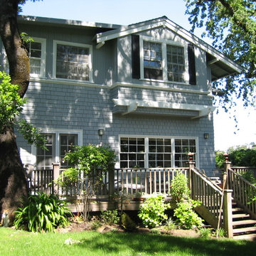
Existing home was a 1906 vintage 2 story shingled home with a wonderful yard shaded by 7 magnificent century old oak trees. The challenge was to maintain the existing charm and street appeal while updating and expanding the home for 21st century life. Remodel included new Kitchen and remodeled second story bedrooms and bathrooms. A family room, bath room and additional office/ bedroom was added between the main home and existing garage. The exterior of the addition, as well as the remodeled area of the existing home, were designed to complement the original shingle style design. The overall result created the perfect setting for relaxed living and gracious entertaining.
 Drury Design
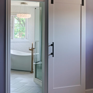
The original idea was to update the tile floor and the tub. That’s it.
A further discussion of wants and needs revealed intentions for an eventual larger shower and an improved vanity storage. It made sense to map out the possibilities and design our update with potential next steps in mind. The process was exciting, ultimately leading to the decision to do a full primary bath remodel.
Design Objectives:
-Maintain existing locations for all major bathroom functions
-Make the shower larger and more open
-Use luxurious materials throughout
-Improve vanity storage and define accessories for specific items
-Incorporate luxury shower fixtures
-Include the latest technology
Design Challenges
-Enlarging the shower in a typical rectangular shape would block the view and light from the alcove windows behind the tub
-Logical placement of the built-in shower caddy and all shower components in accordance with how and where they were to be used
-Keeping the long, back wall free from any shower modules to maintain the decorative tile design
-Combining the owner’s existing smart home system with a comprehensive shower system
-Planning cabinetry for hidden storage and use for various small appliances and make-up
-Integrating expensive shower wall tile with less expensive wall tile for aesthetic and budget purposes
-Incorporating special design features to balance the highly decorative shower tile
Design solutions:
-A clipped corner was planned for the shower bench seat – this allowed for a larger glass wall. The glass wall at the angled bench also brought more natural light into the shower
-Thoughtful shower space design prevented the crowding of features – the shower caddy and handheld shower head were placed on the full-height wall by the shower bench, the regular shower head and body sprays remained on the opposite wall, and the rain head was placed in the center of the shower
-A multi-port DTV system was installed, providing control of all shower components, including chromotherapy and music inside and outside the shower
-The lavish water-jet stone and glass decorative tile was paired with a less-expensive glass tile found in the mosaic
-Pull-out grooming organizers and electrical docking stations were incorporated into the cabinetry
Additional storage was created in the lower corner cabinet
The homeowners are thrilled with their new primary bathroom. Clear goals and carefully evaluated materials informed a fun and functional design that is both thoughtful and sumptuous!
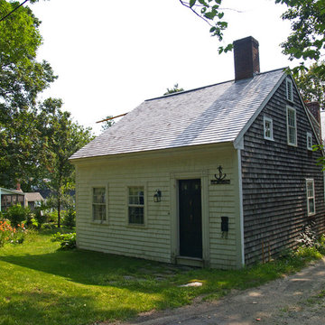 Katie Hutchison Studio
With two small children and a third on the way, the owners of an original eighteenth century Cape were quickly out-growing it, but they had no desire to move away from the Cape Cod home and location they loved. They simply needed a reconfigured layout and more space. Their goals included repurposing some existing rooms, adding a new kitchen/family area plus screen porch on the first level, and creating a master suite and roof deck with an outdoor shower on the second level, connected by a new stair.
Our challenge was to improve the flow between existing spaces, and design the two-story addition without overwhelming the pint-sized original Cape. We took advantage of the lower grade at the rear of the property to step the first floor of the addition down two steps from the existing main level. This allowed us to align the second floor in the addition with the existing second floor, while gaining ceiling height in the new first-floor kitchen/family area. We composed a cross-gabled form for the addition to improve the second floor headroom, while maintaining the existing eave line. We then extended some existing shed dormers to gain headroom and enhance function. We also expanded the outdoor living area with privacy walls along the roof deck.
New, larger, double–hung windows that match the lite configuration of the existing windows, along with new side-wall shingles and trim which resemble the existing exterior treatment help to tie the new addition to the old Cape. Though there’s no mistaking the new for the old, the two are simpatico.
Katie Hutchison Studio collaborated with Geoffrey Koper Architect of Yarmouth Port, Mass. on the Yarmouth Port Antique Cape Renovation and Addition. Kitchen fit-out and interior finishes, fixtures, and furnishings by others.
photo by Katie Hutchison
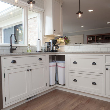 Thompson Remodeling
The kitchen in this 1950’s home needed a complete overhaul. It was dark, outdated and inefficient.
The homeowners wanted to give the space a modern feel without losing the 50’s vibe that is consistent throughout the rest of the home.
The homeowner’s needs included:
- Working within a fixed space, though reconfiguring or moving walls was okay
- Incorporating work space for two chefs
- Creating a mudroom
- Maintaining the existing laundry chute
- A concealed trash receptacle
The new kitchen makes use of every inch of space. To maximize counter and cabinet space, we closed in a second exit door and removed a wall between the kitchen and family room. This allowed us to create two L shaped workspaces and an eat-in bar space. A new mudroom entrance was gained by capturing space from an existing closet next to the main exit door.
The industrial lighting fixtures and wrought iron hardware bring a modern touch to this retro space. Inset doors on cabinets and beadboard details replicate details found throughout the rest of this 50’s era house.

Sponsored
Columbus, OH
Hope Restoration & General Contracting
Columbus Design-Build, Kitchen & Bath Remodeling, Historic Renovations
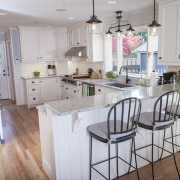 Thompson Remodeling
The kitchen in this 1950’s home needed a complete overhaul. It was dark, outdated and inefficient.
The homeowners wanted to give the space a modern feel without losing the 50’s vibe that is consistent throughout the rest of the home.
The homeowner’s needs included:
- Working within a fixed space, though reconfiguring or moving walls was okay
- Incorporating work space for two chefs
- Creating a mudroom
- Maintaining the existing laundry chute
- A concealed trash receptacle
The new kitchen makes use of every inch of space. To maximize counter and cabinet space, we closed in a second exit door and removed a wall between the kitchen and family room. This allowed us to create two L shaped workspaces and an eat-in bar space. A new mudroom entrance was gained by capturing space from an existing closet next to the main exit door.
The industrial lighting fixtures and wrought iron hardware bring a modern touch to this retro space. Inset doors on cabinets and beadboard details replicate details found throughout the rest of this 50’s era house.
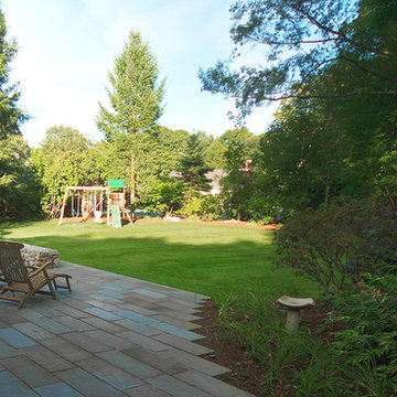
 C2 | Studio Landscape Architecture
This project was a portion of a larger remodeling of a classic mid-century deck house in Weston, MA. The primary areas of focus for the landscape were an interior courtyard and rear terrace, both of which were overgrown and unused. In order to keep within budget limitations, our strategy consisted largely of editing the existing plants on site and reusing the best ones, maintaining existing groupings where appropriate. In keeping with the arts and crafts style of the home with its exposed beams and attention to detail, we implemented a simpler palette of rich materials with well-articulated detailing for a more pared-down contemporary aesthetic.
Scott Carman
 Katie Hutchison Studio
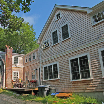
With two small children and a third on the way, the owners of an original eighteenth century Cape were quickly out-growing it, but they had no desire to move away from the Cape Cod home and location they loved. They simply needed a reconfigured layout and more space. Their goals included repurposing some existing rooms, adding a new kitchen/family area plus screen porch on the first level, and creating a master suite and roof deck with an outdoor shower on the second level, connected by a new stair.
Our challenge was to improve the flow between existing spaces, and design the two-story addition without overwhelming the pint-sized original Cape. We took advantage of the lower grade at the rear of the property to step the first floor of the addition down two steps from the existing main level. This allowed us to align the second floor in the addition with the existing second floor, while gaining ceiling height in the new first-floor kitchen/family area. We composed a cross-gabled form for the addition to improve the second floor headroom, while maintaining the existing eave line. We then extended some existing shed dormers to gain headroom and enhance function. We also expanded the outdoor living area with privacy walls along the roof deck.
New, larger, double–hung windows that match the lite configuration of the existing windows, along with new side-wall shingles and trim which resemble the existing exterior treatment help to tie the new addition to the old Cape. Though there’s no mistaking the new for the old, the two are simpatico.
Katie Hutchison Studio collaborated with Geoffrey Koper Architect of Yarmouth Port, Mass. on the Yarmouth Port Antique Cape Renovation and Addition. Kitchen fit-out and interior finishes, fixtures, and furnishings by others.
photo by Katie Hutchison
7