
Search results for "Maintaining existing" in Home Design Ideas
 Klopf Architecture
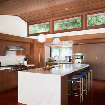
Nestled in the hills of Orinda, California, this 1951 residence is one of only seven extant homes, now known as “The Magnificent Seven”, designed by architect Olof Dahlstrand, a protégé of Frank Lloyd Wright. With its low-slung rooflines, natural materials, and deep integration with the sloping landscape, the home is a pristine example of mid-century modern design inspired by Wright’s organic principles. Over the years, prior homeowners have emphasized preservation, ensuring that the house remained relatively untouched. Each owner has respected the original architecture and stayed true to Dahlstrand’s intent. When a family of five—two college-aged sons and a middle school-aged daughter—acquired the property, they were captivated by its history, legacy of care, and architectural significance. While they appreciated Dahlstrand’s original vision, they also recognized the need to adapt the home for contemporary living while preserving its design integrity.
The remodel was conceived as a thoughtful response to the past—an effort to bring the house into the 21st century without compromising its soul. The primary mandate was to maintain architectural continuity while improving the functionality, comfort, and livability for a modern family. The design team—architects and contractor alike—worked with a shared reverence for the original architecture, allowing that mindset to guide even the most technical or pragmatic decisions.
A key objective was to increase natural light in the kitchen—a departure from Wrightian principles of enclosed, intimate cooking spaces—while maintaining the home’s architectural language. The kitchen was reconfigured to foster a stronger connection to adjacent living spaces while retaining the underlying concept of spatial separation. One of the most transformative architectural changes was the removal of a ridge beam that was originally planned to remain visible through the kitchen. During construction, the team collaborated on a better solution: a wide-flanged steel beam concealed within the roof envelope. This subtle move preserved the clean lines and ceiling continuity, a modern update carried out with utmost respect for the existing framework.
The home’s original powder room, previously accessible only through the kitchen, was relocated for better flow and privacy. A new powder room was carved out of former kitchen cabinetry—a narrow, interior space that could have felt dark and enclosed. To avoid this, the design extended the line of original transom windows into the new powder room and added a skylight above the vanity. The result is a bright and airy space that feels consistent with the rest of the home. Other updates included the installation of new solid-core interior doors with veneers carefully matched to the original mahogany, enhancing the continuity of the interiors. Even smaller decisions, such as placing the door knobs at 42 inches high, mirrored the original proportions. Every choice reflected a shared belief between the architect, contractor, and client: that new work should serve the integrity of the old.
The home’s extensive interior redwood millwork and paneling was meticulously restored. Where new materials were introduced—such as the replacement redwood soffit paneling—the contractor took pains to find finish nails that matched the original, rather than using modern equivalents. This level of craftsmanship and collaboration defined the project. It extended even to the detailing of a blind door to the new powder room, which had to disappear into the existing redwood board-and-batten wall. It was a team effort: the owner found a suitable handle, the architects devised the custom in-swing mechanism, and the contractor executed it so the door aligned precisely with the battens. Throughout, the homeowners were deeply engaged in the design process. One, a meticulous design enthusiast, focused on aesthetic integrity and historic detail. The other brought a practical and function-driven perspective, ensuring that new fixtures and materials would be durable and require minimal maintenance.
While the home’s location posed no major site challenges, sustainability was a key concern. The team upgraded the roof insulation, installed solar panels with battery storage, and added ductless mini-split cooling systems. Lighting was another area where modern technology was woven into a historic framework: new square LED fixtures echo the original custom perimeter soffit lights, maintaining the design language while offering advanced performance.
A planned expansion of a bedroom into suite with a bathroom had to be shelved due to budget constraints and the high cost of below-grade foundation work. Still, the team focused their efforts on making the most of the existing footprint, resolving constraints through design ingenuity rather than adding square footage. This renovation represents a collaborative achievement in preserving and evolving a historically significant home. Every decision was shaped by a shared ethos among clients, architects, and contractor: to maintain the home’s architectural soul while updating it for contemporary life. The result is a timeless modernist residence that continues Olof Dahlstrand’s legacy, remaining grounded in nature, craftsmanship, and human-scale design.
Klopf Architecture Team: John Klopf, AIA, Klara Kevane, Fernanda Bernardes
Interior Architectural Design: Klopf Architecture
Structural Engineer: Daniel Bastiao
Contractor: Don Larwood, Larwood Construction
Photography: Mariko Reed
Year Completed: 2022
 Drury Design
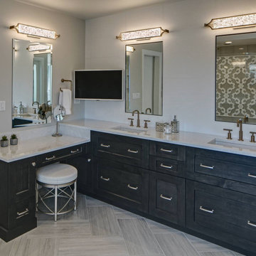
The original idea was to update the tile floor and the tub. That’s it.
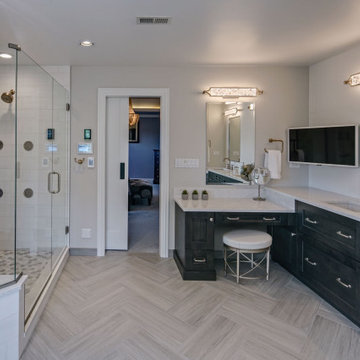
A further discussion of wants and needs revealed intentions for an eventual larger shower and an improved vanity storage. It made sense to map out the possibilities and design our update with potential next steps in mind. The process was exciting, ultimately leading to the decision to do a full primary bath remodel.
Design Objectives:
-Maintain existing locations for all major bathroom functions
-Make the shower larger and more open
-Use luxurious materials throughout
-Improve vanity storage and define accessories for specific items
-Incorporate luxury shower fixtures
-Include the latest technology
Design Challenges
-Enlarging the shower in a typical rectangular shape would block the view and light from the alcove windows behind the tub
-Logical placement of the built-in shower caddy and all shower components in accordance with how and where they were to be used
-Keeping the long, back wall free from any shower modules to maintain the decorative tile design
-Combining the owner’s existing smart home system with a comprehensive shower system
-Planning cabinetry for hidden storage and use for various small appliances and make-up
-Integrating expensive shower wall tile with less expensive wall tile for aesthetic and budget purposes
-Incorporating special design features to balance the highly decorative shower tile
Design solutions:
-A clipped corner was planned for the shower bench seat – this allowed for a larger glass wall. The glass wall at the angled bench also brought more natural light into the shower
-Thoughtful shower space design prevented the crowding of features – the shower caddy and handheld shower head were placed on the full-height wall by the shower bench, the regular shower head and body sprays remained on the opposite wall, and the rain head was placed in the center of the shower
-A multi-port DTV system was installed, providing control of all shower components, including chromotherapy and music inside and outside the shower
-The lavish water-jet stone and glass decorative tile was paired with a less-expensive glass tile found in the mosaic
-Pull-out grooming organizers and electrical docking stations were incorporated into the cabinetry
Additional storage was created in the lower corner cabinet
The homeowners are thrilled with their new primary bathroom. Clear goals and carefully evaluated materials informed a fun and functional design that is both thoughtful and sumptuous!
 Point B Design Group
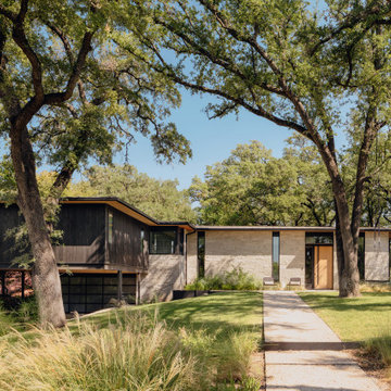
The goal of the Bridle Path Residence was to create a modern take on the original 1950’s split level and leverage multi-functional spaces to minimize the required square footage and maximize daily use of each space. The result is a 2800 SF 3-bedroom, 3.5-bathroom residence with a detached 400 SF ADU. Both structures are the result of strategic additional square footage and a bold yet edited material palette. Conservative sleeping quarters are juxtaposed by spacious common living and entertaining areas. Thoughtfully placed windows allow light without sacrificing privacy. The homeowners wanted to maintain the outdoor space but add some breathing room to the interiors. The existing carport was used to add the bulk of the additional space while the footprint on the main house and ADU were extended as minimally as possible to reduce impervious impacts and maintain existing topography. Interior spaces are designed to encourage family time and push activity outside. The process was collaboration in its purest form between architect, client and contractor.
Find the right local pro for your project
 Benjamin Construction
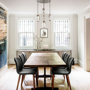
The team worked to maintain several existing details at the property. They added a gas fireplace insert after removing the original fireplace surround and mantle, refurbished the marble, and then reinstalled it.
Another existing architectural element to maintain was the original plaster crown moulding which had to be removed in sections and reinstalled after moving and incorporating double pocket doors into a structural wall.
 Drury Design
The Setup
For this primary bathroom project, the homeowners sought to transform their outdated, beige-toned space into a bright, functional sanctuary. The existing bathroom felt cramped and lifeless, with a small shower and limited storage options. The goal was to create a fresh, updated bathroom that maximizes the existing footprint while addressing specific desires for a more open, organized space with timeless materials.
Design objectives:
Brighten the bathroom and eliminate the dated beige color scheme
Install a freestanding tub in a compact space
Create a larger, more open shower without encroaching on the existing foot print too much
Incorporate hidden storage solutions
Maintain the existing bathroom layout while improving functionality
Update lighting and fixtures to create a contemporary feel
The Remodel
Design challenges to be solved:
- Compact Space Utilization – The small bathroom required careful planning to accommodate a freestanding tub while maintaining functionality and avoiding overcrowding.
- Hidden Storage Integration – The clients wanted a discreet hamper solution that wouldn’t clutter the limited floor space.
- Shower Niche Placement – With plumbing limitations and the clients’ desire to preserve their wavy accent tile wall, finding the perfect niche spot became a creative puzzle.
- Tile and Finish Coordination – Selecting complementary white tile and floor materials that worked harmoniously together.
- Larger Shower Space – Make the shower feel more open and brighter
The Renewed Space
Design solutions:
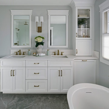
- Strategic Tub Placement – The freestanding tub was carefully positioned to maximize space, with its faucet strategically placed to allow easy access while preserving walking room. We reduced the counter depth just a bit by the tub, allowing more room for hamper cabinet and window access.
- Concealed Hamper Storage – A custom pull-out hamper was integrated into the vanity (right side, by tub), providing discreet storage within an 18-inch depth constraint.
- Shower Plumbing Wall Niche – We shifted the niche left, just enough to work around the plumbing infrastructure and still score a roomy storage spot that looks intentional.
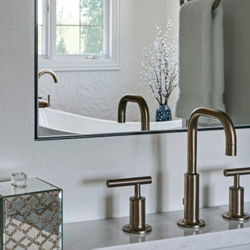
- Sophisticated Selections – Porcelanosa curvy white tile, Kohler brushed gold fixtures, and a neutral grey tile floor created a simple, timeless aesthetic that will be loved years to come.
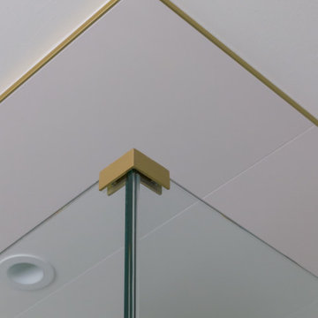
- Open Shower – Replacing the side wall with a clear glass surround, continuing the tile on the ceiling and extending the footprint opened up this area to the room while allowing more natural lighting into the shower space.
This bathroom transformation shows how thoughtful design turns challenges into opportunities. Brushed gold fixtures add warmth to the fresh white palette, while the perfectly balanced floor tile brings just the right depth. A partially glass-fronted vanity introduces subtle charm, giving the space a unique edge. Once cramped and outdated, this bathroom now feels bright, spacious, and serene—a testament to how every design detail makes a difference.
 Drury Design
The original idea was to update the tile floor and the tub. That’s it.
A further discussion of wants and needs revealed intentions for an eventual larger shower and an improved vanity storage. It made sense to map out the possibilities and design our update with potential next steps in mind. The process was exciting, ultimately leading to the decision to do a full primary bath remodel.
Design Objectives:
-Maintain existing locations for all major bathroom functions
-Make the shower larger and more open
-Use luxurious materials throughout
-Improve vanity storage and define accessories for specific items
-Incorporate luxury shower fixtures
-Include the latest technology
Design Challenges
-Enlarging the shower in a typical rectangular shape would block the view and light from the alcove windows behind the tub
-Logical placement of the built-in shower caddy and all shower components in accordance with how and where they were to be used
-Keeping the long, back wall free from any shower modules to maintain the decorative tile design
-Combining the owner’s existing smart home system with a comprehensive shower system
-Planning cabinetry for hidden storage and use for various small appliances and make-up
-Integrating expensive shower wall tile with less expensive wall tile for aesthetic and budget purposes
-Incorporating special design features to balance the highly decorative shower tile
Design solutions:
-A clipped corner was planned for the shower bench seat – this allowed for a larger glass wall. The glass wall at the angled bench also brought more natural light into the shower
-Thoughtful shower space design prevented the crowding of features – the shower caddy and handheld shower head were placed on the full-height wall by the shower bench, the regular shower head and body sprays remained on the opposite wall, and the rain head was placed in the center of the shower
-A multi-port DTV system was installed, providing control of all shower components, including chromotherapy and music inside and outside the shower
-The lavish water-jet stone and glass decorative tile was paired with a less-expensive glass tile found in the mosaic
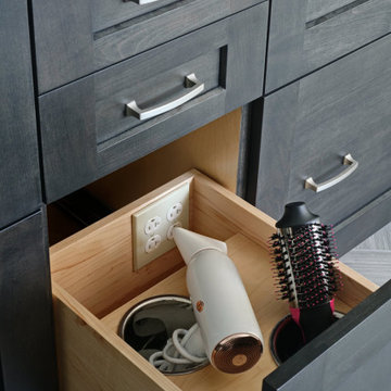
-Pull-out grooming organizers and electrical docking stations were incorporated into the cabinetry
Additional storage was created in the lower corner cabinet
The homeowners are thrilled with their new primary bathroom. Clear goals and carefully evaluated materials informed a fun and functional design that is both thoughtful and sumptuous!
 Drury Design
The original idea was to update the tile floor and the tub. That’s it.
A further discussion of wants and needs revealed intentions for an eventual larger shower and an improved vanity storage. It made sense to map out the possibilities and design our update with potential next steps in mind. The process was exciting, ultimately leading to the decision to do a full primary bath remodel.
Design Objectives:
-Maintain existing locations for all major bathroom functions
-Make the shower larger and more open
-Use luxurious materials throughout
-Improve vanity storage and define accessories for specific items
-Incorporate luxury shower fixtures
-Include the latest technology
Design Challenges
-Enlarging the shower in a typical rectangular shape would block the view and light from the alcove windows behind the tub
-Logical placement of the built-in shower caddy and all shower components in accordance with how and where they were to be used
-Keeping the long, back wall free from any shower modules to maintain the decorative tile design
-Combining the owner’s existing smart home system with a comprehensive shower system
-Planning cabinetry for hidden storage and use for various small appliances and make-up
-Integrating expensive shower wall tile with less expensive wall tile for aesthetic and budget purposes
-Incorporating special design features to balance the highly decorative shower tile
Design solutions:
-A clipped corner was planned for the shower bench seat – this allowed for a larger glass wall. The glass wall at the angled bench also brought more natural light into the shower
-Thoughtful shower space design prevented the crowding of features – the shower caddy and handheld shower head were placed on the full-height wall by the shower bench, the regular shower head and body sprays remained on the opposite wall, and the rain head was placed in the center of the shower
-A multi-port DTV system was installed, providing control of all shower components, including chromotherapy and music inside and outside the shower
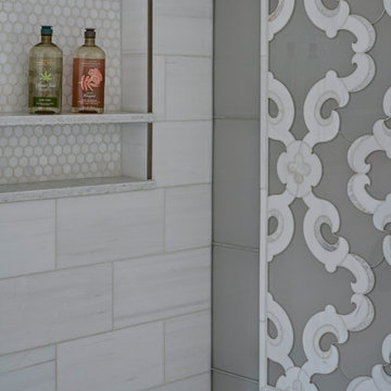
-The lavish water-jet stone and glass decorative tile was paired with a less-expensive glass tile found in the mosaic
-Pull-out grooming organizers and electrical docking stations were incorporated into the cabinetry
Additional storage was created in the lower corner cabinet
The homeowners are thrilled with their new primary bathroom. Clear goals and carefully evaluated materials informed a fun and functional design that is both thoughtful and sumptuous!
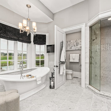
Sponsored
Sunbury, OH

J.Holderby - Renovations
Franklin County's Leading General Contractors - 2X Best of Houzz!
 Katie Hutchison Studio
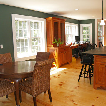
With two small children and a third on the way, the owners of an original eighteenth century Cape were quickly out-growing it, but they had no desire to move away from the Cape Cod home and location they loved. They simply needed a reconfigured layout and more space. Their goals included repurposing some existing rooms, adding a new kitchen/family area plus screen porch on the first level, and creating a master suite and roof deck with an outdoor shower on the second level, connected by a new stair.
Our challenge was to improve the flow between existing spaces, and design the two-story addition without overwhelming the pint-sized original Cape. We took advantage of the lower grade at the rear of the property to step the first floor of the addition down two steps from the existing main level. This allowed us to align the second floor in the addition with the existing second floor, while gaining ceiling height in the new first-floor kitchen/family area. We composed a cross-gabled form for the addition to improve the second floor headroom, while maintaining the existing eave line. We then extended some existing shed dormers to gain headroom and enhance function. We also expanded the outdoor living area with privacy walls along the roof deck.
New, larger, double–hung windows that match the lite configuration of the existing windows, along with new side-wall shingles and trim which resemble the existing exterior treatment help to tie the new addition to the old Cape. Though there’s no mistaking the new for the old, the two are simpatico.
Katie Hutchison Studio collaborated with Geoffrey Koper Architect of Yarmouth Port, Mass. on the Yarmouth Port Antique Cape Renovation and Addition. Kitchen fit-out and interior finishes, fixtures, and furnishings by others.
photo by Katie Hutchison
 Drury Design
The Setup
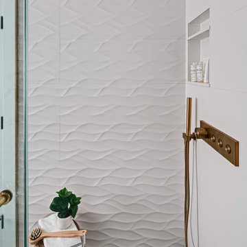
For this primary bathroom project, the homeowners sought to transform their outdated, beige-toned space into a bright, functional sanctuary. The existing bathroom felt cramped and lifeless, with a small shower and limited storage options. The goal was to create a fresh, updated bathroom that maximizes the existing footprint while addressing specific desires for a more open, organized space with timeless materials.
Design objectives:
Brighten the bathroom and eliminate the dated beige color scheme
Install a freestanding tub in a compact space
Create a larger, more open shower without encroaching on the existing foot print too much
Incorporate hidden storage solutions
Maintain the existing bathroom layout while improving functionality
Update lighting and fixtures to create a contemporary feel
The Remodel
Design challenges to be solved:
- Compact Space Utilization – The small bathroom required careful planning to accommodate a freestanding tub while maintaining functionality and avoiding overcrowding.
- Hidden Storage Integration – The clients wanted a discreet hamper solution that wouldn’t clutter the limited floor space.
- Shower Niche Placement – With plumbing limitations and the clients’ desire to preserve their wavy accent tile wall, finding the perfect niche spot became a creative puzzle.
- Tile and Finish Coordination – Selecting complementary white tile and floor materials that worked harmoniously together.
- Larger Shower Space – Make the shower feel more open and brighter
The Renewed Space
Design solutions:
- Strategic Tub Placement – The freestanding tub was carefully positioned to maximize space, with its faucet strategically placed to allow easy access while preserving walking room. We reduced the counter depth just a bit by the tub, allowing more room for hamper cabinet and window access.
- Concealed Hamper Storage – A custom pull-out hamper was integrated into the vanity (right side, by tub), providing discreet storage within an 18-inch depth constraint.
- Shower Plumbing Wall Niche – We shifted the niche left, just enough to work around the plumbing infrastructure and still score a roomy storage spot that looks intentional.
- Sophisticated Selections – Porcelanosa curvy white tile, Kohler brushed gold fixtures, and a neutral grey tile floor created a simple, timeless aesthetic that will be loved years to come.
- Open Shower – Replacing the side wall with a clear glass surround, continuing the tile on the ceiling and extending the footprint opened up this area to the room while allowing more natural lighting into the shower space.
This bathroom transformation shows how thoughtful design turns challenges into opportunities. Brushed gold fixtures add warmth to the fresh white palette, while the perfectly balanced floor tile brings just the right depth. A partially glass-fronted vanity introduces subtle charm, giving the space a unique edge. Once cramped and outdated, this bathroom now feels bright, spacious, and serene—a testament to how every design detail makes a difference.
 Living with Lolo
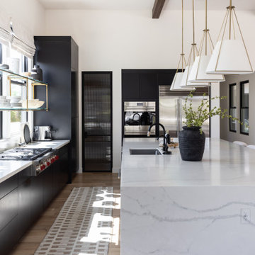
Kitchen in Bronco Revival | Key Feature: A warm, masculine, family-friendly Scottsdale home refresh designed to function as both a lived-in family space and a design showroom, blending current trends with timeless style.
Challenge: The main challenge was maintaining a cohesive design while replacing underperforming elements from a previous installation, all within an existing architectural framework. Additional hurdles included sourcing pieces that worked with existing furniture, finding properly scaled rugs for large North Scottsdale rooms, ensuring correct counter stool height for a substantial 3-inch stone slab island, and coordinating the timeline around photography/videography schedules and local contractor availability.
Solution: We approached the refresh strategically by preserving the strongest existing elements while updating key furnishings and finishes to create a warmer, more sophisticated look. New vendor relationships and products were tested before specifying for broader client use, while all selections prioritized durability for an active family lifestyle. Timeline flexibility became a creative advantage, allowing for an unconventional beam wallpaper application that ultimately became a signature design moment. Our construction management ensured seamless coordination across trades throughout the Scottsdale area.
Materials:
Moss Studio- Sofa + Pillows |
Coffee tables by MadeGoods: Davion Coffee Tables – sculptural mango wood with rich texture |
Performance rugs by Loloi: High-traffic wool construction perfect for pets and children |
Custom drapery fabric by Schumacher: Premium textiles maintaining original custom window treatments |
Drapery hardware by Hesler Brothers |
Palmer Industries - |
Sun Lighting - Chandeliers, Table Lamps, Pendants |
Budget ($ Range): $75-$100K |
Timeline (Duration): 3 months
 Drury Design
The Setup
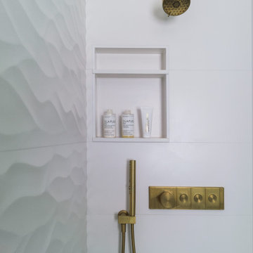
For this primary bathroom project, the homeowners sought to transform their outdated, beige-toned space into a bright, functional sanctuary. The existing bathroom felt cramped and lifeless, with a small shower and limited storage options. The goal was to create a fresh, updated bathroom that maximizes the existing footprint while addressing specific desires for a more open, organized space with timeless materials.
Design objectives:
Brighten the bathroom and eliminate the dated beige color scheme
Install a freestanding tub in a compact space
Create a larger, more open shower without encroaching on the existing foot print too much
Incorporate hidden storage solutions
Maintain the existing bathroom layout while improving functionality
Update lighting and fixtures to create a contemporary feel
The Remodel
Design challenges to be solved:
- Compact Space Utilization – The small bathroom required careful planning to accommodate a freestanding tub while maintaining functionality and avoiding overcrowding.
- Hidden Storage Integration – The clients wanted a discreet hamper solution that wouldn’t clutter the limited floor space.
- Shower Niche Placement – With plumbing limitations and the clients’ desire to preserve their wavy accent tile wall, finding the perfect niche spot became a creative puzzle.
- Tile and Finish Coordination – Selecting complementary white tile and floor materials that worked harmoniously together.
- Larger Shower Space – Make the shower feel more open and brighter
The Renewed Space
Design solutions:
- Strategic Tub Placement – The freestanding tub was carefully positioned to maximize space, with its faucet strategically placed to allow easy access while preserving walking room. We reduced the counter depth just a bit by the tub, allowing more room for hamper cabinet and window access.
- Concealed Hamper Storage – A custom pull-out hamper was integrated into the vanity (right side, by tub), providing discreet storage within an 18-inch depth constraint.
- Shower Plumbing Wall Niche – We shifted the niche left, just enough to work around the plumbing infrastructure and still score a roomy storage spot that looks intentional.
- Sophisticated Selections – Porcelanosa curvy white tile, Kohler brushed gold fixtures, and a neutral grey tile floor created a simple, timeless aesthetic that will be loved years to come.
- Open Shower – Replacing the side wall with a clear glass surround, continuing the tile on the ceiling and extending the footprint opened up this area to the room while allowing more natural lighting into the shower space.
This bathroom transformation shows how thoughtful design turns challenges into opportunities. Brushed gold fixtures add warmth to the fresh white palette, while the perfectly balanced floor tile brings just the right depth. A partially glass-fronted vanity introduces subtle charm, giving the space a unique edge. Once cramped and outdated, this bathroom now feels bright, spacious, and serene—a testament to how every design detail makes a difference.
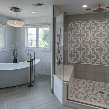 Drury Design
The original idea was to update the tile floor and the tub. That’s it.
A further discussion of wants and needs revealed intentions for an eventual larger shower and an improved vanity storage. It made sense to map out the possibilities and design our update with potential next steps in mind. The process was exciting, ultimately leading to the decision to do a full primary bath remodel.
Design Objectives:
-Maintain existing locations for all major bathroom functions
-Make the shower larger and more open
-Use luxurious materials throughout
-Improve vanity storage and define accessories for specific items
-Incorporate luxury shower fixtures
-Include the latest technology
Design Challenges
-Enlarging the shower in a typical rectangular shape would block the view and light from the alcove windows behind the tub
-Logical placement of the built-in shower caddy and all shower components in accordance with how and where they were to be used
-Keeping the long, back wall free from any shower modules to maintain the decorative tile design
-Combining the owner’s existing smart home system with a comprehensive shower system
-Planning cabinetry for hidden storage and use for various small appliances and make-up
-Integrating expensive shower wall tile with less expensive wall tile for aesthetic and budget purposes
-Incorporating special design features to balance the highly decorative shower tile
Design solutions:
-A clipped corner was planned for the shower bench seat – this allowed for a larger glass wall. The glass wall at the angled bench also brought more natural light into the shower
-Thoughtful shower space design prevented the crowding of features – the shower caddy and handheld shower head were placed on the full-height wall by the shower bench, the regular shower head and body sprays remained on the opposite wall, and the rain head was placed in the center of the shower
-A multi-port DTV system was installed, providing control of all shower components, including chromotherapy and music inside and outside the shower
-The lavish water-jet stone and glass decorative tile was paired with a less-expensive glass tile found in the mosaic
-Pull-out grooming organizers and electrical docking stations were incorporated into the cabinetry
Additional storage was created in the lower corner cabinet
The homeowners are thrilled with their new primary bathroom. Clear goals and carefully evaluated materials informed a fun and functional design that is both thoughtful and sumptuous!
 Katie Hutchison Studio
With two small children and a third on the way, the owners of an original eighteenth century Cape were quickly out-growing it, but they had no desire to move away from the Cape Cod home and location they loved. They simply needed a reconfigured layout and more space. Their goals included repurposing some existing rooms, adding a new kitchen/family area plus screen porch on the first level, and creating a master suite and roof deck with an outdoor shower on the second level, connected by a new stair.
Our challenge was to improve the flow between existing spaces, and design the two-story addition without overwhelming the pint-sized original Cape. We took advantage of the lower grade at the rear of the property to step the first floor of the addition down two steps from the existing main level. This allowed us to align the second floor in the addition with the existing second floor, while gaining ceiling height in the new first-floor kitchen/family area. We composed a cross-gabled form for the addition to improve the second floor headroom, while maintaining the existing eave line. We then extended some existing shed dormers to gain headroom and enhance function. We also expanded the outdoor living area with privacy walls along the roof deck.
New, larger, double–hung windows that match the lite configuration of the existing windows, along with new side-wall shingles and trim which resemble the existing exterior treatment help to tie the new addition to the old Cape. Though there’s no mistaking the new for the old, the two are simpatico.
Katie Hutchison Studio collaborated with Geoffrey Koper Architect of Yarmouth Port, Mass. on the Yarmouth Port Antique Cape Renovation and Addition. Kitchen fit-out and interior finishes, fixtures, and furnishings by others.
photo by Katie Hutchison

Sponsored
Columbus, OH

Hope Restoration & General Contracting
Columbus Design-Build, Kitchen & Bath Remodeling, Historic Renovations
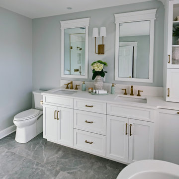 Drury Design
The Setup
For this primary bathroom project, the homeowners sought to transform their outdated, beige-toned space into a bright, functional sanctuary. The existing bathroom felt cramped and lifeless, with a small shower and limited storage options. The goal was to create a fresh, updated bathroom that maximizes the existing footprint while addressing specific desires for a more open, organized space with timeless materials.
Design objectives:
Brighten the bathroom and eliminate the dated beige color scheme
Install a freestanding tub in a compact space
Create a larger, more open shower without encroaching on the existing foot print too much
Incorporate hidden storage solutions
Maintain the existing bathroom layout while improving functionality
Update lighting and fixtures to create a contemporary feel
The Remodel
Design challenges to be solved:
- Compact Space Utilization – The small bathroom required careful planning to accommodate a freestanding tub while maintaining functionality and avoiding overcrowding.
- Hidden Storage Integration – The clients wanted a discreet hamper solution that wouldn’t clutter the limited floor space.
- Shower Niche Placement – With plumbing limitations and the clients’ desire to preserve their wavy accent tile wall, finding the perfect niche spot became a creative puzzle.
- Tile and Finish Coordination – Selecting complementary white tile and floor materials that worked harmoniously together.
- Larger Shower Space – Make the shower feel more open and brighter
The Renewed Space
Design solutions:
- Strategic Tub Placement – The freestanding tub was carefully positioned to maximize space, with its faucet strategically placed to allow easy access while preserving walking room. We reduced the counter depth just a bit by the tub, allowing more room for hamper cabinet and window access.
- Concealed Hamper Storage – A custom pull-out hamper was integrated into the vanity (right side, by tub), providing discreet storage within an 18-inch depth constraint.
- Shower Plumbing Wall Niche – We shifted the niche left, just enough to work around the plumbing infrastructure and still score a roomy storage spot that looks intentional.
- Sophisticated Selections – Porcelanosa curvy white tile, Kohler brushed gold fixtures, and a neutral grey tile floor created a simple, timeless aesthetic that will be loved years to come.
- Open Shower – Replacing the side wall with a clear glass surround, continuing the tile on the ceiling and extending the footprint opened up this area to the room while allowing more natural lighting into the shower space.
This bathroom transformation shows how thoughtful design turns challenges into opportunities. Brushed gold fixtures add warmth to the fresh white palette, while the perfectly balanced floor tile brings just the right depth. A partially glass-fronted vanity introduces subtle charm, giving the space a unique edge. Once cramped and outdated, this bathroom now feels bright, spacious, and serene—a testament to how every design detail makes a difference.
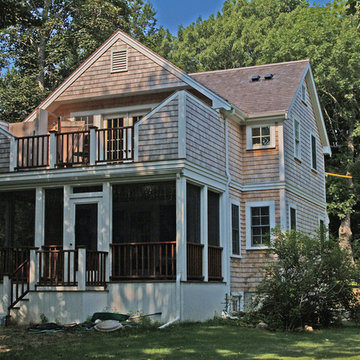 Katie Hutchison Studio
With two small children and a third on the way, the owners of an original eighteenth century Cape were quickly out-growing it, but they had no desire to move away from the Cape Cod home and location they loved. They simply needed a reconfigured layout and more space. Their goals included repurposing some existing rooms, adding a new kitchen/family area plus screen porch on the first level, and creating a master suite and roof deck with an outdoor shower on the second level, connected by a new stair.
Our challenge was to improve the flow between existing spaces, and design the two-story addition without overwhelming the pint-sized original Cape. We took advantage of the lower grade at the rear of the property to step the first floor of the addition down two steps from the existing main level. This allowed us to align the second floor in the addition with the existing second floor, while gaining ceiling height in the new first-floor kitchen/family area. We composed a cross-gabled form for the addition to improve the second floor headroom, while maintaining the existing eave line. We then extended some existing shed dormers to gain headroom and enhance function. We also expanded the outdoor living area with privacy walls along the roof deck.
New, larger, double–hung windows that match the lite configuration of the existing windows, along with new side-wall shingles and trim which resemble the existing exterior treatment help to tie the new addition to the old Cape. Though there’s no mistaking the new for the old, the two are simpatico.
Katie Hutchison Studio collaborated with Geoffrey Koper Architect of Yarmouth Port, Mass. on the Yarmouth Port Antique Cape Renovation and Addition. Kitchen fit-out and interior finishes, fixtures, and furnishings by others.
photo by Katie Hutchison
 Drury Design
The original idea was to update the tile floor and the tub. That’s it.
A further discussion of wants and needs revealed intentions for an eventual larger shower and an improved vanity storage. It made sense to map out the possibilities and design our update with potential next steps in mind. The process was exciting, ultimately leading to the decision to do a full primary bath remodel.
Design Objectives:
-Maintain existing locations for all major bathroom functions
-Make the shower larger and more open
-Use luxurious materials throughout
-Improve vanity storage and define accessories for specific items
-Incorporate luxury shower fixtures
-Include the latest technology
Design Challenges
-Enlarging the shower in a typical rectangular shape would block the view and light from the alcove windows behind the tub
-Logical placement of the built-in shower caddy and all shower components in accordance with how and where they were to be used
-Keeping the long, back wall free from any shower modules to maintain the decorative tile design
-Combining the owner’s existing smart home system with a comprehensive shower system
-Planning cabinetry for hidden storage and use for various small appliances and make-up
-Integrating expensive shower wall tile with less expensive wall tile for aesthetic and budget purposes
-Incorporating special design features to balance the highly decorative shower tile
Design solutions:
-A clipped corner was planned for the shower bench seat – this allowed for a larger glass wall. The glass wall at the angled bench also brought more natural light into the shower
-Thoughtful shower space design prevented the crowding of features – the shower caddy and handheld shower head were placed on the full-height wall by the shower bench, the regular shower head and body sprays remained on the opposite wall, and the rain head was placed in the center of the shower
-A multi-port DTV system was installed, providing control of all shower components, including chromotherapy and music inside and outside the shower
-The lavish water-jet stone and glass decorative tile was paired with a less-expensive glass tile found in the mosaic
-Pull-out grooming organizers and electrical docking stations were incorporated into the cabinetry
Additional storage was created in the lower corner cabinet
The homeowners are thrilled with their new primary bathroom. Clear goals and carefully evaluated materials informed a fun and functional design that is both thoughtful and sumptuous!
 Drury Design
The Setup
For this primary bathroom project, the homeowners sought to transform their outdated, beige-toned space into a bright, functional sanctuary. The existing bathroom felt cramped and lifeless, with a small shower and limited storage options. The goal was to create a fresh, updated bathroom that maximizes the existing footprint while addressing specific desires for a more open, organized space with timeless materials.
Design objectives:
Brighten the bathroom and eliminate the dated beige color scheme
Install a freestanding tub in a compact space
Create a larger, more open shower without encroaching on the existing foot print too much
Incorporate hidden storage solutions
Maintain the existing bathroom layout while improving functionality
Update lighting and fixtures to create a contemporary feel
The Remodel
Design challenges to be solved:
- Compact Space Utilization – The small bathroom required careful planning to accommodate a freestanding tub while maintaining functionality and avoiding overcrowding.
- Hidden Storage Integration – The clients wanted a discreet hamper solution that wouldn’t clutter the limited floor space.
- Shower Niche Placement – With plumbing limitations and the clients’ desire to preserve their wavy accent tile wall, finding the perfect niche spot became a creative puzzle.
- Tile and Finish Coordination – Selecting complementary white tile and floor materials that worked harmoniously together.
- Larger Shower Space – Make the shower feel more open and brighter
The Renewed Space
Design solutions:
- Strategic Tub Placement – The freestanding tub was carefully positioned to maximize space, with its faucet strategically placed to allow easy access while preserving walking room. We reduced the counter depth just a bit by the tub, allowing more room for hamper cabinet and window access.
- Concealed Hamper Storage – A custom pull-out hamper was integrated into the vanity (right side, by tub), providing discreet storage within an 18-inch depth constraint.
- Shower Plumbing Wall Niche – We shifted the niche left, just enough to work around the plumbing infrastructure and still score a roomy storage spot that looks intentional.
- Sophisticated Selections – Porcelanosa curvy white tile, Kohler brushed gold fixtures, and a neutral grey tile floor created a simple, timeless aesthetic that will be loved years to come.
- Open Shower – Replacing the side wall with a clear glass surround, continuing the tile on the ceiling and extending the footprint opened up this area to the room while allowing more natural lighting into the shower space.
This bathroom transformation shows how thoughtful design turns challenges into opportunities. Brushed gold fixtures add warmth to the fresh white palette, while the perfectly balanced floor tile brings just the right depth. A partially glass-fronted vanity introduces subtle charm, giving the space a unique edge. Once cramped and outdated, this bathroom now feels bright, spacious, and serene—a testament to how every design detail makes a difference.

Sponsored
Columbus, OH
Hope Restoration & General Contracting
Columbus Design-Build, Kitchen & Bath Remodeling, Historic Renovations
 Drury Design
The Setup
The homeowners of this Barrington Hills residence approached Drury Design with a clear vision: transform their existing kitchen into a space that would better serve their active family of four. With two young children who are homeschooled and love to bake with their mom, plus two dogs, this kitchen needed to function as the true heart of the home.
The existing kitchen was functional but didn’t maximize the potential of the beautiful natural light and scenic views available through the floor-to-ceiling windows. The space was locked between the dining room and family room, which limited structural modifications, but the homeowners wanted to create a more family-friendly environment that would complement the warm walnut built-ins and furnishings in the adjacent dining room while staying true to the home’s overall aesthetic.
Design Objectives:
Create a highly functional workspace that accommodates multiple family members cooking and gathering simultaneously
Maximize the connection to the beautiful outdoor scenery and natural light through thoughtful design choices
Establish a cohesive color palette that complements the existing walnut elements in the adjacent dining room without becoming too tone-on-tone (aka “matchy matchy”)
Improve the seating arrangement to take advantage of the stunning views (rather than facing away from the windows)
Work within the existing architectural constraints, including a curved soffit that could not be removed
Increase storage capacity while maintaining clean, uncluttered sightlines throughout the space
Design Challenges:
The curved soffit presented a design dilemma of whether to echo the curve throughout the kitchen or work with it in a more subtle way
The relatively low ceiling height required careful consideration to avoid making the space feel cramped or cave-like
The existing hardwood floor could not be refinished, which meant the new kitchen footprint had to match or exceed the original layout exactly
Finding the right balance of warm and neutral tones to complement both the existing walnut elements nearby and the natural outdoor views proved challenging
The refrigerator placement was constrained by door swing requirements, which affected the entire layout and prevented centering the sink on the back wall
Rethinking the original seating, which faced inward toward the kitchen (turning backs to the beautiful windows and outdoor views)
Pendant lighting from the previous kitchen obstructed views to the outdoors despite the abundant natural light available
The Renewed Space
Design Solutions:
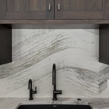
The curved soffit was embraced subtly through the full slab backsplash, which echoes the curve without requiring curved cabinetry or architectural elements that might feel forced
Low ceiling challenges were addressed by using lighter painted cabinets for some tall elements, including the double oven, pantries, and refrigerator area, creating an airy feel while reserving the darker stained walnut for the center section and island
The floor constraint was managed by designing the new layout to cover all previously unfinished areas while maintaining the exact footprint, with only minor touch-ups needed in a few areas
The color palette balances warm walnut stain (harmonizing with the dining room built-ins) with soft, neutral painted cabinets – avoiding stark white that wouldn’t complement the home’s warm aesthetic
Refrigerator placement was optimized with a slim pullout pantry to the left, allowing proper door clearance while maintaining the desired layout flow and enabling the main pantry to be positioned adjacently
The seating was completely reimagined with a built-in banquette facing the windows, allowing diners to enjoy the outdoor views while providing flexible seating for two to four people
Decorative pendant lighting was eliminated in favor of recessed can lights, preserving the unobstructed views to the beautiful outdoor scenery
This kitchen transformation demonstrates how thoughtful design can dramatically improve functionality for a busy family while honoring existing architectural elements. The children immediately began cooking and baking with their mother in the new space, and the window-facing banquette has become a favorite gathering spot where the family can enjoy both meals and the beautiful outdoor views.
 Drury Design
The original idea was to update the tile floor and the tub. That’s it.
A further discussion of wants and needs revealed intentions for an eventual larger shower and an improved vanity storage. It made sense to map out the possibilities and design our update with potential next steps in mind. The process was exciting, ultimately leading to the decision to do a full primary bath remodel.
Design Objectives:
-Maintain existing locations for all major bathroom functions
-Make the shower larger and more open
-Use luxurious materials throughout
-Improve vanity storage and define accessories for specific items
-Incorporate luxury shower fixtures
-Include the latest technology
Design Challenges
-Enlarging the shower in a typical rectangular shape would block the view and light from the alcove windows behind the tub
-Logical placement of the built-in shower caddy and all shower components in accordance with how and where they were to be used
-Keeping the long, back wall free from any shower modules to maintain the decorative tile design
-Combining the owner’s existing smart home system with a comprehensive shower system
-Planning cabinetry for hidden storage and use for various small appliances and make-up
-Integrating expensive shower wall tile with less expensive wall tile for aesthetic and budget purposes
-Incorporating special design features to balance the highly decorative shower tile
Design solutions:
-A clipped corner was planned for the shower bench seat – this allowed for a larger glass wall. The glass wall at the angled bench also brought more natural light into the shower
-Thoughtful shower space design prevented the crowding of features – the shower caddy and handheld shower head were placed on the full-height wall by the shower bench, the regular shower head and body sprays remained on the opposite wall, and the rain head was placed in the center of the shower
-A multi-port DTV system was installed, providing control of all shower components, including chromotherapy and music inside and outside the shower
-The lavish water-jet stone and glass decorative tile was paired with a less-expensive glass tile found in the mosaic
-Pull-out grooming organizers and electrical docking stations were incorporated into the cabinetry
Additional storage was created in the lower corner cabinet
The homeowners are thrilled with their new primary bathroom. Clear goals and carefully evaluated materials informed a fun and functional design that is both thoughtful and sumptuous!
 Drury Design
The Setup
For this primary bathroom project, the homeowners sought to transform their outdated, beige-toned space into a bright, functional sanctuary. The existing bathroom felt cramped and lifeless, with a small shower and limited storage options. The goal was to create a fresh, updated bathroom that maximizes the existing footprint while addressing specific desires for a more open, organized space with timeless materials.
Design objectives:
Brighten the bathroom and eliminate the dated beige color scheme
Install a freestanding tub in a compact space
Create a larger, more open shower without encroaching on the existing foot print too much
Incorporate hidden storage solutions
Maintain the existing bathroom layout while improving functionality
Update lighting and fixtures to create a contemporary feel
The Remodel
Design challenges to be solved:
- Compact Space Utilization – The small bathroom required careful planning to accommodate a freestanding tub while maintaining functionality and avoiding overcrowding.
- Hidden Storage Integration – The clients wanted a discreet hamper solution that wouldn’t clutter the limited floor space.
- Shower Niche Placement – With plumbing limitations and the clients’ desire to preserve their wavy accent tile wall, finding the perfect niche spot became a creative puzzle.
- Tile and Finish Coordination – Selecting complementary white tile and floor materials that worked harmoniously together.
- Larger Shower Space – Make the shower feel more open and brighter
The Renewed Space
Design solutions:
- Strategic Tub Placement – The freestanding tub was carefully positioned to maximize space, with its faucet strategically placed to allow easy access while preserving walking room. We reduced the counter depth just a bit by the tub, allowing more room for hamper cabinet and window access.
- Concealed Hamper Storage – A custom pull-out hamper was integrated into the vanity (right side, by tub), providing discreet storage within an 18-inch depth constraint.
- Shower Plumbing Wall Niche – We shifted the niche left, just enough to work around the plumbing infrastructure and still score a roomy storage spot that looks intentional.
- Sophisticated Selections – Porcelanosa curvy white tile, Kohler brushed gold fixtures, and a neutral grey tile floor created a simple, timeless aesthetic that will be loved years to come.
- Open Shower – Replacing the side wall with a clear glass surround, continuing the tile on the ceiling and extending the footprint opened up this area to the room while allowing more natural lighting into the shower space.
This bathroom transformation shows how thoughtful design turns challenges into opportunities. Brushed gold fixtures add warmth to the fresh white palette, while the perfectly balanced floor tile brings just the right depth. A partially glass-fronted vanity introduces subtle charm, giving the space a unique edge. Once cramped and outdated, this bathroom now feels bright, spacious, and serene—a testament to how every design detail makes a difference.
8