
Search results for "Maintaining existing" in Home Design Ideas
 Susan Yeley Homes
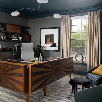
We honored the building’s history where possible, keeping original bones and character wherever possible, then layered in the clients’ distinct creative identity. On the main floor, we designed spaces that shift seamlessly from workday to reception-ready. Lighting was planned with intention, to preserve the original plaster ceilings and spotlight rotating installations without sacrificing ambient warmth. Custom built-ins maximize functionality while maintaining a distinctly un-officey feel. Upstairs, the artist apartment is a thoughtful retreat: adaptable, light-filled, and comfortable, with just enough quirk to spark inspiration. Even the basement—home to a full photography studio and workroom—balances technical needs with aesthetic ease. Throughout, we used color, texture, and collected pieces to ensure each room feels curated, not staged. Personal, not polished.
 Robert Miller FAIA Architects
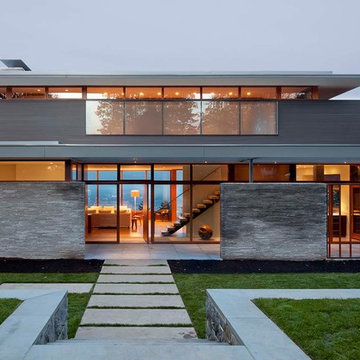
The Council Crest Residence is a renovation and addition to an early 1950s house built for inventor Karl Kurz, whose work included stereoscopic cameras and projectors. Designed by prominent local architect Roscoe Hemenway, the house was built with a traditional ranch exterior and a mid-century modern interior. It became known as “The View-Master House,” alluding to both the inventions of its owner and the dramatic view through the glass entry.
Approached from a small neighborhood park, the home was re-clad maintaining its welcoming scale, with privacy obtained through thoughtful placement of translucent glass, clerestory windows, and a stone screen wall. The original entry was maintained as a glass aperture, a threshold between the quiet residential neighborhood and the dramatic view over the city of Portland and landscape beyond. At the south terrace, an outdoor fireplace is integrated into the stone wall providing a comfortable space for the family and their guests.
Within the existing footprint, the main floor living spaces were completely remodeled. Raised ceilings and new windows create open, light filled spaces. An upper floor was added within the original profile creating a master suite, study, and south facing deck. Space flows freely around a central core while continuous clerestory windows reinforce the sense of openness and expansion as the roof and wall planes extend to the exterior.
Images By: Jeremy Bitterman, Photoraphy Portland OR
 Katie Hutchison Studio
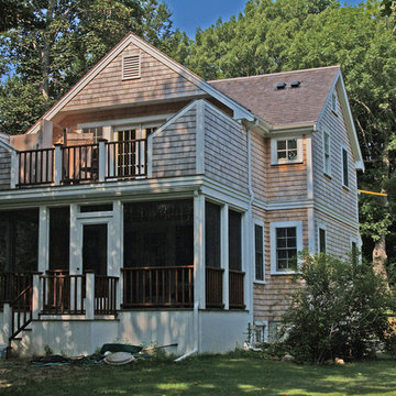
With two small children and a third on the way, the owners of an original eighteenth century Cape were quickly out-growing it, but they had no desire to move away from the Cape Cod home and location they loved. They simply needed a reconfigured layout and more space. Their goals included repurposing some existing rooms, adding a new kitchen/family area plus screen porch on the first level, and creating a master suite and roof deck with an outdoor shower on the second level, connected by a new stair.
Our challenge was to improve the flow between existing spaces, and design the two-story addition without overwhelming the pint-sized original Cape. We took advantage of the lower grade at the rear of the property to step the first floor of the addition down two steps from the existing main level. This allowed us to align the second floor in the addition with the existing second floor, while gaining ceiling height in the new first-floor kitchen/family area. We composed a cross-gabled form for the addition to improve the second floor headroom, while maintaining the existing eave line. We then extended some existing shed dormers to gain headroom and enhance function. We also expanded the outdoor living area with privacy walls along the roof deck.
New, larger, double–hung windows that match the lite configuration of the existing windows, along with new side-wall shingles and trim which resemble the existing exterior treatment help to tie the new addition to the old Cape. Though there’s no mistaking the new for the old, the two are simpatico.
Katie Hutchison Studio collaborated with Geoffrey Koper Architect of Yarmouth Port, Mass. on the Yarmouth Port Antique Cape Renovation and Addition. Kitchen fit-out and interior finishes, fixtures, and furnishings by others.
photo by Katie Hutchison
Find the right local pro for your project
 PBF HOMES
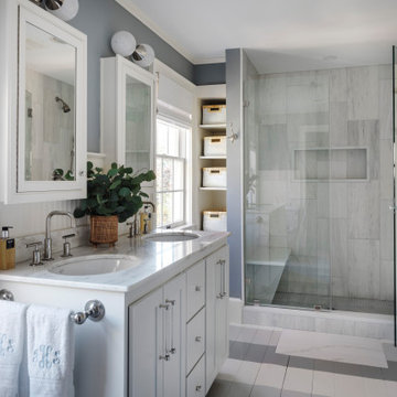
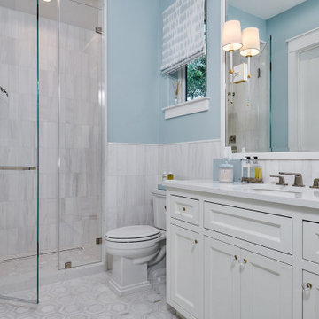
Alcove shower - coastal 3/4 double-sink alcove shower idea in Boston with shaker cabinets, white cabinets, gray walls, an undermount sink, marble countertops, a hinged shower door and a built-in vanity
 kimberly peck architect
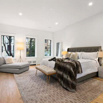
When the developer found this brownstone on the Upper Westside he immediately researched and found its potential for expansion. We were hired to maximize the existing brownstone and turn it from its current existence as 5 individual apartments into a large luxury single family home. The existing building was extended 16 feet into the rear yard and a new sixth story was added along with an occupied roof. The project was not a complete gut renovation, the character of the parlor floor was maintained, along with the original front facade, windows, shutters, and fireplaces throughout. A new solid oak stair was built from the garden floor to the roof in conjunction with a small supplemental passenger elevator directly adjacent to the staircase. The new brick rear facade features oversized windows; one special aspect of which is the folding window wall at the ground level that can be completely opened to the garden. The goal to keep the original character of the brownstone yet to update it with modern touches can be seen throughout the house. The large kitchen has Italian lacquer cabinetry with walnut and glass accents, white quartz counters and backsplash and a Calcutta gold arabesque mosaic accent wall. On the parlor floor a custom wetbar, large closet and powder room are housed in a new floor to ceiling wood paneled core. The master bathroom contains a large freestanding tub, a glass enclosed white marbled steam shower, and grey wood vanities accented by a white marble floral mosaic. The new forth floor front room is highlighted by a unique sloped skylight that offers wide skyline views. The house is topped off with a glass stair enclosure that contains an integrated window seat offering views of the roof and an intimate space to relax in the sun.
 Harrell Design + Build
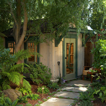
What our clients needed:
• Create a garden folly that doubles as a well-built shed for crafts and storage.
• Size the structure large enough for comfortable storage without dominating the garden.
• Discreetly locate the shed in the far corner of the rear yard while maintaining existing trees.
• Ensure that the structure is protected from the weather and carefully detailed to deter access of wildlife and rodents.
FUNCTION
• Construct the shed slab close to grade to permit easy access for bicycle storage, while building shed walls above grade to ensure against termites and dryrot.
• Install a French door and operable casement windows to admit plenty of daylight and provide views to the garden.
• Include rugged built-in work bench, shelves, bike racks and tool storage for a rustic well-organized and efficient space.
• Incorporate GFIC electrical service for safe access to power at this distant corner of the yard.
• Position energy-efficient interior lighting to ensure space can be used year-round.
• Switch control of exterior light from house and from shed for ease of command.
AESTHETICS
• Design and detail the shed to coordinate with the Arts and Crafts style house.
• Include an arbor for future flowering vines, further softening the shed’s garden presence.
• Simple and rustic interior surfaces ensure that the space is easy to clean.
• Create an aged and softly weathered appearance, and protect the exterior siding by finishing the cedar with a custom-colored semi-transparent stain.
INNOVATIVE MATERIALS AND CONSTRUCTION
• Factory-built components were pre-assembled to allow for a speedy assembly and for a shorter on-site construction schedule.
• Each component was easily transported through the yard without disturbing garden features.
• Decorative exterior trim frames the door and windows, while a simpler trim is used inside the unadorned shed.
OBSTACLE OVERCOME
• The structure is located in the corner of the yard to avoid disturbance of a curly willow tree.
• The low-profile structure is positioned close to property lines while staying beneath the allowable daylight plane for structures.
• To comply with daylight plane close to fence, the roof form combines hip and gable forms, with door located at gable end.
• The height of the modest interior is maximized, without exceeding the allowable building height.
CRAFTSMANSHIP
• The concrete slab was precisely formed and finished for ease of shed assembly before the factory-built components were delivered to site.
• Precision planning meant the pre-framed door fit exactly between raised concrete curb.
 Dona Rosene Interiors
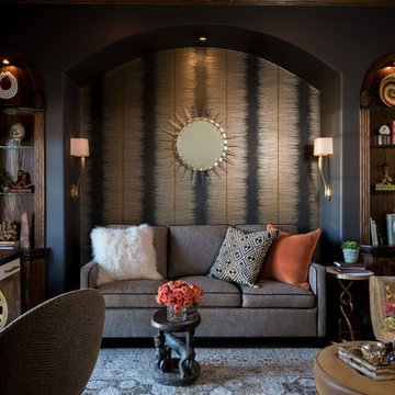
ASID 2018 DESIGN OVATION SINGLE SPACE DEDICATED FUNCTION/ SECOND PLACE. The clients requested professional assistance transforming this small, jumbled room with lots of angles into an efficient home office and occasional guest bedroom for visiting family. Maintaining the existing stained wood moldings was requested and the final vision was to reflect their Nigerian heritage in a dramatic and tasteful fashion. Photo by Michael Hunter

Sponsored
Columbus, OH

Hope Restoration & General Contracting
Columbus Design-Build, Kitchen & Bath Remodeling, Historic Renovations

 Joni L. Janecki & Associates, Inc.
Lepere Studio
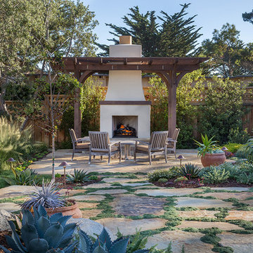
Inspiration for a mediterranean backyard stone and wood fence landscaping in Other with a pergola.
Inspiration for a mediterranean backyard stone and wood fence landscaping in Other with a pergola.
 Drury Design
THE SETUP
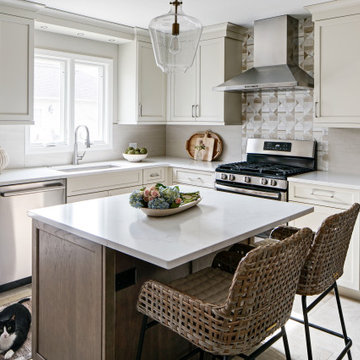
Client Background: Our clients, a couple who have transitioned into the empty nest phase, have cherished their home for over three decades without undergoing any significant renovations. With a newfound desire to adapt their living space to better suit their current lifestyle, they’ve embarked on a journey to reimagine their kitchen — the heart of their home. Their aspiration is to cultivate a serene, neutral-toned sanctuary on the first floor that seamlessly merges with their family room, ensuring a harmonious and inviting environment.
Design Inspiration: The renovation is inspired by the couple’s penchant for soft, calming neutrals, using their cherished family room and the kitchen’s existing tile flooring as the cornerstone for the color scheme. This approach aims to foster a sense of warmth and tranquility throughout.
Design Objectives:
Harmonize the kitchen with the family room by adopting a soothing, neutral color scheme, ensuring a seamless flow across the first floor.
Enhance kitchen functionality with thoughtfully designed cabinetry, providing a designated place for every item and maximizing storage efficiency.
Cultivate an inviting and comfortable atmosphere that reflects the homeowners’ desire for a calm and relaxing space.
Design Challenges:
The homeowners wish to retain the existing kitchen tile flooring and integrate it into a refreshed, modern design.
Accommodating a dining area spacious enough for family visits without compromising the kitchen’s open feel or functional layout.
Despite liking the current placement of plumbing and appliances, the homeowners aspire for a more open floor plan to facilitate better movement and interaction.
The need to amplify natural light in the kitchen, especially around the sink area, where existing lighting is insufficient.
Preserving the half-wall between the kitchen and family room, a feature the homeowners want to keep, while ensuring it complements the new design.
THE RENEWED SPACE
Design Solutions:
By choosing a neutral color palette that complements the existing tile, the design unifies the kitchen with the adjacent spaces. The tile’s grout was cleaned and restored, enhancing the floor’s appearance and integrating it seamlessly with the new kitchen aesthetic.
The inclusion of a larger island with seating for two, alongside maintaining a substantial dining table, was achieved by optimizing the spatial layout. This allowed for a sociable yet functional kitchen, accommodating large family gatherings without feeling crowded.
Minor adjustments to the kitchen’s layout maintained the preferred locations for plumbing and appliances while introducing an ‘open’ design concept. Strategic modifications, such as angling the pantry wall, improved the flow and accessibility within the space.
Replacing the garden window with a broader, standard window significantly increased natural light, transforming the sink area into a bright, welcoming space with enhanced views of the outdoors.
The decision to keep the half-wall was ingeniously leveraged to define the dining area while maintaining an open connection to the family room. This feature not only serves as a visual separator but also ties the two spaces together through the shared color scheme and design elements.
The homeowners are thrilled with their newly remodeled kitchen, which has become a hub of warmth and hospitality. Hosting a wedding shower and a birthday party, they have shared their renewed space with friends and family, who have been equally enamored. This remodel has not only met their functional and aesthetic desires but has also enriched their home with a fresh sense of serenity and joy.
The upstairs part of the home is shaping up nicely. Here’s their newly remodeled primary bathroom.
 Samantha Friedman Interior Designs
Jesse Snyder
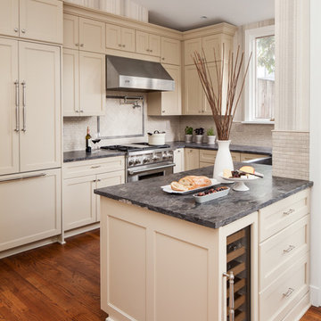
Mid-sized transitional u-shaped medium tone wood floor and brown floor open concept kitchen photo in DC Metro with a farmhouse sink, recessed-panel cabinets, beige cabinets, granite countertops, beige backsplash, ceramic backsplash, stainless steel appliances and a peninsula
Mid-sized transitional u-shaped medium tone wood floor and brown floor open concept kitchen photo in DC Metro with a farmhouse sink, recessed-panel cabinets, beige cabinets, granite countertops, beige backsplash, ceramic backsplash, stainless steel appliances and a peninsula
 Virtuoso Builders
This home in the upscale Dominion area was completely transformed from an outdated rustic interior to a fresh and modern space! The kitchen has an upgraded island with Taj Mahal waterfall panels and mitered edges, similar to the rest of the kitchen Taj Mahal quartzite countertops and backsplash. The existing perimeter cabinets in the kitchen were painted a classic white lacquer finish. A new dual finish Blue Star vent hood was installed, along with gorgeous matching brass knobs and faucets.
The kitchen flooring is white oak herringbone pattern hardwood which flows throughout the house. The entryway has a brand new iron pivot door making for a seamless transition into the home.
This homeowner's guest bathroom was completely gutted and replaced with a quartz countertop, wainscoting dolomite tile on bathroom walls, and mother of pearl floor tile. The connecting guest bedroom was completely repainted and given a brand new look with bright blue and white wallpaper.
The powder room is to die for, with gold and black accents, a gorgeous new moss green vanity, and a black quartzite countertop with an golden under-mount sink.
Lastly, we completed the home bar area, installing a antiqued backsplash and custom lit floating shelves, perfect for keeping the homeowner's liquor of choice. It's 5 o'clock somewhere!
 Klopf Architecture
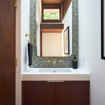
Nestled in the hills of Orinda, California, this 1951 residence is one of only seven extant homes, now known as “The Magnificent Seven”, designed by architect Olof Dahlstrand, a protégé of Frank Lloyd Wright. With its low-slung rooflines, natural materials, and deep integration with the sloping landscape, the home is a pristine example of mid-century modern design inspired by Wright’s organic principles. Over the years, prior homeowners have emphasized preservation, ensuring that the house remained relatively untouched. Each owner has respected the original architecture and stayed true to Dahlstrand’s intent. When a family of five—two college-aged sons and a middle school-aged daughter—acquired the property, they were captivated by its history, legacy of care, and architectural significance. While they appreciated Dahlstrand’s original vision, they also recognized the need to adapt the home for contemporary living while preserving its design integrity.
The remodel was conceived as a thoughtful response to the past—an effort to bring the house into the 21st century without compromising its soul. The primary mandate was to maintain architectural continuity while improving the functionality, comfort, and livability for a modern family. The design team—architects and contractor alike—worked with a shared reverence for the original architecture, allowing that mindset to guide even the most technical or pragmatic decisions.
A key objective was to increase natural light in the kitchen—a departure from Wrightian principles of enclosed, intimate cooking spaces—while maintaining the home’s architectural language. The kitchen was reconfigured to foster a stronger connection to adjacent living spaces while retaining the underlying concept of spatial separation. One of the most transformative architectural changes was the removal of a ridge beam that was originally planned to remain visible through the kitchen. During construction, the team collaborated on a better solution: a wide-flanged steel beam concealed within the roof envelope. This subtle move preserved the clean lines and ceiling continuity, a modern update carried out with utmost respect for the existing framework.
The home’s original powder room, previously accessible only through the kitchen, was relocated for better flow and privacy. A new powder room was carved out of former kitchen cabinetry—a narrow, interior space that could have felt dark and enclosed. To avoid this, the design extended the line of original transom windows into the new powder room and added a skylight above the vanity. The result is a bright and airy space that feels consistent with the rest of the home. Other updates included the installation of new solid-core interior doors with veneers carefully matched to the original mahogany, enhancing the continuity of the interiors. Even smaller decisions, such as placing the door knobs at 42 inches high, mirrored the original proportions. Every choice reflected a shared belief between the architect, contractor, and client: that new work should serve the integrity of the old.
The home’s extensive interior redwood millwork and paneling was meticulously restored. Where new materials were introduced—such as the replacement redwood soffit paneling—the contractor took pains to find finish nails that matched the original, rather than using modern equivalents. This level of craftsmanship and collaboration defined the project. It extended even to the detailing of a blind door to the new powder room, which had to disappear into the existing redwood board-and-batten wall. It was a team effort: the owner found a suitable handle, the architects devised the custom in-swing mechanism, and the contractor executed it so the door aligned precisely with the battens. Throughout, the homeowners were deeply engaged in the design process. One, a meticulous design enthusiast, focused on aesthetic integrity and historic detail. The other brought a practical and function-driven perspective, ensuring that new fixtures and materials would be durable and require minimal maintenance.
While the home’s location posed no major site challenges, sustainability was a key concern. The team upgraded the roof insulation, installed solar panels with battery storage, and added ductless mini-split cooling systems. Lighting was another area where modern technology was woven into a historic framework: new square LED fixtures echo the original custom perimeter soffit lights, maintaining the design language while offering advanced performance.
A planned expansion of a bedroom into suite with a bathroom had to be shelved due to budget constraints and the high cost of below-grade foundation work. Still, the team focused their efforts on making the most of the existing footprint, resolving constraints through design ingenuity rather than adding square footage. This renovation represents a collaborative achievement in preserving and evolving a historically significant home. Every decision was shaped by a shared ethos among clients, architects, and contractor: to maintain the home’s architectural soul while updating it for contemporary life. The result is a timeless modernist residence that continues Olof Dahlstrand’s legacy, remaining grounded in nature, craftsmanship, and human-scale design.
Klopf Architecture Team: John Klopf, AIA, Klara Kevane, Fernanda Bernardes
Interior Architectural Design: Klopf Architecture
Structural Engineer: Daniel Bastiao
Contractor: Don Larwood, Larwood Construction
Photography: Mariko Reed
Year Completed: 2022
Sponsored
Sunbury, OH

J.Holderby - Renovations
Franklin County's Leading General Contractors - 2X Best of Houzz!
 Velène Design House
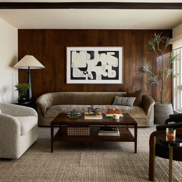
At Velène Design House, we revived the home’s vintage charm, balancing original mid‑century elements, like stone fireplaces and wood paneling, with clean, contemporary lines, subtle traditional touches, and thoughtful textures.
This mid‑century ranch remodel transformed a largely untouched 1960s home into a refined, family‑ready retreat.
 Hursthouse Landscape - Architect, Build, Maintain
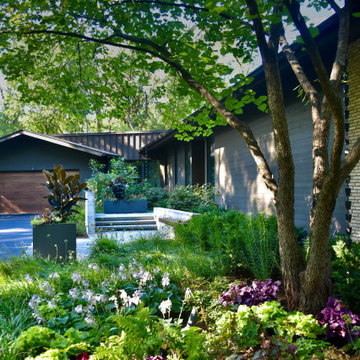
Low-profile landscape plantings under the arching redbud create focus on the front entry while walking through the garden. Rectilinear containers amplify the mid-century modern lines of the home.
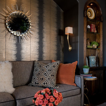 Dona Rosene Interiors
ASID 2018 DESIGN OVATION SINGLE SPACE DEDICATED FUNCTION/ SECOND PLACE. The clients requested professional assistance transforming this small, jumbled room with lots of angles into an efficient home office and occasional guest bedroom for visiting family. Maintaining the existing stained wood moldings was requested and the final vision was to reflect their Nigerian heritage in a dramatic and tasteful fashion. Photo by Michael Hunter
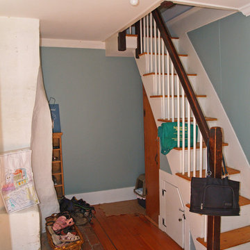 Katie Hutchison Studio
With two small children and a third on the way, the owners of an original eighteenth century Cape were quickly out-growing it, but they had no desire to move away from the Cape Cod home and location they loved. They simply needed a reconfigured layout and more space. Their goals included repurposing some existing rooms, adding a new kitchen/family area plus screen porch on the first level, and creating a master suite and roof deck with an outdoor shower on the second level, connected by a new stair.
Our challenge was to improve the flow between existing spaces, and design the two-story addition without overwhelming the pint-sized original Cape. We took advantage of the lower grade at the rear of the property to step the first floor of the addition down two steps from the existing main level. This allowed us to align the second floor in the addition with the existing second floor, while gaining ceiling height in the new first-floor kitchen/family area. We composed a cross-gabled form for the addition to improve the second floor headroom, while maintaining the existing eave line. We then extended some existing shed dormers to gain headroom and enhance function. We also expanded the outdoor living area with privacy walls along the roof deck.
New, larger, double–hung windows that match the lite configuration of the existing windows, along with new side-wall shingles and trim which resemble the existing exterior treatment help to tie the new addition to the old Cape. Though there’s no mistaking the new for the old, the two are simpatico.
Katie Hutchison Studio collaborated with Geoffrey Koper Architect of Yarmouth Port, Mass. on the Yarmouth Port Antique Cape Renovation and Addition. Kitchen fit-out and interior finishes, fixtures, and furnishings by others.
photo by Katie Hutchison

Sponsored
Columbus, OH
Hope Restoration & General Contracting
Columbus Design-Build, Kitchen & Bath Remodeling, Historic Renovations
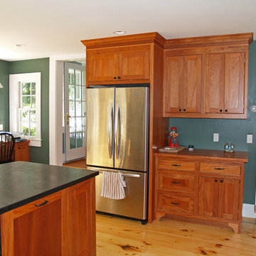 Katie Hutchison Studio
With two small children and a third on the way, the owners of an original eighteenth century Cape were quickly out-growing it, but they had no desire to move away from the Cape Cod home and location they loved. They simply needed a reconfigured layout and more space. Their goals included repurposing some existing rooms, adding a new kitchen/family area plus screen porch on the first level, and creating a master suite and roof deck with an outdoor shower on the second level, connected by a new stair.
Our challenge was to improve the flow between existing spaces, and design the two-story addition without overwhelming the pint-sized original Cape. We took advantage of the lower grade at the rear of the property to step the first floor of the addition down two steps from the existing main level. This allowed us to align the second floor in the addition with the existing second floor, while gaining ceiling height in the new first-floor kitchen/family area. We composed a cross-gabled form for the addition to improve the second floor headroom, while maintaining the existing eave line. We then extended some existing shed dormers to gain headroom and enhance function. We also expanded the outdoor living area with privacy walls along the roof deck.
New, larger, double–hung windows that match the lite configuration of the existing windows, along with new side-wall shingles and trim which resemble the existing exterior treatment help to tie the new addition to the old Cape. Though there’s no mistaking the new for the old, the two are simpatico.
Katie Hutchison Studio collaborated with Geoffrey Koper Architect of Yarmouth Port, Mass. on the Yarmouth Port Antique Cape Renovation and Addition. Kitchen fit-out and interior finishes, fixtures, and furnishings by others.
photo by Katie Hutchison
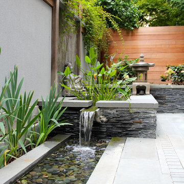
 Horn & Co. (Previously JHLA)
Our clients on this project were inspired by their travels to Asia and wanted to mimic this aesthetic at their DC property. We designed a water feature that effectively masks adjacent traffic noise and maintains a small footprint.
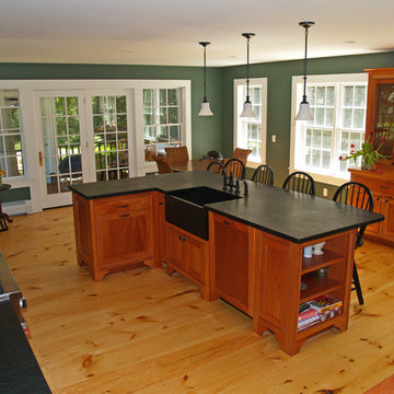 Katie Hutchison Studio
With two small children and a third on the way, the owners of an original eighteenth century Cape were quickly out-growing it, but they had no desire to move away from the Cape Cod home and location they loved. They simply needed a reconfigured layout and more space. Their goals included repurposing some existing rooms, adding a new kitchen/family area plus screen porch on the first level, and creating a master suite and roof deck with an outdoor shower on the second level, connected by a new stair.
Our challenge was to improve the flow between existing spaces, and design the two-story addition without overwhelming the pint-sized original Cape. We took advantage of the lower grade at the rear of the property to step the first floor of the addition down two steps from the existing main level. This allowed us to align the second floor in the addition with the existing second floor, while gaining ceiling height in the new first-floor kitchen/family area. We composed a cross-gabled form for the addition to improve the second floor headroom, while maintaining the existing eave line. We then extended some existing shed dormers to gain headroom and enhance function. We also expanded the outdoor living area with privacy walls along the roof deck.
New, larger, double–hung windows that match the lite configuration of the existing windows, along with new side-wall shingles and trim which resemble the existing exterior treatment help to tie the new addition to the old Cape. Though there’s no mistaking the new for the old, the two are simpatico.
Katie Hutchison Studio collaborated with Geoffrey Koper Architect of Yarmouth Port, Mass. on the Yarmouth Port Antique Cape Renovation and Addition. Kitchen fit-out and interior finishes, fixtures, and furnishings by others.
photo by Katie Hutchison
1