
Search results for "Massive selection" in Home Design Ideas
 Westover Landscape Design
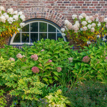
Not everyone would see the hidden beauty in the Yonkers property destined for the wrecking ball in 2000. But one family took the serious fixer-upper under their wing. Crumbling walls, overgrown maples (indeed, saplings were busting through the brick walls), and deer living in the basement was the state of affairs when Westover Landscape Design initially arrived on the scene. A year of intensive, meticulous, thoughtful renovation by the homeowner followed while the house was brought up to speed. When the last construction machine finally rumbled out, that’s when Robert Welsch and his crew began their odyssey.
The goal was to honor the newly restored relic and deliver it into the future with fitting surroundings. “We wanted to bring that treasure back to life,” Robert Welsch explains. Working closely with the homeowner as well as the city of Yonkers to guide the restoration, their first feat was to install a proper drainage system with catchments capable of keeping storm water from the massive roof flowing away. Before anything was visible on the surface, extensive work was accomplished underground. Meanwhile, a plan was drafted to honor the era of the house. Westover chose bluestone as the primary path material for its easy maintenance and simplicity when laying the swank configuration of pathways around the house and outward to an entertaining pavilion. By cleverly hemming the bluestone with period brick that echoes the building material for the house for continuity, the result is a smart and sophisticated finish to a promenade that constantly draws the family and their pets outdoors. Brick was also used to rebuild the walled gardens for the much-needed privacy in a close-knit Yonkers community. And a graceful wrought iron gate enhances the arrival experience. But walls and gates were not the only element to screen and reveal views—plant selection was critical.
Few landscapers would go the extra mile to find period perfect plants for a 19th Century restoration, but Robert Welsch saw the importance of authenticity in creating the mood. He repeated large trees—such as an exquisite London plane tree in the front yard—to balance the expression in the back. Recognizing the need for immediate stature, he selected a weeping willow to gain instant volume, giving the landscape a sense of deep roots. A weeping Camperdown elm adds sophisticated drama to the walled stroll gardens. Hydrangeas were incorporated for their billowy stature, easy maintenance, and long blooming season. Similarly, all the plants in residence play their part in the display that goes beyond the usual spring fling to extend throughout the growing season—offering visual interest even when they are not performing. From spring bulbs to autumn perennials, there is never a dull moment. Meanwhile, every step along the way was a collaboration working hand-in-hand with the homeowner and the city to make certain that the historic landmark status of the property was upheld and honored.
The result goes beyond a landscape that is just old faithful. It adds life to the picture, creating a jewel-like setting for the newly proud house. In a word, it is sublime. By planting wisely and using sustainable elements, the restored house and its surroundings are ready for the next generation and beyond. This Yonkers gem remains meticulously groomed under the watchful eye and skill of Westover Landscape Design’s team of gardeners—It’s a keeper.
 Westover Landscape Design
Not everyone would see the hidden beauty in the Yonkers property destined for the wrecking ball in 2000. But one family took the serious fixer-upper under their wing. Crumbling walls, overgrown maples (indeed, saplings were busting through the brick walls), and deer living in the basement was the state of affairs when Westover Landscape Design initially arrived on the scene. A year of intensive, meticulous, thoughtful renovation by the homeowner followed while the house was brought up to speed. When the last construction machine finally rumbled out, that’s when Robert Welsch and his crew began their odyssey.
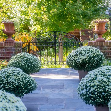
The goal was to honor the newly restored relic and deliver it into the future with fitting surroundings. “We wanted to bring that treasure back to life,” Robert Welsch explains. Working closely with the homeowner as well as the city of Yonkers to guide the restoration, their first feat was to install a proper drainage system with catchments capable of keeping storm water from the massive roof flowing away. Before anything was visible on the surface, extensive work was accomplished underground. Meanwhile, a plan was drafted to honor the era of the house. Westover chose bluestone as the primary path material for its easy maintenance and simplicity when laying the swank configuration of pathways around the house and outward to an entertaining pavilion. By cleverly hemming the bluestone with period brick that echoes the building material for the house for continuity, the result is a smart and sophisticated finish to a promenade that constantly draws the family and their pets outdoors. Brick was also used to rebuild the walled gardens for the much-needed privacy in a close-knit Yonkers community. And a graceful wrought iron gate enhances the arrival experience. But walls and gates were not the only element to screen and reveal views—plant selection was critical.
Few landscapers would go the extra mile to find period perfect plants for a 19th Century restoration, but Robert Welsch saw the importance of authenticity in creating the mood. He repeated large trees—such as an exquisite London plane tree in the front yard—to balance the expression in the back. Recognizing the need for immediate stature, he selected a weeping willow to gain instant volume, giving the landscape a sense of deep roots. A weeping Camperdown elm adds sophisticated drama to the walled stroll gardens. Hydrangeas were incorporated for their billowy stature, easy maintenance, and long blooming season. Similarly, all the plants in residence play their part in the display that goes beyond the usual spring fling to extend throughout the growing season—offering visual interest even when they are not performing. From spring bulbs to autumn perennials, there is never a dull moment. Meanwhile, every step along the way was a collaboration working hand-in-hand with the homeowner and the city to make certain that the historic landmark status of the property was upheld and honored.
The result goes beyond a landscape that is just old faithful. It adds life to the picture, creating a jewel-like setting for the newly proud house. In a word, it is sublime. By planting wisely and using sustainable elements, the restored house and its surroundings are ready for the next generation and beyond. This Yonkers gem remains meticulously groomed under the watchful eye and skill of Westover Landscape Design’s team of gardeners—It’s a keeper.
 Heather DeMoras Design Consultants Inc.
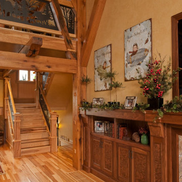
The owners of this magnificent fly-in/ fly-out lodge had a vision for a home that would showcase their love of nature, animals, flying and big game hunting. Featured in the 2011 Design New York Magazine, we are proud to bring this vision to life.
Chuck Smith, AIA, created the architectural design for the timber frame lodge which is situated next to a regional airport. Heather DeMoras Design Consultants was chosen to continue the owners vision through careful interior design and selection of finishes, furniture and lighting, built-ins, and accessories.
HDDC's involvement touched every aspect of the home, from Kitchen and Trophy Room design to each of the guest baths and every room in between. Drawings and 3D visualization were produced for built in details such as massive fireplaces and their surrounding mill work, the trophy room and its world map ceiling and floor with inlaid compass rose, custom molding, trim & paneling throughout the house, and a master bath suite inspired by and Oak Forest. A home of this caliber requires and attention to detail beyond simple finishes. Extensive tile designs highlight natural scenes and animals. Many portions of the home received artisan paint effects to soften the scale and highlight architectural features. Artistic balustrades depict woodland creatures in forest settings. To insure the continuity of the Owner's vision, we assisted in the selection of furniture and accessories, and even assisted with the selection of windows and doors, exterior finishes and custom exterior lighting fixtures.
Interior details include ceiling fans with finishes and custom detailing to coordinate with the other custom lighting fixtures of the home. The Dining Room boasts of a bronze moose chandelier above the dining room table. Along with custom furniture, other touches include a hand stitched Mennonite quilt in the Master Bedroom and murals by our decorative artist.
Find the right local pro for your project
 Bilotta Kitchen & Home
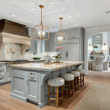
Some clients have such great taste, that it’s easy to help create the kitchen of their dreams. Our client in this case had such passion for the design of her own kitchen that it made it such a fun collaborative experience that you don’t always get with clients. She put her heart and soul into making sure every detail was exactly the way she wanted. This kitchen is only a small piece of a well-appointed home. The 1” thick custom door (from Bilotta’s private custom cabinet collection), traditionally styled, yet not overly so, matches beautifully with the details of the adjacent rooms. The grey colored cabinetry blends with the colors in the adjoining rooms creating the perfect centerpiece. The client chose a massive stone Francois & Co. Toulouse Shelf w/ Concave Stack hood from a dealer in London and had it shipped over on a boat! She selected beautiful “Mother of Pearl” knobs from Anthropologie and adorned select cabinets with them like pieces of jewelry. The naturally pearlescent clay tile, the Quartzite countertops and the lanterns above the island were all chosen to mirror these knobs. The lanterns were also chosen to replicate the movement of the gold pattern in the knobs. The client opted to turn the tile on the diagonal as it felt more fluid and in keeping with the movement in the knobs and lanterns. The stone hood, tile, and quartzite sample coordinated perfectly. The room was equipped with a mix of SubZero Wolf and Miele appliances with a Kohler apron sink. The space of course has the perfect amount of accessories for making it more than just visually appealing – it’s a baker’s dream with a lift up for a frequently used mixer. There’s a built-in paper towel holder and just the right amount of utensil dividers, cutlery dividers, tray dividers, roll-outs and even a secret pantry with matching cabinetry hidden in the corner.
Bilotta Designer: Randy O’Kane, CKD & Senior Designer
Builder: Rob Norr, Nordic Construction
Architect: Brad Demotte
Photographer: Anthony Acocella
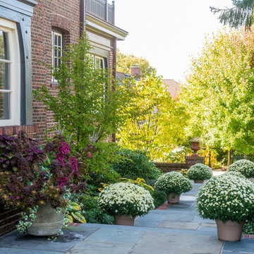 Westover Landscape Design
Not everyone would see the hidden beauty in the Yonkers property destined for the wrecking ball in 2000. But one family took the serious fixer-upper under their wing. Crumbling walls, overgrown maples (indeed, saplings were busting through the brick walls), and deer living in the basement was the state of affairs when Westover Landscape Design initially arrived on the scene. A year of intensive, meticulous, thoughtful renovation by the homeowner followed while the house was brought up to speed. When the last construction machine finally rumbled out, that’s when Robert Welsch and his crew began their odyssey.
The goal was to honor the newly restored relic and deliver it into the future with fitting surroundings. “We wanted to bring that treasure back to life,” Robert Welsch explains. Working closely with the homeowner as well as the city of Yonkers to guide the restoration, their first feat was to install a proper drainage system with catchments capable of keeping storm water from the massive roof flowing away. Before anything was visible on the surface, extensive work was accomplished underground. Meanwhile, a plan was drafted to honor the era of the house. Westover chose bluestone as the primary path material for its easy maintenance and simplicity when laying the swank configuration of pathways around the house and outward to an entertaining pavilion. By cleverly hemming the bluestone with period brick that echoes the building material for the house for continuity, the result is a smart and sophisticated finish to a promenade that constantly draws the family and their pets outdoors. Brick was also used to rebuild the walled gardens for the much-needed privacy in a close-knit Yonkers community. And a graceful wrought iron gate enhances the arrival experience. But walls and gates were not the only element to screen and reveal views—plant selection was critical.
Few landscapers would go the extra mile to find period perfect plants for a 19th Century restoration, but Robert Welsch saw the importance of authenticity in creating the mood. He repeated large trees—such as an exquisite London plane tree in the front yard—to balance the expression in the back. Recognizing the need for immediate stature, he selected a weeping willow to gain instant volume, giving the landscape a sense of deep roots. A weeping Camperdown elm adds sophisticated drama to the walled stroll gardens. Hydrangeas were incorporated for their billowy stature, easy maintenance, and long blooming season. Similarly, all the plants in residence play their part in the display that goes beyond the usual spring fling to extend throughout the growing season—offering visual interest even when they are not performing. From spring bulbs to autumn perennials, there is never a dull moment. Meanwhile, every step along the way was a collaboration working hand-in-hand with the homeowner and the city to make certain that the historic landmark status of the property was upheld and honored.
The result goes beyond a landscape that is just old faithful. It adds life to the picture, creating a jewel-like setting for the newly proud house. In a word, it is sublime. By planting wisely and using sustainable elements, the restored house and its surroundings are ready for the next generation and beyond. This Yonkers gem remains meticulously groomed under the watchful eye and skill of Westover Landscape Design’s team of gardeners—It’s a keeper.
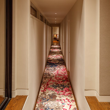
 LMB Interiors
Hall: Hallway runner of extraordinary length and colorful depth by Decorative Carpets by STARK
Photo by Eric Rorer
While we adore all of our clients and the beautiful structures which we help fill and adorn, like a parent adores all of their children, this recent mid-century modern interior design project was a particular delight.
This client, a smart, energetic, creative, happy person, a man who, in-person, presents as refined and understated — he wanted color. Lots of color. When we introduced some color, he wanted even more color: Bright pops; lively art.
In fact, it started with the art.
This new homeowner was shopping at SLATE ( https://slateart.net) for art one day… many people choose art as the finishing touches to an interior design project, however this man had not yet hired a designer.
He mentioned his predicament to SLATE principal partner (and our dear partner in art sourcing) Danielle Fox, and she promptly referred him to us.
At the time that we began our work, the client and his architect, Jack Backus, had finished up a massive remodel, a thoughtful and thorough update of the elegant, iconic mid-century structure (originally designed by Ratcliff & Ratcliff) for modern 21st-century living.
And when we say, “the client and his architect” — we mean it. In his professional life, our client owns a metal fabrication company; given his skills and knowledge of engineering, build, and production, he elected to act as contractor on the project.
His eye for metal and form made its way into some of our furniture selections, in particular the coffee table in the living room, fabricated and sold locally by Turtle and Hare.
Color for miles: One of our favorite aspects of the project was the long hallway. By choosing to put nothing on the walls, and adorning the length of floor with an amazing, vibrant, patterned rug, we created a perfect venue. The rug stands out, drawing attention to the art on the floor.
In fact, the rugs in each room were as thoughtfully selected for color and design as the art on the walls. In total, on this project, we designed and decorated the living room, family room, master bedroom, and back patio. (Visit www.lmbinteriors.com to view the complete portfolio of images.)
While my design firm is known for our work with traditional and transitional architecture, and we love those projects, I think it is clear from this project that Modern is also our cup of tea.
If you have a Modern house and are thinking about how to make it more vibrantly YOU, contact us for a consultation.
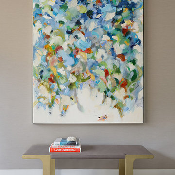 LMB Interiors
Art and bench: Bench by Jiun Ho; Painting by Maria Burtis, via SLATE Gallery
Photo by Eric Rorer
While we adore all of our clients and the beautiful structures which we help fill and adorn, like a parent adores all of their children, this recent mid-century modern interior design project was a particular delight.
This client, a smart, energetic, creative, happy person, a man who, in-person, presents as refined and understated — he wanted color. Lots of color. When we introduced some color, he wanted even more color: Bright pops; lively art.
In fact, it started with the art.
This new homeowner was shopping at SLATE ( https://slateart.net) for art one day… many people choose art as the finishing touches to an interior design project, however this man had not yet hired a designer.
He mentioned his predicament to SLATE principal partner (and our dear partner in art sourcing) Danielle Fox, and she promptly referred him to us.
At the time that we began our work, the client and his architect, Jack Backus, had finished up a massive remodel, a thoughtful and thorough update of the elegant, iconic mid-century structure (originally designed by Ratcliff & Ratcliff) for modern 21st-century living.
And when we say, “the client and his architect” — we mean it. In his professional life, our client owns a metal fabrication company; given his skills and knowledge of engineering, build, and production, he elected to act as contractor on the project.
His eye for metal and form made its way into some of our furniture selections, in particular the coffee table in the living room, fabricated and sold locally by Turtle and Hare.
Color for miles: One of our favorite aspects of the project was the long hallway. By choosing to put nothing on the walls, and adorning the length of floor with an amazing, vibrant, patterned rug, we created a perfect venue. The rug stands out, drawing attention to the art on the floor.
In fact, the rugs in each room were as thoughtfully selected for color and design as the art on the walls. In total, on this project, we designed and decorated the living room, family room, master bedroom, and back patio. (Visit www.lmbinteriors.com to view the complete portfolio of images.)
While my design firm is known for our work with traditional and transitional architecture, and we love those projects, I think it is clear from this project that Modern is also our cup of tea.
If you have a Modern house and are thinking about how to make it more vibrantly YOU, contact us for a consultation.


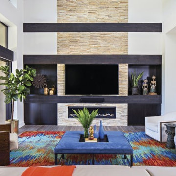
 Metropolitan Custom Homes
PRIMARY COLORS The Noakeses are not afraid of color, which found an outlet in the brilliant red, orange and blue of the Tufenkian Borealis Pacific Fire rug anchoring the living room. On the following spread, the homeowners’ art hangs on a dining room wall and is the soulmate to the living room rug’s deeply saturated colors as well as to the bright oranges in the wool and silk rug under the dining table.
Glamour is a driving force in the house, but it never overwhelms. As a backdrop in the dining room, golden Lori Weitzner wallpaper lines the display shelf where Perry and Suzy Noakes display treasures from their travels.
In the kitchen, a grouping of seeded blown glass cylinder pendants illuminates Bright Group stools and a generously proportioned island that’s big enough to seat eight guests.
The entry’s bright-red lacquered console is a place for the homeowners’ Buddha collection to get attention.
Pieces from Laura Britt’s sustainable furniture line Vervano populate the bedroom, including the Noakeses use for media storage.
Pieces from Laura Britt’s sustainable furniture line Vervano populate the bedroom, including the chair underneath the windows
The gray theme continues in the master bath, where vein-cut travertine slabs on the floor set off the sculptural flair of the bathtub.
“Homes didn’t mean anything to us,” says Perry Noakes, “except as a place to put our keys and get ready for the next journey.” The retired high-tech company executive and his wife, Suzy, are avid globe-trotters. The couple had also lived in Asia for 15 years as part of Perry’s work. Finding a place to live was a well-rehearsed exercise that figured into their system for settling in to a foreign country. But all that changed when Perry and Suzy decided to downsize to a new house in Austin. A friend told them about a spec house under construction, the project of a dream team of Austin-based design professionals that included builder Keith Husbands, architect Bob Wetmore of Cornerstone Architects, and interior designer Laura Britt and her staff. “We went to see it,” says Perry, “and loved it.” The couple quickly bought the framed-out 5,800-square-foot building.
The fact that the two-story dwelling was near a golf course was a bonus for the two golfers, but the low-slung four-bedroom, four-bath house also backs up onto a nature preserve. “The land offered us great opportunity to nestle the house into the topography, giving us both privacy and stunning views,” says Wetmore, who had to negotiate his design for the native stone, stucco and metal house to fit onto the steeply sloping and oddly elongated lot. The Hill Country contemporary house stretches out just below the rim of the slope, comfortably settled into the topography courtesy of terraced landscaping that defines the front approach to the house. “We turned a negative into a positive,” says Wetmore about the difficult site. The rough-and-ready landscape accounts for the building’s quiet dynamics, which Wetmore chronicled with the roofline, a series of horizontal areas that correspond to transitional spaces inside, interrupted by a clerestory that caps the entry and living room.
The process of taking a house from the framing stage to completion was a new experience for the couple. “We had never participated in the building process,” says Suzy. They threw themselves into it as if it were just another one of their adventures. “I think of it as my first project after I retired,” says Perry.
The budding design enthusiast so endeared himself to Britt that she and her staff awarded him with a beret to wear to design meetings, in honor of his artistic verve. “We were able to redesign a lot of the house since we came into the process so early,” says Suzy. “The house started as a spec house,” says Britt, “but it quickly became a custom home with the Noakeses’ involvement.”
Britt started the process by helping the couple select materials and lighting, opting for an earthy glamour that became the touchstone of the house. For pure wow factor, the living room’s stone and steel fireplace—sliced horizontally by three massive wood beams—is a tour de force of drama. In the kitchen, an oversize island (big enough to seat eight) is topped with a slab of dramatically veined marble; the countertops are a quieter quartzite. In the master bath, bold vein-cut travertine pavers on the floor are a counterpoint to the linear-cut mosaic tiles that back the vanity and reach all the way to the skylit ceiling. The pièce de résistance is the shimmering white pebble wall behind the free-standing tub that creates the effect of water frozen in free fall.
Britt used contrast as a backdrop to all the drama, opting for a forged metal chandelier in the shape of a lotus leaf in the entry—a worthy match to the darkened-steel front door. She designed a dining room table (through Vervano, her furniture design company) topped with patinaed steel; overhead, a massive steel-framed drum pendant with mica panels casts a delicate glow over the room. The designer was careful to leave wall space for the homeowners’ art collection, as well as to add space wherever possible. The dining room’s asymmetrical built-in is a place to display Buddhas and other pieces the couple has collected in their travels.
“We wanted this house to be about us and who we are,” says Suzy. That’s understandable since, after 16 previous homes that were really just places to live, the freedom of expression is obviously a thrill. Maybe even too much of a thrill—although this house is the couple’s dream home, they were completely enthralled with the design process. Could house No. 17 be the best and last? Maybe not. But if there is another house in the Noakeses’ future, one thing is certain, says Perry: “We won’t make a move without consulting Laura first.”
https://modernluxury.com/interiors-texas/story/smooth-move
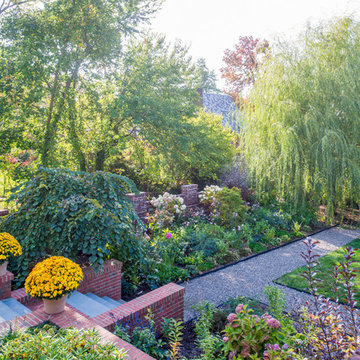 Westover Landscape Design
Not everyone would see the hidden beauty in the Yonkers property destined for the wrecking ball in 2000. But one family took the serious fixer-upper under their wing. Crumbling walls, overgrown maples (indeed, saplings were busting through the brick walls), and deer living in the basement was the state of affairs when Westover Landscape Design initially arrived on the scene. A year of intensive, meticulous, thoughtful renovation by the homeowner followed while the house was brought up to speed. When the last construction machine finally rumbled out, that’s when Robert Welsch and his crew began their odyssey.
The goal was to honor the newly restored relic and deliver it into the future with fitting surroundings. “We wanted to bring that treasure back to life,” Robert Welsch explains. Working closely with the homeowner as well as the city of Yonkers to guide the restoration, their first feat was to install a proper drainage system with catchments capable of keeping storm water from the massive roof flowing away. Before anything was visible on the surface, extensive work was accomplished underground. Meanwhile, a plan was drafted to honor the era of the house. Westover chose bluestone as the primary path material for its easy maintenance and simplicity when laying the swank configuration of pathways around the house and outward to an entertaining pavilion. By cleverly hemming the bluestone with period brick that echoes the building material for the house for continuity, the result is a smart and sophisticated finish to a promenade that constantly draws the family and their pets outdoors. Brick was also used to rebuild the walled gardens for the much-needed privacy in a close-knit Yonkers community. And a graceful wrought iron gate enhances the arrival experience. But walls and gates were not the only element to screen and reveal views—plant selection was critical.
Few landscapers would go the extra mile to find period perfect plants for a 19th Century restoration, but Robert Welsch saw the importance of authenticity in creating the mood. He repeated large trees—such as an exquisite London plane tree in the front yard—to balance the expression in the back. Recognizing the need for immediate stature, he selected a weeping willow to gain instant volume, giving the landscape a sense of deep roots. A weeping Camperdown elm adds sophisticated drama to the walled stroll gardens. Hydrangeas were incorporated for their billowy stature, easy maintenance, and long blooming season. Similarly, all the plants in residence play their part in the display that goes beyond the usual spring fling to extend throughout the growing season—offering visual interest even when they are not performing. From spring bulbs to autumn perennials, there is never a dull moment. Meanwhile, every step along the way was a collaboration working hand-in-hand with the homeowner and the city to make certain that the historic landmark status of the property was upheld and honored.
The result goes beyond a landscape that is just old faithful. It adds life to the picture, creating a jewel-like setting for the newly proud house. In a word, it is sublime. By planting wisely and using sustainable elements, the restored house and its surroundings are ready for the next generation and beyond. This Yonkers gem remains meticulously groomed under the watchful eye and skill of Westover Landscape Design’s team of gardeners—It’s a keeper.
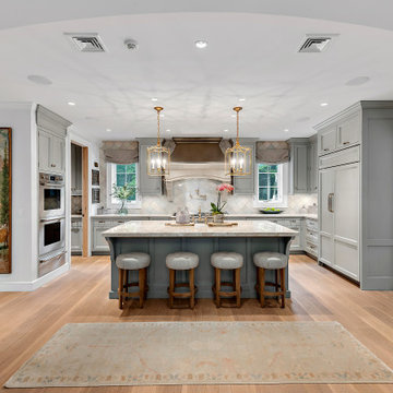 Bilotta Kitchen & Home
Some clients have such great taste, that it’s easy to help create the kitchen of their dreams. Our client in this case had such passion for the design of her own kitchen that it made it such a fun collaborative experience that you don’t always get with clients. She put her heart and soul into making sure every detail was exactly the way she wanted. This kitchen is only a small piece of a well-appointed home. The 1” thick custom door (from Bilotta’s private custom cabinet collection), traditionally styled, yet not overly so, matches beautifully with the details of the adjacent rooms. The grey colored cabinetry blends with the colors in the adjoining rooms creating the perfect centerpiece. The client chose a massive stone Francois & Co. Toulouse Shelf w/ Concave Stack hood from a dealer in London and had it shipped over on a boat! She selected beautiful “Mother of Pearl” knobs from Anthropologie and adorned select cabinets with them like pieces of jewelry. The naturally pearlescent clay tile, the Quartzite countertops and the lanterns above the island were all chosen to mirror these knobs. The lanterns were also chosen to replicate the movement of the gold pattern in the knobs. The client opted to turn the tile on the diagonal as it felt more fluid and in keeping with the movement in the knobs and lanterns. The stone hood, tile, and quartzite sample coordinated perfectly. The room was equipped with a mix of SubZero Wolf and Miele appliances with a Kohler apron sink. The space of course has the perfect amount of accessories for making it more than just visually appealing – it’s a baker’s dream with a lift up for a frequently used mixer. There’s a built-in paper towel holder and just the right amount of utensil dividers, cutlery dividers, tray dividers, roll-outs and even a secret pantry with matching cabinetry hidden in the corner.
Bilotta Designer: Randy O’Kane, CKD & Senior Designer
Builder: Rob Norr, Nordic Construction
Architect: Brad Demotte
Photographer: Anthony Acocella
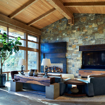
 BARRETT STUDIO architects
This is a quintessential Colorado home. Massive raw steel beams are juxtaposed with refined fumed larch cabinetry, heavy lashed timber is foiled by the lightness of window walls. Monolithic stone walls lay perpendicular to a curved ridge, organizing the home as they converge in the protected entry courtyard. From here, the walls radiate outwards, both dividing and capturing spacious interior volumes and distinct views to the forest, the meadow, and Rocky Mountain peaks. An exploration in craftmanship and artisanal masonry & timber work, the honesty of organic materials grounds and warms expansive interior spaces.
Collaboration:
Photography
Ron Ruscio
Denver, CO 80202
Interior Design, Furniture, & Artwork:
Fedderly and Associates
Palm Desert, CA 92211
Landscape Architect and Landscape Contractor
Lifescape Associates Inc.
Denver, CO 80205
Kitchen Design
Exquisite Kitchen Design
Denver, CO 80209
Custom Metal Fabrication
Raw Urth Designs
Fort Collins, CO 80524
Contractor
Ebcon, Inc.
Mead, CO 80542
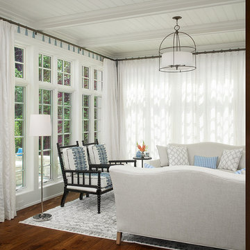
 Visbeen Architects
Builder: J. Peterson Homes
Interior Designer: Francesca Owens
Photographers: Ashley Avila Photography, Bill Hebert, & FulView
Capped by a picturesque double chimney and distinguished by its distinctive roof lines and patterned brick, stone and siding, Rookwood draws inspiration from Tudor and Shingle styles, two of the world’s most enduring architectural forms. Popular from about 1890 through 1940, Tudor is characterized by steeply pitched roofs, massive chimneys, tall narrow casement windows and decorative half-timbering. Shingle’s hallmarks include shingled walls, an asymmetrical façade, intersecting cross gables and extensive porches. A masterpiece of wood and stone, there is nothing ordinary about Rookwood, which combines the best of both worlds.
Once inside the foyer, the 3,500-square foot main level opens with a 27-foot central living room with natural fireplace. Nearby is a large kitchen featuring an extended island, hearth room and butler’s pantry with an adjacent formal dining space near the front of the house. Also featured is a sun room and spacious study, both perfect for relaxing, as well as two nearby garages that add up to almost 1,500 square foot of space. A large master suite with bath and walk-in closet which dominates the 2,700-square foot second level which also includes three additional family bedrooms, a convenient laundry and a flexible 580-square-foot bonus space. Downstairs, the lower level boasts approximately 1,000 more square feet of finished space, including a recreation room, guest suite and additional storage.
 LMB Interiors
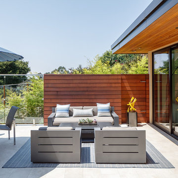
Outdoor patio: Rug by Dash and Albert
Photo by Eric Rorer
While we adore all of our clients and the beautiful structures which we help fill and adorn, like a parent adores all of their children, this recent mid-century modern interior design project was a particular delight.
This client, a smart, energetic, creative, happy person, a man who, in-person, presents as refined and understated — he wanted color. Lots of color. When we introduced some color, he wanted even more color: Bright pops; lively art.
In fact, it started with the art.
This new homeowner was shopping at SLATE ( https://slateart.net) for art one day… many people choose art as the finishing touches to an interior design project, however this man had not yet hired a designer.
He mentioned his predicament to SLATE principal partner (and our dear partner in art sourcing) Danielle Fox, and she promptly referred him to us.
At the time that we began our work, the client and his architect, Jack Backus, had finished up a massive remodel, a thoughtful and thorough update of the elegant, iconic mid-century structure (originally designed by Ratcliff & Ratcliff) for modern 21st-century living.
And when we say, “the client and his architect” — we mean it. In his professional life, our client owns a metal fabrication company; given his skills and knowledge of engineering, build, and production, he elected to act as contractor on the project.
His eye for metal and form made its way into some of our furniture selections, in particular the coffee table in the living room, fabricated and sold locally by Turtle and Hare.
Color for miles: One of our favorite aspects of the project was the long hallway. By choosing to put nothing on the walls, and adorning the length of floor with an amazing, vibrant, patterned rug, we created a perfect venue. The rug stands out, drawing attention to the art on the floor.
In fact, the rugs in each room were as thoughtfully selected for color and design as the art on the walls. In total, on this project, we designed and decorated the living room, family room, master bedroom, and back patio. (Visit www.lmbinteriors.com to view the complete portfolio of images.)
While my design firm is known for our work with traditional and transitional architecture, and we love those projects, I think it is clear from this project that Modern is also our cup of tea.
If you have a Modern house and are thinking about how to make it more vibrantly YOU, contact us for a consultation.


 LMB Interiors
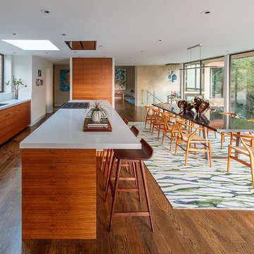
Kitchen/dining room: Colorful statement rug by STARK
Photo credit: Eric Rorer
While we adore all of our clients and the beautiful structures which we help fill and adorn, like a parent adores all of their children, this recent mid-century modern interior design project was a particular delight.
This client, a smart, energetic, creative, happy person, a man who, in-person, presents as refined and understated — he wanted color. Lots of color. When we introduced some color, he wanted even more color: Bright pops; lively art.
In fact, it started with the art.
This new homeowner was shopping at SLATE ( https://slateart.net) for art one day… many people choose art as the finishing touches to an interior design project, however this man had not yet hired a designer.
He mentioned his predicament to SLATE principal partner (and our dear partner in art sourcing) Danielle Fox, and she promptly referred him to us.
At the time that we began our work, the client and his architect, Jack Backus, had finished up a massive remodel, a thoughtful and thorough update of the elegant, iconic mid-century structure (originally designed by Ratcliff & Ratcliff) for modern 21st-century living.
And when we say, “the client and his architect” — we mean it. In his professional life, our client owns a metal fabrication company; given his skills and knowledge of engineering, build, and production, he elected to act as contractor on the project.
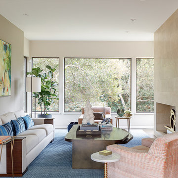
His eye for metal and form made its way into some of our furniture selections, in particular the coffee table in the living room, fabricated and sold locally by Turtle and Hare.
Color for miles: One of our favorite aspects of the project was the long hallway. By choosing to put nothing on the walls, and adorning the length of floor with an amazing, vibrant, patterned rug, we created a perfect venue. The rug stands out, drawing attention to the art on the floor.
In fact, the rugs in each room were as thoughtfully selected for color and design as the art on the walls. In total, on this project, we designed and decorated the living room, family room, master bedroom, and back patio. (Visit www.lmbinteriors.com to view the complete portfolio of images.)
While my design firm is known for our work with traditional and transitional architecture, and we love those projects, I think it is clear from this project that Modern is also our cup of tea.
If you have a Modern house and are thinking about how to make it more vibrantly YOU, contact us for a consultation.
 LMB Interiors
Painting over sofa by Joanne Fox, via SLATE. Custom coffee table design specs by LMBI, fabrication by Turtle and Hare, with steel legs fabricated by our client’s metal manufacturing company. Rug by Scott Group — Studio Hokanson. Wallpaper on art wall, vinyl, color: pebble, by Cowtan and Tout.
Photo by Eric Rorer
While we adore all of our clients and the beautiful structures which we help fill and adorn, like a parent adores all of their children, this recent mid-century modern interior design project was a particular delight.
This client, a smart, energetic, creative, happy person, a man who, in-person, presents as refined and understated — he wanted color. Lots of color. When we introduced some color, he wanted even more color: Bright pops; lively art.
In fact, it started with the art.
This new homeowner was shopping at SLATE ( https://slateart.net) for art one day… many people choose art as the finishing touches to an interior design project, however this man had not yet hired a designer.
He mentioned his predicament to SLATE principal partner (and our dear partner in art sourcing) Danielle Fox, and she promptly referred him to us.
At the time that we began our work, the client and his architect, Jack Backus, had finished up a massive remodel, a thoughtful and thorough update of the elegant, iconic mid-century structure (originally designed by Ratcliff & Ratcliff) for modern 21st-century living.
And when we say, “the client and his architect” — we mean it. In his professional life, our client owns a metal fabrication company; given his skills and knowledge of engineering, build, and production, he elected to act as contractor on the project.
His eye for metal and form made its way into some of our furniture selections, in particular the coffee table in the living room, fabricated and sold locally by Turtle and Hare.
Color for miles: One of our favorite aspects of the project was the long hallway. By choosing to put nothing on the walls, and adorning the length of floor with an amazing, vibrant, patterned rug, we created a perfect venue. The rug stands out, drawing attention to the art on the floor.
In fact, the rugs in each room were as thoughtfully selected for color and design as the art on the walls. In total, on this project, we designed and decorated the living room, family room, master bedroom, and back patio. (Visit www.lmbinteriors.com to view the complete portfolio of images.)
While my design firm is known for our work with traditional and transitional architecture, and we love those projects, I think it is clear from this project that Modern is also our cup of tea.
If you have a Modern house and are thinking about how to make it more vibrantly YOU, contact us for a consultation.
 LMB Interiors
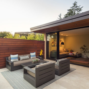
Outdoor patio: Rug by Dash and Albert
Photo by Eric Rorer
While we adore all of our clients and the beautiful structures which we help fill and adorn, like a parent adores all of their children, this recent mid-century modern interior design project was a particular delight.
This client, a smart, energetic, creative, happy person, a man who, in-person, presents as refined and understated — he wanted color. Lots of color. When we introduced some color, he wanted even more color: Bright pops; lively art.
In fact, it started with the art.
This new homeowner was shopping at SLATE ( https://slateart.net) for art one day… many people choose art as the finishing touches to an interior design project, however this man had not yet hired a designer.
He mentioned his predicament to SLATE principal partner (and our dear partner in art sourcing) Danielle Fox, and she promptly referred him to us.
At the time that we began our work, the client and his architect, Jack Backus, had finished up a massive remodel, a thoughtful and thorough update of the elegant, iconic mid-century structure (originally designed by Ratcliff & Ratcliff) for modern 21st-century living.
And when we say, “the client and his architect” — we mean it. In his professional life, our client owns a metal fabrication company; given his skills and knowledge of engineering, build, and production, he elected to act as contractor on the project.
His eye for metal and form made its way into some of our furniture selections, in particular the coffee table in the living room, fabricated and sold locally by Turtle and Hare.
Color for miles: One of our favorite aspects of the project was the long hallway. By choosing to put nothing on the walls, and adorning the length of floor with an amazing, vibrant, patterned rug, we created a perfect venue. The rug stands out, drawing attention to the art on the floor.
In fact, the rugs in each room were as thoughtfully selected for color and design as the art on the walls. In total, on this project, we designed and decorated the living room, family room, master bedroom, and back patio. (Visit www.lmbinteriors.com to view the complete portfolio of images.)
While my design firm is known for our work with traditional and transitional architecture, and we love those projects, I think it is clear from this project that Modern is also our cup of tea.
If you have a Modern house and are thinking about how to make it more vibrantly YOU, contact us for a consultation.
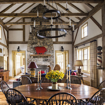
 Haver & Skolnick LLC Architects
The Family Room includes a large oval breakfast table and a massive stone fireplace. Colorful antique accessories include a playful tin barbecue sign above the mantle.
Robert Benson Photography
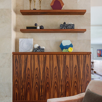 LMB Interiors
Photo by Eric Rorer
While we adore all of our clients and the beautiful structures which we help fill and adorn, like a parent adores all of their children, this recent mid-century modern interior design project was a particular delight.
This client, a smart, energetic, creative, happy person, a man who, in-person, presents as refined and understated — he wanted color. Lots of color. When we introduced some color, he wanted even more color: Bright pops; lively art.
In fact, it started with the art.
This new homeowner was shopping at SLATE ( https://slateart.net) for art one day… many people choose art as the finishing touches to an interior design project, however this man had not yet hired a designer.
He mentioned his predicament to SLATE principal partner (and our dear partner in art sourcing) Danielle Fox, and she promptly referred him to us.
At the time that we began our work, the client and his architect, Jack Backus, had finished up a massive remodel, a thoughtful and thorough update of the elegant, iconic mid-century structure (originally designed by Ratcliff & Ratcliff) for modern 21st-century living.
And when we say, “the client and his architect” — we mean it. In his professional life, our client owns a metal fabrication company; given his skills and knowledge of engineering, build, and production, he elected to act as contractor on the project.
His eye for metal and form made its way into some of our furniture selections, in particular the coffee table in the living room, fabricated and sold locally by Turtle and Hare.
Color for miles: One of our favorite aspects of the project was the long hallway. By choosing to put nothing on the walls, and adorning the length of floor with an amazing, vibrant, patterned rug, we created a perfect venue. The rug stands out, drawing attention to the art on the floor.
In fact, the rugs in each room were as thoughtfully selected for color and design as the art on the walls. In total, on this project, we designed and decorated the living room, family room, master bedroom, and back patio. (Visit www.lmbinteriors.com to view the complete portfolio of images.)
While my design firm is known for our work with traditional and transitional architecture, and we love those projects, I think it is clear from this project that Modern is also our cup of tea.
If you have a Modern house and are thinking about how to make it more vibrantly YOU, contact us for a consultation.
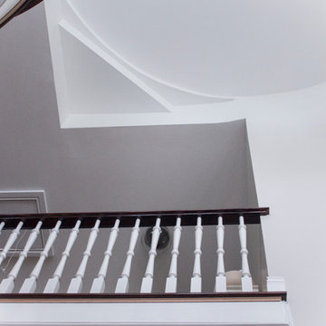
 Century Stair Company
Stunning curved stair system in home with Bull Run Mountain breathtaking views; smooth wood treads and inviting volutes match owners beautiful flooring selection. The massive hand railing system in this staircase complement front doors unique design, and comply with local building codes. Century Stair brought to life owner’s vision; we designed, manufactured and installed the complete spiraling staircase (basement, main level, and second floor).CSC 1976-2020 © Century Stair Company ® All rights reserved.
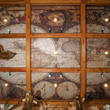 Heather DeMoras Design Consultants Inc.
The owners of this magnificent fly-in/ fly-out lodge had a vision for a home that would showcase their love of nature, animals, flying and big game hunting. Featured in the 2011 Design New York Magazine, we are proud to bring this vision to life.
Chuck Smith, AIA, created the architectural design for the timber frame lodge which is situated next to a regional airport. Heather DeMoras Design Consultants was chosen to continue the owners vision through careful interior design and selection of finishes, furniture and lighting, built-ins, and accessories.
HDDC's involvement touched every aspect of the home, from Kitchen and Trophy Room design to each of the guest baths and every room in between. Drawings and 3D visualization were produced for built in details such as massive fireplaces and their surrounding mill work, the trophy room and its world map ceiling and floor with inlaid compass rose, custom molding, trim & paneling throughout the house, and a master bath suite inspired by and Oak Forest. A home of this caliber requires and attention to detail beyond simple finishes. Extensive tile designs highlight natural scenes and animals. Many portions of the home received artisan paint effects to soften the scale and highlight architectural features. Artistic balustrades depict woodland creatures in forest settings. To insure the continuity of the Owner's vision, we assisted in the selection of furniture and accessories, and even assisted with the selection of windows and doors, exterior finishes and custom exterior lighting fixtures.
Interior details include ceiling fans with finishes and custom detailing to coordinate with the other custom lighting fixtures of the home. The Dining Room boasts of a bronze moose chandelier above the dining room table. Along with custom furniture, other touches include a hand stitched Mennonite quilt in the Master Bedroom and murals by our decorative artist.
6