
Search results for "Master achieve" in Home Design Ideas
 SENCE ARCHITECTS
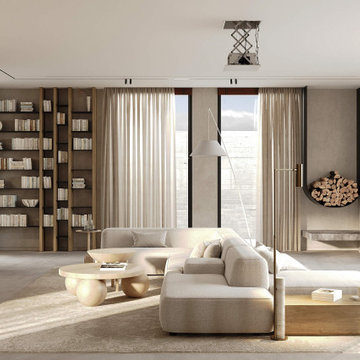
Our approach was to maximize natural light, enhancing the open feel of the home. We achieved this through a palette of light shades on the walls and floors, creating a tranquil backdrop for home life.
In the living room, simplicity meets sophistication. The sleek open kitchen flows seamlessly into the spacious living area. A unique feature of the layout is a mechanism that can transform the space from open to closed, providing both privacy and openness as desired. Natural materials prevail in the interior: wood brings warmth to each room, while the microcement floors add a touch of contemporary elegance. Elements of natural stone ground the space, bringing an organic touch to the modern home.
The furniture is selected for both comfort and aesthetic appeal, with soft fabrics and a neutral color scheme. Instead of a traditional TV, we opted for a projector, adding a contemporary, cinematic feel to the living space. The fireplace has a curved metal wood shelf that is as functional as it is artistic.
Upstairs is the master bedroom and a teen girl's bedroom. The master bedroom is a light-filled respite, with a feature wall of glass blocks elegantly separating it from the bathroom. This private nook is done in contemporary terracotta tones with dark hardware, creating a space that is simultaneously lush and relaxing.
The teen girl's room, decorated in soft milky tones with delicate accents of light blue and light pink, is an airy and modern space for inspiration.
The interior of the NOM house is designed not just to be seen, but to be lived in, creating an environment where every moment is spent in comfort and style.
Size / 300 sq.m.
Year / 2024
Location / Limassol, Cyprus
 Living with Lolo
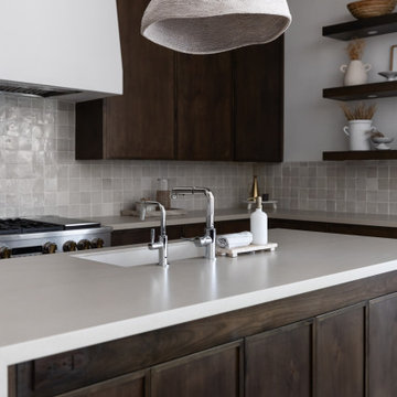
Kitchen in Wabi Sabi Retreat |
Room Type:
3 bed, 4 bath, 3770 square feet- Master Bath, Kitchen, Dining Room, Den, Laundry Room, Powder Bath, Family Room, Living Room, Entry.
Project Name:
Wabi Sabi Retreat.
Key Feature:
A wabi sabi–inspired home that captures simplicity, imperfection, and tranquility through organic textures, weathered finishes, and intentional negative space, while working within the existing architecture.
Challenge:
The home’s architecture did not naturally lend itself to traditional wabi sabi design, requiring a thoughtful approach to achieve the desired feeling without forcing the aesthetic.
Solution:
Rather than applying a rigid style, the team focused on evoking tranquility through contrast, organic materials, intentional emptiness, and finishes that develop character over time.
Materials:
Furniture: Four Hands, Noir, Vig, Moss Studio, Dovetail, TOV.
Lighting: Arteriors, Lucent Light Shop, Ping Lighting.
Rugs: Jaipur, Loloi.
Artwork: Leftbank, Etsy.
Budget:
$100k- $300k |
Timeline:
6 months, completed March 2025
 Living with Lolo
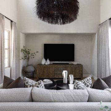
Living Room in Wabi Sabi Retreat |
Room Type:
3 bed, 4 bath, 3770 square feet- Master Bath, Kitchen, Dining Room, Den, Laundry Room, Powder Bath, Family Room, Living Room, Entry.
Project Name:
Wabi Sabi Retreat.
Key Feature:
A wabi sabi–inspired home that captures simplicity, imperfection, and tranquility through organic textures, weathered finishes, and intentional negative space, while working within the existing architecture.
Challenge:
The home’s architecture did not naturally lend itself to traditional wabi sabi design, requiring a thoughtful approach to achieve the desired feeling without forcing the aesthetic.
Solution:
Rather than applying a rigid style, the team focused on evoking tranquility through contrast, organic materials, intentional emptiness, and finishes that develop character over time.
Materials:
Furniture: Four Hands, Noir, Vig, Moss Studio, Dovetail, TOV.
Lighting: Arteriors, Lucent Light Shop, Ping Lighting.
Rugs: Jaipur, Loloi.
Artwork: Leftbank, Etsy.
Budget:
$100k- $300k |
Timeline:
6 months, completed March 2025
Find the right local pro for your project
 Marvin
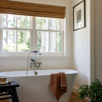
The homeowners of this home outside Savannah, Georgia wanted something small-ish that would meet their desire to host guests, but also meet their future age-in-place needs. Despite its low profile, the property boasts an impressive footprint that includes two outbuildings, a garage and guest house, and a centuries-old live oak tree.
The design and build team used products from the Marvin Ultimate collection to achieve the level of customization and traditional styling they wanted for this Southern new build. The collection’s build and performance ratings were also an advantage for this waterfront home against the temperamental coastal weather.
“The magic of a house like this is when the relationships come together. There are a few partners we have that we feel like are more tangible partners. Marvin is one of those,” said Josh Brooks, owner of Brooks Construction Group, LLC.
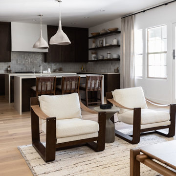 Living with Lolo
Living Room in Wabi Sabi Retreat |
Room Type:
3 bed, 4 bath, 3770 square feet- Master Bath, Kitchen, Dining Room, Den, Laundry Room, Powder Bath, Family Room, Living Room, Entry.
Project Name:
Wabi Sabi Retreat.
Key Feature:
A wabi sabi–inspired home that captures simplicity, imperfection, and tranquility through organic textures, weathered finishes, and intentional negative space, while working within the existing architecture.
Challenge:
The home’s architecture did not naturally lend itself to traditional wabi sabi design, requiring a thoughtful approach to achieve the desired feeling without forcing the aesthetic.
Solution:
Rather than applying a rigid style, the team focused on evoking tranquility through contrast, organic materials, intentional emptiness, and finishes that develop character over time.
Materials:
Furniture: Four Hands, Noir, Vig, Moss Studio, Dovetail, TOV.
Lighting: Arteriors, Lucent Light Shop, Ping Lighting.
Rugs: Jaipur, Loloi.
Artwork: Leftbank, Etsy.
Budget:
$100k- $300k |
Timeline:
6 months, completed March 2025
 FLYNN associates
Joseph L. Flynn, AIA Architect
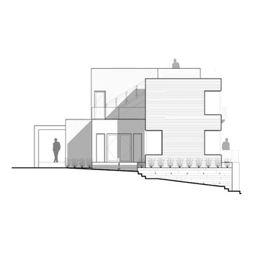
The Silverlake Hillside Residence is a contemporary, and sustainable custom home located within the hillside community of Silverlake, Los Angeles, designed by Joe Flynn Architecture. The primary project goal was to bring the outdoor environment to the indoors. To achieve this, the project is oriented towards its views of significant natural and man made landmarks which it bare witness to. The downtown skyline of Los Angeles is visible from the master bedroom corner windows. Views of the lush green landscape of Franklin Hills can be enjoyed through the living room corner windows, as well as the full-height accordion glass "nana-wall" door system which links the kitchen to the patio. Views of Griffith Park Observatory, and the Hollywood Sign through the rooftop deck, as well as the downtown skyline. Slight variations in floor elevation create a sense of individuality to each interior and exterior space, giving the feeling of separate "rooms", while offering a continuity of light, space, and views.
 Fergus Garber Architects
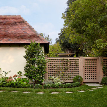
Enlarging and reconfiguring this endearing 100 year old Palo Alto cottage gives the home a new life in the twenty-first century.
When it comes to architecture and interior design, character and charm go a long way, but natural light, spaciousness, and fluidity are just as essential to creating a home. Over the course of design process, the FGA team explored inventive ways to maximize this 1920s Palo Alto home’s potential while maintaining its historic perspective. The new design connects, modernizes, and functionalizes the floor plan and cleans up outdated 1960s renovations. To achieve this, a new second wing was added to the original structure using the same French Tudor and half-timber style. The U-shaped courtyard configuration now creates a quaint centralized patio area easily accessible by French doors on both wings. The new wing houses a ground floor family room directly off the kitchen and an enlarged private master suite above. To take advantage of existing interior space, the second floor was reimagined by clearing out a warren of small, dark servant rooms. An unused elevator shaft was also removed affording larger, brighter, and more cohesive spaces on the ground floor and a cleaner, simplified exterior roof line that enhances the home's appearance from the street.

 A to Z Construction Inc.
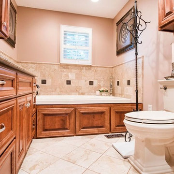
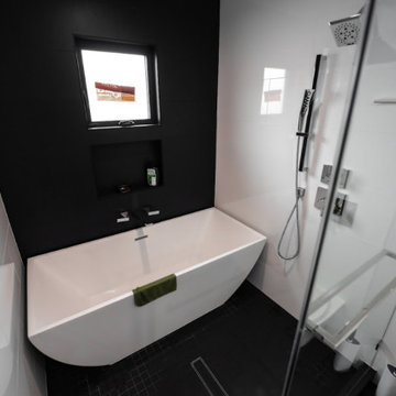
In the extensive Northridge project, we executed a complete gutting of the house, initiating a fresh start for a transformative outcome. By removing support walls and adding 650 square feet of living space for the living room and master bedroom, we successfully opened up the floor plan and enhanced the overall functionality. The meticulous reframing of the entire house allowed for the creation of a stunning vaulted ceiling, while the installation of brand new tile floors throughout the whole house and custom-made kitchen cabinets elevated the interior aesthetics. Additionally, we enhanced the curb appeal with the installation of new fiberglass windows, a preambled pavers driveway, and a captivating redwood feature at the front entrance, achieving a modern and inviting look for the property.
 Kitchen & Bath Masters
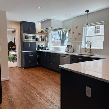
Our client, Filipa, approached us with the desire to renovate the kitchen in her McLean home. Her goal was to completely transform the existing closed-off, L-shaped kitchen into a more open, functional, and visually striking space.
To make this happen, we removed the separating wall and opened up the area to accommodate a spacious island. By connecting the kitchen and dining room, we created an airy and inviting open-concept layout that better suits modern living and entertaining.
Filipa envisioned a kitchen that felt both classic and contemporary, with a strong sense of sophistication. To achieve this balance, we selected Slim Shaker-style cabinets in a rich navy blue finish, offering depth and elegance while maintaining a clean and timeless look.
To enhance the design, we incorporated a glass-front pantry cabinet in the corner—ideal for display and added storage. This detail not only adds visual interest but also gives the kitchen a touch of personalized charm.
To complete the transformation, we topped everything with a white to soft off-white quartz countertop, bringing brightness and contrast to the navy cabinetry and adding a refined, luxurious finish to the space.
The result is a beautiful blend of functionality and style—perfectly tailored to our client’s taste and lifestyle.

 Kristin Hoaglund Design
This beautiful French Provincial home is set on 10 acres, nestled perfectly in the oak trees. The original home was built in 1974 and had two large additions added; a great room in 1990 and a main floor master suite in 2001. This was my dream project: a full gut renovation of the entire 4,300 square foot home! I contracted the project myself, and we finished the interior remodel in just six months. The exterior received complete attention as well. The 1970s mottled brown brick went white to completely transform the look from dated to classic French. Inside, walls were removed and doorways widened to create an open floor plan that functions so well for everyday living as well as entertaining. The white walls and white trim make everything new, fresh and bright. It is so rewarding to see something old transformed into something new, more beautiful and more functional.

 Chapman Design Group, Inc.
This rustic style home on Hartwell Lake was designed and built for the owners to enjoy with family and friends during their active weekend lifestyle. The home was built on a narrow, deep lot that was semi-level on the roadside and steep on the lakeside. The back half of the lot heavily wooded with mature oak and poplar trees reducing the harsh sun’s heat gain on the home.
The exterior utilizes fiber cement cedar shake and lap siding complimented by deep brown colors for the windows, soffit, trim and the large square columns. A nice balance of natural earth toned stacked stone rounds out the exterior materials completing the rustic casual lake living.
The home 5400 SF is designed and built on thee levels each having a primary focus. The main level creates primary daily living for the owners. This level features an open plan with an entry, stair, dining, kitchen and living areas leading to a large lakeside screened porch. A master suite is privately tucked off its own hallway and allowing it to enjoy the lakeside as well with its own private deck. On the opposite side are two bedrooms, a study and a shared bathroom for each to utilize. An open carport for two vehicles was created with the motor court and connects to the mudroom/utility room giving the owners direct entry into their home.
The upper level is for the grand children with an oversized bedroom, bathroom and loft area for play.
The lower level is the considered the party level. Its primary feature is an elevated stage for the owner’s band opened to a large seating area, dining and kitchen for viewing and listening with direct access to another screened porch. Flanking each side is a theater and two additional bedrooms and bathrooms.
Energy Efficient features include:
• The majority of the lower level sunk into the site below grade
• 6” thick walls utilizing advanced framing techniques
• Foil covered roof sheathing
• Extensive use of blown in cellulous
• All windows & doors are double paned low E argon filed glass
• Tank-less water heaters
• Three separate high efficiency HVAC units with programmable thermostats and a fresh air ERV.
Lastly the owner requested we make every effort to sound proof the home. Many materials and techniques gave a duel purpose and added to the energy efficiency.
These items include:
• 2x6 walls with staggered studs
• Extensive use if rock wool acoustic batting
• Tempered glass in all exterior doors and windows
• ¼ thick Mass Loaded Vinyl (MLV) was installed on the top and bottom of the floor trusses and on all lower level walls.
The combination of the design and detailing utilizing these specific materials enabled us to achieve a 5 Star Plus Energy Star Certification with a HERS Index Score of 50. This home received a the 2015 Pinnacle Award from the SC Home Builders Association for the “Best Achievement in Energy Efficiency” sponsored by the SC Department Commerce.
 SENCE ARCHITECTS
Our approach was to maximize natural light, enhancing the open feel of the home. We achieved this through a palette of light shades on the walls and floors, creating a tranquil backdrop for home life.
In the living room, simplicity meets sophistication. The sleek open kitchen flows seamlessly into the spacious living area. A unique feature of the layout is a mechanism that can transform the space from open to closed, providing both privacy and openness as desired. Natural materials prevail in the interior: wood brings warmth to each room, while the microcement floors add a touch of contemporary elegance. Elements of natural stone ground the space, bringing an organic touch to the modern home.
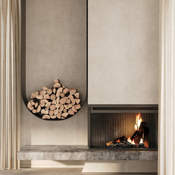
The furniture is selected for both comfort and aesthetic appeal, with soft fabrics and a neutral color scheme. Instead of a traditional TV, we opted for a projector, adding a contemporary, cinematic feel to the living space. The fireplace has a curved metal wood shelf that is as functional as it is artistic.
Upstairs is the master bedroom and a teen girl's bedroom. The master bedroom is a light-filled respite, with a feature wall of glass blocks elegantly separating it from the bathroom. This private nook is done in contemporary terracotta tones with dark hardware, creating a space that is simultaneously lush and relaxing.
The teen girl's room, decorated in soft milky tones with delicate accents of light blue and light pink, is an airy and modern space for inspiration.
The interior of the NOM house is designed not just to be seen, but to be lived in, creating an environment where every moment is spent in comfort and style.
Size / 300 sq.m.
Year / 2024
Location / Limassol, Cyprus

 Ceramic Tile Design
This Sonoma steam shower is a luxurious usage of our Listone D wood-look porcelain that is imported straight from Italy.
CTD is a family owned business with a showroom and warehouse in both San Rafael and San Francisco.
Our showrooms are staffed with talented teams of Design Consultants. Whether you already know exactly what you want or have no knowledge of what's possible we can help your project exceed your expectations. To achieve this we stock the best Italian porcelain lines in a variety of styles and work with the most creative American art tile companies to set your project apart from the rest.
Our warehouses not only provide a safe place for your order to arrive, but also stock a complete array of all the setting materials your contractor will need to complete your project saving him time and you money. The warehouse staff is knowledgeable and friendly to help make sure your project goes smoothly.

Sponsored
Sunbury, OH

J.Holderby - Renovations
Franklin County's Leading General Contractors - 2X Best of Houzz!

 Kitchen Design Concepts
We love a good bathroom success story! The original state of this bathroom had good, modern bones, but needed new finishes. Without changing the great layout it already had, we managed to give this space a brand new look! The main goal of the space was to replace the orange hues with more updated tones, resulting in a more balanced look (there is no denying the orange needed to go!). So, before we dig into the new space, take a look at how it was before:
Cabinets
Replacing the door and drawer fronts was a major step to creating a new look to the space. We replaced the orange stained door and drawer fronts with new ones having a grey painted finish. This instantly brightened up the space! It’s amazing what a new color can do to a room.
Countertop
We love using quartz in bathroom spaces, and all spaces really! But especially in bathrooms because of its non-porous qualities which means it can handle splashes of water like no other. This is why we have it as the countertop on the vanity, the tub deck, and also tub surround. There is no denying the finish of this quartz is what makes this space pop. This is a 3cm Caesarstone in a finish of Calcutta Nuvo. It has lovely marble-like markings and we love the effect it has on the tub surround.
Although this space did not include any major renovation, we still achieved a space with a major new look. Don’t underestimate the power of new finishes!

 Axis Mundi | SF
When the Gimbels department store chain closed in 1986, many of its selling floors were converted into luxury apartments, including those of this branch at 86th Street and Lexington Avenue. The retailer’s soaring ceilings allowed Axis Mundi to create bedroom mezzanine spaces overlooking the living and dining rooms. Defining them with translucent glass welcomed natural light while retaining privacy. Downstairs, spaces bleed one into another, their basic monochromatic black-and-white palette acting as a unifying leitmotif. Yet each space feels distinct, with its own programmatic purpose, a feat largely achieved by varying floor and wall treatments—a graphic tile pattern in the entry, a red wall in the hall leading to the master suite, a colorful area rug in the living room. In the retailer’s heyday, the then-common saying, “Would Macy’s tell Gimbels?” implied the strategies the competitors kept from each other to gain the upper hand. Here, a structure iconic in its day also conceals something: a handsome, wholly contemporary repurposing that represents just the sort of innovation that made Gimbels the celebrated name that it was.
Project Team: John Beckmann, Nick Messerlian and Richard Rosenbloom
Kitchen by Minimal USA
Photography: Federica Carlet
© Axis Mundi Design LLC

 Axis Mundi | New York
When the Gimbels department store chain closed in 1986, many of its selling floors were converted into luxury apartments, including those of this branch at 86th Street and Lexington Avenue. The retailer’s soaring ceilings allowed Axis Mundi to create bedroom mezzanine spaces overlooking the living and dining rooms. Defining them with translucent glass welcomed natural light while retaining privacy. Downstairs, spaces bleed one into another, their basic monochromatic black-and-white palette acting as a unifying leitmotif. Yet each space feels distinct, with its own programmatic purpose, a feat largely achieved by varying floor and wall treatments—a graphic tile pattern in the entry, a red wall in the hall leading to the master suite, a colorful area rug in the living room. In the retailer’s heyday, the then-common saying, “Would Macy’s tell Gimbels?” implied the strategies the competitors kept from each other to gain the upper hand. Here, a structure iconic in its day also conceals something: a handsome, wholly contemporary repurposing that represents just the sort of innovation that made Gimbels the celebrated name that it was.
Project Team: John Beckmann, Nick Messerlian and Richard Rosenbloom
Kitchen by Minimal USA
Photography: Federica Carlet
Contractor: James Sappho
© Axis Mundi Design LLC.
 Living with Lolo
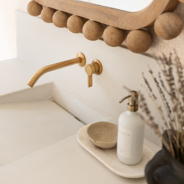
Powder Room in Wabi Sabi Retreat |
Room Type:
3 bed, 4 bath, 3770 square feet- Master Bath, Kitchen, Dining Room, Den, Laundry Room, Powder Bath, Family Room, Living Room, Entry.
Project Name:
Wabi Sabi Retreat.
Key Feature:
A wabi sabi–inspired home that captures simplicity, imperfection, and tranquility through organic textures, weathered finishes, and intentional negative space, while working within the existing architecture.
Challenge:
The home’s architecture did not naturally lend itself to traditional wabi sabi design, requiring a thoughtful approach to achieve the desired feeling without forcing the aesthetic.
Solution:
Rather than applying a rigid style, the team focused on evoking tranquility through contrast, organic materials, intentional emptiness, and finishes that develop character over time.
Materials:
Furniture: Four Hands, Noir, Vig, Moss Studio, Dovetail, TOV.
Lighting: Arteriors, Lucent Light Shop, Ping Lighting.
Rugs: Jaipur, Loloi.
Artwork: Leftbank, Etsy.
Budget:
$100k- $300k |
Timeline:
6 months, completed March 2025
Sponsored
Delaware, OH

Buckeye Basements, Inc.
Central Ohio's Basement Finishing ExpertsBest Of Houzz '13-'21
 Axis Mundi | SF
When the Gimbels department store chain closed in 1986, many of its selling floors were converted into luxury apartments, including those of this branch at 86th Street and Lexington Avenue. The retailer’s soaring ceilings allowed Axis Mundi to create bedroom mezzanine spaces overlooking the living and dining rooms. Defining them with translucent glass welcomed natural light while retaining privacy. Downstairs, spaces bleed one into another, their basic monochromatic black-and-white palette acting as a unifying leitmotif. Yet each space feels distinct, with its own programmatic purpose, a feat largely achieved by varying floor and wall treatments—a graphic tile pattern in the entry, a red wall in the hall leading to the master suite, a colorful area rug in the living room. In the retailer’s heyday, the then-common saying, “Would Macy’s tell Gimbels?” implied the strategies the competitors kept from each other to gain the upper hand. Here, a structure iconic in its day also conceals something: a handsome, wholly contemporary repurposing that represents just the sort of innovation that made Gimbels the celebrated name that it was.
Project Team: John Beckmann, Nick Messerlian and Richard Rosenbloom
Kitchen by Minimal USA
Photography: Federica Carlet
© Axis Mundi Design LLC

 Innovative Design Build
Five stars isn’t enough! Our project was to reconfigure and update the main floor of a house we recently purchased that was built in 1961. We wanted to maintain some of the unique feeling it originally had but bring it up-to-date and eliminate the closed-in rooms and downright weird layout that was the result of multiple, partial remodeling projects. We began with a long wishlist of changes which also required replacement of very antiquated plumbing, electrical wiring and HVAC. We even found a fireplace that had been walled in and needed major re-construction. Many other aspects and details on this incredible list we made included an all new kitchen layout, converting a bedroom into a master closet, adding new half-bath, completely rebuilding the master bath, and adding stone, tile and custom built cabinetry. Our design plans included many fixtures and details that we specified and required professional installation and careful handling. Innovative helped us make reasonable decisions. Their skilled staff took us through a design process that made sense. There were many questions and all were answered with sincere conversation and positive – innovation – on how we could achieve our goals. Innovative provided us with professional consultants, who listened and were courteous and creative, with solid knowledge and informative judgement. When they didn’t have an answer, they did the research. They developed a comprehensive project plan that exceeded our expectations. Every item on our long list was checked-off. All agreed on work was fulfilled and they completed all this in just under four months. Innovative took care of putting together a team of skilled professional specialists who were all dedicated to make everything right. Engineering, construction, supervision, and I cannot even begin to describe how much thanks we have for the demolition crew! Our multiple, detailed project designs from Raul and professional design advice from Mindy and the connections she recommended are all of the best quality. Diego Jr., Trevor and his team kept everything on track and neat and tidy every single day and Diego Sr., Mark, Ismael, Albert, Santiago and team are true craftsmen who follow-up and make the most minuscule woodworking details perfect. The cabinets by Tim and electrical work and installation of fixtures by Kemchan Harrilal-BB and Navindra Doolratram, and Augustine and his crew on tile and stone work – all perfection. Aisling and the office crew were always responsive to our calls and requests. And of course Clark and Eric who oversaw everything and gave us the best of the best! Apologies if we didn’t get everyone on this list – you’re all great! Thank you for your hard work and dedication. We can’t thank you enough Innovative Construction – we kind of want to do it again!
Dave Hallman & Matt DeGraffenreid
 Fergus Garber Architects
Enlarging and reconfiguring this endearing 100 year old Palo Alto cottage gives the home a new life in the twenty-first century.
When it comes to architecture and interior design, character and charm go a long way, but natural light, spaciousness, and fluidity are just as essential to creating a home. Over the course of design process, the FGA team explored inventive ways to maximize this 1920s Palo Alto home’s potential while maintaining its historic perspective. The new design connects, modernizes, and functionalizes the floor plan and cleans up outdated 1960s renovations. To achieve this, a new second wing was added to the original structure using the same French Tudor and half-timber style. The U-shaped courtyard configuration now creates a quaint centralized patio area easily accessible by French doors on both wings. The new wing houses a ground floor family room directly off the kitchen and an enlarged private master suite above. To take advantage of existing interior space, the second floor was reimagined by clearing out a warren of small, dark servant rooms. An unused elevator shaft was also removed affording larger, brighter, and more cohesive spaces on the ground floor and a cleaner, simplified exterior roof line that enhances the home's appearance from the street.
151