
Search results for "Master any space" in Home Design Ideas
 TVL Creative Ltd.
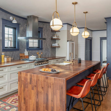
This 1910 West Highlands home was so compartmentalized that you couldn't help to notice you were constantly entering a new room every 8-10 feet. There was also a 500 SF addition put on the back of the home to accommodate a living room, 3/4 bath, laundry room and back foyer - 350 SF of that was for the living room. Needless to say, the house needed to be gutted and replanned.
Kitchen+Dining+Laundry-Like most of these early 1900's homes, the kitchen was not the heartbeat of the home like they are today. This kitchen was tucked away in the back and smaller than any other social rooms in the house. We knocked out the walls of the dining room to expand and created an open floor plan suitable for any type of gathering. As a nod to the history of the home, we used butcherblock for all the countertops and shelving which was accented by tones of brass, dusty blues and light-warm greys. This room had no storage before so creating ample storage and a variety of storage types was a critical ask for the client. One of my favorite details is the blue crown that draws from one end of the space to the other, accenting a ceiling that was otherwise forgotten.
Primary Bath-This did not exist prior to the remodel and the client wanted a more neutral space with strong visual details. We split the walls in half with a datum line that transitions from penny gap molding to the tile in the shower. To provide some more visual drama, we did a chevron tile arrangement on the floor, gridded the shower enclosure for some deep contrast an array of brass and quartz to elevate the finishes.
Powder Bath-This is always a fun place to let your vision get out of the box a bit. All the elements were familiar to the space but modernized and more playful. The floor has a wood look tile in a herringbone arrangement, a navy vanity, gold fixtures that are all servants to the star of the room - the blue and white deco wall tile behind the vanity.
Full Bath-This was a quirky little bathroom that you'd always keep the door closed when guests are over. Now we have brought the blue tones into the space and accented it with bronze fixtures and a playful southwestern floor tile.
Living Room & Office-This room was too big for its own good and now serves multiple purposes. We condensed the space to provide a living area for the whole family plus other guests and left enough room to explain the space with floor cushions. The office was a bonus to the project as it provided privacy to a room that otherwise had none before.
 ZeroEnergy Design
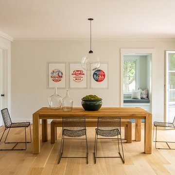
This LEED Platinum certified house reflects the homeowner's desire for an exceptionally healthy and comfortable living environment, within a traditional neighborhood.
INFILL SITE. The family, who moved from another area of Wellesley, sought out this property to be within walking distance of the high school and downtown area. An existing structure on the tight lot was removed to make way for the new home. 84% of the construction waste, from both the previous structure and the new home, was diverted from a landfill. ZED designed to preserve the existing mature trees on the perimeter of the property to minimize site impacts, and to maintain the character of the neighborhood as well as privacy on the site.
EXTERIOR EXPRESSION. The street facade of the home relates to the local New England vernacular. The rear uses contemporary language, a nod to the family’s Californian roots, to incorporate a roof deck, solar panels, outdoor living space, and the backyard swimming pool. ZED’s careful planning avoided to the need to face the garage doors towards the street, a common syndrome of a narrow lot.
THOUGHTFUL SPACE. Homes with dual entries can often result in duplicate and unused spaces. In this home, the everyday and formal entry areas are one and the same; the front and garage doors share the entry program of coat closets, mudroom storage with bench for removing your shoes, and a laundry room with generous closets for the children's sporting equipment. The entry area leads directly to the living space, encompassing the kitchen, dining and sitting area areas in an L-shaped open plan arrangement. The kitchen is placed at the south-west corner of the space to allow for a strong connection to the dining, sitting and outdoor living spaces. A fire pit on the deck satisfies the family’s desire for an open flame while a sealed gas fireplace is used indoors - ZED’s preference after omitting gas burning appliances completely from an airtight home. A small study, with a window seat, is conveniently located just off of the living space. A first floor guest bedroom includes an accessible bathroom for aging visitors and can be used as a master suite to accommodate aging in place.
HEALTHY LIVING. The client requested a home that was easy to clean and would provide a respite from seasonal allergies and common contaminants that are found in many indoor spaces. ZED selected easy to clean solid surface flooring throughout, provided ample space for cleaning supplies on each floor, and designed a mechanical system with ventilation that provides a constant supply of fresh outdoor air. ZED selected durable materials, finishes, cabinetry, and casework with low or no volatile organic compounds (VOCs) and no added urea formaldehyde.
YEAR-ROUND COMFORT. The home is super insulated and air-tight, paired with high performance triple-paned windows, to ensure it is draft-free throughout the winter (even when in front of the large windows and doors). ZED designed a right-sized heating and cooling system to pair with the thermally improved building enclosure to ensure year-round comfort. The glazing on the home maximizes passive solar gains, and facilitates cross ventilation and daylighting.
ENERGY EFFICIENT. As one of the most energy efficient houses built to date in Wellesley, the home highlights a practical solution for Massachusetts. First, the building enclosure reduces the largest energy requirement for typical houses (heating). Super-insulation, exceptional air sealing, a thermally broken wall assembly, triple pane windows, and passive solar gain combine for a sizable heating load reduction. Second, within the house only efficient systems consume energy. These include an air source heat pump for heating & cooling, a heat pump hot water heater, LED lighting, energy recovery ventilation, and high efficiency appliances. Lastly, photovoltaics provide renewable energy help offset energy consumption. The result is an 89% reduction in energy use compared to a similar brand new home built to code requirements.
RESILIENT. The home will fare well in extreme weather events. During a winter power outage, heat loss will be very slow due to the super-insulated and airtight envelope– taking multiple days to drop to 60 degrees even with no heat source. An engineered drainage system, paired with careful the detailing of the foundation, will help to keep the finished basement dry. A generator will provide full operation of the all-electric house during a power outage.
OVERALL. The home is a reflection of the family goals and an expression of their values, beautifully enabling health, comfort, safety, resilience, and utility, all while respecting the planet.
ZED - Architect & Mechanical Designer
Bevilacqua Builders Inc - Contractor
Creative Land & Water Engineering - Civil Engineering
Barbara Peterson Landscape - Landscape Design
Nest & Company - Interior Furnishings
Eric Roth Photography - Photography
 Furnitureland South
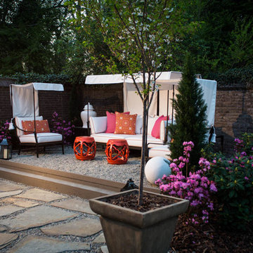
“Greensboro’s Grandest House” was recently selected as the 2013 ShowHouse presented by the Junior League of Greensboro and national media sponsor Traditional Home. Among the local and national design talent featured in this special fundraising event was design duo Patti Allen and Stephanie James of Furnitureland South, who transformed the estate’s patio into a classic, colorful and cozy space.
Built in the early 1920s, the Adamsleigh estate is more than 15,000 square feet and covers 13.5 acres that include pools, a lake, tennis courts, a stone gazebo and a five-car garage. The 30×60 patio presented a special design challenge – the space was in disrepair and sat unevenly on a downward slope. Rising to the challenge, Patti and Stephanie partnered with Outer Space Landscapes to change the elevation of the patio in order to draw attention to the focal point and inspiration of the project: a beautiful canopy sofa by Century Furniture.
The addition of 6 tons of landscaping material included Pennsylvania blue stone, pebbles, sand, cherry trees, azaleas and geraniums all blooming in the colors of the latest Sunbrella fabrics featured in the outdoor furnishings: crisp, sandy white, fuchsia and tangerine. Patti and Stephanie wanted to showcase clean and classic outdoor style with an edge of color and unexpected elements. Playful ottomans by Baker float in the space for multiple functions, adding an extra pop of color to the sophisticated setting which includes a dining table by Oscar de la Renta, organic spot tables from Phillips Collection, and daybeds and seating from Century Furniture.
Combining their passion for interior spaces with signature designs, Allen and James Designs gave this outdoor space the comfort, color and style it deserved.
Patti and Stephanie, co-founders of Allen and James Designs, are committed to inspire and influence unique spaces for home, work, play and relaxation. With over 25 years of experience and a dedication to client relationships, their infusion of international inspiration with style, color, texture and vision make Patti and Stephanie a creative duo capable of exceeding the expectations of any client’s design project. By forming over 400 connections with key manufactures such as Henredon, Century, Lillian August, Dovetail, Maitland Smith and Huntington House, Allen and James Designs can provide a broad range of options that virtually meet any need a client has to create their dream home.
Find the right local pro for your project
 TREX COMPANY INC
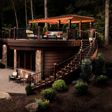
Designed using Trex Transcend decking in Lava Rock – a rich reddish-black shade with subtle shading and natural shade variations creating distinctive hardwood-like streaking and intense tropical hues and Trex Transcend decking in Tiki Torch – a warm, earthy shade features rich, reddish-brown hardwood streaking, and is designed to off the look of real tropical hardwoods with slight variations of color and streaking.
Additional Trex products featured include Trex Elevations, Trex Reveal railing, Trex Pergola, Trex Outdoor Furniture and Trex Outdoor Lighting – stair riser lights, post cap lights and recessed lights.
 Precision Homecrafters, LLC
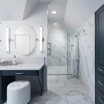
The Inverness Bathroom remodel had these goals: to complete the work while allowing the owner to continue to use their workshop below the project's construction, to provide a high-end quality product that was low-maintenance to the owners, to allow for future accessibility, more natural light and to better meet the daily needs of both the husband's and wife's lifestyles.
The first challenge was providing the required structural support to continue to clear span the two cargarage below which housed a workshop. The sheetrock removal, framing and sheetrock repairs and painting were completed first so the owner could continue to use his workshop, as requested. The HVAC supply line was originally an 8" duct that barely fit in the roof triangle between the ridge pole and ceiling. In order to provide the required air flow to additional supply vents in ceiling, a triangular duct was fabricated allowing us to use every square inch of available space. Since every exterior wall in the space adjoined a sloped ceiling, we installed ventilation baffles between each rafter and installed spray foam insulation.This project more than doubled the square footage of usable space. The new area houses a spaciousshower, large bathtub and dressing area. The addition of a window provides natural light. Instead of a small double vanity, they now have a his-and-hers vanity area. We wanted to provide a practical and comfortable space for the wife to get ready for her day and were able to incorporate a sit down make up station for her. The honed white marble looking tile is not only low maintenance but creates a clean bright spa appearance. The custom color vanities and built in linen press provide the perfect contrast of boldness to create the WOW factor. The sloped ceilings allowed us to maximize the amount of usable space plus provided the opportunity for the built in linen press with drawers at the bottom for additional storage. We were also able to combine two closets and add built in shelves for her. This created a dream space for our client that craved organization and functionality. A separate closet on opposite side of entrance provided suitable and comfortable closet space for him. In the end, these clients now have a large, bright and inviting master bath that will allow for complete accessibility in the future.
 Building Arts Sustainable Architecture
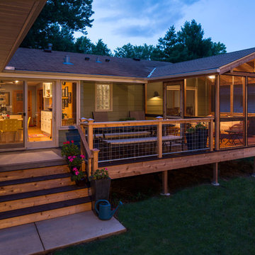
The kitchen spills out onto the deck and the sliding glass door that was added in the master suite opens up into an exposed structure screen porch. Over all the exterior space extends the traffic flow of the interior and makes the home feel larger without adding actual square footage.
Troy Thies Photography
 Homestyle Select Decor
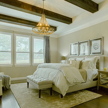
This elegant and serene master bedroom retreat utilizes neutral tomes in grey, white and ivory.
Photo by Fernando De Los Santos
Inspiration for a mid-sized coastal master dark wood floor and brown floor bedroom remodel in Dallas with gray walls and no fireplace
Inspiration for a mid-sized coastal master dark wood floor and brown floor bedroom remodel in Dallas with gray walls and no fireplace

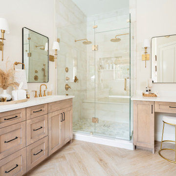
 Zion Home and Building, LLC
The goal for this master suite was to replace a dated, heavy layout with a sense of "Warm Minimalism." We wanted to trade visual clutter for intentional textures. By pairing the natural grain of White Oak with the crisp, architectural lines of Matte Black fixtures, we created a space that feels grounded, airy, and deeply restorative.
A master bath is a high-stakes environment where every inch counts. We took absolute ownership of the "inch-by-inch" planning required to expand the shower and incorporate a freestanding soaking tub without making the room feel crowded. Our Guided Process ensured the client felt confident in the bold choice of vertical stack tile—a design-forward move that draws the eye upward and adds a custom, boutique-hotel feel to the space.
This is a "Host’s Private Oasis." While the rest of the home is ready for guests, this bathroom is a master-grade sanctuary for the homeowners. The elite craftsmanship is visible in the precision of the tile alignments and the seamless integration of the natural wood elements, providing a feeling of pride and daily joy.
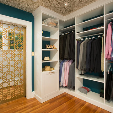
 MARK IV Builders, Inc
New babies have a way to raising the importance of additions and remodeling. So it was with this project. This 1920’ era DC home has lots of character, but not of space or bathrooms for this growing family. The need for a larger master suite with its own bath necessitated a 2nd floor bedroom addition. The clients wanted a large bedroom with a fresh look while still harmonizing with the traditional character of the house. Interesting water jet cut steel doors with barn door hardware and cathedral ceilings fit the bill. Contemporary lighting teamed with complex tile makes a good marriage of the new and old space. While the new mom got her new master suite, the new dad wanted an entertainment space reminiscent of his home in Argentina. The 2nd floor bedroom addition provided a covered porch below that then allowed for a very large Asada grill/fireplace. Argentinians are very serious about their barbeques and so was this client. The fireplace style barbeque has a large exotic grilling area along with a dedicated space for making his own charcoal for the grill. The addition above provides cover and also allows for a ceiling fan to cool the hardworking grillmaster.
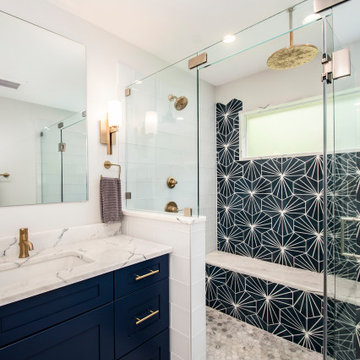
 Alair Homes Plano
 Our clients came to us because they were tired of looking at the side of their neighbor’s house from their master bedroom window! Their 1959 Dallas home had worked great for them for years, but it was time for an update and reconfiguration to make it more functional for their family.
They were looking to open up their dark and choppy space to bring in as much natural light as possible in both the bedroom and bathroom. They knew they would need to reconfigure the master bathroom and bedroom to make this happen. They were thinking the current bedroom would become the bathroom, but they weren’t sure where everything else would go.
This is where we came in! Our designers were able to create their new floorplan and show them a 3D rendering of exactly what the new spaces would look like.
The space that used to be the master bedroom now consists of the hallway into their new master suite, which includes a new large walk-in closet where the washer and dryer are now located.
From there, the space flows into their new beautiful, contemporary bathroom. They decided that a bathtub wasn’t important to them but a large double shower was! So, the new shower became the focal point of the bathroom. The new shower has contemporary Marine Bone Electra cement hexagon tiles and brushed bronze hardware. A large bench, hidden storage, and a rain shower head were must-have features. Pure Snow glass tile was installed on the two side walls while Carrara Marble Bianco hexagon mosaic tile was installed for the shower floor.
For the main bathroom floor, we installed a simple Yosemite tile in matte silver. The new Bellmont cabinets, painted naval, are complemented by the Greylac marble countertop and the Brainerd champagne bronze arched cabinet pulls. The rest of the hardware, including the faucet, towel rods, towel rings, and robe hooks, are Delta Faucet Trinsic, in a classic champagne bronze finish. To finish it off, three 14” Classic Possini Euro Ludlow wall sconces in burnished brass were installed between each sheet mirror above the vanity.
In the space that used to be the master bathroom, all of the furr downs were removed. We replaced the existing window with three large windows, opening up the view to the backyard. We also added a new door opening up into the main living room, which was totally closed off before.
Our clients absolutely love their cool, bright, contemporary bathroom, as well as the new wall of windows in their master bedroom, where they are now able to enjoy their beautiful backyard!
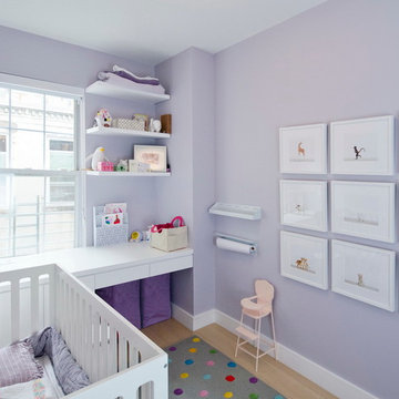
 StudioLAB
A young couple with three small children purchased this full floor loft in Tribeca in need of a gut renovation. The existing apartment was plagued with awkward spaces, limited natural light and an outdated décor. It was also lacking the required third child’s bedroom desperately needed for their newly expanded family. StudioLAB aimed for a fluid open-plan layout in the larger public spaces while creating smaller, tighter quarters in the rear private spaces to satisfy the family’s programmatic wishes. 3 small children’s bedrooms were carved out of the rear lower level connected by a communal playroom and a shared kid’s bathroom. Upstairs, the master bedroom and master bathroom float above the kid’s rooms on a mezzanine accessed by a newly built staircase. Ample new storage was built underneath the staircase as an extension of the open kitchen and dining areas. A custom pull out drawer containing the food and water bowls was installed for the family’s two dogs to be hidden away out of site when not in use. All wall surfaces, existing and new, were limited to a bright but warm white finish to create a seamless integration in the ceiling and wall structures allowing the spatial progression of the space and sculptural quality of the midcentury modern furniture pieces and colorful original artwork, painted by the wife’s brother, to enhance the space. The existing tin ceiling was left in the living room to maximize ceiling heights and remain a reminder of the historical details of the original construction. A new central AC system was added with an exposed cylindrical duct running along the long living room wall. A small office nook was built next to the elevator tucked away to be out of site.
 Custom Design & Construction
The homeowners had just purchased this home in El Segundo and they had remodeled the kitchen and one of the bathrooms on their own. However, they had more work to do. They felt that the rest of the project was too big and complex to tackle on their own and so they retained us to take over where they left off. The main focus of the project was to create a master suite and take advantage of the rather large backyard as an extension of their home. They were looking to create a more fluid indoor outdoor space.
When adding the new master suite leaving the ceilings vaulted along with French doors give the space a feeling of openness. The window seat was originally designed as an architectural feature for the exterior but turned out to be a benefit to the interior! They wanted a spa feel for their master bathroom utilizing organic finishes. Since the plan is that this will be their forever home a curbless shower was an important feature to them. The glass barn door on the shower makes the space feel larger and allows for the travertine shower tile to show through. Floating shelves and vanity allow the space to feel larger while the natural tones of the porcelain tile floor are calming. The his and hers vessel sinks make the space functional for two people to use it at once. The walk-in closet is open while the master bathroom has a white pocket door for privacy.
Since a new master suite was added to the home we converted the existing master bedroom into a family room. Adding French Doors to the family room opened up the floorplan to the outdoors while increasing the amount of natural light in this room. The closet that was previously in the bedroom was converted to built in cabinetry and floating shelves in the family room. The French doors in the master suite and family room now both open to the same deck space.
The homes new open floor plan called for a kitchen island to bring the kitchen and dining / great room together. The island is a 3” countertop vs the standard inch and a half. This design feature gives the island a chunky look. It was important that the island look like it was always a part of the kitchen. Lastly, we added a skylight in the corner of the kitchen as it felt dark once we closed off the side door that was there previously.
Repurposing rooms and opening the floor plan led to creating a laundry closet out of an old coat closet (and borrowing a small space from the new family room).
The floors become an integral part of tying together an open floor plan like this. The home still had original oak floors and the homeowners wanted to maintain that character. We laced in new planks and refinished it all to bring the project together.
To add curb appeal we removed the carport which was blocking a lot of natural light from the outside of the house. We also re-stuccoed the home and added exterior trim.
 Designs by Cheryl
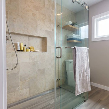
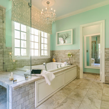
What a gorgeous after transformation this room under went. The client's wanted a relaxing and tranquil feel to this space, and we accomplished this. The tall shower doors after taken down 2 walls makes this space larger looking. The shower has a built in seat bench the client's love and wanted. The large tiles 12 x 24 makes the floor more open and makes the space appear larger. The accessories really added that special touch to the space, giving it a welcome and inviting feeling. John Magor Photography took this beautiful photo.This was a fun project, making it easy to love what I do.

 VanderHorn Architects
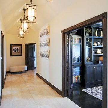
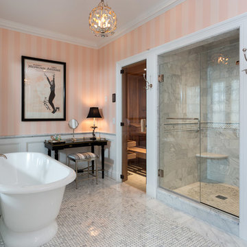
The main space features a soaking tub and vanity, while the sauna, shower and toilet rooms are arranged along one side of the room.
Gus Cantavero Photography
 Diego Alejandro Interior Design
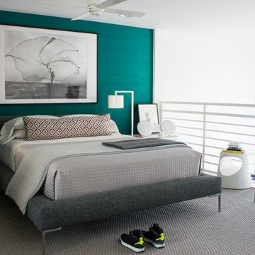
From the beginning, I envisioned creating a clean, white palette for the overall look of the apartment, but I also wanted to create some beautiful, unexpected surprises through blocks of color. On the master bedroom wall behind the bed, I installed a vibrant turquoise green silk wallpaper. The color evokes the green waters of la Ciénaga Grande de Santa Marta (Spanish for Large Marsh of Santa Marta) in Colombia, where the black and white Leo Matíz photograph “Pavo Real del Mar” hanging over the bed was taken more than 60 years ago. I saw a smaller version of the photograph for the first time in a gallery in Chelsea, NY.
Photography by Diego Alejandro Design, LLC
 User
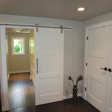
UserA sliding barn door is the perfect solution for this bedroom. A striking detail that doesn't take up any floor space.
Mid-sized minimalist master dark wood floor bedroom photo in Seattle with gray walls
Mid-sized minimalist master dark wood floor bedroom photo in Seattle with gray walls
 Cummings Architecture + Interiors
Situated along Eagle River, looking across to the mouth of the Ipswich Harbor, this was clearly a little cape house that was married to the sea. The owners were inquiring about adding a simple shed dormer to provide additional exposure to the stunning water view, but they were also interested in what Mathew would design if this beach cottage were his.
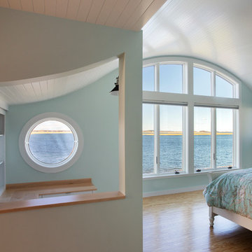
Inspired by the waves that came ashore mere feet from the little house, Mathew took up a fat marker and sketched a sweeping, S-shape dormer on the waterside of the building. He then described how the dormer would be designed in the shape of an ocean wave. “This way,” he explained, “you will not only be able to see the ocean from your new master bedroom, you’ll also be able to experience that view from a space that actually reflects the spirit of the waves.”
Mathew and his team designed the master suite and study using a subtle combination of contemporary and traditional, beach-house elements. The result was a completely unique and one-of-a-kind space inside and out. Transparencies are built into the design via features like gently curved glass that reflects the water and the arched interior window separating the bedroom and bath. On the exterior, the curved dormer on the street side echoes these rounded shapes and lines to create continuity throughout. The sense of movement is accentuated by the continuous, V-groove boarded ceiling that runs from one ocean-shaped dormer through to the opposite side of the house.
The bedroom features a cozy sitting area with built in storage and a porthole window to look out onto the rowboats in the harbor. A bathroom and closet were combined into a single room in a modern design that doesn't sacrifice any style or space and provides highly efficient functionality. A striking barn door made of glass with industrial hardware divides the two zones of the master suite. The custom, built-in maple cabinetry of the closets provides a textural counterpoint to the unique glass shower that incorporates sea stones and an ocean wave motif accent tile.
With this spectacular design vision, the owners are now able to enjoy their stunning view from a bright and spacious interior that brings the natural elements of the beach into the home.
Photo by Eric Roth
Sponsored
Columbus, OH

Hope Restoration & General Contracting
Columbus Design-Build, Kitchen & Bath Remodeling, Historic Renovations
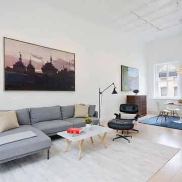 StudioLAB
A young couple with three small children purchased this full floor loft in Tribeca in need of a gut renovation. The existing apartment was plagued with awkward spaces, limited natural light and an outdated décor. It was also lacking the required third child’s bedroom desperately needed for their newly expanded family. StudioLAB aimed for a fluid open-plan layout in the larger public spaces while creating smaller, tighter quarters in the rear private spaces to satisfy the family’s programmatic wishes. 3 small children’s bedrooms were carved out of the rear lower level connected by a communal playroom and a shared kid’s bathroom. Upstairs, the master bedroom and master bathroom float above the kid’s rooms on a mezzanine accessed by a newly built staircase. Ample new storage was built underneath the staircase as an extension of the open kitchen and dining areas. A custom pull out drawer containing the food and water bowls was installed for the family’s two dogs to be hidden away out of site when not in use. All wall surfaces, existing and new, were limited to a bright but warm white finish to create a seamless integration in the ceiling and wall structures allowing the spatial progression of the space and sculptural quality of the midcentury modern furniture pieces and colorful original artwork, painted by the wife’s brother, to enhance the space. The existing tin ceiling was left in the living room to maximize ceiling heights and remain a reminder of the historical details of the original construction. A new central AC system was added with an exposed cylindrical duct running along the long living room wall. A small office nook was built next to the elevator tucked away to be out of site.
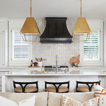
 Visbeen Architects
This cozy lake cottage skillfully incorporates a number of features that would normally be restricted to a larger home design. A glance of the exterior reveals a simple story and a half gable running the length of the home, enveloping the majority of the interior spaces. To the rear, a pair of gables with copper roofing flanks a covered dining area that connects to a screened porch. Inside, a linear foyer reveals a generous staircase with cascading landing. Further back, a centrally placed kitchen is connected to all of the other main level entertaining spaces through expansive cased openings. A private study serves as the perfect buffer between the homes master suite and living room. Despite its small footprint, the master suite manages to incorporate several closets, built-ins, and adjacent master bath complete with a soaker tub flanked by separate enclosures for shower and water closet. Upstairs, a generous double vanity bathroom is shared by a bunkroom, exercise space, and private bedroom. The bunkroom is configured to provide sleeping accommodations for up to 4 people. The rear facing exercise has great views of the rear yard through a set of windows that overlook the copper roof of the screened porch below.
Builder: DeVries & Onderlinde Builders
Interior Designer: Vision Interiors by Visbeen
Photographer: Ashley Avila Photography
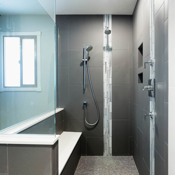
 Studio Em Interiors
Complete Master Bath remodel. Closet space and an alcove were taken from the neighboring bedroom to expand the master bathroom space. That allowed us to create a large walk in shower, expand the vanity space and create a large single walk in closet for the homeowners. This made the entrance to the bathroom a single entrance from the master bedroom versus the hallway entrance the bathroom had previously. This allowed us to create a true master bathroom as part of the new master suite. The shower is tiled with rectangular gray tiles installed vertically in a brick pattern. We used a glass tile as an accent and gray hexagon mosaic stone on the floor. The bench is topped with the countertop material.
17