
Search results for "Master consists" in Home Design Ideas
 Atelier Drome Architecture
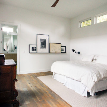
The master bedroom is a clean but cozy space filled with plenty of light from the clerestory windows
Bedroom - large modern master medium tone wood floor bedroom idea with white walls
Bedroom - large modern master medium tone wood floor bedroom idea with white walls
 SDH Studio Architecture and Interior Design
SDH Studio - Architecture and Design
Location: Southwest Ranches, Florida, Florida, USA
Set on a expansive two-acre lot in horse country, Southwest Ranches, Florida.
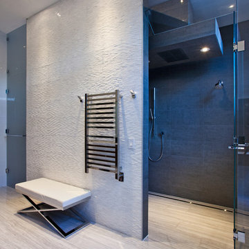
This project consists on the transformation of a 3700 Sq. Ft. Mediterranean structure to a 6500 Sq. Ft. Contemporary Home.
 Coco Maison Design
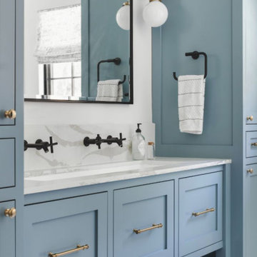
We planned a thoughtful redesign of this beautiful home while retaining many of the existing features. We wanted this house to feel the immediacy of its environment. So we carried the exterior front entry style into the interiors, too, as a way to bring the beautiful outdoors in. In addition, we added patios to all the bedrooms to make them feel much bigger. Luckily for us, our temperate California climate makes it possible for the patios to be used consistently throughout the year.
The original kitchen design did not have exposed beams, but we decided to replicate the motif of the 30" living room beams in the kitchen as well, making it one of our favorite details of the house. To make the kitchen more functional, we added a second island allowing us to separate kitchen tasks. The sink island works as a food prep area, and the bar island is for mail, crafts, and quick snacks.
We designed the primary bedroom as a relaxation sanctuary – something we highly recommend to all parents. It features some of our favorite things: a cognac leather reading chair next to a fireplace, Scottish plaid fabrics, a vegetable dye rug, art from our favorite cities, and goofy portraits of the kids.
---
Project designed by Courtney Thomas Design in La Cañada. Serving Pasadena, Glendale, Monrovia, San Marino, Sierra Madre, South Pasadena, and Altadena.
For more about Courtney Thomas Design, see here: https://www.courtneythomasdesign.com/
To learn more about this project, see here:
https://www.courtneythomasdesign.com/portfolio/functional-ranch-house-design/
Find the right local pro for your project
 Blair Burke General Contractors, Inc.
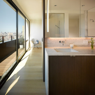
Featured in the 2013 AIA San Francisco Home Tour, this Bernal Heights residence was transformed from a drab stucco box to an architectural gem prominently positioned to take in bridge to bridge views. Scope of work consisted of a complete gut of the existing house and adding a third story to capture kitchen, dining and living room functions. An exterior Skatelite rainscreen system provides street side privacy while modest materials and simple glass box bring in the views without distraction.
 Sergio Mercado Design
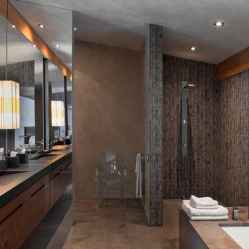
Large minimalist master brown tile, gray tile and glass tile brown floor bathroom photo in New York with flat-panel cabinets, dark wood cabinets, an undermount tub, brown walls, an undermount sink and solid surface countertops
 User
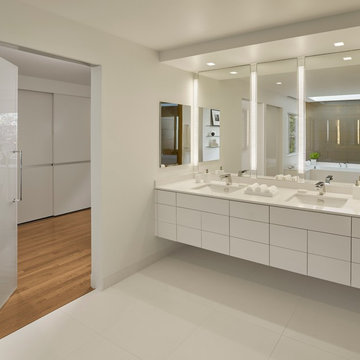
UserASID Design Excellence First Place Residential – Kitchen and Bathroom: Michael Merrill Design Studio was approached three years ago by the homeowner to redesign her kitchen. Although she was dissatisfied with some aspects of her home, she still loved it dearly. As we discovered her passion for design, we began to rework her entire home for consistency including this bathroom.
 TKS Design Group
Download our free ebook, Creating the Ideal Kitchen. DOWNLOAD NOW
Lakefront property in the northwest suburbs of Chicago is hard to come by, so when we were hired by this young family with exactly that, we were immediately inspired by not just the unusually large footprint of this 1950’s colonial revival but also the lovely views of the manmade lake it was sited on. The large 5-bedroom home was solidly stuck in the 1980’s, but we saw tons of potential. We started out by updating the existing staircase with a fresh coat of paint and adding new herringbone slate to the entry hall.
The powder room off the entryway also got a refresh - new flooring, new cabinets and fixtures. We ran the new slate right through into this space for some consistency. A fun wallpaper and shiplap trim add a welcoming feel and set the tone for the home.
Next, we tackled the kitchen. Located away from the rest of the first floor, the kitchen felt a little isolated, so we immediately began planning for how to better connect it to the rest of the first floor. We landed on removing the wall between the kitchen and dining room and designed a modified galley style space with separate cooking and clean up zones. The cooking zone consists of the refrigerator, prep sink and cooktop, along with a nice long run of prep space at the island. The cleanup side of the kitchen consists of the main sink and dishwasher. Both areas are situated so that the user can view the lake during prep work and cleanup!
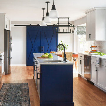
One of the home’s main puzzles was how to incorporate the mudroom and area in front of the patio doors at the back of the house. We already had a breakfast table area, so the space by the patio doors was a bit of a no man’s land. We decided to separate the kitchen proper from what became the new mudroom with a large set of barn doors. That way you can quickly hide any mudroom messes but have easy access to the light coming in through the patio doors as well as the outdoor grilling station. We also love the impact the barn doors add to the overall space.
The homeowners’ first words to us were “it’s time to ditch the brown,” so we did! We chose a lovely blue pallet that reflects the home’s location on the lake which is also vibrant yet easy on the eye. Countertops are white quartz, and the natural oak floor works well with the other honey accents. The breakfast table was given a refresh with new chairs, chandelier and window treatments that frame the gorgeous views of the lake out the back.
We coordinated the slate mudroom flooring with that used in the home’s main entrance for a consistent feel. The storage area consists of open and closed storage to allow for some clutter control as needed.
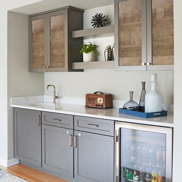
Next on our “to do” list was revamping the dated brown bar area in the neighboring dining room. We eliminated the clutter by adding some closed cabinets and did some easy updates to help the space feel more current. One snag we ran into here was the discovery of a beam above the existing open shelving that had to be modified with a smaller structural beam to allow for our new design to work. This was an unexpected surprise, but in the end we think it was well worth it!
We kept the colors here a bit more muted to blend with the homeowner’s existing furnishings. Open shelving and polished nickel hardware add some simple detail to the new entertainment zone which also looks out onto the lake!
Next we tackled the upstairs starting with the homeowner’s son’s bath. The bath originally had both a tub shower and a separate shower, so we decided to swap out the shower for a new laundry area. This freed up some space downstairs in what used to be the mudroom/laundry room and is much more convenient for daily laundry needs.
We continued the blue palette here with navy cabinetry and the navy tile in the shower. Porcelain floor tile and chrome fixtures keep maintenance to a minimum while matte black mirrors and lighting add some depth the design. A low maintenance runner adds some warmth underfoot and ties the whole space together.
We added a pocket door to the bathroom to minimize interference with the door swings. The left door of the laundry closet is on a 180 degree hinge to allow for easy full access to the machines. Next we tackled the master bath which is an en suite arrangement. The original was typical of the 1980’s with the vanity outside of the bathroom, situated near the master closet. And the brown theme continued here with multiple shades of brown.
Our first move was to segment off the bath and the closet from the master bedroom. We created a short hall from the bedroom to the bathroom with his and hers walk-in closets on the left and right as well as a separate toilet closet outside of the main bathroom for privacy and flexibility.
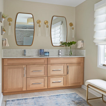
The original bathroom had a giant soaking tub with steps (dangerous!) as well as a small shower that did not work well for our homeowner who is 6’3”. With other bathtubs in the home, they decided to eliminate the tub and create an oversized shower which takes up the space where the old tub was located. The double vanity is on the opposite wall and a bench is located under the window for morning conversations and a place to set a couple of towels.
The pallet in here is light and airy with a mix of blond wood, creamy porcelain and marble tile, and brass accents. A simple roman shade adds some texture and it’s top-down mechanism allows for light and privacy.
This large whole house remodel gave our homeowners not only the ability to maximize the potential of their home but also created a lovely new frame from which to view their fabulous lake views.
Designed by: Susan Klimala, CKD, CBD
Photography by: Michael Kaskel
For more information on kitchen and bath design ideas go to: www.kitchenstudio-ge.com
Sponsored
Columbus, OH

Wannemacher Interiors
Customized Award-Winning Interior Design Solutions in Franklin Cnty OH
 Debra Lipset Designs
Murdoch Photography & Company
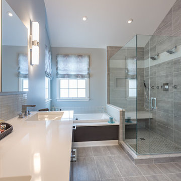
Example of a large minimalist master gray tile and porcelain tile porcelain tile bathroom design in New York with an undermount sink, flat-panel cabinets, dark wood cabinets, quartz countertops, a one-piece toilet and blue walls
Example of a large minimalist master gray tile and porcelain tile porcelain tile bathroom design in New York with an undermount sink, flat-panel cabinets, dark wood cabinets, quartz countertops, a one-piece toilet and blue walls
 User
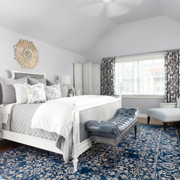
UserSerenity is the name of the game in this cool hued traditional master bedroom layered in shades of gray. Light grey paint covers the walls and ceiling and is accented by clean white trim. Linen draperies in a toile pattern are suspended from polished nickel rods. An antique white French bed stands on a grey and navy rug that gracefully covers the walnut stained floor. The bed’s headboard and footboard are upholstered with gray linen that coordinates with the lush bedding layered to create sumptuous texture. A pair of bedside tables with stained wood tops are home to a pair of porcelain lamps. At the foot of the bed stands a Williamsburg blue tufted leather bench with charcoal gray legs. A gold sunburst mirror hangs above the bed providing a bit of glam while accentuating the vaulted ceiling. A four paneled upholstered screen trimmed with silver nails stands in one corner, while a comfortable chaise in a blue geometric pattern beckons from another. A white garden seat stands nearby.
Carter Tippins Photography
 Brian McCloud Photography
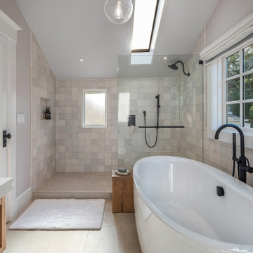
Bathroom - transitional master beige floor, single-sink and vaulted ceiling bathroom idea in San Francisco with open cabinets, medium tone wood cabinets, beige walls, a vessel sink, marble countertops, white countertops and a floating vanity
 Blue Heron Signature Homes
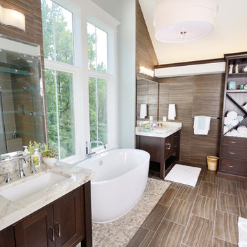
Designed and built by Terramor Homes in Raleigh, NC. In continuing the retreat feel, the goal in the master bath was to achieve a spa like feel. Inspired to incorporate the spa together with the tone of the rest of the home, the main focal element was a gorgeous free standing oval tub centered in the room under the vault of the ceiling and an 8 foot tall and 5 foot wide casement window that overlooks the river and greenway area behind the home. Directly across, the 6 foot by 6 foot full glass and glass tile was located- sharing the view out of the large windows. Flanking the tub are the adult height cabinets with large square legs and a shelf underneath, similar to the spa look that is expected. A full height cabinet pantry was added to encourage storage or rolled towels, bathing accessories and additional storage as well. The entire room was finished with a chocolate brown, 18” x 12” tile, laid in a brick pattern and continued up the walls for the consistent and clean look. Centered in the vault, a large, linen drum pendant with chrome trim drops- bringing elegance to the space. Small shelves were built at the bottom of each side of the vaulted ceiling to house the LED lighting that shines up the vaults of the ceiling, again replicating natural day light at any time of day. The final result of this master bath was exactly as we had set out to achieve- a peaceful and relaxing retreat right inside our home.
Photography: M. Eric Honeycutt
 Lee Edwards - residential design
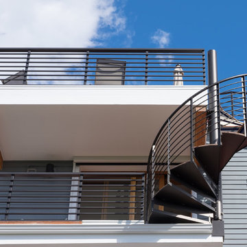
Situated on the west slope of Mt. Baker Ridge, this remodel takes a contemporary view on traditional elements to maximize space, lightness and spectacular views of downtown Seattle and Puget Sound. We were approached by Vertical Construction Group to help a client bring their 1906 craftsman into the 21st century. The original home had many redeeming qualities that were unfortunately compromised by an early 2000’s renovation. This left the new homeowners with awkward and unusable spaces. After studying numerous space plans and roofline modifications, we were able to create quality interior and exterior spaces that reflected our client’s needs and design sensibilities. The resulting master suite, living space, roof deck(s) and re-invented kitchen are great examples of a successful collaboration between homeowner and design and build teams.
 TKS Design Group
Download our free ebook, Creating the Ideal Kitchen. DOWNLOAD NOW
Lakefront property in the northwest suburbs of Chicago is hard to come by, so when we were hired by this young family with exactly that, we were immediately inspired by not just the unusually large footprint of this 1950’s colonial revival but also the lovely views of the manmade lake it was sited on. The large 5-bedroom home was solidly stuck in the 1980’s, but we saw tons of potential. We started out by updating the existing staircase with a fresh coat of paint and adding new herringbone slate to the entry hall.
The powder room off the entryway also got a refresh - new flooring, new cabinets and fixtures. We ran the new slate right through into this space for some consistency. A fun wallpaper and shiplap trim add a welcoming feel and set the tone for the home.
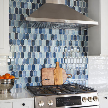
Next, we tackled the kitchen. Located away from the rest of the first floor, the kitchen felt a little isolated, so we immediately began planning for how to better connect it to the rest of the first floor. We landed on removing the wall between the kitchen and dining room and designed a modified galley style space with separate cooking and clean up zones. The cooking zone consists of the refrigerator, prep sink and cooktop, along with a nice long run of prep space at the island. The cleanup side of the kitchen consists of the main sink and dishwasher. Both areas are situated so that the user can view the lake during prep work and cleanup!
One of the home’s main puzzles was how to incorporate the mudroom and area in front of the patio doors at the back of the house. We already had a breakfast table area, so the space by the patio doors was a bit of a no man’s land. We decided to separate the kitchen proper from what became the new mudroom with a large set of barn doors. That way you can quickly hide any mudroom messes but have easy access to the light coming in through the patio doors as well as the outdoor grilling station. We also love the impact the barn doors add to the overall space.
The homeowners’ first words to us were “it’s time to ditch the brown,” so we did! We chose a lovely blue pallet that reflects the home’s location on the lake which is also vibrant yet easy on the eye. Countertops are white quartz, and the natural oak floor works well with the other honey accents. The breakfast table was given a refresh with new chairs, chandelier and window treatments that frame the gorgeous views of the lake out the back.
We coordinated the slate mudroom flooring with that used in the home’s main entrance for a consistent feel. The storage area consists of open and closed storage to allow for some clutter control as needed.
Next on our “to do” list was revamping the dated brown bar area in the neighboring dining room. We eliminated the clutter by adding some closed cabinets and did some easy updates to help the space feel more current. One snag we ran into here was the discovery of a beam above the existing open shelving that had to be modified with a smaller structural beam to allow for our new design to work. This was an unexpected surprise, but in the end we think it was well worth it!
We kept the colors here a bit more muted to blend with the homeowner’s existing furnishings. Open shelving and polished nickel hardware add some simple detail to the new entertainment zone which also looks out onto the lake!
Next we tackled the upstairs starting with the homeowner’s son’s bath. The bath originally had both a tub shower and a separate shower, so we decided to swap out the shower for a new laundry area. This freed up some space downstairs in what used to be the mudroom/laundry room and is much more convenient for daily laundry needs.
We continued the blue palette here with navy cabinetry and the navy tile in the shower. Porcelain floor tile and chrome fixtures keep maintenance to a minimum while matte black mirrors and lighting add some depth the design. A low maintenance runner adds some warmth underfoot and ties the whole space together.
We added a pocket door to the bathroom to minimize interference with the door swings. The left door of the laundry closet is on a 180 degree hinge to allow for easy full access to the machines. Next we tackled the master bath which is an en suite arrangement. The original was typical of the 1980’s with the vanity outside of the bathroom, situated near the master closet. And the brown theme continued here with multiple shades of brown.
Our first move was to segment off the bath and the closet from the master bedroom. We created a short hall from the bedroom to the bathroom with his and hers walk-in closets on the left and right as well as a separate toilet closet outside of the main bathroom for privacy and flexibility.
The original bathroom had a giant soaking tub with steps (dangerous!) as well as a small shower that did not work well for our homeowner who is 6’3”. With other bathtubs in the home, they decided to eliminate the tub and create an oversized shower which takes up the space where the old tub was located. The double vanity is on the opposite wall and a bench is located under the window for morning conversations and a place to set a couple of towels.
The pallet in here is light and airy with a mix of blond wood, creamy porcelain and marble tile, and brass accents. A simple roman shade adds some texture and it’s top-down mechanism allows for light and privacy.
This large whole house remodel gave our homeowners not only the ability to maximize the potential of their home but also created a lovely new frame from which to view their fabulous lake views.
Designed by: Susan Klimala, CKD, CBD
Photography by: Michael Kaskel
For more information on kitchen and bath design ideas go to: www.kitchenstudio-ge.com

Sponsored
Sunbury, OH

J.Holderby - Renovations
Franklin County's Leading General Contractors - 2X Best of Houzz!
 L. Hamilton & Co.
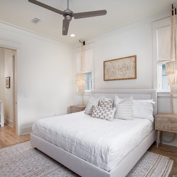
A coastal bedroom with shades of blue and gray. The wall consists of shiplap, coastal art, and shades of blue abstract art.
Beach style master light wood floor bedroom photo in Miami with white walls and no fireplace
Beach style master light wood floor bedroom photo in Miami with white walls and no fireplace
 Alair Homes Plano
 Our clients came to us because they were tired of looking at the side of their neighbor’s house from their master bedroom window! Their 1959 Dallas home had worked great for them for years, but it was time for an update and reconfiguration to make it more functional for their family.
They were looking to open up their dark and choppy space to bring in as much natural light as possible in both the bedroom and bathroom. They knew they would need to reconfigure the master bathroom and bedroom to make this happen. They were thinking the current bedroom would become the bathroom, but they weren’t sure where everything else would go.
This is where we came in! Our designers were able to create their new floorplan and show them a 3D rendering of exactly what the new spaces would look like.
The space that used to be the master bedroom now consists of the hallway into their new master suite, which includes a new large walk-in closet where the washer and dryer are now located.
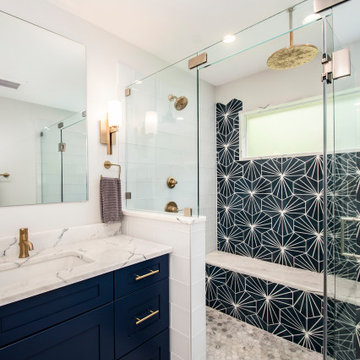
From there, the space flows into their new beautiful, contemporary bathroom. They decided that a bathtub wasn’t important to them but a large double shower was! So, the new shower became the focal point of the bathroom. The new shower has contemporary Marine Bone Electra cement hexagon tiles and brushed bronze hardware. A large bench, hidden storage, and a rain shower head were must-have features. Pure Snow glass tile was installed on the two side walls while Carrara Marble Bianco hexagon mosaic tile was installed for the shower floor.
For the main bathroom floor, we installed a simple Yosemite tile in matte silver. The new Bellmont cabinets, painted naval, are complemented by the Greylac marble countertop and the Brainerd champagne bronze arched cabinet pulls. The rest of the hardware, including the faucet, towel rods, towel rings, and robe hooks, are Delta Faucet Trinsic, in a classic champagne bronze finish. To finish it off, three 14” Classic Possini Euro Ludlow wall sconces in burnished brass were installed between each sheet mirror above the vanity.
In the space that used to be the master bathroom, all of the furr downs were removed. We replaced the existing window with three large windows, opening up the view to the backyard. We also added a new door opening up into the main living room, which was totally closed off before.
Our clients absolutely love their cool, bright, contemporary bathroom, as well as the new wall of windows in their master bedroom, where they are now able to enjoy their beautiful backyard!
 Foran Interior Design
Based on extensive interviews with our clients, our challenges were to create an environment that was an artistic mix of traditional and clean lines. They wanted it
dramatic and sophisticated. They also wanted each piece to be special and unique, as well as artsy. Because our clients were young and have an active son, they wanted their home to be comfortable and practical, as well as beautiful. The clients wanted a sophisticated and up-to-date look. They loved brown, turquoise and orange. The other challenge we faced, was to give each room its own identity while maintaining a consistent flow throughout the home. Each space shared a similar color palette and uniqueness, while the furnishings, draperies, and accessories provided individuality to each room.
We incorporated comfortable and stylish furniture with artistic accents in pillows, throws, artwork and accessories. Each piece was selected to not only be unique, but to create a beautiful and sophisticated environment. We hunted the markets for all the perfect accessories and artwork that are the jewelry in this artistic living area.
Some of the selections included clean moldings, walnut floors and a backsplash with mosaic glass tile. In the living room we went with a cleaner look, but used some traditional accents such as the embroidered casement fabric and the paisley fabric on the chair and pillows. A traditional bow front chest with a crackled turquoise lacquer was used in the foyer.
 Casafina Interior Design
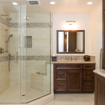
Remodeled Master Bathroom. Original layout consisted of a tiled tub/ shower & standard double sinks. The scope of work included conversion to shower only with 12" x 24" porcelain tile & glass mosaic liner. Client preferred to separate vanities with reeded glass front doors & matching mirrors. The same glass mosaic tile was used for backsplashes. New wall sconces complete the look.
Brett Hickman
 TKS Design Group
Download our free ebook, Creating the Ideal Kitchen. DOWNLOAD NOW
Lakefront property in the northwest suburbs of Chicago is hard to come by, so when we were hired by this young family with exactly that, we were immediately inspired by not just the unusually large footprint of this 1950’s colonial revival but also the lovely views of the manmade lake it was sited on. The large 5-bedroom home was solidly stuck in the 1980’s, but we saw tons of potential. We started out by updating the existing staircase with a fresh coat of paint and adding new herringbone slate to the entry hall.
The powder room off the entryway also got a refresh - new flooring, new cabinets and fixtures. We ran the new slate right through into this space for some consistency. A fun wallpaper and shiplap trim add a welcoming feel and set the tone for the home.
Next, we tackled the kitchen. Located away from the rest of the first floor, the kitchen felt a little isolated, so we immediately began planning for how to better connect it to the rest of the first floor. We landed on removing the wall between the kitchen and dining room and designed a modified galley style space with separate cooking and clean up zones. The cooking zone consists of the refrigerator, prep sink and cooktop, along with a nice long run of prep space at the island. The cleanup side of the kitchen consists of the main sink and dishwasher. Both areas are situated so that the user can view the lake during prep work and cleanup!
One of the home’s main puzzles was how to incorporate the mudroom and area in front of the patio doors at the back of the house. We already had a breakfast table area, so the space by the patio doors was a bit of a no man’s land. We decided to separate the kitchen proper from what became the new mudroom with a large set of barn doors. That way you can quickly hide any mudroom messes but have easy access to the light coming in through the patio doors as well as the outdoor grilling station. We also love the impact the barn doors add to the overall space.
The homeowners’ first words to us were “it’s time to ditch the brown,” so we did! We chose a lovely blue pallet that reflects the home’s location on the lake which is also vibrant yet easy on the eye. Countertops are white quartz, and the natural oak floor works well with the other honey accents. The breakfast table was given a refresh with new chairs, chandelier and window treatments that frame the gorgeous views of the lake out the back.
We coordinated the slate mudroom flooring with that used in the home’s main entrance for a consistent feel. The storage area consists of open and closed storage to allow for some clutter control as needed.
Next on our “to do” list was revamping the dated brown bar area in the neighboring dining room. We eliminated the clutter by adding some closed cabinets and did some easy updates to help the space feel more current. One snag we ran into here was the discovery of a beam above the existing open shelving that had to be modified with a smaller structural beam to allow for our new design to work. This was an unexpected surprise, but in the end we think it was well worth it!
We kept the colors here a bit more muted to blend with the homeowner’s existing furnishings. Open shelving and polished nickel hardware add some simple detail to the new entertainment zone which also looks out onto the lake!
Next we tackled the upstairs starting with the homeowner’s son’s bath. The bath originally had both a tub shower and a separate shower, so we decided to swap out the shower for a new laundry area. This freed up some space downstairs in what used to be the mudroom/laundry room and is much more convenient for daily laundry needs.
We continued the blue palette here with navy cabinetry and the navy tile in the shower. Porcelain floor tile and chrome fixtures keep maintenance to a minimum while matte black mirrors and lighting add some depth the design. A low maintenance runner adds some warmth underfoot and ties the whole space together.
We added a pocket door to the bathroom to minimize interference with the door swings. The left door of the laundry closet is on a 180 degree hinge to allow for easy full access to the machines. Next we tackled the master bath which is an en suite arrangement. The original was typical of the 1980’s with the vanity outside of the bathroom, situated near the master closet. And the brown theme continued here with multiple shades of brown.
Our first move was to segment off the bath and the closet from the master bedroom. We created a short hall from the bedroom to the bathroom with his and hers walk-in closets on the left and right as well as a separate toilet closet outside of the main bathroom for privacy and flexibility.
The original bathroom had a giant soaking tub with steps (dangerous!) as well as a small shower that did not work well for our homeowner who is 6’3”. With other bathtubs in the home, they decided to eliminate the tub and create an oversized shower which takes up the space where the old tub was located. The double vanity is on the opposite wall and a bench is located under the window for morning conversations and a place to set a couple of towels.
The pallet in here is light and airy with a mix of blond wood, creamy porcelain and marble tile, and brass accents. A simple roman shade adds some texture and it’s top-down mechanism allows for light and privacy.
This large whole house remodel gave our homeowners not only the ability to maximize the potential of their home but also created a lovely new frame from which to view their fabulous lake views.
Designed by: Susan Klimala, CKD, CBD
Photography by: Michael Kaskel
For more information on kitchen and bath design ideas go to: www.kitchenstudio-ge.com
 TKS Design Group
Download our free ebook, Creating the Ideal Kitchen. DOWNLOAD NOW
Lakefront property in the northwest suburbs of Chicago is hard to come by, so when we were hired by this young family with exactly that, we were immediately inspired by not just the unusually large footprint of this 1950’s colonial revival but also the lovely views of the manmade lake it was sited on. The large 5-bedroom home was solidly stuck in the 1980’s, but we saw tons of potential. We started out by updating the existing staircase with a fresh coat of paint and adding new herringbone slate to the entry hall.
The powder room off the entryway also got a refresh - new flooring, new cabinets and fixtures. We ran the new slate right through into this space for some consistency. A fun wallpaper and shiplap trim add a welcoming feel and set the tone for the home.
Next, we tackled the kitchen. Located away from the rest of the first floor, the kitchen felt a little isolated, so we immediately began planning for how to better connect it to the rest of the first floor. We landed on removing the wall between the kitchen and dining room and designed a modified galley style space with separate cooking and clean up zones. The cooking zone consists of the refrigerator, prep sink and cooktop, along with a nice long run of prep space at the island. The cleanup side of the kitchen consists of the main sink and dishwasher. Both areas are situated so that the user can view the lake during prep work and cleanup!
One of the home’s main puzzles was how to incorporate the mudroom and area in front of the patio doors at the back of the house. We already had a breakfast table area, so the space by the patio doors was a bit of a no man’s land. We decided to separate the kitchen proper from what became the new mudroom with a large set of barn doors. That way you can quickly hide any mudroom messes but have easy access to the light coming in through the patio doors as well as the outdoor grilling station. We also love the impact the barn doors add to the overall space.
The homeowners’ first words to us were “it’s time to ditch the brown,” so we did! We chose a lovely blue pallet that reflects the home’s location on the lake which is also vibrant yet easy on the eye. Countertops are white quartz, and the natural oak floor works well with the other honey accents. The breakfast table was given a refresh with new chairs, chandelier and window treatments that frame the gorgeous views of the lake out the back.
We coordinated the slate mudroom flooring with that used in the home’s main entrance for a consistent feel. The storage area consists of open and closed storage to allow for some clutter control as needed.
Next on our “to do” list was revamping the dated brown bar area in the neighboring dining room. We eliminated the clutter by adding some closed cabinets and did some easy updates to help the space feel more current. One snag we ran into here was the discovery of a beam above the existing open shelving that had to be modified with a smaller structural beam to allow for our new design to work. This was an unexpected surprise, but in the end we think it was well worth it!
We kept the colors here a bit more muted to blend with the homeowner’s existing furnishings. Open shelving and polished nickel hardware add some simple detail to the new entertainment zone which also looks out onto the lake!
Next we tackled the upstairs starting with the homeowner’s son’s bath. The bath originally had both a tub shower and a separate shower, so we decided to swap out the shower for a new laundry area. This freed up some space downstairs in what used to be the mudroom/laundry room and is much more convenient for daily laundry needs.
We continued the blue palette here with navy cabinetry and the navy tile in the shower. Porcelain floor tile and chrome fixtures keep maintenance to a minimum while matte black mirrors and lighting add some depth the design. A low maintenance runner adds some warmth underfoot and ties the whole space together.
We added a pocket door to the bathroom to minimize interference with the door swings. The left door of the laundry closet is on a 180 degree hinge to allow for easy full access to the machines. Next we tackled the master bath which is an en suite arrangement. The original was typical of the 1980’s with the vanity outside of the bathroom, situated near the master closet. And the brown theme continued here with multiple shades of brown.
Our first move was to segment off the bath and the closet from the master bedroom. We created a short hall from the bedroom to the bathroom with his and hers walk-in closets on the left and right as well as a separate toilet closet outside of the main bathroom for privacy and flexibility.
The original bathroom had a giant soaking tub with steps (dangerous!) as well as a small shower that did not work well for our homeowner who is 6’3”. With other bathtubs in the home, they decided to eliminate the tub and create an oversized shower which takes up the space where the old tub was located. The double vanity is on the opposite wall and a bench is located under the window for morning conversations and a place to set a couple of towels.
The pallet in here is light and airy with a mix of blond wood, creamy porcelain and marble tile, and brass accents. A simple roman shade adds some texture and it’s top-down mechanism allows for light and privacy.
This large whole house remodel gave our homeowners not only the ability to maximize the potential of their home but also created a lovely new frame from which to view their fabulous lake views.
Designed by: Susan Klimala, CKD, CBD
Photography by: Michael Kaskel
For more information on kitchen and bath design ideas go to: www.kitchenstudio-ge.com
 Vagabond Designs by Kim Lewis
Rebecca Sanabria
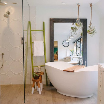
Bathroom - cottage master light wood floor bathroom idea in Los Angeles with white walls
Bathroom - cottage master light wood floor bathroom idea in Los Angeles with white walls
8