
Search results for "Master period" in Home Design Ideas


 Advance Design Studio, Ltd.
The design challenge was to enhance the square footage, flow and livability in this 1,442 sf 1930’s Tudor style brick house for a growing family of four. A two story 1,000 sf addition was the solution proposed by the design team at Advance Design Studio, Ltd. The new addition provided enough space to add a new kitchen and eating area with a butler pantry, a food pantry, a powder room and a mud room on the lower level, and a new master suite on the upper level.
The family envisioned a bright and airy white classically styled kitchen accented with espresso in keeping with the 1930’s style architecture of the home. Subway tile and timely glass accents add to the classic charm of the crisp white craftsman style cabinetry and sparkling chrome accents. Clean lines in the white farmhouse sink and the handsome bridge faucet in polished nickel make a vintage statement. River white granite on the generous new island makes for a fantastic gathering place for family and friends and gives ample casual seating. Dark stained oak floors extend to the new butler’s pantry and powder room, and throughout the first floor making a cohesive statement throughout. Classic arched doorways were added to showcase the home’s period details.
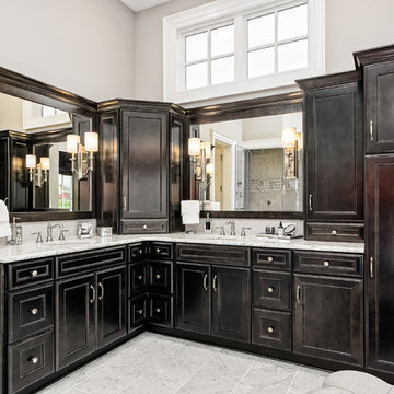
On the upper level, the newly expanded garage space nestles below an expansive new master suite complete with a spectacular bath retreat and closet space and an impressively vaulted ceiling. The soothing master getaway is bathed in soft gray tones with painted cabinets and amazing “fantasy” granite that reminds one of beach vacations. The floor mimics a wood feel underfoot with a gray textured porcelain tile and the spacious glass shower boasts delicate glass accents and a basket weave tile floor. Sparkling fixtures rest like fine jewelry completing the space.
The vaulted ceiling throughout the master suite lends to the spacious feel as does the archway leading to the expansive master closet. An elegant bank of 6 windows floats above the bed, bathing the space in light.
Photo Credits- Joe Nowak
 Advance Design Studio, Ltd.
The design challenge was to enhance the square footage, flow and livability in this 1,442 sf 1930’s Tudor style brick house for a growing family of four. A two story 1,000 sf addition was the solution proposed by the design team at Advance Design Studio, Ltd. The new addition provided enough space to add a new kitchen and eating area with a butler pantry, a food pantry, a powder room and a mud room on the lower level, and a new master suite on the upper level.
The family envisioned a bright and airy white classically styled kitchen accented with espresso in keeping with the 1930’s style architecture of the home. Subway tile and timely glass accents add to the classic charm of the crisp white craftsman style cabinetry and sparkling chrome accents. Clean lines in the white farmhouse sink and the handsome bridge faucet in polished nickel make a vintage statement. River white granite on the generous new island makes for a fantastic gathering place for family and friends and gives ample casual seating. Dark stained oak floors extend to the new butler’s pantry and powder room, and throughout the first floor making a cohesive statement throughout. Classic arched doorways were added to showcase the home’s period details.
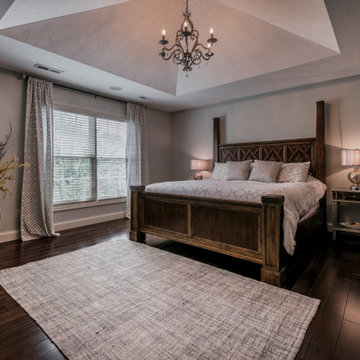
On the upper level, the newly expanded garage space nestles below an expansive new master suite complete with a spectacular bath retreat and closet space and an impressively vaulted ceiling. The soothing master getaway is bathed in soft gray tones with painted cabinets and amazing “fantasy” granite that reminds one of beach vacations. The floor mimics a wood feel underfoot with a gray textured porcelain tile and the spacious glass shower boasts delicate glass accents and a basket weave tile floor. Sparkling fixtures rest like fine jewelry completing the space.
The vaulted ceiling throughout the master suite lends to the spacious feel as does the archway leading to the expansive master closet. An elegant bank of 6 windows floats above the bed, bathing the space in light.
Photo Credits- Joe Nowak
Find the right local pro for your project

 Francois & Co
THE BASTIDE | An early 17th century piece, the Bastide has all the characteristics and appeal of a Renaissance
period mantel. It features sturdy bases rising up into beautifully carved corbels and a lintel with an exquisitely executed cartouche at its center. Learn more about this beautiful mantel, and others like it by viewing our online catalog! http://francoisandco.com/catalogs/countryside-mantels/
PHOTOGRAPHY
Mali Azima
INTERIOR DESIGN
Wendy Peterson Interiors

 Beautiful Habitat: Design & Decoration
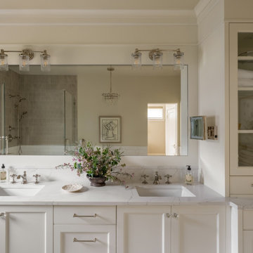
A new en suite master bath was created in the new second floor of the house. The original architect plans called for a small bathroom because of the necessary roof pitch. My design changed that by pushing into the "dead space" to create an extra wall of storage. We were able to add 2 cabinets and towel storage to max out this small bathroom.
While too small for a bathtub, we created an oversized shower with a bench and storage niches.
THe showpiece of this bathroom is the patterned floor, created from painted Gray Cement Tiles. All of the gray finishes were warmed up with wood cabinets stained in nutmeg.
Alcove for extra storage

 Heidi Pribell Interiors
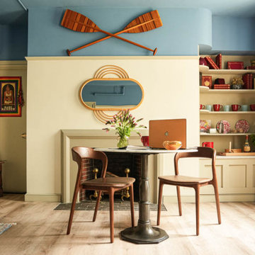
So when the Society of Fellows asked me to redesign their guest rooms at Eliot House last year, my goal was to assemble an up-to-date, Harvard interior for the 21st century.
The fundamental colors of Red (for Crimson), Blue & Yellow felt primarily appropriate for the venue.
By blending elements from four eras on campus – Georgian, Arts & Crafts, Modernism and Counter Culture – I anticipated conjuring a sense of the past, from the vantage point of today.
Notice the amount of years each style was culturally prevalent.
The first 140 years of the college was run by British Loyalists. I wonder how Harvard changed afterwards? The campus certainly continued maintaining English standards of excellence, as did most of the country, by the way.
Traditional furniture from this era remains timeless and becomes especially appealing when masterfully intertwined with today’s materials.
That earthy Arts & Crafts period has more to do with the college than I’d first imagined. Its principles echo narratives of Thoreau at Walden Pond, Eagle Scouts, horse saddles and several clubs on campus.
Sponsored
Delaware, OH

Buckeye Basements, Inc.
Central Ohio's Basement Finishing ExpertsBest Of Houzz '13-'21
 McKay Construction
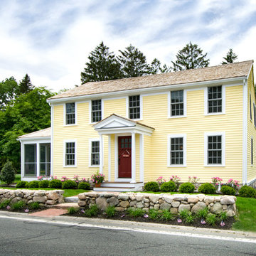
This exceptional residence presents a harmonious blend of contemporary comforts & period details - restored to perfection! For over 12 months, prestigious designers & artisans have worked to create a true masterpiece w/ 4200 sf set on over 4 Walden-esque acres w/ high end amenities & the richest finishes throughout. Featuring 12 rooms, 5 BRs, 3 full & one half baths, each space makes sense for today's lifestyle. The spectacular chef's kitchen is wide open to the family room w/fireplace forming the heart of the home. Add a mudroom with cubbies & ½ bath for day to day ease. The formal dining room w/ fireplace, library, living room & guest suite complete the 1st floor. Dual staircases lead up to 4 bedrooms including a luxurious master suite
with walk-in closet, designer tile shower, double vanity & soaking tub. A true modern layout with walk -in & double closets, 2nd floor laundry and high ceilings. Enjoy "Better Than New" construction in this historic beauty's next chapter.

 Medallion Cabinetry
Experience the finer aspects of life with the Galleria collection from Medallion. Distinguished, artful design meets the everlasting prominence of classical architecture. Step into a refined slice of the past and indulge your senses in the exquisite beauty of Galleria.

 Architectural Collaborative
We designed this 3,162 square foot home for empty-nesters who love lake life. Functionally, the home accommodates multiple generations. Elderly in-laws stay for prolonged periods, and the homeowners are thinking ahead to their own aging in place. This required two master suites on the first floor. Accommodations were made for visiting children upstairs. Aside from the functional needs of the occupants, our clients desired a home which maximizes indoor connection to the lake, provides covered outdoor living, and is conducive to entertaining. Our concept celebrates the natural surroundings through materials, views, daylighting, and building massing.
We placed all main public living areas along the rear of the house to capitalize on the lake views while efficiently stacking the bedrooms and bathrooms in a two-story side wing. Secondary support spaces are integrated across the front of the house with the dramatic foyer. The front elevation, with painted green and natural wood siding and soffits, blends harmoniously with wooded surroundings. The lines and contrasting colors of the light granite wall and silver roofline draws attention toward the entry and through the house to the real focus: the water. The one-story roof over the garage and support spaces takes flight at the entry, wraps the two-story wing, turns, and soars again toward the lake as it approaches the rear patio. The granite wall extending from the entry through the interior living space is mirrored along the opposite end of the rear covered patio. These granite bookends direct focus to the lake.
 Bluestem Remodeling
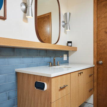
Two totally refreshed bathroom remodels take center stage in this St. Louis Park home.
The homeowners loved their 1968 split level home and its unique period features. It was a well-built custom home with gorgeous maple trim and oak floors throughout.
However, the main bathroom had water damage to the sub-floor that needed to be replaced. The owners decided to go ahead and update the rest of the bathroom at the same time, taking care of other items they had long wanted to do. For example, the plumbing was outdated, and the shower didn’t drain well. They also hoped for a wood vanity that would match the rest of the home, in look and era, and wished the previous homeowners hadn’t painted the original.
As the couple discussed the remodel, they ultimately decided to take the plunge and take advantage of work being done in the home and update both the main floor bathroom and the master bathroom at the same time.
Tackling both projects at once made sense for project efficiency, both in time and budget, and they are thrilled to now each have “their own” new bathroom!

 Saikley Architects
Remodel to a timber frame and adobe brick house originally built from a design by renowned mid-century modern architect Cliff May. We modernized the house – opening walls, bringing in light, converting a garage to a master suite and updating everything – while carefully preserving and restoring the original details of the house. Original adobe bricks, redwood timbers, and patterned tiles and other materials were salvaged and repurposed within the project. Period details such as louvered vents below the window sills were retained and repaired. The kitchen was designed to accommodate very specific wishes of the clients for ease of use and supporting their lifestyle. The original house beautifully interlocks with the landscape and the remodel furthers the indoor-outdoor relationships. New materials are simple and earthy in keeping with the original character of the house. We designed the house to be a calm retreat from the bustle of Silicon Valley.
Photography by Kurt Manley.
https://saikleyarchitects.com/portfolio/cliff-may-adobe-update/
 Saikley Architects
Remodel to a timber frame and adobe brick house originally built from a design by renowned mid-century modern architect Cliff May. We modernized the house – opening walls, bringing in light, converting a garage to a master suite and updating everything – while carefully preserving and restoring the original details of the house. Original adobe bricks, redwood timbers, and patterned tiles and other materials were salvaged and repurposed within the project. Period details such as louvered vents below the window sills were retained and repaired. The kitchen was designed to accommodate very specific wishes of the clients for ease of use and supporting their lifestyle. The original house beautifully interlocks with the landscape and the remodel furthers the indoor-outdoor relationships. New materials are simple and earthy in keeping with the original character of the house. We designed the house to be a calm retreat from the bustle of Silicon Valley.
Photography by Kurt Manley.
https://saikleyarchitects.com/portfolio/cliff-may-adobe-update/
Sponsored
Sunbury, OH

J.Holderby - Renovations
Franklin County's Leading General Contractors - 2X Best of Houzz!

 Roughan Interior Design
This Upper East Side prewar interior was specifically designed as a guest apartment for friends and family to stay for long periods of time. They wanted their guests to feel like home while staying in the city. Our criteria was that it had to be functional while remaining tailored, sophisticated and inviting. The space was rather dark so we opted for wallcoverings and paint colors that were soft, textural and exuded contrast. Our design was to completely renovate the living room, bathroom and master bedroom/sitting area. The kitchen was cosmetic with floor stain, paint, hardware and lighting. Grey, taupe, white and black were accents in the living room and created a friendly environment. This room also had to function as a guest room therefore a pullout sofa covered in a Lee Jofa linen was the perfect choice. The Bedroom has a soft palate which is extremely welcoming with touches of silver and pale grey. The hints of peacock blue and brown transform the space completely and work well with the pheasant mirror above the bed. There is also a reading nook where our star Winston occasionally takes naps when he returns from his runs in Central Park. Photography Jane Beiles


 User
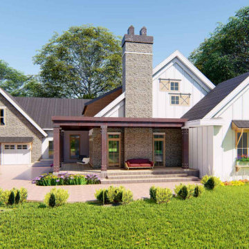
It's a small bungalow house plan. It goes nicely for a single-family home. This plan is also ideal for small urban areas.
It is a 1-story house plan with 2 car parks, 3 bedrooms, and 2.5 bathrooms. It has screened patterns on the front porch to enjoy stunning views. The master bedroom is attached to a rear deck on the main floor with lounge area ideas to spend a relaxed period and a master bathroom with double vanity sink plumbing and a separate shower and toilet. Another practical feature is the pantry model of a butler with a breakfast nook style to feel luxurious and a kitchen eating counter. There is also a spacious office and a living room. A formal concept for a cozy living room with guests and relatives. The sunroom concept is more appealing for the consumer to make life in the interior fresher, more normal, lighter, and more pleasing aesthetic. The interior hall is a vault ceiling idea that increases the natural lights of your house and has an open gable roof with a truss framing, particularly when accompanied by big windows.
Do not leave it unseen by the sight that produces seduction for the customer both externally and indoors.
 Archimple LLC
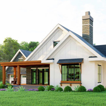
It’s a tiny low bungalow house with a small space. It goes well for a single-family home. For small urban areas, this plan is also suitable. It's a 1 story house plan with 2 car garages, 3 bedrooms, and 2.5 bathrooms for limited space. It has screened patterns on the front porch to enjoy stunning views. The master bedroom is attached to a rear deck on the main floor with lounge area ideas to spend a relaxed period and a master bathroom with double vanity sink plumbing and a separate shower and toilet. Another practical feature is the pantry model of a butler with a breakfast nook style to feel luxurious and a kitchen eating counter. There is also a great room and a conference place for the family. A formal concept for a cozy living room with guests and relatives. The sunroom concept is more appealing for the consumer to make life in the interior fresher, more normal, lighter, and more pleasing aesthetic. The interior hall is a vault ceiling idea that increases the natural lights of your house and has an open gable roof with a truss framing, particularly when accompanied by big windows. Do not leave it unseen by a sight that produces seduction for the customer both externally and indoors.


 Visbeen Architects
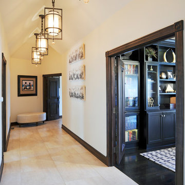
Inspired by the surrounding landscape, the Craftsman/Prairie style is one of the few truly American architectural styles. It was developed around the turn of the century by a group of Midwestern architects and continues to be among the most comfortable of all American-designed architecture more than a century later, one of the main reasons it continues to attract architects and homeowners today. Oxbridge builds on that solid reputation, drawing from Craftsman/Prairie and classic Farmhouse styles. Its handsome Shingle-clad exterior includes interesting pitched rooflines, alternating rows of cedar shake siding, stone accents in the foundation and chimney and distinctive decorative brackets. Repeating triple windows add interest to the exterior while keeping interior spaces open and bright. Inside, the floor plan is equally impressive. Columns on the porch and a custom entry door with sidelights and decorative glass leads into a spacious 2,900-square-foot main floor, including a 19 by 24-foot living room with a period-inspired built-ins and a natural fireplace. While inspired by the past, the home lives for the present, with open rooms and plenty of storage throughout. Also included is a 27-foot-wide family-style kitchen with a large island and eat-in dining and a nearby dining room with a beadboard ceiling that leads out onto a relaxing 240-square-foot screen porch that takes full advantage of the nearby outdoors and a private 16 by 20-foot master suite with a sloped ceiling and relaxing personal sitting area. The first floor also includes a large walk-in closet, a home management area and pantry to help you stay organized and a first-floor laundry area. Upstairs, another 1,500 square feet awaits, with a built-ins and a window seat at the top of the stairs that nod to the home’s historic inspiration. Opt for three family bedrooms or use one of the three as a yoga room; the upper level also includes attic access, which offers another 500 square feet, perfect for crafts or a playroom. More space awaits in the lower level, where another 1,500 square feet (and an additional 1,000) include a recreation/family room with nine-foot ceilings, a wine cellar and home office.
Photographer: Jeff Garland

 ZeroEnergy Design
This renovated brick rowhome in Boston’s South End offers a modern aesthetic within a historic structure, creative use of space, exceptional thermal comfort, a reduced carbon footprint, and a passive stream of income.
DESIGN PRIORITIES. The goals for the project were clear - design the primary unit to accommodate the family’s modern lifestyle, rework the layout to create a desirable rental unit, improve thermal comfort and introduce a modern aesthetic. We designed the street-level entry as a shared entrance for both the primary and rental unit. The family uses it as their everyday entrance - we planned for bike storage and an open mudroom with bench and shoe storage to facilitate the change from shoes to slippers or bare feet as they enter their home. On the main level, we expanded the kitchen into the dining room to create an eat-in space with generous counter space and storage, as well as a comfortable connection to the living space. The second floor serves as master suite for the couple - a bedroom with a walk-in-closet and ensuite bathroom, and an adjacent study, with refinished original pumpkin pine floors. The upper floor, aside from a guest bedroom, is the child's domain with interconnected spaces for sleeping, work and play. In the play space, which can be separated from the work space with new translucent sliding doors, we incorporated recreational features inspired by adventurous and competitive television shows, at their son’s request.
MODERN MEETS TRADITIONAL. We left the historic front facade of the building largely unchanged - the security bars were removed from the windows and the single pane windows were replaced with higher performing historic replicas. We designed the interior and rear facade with a vision of warm modernism, weaving in the notable period features. Each element was either restored or reinterpreted to blend with the modern aesthetic. The detailed ceiling in the living space, for example, has a new matte monochromatic finish, and the wood stairs are covered in a dark grey floor paint, whereas the mahogany doors were simply refinished. New wide plank wood flooring with a neutral finish, floor-to-ceiling casework, and bold splashes of color in wall paint and tile, and oversized high-performance windows (on the rear facade) round out the modern aesthetic.
RENTAL INCOME. The existing rowhome was zoned for a 2-family dwelling but included an undesirable, single-floor studio apartment at the garden level with low ceiling heights and questionable emergency egress. In order to increase the quality and quantity of space in the rental unit, we reimagined it as a two-floor, 1 or 2 bedroom, 2 bathroom apartment with a modern aesthetic, increased ceiling height on the lowest level and provided an in-unit washer/dryer. The apartment was listed with Jackie O'Connor Real Estate and rented immediately, providing the owners with a source of passive income.
ENCLOSURE WITH BENEFITS. The homeowners sought a minimal carbon footprint, enabled by their urban location and lifestyle decisions, paired with the benefits of a high-performance home. The extent of the renovation allowed us to implement a deep energy retrofit (DER) to address air tightness, insulation, and high-performance windows. The historic front facade is insulated from the interior, while the rear facade is insulated on the exterior. Together with these building enclosure improvements, we designed an HVAC system comprised of continuous fresh air ventilation, and an efficient, all-electric heating and cooling system to decouple the house from natural gas. This strategy provides optimal thermal comfort and indoor air quality, improved acoustic isolation from street noise and neighbors, as well as a further reduced carbon footprint. We also took measures to prepare the roof for future solar panels, for when the South End neighborhood’s aging electrical infrastructure is upgraded to allow them.
URBAN LIVING. The desirable neighborhood location allows the both the homeowners and tenant to walk, bike, and use public transportation to access the city, while each charging their respective plug-in electric cars behind the building to travel greater distances.
OVERALL. The understated rowhouse is now ready for another century of urban living, offering the owners comfort and convenience as they live life as an expression of their values.
Eric Roth Photo
 Bluestem Remodeling
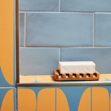
Two totally refreshed bathroom remodels take center stage in this St. Louis Park home.
The homeowners loved their 1968 split level home and its unique period features. It was a well-built custom home with gorgeous maple trim and oak floors throughout.
However, the main bathroom had water damage to the sub-floor that needed to be replaced. The owners decided to go ahead and update the rest of the bathroom at the same time, taking care of other items they had long wanted to do. For example, the plumbing was outdated, and the shower didn’t drain well. They also hoped for a wood vanity that would match the rest of the home, in look and era, and wished the previous homeowners hadn’t painted the original.
As the couple discussed the remodel, they ultimately decided to take the plunge and take advantage of work being done in the home and update both the main floor bathroom and the master bathroom at the same time.
Tackling both projects at once made sense for project efficiency, both in time and budget, and they are thrilled to now each have “their own” new bathroom!
72