
Search results for "Master regulator" in Home Design Ideas
 Dresner Design | Chicago Custom Kitchens Cabinets
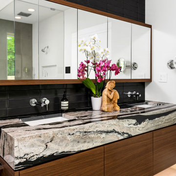
This couple moved from Chicago’s Wicker Park to a rural setting but wanted to maintain their modern aesthetic. Scott Dresner of Dresner Design created a modern spa oasis for the couple’s master bathroom. The second project completed by Scott in the couple’s home. On the client’s, wish list…a luxurious space to relax, a new window to replace the dated looking glass block, great storage for towels and larger items as well as smaller toiletries. Scott accomplished a variety of storage with deep vanity drawers with push hardware, medicine cabinets with storage on the entire wall, and a large linen closet. Finishes are modern with a hint of warmth created by the floating walnut vanity and trim work. LED light along the vanity and medicine cabinets create a soft ambience perfect for a relaxing bath. Floors are radiant heat, window treatment is motorized, and panel controls a speaker and LED lighting in the rain showerhead.
Sources:
-Lighting, Lucy Slivinski
-Artwork, Linc Thelen
-Gray Porcelain Tile, Renaissance Tile + Bath
-White Porcelain Tile, Porcelainosa
-Black Porcelain tile, The Tile Outlet
-Mosaic Shower Floor, Porcelainosa
-Bath Tub, Victoria + Albert
-Tub Tray, Victoria + Albert
-Bath Filler, Phylich
-Regulators, Graff
-Shower Head, Jaclo
-Accessories, Colonial Bronze + Dezi
-Rain Shower (LED lighting + music), Thermasol
-Toilet, TOTO
-Hand spray, Graff
-Stone, Calia Stone Boutique
-Stone Fabrication, Euro Marble Supply
-Vanity, Mirrors, and Linen Closet, The Dresner Design Private Label Collection by De Angelis Italia
-Radiant Flooring, Warmup
-Linerar Drain, Infinity
-Sinks, Lacava
-Sink Plumbing, Graff
-Window Treatment, The Shade Store
-Chair, CB2
 Dresner Design | Chicago Custom Kitchens Cabinets
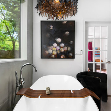
This couple moved from Chicago’s Wicker Park to a rural setting but wanted to maintain their modern aesthetic. Scott Dresner of Dresner Design created a modern spa oasis for the couple’s master bathroom. The second project completed by Scott in the couple’s home. On the client’s, wish list…a luxurious space to relax, a new window to replace the dated looking glass block, great storage for towels and larger items as well as smaller toiletries. Scott accomplished a variety of storage with deep vanity drawers with push hardware, medicine cabinets with storage on the entire wall, and a large linen closet. Finishes are modern with a hint of warmth created by the floating walnut vanity and trim work. LED light along the vanity and medicine cabinets create a soft ambience perfect for a relaxing bath. Floors are radiant heat, window treatment is motorized, and panel controls a speaker and LED lighting in the rain showerhead.
Sources:
-Lighting, Lucy Slivinski
-Artwork, Linc Thelen
-Gray Porcelain Tile, Renaissance Tile + Bath
-White Porcelain Tile, Porcelainosa
-Black Porcelain tile, The Tile Outlet
-Mosaic Shower Floor, Porcelainosa
-Bath Tub, Victoria + Albert
-Tub Tray, Victoria + Albert
-Bath Filler, Phylich
-Regulators, Graff
-Shower Head, Jaclo
-Accessories, Colonial Bronze + Dezi
-Rain Shower (LED lighting + music), Thermasol
-Toilet, TOTO
-Hand spray, Graff
-Stone, Calia Stone Boutique
-Stone Fabrication, Euro Marble Supply
-Vanity, Mirrors, and Linen Closet, The Dresner Design Private Label Collection by De Angelis Italia
-Radiant Flooring, Warmup
-Linerar Drain, Infinity
-Sinks, Lacava
-Sink Plumbing, Graff
-Window Treatment, The Shade Store
-Chair, CB2
 Cure Design Group
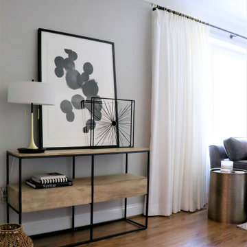
a classic city home, built in the 50’s. Her family moved in August of ’18, and in less than a year, she’s already completed a number of remodel projects including additions to the master bedroom and 2-bedroom + bath “kids’ wing.” She’s opened walls from the kitchen to the living and dining rooms creating a massive open floor plan and refinished all the original hardwood floors. After seeing her beautifully furnished space and hearing her listing everything she’s done to get her house the way it looks today, I had so many exciting ideas to help her add the finishing touches she was needing and to give her the look she was going for.
Referencing her inspiration pics saved to Houzz and Pinterest, the first item on the list was to add window treatments. These were presented in a soft, crisp white fabric which maintains the brightness for each room, diffusing the sunlight throughout, keeping each space light and airy. The simple functional panels give her the privacy she wanted from all the passersby walking the park, which are lined to help regulate the temperature differences she needed. The hardware for these panels is something to mention –simple, modern, matte black rods and brackets, highlighted with acrylic finials and gold rings. This combination is an exclamation point showcasing what custom window treatments can really do for a room. The main dining room window boasts a striking contrast of rich black wide leather tape, drawing your eye right to the beautiful picture window, which in and of itself is a perfect accent to this space.
From there, adding the right wall hangings and artwork, task lighting, accessories, and accents layered throughout, mixing lots of textures, metal finishes, and varying shades of color synchronizes one room to the next buttoning up the entire design concept she was striving to achieve.
Find the right local pro for your project
 Dresner Design | Chicago Custom Kitchens Cabinets
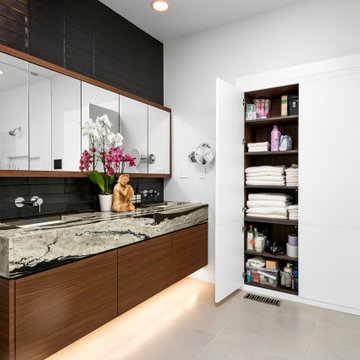
This couple moved from Chicago’s Wicker Park to a rural setting but wanted to maintain their modern aesthetic. Scott Dresner of Dresner Design created a modern spa oasis for the couple’s master bathroom. The second project completed by Scott in the couple’s home. On the client’s, wish list…a luxurious space to relax, a new window to replace the dated looking glass block, great storage for towels and larger items as well as smaller toiletries. Scott accomplished a variety of storage with deep vanity drawers with push hardware, medicine cabinets with storage on the entire wall, and a large linen closet. Finishes are modern with a hint of warmth created by the floating walnut vanity and trim work. LED light along the vanity and medicine cabinets create a soft ambience perfect for a relaxing bath. Floors are radiant heat, window treatment is motorized, and panel controls a speaker and LED lighting in the rain showerhead.
Sources:
-Lighting, Lucy Slivinski
-Artwork, Linc Thelen
-Gray Porcelain Tile, Renaissance Tile + Bath
-White Porcelain Tile, Porcelainosa
-Black Porcelain tile, The Tile Outlet
-Mosaic Shower Floor, Porcelainosa
-Bath Tub, Victoria + Albert
-Tub Tray, Victoria + Albert
-Bath Filler, Phylich
-Regulators, Graff
-Shower Head, Jaclo
-Accessories, Colonial Bronze + Dezi
-Rain Shower (LED lighting + music), Thermasol
-Toilet, TOTO
-Hand spray, Graff
-Stone, Calia Stone Boutique
-Stone Fabrication, Euro Marble Supply
-Vanity, Mirrors, and Linen Closet, The Dresner Design Private Label Collection by De Angelis Italia
-Radiant Flooring, Warmup
-Linerar Drain, Infinity
-Sinks, Lacava
-Sink Plumbing, Graff
-Window Treatment, The Shade Store
-Chair, CB2
 Cure Design Group
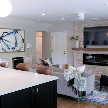
a classic city home, built in the 50’s. Her family moved in August of ’18, and in less than a year, she’s already completed a number of remodel projects including additions to the master bedroom and 2-bedroom + bath “kids’ wing.” She’s opened walls from the kitchen to the living and dining rooms creating a massive open floor plan and refinished all the original hardwood floors. After seeing her beautifully furnished space and hearing her listing everything she’s done to get her house the way it looks today, I had so many exciting ideas to help her add the finishing touches she was needing and to give her the look she was going for.
Referencing her inspiration pics saved to Houzz and Pinterest, the first item on the list was to add window treatments. These were presented in a soft, crisp white fabric which maintains the brightness for each room, diffusing the sunlight throughout, keeping each space light and airy. The simple functional panels give her the privacy she wanted from all the passersby walking the park, which are lined to help regulate the temperature differences she needed. The hardware for these panels is something to mention –simple, modern, matte black rods and brackets, highlighted with acrylic finials and gold rings. This combination is an exclamation point showcasing what custom window treatments can really do for a room. The main dining room window boasts a striking contrast of rich black wide leather tape, drawing your eye right to the beautiful picture window, which in and of itself is a perfect accent to this space.
From there, adding the right wall hangings and artwork, task lighting, accessories, and accents layered throughout, mixing lots of textures, metal finishes, and varying shades of color synchronizes one room to the next buttoning up the entire design concept she was striving to achieve.
 Cure Design Group
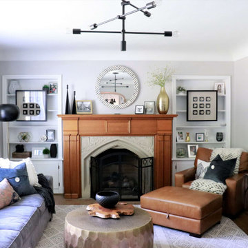
a classic city home, built in the 50’s. Her family moved in August of ’18, and in less than a year, she’s already completed a number of remodel projects including additions to the master bedroom and 2-bedroom + bath “kids’ wing.” She’s opened walls from the kitchen to the living and dining rooms creating a massive open floor plan and refinished all the original hardwood floors. After seeing her beautifully furnished space and hearing her listing everything she’s done to get her house the way it looks today, I had so many exciting ideas to help her add the finishing touches she was needing and to give her the look she was going for.
Referencing her inspiration pics saved to Houzz and Pinterest, the first item on the list was to add window treatments. These were presented in a soft, crisp white fabric which maintains the brightness for each room, diffusing the sunlight throughout, keeping each space light and airy. The simple functional panels give her the privacy she wanted from all the passersby walking the park, which are lined to help regulate the temperature differences she needed. The hardware for these panels is something to mention –simple, modern, matte black rods and brackets, highlighted with acrylic finials and gold rings. This combination is an exclamation point showcasing what custom window treatments can really do for a room. The main dining room window boasts a striking contrast of rich black wide leather tape, drawing your eye right to the beautiful picture window, which in and of itself is a perfect accent to this space.
From there, adding the right wall hangings and artwork, task lighting, accessories, and accents layered throughout, mixing lots of textures, metal finishes, and varying shades of color synchronizes one room to the next buttoning up the entire design concept she was striving to achieve.
 Homestead Doors, Inc.
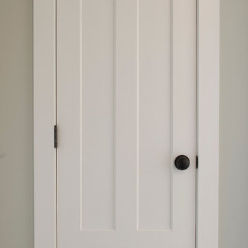
Door #10
FP3190
Flat 3 Panel Interior Door with Farmhouse Sticking
Solid Poplar stiles and rails
MDF panels
Painted White
1 x 4 door casing
1 x 6 baseboard
Bravura 336B door knob
Call us for a quote on your door project
419-684-9582
Visit https://www.door.cc

 Cure Design Group
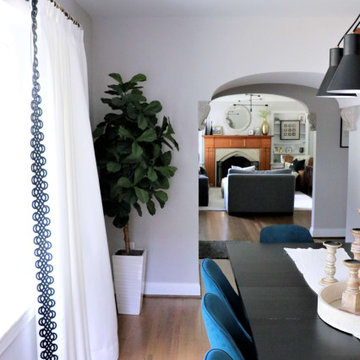
a classic city home, built in the 50’s. Her family moved in August of ’18, and in less than a year, she’s already completed a number of remodel projects including additions to the master bedroom and 2-bedroom + bath “kids’ wing.” She’s opened walls from the kitchen to the living and dining rooms creating a massive open floor plan and refinished all the original hardwood floors. After seeing her beautifully furnished space and hearing her listing everything she’s done to get her house the way it looks today, I had so many exciting ideas to help her add the finishing touches she was needing and to give her the look she was going for.
Referencing her inspiration pics saved to Houzz and Pinterest, the first item on the list was to add window treatments. These were presented in a soft, crisp white fabric which maintains the brightness for each room, diffusing the sunlight throughout, keeping each space light and airy. The simple functional panels give her the privacy she wanted from all the passersby walking the park, which are lined to help regulate the temperature differences she needed. The hardware for these panels is something to mention –simple, modern, matte black rods and brackets, highlighted with acrylic finials and gold rings. This combination is an exclamation point showcasing what custom window treatments can really do for a room. The main dining room window boasts a striking contrast of rich black wide leather tape, drawing your eye right to the beautiful picture window, which in and of itself is a perfect accent to this space.
From there, adding the right wall hangings and artwork, task lighting, accessories, and accents layered throughout, mixing lots of textures, metal finishes, and varying shades of color synchronizes one room to the next buttoning up the entire design concept she was striving to achieve.
 Cure Design Group
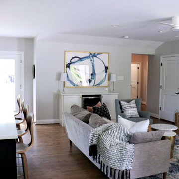
a classic city home, built in the 50’s. Her family moved in August of ’18, and in less than a year, she’s already completed a number of remodel projects including additions to the master bedroom and 2-bedroom + bath “kids’ wing.” She’s opened walls from the kitchen to the living and dining rooms creating a massive open floor plan and refinished all the original hardwood floors. After seeing her beautifully furnished space and hearing her listing everything she’s done to get her house the way it looks today, I had so many exciting ideas to help her add the finishing touches she was needing and to give her the look she was going for.
Referencing her inspiration pics saved to Houzz and Pinterest, the first item on the list was to add window treatments. These were presented in a soft, crisp white fabric which maintains the brightness for each room, diffusing the sunlight throughout, keeping each space light and airy. The simple functional panels give her the privacy she wanted from all the passersby walking the park, which are lined to help regulate the temperature differences she needed. The hardware for these panels is something to mention –simple, modern, matte black rods and brackets, highlighted with acrylic finials and gold rings. This combination is an exclamation point showcasing what custom window treatments can really do for a room. The main dining room window boasts a striking contrast of rich black wide leather tape, drawing your eye right to the beautiful picture window, which in and of itself is a perfect accent to this space.
From there, adding the right wall hangings and artwork, task lighting, accessories, and accents layered throughout, mixing lots of textures, metal finishes, and varying shades of color synchronizes one room to the next buttoning up the entire design concept she was striving to achieve.
 Cure Design Group
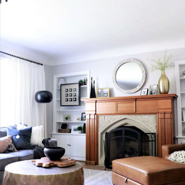
a classic city home, built in the 50’s. Her family moved in August of ’18, and in less than a year, she’s already completed a number of remodel projects including additions to the master bedroom and 2-bedroom + bath “kids’ wing.” She’s opened walls from the kitchen to the living and dining rooms creating a massive open floor plan and refinished all the original hardwood floors. After seeing her beautifully furnished space and hearing her listing everything she’s done to get her house the way it looks today, I had so many exciting ideas to help her add the finishing touches she was needing and to give her the look she was going for.
Referencing her inspiration pics saved to Houzz and Pinterest, the first item on the list was to add window treatments. These were presented in a soft, crisp white fabric which maintains the brightness for each room, diffusing the sunlight throughout, keeping each space light and airy. The simple functional panels give her the privacy she wanted from all the passersby walking the park, which are lined to help regulate the temperature differences she needed. The hardware for these panels is something to mention –simple, modern, matte black rods and brackets, highlighted with acrylic finials and gold rings. This combination is an exclamation point showcasing what custom window treatments can really do for a room. The main dining room window boasts a striking contrast of rich black wide leather tape, drawing your eye right to the beautiful picture window, which in and of itself is a perfect accent to this space.
From there, adding the right wall hangings and artwork, task lighting, accessories, and accents layered throughout, mixing lots of textures, metal finishes, and varying shades of color synchronizes one room to the next buttoning up the entire design concept she was striving to achieve.
 Amanda Martocchio Architecture
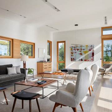
When a world class sailing champion approached us to design a Newport home for his family, with lodging for his sailing crew, we set out to create a clean, light-filled modern home that would integrate with the natural surroundings of the waterfront property, and respect the character of the historic district.
Our approach was to make the marine landscape an integral feature throughout the home. One hundred eighty degree views of the ocean from the top floors are the result of the pinwheel massing. The home is designed as an extension of the curvilinear approach to the property through the woods and reflects the gentle undulating waterline of the adjacent saltwater marsh. Floodplain regulations dictated that the primary occupied spaces be located significantly above grade; accordingly, we designed the first and second floors on a stone “plinth” above a walk-out basement with ample storage for sailing equipment. The curved stone base slopes to grade and houses the shallow entry stair, while the same stone clads the interior’s vertical core to the roof, along which the wood, glass and stainless steel stair ascends to the upper level.
One critical programmatic requirement was enough sleeping space for the sailing crew, and informal party spaces for the end of race-day gatherings. The private master suite is situated on one side of the public central volume, giving the homeowners views of approaching visitors. A “bedroom bar,” designed to accommodate a full house of guests, emerges from the other side of the central volume, and serves as a backdrop for the infinity pool and the cove beyond.
Also essential to the design process was ecological sensitivity and stewardship. The wetlands of the adjacent saltwater marsh were designed to be restored; an extensive geo-thermal heating and cooling system was implemented; low carbon footprint materials and permeable surfaces were used where possible. Native and non-invasive plant species were utilized in the landscape. The abundance of windows and glass railings maximize views of the landscape, and, in deference to the adjacent bird sanctuary, bird-friendly glazing was used throughout.
Photo: Michael Moran/OTTO Photography

 Beth Diana Smith Interior Design
Rhino hooks
Patrick Cline
Mid-sized eclectic master carpeted bedroom photo in New York with purple walls and no fireplace
Mid-sized eclectic master carpeted bedroom photo in New York with purple walls and no fireplace
 Closet Organizing Systems
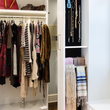
This lovely master closet is finished with traditional white melamine and thermofoil raised panel fronts to closely match the existing bathroom area. Using the full height of the room allowed for open shelving above clothing sections used for decorative display. The center island contains 2 tilt out hampers and 6 drawer banks for added storage. The countertop is Grey Savoie by Victostone. To create a column effect around the window, tall pull outs were used on both sides for scarf/necklace storage for her and belt/tie storage for him. The finishing touches include matte round aluminum rods, clear Lucite jewelry tray, valet rods, belt racks, hidden wall safe, and a pull out ironing station cabinet. LED lighting was routed into the shelving above all rods and puck lights above the two dresser areas, creating additional pizzazz and glamour to the space. The goal of this closet was to make the dressing area for a couple as a meeting place, conducive to conversation and organization. Designed by Donna Siben for Closet Organizing Systems

 Amanda Martocchio Architecture
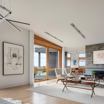
When a world class sailing champion approached us to design a Newport home for his family, with lodging for his sailing crew, we set out to create a clean, light-filled modern home that would integrate with the natural surroundings of the waterfront property, and respect the character of the historic district.
Our approach was to make the marine landscape an integral feature throughout the home. One hundred eighty degree views of the ocean from the top floors are the result of the pinwheel massing. The home is designed as an extension of the curvilinear approach to the property through the woods and reflects the gentle undulating waterline of the adjacent saltwater marsh. Floodplain regulations dictated that the primary occupied spaces be located significantly above grade; accordingly, we designed the first and second floors on a stone “plinth” above a walk-out basement with ample storage for sailing equipment. The curved stone base slopes to grade and houses the shallow entry stair, while the same stone clads the interior’s vertical core to the roof, along which the wood, glass and stainless steel stair ascends to the upper level.
One critical programmatic requirement was enough sleeping space for the sailing crew, and informal party spaces for the end of race-day gatherings. The private master suite is situated on one side of the public central volume, giving the homeowners views of approaching visitors. A “bedroom bar,” designed to accommodate a full house of guests, emerges from the other side of the central volume, and serves as a backdrop for the infinity pool and the cove beyond.
Also essential to the design process was ecological sensitivity and stewardship. The wetlands of the adjacent saltwater marsh were designed to be restored; an extensive geo-thermal heating and cooling system was implemented; low carbon footprint materials and permeable surfaces were used where possible. Native and non-invasive plant species were utilized in the landscape. The abundance of windows and glass railings maximize views of the landscape, and, in deference to the adjacent bird sanctuary, bird-friendly glazing was used throughout.
Photo: Michael Moran/OTTO Photography
 Amanda Martocchio Architecture
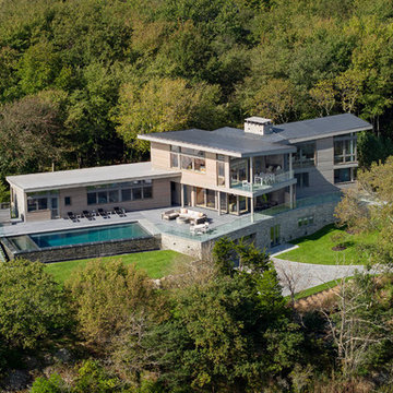
When a world class sailing champion approached us to design a Newport home for his family, with lodging for his sailing crew, we set out to create a clean, light-filled modern home that would integrate with the natural surroundings of the waterfront property, and respect the character of the historic district.
Our approach was to make the marine landscape an integral feature throughout the home. One hundred eighty degree views of the ocean from the top floors are the result of the pinwheel massing. The home is designed as an extension of the curvilinear approach to the property through the woods and reflects the gentle undulating waterline of the adjacent saltwater marsh. Floodplain regulations dictated that the primary occupied spaces be located significantly above grade; accordingly, we designed the first and second floors on a stone “plinth” above a walk-out basement with ample storage for sailing equipment. The curved stone base slopes to grade and houses the shallow entry stair, while the same stone clads the interior’s vertical core to the roof, along which the wood, glass and stainless steel stair ascends to the upper level.
One critical programmatic requirement was enough sleeping space for the sailing crew, and informal party spaces for the end of race-day gatherings. The private master suite is situated on one side of the public central volume, giving the homeowners views of approaching visitors. A “bedroom bar,” designed to accommodate a full house of guests, emerges from the other side of the central volume, and serves as a backdrop for the infinity pool and the cove beyond.
Also essential to the design process was ecological sensitivity and stewardship. The wetlands of the adjacent saltwater marsh were designed to be restored; an extensive geo-thermal heating and cooling system was implemented; low carbon footprint materials and permeable surfaces were used where possible. Native and non-invasive plant species were utilized in the landscape. The abundance of windows and glass railings maximize views of the landscape, and, in deference to the adjacent bird sanctuary, bird-friendly glazing was used throughout.
Photo: Michael Moran/OTTO Photography
 Sweet Smiling Landscape Design
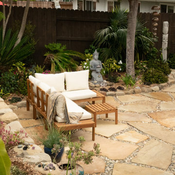
When I came to this property not only was the landscape a scrappy mess the property also had some very real grading and drainage issues that were jeopardizing the safety of this house. As recent transplants from New Jerseys to Southern California these clients were in awe of all the plants they were seeing in their neighborhood. Living on the water at the Ventura harbor they wanted to be able to take full advantage or the outdoor lifestyle and cool ocean breeze. Being environmentally conscious citizens, these clients were very concerned that their garden was designed with sustainability as a leading factor. As they said in our initial consultation, “Would want or garden be part of the solution not part of the problem.”
This property is the last house on the bottom of a gently sloping street. All the water from the neighbor’s houses drain onto this property. When I came into this project the back yard sloped into the house. When it would rain the water would pool up against the house causing water damage. To address the drainage we employed several tactics. Firstly, we had to invert the slope in the back yard so that water would not pool against the house. We created a very minor slope going away from the house so that water drains away but so the patio area feels flat.
The back of the back yard had an existing retaining wall made out of shabby looking slump stone. In front of that retaining wall we created a beautiful natural stone retaining wall. This retain wall severs many purposes. One it works as a place to put some of the soil removed from the grading giving this project a smaller carbon foot print (moving soil of a site burns a lot of fossil fuel). The retaining wall also helps obscure the shabby existing retaining wall and allows for planting space above the footing from the existing retaining wall. The soil behind the ne retaining wall is slightly lower than the top of the wall so that when the run on water on from the neighbor’s property flows it is slowed down and absorbed before it has a chance to get near the house. Finally, the wall is at a height designed to serve as overflow seating as these clients intend to have occasional large parties and gatherings.
Other efforts made to help keep the house safe and dry are that we used permeable paving. With the hardscape being comprised of flag stone with gravel in-between water has a chance to soak into the ground so it does not flow into spots where it will pool up.
The final element to help keep the house dry is the addition of infiltration swales. Infiltration swales are depressions in the landscape that capture rain water. The down spouts on the sides of the houses are connected to pipe that goes under the ground and conveys the water to the swales. In this project it helps move rain water away from the house. In general, these Infiltration swales are a powerful element in creating sustainable landscapes. These swales capture pollutants that accumulate on the roof and in the landscape. Biology in the soil in the swales can break down these pollutants. When run of watered is not captured by soil on a property the dirty water flows into water ways and then the ocean were the biology that breaks down the pollutants is not as prolific. This is particularly important in this project as it drains directly into the harbor. The water that is absorbed in to the swales can replenish aquafers as well as increasing the water available to the plants planted in that area recusing the amount of water that is needed from irrigation.
When it came to the planting we went with a California friendly tropical theme. Using lots of succulents and plants with colorful foliage we created vibrant lush landscape that will have year around color. We planted densely (the images in the picture were taken only a month after installation). Taller drought tolerant plants to help regulate the temperature and loss of water from the plants below them. The dense plantings will help keep the garden, the house and even the neighborhood cooler on hot days, will provide spaces for birds to enjoy and will create an illusion of depth in a somewhat narrow space.
Today this garden is a space these homeowners can fully enjoy while having the peace of mind that their house is protected from flooding and they are helping the environment.

 User
User
Specifications
Plan Styles
Bedroom Features
Upstairs Master Bdrm
Walk In Closet
Garage
Oversized Garage
Side Entry Garage
Lot Characteristics
Suited For Corner Lot
Suited For Sloping Lot
Area
Upper Floor Sq Ft
924 sq ft
Total Sq Ft
2192 sq ft
Main Floor Sq Ft
1268 sq ft
Lower Floor Sq Ft
900 sq ft
Designer Notes
Included
EXTERIOR ELEVATIONS: shows the front, rear and sides of the house, including exterior materials, details and measurements.
FOUNDATION PLAN: includes drawings for a full, daylight or partial basement. Some of our plans are drawn with a crawlspace, but we do not offer plans with pole foundation. All necessary notations and dimensions are included. Foundation options will vary for each plan. If the home you want does not have the type of foundation you desire, one may be developed for you by contacting us.
DETAILED FLOOR PLANS: shows the placement of the interior walls and the dimensions for rooms, doors, windows, stairways, etc., of each level of the house.
CROSS SECTIONS: shows details of the house as though it were cut in slices from the roof to the foundation. The cross sections specify the home's construction, insulation, flooring and roofing details. Most of our Cross Sections are common sections of that particular style of house. If the house is complex a Cross Section or other form of detail will be included to help explain how parts of that house will fit together.
ROOF DETAILS: shows slope, pitch and location of dormers, gables and other roof elements, including skylights. These details may be shown on the elevation sheet or on a separate diagram. Note: If trusses are used, we suggest using a local truss manufacturer to design your trusses to comply with your local codes and regulations. If Rafters are used we suggest using your local lumber company. Most lumber companies employ structural engineers who can figure out the proper spans and loads for this type of roof system.
Additional Rooms
Great Room Living Room
Unfinished Future Space
Outdo

Sponsored
Sunbury, OH

J.Holderby - Renovations
Franklin County's Leading General Contractors - 2X Best of Houzz!
 Dale Cohen Designstudio
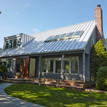
Asked by her client to review a typically mundane South Hampton ‘50s saltbox because “the last designer they talked to said they would have to add on to make the house anything,” Ms. Cohen approached the renovation in exactly the opposite manner. To refine the small building footprint, precise architectural gestures were used with a series of finely calibrated moments make the space more gracious and welcoming. Architectural acts were bold in concept but not in actual construction work; such as capturing the car garage to add a hyper modern sunroom/den along with a powder room and laundry. Reconfiguring one side of the house’s roofline to manipulate the space into a sensational master suite saved the north side of the house from remaining an un-useful attic space. This inner sanctum of bedroom and master bath is reminiscent of a Hampton’s beachscape in all its elegance and minimalism. The only square footage actually added was a tiny 4X4 corner as an addition to the front entry, oddly an essential piece of real estate to make an actual vestibule. All these refinements make for a crafted, articulate result rather than bowing to the bigger is better theme, which is more prevalent in the Hamptons.
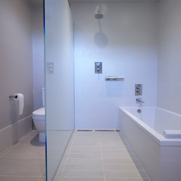
The function of the plan and the accompanying finishes are impressive. The Jack and Jill bathroom, an invention of the American post-war housing boom, was outfitted in handsome walnut Duravit vanity cabinets and neutral finishes. The master bath, with its expansive skylights, might be mistaken for a conceptual art installation due to its evocative marble countertop in striped ethereal hues. Finally, Ms. Cohen uses wallpaper like a museum curator, hanging an iconic Knoll pattern to punctuate the dining/media space.
Each room in the house was sculpted via a palette of watercolor blue of varying saturations. Fabrics were culled from the greats of modernist textiles, Maharam’s Quatrefoil pattern in blue and Knoll classic Sway pattern in sea shades. The blue on white “beach” scheme runs from a soft cotton candy sky in the girl’s room to an immersive David Sutherland Park Bark wallpaper in the powder room. This intellectual inquiry as to what are the true colors at the beach belays the sophistication that surpasses the usual nautical curse of the average beach house. Out of the corner of your eye, in almost every quadrant of the house, is a burst of colorful expression and delight; this serves as Ms. Cohen’s painterly gift to the client.
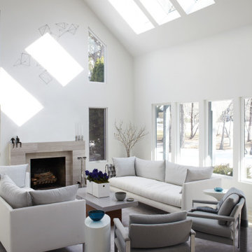
Ms. Cohen’s hidden strength is her ability to choreograph a seating area. Whether it is a formal living room or the ultimate hang out spot, each space has the right amount of distance, intimacy and dare I say intrigue to make the arrangements inviting. Each conversation, because it really looks like a fine chat can be had, has an elegant side table ready for duty and all tête-à-têtes are regulated to a sumptuous area rugs. Habitants in Ms. Cohen’s world only work through deep discourse.
 Dale Cohen Designstudio
Asked by her client to review a typically mundane South Hampton ‘50s saltbox because “the last designer they talked to said they would have to add on to make the house anything,” Ms. Cohen approached the renovation in exactly the opposite manner. To refine the small building footprint, precise architectural gestures were used with a series of finely calibrated moments make the space more gracious and welcoming. Architectural acts were bold in concept but not in actual construction work; such as capturing the car garage to add a hyper modern sunroom/den along with a powder room and laundry. Reconfiguring one side of the house’s roofline to manipulate the space into a sensational master suite saved the north side of the house from remaining an un-useful attic space. This inner sanctum of bedroom and master bath is reminiscent of a Hampton’s beachscape in all its elegance and minimalism. The only square footage actually added was a tiny 4X4 corner as an addition to the front entry, oddly an essential piece of real estate to make an actual vestibule. All these refinements make for a crafted, articulate result rather than bowing to the bigger is better theme, which is more prevalent in the Hamptons.
The function of the plan and the accompanying finishes are impressive. The Jack and Jill bathroom, an invention of the American post-war housing boom, was outfitted in handsome walnut Duravit vanity cabinets and neutral finishes. The master bath, with its expansive skylights, might be mistaken for a conceptual art installation due to its evocative marble countertop in striped ethereal hues. Finally, Ms. Cohen uses wallpaper like a museum curator, hanging an iconic Knoll pattern to punctuate the dining/media space.
Each room in the house was sculpted via a palette of watercolor blue of varying saturations. Fabrics were culled from the greats of modernist textiles, Maharam’s Quatrefoil pattern in blue and Knoll classic Sway pattern in sea shades. The blue on white “beach” scheme runs from a soft cotton candy sky in the girl’s room to an immersive David Sutherland Park Bark wallpaper in the powder room. This intellectual inquiry as to what are the true colors at the beach belays the sophistication that surpasses the usual nautical curse of the average beach house. Out of the corner of your eye, in almost every quadrant of the house, is a burst of colorful expression and delight; this serves as Ms. Cohen’s painterly gift to the client.
Ms. Cohen’s hidden strength is her ability to choreograph a seating area. Whether it is a formal living room or the ultimate hang out spot, each space has the right amount of distance, intimacy and dare I say intrigue to make the arrangements inviting. Each conversation, because it really looks like a fine chat can be had, has an elegant side table ready for duty and all tête-à-têtes are regulated to a sumptuous area rugs. Habitants in Ms. Cohen’s world only work through deep discourse.
 Dale Cohen Designstudio
Asked by her client to review a typically mundane South Hampton ‘50s saltbox because “the last designer they talked to said they would have to add on to make the house anything,” Ms. Cohen approached the renovation in exactly the opposite manner. To refine the small building footprint, precise architectural gestures were used with a series of finely calibrated moments make the space more gracious and welcoming. Architectural acts were bold in concept but not in actual construction work; such as capturing the car garage to add a hyper modern sunroom/den along with a powder room and laundry. Reconfiguring one side of the house’s roofline to manipulate the space into a sensational master suite saved the north side of the house from remaining an un-useful attic space. This inner sanctum of bedroom and master bath is reminiscent of a Hampton’s beachscape in all its elegance and minimalism. The only square footage actually added was a tiny 4X4 corner as an addition to the front entry, oddly an essential piece of real estate to make an actual vestibule. All these refinements make for a crafted, articulate result rather than bowing to the bigger is better theme, which is more prevalent in the Hamptons.
The function of the plan and the accompanying finishes are impressive. The Jack and Jill bathroom, an invention of the American post-war housing boom, was outfitted in handsome walnut Duravit vanity cabinets and neutral finishes. The master bath, with its expansive skylights, might be mistaken for a conceptual art installation due to its evocative marble countertop in striped ethereal hues. Finally, Ms. Cohen uses wallpaper like a museum curator, hanging an iconic Knoll pattern to punctuate the dining/media space.
Each room in the house was sculpted via a palette of watercolor blue of varying saturations. Fabrics were culled from the greats of modernist textiles, Maharam’s Quatrefoil pattern in blue and Knoll classic Sway pattern in sea shades. The blue on white “beach” scheme runs from a soft cotton candy sky in the girl’s room to an immersive David Sutherland Park Bark wallpaper in the powder room. This intellectual inquiry as to what are the true colors at the beach belays the sophistication that surpasses the usual nautical curse of the average beach house. Out of the corner of your eye, in almost every quadrant of the house, is a burst of colorful expression and delight; this serves as Ms. Cohen’s painterly gift to the client.
Ms. Cohen’s hidden strength is her ability to choreograph a seating area. Whether it is a formal living room or the ultimate hang out spot, each space has the right amount of distance, intimacy and dare I say intrigue to make the arrangements inviting. Each conversation, because it really looks like a fine chat can be had, has an elegant side table ready for duty and all tête-à-têtes are regulated to a sumptuous area rugs. Habitants in Ms. Cohen’s world only work through deep discourse.
11