
Search results for "Master returning" in Home Design Ideas

 DC Interiors & Renovations
Walking through this property for the first time with the homeowner was interesting. We really do love historical properties and always want to see them returned to safe, comfortable, and very livable spaces. We saw a lot of opportunities in what some may have walked away from.
The transformation was met with some challenges along the way as you might expect from a 101 year old home that had not been updated. We saw them as opportunities and created solutions for each one that we met.
We started with structural engineering, and testing for asbestos and lead. Fortunately no Asbestos was present. We took everything down to studs and made sure the house was level and safe. We removed some walls, moved staircases and created a more functional layout for kitchen, hall bathroom, and added a bathroom to the master suite.
The end result is a beautiful “new” home with all the charm of its long history in a gorgeous and quaint neighborhood in Madison, WI.

 DRAPES & DECOR
This project has been very special to work on as the clients went through the unfortunate flooding of their house and most of the furnishings were damaged by water. Trying to help this family rebuild and return into their sweet home has been our top priority. We had a pleasure to replaced all damaged window coverings and install a new beautiful drapes that not only added function but framed the windows and softened the entire space. We've selected a linen blend fabric to complement the relaxed and elegant feel of the house. The same fabric was used on all rooms including living/breakfast area, dining room and master bedroom. A combination of different textures and natural tones gave this modern farmhouse a very welcoming and sophisticated feel. It's been a pleasure to see this family moving back to their gorgeous home.

 Advance Design Studio, Ltd.
Scott and Janet of Elgin have had four design to build renovations with Advance Design over the last decade. We got the chance to sit down and talk with Janet about her experience working with Advance Design on so many different areas of her home. Starting with her kitchen in 2009, Janet proclaimed, “The reason we kept coming back is because our first [renovation] went so extremely well, exceeding all of my expectations.”
Since their kitchen renovation with Advance Design ten years ago, Scott and Janet have also worked with Advance to remodel their master bedroom, their power room, a wet bar, and most recently their master bath. Having renovated practically every major room in the house with the team, we asked Janet what made her experience with Advance Design so special. “We went with Advance Design because we trusted them so much more, their experience, and everything that they brought. We were confident they were giving us what we wanted for the money we were spending.”
For their most recent renovation, Scott and Janet clearly knew what to expect going into their master bath renovation. They were familiar with Advance’s step by step design process that epitomizes the “Common Sense Remodeling” philosophy applied in every project Advance creates. After once again experiencing the careful budgeting analysis, the pointed design meetings, and the clear documentation that leads up the a thoroughly managed installation, Janet’s simple summary of their experience is this; “The word I would use to describe the process is – collaboration!”
Working closely with Advance Design kitchen designer Michelle Lecinski, together they were able to develop a new master bath design that not only worked with their investment goal, but also made sense for their lifestyle. “Oh Michelle, my designer! I connected with her immediately. She spent time getting to know us, our lifestyle, even the setting of our house.” The threesome had a great experience designing and producing yet another successful project together.
When it came to their new project plans, Scott and Janet were interested in creating a relaxing “spa-like” experience in their master bath. One of the many ideas Michelle introduced during the design process was installing a Kohler Alteo series showerhead for a rain-like shower experience. This designer showerhead, mixed with the warm ambiance of the lighting and pebble accent running throughout the shower make for what Janet calls a “luxury spa essence”. From the oversized glass sliding door to the recessed niche for accessories, each special detail was considered and implemented intentionally so as to create the maximumly optimized use of the compact space. Not only was this transformation one of beauty and luxury, but special attention was given to every way possible to provide additional storage to maximize the functionality of the bath area as a whole.
Once design was complete and the bath construction project began in their home, making sure everything happened efficiently and on schedule became new priority number one. “Having a project manager made an enormous difference,” Janet said, “It was so worth it to hire professionals that knew exactly what they were doing. Even after all of these years, I wouldn’t change a thing.”
“It was a pleasure working together with Janet and Scott to create this beautiful space that will enhance their lives for many years,” says Michelle. “It is so much fun to get to do this job every day, I love that I can have this sort of impact on their lives by doing something for them [Janet & Scott] that comes so naturally to me!”
After reviewing the long-term relationship with clients like Scott and Janet, owner Todd Jurs had this to say, “Clients returning and asking us to transform that next area of their home really warms my heart. It reaffirms that every decision to please clients no matter what is always the right choice, and that our honesty and integrity along with the immense collective talent of this team is recognized and appreciated by those who continue to return to us year after year.” He continued to say, “I always say how blessed we truly are to be able to do what we do, and experiences like this one put a smile on my face every time.”
Find the right local pro for your project

 Laidlaw Schultz architects
The project’s starting point was to understand the building’s original post and beam structure and to use that internal logic to formulate a sympathetic remodel. With an emphasis on the upper back unit, the owner’s private residence within this recently purchased Edward Killingsworth triplex, the first order of business was to strip the excess out and to return the complex to something that resembled the original. With a limited budget, the tact was to restore where possible, and to insert where needed, but always with a sympathetic eye. The kitchen quickly became the primary focus and it was soon realized that by removing the division between the existing galley and family room that the essence of the structural system could be revealed. Once opened the datum of the layered beams was adhered to with the kitchen reinforcing this overhead water line. The primary internal wall was then highlighted with a new wood veneer with the refrigerator recessed (borrowing a bit of space from the master closet) and the existing heater chromed.
 Laidlaw Schultz architects
The project’s starting point was to understand the building’s original post and beam structure and to use that internal logic to formulate a sympathetic remodel. With an emphasis on the upper back unit, the owner’s private residence within this recently purchased Edward Killingsworth triplex, the first order of business was to strip the excess out and to return the complex to something that resembled the original. With a limited budget, the tact was to restore where possible, and to insert where needed, but always with a sympathetic eye. The kitchen quickly became the primary focus and it was soon realized that by removing the division between the existing galley and family room that the essence of the structural system could be revealed. Once opened the datum of the layered beams was adhered to with the kitchen reinforcing this overhead water line. The primary internal wall was then highlighted with a new wood veneer with the refrigerator recessed (borrowing a bit of space from the master closet) and the existing heater chromed.
 Laidlaw Schultz architects
The project’s starting point was to understand the building’s original post and beam structure and to use that internal logic to formulate a sympathetic remodel. With an emphasis on the upper back unit, the owner’s private residence within this recently purchased Edward Killingsworth triplex, the first order of business was to strip the excess out and to return the complex to something that resembled the original. With a limited budget, the tact was to restore where possible, and to insert where needed, but always with a sympathetic eye. The kitchen quickly became the primary focus and it was soon realized that by removing the division between the existing galley and family room that the essence of the structural system could be revealed. Once opened the datum of the layered beams was adhered to with the kitchen reinforcing this overhead water line. The primary internal wall was then highlighted with a new wood veneer with the refrigerator recessed (borrowing a bit of space from the master closet) and the existing heater chromed.

 Roughan Interior Design
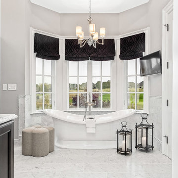
This Upper East Side prewar interior was specifically designed as a guest apartment for friends and family to stay for long periods of time. They wanted their guests to feel like home while staying in the city. Our criteria was that it had to be functional while remaining tailored, sophisticated and inviting. The space was rather dark so we opted for wallcoverings and paint colors that were soft, textural and exuded contrast. Our design was to completely renovate the living room, bathroom and master bedroom/sitting area. The kitchen was cosmetic with floor stain, paint, hardware and lighting. Grey, taupe, white and black were accents in the living room and created a friendly environment. This room also had to function as a guest room therefore a pullout sofa covered in a Lee Jofa linen was the perfect choice. The Bedroom has a soft palate which is extremely welcoming with touches of silver and pale grey. The hints of peacock blue and brown transform the space completely and work well with the pheasant mirror above the bed. There is also a reading nook where our star Winston occasionally takes naps when he returns from his runs in Central Park. Photography Jane Beiles
Sponsored
Sunbury, OH

J.Holderby - Renovations
Franklin County's Leading General Contractors - 2X Best of Houzz!

 StoneUnlimited Kitchen and Bath Remodeling
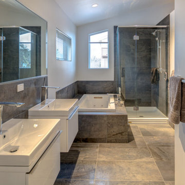
When deciding to either keep a tub and shower or take out the tub and expand the shower in the master bathroom is solely dependent on a homeowner's preference. Although having a tub in the master bathroom is still a desired feature for home buyer's, especially for those who have or are excepting children, there's no definitive proof that having a tub is going to guarantee a higher rate of return on the investment.
This chic and modern shower is easily accessible. The expanded room provides the ability to move around freely without constraint and makes showering more welcoming and relaxing. This shower is a great addition and can be highly beneficial in the future to any individuals who are elderly, wheelchair bound or have mobility impairments. Fixtures and furnishings such as the grab bar, a bench and hand shower also makes the shower more user friendly.
The decision to take out the tub and make the shower larger has visually transformed this master bathroom and created a spacious feel. The shower is a wonderful upgrade and has added value and style to our client's beautiful home.
Check out the before and after photographs as well as the video!
Here are some of the materials that were used for this transformation:
12x24 Porcelain Lara Dark Grey
6" Shower band of Keystone Interlocking Mosaic Tile
Delta fixtures throughout
Ranier Quartz vanity countertops

 Bianchi Design
This project is a (new) pool within an (existing) pool! The client asked me to remodel their extra large 1970s trapezoid pool that was lacking a spa and seating area. They wanted to make it into a focal feature of their yard allowing them to entertain and capture there scenic view in ways that the previous configuration prevented.
On this property, it made sense for the new spa to be on the uphill side adjacent to the master bedroom -- not only for convenience but also for enjoying the views, and allowing us to overflow the spa so that the water could return downhill back to the pool. This is where the cylindrical glass tile “jewel” is situated. The vibrant color of glass was chosen to compliment (be the opposite of, in order to visually resonate and create a higher energy feel) with the ocher seen in the natural stone palette that the house gave us as precedent.
Once the spas location was decided, the best views enjoyed by this property are located where the chaise lounges are now in the finished design. The previous pool occupied the space, and this prime area could not be accessed at all! Our second order of business was to carve out a destination space from the previous pool and give it back to be a furniture area for entertaining.
Locating the chaise lounger deck across the pool presented a challenge that became a fun opportunity not to be passed up. The overflowing spa water had to return to the pool somehow, and the flowing water had to be crossed over to get to the Chaise lounge viewing deck. The solution? A bridge of course! And with the stairs ascending up to the spa, why not have a stairway like water feature underneath the bridge?
The final touch on this design was omitting the weak and poorly executed vanishing edge, which had a horizon line finishing right into the rooftops of the homes below. Not the best aesthetic!
To block the roof lines of the homes below and direct your eyes up to the mountain peaks beyond, a stone clad raised planter became the central focal point of the yard, allowing us to create a beautiful agave, yucca, and cacti display to be enjoyed from every angle of the home.
Altogether the new configuration really plays off the angular shapes of the home, extends the pallet of materials around the yard, and makes the new space all that more enjoyable for the owners private and public entertainment.
 Laidlaw Schultz architects
The project’s starting point was to understand the building’s original post and beam structure and to use that internal logic to formulate a sympathetic remodel. With an emphasis on the upper back unit, the owner’s private residence within this recently purchased Edward Killingsworth triplex, the first order of business was to strip the excess out and to return the complex to something that resembled the original. With a limited budget, the tact was to restore where possible, and to insert where needed, but always with a sympathetic eye. The kitchen quickly became the primary focus and it was soon realized that by removing the division between the existing galley and family room that the essence of the structural system could be revealed. Once opened the datum of the layered beams was adhered to with the kitchen reinforcing this overhead water line. The primary internal wall was then highlighted with a new wood veneer with the refrigerator recessed (borrowing a bit of space from the master closet) and the existing heater chromed.

 OMNIA Group Architects
No less than a return to the great manor home of yesteryear, this grand residence is steeped in elegance and luxury. Yet the tuxedo formality of the main façade and foyer gives way to astonishingly open and casually livable gathering areas surrounding the pools and embracing the rear yard on one of the region's most sought after streets. At over 18,000 finished square feet it is a mansion indeed, and yet while providing for exceptionally well appointed entertaining areas, it accommodates the owner's young family in a comfortable setting.
 Better Builders
This Seward Park residence was reimagined for a retired architect returning to Seattle, blending bold design with practical function. The remodel retained only the original foundation, reinforcing it to support a brand-new second story. Vaulted ceilings and a glass railing system give the home an airy, open feel filled with natural light.
Inside, modern upgrades include a chef’s kitchen with a 48” range, built-in refrigerator, and smart storage throughout. Floating vanities make bathrooms easy to maintain, while thoughtful finishes add everyday convenience. Outside, new retaining walls, pervious pavers, and gravel pits provide stormwater management and off-street parking—all while enhancing curb appeal.
The result is a modern, stylish home designed for comfortable living and long-term resilience.
 Mila Held
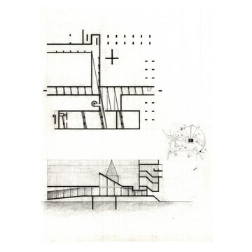
Studying master architect, Le Corbusier’s control of light in his famous monastery, La Tourette.
In the afternoon, a friar embarks on a solitary hike through the woods surrounding the convent. Upon his return, he is met with a solemn staircase at the west entrance of La Tourette. Sprouting from the grass beneath, they beckon to the friar. He reaches the dimly lit opening to a cloister, admiring the upward slope of the ceiling. Asymmetrical windows facing the adjacent courtyard comprise the right side of the hall. The friar continues his journey through the cloister. The ceiling reaches maximum height, revealing a moderately sized atrium. Tall, open walls reach for the heavens, inviting the friar to meditate as divine light shines onto him in rhythmic vertical patterns. He reflects upon his life before becoming a member of the Couvent. He had meandered aimlessly through life until religion finally offered direction. God tenderly guides the friar as the staircase draws him to enter the cloister. The fabric of La Tourette defines a religious experience; its very shadows encouraging the devout musings of the deferential friar.


 Simply Stunning Spaces
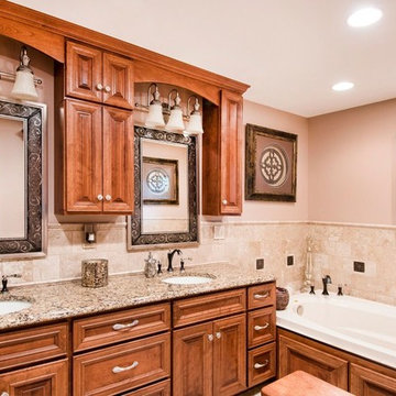
A comfortable, modern home to return to is essential for a busy, active, professional and philanthropic bachelor like Kiptyn.
Mid-sized trendy master dark wood floor bedroom photo in San Diego with blue walls and no fireplace
Mid-sized trendy master dark wood floor bedroom photo in San Diego with blue walls and no fireplace
 Laidlaw Schultz architects
The project’s starting point was to understand the building’s original post and beam structure and to use that internal logic to formulate a sympathetic remodel. With an emphasis on the upper back unit, the owner’s private residence within this recently purchased Edward Killingsworth triplex, the first order of business was to strip the excess out and to return the complex to something that resembled the original. With a limited budget, the tact was to restore where possible, and to insert where needed, but always with a sympathetic eye. The kitchen quickly became the primary focus and it was soon realized that by removing the division between the existing galley and family room that the essence of the structural system could be revealed. Once opened the datum of the layered beams was adhered to with the kitchen reinforcing this overhead water line. The primary internal wall was then highlighted with a new wood veneer with the refrigerator recessed (borrowing a bit of space from the master closet) and the existing heater chromed.
 Laidlaw Schultz architects
The project’s starting point was to understand the building’s original post and beam structure and to use that internal logic to formulate a sympathetic remodel. With an emphasis on the upper back unit, the owner’s private residence within this recently purchased Edward Killingsworth triplex, the first order of business was to strip the excess out and to return the complex to something that resembled the original. With a limited budget, the tact was to restore where possible, and to insert where needed, but always with a sympathetic eye. The kitchen quickly became the primary focus and it was soon realized that by removing the division between the existing galley and family room that the essence of the structural system could be revealed. Once opened the datum of the layered beams was adhered to with the kitchen reinforcing this overhead water line. The primary internal wall was then highlighted with a new wood veneer with the refrigerator recessed (borrowing a bit of space from the master closet) and the existing heater chromed.
 Laidlaw Schultz architects
The project’s starting point was to understand the building’s original post and beam structure and to use that internal logic to formulate a sympathetic remodel. With an emphasis on the upper back unit, the owner’s private residence within this recently purchased Edward Killingsworth triplex, the first order of business was to strip the excess out and to return the complex to something that resembled the original. With a limited budget, the tact was to restore where possible, and to insert where needed, but always with a sympathetic eye. The kitchen quickly became the primary focus and it was soon realized that by removing the division between the existing galley and family room that the essence of the structural system could be revealed. Once opened the datum of the layered beams was adhered to with the kitchen reinforcing this overhead water line. The primary internal wall was then highlighted with a new wood veneer with the refrigerator recessed (borrowing a bit of space from the master closet) and the existing heater chromed.
Sponsored
Sunbury, OH
J.Holderby - Renovations
Franklin County's Leading General Contractors - 2X Best of Houzz!
 Murphy Bros. Design | Build | Remodel
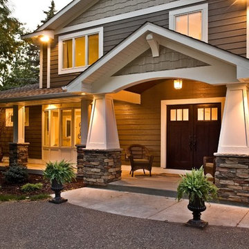
Exterior front elevation at dusk—Well-scaled gables, a stylish portico, complementary SmartSide siding styles and updated cultured stone accents add height, texture and architectural interest while overcoming visual sprawl.
We added a cultured stone knee wall and multiple post wraps to anchor the new design and update the chimneys above. The rough texture draws from the wooded setting and provides the perfect counterpoint to gray/green and white LP SmartSide clapboards, shakes and trim and TAMKO "Heritage" "Pinnacle architectural roof shingles. It was important to the homeowners that their new exterior statement be as visible in the dark as in the light of day. So we worked with a lighting designer to ensured the home would be both stunning and secure after dark for their returning college-age children and invited guests. New energy efficient windows and doors and interior finishes make the master bedroom and rear-facing sunroom more pleasant, comfortable and attractive. They also boxed and insulated under the upstairs bathroom window. Now this shining house on the hill is worthy of its long driveway.
 StoneUnlimited Kitchen and Bath Remodeling
When deciding to either keep a tub and shower or take out the tub and expand the shower in the master bathroom is solely dependent on a homeowner's preference. Although having a tub in the master bathroom is still a desired feature for home buyer's, especially for those who have or are excepting children, there's no definitive proof that having a tub is going to guarantee a higher rate of return on the investment.
This chic and modern shower is easily accessible. The expanded room provides the ability to move around freely without constraint and makes showering more welcoming and relaxing. This shower is a great addition and can be highly beneficial in the future to any individuals who are elderly, wheelchair bound or have mobility impairments. Fixtures and furnishings such as the grab bar, a bench and hand shower also makes the shower more user friendly.
The decision to take out the tub and make the shower larger has visually transformed this master bathroom and created a spacious feel. The shower is a wonderful upgrade and has added value and style to our client's beautiful home.
Check out the before and after photographs as well as the video!
Here are some of the materials that were used for this transformation:
12x24 Porcelain Lara Dark Grey
6" Shower band of Keystone Interlocking Mosaic Tile
Delta fixtures throughout
Ranier Quartz vanity countertops


49