
Search results for "Master rule" in Home Design Ideas
 Thomas Roszak Architecture, LLC
Photo credit: Scott McDonald @ Hedrich Blessing
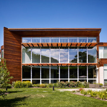
7RR-Ecohome:
The design objective was to build a house for a couple recently married who both had kids from previous marriages. How to bridge two families together?
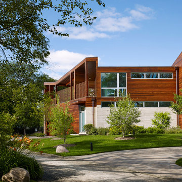
The design looks forward in terms of how people live today. The home is an experiment in transparency and solid form; removing borders and edges from outside to inside the house, and to really depict “flowing and endless space”. The house floor plan is derived by pushing and pulling the house’s form to maximize the backyard and minimize the public front yard while welcoming the sun in key rooms by rotating the house 45-degrees to true north. The angular form of the house is a result of the family’s program, the zoning rules, the lot’s attributes, and the sun’s path. We wanted to construct a house that is smart and efficient in terms of construction and energy, both in terms of the building and the user. We could tell a story of how the house is built in terms of the constructability, structure and enclosure, with a nod to Japanese wood construction in the method in which the siding is installed and the exposed interior beams are placed in the double height space. We engineered the house to be smart which not only looks modern but acts modern; every aspect of user control is simplified to a digital touch button, whether lights, shades, blinds, HVAC, communication, audio, video, or security. We developed a planning module based on a 6-foot square room size and a 6-foot wide connector called an interstitial space for hallways, bathrooms, stairs and mechanical, which keeps the rooms pure and uncluttered. The house is 6,200 SF of livable space, plus garage and basement gallery for a total of 9,200 SF. A large formal foyer celebrates the entry and opens up to the living, dining, kitchen and family rooms all focused on the rear garden. The east side of the second floor is the Master wing and a center bridge connects it to the kid’s wing on the west. Second floor terraces and sunscreens provide views and shade in this suburban setting. The playful mathematical grid of the house in the x, y and z axis also extends into the layout of the trees and hard-scapes, all centered on a suburban one-acre lot.
Many green attributes were designed into the home; Ipe wood sunscreens and window shades block out unwanted solar gain in summer, but allow winter sun in. Patio door and operable windows provide ample opportunity for natural ventilation throughout the open floor plan. Minimal windows on east and west sides to reduce heat loss in winter and unwanted gains in summer. Open floor plan and large window expanse reduces lighting demands and maximizes available daylight. Skylights provide natural light to the basement rooms. Durable, low-maintenance exterior materials include stone, ipe wood siding and decking, and concrete roof pavers. Design is based on a 2' planning grid to minimize construction waste. Basement foundation walls and slab are highly insulated. FSC-certified walnut wood flooring was used. Light colored concrete roof pavers to reduce cooling loads by as much as 15%. 2x6 framing allows for more insulation and energy savings. Super efficient windows have low-E argon gas filled units, and thermally insulated aluminum frames. Permeable brick and stone pavers reduce the site’s storm-water runoff. Countertops use recycled composite materials. Energy-Star rated furnaces and smart thermostats are located throughout the house to minimize duct runs and avoid energy loss. Energy-Star rated boiler that heats up both radiant floors and domestic hot water. Low-flow toilets and plumbing fixtures are used to conserve water usage. No VOC finish options and direct venting fireplaces maintain a high interior air quality. Smart home system controls lighting, HVAC, and shades to better manage energy use. Plumbing runs through interior walls reducing possibilities of heat loss and freezing problems. A large food pantry was placed next to kitchen to reduce trips to the grocery store. Home office reduces need for automobile transit and associated CO2 footprint. Plan allows for aging in place, with guest suite than can become the master suite, with no need to move as family members mature.
 lavish
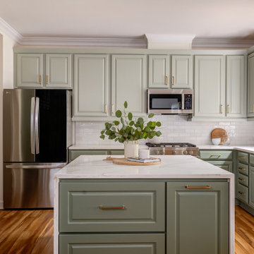
A Fresh Take on Timeless — Sage Green Kitchen Remodel | Raleigh, NC
This kitchen transformation proves that a well-designed remodel can completely redefine how a home feels to live in. The homeowners wanted a space that was both functional and elevated — a kitchen that worked hard without sacrificing beauty.
The design centers around custom sage green cabinetry with raised panel detailing, extending floor-to-ceiling with a full-height pantry wall that maximizes every inch of storage. Brushed brass hardware ties the palette together, lending warmth against the cooler green tones. The island features a dramatic waterfall edge in Calacatta-style quartz with gold veining — a material that recurs throughout the perimeter counters, creating a cohesive, luxurious feel.
A handcrafted zellige-inspired subway tile backsplash adds subtle texture, while a statement brass saucer pendant anchors the dining area and a pair of matte black pendants with brass interiors flank the sink window. Warm hardwood floors ground the space and complement the natural wood accents used in the styling.
The remodel also included a custom mudroom nook — designed and built as part of the same seamless scope — with a floating white oak bench, open cubbies, and matte black hooks.
Every detail was intentional. Every finish was chosen with longevity in mind.
 Patrick Brickman
Photography by Patrick Brickman
Home by Lowcountry Premier Custom Homes
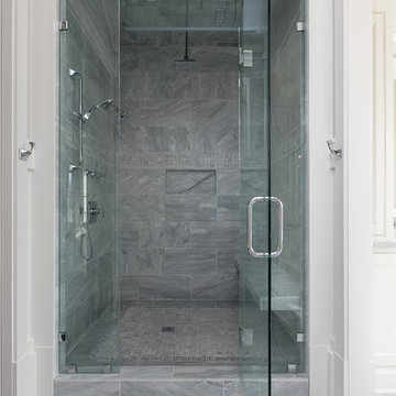
Bathroom photo in Charleston
Bathroom photo in Charleston
Find the right local pro for your project
 Thomas Roszak Architecture, LLC
Photo credit: Scott McDonald @ Hedrich Blessing
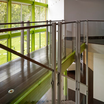
7RR-Ecohome:
The design objective was to build a house for a couple recently married who both had kids from previous marriages. How to bridge two families together?
The design looks forward in terms of how people live today. The home is an experiment in transparency and solid form; removing borders and edges from outside to inside the house, and to really depict “flowing and endless space”. The house floor plan is derived by pushing and pulling the house’s form to maximize the backyard and minimize the public front yard while welcoming the sun in key rooms by rotating the house 45-degrees to true north. The angular form of the house is a result of the family’s program, the zoning rules, the lot’s attributes, and the sun’s path. We wanted to construct a house that is smart and efficient in terms of construction and energy, both in terms of the building and the user. We could tell a story of how the house is built in terms of the constructability, structure and enclosure, with a nod to Japanese wood construction in the method in which the siding is installed and the exposed interior beams are placed in the double height space. We engineered the house to be smart which not only looks modern but acts modern; every aspect of user control is simplified to a digital touch button, whether lights, shades, blinds, HVAC, communication, audio, video, or security. We developed a planning module based on a 6-foot square room size and a 6-foot wide connector called an interstitial space for hallways, bathrooms, stairs and mechanical, which keeps the rooms pure and uncluttered. The house is 6,200 SF of livable space, plus garage and basement gallery for a total of 9,200 SF. A large formal foyer celebrates the entry and opens up to the living, dining, kitchen and family rooms all focused on the rear garden. The east side of the second floor is the Master wing and a center bridge connects it to the kid’s wing on the west. Second floor terraces and sunscreens provide views and shade in this suburban setting. The playful mathematical grid of the house in the x, y and z axis also extends into the layout of the trees and hard-scapes, all centered on a suburban one-acre lot.
Many green attributes were designed into the home; Ipe wood sunscreens and window shades block out unwanted solar gain in summer, but allow winter sun in. Patio door and operable windows provide ample opportunity for natural ventilation throughout the open floor plan. Minimal windows on east and west sides to reduce heat loss in winter and unwanted gains in summer. Open floor plan and large window expanse reduces lighting demands and maximizes available daylight. Skylights provide natural light to the basement rooms. Durable, low-maintenance exterior materials include stone, ipe wood siding and decking, and concrete roof pavers. Design is based on a 2' planning grid to minimize construction waste. Basement foundation walls and slab are highly insulated. FSC-certified walnut wood flooring was used. Light colored concrete roof pavers to reduce cooling loads by as much as 15%. 2x6 framing allows for more insulation and energy savings. Super efficient windows have low-E argon gas filled units, and thermally insulated aluminum frames. Permeable brick and stone pavers reduce the site’s storm-water runoff. Countertops use recycled composite materials. Energy-Star rated furnaces and smart thermostats are located throughout the house to minimize duct runs and avoid energy loss. Energy-Star rated boiler that heats up both radiant floors and domestic hot water. Low-flow toilets and plumbing fixtures are used to conserve water usage. No VOC finish options and direct venting fireplaces maintain a high interior air quality. Smart home system controls lighting, HVAC, and shades to better manage energy use. Plumbing runs through interior walls reducing possibilities of heat loss and freezing problems. A large food pantry was placed next to kitchen to reduce trips to the grocery store. Home office reduces need for automobile transit and associated CO2 footprint. Plan allows for aging in place, with guest suite than can become the master suite, with no need to move as family members mature.
 Architessa
Mary Drysdale, Interior Design
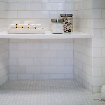
Example of a huge classic master white tile and stone tile marble floor bathroom design in DC Metro with flat-panel cabinets, white cabinets, white walls, a vessel sink and marble countertops
Example of a huge classic master white tile and stone tile marble floor bathroom design in DC Metro with flat-panel cabinets, white cabinets, white walls, a vessel sink and marble countertops
 Thomas Roszak Architecture, LLC
Photo credit: Scott McDonald @ Hedrich Blessing
7RR-Ecohome:
The design objective was to build a house for a couple recently married who both had kids from previous marriages. How to bridge two families together?
The design looks forward in terms of how people live today. The home is an experiment in transparency and solid form; removing borders and edges from outside to inside the house, and to really depict “flowing and endless space”. The house floor plan is derived by pushing and pulling the house’s form to maximize the backyard and minimize the public front yard while welcoming the sun in key rooms by rotating the house 45-degrees to true north. The angular form of the house is a result of the family’s program, the zoning rules, the lot’s attributes, and the sun’s path. We wanted to construct a house that is smart and efficient in terms of construction and energy, both in terms of the building and the user. We could tell a story of how the house is built in terms of the constructability, structure and enclosure, with a nod to Japanese wood construction in the method in which the siding is installed and the exposed interior beams are placed in the double height space. We engineered the house to be smart which not only looks modern but acts modern; every aspect of user control is simplified to a digital touch button, whether lights, shades, blinds, HVAC, communication, audio, video, or security. We developed a planning module based on a 6-foot square room size and a 6-foot wide connector called an interstitial space for hallways, bathrooms, stairs and mechanical, which keeps the rooms pure and uncluttered. The house is 6,200 SF of livable space, plus garage and basement gallery for a total of 9,200 SF. A large formal foyer celebrates the entry and opens up to the living, dining, kitchen and family rooms all focused on the rear garden. The east side of the second floor is the Master wing and a center bridge connects it to the kid’s wing on the west. Second floor terraces and sunscreens provide views and shade in this suburban setting. The playful mathematical grid of the house in the x, y and z axis also extends into the layout of the trees and hard-scapes, all centered on a suburban one-acre lot.
Many green attributes were designed into the home; Ipe wood sunscreens and window shades block out unwanted solar gain in summer, but allow winter sun in. Patio door and operable windows provide ample opportunity for natural ventilation throughout the open floor plan. Minimal windows on east and west sides to reduce heat loss in winter and unwanted gains in summer. Open floor plan and large window expanse reduces lighting demands and maximizes available daylight. Skylights provide natural light to the basement rooms. Durable, low-maintenance exterior materials include stone, ipe wood siding and decking, and concrete roof pavers. Design is based on a 2' planning grid to minimize construction waste. Basement foundation walls and slab are highly insulated. FSC-certified walnut wood flooring was used. Light colored concrete roof pavers to reduce cooling loads by as much as 15%. 2x6 framing allows for more insulation and energy savings. Super efficient windows have low-E argon gas filled units, and thermally insulated aluminum frames. Permeable brick and stone pavers reduce the site’s storm-water runoff. Countertops use recycled composite materials. Energy-Star rated furnaces and smart thermostats are located throughout the house to minimize duct runs and avoid energy loss. Energy-Star rated boiler that heats up both radiant floors and domestic hot water. Low-flow toilets and plumbing fixtures are used to conserve water usage. No VOC finish options and direct venting fireplaces maintain a high interior air quality. Smart home system controls lighting, HVAC, and shades to better manage energy use. Plumbing runs through interior walls reducing possibilities of heat loss and freezing problems. A large food pantry was placed next to kitchen to reduce trips to the grocery store. Home office reduces need for automobile transit and associated CO2 footprint. Plan allows for aging in place, with guest suite than can become the master suite, with no need to move as family members mature.
 InnovationLand
Houston Interior Designer Lisha Maxey took this Museum District condo from the dated, mirrored walls of the 1980s to Mid Century Modern with a gallery look featuring the client's art collection.
"The place was covered with glued-down, floor-to-ceiling mirrors," says Lisha Maxey, senior designer for Homescapes of Houston and principal at LGH Design Services in Houston. "When we took them off the walls, the walls came apart. We ended up taking them down to the studs."
The makeover took six months to complete, primarily because of strict condo association rules that only gave the Houston interior designers very limited access to the elevator - through which all materials and team members had to go.
"Monday through Friday, we could only be noisy from 10 a.m. to 2 p.m., and if we had to do something extra loud, like sawing or drilling, we had to schedule it with the management and they had to communicate that to the condo owners. So it was just a lot of coordination. But a lot of Inner City Loopers live in these kinds of buildings, so we're used to handling that kind of thing."
The client, a child psychiatrist in her 60s, recently moved to Houston from northeast Texas to be with friends. After being widowed three years ago, she decided it was time to let go of the traditionally styled estate that wasn't really her style anyway. An avid diver who has traveled around the world to pursue her passion, she has amassed a large collection of art from her travels. Downsizing to 1,600 feet and wanting to go more contemporary, she wanted the display - and the look - more streamlined.
"She wanted clean lines and muted colors, with the main focus being her artwork," says Maxey. "So we made the space a palette for that."
Enter the white, gallery-grade paint she chose for the walls: "It's halfway between satin and flat," explains Maxey. "It's not glossy and it's not chalky - just very smooth and clean."
Adding to the gallery theme is the satin nickel track lighting with lamps aimed to highlight pieces of art. "This lighting has no wires," notes Maxey. "It's powered by a positive and negative conduit."
The new flooring throughout is a blended-grey porcelain tile that looks like wood planks. "It's gorgeous, natural-looking and combines all the beauty of wood with the durability of tile," says Maxey. "We used it throughout the condo to unify the space."
After Maxey started looking at the client's bright, vibrant, colorful artwork, she felt the palette couldn't stay as muted anymore. Hence the Mid Century Modern orange leather sofas from West Elm and bright green chairs from Joybird, plus the throw pillows in different textures, patterns and shades of gold, orange and green.
The concave lines of the Danish-inspired chairs, she notes, help them look beautiful from all the way around - a key to designing spaces for loft living.
"The table in the living room is very interesting," notes Maxey. "It was handmade for the client in 1974 and has a signature on it from the artist. She was adamant about including the piece, which has all these hand-painted black-and-white art tiles on the top. I took one look at it and said 'It's not really going to go.'"
However, after cutting 6 inches off the bottom and making it look a little distressed, the table ended up being the perfect complement to the sofas.
The dining room table - from Design Within Reach - is a solid piece of mahogany, the chair upholstery a mix of grey velvet and leather and the legs a shiny brass. "The side chairs are leather and the end ones are velvet," says Maxey. "It's a nice textural mix that lends depth and texture."
The galley kitchen, meanwhile, has been lightened and brightened, with white quartz countertops and backsplashes mimicking the look of Carrara marble, stainless steel appliances and a velvet green bench seat for a punch of color. The cabinets are painted a cool grey color called "Silverplate."
The two bathrooms have been updated with contemporary white vanities and vessel sinks and the master bath now features a walk-in shower tiled in Dolomite white marble (the floor is Bianco Carrara marble mosaic, done in a herringbone pattern.
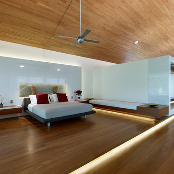
In the master bedroom, Homescapes of Houston knocked down a wall between two smaller closets with swing doors to make one large walk-in closet with pocket doors. The closet in the guest bedroom also came out 13 more inches.
The client's artwork throughout personalizes the space and tells the story of a life. There's a huge bowl of shells from the client's diving adventures, framed art from her child psychiatry patients and a 16th century wood carving from a monastery that's been in her family forever.
"Her collection is quite impressive," says Maxey. "There's even a framed piece of autographed songs written by John Lennon." (You can see this black-framed piece of art on the wall in the photo above of two green chairs).
"We're extremely happy with how the project turned out, and so is the client," says Maxey. "No expense was spared for her. It was a labor of love and we were excited to do it."

Sponsored
Sunbury, OH

J.Holderby - Renovations
Franklin County's Leading General Contractors - 2X Best of Houzz!

 Speers Flooring
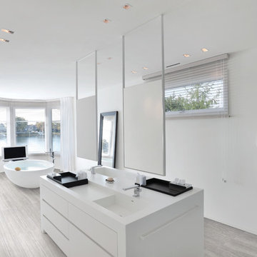
12" x 24" Eramosa Ice Lifestyle Porcelain Tile
Inspiration for a mid-sized contemporary master gray tile and porcelain tile porcelain tile freestanding bathtub remodel in Toronto with flat-panel cabinets, white cabinets, quartz countertops, white walls and an integrated sink
Inspiration for a mid-sized contemporary master gray tile and porcelain tile porcelain tile freestanding bathtub remodel in Toronto with flat-panel cabinets, white cabinets, quartz countertops, white walls and an integrated sink
 Pillar 3 Design Group
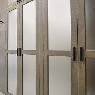
BC Woodworking, you rule.
Photo by Brian Wilson
Large minimalist master bathroom photo in Other with glass-front cabinets and gray cabinets
Large minimalist master bathroom photo in Other with glass-front cabinets and gray cabinets
 Star Furniture
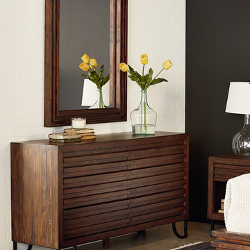
Magnolia Home's Boho collection is an eclectic mix of design elements from across time, and this bold six-drawer Stacked Slat Dresser combines favorite Mid-Century Modern hairpin metal legs with horizontal slat front drawers.
The beautiful Magnolia Home line was designed exclusively by Joanna Gaines to convey her fresh, unique design style that embodies her lifestyle of home and family. Each piece falls onto a specific genre: Boho, Farmhouse, French Inspired, Industrial, Primitive or Traditional. Painted finishes and wood stains are offered that replicate the look of age-worn vintage patinas.
This piece is part of her Boho genre, with is a seamless blend of eclectic and vintage styles, with Victorian Bistro and Mid-Century Modern elements. It's fun and playful because, the eclectic feel allows you to throw the design rules right out the window. Boho is an unexpected play on texture, color, and shape.
 Thomas Roszak Architecture, LLC
Photo credit: Scott McDonald @ Hedrich Blessing
7RR-Ecohome:
The design objective was to build a house for a couple recently married who both had kids from previous marriages. How to bridge two families together?
The design looks forward in terms of how people live today. The home is an experiment in transparency and solid form; removing borders and edges from outside to inside the house, and to really depict “flowing and endless space”. The house floor plan is derived by pushing and pulling the house’s form to maximize the backyard and minimize the public front yard while welcoming the sun in key rooms by rotating the house 45-degrees to true north. The angular form of the house is a result of the family’s program, the zoning rules, the lot’s attributes, and the sun’s path. We wanted to construct a house that is smart and efficient in terms of construction and energy, both in terms of the building and the user. We could tell a story of how the house is built in terms of the constructability, structure and enclosure, with a nod to Japanese wood construction in the method in which the siding is installed and the exposed interior beams are placed in the double height space. We engineered the house to be smart which not only looks modern but acts modern; every aspect of user control is simplified to a digital touch button, whether lights, shades, blinds, HVAC, communication, audio, video, or security. We developed a planning module based on a 6-foot square room size and a 6-foot wide connector called an interstitial space for hallways, bathrooms, stairs and mechanical, which keeps the rooms pure and uncluttered. The house is 6,200 SF of livable space, plus garage and basement gallery for a total of 9,200 SF. A large formal foyer celebrates the entry and opens up to the living, dining, kitchen and family rooms all focused on the rear garden. The east side of the second floor is the Master wing and a center bridge connects it to the kid’s wing on the west. Second floor terraces and sunscreens provide views and shade in this suburban setting. The playful mathematical grid of the house in the x, y and z axis also extends into the layout of the trees and hard-scapes, all centered on a suburban one-acre lot.
Many green attributes were designed into the home; Ipe wood sunscreens and window shades block out unwanted solar gain in summer, but allow winter sun in. Patio door and operable windows provide ample opportunity for natural ventilation throughout the open floor plan. Minimal windows on east and west sides to reduce heat loss in winter and unwanted gains in summer. Open floor plan and large window expanse reduces lighting demands and maximizes available daylight. Skylights provide natural light to the basement rooms. Durable, low-maintenance exterior materials include stone, ipe wood siding and decking, and concrete roof pavers. Design is based on a 2' planning grid to minimize construction waste. Basement foundation walls and slab are highly insulated. FSC-certified walnut wood flooring was used. Light colored concrete roof pavers to reduce cooling loads by as much as 15%. 2x6 framing allows for more insulation and energy savings. Super efficient windows have low-E argon gas filled units, and thermally insulated aluminum frames. Permeable brick and stone pavers reduce the site’s storm-water runoff. Countertops use recycled composite materials. Energy-Star rated furnaces and smart thermostats are located throughout the house to minimize duct runs and avoid energy loss. Energy-Star rated boiler that heats up both radiant floors and domestic hot water. Low-flow toilets and plumbing fixtures are used to conserve water usage. No VOC finish options and direct venting fireplaces maintain a high interior air quality. Smart home system controls lighting, HVAC, and shades to better manage energy use. Plumbing runs through interior walls reducing possibilities of heat loss and freezing problems. A large food pantry was placed next to kitchen to reduce trips to the grocery store. Home office reduces need for automobile transit and associated CO2 footprint. Plan allows for aging in place, with guest suite than can become the master suite, with no need to move as family members mature.
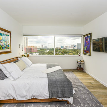 InnovationLand
Houston Interior Designer Lisha Maxey took this Museum District condo from the dated, mirrored walls of the 1980s to Mid Century Modern with a gallery look featuring the client's art collection.
"The place was covered with glued-down, floor-to-ceiling mirrors," says Lisha Maxey, senior designer for Homescapes of Houston and principal at LGH Design Services in Houston. "When we took them off the walls, the walls came apart. We ended up taking them down to the studs."
The makeover took six months to complete, primarily because of strict condo association rules that only gave the Houston interior designers very limited access to the elevator - through which all materials and team members had to go.
"Monday through Friday, we could only be noisy from 10 a.m. to 2 p.m., and if we had to do something extra loud, like sawing or drilling, we had to schedule it with the management and they had to communicate that to the condo owners. So it was just a lot of coordination. But a lot of Inner City Loopers live in these kinds of buildings, so we're used to handling that kind of thing."
The client, a child psychiatrist in her 60s, recently moved to Houston from northeast Texas to be with friends. After being widowed three years ago, she decided it was time to let go of the traditionally styled estate that wasn't really her style anyway. An avid diver who has traveled around the world to pursue her passion, she has amassed a large collection of art from her travels. Downsizing to 1,600 feet and wanting to go more contemporary, she wanted the display - and the look - more streamlined.
"She wanted clean lines and muted colors, with the main focus being her artwork," says Maxey. "So we made the space a palette for that."
Enter the white, gallery-grade paint she chose for the walls: "It's halfway between satin and flat," explains Maxey. "It's not glossy and it's not chalky - just very smooth and clean."
Adding to the gallery theme is the satin nickel track lighting with lamps aimed to highlight pieces of art. "This lighting has no wires," notes Maxey. "It's powered by a positive and negative conduit."
The new flooring throughout is a blended-grey porcelain tile that looks like wood planks. "It's gorgeous, natural-looking and combines all the beauty of wood with the durability of tile," says Maxey. "We used it throughout the condo to unify the space."
After Maxey started looking at the client's bright, vibrant, colorful artwork, she felt the palette couldn't stay as muted anymore. Hence the Mid Century Modern orange leather sofas from West Elm and bright green chairs from Joybird, plus the throw pillows in different textures, patterns and shades of gold, orange and green.
The concave lines of the Danish-inspired chairs, she notes, help them look beautiful from all the way around - a key to designing spaces for loft living.
"The table in the living room is very interesting," notes Maxey. "It was handmade for the client in 1974 and has a signature on it from the artist. She was adamant about including the piece, which has all these hand-painted black-and-white art tiles on the top. I took one look at it and said 'It's not really going to go.'"
However, after cutting 6 inches off the bottom and making it look a little distressed, the table ended up being the perfect complement to the sofas.
The dining room table - from Design Within Reach - is a solid piece of mahogany, the chair upholstery a mix of grey velvet and leather and the legs a shiny brass. "The side chairs are leather and the end ones are velvet," says Maxey. "It's a nice textural mix that lends depth and texture."
The galley kitchen, meanwhile, has been lightened and brightened, with white quartz countertops and backsplashes mimicking the look of Carrara marble, stainless steel appliances and a velvet green bench seat for a punch of color. The cabinets are painted a cool grey color called "Silverplate."
The two bathrooms have been updated with contemporary white vanities and vessel sinks and the master bath now features a walk-in shower tiled in Dolomite white marble (the floor is Bianco Carrara marble mosaic, done in a herringbone pattern.
In the master bedroom, Homescapes of Houston knocked down a wall between two smaller closets with swing doors to make one large walk-in closet with pocket doors. The closet in the guest bedroom also came out 13 more inches.
The client's artwork throughout personalizes the space and tells the story of a life. There's a huge bowl of shells from the client's diving adventures, framed art from her child psychiatry patients and a 16th century wood carving from a monastery that's been in her family forever.
"Her collection is quite impressive," says Maxey. "There's even a framed piece of autographed songs written by John Lennon." (You can see this black-framed piece of art on the wall in the photo above of two green chairs).
"We're extremely happy with how the project turned out, and so is the client," says Maxey. "No expense was spared for her. It was a labor of love and we were excited to do it."
Sponsored
Columbus, OH

Wannemacher Interiors
Customized Award-Winning Interior Design Solutions in Franklin Cnty OH
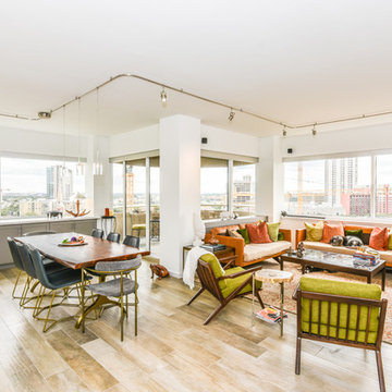 InnovationLand
Houston Interior Designer Lisha Maxey took this Museum District condo from the dated, mirrored walls of the 1980s to Mid Century Modern with a gallery look featuring the client’s art collection.
The place was covered with glued-down, floor-to-ceiling mirrors,” says Lisha Maxey, senior designer for Homescapes of Houston and principal at LGH Design Services in Houston. “When we took them off the walls, the walls came apart. We ended up taking them down to the studs."
The makeover took six months to complete, primarily because of strict condo association rules that only gave the Houston interior designers very limited access to the elevator – through which all materials and team members had to go.
“Monday through Friday, we could only be noisy from 10 a.m. to 2 p.m., and if we had to do something extra loud, like sawing or drilling, we had to schedule it with the management and they had to communicate that to the condo owners. So it was just a lot of coordination. But a lot of Inner City Loopers live in these kinds of buildings, so we’re used to handling that kind of thing.”
The client, a child psychiatrist in her 60s, recently moved to Houston from northeast Texas to be with friends. After being widowed three years ago, she decided it was time to let go of the traditionally styled estate that wasn’t really her style anyway. An avid diver who has traveled around the world to pursue her passion, she has amassed a large collection of art from her travels. Downsizing to 1,600 feet and wanting to go more contemporary, she wanted the display – and the look – more streamlined.
“She wanted clean lines and muted colors, with the main focus being her artwork,” says Maxey. “So we made the space a palette for that.”
Enter the white, gallery-grade paint she chose for the walls: “It’s halfway between satin and flat,” explains Maxey. “It’s not glossy and it’s not chalky – just very smooth and clean."
Adding to the gallery theme is the satin nickel track lighting with lamps aimed to highlight pieces of art. “This lighting has no wires,” notes Maxey. “It’s powered by a positive and negative conduit.”
The new flooring throughout is a blended-grey porcelain tile that looks like wood planks. “It’s gorgeous, natural-looking and combines all the beauty of wood with the durability of tile,” says Maxey. “We used it throughout the condo to unify the space.”
After Maxey started looking at the client’s bright, vibrant, colorful artwork, she felt the palette couldn’t stay as muted anymore. Hence the Mid Century Modern orange leather sofas from West Elm and bright green chairs from Joybird, plus the throw pillows in different textures, patterns and shades of gold, orange and green.
The concave lines of the Danish-inspired chairs, she notes, help them look beautiful from all the way around – a key to designing spaces for loft living.
“The table in the living room is very interesting,” notes Maxey. “It was handmade for the client in 1974 and has a signature on it from the artist. She was adamant about including the piece, which has all these hand-painted black-and-white art tiles on the top. I took one look at it and said ‘It’s not really going to go.’”
However, after cutting 6 inches off the bottom and making it look a little distressed, the table ended up being the perfect complement to the sofas.
The dining room table – from Design Within Reach – is a solid piece of mahogany, the chair upholstery a mix of grey velvet and leather and the legs a shiny brass. “The side chairs are leather and the end ones are velvet,” says Maxey. “It’s a nice textural mix that lends depth and texture.”The galley kitchen, meanwhile, has been lightened and brightened, with new, white contemporary cabinetry, quartz countertops mimicking the look of Carrara marble, stainless steel appliances and a velvet green bench seat for a punch of color.The two bathrooms have been updated with contemporary white vanities and vessel sinks and the master bath now features a walk-in shower tiled in Dolomite white marble (the floor is Bianco Carrara marble mosaic, done in a herringbone pattern).In the master bedroom, Homescapes of Houston knocked down a wall between two smaller closets with swing doors to make one large walk-in closet with pocket doors. The closet in the guest bedroom also came out 13 more inches.The client’s artwork throughout personalizes the space and tells the story of a life. There’s a huge bowl of shells from the client’s diving adventures, framed art from her child psychiatry patients and a 16th century wood carving from a monastery that’s been in her family forever.
“Her collection is quite impressive,” says Maxey. “There’s even a framed piece of autographed songs written by John Lennon.” (You can see this black-framed piece of art on the wall in the photo above of two green chairs).
“We’re extremely happy with how the project turned out, and so is the client,” says Maxey. “No expense was spared for her. It was a labor of love and we were excited to do it.”
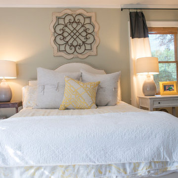
 Krystine Edwards Design
his interior design client reached out to me with her newly purchased home. After building trust and adhering to her two rules – can’t change the green paint color and no new furniture – we began with a mood board, bounced ideas off one another and ultimately created a dream space:
Photos by: Brennan Wesley
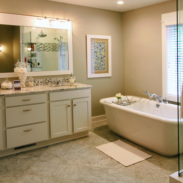
 Visbeen Architects
Dating to the early 20th century, Craftsmen houses originated in southern California and quickly spread throughout the country, eventually becoming one of the early 20th century’s most beloved architectural styles. Holbrooke features Craftsman quality and Shingle style details and suits today’s homeowners who have vintage sensibilities as well as modern needs. Outside, wood shingles, dovecote, cupola, large windows and stone accents complement the front porch, which welcomes with attractive trim and columns.
Step inside, the 1,900-square-foot main level leading from the foyer into a spacious 17-foot living room with a distinctive raised ceiling leads into a spacious sun room perfect for relaxing at the end of the day when work is done.
An open kitchen and dining area provide a stylish and functional workspace for entertaining large groups. Nearby, the 900-square-foot three-car garage has plenty of storage for lawn equipment and outdoor toys. The upstairs has an additional 1,500 square feet, with a 17 by 17-foot private master suite with a large master bath and two additional family bedrooms with bath. Recreation rules in the 1,200-square-foot lower level, with a family room, 500-square-foot home theater, exercise/play room and an 11-by-14 guest bedroom for family and friends.
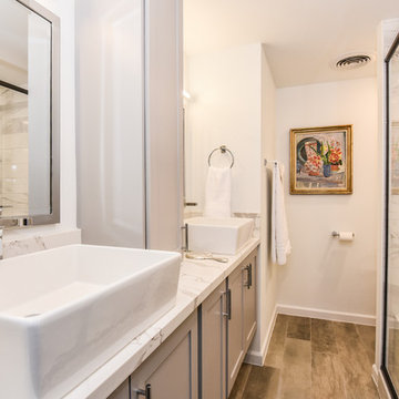 InnovationLand
Houston Interior Designer Lisha Maxey took this Museum District condo from the dated, mirrored walls of the 1980s to Mid Century Modern with a gallery look featuring the client’s art collection.
The place was covered with glued-down, floor-to-ceiling mirrors,” says Lisha Maxey, senior designer for Homescapes of Houston and principal at LGH Design Services in Houston. “When we took them off the walls, the walls came apart. We ended up taking them down to the studs."
The makeover took six months to complete, primarily because of strict condo association rules that only gave the Houston interior designers very limited access to the elevator – through which all materials and team members had to go.
“Monday through Friday, we could only be noisy from 10 a.m. to 2 p.m., and if we had to do something extra loud, like sawing or drilling, we had to schedule it with the management and they had to communicate that to the condo owners. So it was just a lot of coordination. But a lot of Inner City Loopers live in these kinds of buildings, so we’re used to handling that kind of thing.”
The client, a child psychiatrist in her 60s, recently moved to Houston from northeast Texas to be with friends. After being widowed three years ago, she decided it was time to let go of the traditionally styled estate that wasn’t really her style anyway. An avid diver who has traveled around the world to pursue her passion, she has amassed a large collection of art from her travels. Downsizing to 1,600 feet and wanting to go more contemporary, she wanted the display – and the look – more streamlined.
“She wanted clean lines and muted colors, with the main focus being her artwork,” says Maxey. “So we made the space a palette for that.”
Enter the white, gallery-grade paint she chose for the walls: “It’s halfway between satin and flat,” explains Maxey. “It’s not glossy and it’s not chalky – just very smooth and clean."
Adding to the gallery theme is the satin nickel track lighting with lamps aimed to highlight pieces of art. “This lighting has no wires,” notes Maxey. “It’s powered by a positive and negative conduit.”
The new flooring throughout is a blended-grey porcelain tile that looks like wood planks. “It’s gorgeous, natural-looking and combines all the beauty of wood with the durability of tile,” says Maxey. “We used it throughout the condo to unify the space.”
After Maxey started looking at the client’s bright, vibrant, colorful artwork, she felt the palette couldn’t stay as muted anymore. Hence the Mid Century Modern orange leather sofas from West Elm and bright green chairs from Joybird, plus the throw pillows in different textures, patterns and shades of gold, orange and green.
The concave lines of the Danish-inspired chairs, she notes, help them look beautiful from all the way around – a key to designing spaces for loft living.
“The table in the living room is very interesting,” notes Maxey. “It was handmade for the client in 1974 and has a signature on it from the artist. She was adamant about including the piece, which has all these hand-painted black-and-white art tiles on the top. I took one look at it and said ‘It’s not really going to go.’”
However, after cutting 6 inches off the bottom and making it look a little distressed, the table ended up being the perfect complement to the sofas.
The dining room table – from Design Within Reach – is a solid piece of mahogany, the chair upholstery a mix of grey velvet and leather and the legs a shiny brass. “The side chairs are leather and the end ones are velvet,” says Maxey. “It’s a nice textural mix that lends depth and texture.”The galley kitchen, meanwhile, has been lightened and brightened, with new, white contemporary cabinetry, quartz countertops mimicking the look of Carrara marble, stainless steel appliances and a velvet green bench seat for a punch of color.The two bathrooms have been updated with contemporary white vanities and vessel sinks and the master bath now features a walk-in shower tiled in Dolomite white marble (the floor is Bianco Carrara marble mosaic, done in a herringbone pattern).In the master bedroom, Homescapes of Houston knocked down a wall between two smaller closets with swing doors to make one large walk-in closet with pocket doors. The closet in the guest bedroom also came out 13 more inches.The client’s artwork throughout personalizes the space and tells the story of a life. There’s a huge bowl of shells from the client’s diving adventures, framed art from her child psychiatry patients and a 16th century wood carving from a monastery that’s been in her family forever.
“Her collection is quite impressive,” says Maxey. “There’s even a framed piece of autographed songs written by John Lennon.” (You can see this black-framed piece of art on the wall in the photo above of two green chairs).
“We’re extremely happy with how the project turned out, and so is the client,” says Maxey. “No expense was spared for her. It was a labor of love and we were excited to do it.”
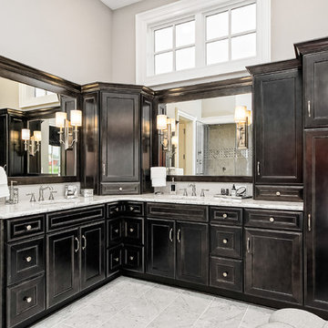
Sponsored
Sunbury, OH
J.Holderby - Renovations
Franklin County's Leading General Contractors - 2X Best of Houzz!
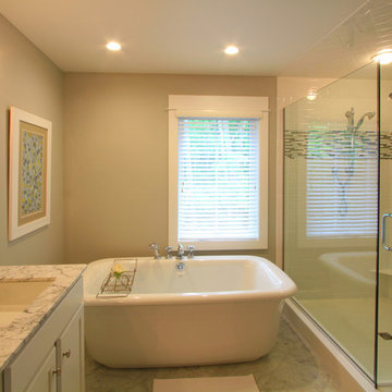 Visbeen Architects
Dating to the early 20th century, Craftsmen houses originated in southern California and quickly spread throughout the country, eventually becoming one of the early 20th century’s most beloved architectural styles. Holbrooke features Craftsman quality and Shingle style details and suits today’s homeowners who have vintage sensibilities as well as modern needs. Outside, wood shingles, dovecote, cupola, large windows and stone accents complement the front porch, which welcomes with attractive trim and columns.
Step inside, the 1,900-square-foot main level leading from the foyer into a spacious 17-foot living room with a distinctive raised ceiling leads into a spacious sun room perfect for relaxing at the end of the day when work is done.
An open kitchen and dining area provide a stylish and functional workspace for entertaining large groups. Nearby, the 900-square-foot three-car garage has plenty of storage for lawn equipment and outdoor toys. The upstairs has an additional 1,500 square feet, with a 17 by 17-foot private master suite with a large master bath and two additional family bedrooms with bath. Recreation rules in the 1,200-square-foot lower level, with a family room, 500-square-foot home theater, exercise/play room and an 11-by-14 guest bedroom for family and friends.
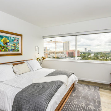 InnovationLand
Houston Interior Designer Lisha Maxey took this Museum District condo from the dated, mirrored walls of the 1980s to Mid Century Modern with a gallery look featuring the client's art collection.
"The place was covered with glued-down, floor-to-ceiling mirrors," says Lisha Maxey, senior designer for Homescapes of Houston and principal at LGH Design Services in Houston. "When we took them off the walls, the walls came apart. We ended up taking them down to the studs."
The makeover took six months to complete, primarily because of strict condo association rules that only gave the Houston interior designers very limited access to the elevator - through which all materials and team members had to go.
"Monday through Friday, we could only be noisy from 10 a.m. to 2 p.m., and if we had to do something extra loud, like sawing or drilling, we had to schedule it with the management and they had to communicate that to the condo owners. So it was just a lot of coordination. But a lot of Inner City Loopers live in these kinds of buildings, so we're used to handling that kind of thing."
The client, a child psychiatrist in her 60s, recently moved to Houston from northeast Texas to be with friends. After being widowed three years ago, she decided it was time to let go of the traditionally styled estate that wasn't really her style anyway. An avid diver who has traveled around the world to pursue her passion, she has amassed a large collection of art from her travels. Downsizing to 1,600 feet and wanting to go more contemporary, she wanted the display - and the look - more streamlined.
"She wanted clean lines and muted colors, with the main focus being her artwork," says Maxey. "So we made the space a palette for that."
Enter the white, gallery-grade paint she chose for the walls: "It's halfway between satin and flat," explains Maxey. "It's not glossy and it's not chalky - just very smooth and clean."
Adding to the gallery theme is the satin nickel track lighting with lamps aimed to highlight pieces of art. "This lighting has no wires," notes Maxey. "It's powered by a positive and negative conduit."
The new flooring throughout is a blended-grey porcelain tile that looks like wood planks. "It's gorgeous, natural-looking and combines all the beauty of wood with the durability of tile," says Maxey. "We used it throughout the condo to unify the space."
After Maxey started looking at the client's bright, vibrant, colorful artwork, she felt the palette couldn't stay as muted anymore. Hence the Mid Century Modern orange leather sofas from West Elm and bright green chairs from Joybird, plus the throw pillows in different textures, patterns and shades of gold, orange and green.
The concave lines of the Danish-inspired chairs, she notes, help them look beautiful from all the way around - a key to designing spaces for loft living.
"The table in the living room is very interesting," notes Maxey. "It was handmade for the client in 1974 and has a signature on it from the artist. She was adamant about including the piece, which has all these hand-painted black-and-white art tiles on the top. I took one look at it and said 'It's not really going to go.'"
However, after cutting 6 inches off the bottom and making it look a little distressed, the table ended up being the perfect complement to the sofas.
The dining room table - from Design Within Reach - is a solid piece of mahogany, the chair upholstery a mix of grey velvet and leather and the legs a shiny brass. "The side chairs are leather and the end ones are velvet," says Maxey. "It's a nice textural mix that lends depth and texture."
The galley kitchen, meanwhile, has been lightened and brightened, with white quartz countertops and backsplashes mimicking the look of Carrara marble, stainless steel appliances and a velvet green bench seat for a punch of color. The cabinets are painted a cool grey color called "Silverplate."
The two bathrooms have been updated with contemporary white vanities and vessel sinks and the master bath now features a walk-in shower tiled in Dolomite white marble (the floor is Bianco Carrara marble mosaic, done in a herringbone pattern.
In the master bedroom, Homescapes of Houston knocked down a wall between two smaller closets with swing doors to make one large walk-in closet with pocket doors. The closet in the guest bedroom also came out 13 more inches.
The client's artwork throughout personalizes the space and tells the story of a life. There's a huge bowl of shells from the client's diving adventures, framed art from her child psychiatry patients and a 16th century wood carving from a monastery that's been in her family forever.
"Her collection is quite impressive," says Maxey. "There's even a framed piece of autographed songs written by John Lennon." (You can see this black-framed piece of art on the wall in the photo above of two green chairs).
"We're extremely happy with how the project turned out, and so is the client," says Maxey. "No expense was spared for her. It was a labor of love and we were excited to do it."
 REF Construction LLC
Interior Design work performed by Design By Eric G
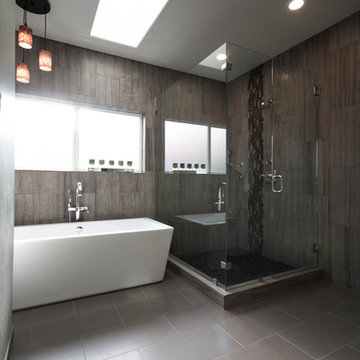
Inspiration for a large contemporary master gray tile and ceramic tile porcelain tile bathroom remodel in Portland with recessed-panel cabinets, brown cabinets, a two-piece toilet, green walls, an undermount sink and quartz countertops
Inspiration for a large contemporary master gray tile and ceramic tile porcelain tile bathroom remodel in Portland with recessed-panel cabinets, brown cabinets, a two-piece toilet, green walls, an undermount sink and quartz countertops
14