
Search results for "Maximized" in Home Design Ideas

 Deep River Partners
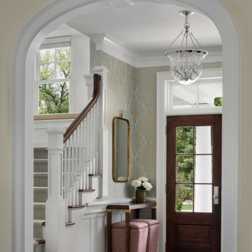
A young family sought their forever home where they would grow together and create lasting memories. Designing this custom home on a spacious 4.5-acre waterfront lot provided the perfect setting to create an openness with spaces where every member of the family could enjoy.
The primary goal was to maximize the lake views with separate special spaces for various uses and activities, yet with an open concept for connection between rooms. They wanted a home that would stand the test of time and grow with the family.
Traditional with a classic sensibility lead the design theme. A happy color palette of soft toned colors in blues, pinks, and turquoise - with a nod to lake living through patterns, and natural elements - provides a lived in and welcoming sense. It’s eclectic flair of polished sparkle finds balanced with rustic detailing that gives it a curated presentation with classic styling for the sense of a home that has always been there.
 Closet Solutions
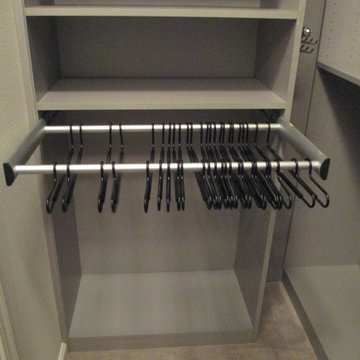
A modern gray walk-in some great space maximizing features like pant racks, adjustable shelves and deep drawers.
Pant racks can be a great way to help maximize space utilization.
Find the right local pro for your project
 Sanandres Construction
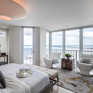
This award-winning luxury penthouse overlooking Miami’s stunning Biscayne Bay transformed an outdated space and clumsy layout into a breathtaking residence ideal for entertaining guests and welcoming family and visitors. Sanandres intervened to relocate the stair and reorganize the upstairs layout, creating a double-height oceanside view and inviting improved flow and format.
 Bloom Architecture
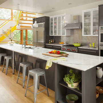
Adjacent to a 40 acre conservation area, this house on a slope is designed to maximize the connection to the woods, while maintaining privacy from this popular public hiking area. Despite its location in a suburban neighborhood, the house is made to feel like a wooded retreat. With passive-solar strategies, the house orients northward to nature, while allowing the southerly sun to enter through large openings and clerestories. A geothermal system provides the hot water, heating and cooling.
 Wheatland Custom Cabinetry & Woodwork
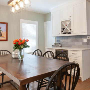
The goal of this kitchen remodel was to create more space in the kitchen area as well as maximize storage. We designed a layout that included removing a wall and integrating the extra space from the mudroom into the kitchen. Stainless steel appliances and quartz countertops finished the look.
Walnut countertop on the island and matching shelves and bench seat adjacent. We also finished the eat-in kitchen with a dry bar and bench seat with storage drawers. Now this kitchen is ready for entertaining with plenty of space to mingle and sit.
 Drewett Works
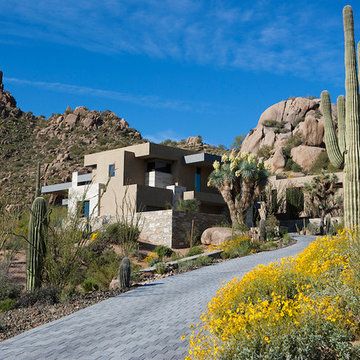
The primary goal for this project was to craft a modernist derivation of pueblo architecture. Set into a heavily laden boulder hillside, the design also reflects the nature of the stacked boulder formations. The site, located near local landmark Pinnacle Peak, offered breathtaking views which were largely upward, making proximity an issue. Maintaining southwest fenestration protection and maximizing views created the primary design constraint. The views are maximized with careful orientation, exacting overhangs, and wing wall locations. The overhangs intertwine and undulate with alternating materials stacking to reinforce the boulder strewn backdrop. The elegant material palette and siting allow for great harmony with the native desert.
The Elegant Modern at Estancia was the collaboration of many of the Valley's finest luxury home specialists. Interiors guru David Michael Miller contributed elegance and refinement in every detail. Landscape architect Russ Greey of Greey | Pickett contributed a landscape design that not only complimented the architecture, but nestled into the surrounding desert as if always a part of it. And contractor Manship Builders -- Jim Manship and project manager Mark Laidlaw -- brought precision and skill to the construction of what architect C.P. Drewett described as "a watch."
Project Details | Elegant Modern at Estancia
Architecture: CP Drewett, AIA, NCARB
Builder: Manship Builders, Carefree, AZ
Interiors: David Michael Miller, Scottsdale, AZ
Landscape: Greey | Pickett, Scottsdale, AZ
Photography: Dino Tonn, Scottsdale, AZ
Publications:
"On the Edge: The Rugged Desert Landscape Forms the Ideal Backdrop for an Estancia Home Distinguished by its Modernist Lines" Luxe Interiors + Design, Nov/Dec 2015.
Awards:
2015 PCBC Grand Award: Best Custom Home over 8,000 sq. ft.
2015 PCBC Award of Merit: Best Custom Home over 8,000 sq. ft.
The Nationals 2016 Silver Award: Best Architectural Design of a One of a Kind Home - Custom or Spec
2015 Excellence in Masonry Architectural Award - Merit Award
Photography: Dino Tonn

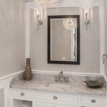
 Maxim Lighting International
Fixtures: Vision single Wall Sconce and Cassini Pendant Chandelier by ET2 Contemporary Lighting
Pictures provided by:
Alan Dabach – (818) 235-9300 – Vision Realty Group
Get these lights at:
www.maximlighting.com
www.et2online.com
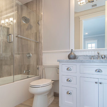 Maxim Lighting International
Fixture: Lola Bath Pendant by Maxim Lighting
Photo Provided by:
Alan Dabach – (818) 235-9300 – Vision Realty Group
Get these lights at:
www.maximlighting.com
www.et2online.com
 GUSTO DESIGN COLLECTION
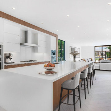
Kitchen Remodeling using the space maximizing the client needs.
Kitchen - huge contemporary u-shaped gray floor kitchen idea in Miami with an undermount sink, flat-panel cabinets, white cabinets, white backsplash, stainless steel appliances, an island and white countertops
Kitchen - huge contemporary u-shaped gray floor kitchen idea in Miami with an undermount sink, flat-panel cabinets, white cabinets, white backsplash, stainless steel appliances, an island and white countertops
 BRNS Design
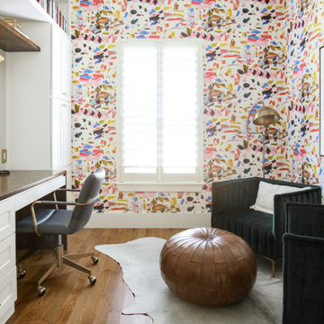
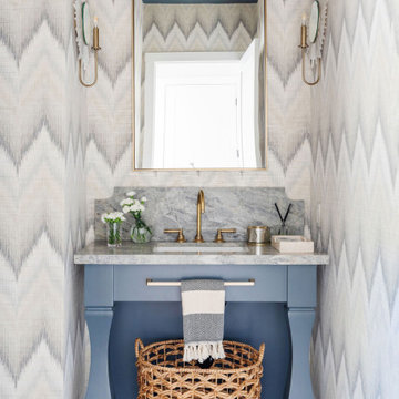
This eclectic office for two focuses on creating a functional space that creates that wow moment every home needs. when transforming this empty builder-grade room into a home office, we prioritized storage and usability to maximize the available space. A bold and colorful wallpaper was selected to bring the office to life and contrast against the crisp white custom built-in desk and cabinets.

 Lampert Lumber - Rice Lake
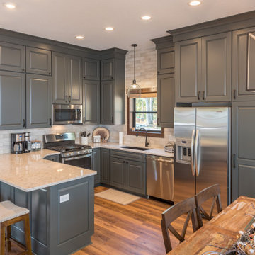
This family created a great, lakeside get-away for relaxing weekends in the northwoods. This new build maximizes their space and functionality for everyone! Contemporary takes on more traditional styles make this retreat a one of a kind.
 Alair Homes Plano
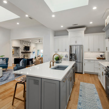
Our clients came to us wanting to maximize the space they had. They were not planning on moving anytime soon, as they loved their neighborhood. They wanted to renovate the front of their house, which included the front atrium, living room, kitchen, and powder bath. They hated their kitchen because it was completely closed off, had low ceilings, was dark and outdated, not to mention the floors were different in each of these rooms! The pantry was in the breakfast area and the kitchen table became a junk catcher, being the first thing you see when coming in from the garage/laundry room. In their living room, they wanted the spaces on either side of the fireplace to be symmetrical, whether that be bookshelves, a wet bar or closed off. Both parents are working professionals with no time and/or desire to design, create and figure this out on their own. They needed help figuring out how to reconfigure their current space in order to maximize what they already had, as they could not see an obvious solution. They could not envision how it would look so the fact that our designers were able to show them their new kitchen in 3D was pertinent.
We removed the pass-through windows that surrounded the atrium and front dining room, as well as the entire kitchen wall, completely opening up those two rooms. We removed a hall that used to lead between the kitchen and the living room since it was a complete waste of space! The ceilings were raised to 10’ in the kitchen and we were able to leave the skylight, letting in that natural light they wanted. We were able to give them a much larger pantry with tons of shelving and increase the size of their laundry room by utilizing the space of their old breakfast nook.
We relocated the door to the garage into their new elongated laundry room, built a wet bar across from their new larger pantry (with a pocket door) and the flow and functionality of these new spaces is just perfect! All new Waypoint cabinets were installed one two main kitchen surrounding walls painted Linen. Calacatta Bianco Polished Porcelain Tile 4x12 was used for the backsplash. A large eat-at island was installed, painted Stone, where the family can now gather for homework, meals, and mingling. The soft champagne bronze hardware and accent lighting really give this white and gray kitchen a soft classic look.
In the living room, we removed the built-in bookshelves to the left of the fireplace and closed off the wet-bar on the other side, giving them more space in their master suite. White Oak wood flooring, stained Putney, was installed throughout the entire new space, giving it the continuity they were looking for.
In the guest bathroom, Carrara white herringbone marble mosaic 12x12 tile was used on the shower floor and niche, while basic marble Bianco polished 12x24 porcelain tile was used on the walls. Luxart polished chrome traditional hardware gives this timeless bathroom the perfect shine.
Our clients are so happy with the new functionality and look of their space. It has definitely changed their lives in a way they could have never imagined!
 Alair Homes Plano
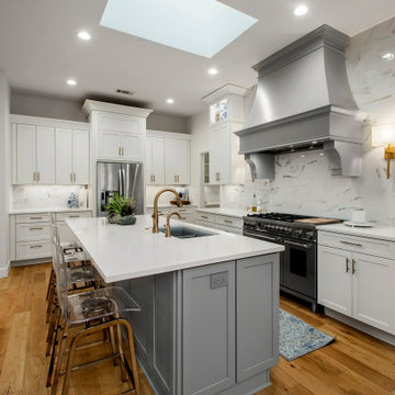
Our clients came to us wanting to maximize the space they had. They were not planning on moving anytime soon, as they loved their neighborhood. They wanted to renovate the front of their house, which included the front atrium, living room, kitchen, and powder bath. They hated their kitchen because it was completely closed off, had low ceilings, was dark and outdated, not to mention the floors were different in each of these rooms! The pantry was in the breakfast area and the kitchen table became a junk catcher, being the first thing you see when coming in from the garage/laundry room. In their living room, they wanted the spaces on either side of the fireplace to be symmetrical, whether that be bookshelves, a wet bar or closed off. Both parents are working professionals with no time and/or desire to design, create and figure this out on their own. They needed help figuring out how to reconfigure their current space in order to maximize what they already had, as they could not see an obvious solution. They could not envision how it would look so the fact that our designers were able to show them their new kitchen in 3D was pertinent.
We removed the pass-through windows that surrounded the atrium and front dining room, as well as the entire kitchen wall, completely opening up those two rooms. We removed a hall that used to lead between the kitchen and the living room since it was a complete waste of space! The ceilings were raised to 10’ in the kitchen and we were able to leave the skylight, letting in that natural light they wanted. We were able to give them a much larger pantry with tons of shelving and increase the size of their laundry room by utilizing the space of their old breakfast nook.
We relocated the door to the garage into their new elongated laundry room, built a wet bar across from their new larger pantry (with a pocket door) and the flow and functionality of these new spaces is just perfect! All new Waypoint cabinets were installed one two main kitchen surrounding walls painted Linen. Calacatta Bianco Polished Porcelain Tile 4x12 was used for the backsplash. A large eat-at island was installed, painted Stone, where the family can now gather for homework, meals, and mingling. The soft champagne bronze hardware and accent lighting really give this white and gray kitchen a soft classic look.
In the living room, we removed the built-in bookshelves to the left of the fireplace and closed off the wet-bar on the other side, giving them more space in their master suite. White Oak wood flooring, stained Putney, was installed throughout the entire new space, giving it the continuity they were looking for.
In the guest bathroom, Carrara white herringbone marble mosaic 12x12 tile was used on the shower floor and niche, while basic marble Bianco polished 12x24 porcelain tile was used on the walls. Luxart polished chrome traditional hardware gives this timeless bathroom the perfect shine.
Our clients are so happy with the new functionality and look of their space. It has definitely changed their lives in a way they could have never imagined!
 Roselind Wilson Design
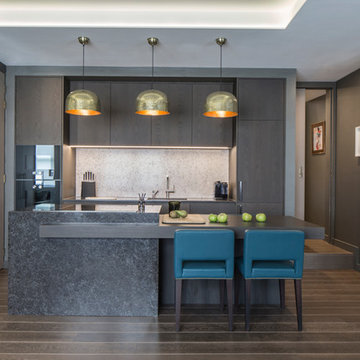
The open-plan kitchen in our Fitzrovia apartment has been carefully designed to maximise space and storage yet also allow for a Gaggenau oven and combi-microwave and wine fridge. There is a water filter system and instant hot water tap for further convenience. The worktop and splash back in a marble effect composite add a fresh burst of white to the scheme. Clever pantry storage accommodates dry foods and the ability to store away larger appliances such as the toaster and blender. There is ample space in the pantry as well as plug sockets, which have also been built into the kitchen island together with USB ports.
Photography by Richard Waite
 Maxim Lighting International
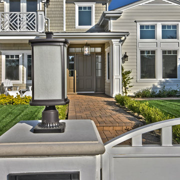
Outdoor Post (3250FSOB) by Maxim Lighting
http://maximlighting.com/proddetail.aspx?itemid=3250FSOB
 Maxim Lighting International
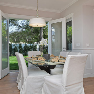
Rondo 4-Light Drum Pendant (12753WTPN ) by Maxim Lighting
http://maximlighting.com/proddetail.aspx?ItemID=12753WTPN
 Maxim Lighting International
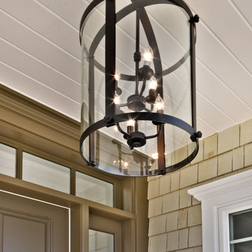
Close up of the Tara 6-Light Pendant (21554CLBZ) by Maxim Lighting
http://maximlighting.com/proddetail.aspx?ItemID=21554CLBZ
 Maxim Lighting International
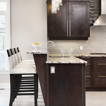
Fixture: ET2 Frost ( http://et2online.com/familydisp2.aspx?familyid=FROS)
Illumination on ice best describes the contemporary Frost collection. Exquisite design Clear/White glass cylinders, accented by Polished Chrome ring spacers deliver on the promise of chic. With each light individually hung, this fixture provides illumination from each lamp for high-key drama that is perfect for kitchen utility or dining elegance.
Laurysen Kitchen Ltd.
2415 Carp Road, P.O. Box 1235
Stittsville, Ontario
K2S 1B3
147