
Search results for "Maximized" in Home Design Ideas
 Jack Calderone
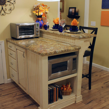
This custom kitchen is part of an adventuresome project my wife and I embarked upon to create a complete apartment in the basement of our townhouse. We designed a floor plan that creatively and efficiently used all of the 385-square-foot-space, without sacrificing beauty, comfort or function – and all without breaking the bank! To maximize our budget, we did the work ourselves and added everything from thrift store finds to DIY wall art to bring it all together.
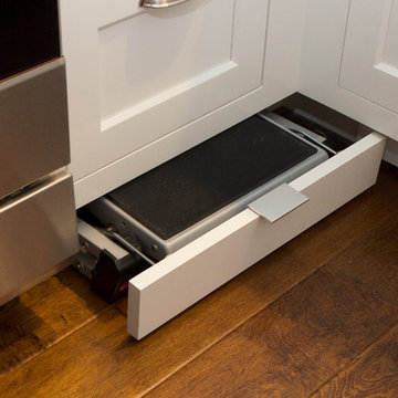
This combination island-and-bar was the most challenging of the cabinets to design and build. It incorporates an eating area, a cabinet, and drawers for storage, with shelves to match the other cabinets. I also made the upper shelf extra deep to accommodate a full size microwave. Because of local codes, we were unable to install a full stove in a basement, so instead we purchased a high-quality hot plate and countertop oven. The hot plate can be stored in a cabinet to maximize counter space.
 AG Millworks
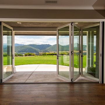
An AG Bi-Fold Door System creates an open-air dining room and connects the indoor living space to the outdoor pool and patio area.
Contractor: Steve Holmlund
Designer: Samantha Keeping
Dealer: Nielsen Building Materials
Photo by Logan Hall

Find the right local pro for your project

 Drewett Works
The primary goal for this project was to craft a modernist derivation of pueblo architecture. Set into a heavily laden boulder hillside, the design also reflects the nature of the stacked boulder formations. The site, located near local landmark Pinnacle Peak, offered breathtaking views which were largely upward, making proximity an issue. Maintaining southwest fenestration protection and maximizing views created the primary design constraint. The views are maximized with careful orientation, exacting overhangs, and wing wall locations. The overhangs intertwine and undulate with alternating materials stacking to reinforce the boulder strewn backdrop. The elegant material palette and siting allow for great harmony with the native desert.
The Elegant Modern at Estancia was the collaboration of many of the Valley's finest luxury home specialists. Interiors guru David Michael Miller contributed elegance and refinement in every detail. Landscape architect Russ Greey of Greey | Pickett contributed a landscape design that not only complimented the architecture, but nestled into the surrounding desert as if always a part of it. And contractor Manship Builders -- Jim Manship and project manager Mark Laidlaw -- brought precision and skill to the construction of what architect C.P. Drewett described as "a watch."
Project Details | Elegant Modern at Estancia
Architecture: CP Drewett, AIA, NCARB
Builder: Manship Builders, Carefree, AZ
Interiors: David Michael Miller, Scottsdale, AZ
Landscape: Greey | Pickett, Scottsdale, AZ
Photography: Dino Tonn, Scottsdale, AZ
Publications:
"On the Edge: The Rugged Desert Landscape Forms the Ideal Backdrop for an Estancia Home Distinguished by its Modernist Lines" Luxe Interiors + Design, Nov/Dec 2015.
Awards:
2015 PCBC Grand Award: Best Custom Home over 8,000 sq. ft.
2015 PCBC Award of Merit: Best Custom Home over 8,000 sq. ft.
The Nationals 2016 Silver Award: Best Architectural Design of a One of a Kind Home - Custom or Spec
2015 Excellence in Masonry Architectural Award - Merit Award
Photography: Dino Tonn
 50 Degrees North Architects
Overview
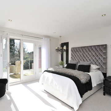
Extension and complete refurbishment.
The Brief
The existing house had very shallow rooms with a need for more depth throughout the property by extending into the rear garden which is large and south facing. We were to look at extending to the rear and to the end of the property, where we had redundant garden space, to maximise the footprint and yield a series of WOW factor spaces maximising the value of the house.
The brief requested 4 bedrooms plus a luxurious guest space with separate access; large, open plan living spaces with large kitchen/entertaining area, utility and larder; family bathroom space and a high specification ensuite to two bedrooms. In addition, we were to create balconies overlooking a beautiful garden and design a ‘kerb appeal’ frontage facing the sought-after street location.
Buildings of this age lend themselves to use of natural materials like handmade tiles, good quality bricks and external insulation/render systems with timber windows. We specified high quality materials to achieve a highly desirable look which has become a hit on Houzz.
Our Solution
One of our specialisms is the refurbishment and extension of detached 1930’s properties.
Taking the existing small rooms and lack of relationship to a large garden we added a double height rear extension to both ends of the plan and a new garage annex with guest suite.
We wanted to create a view of, and route to the garden from the front door and a series of living spaces to meet our client’s needs. The front of the building needed a fresh approach to the ordinary palette of materials and we re-glazed throughout working closely with a great build team.
 Pamela Dailey Design
This 400 s.f. studio apartment in NYC’s Greenwich Village serves as a pied-a-terre
for clients whose primary residence is on the West Coast.
Although the clients do not reside here full-time, this tiny space accommodates
all the creature comforts of home.
Bleached hardwood floors, crisp white walls, and high ceilings are the backdrop to
a custom blackened steel and glass partition, layered with raw silk sheer draperies,
to create a private sleeping area, replete with custom built-in closets.
Simple headboard and crisp linens are balanced with a lightly-metallic glazed
duvet and a vintage textile pillow.
The living space boasts a custom Belgian linen sectional sofa that pulls out into a
full-size bed for the couple’s young children who sometimes accompany them.
Efficient and inexpensive dining furniture sits comfortably in the main living space
and lends clean, Scandinavian functionality for sharing meals. The sculptural
handcrafted metal ceiling mobile offsets the architecture’s clean lines, defining the
space while accentuating the tall ceilings.
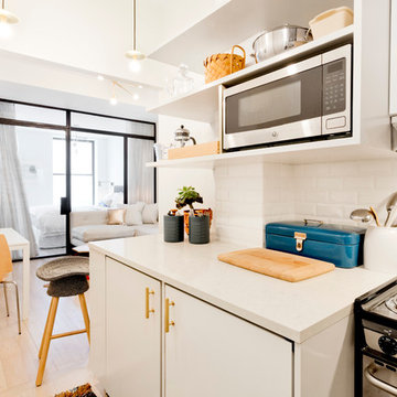
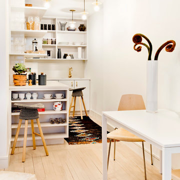
The kitchenette combines custom cool grey lacquered cabinets with brass fittings,
white beveled subway tile, and a warm brushed brass backsplash; an antique
Boucherouite runner and textural woven stools that pull up to the kitchen’s
coffee counter punctuate the clean palette with warmth and the human scale.
The under-counter freezer and refrigerator, along with the 18” dishwasher, are all
panelled to match the cabinets, and open shelving to the ceiling maximizes the
feeling of the space’s volume.
The entry closet doubles as home for a combination washer/dryer unit.
The custom bathroom vanity, with open brass legs sitting against floor-to-ceiling
marble subway tile, boasts a honed gray marble countertop, with an undermount
sink offset to maximize precious counter space and highlight a pendant light. A
tall narrow cabinet combines closed and open storage, and a recessed mirrored
medicine cabinet conceals additional necessaries.
The stand-up shower is kept minimal, with simple white beveled subway tile and
frameless glass doors, and is large enough to host a teak and stainless bench for
comfort; black sink and bath fittings ground the otherwise light palette.
What had been a generic studio apartment became a rich landscape for living.
 Drewett Works
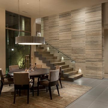
The primary goal for this project was to craft a modernist derivation of pueblo architecture. Set into a heavily laden boulder hillside, the design also reflects the nature of the stacked boulder formations. The site, located near local landmark Pinnacle Peak, offered breathtaking views which were largely upward, making proximity an issue. Maintaining southwest fenestration protection and maximizing views created the primary design constraint. The views are maximized with careful orientation, exacting overhangs, and wing wall locations. The overhangs intertwine and undulate with alternating materials stacking to reinforce the boulder strewn backdrop. The elegant material palette and siting allow for great harmony with the native desert.
The Elegant Modern at Estancia was the collaboration of many of the Valley's finest luxury home specialists. Interiors guru David Michael Miller contributed elegance and refinement in every detail. Landscape architect Russ Greey of Greey | Pickett contributed a landscape design that not only complimented the architecture, but nestled into the surrounding desert as if always a part of it. And contractor Manship Builders -- Jim Manship and project manager Mark Laidlaw -- brought precision and skill to the construction of what architect C.P. Drewett described as "a watch."
Project Details | Elegant Modern at Estancia
Architecture: CP Drewett, AIA, NCARB
Builder: Manship Builders, Carefree, AZ
Interiors: David Michael Miller, Scottsdale, AZ
Landscape: Greey | Pickett, Scottsdale, AZ
Photography: Dino Tonn, Scottsdale, AZ
Publications:
"On the Edge: The Rugged Desert Landscape Forms the Ideal Backdrop for an Estancia Home Distinguished by its Modernist Lines" Luxe Interiors + Design, Nov/Dec 2015.
Awards:
2015 PCBC Grand Award: Best Custom Home over 8,000 sq. ft.
2015 PCBC Award of Merit: Best Custom Home over 8,000 sq. ft.
The Nationals 2016 Silver Award: Best Architectural Design of a One of a Kind Home - Custom or Spec
2015 Excellence in Masonry Architectural Award - Merit Award
Photography: Dino Tonn

 Drewett Works
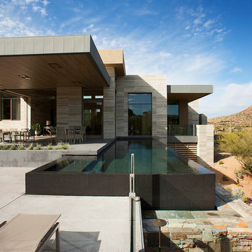
The primary goal for this project was to craft a modernist derivation of pueblo architecture. Set into a heavily laden boulder hillside, the design also reflects the nature of the stacked boulder formations. The site, located near local landmark Pinnacle Peak, offered breathtaking views which were largely upward, making proximity an issue. Maintaining southwest fenestration protection and maximizing views created the primary design constraint. The views are maximized with careful orientation, exacting overhangs, and wing wall locations. The overhangs intertwine and undulate with alternating materials stacking to reinforce the boulder strewn backdrop. The elegant material palette and siting allow for great harmony with the native desert.
The Elegant Modern at Estancia was the collaboration of many of the Valley's finest luxury home specialists. Interiors guru David Michael Miller contributed elegance and refinement in every detail. Landscape architect Russ Greey of Greey | Pickett contributed a landscape design that not only complimented the architecture, but nestled into the surrounding desert as if always a part of it. And contractor Manship Builders -- Jim Manship and project manager Mark Laidlaw -- brought precision and skill to the construction of what architect C.P. Drewett described as "a watch."
Project Details | Elegant Modern at Estancia
Architecture: CP Drewett, AIA, NCARB
Builder: Manship Builders, Carefree, AZ
Interiors: David Michael Miller, Scottsdale, AZ
Landscape: Greey | Pickett, Scottsdale, AZ
Photography: Dino Tonn, Scottsdale, AZ
Publications:
"On the Edge: The Rugged Desert Landscape Forms the Ideal Backdrop for an Estancia Home Distinguished by its Modernist Lines" Luxe Interiors + Design, Nov/Dec 2015.
Awards:
2015 PCBC Grand Award: Best Custom Home over 8,000 sq. ft.
2015 PCBC Award of Merit: Best Custom Home over 8,000 sq. ft.
The Nationals 2016 Silver Award: Best Architectural Design of a One of a Kind Home - Custom or Spec
2015 Excellence in Masonry Architectural Award - Merit Award
Photography: Dino Tonn
 TOC design & construction inc.
DESIGNED BY TOC design
CONSTRUCTION BY TOC design & Construction inc.
PHOTOS BY : Tania Scardellato
I was fortunate to have a young family approach me in desperate need to renovate there only 3 piece bathroom. This space was In dire need of a remodel, with old brown wall to wall tiles and a dated bulky yellow brown single sink vanity.
Storage was a must, lighting a necessity, and proper accessibility to the shower bath area.
We had a tight budget to respect, but a full gut of this bathroom was required. And a good thing too, once we started doing the demolition we noticed that mildew and rotting floors and walls had accumulated throughout the years. Doing it right the first time is no joke when dealing with water and electrical issues.
We discarded all reminisce of old and built from scratch, new walls, new plumbing, new electrical ,new insulation and a new window, a new fan that actually exhausted outside ( I say this laughing as you would be amazed at how many fans are installed but don’t exhaust outside, and you the client would never know unless you go inside the attic space.
Once all the hard stuff was done, the rest is just a matter of smart design. If you have a small bathroom here are some tips to guide you.
10 tips for making a small bathroom feel larger
Is your tiny bathroom cramping your functionality and style, leaving you longing for the enormous bathrooms gracing the pages of design magazines? Even if your bathroom is a fraction of the size, all it takes is some design savvy to make the most of the space you have. Consider these 10 smart tips that will help your bathroom look, feel and function like those larger contenders.
1-Get creative with corners
Space is at a premium in small bathrooms, so it's important to maximize every inch. Corners, for example, provide extra space for shelving, storage units and even hooks. Get creative and install unique design solutions that are not only functional, but also eye-catching. If you love the airiness of floating cabinets, add baskets or decorative boxes under for extra storage. If you are installing floating cabinets insure that they are installed securely to studs or plywood at wall.
2- Let solid colors shine
Busy patterns have a shrinking effect and make small bathrooms seem even smaller. Conversely, light natural hues make a space feel more open. If you're itching to get creative with design, experiment with textures but keep overpowering patterns to a minimum. Tone on tone is the best to achieve this.
3 - Maximize your bathtub
A bathtub takes up a significant portion of the room, but modern, compact options with curved basins, can make the tub feel larger when in use, all while conserving space.
4 - Select a smaller faucet
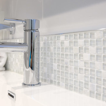
A faucet is jewelry for the bathroom. And just as accessories can overpower an outfit, a big bulky faucet isn't flattering in a small bath. Single-handle designs conserve counter space, while a wall-mount installation frees it up all together and can create quite the wow-factor, if the budget can accommodate the required changes to plumbing behind the wall.
5 - Make vanity storage simple
If you're in a storage war with your small bathroom, you're not alone in the battle. Toiletries and personal supplies without a place to call home only add clutter and chaos. Store smart with a space-saving vanity, the dual sink vanity shown here, looks quite simple, but in reality it has 4 sets of full extension drawers, and the vanity tower adds extra storage without overpowering the use of space.
6 - Show off the shower
Shower curtains may be pretty, but they interrupt the visual flow of a bathing space and make it feel significantly smaller. In bathrooms with small footprints, opt for a clear glass sliding shower door that doesn't require the clearance of one with a hinged design. Or as shown in this design and for fraction less expensive a half hinged panel installed on a fixed tempered glass panel. If you're embarking on a big remodel, create the illusion of more space by using same tile in the shower that's used throughout; instead of seeing them as two separate zones, the eye will read them as one.
7 - Discover the treasure of hidden storage
Work with a contractor, and you just might find some serious storage potential hidden behind your walls. Whether it's utilizing space between the studs for shallow shelving or a creating a small linen closet by annexing space from an adjacent room, even small additions can make a big difference.
8 - Focal Point
Tile is a beautiful, durable addition to any bathroom. For dainty spaces, consider installing tile at a diagonal to accentuate the focal point or as in this bathroom I used an oversized textured pattern to bring depth to the space at the window wall.
9 - Choose the right lights
Strategically install light to reflect and brighten a small bathroom to make it appear larger. Recessed lighting is an affordable solution for tiny rooms, offering ample light while taking up little space. Wall sconces alongside a mirror also reflect off the walls and make a room feel bright and airy. I always recommend going with LED lighting at 2800 to 3000K.
10 – Accessorize
This is your time to shine in your decorating skills, have fun with your towels, you can change the color scheme daily just by adding pops of color in your accessories, make sure to get items that serve a dual purpose, like baskets, boxes they can always be used as hampers, storing of towels and even a nice display for your guest.
 Maxim Lighting International
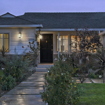
From Maxim Lighting's New Age LED Collection. These outdoor wall Lanterns adds just the right amount of contemporary design to make this house relevant in todays times. — at http://www.maximlighting.com/familydisp2.aspx?family=8835.
Lights are by Maxim Lighting and ET2 Contemporary Lighting
www.maximlighting.com / www.ET2online.com
Photos are by James Moss
 Maxim Lighting International
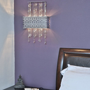
The Symmetry Collection by Maxim Lighting adds just the right amount of light, which bounce off the beautifully cut crystals and creates this amazing glow. — at http://www.maximlighting.com/familydisp2.aspx?family=2238.
Lights are by Maxim Lighting and ET2 Contemporary Lighting
www.maximlighting.com / www.ET2online.com
Photos are by James Moss
 Maxim Lighting International
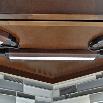
Here you can see how the Maxim Lighting CounterMax Connects to one another — with Lighting Showcase at http://www.maximlighting.com/familydisp.aspx?family=CounterMax&Submit2=Go&searchflag=family.
Lights are by Maxim Lighting and ET2 Contemporary Lighting
www.maximlighting.com / www.ET2online.com
Photos are by James Moss
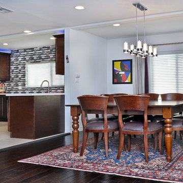 Maxim Lighting International
The Silo Pendant by Maxim Lighting is a modern twist to the traditional Chandelier.
http://www.maximlighting.com/familydisp2.aspx?family=2307
Accompanied by the ET2 Starstrand Rainbow LED Rainbow Tape lighting, you get this nice mix of colors.
http://www.et2online.com/familydisp2.aspx?familyid=STAS
Photos are by James Moss
Lights are by Maxim Lighting and ET2 Contemporary Lighting
www.maximlighting.com / www.ET2online.com
Photos are by James Moss
 Kimball Starr Interior Design
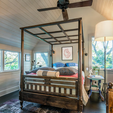
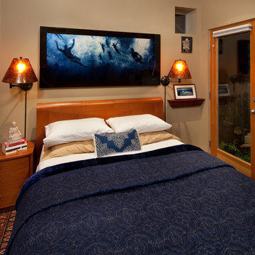
Small space living solutions are used throughout this contemporary 596 square foot tiny house. Adjustable height table in the entry area serves as both a coffee table for socializing and as a dining table for eating. Curved banquette is upholstered in outdoor fabric for durability and maximizes space with hidden storage underneath the seat. Kitchen island has a retractable countertop for additional seating while the living area conceals a work desk and media center behind sliding shoji screens.
Calming tones of sand and deep ocean blue fill the tiny bedroom downstairs. Glowing bedside sconces utilize wall-mounting and swing arms to conserve bedside space and maximize flexibility.
 Lux Decor
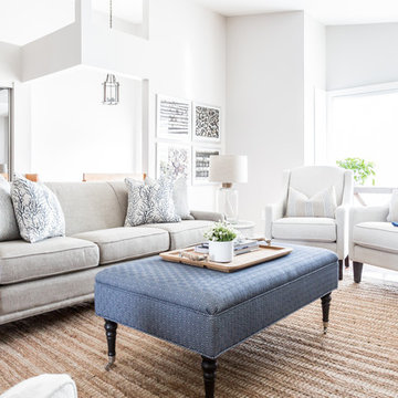
Designed by Lux Decor.
Photographed by Angela Auclair Photography
Example of a small classic open concept living room design in Montreal
Example of a small classic open concept living room design in Montreal
 Plus Interiors
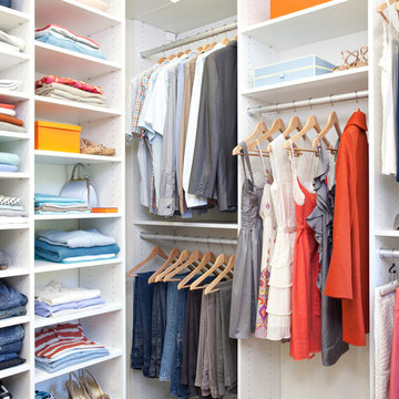
This spacious, classic white walk in closet includes space for his and her clothes, accessories and shoes. Adjustable floor-to-ceiling open shelving maximizes one wall of space, while single and double-hang sections allow for versatile storage of clothing. Utilizing every inch of closet space helps maximize the storage capacity of this walk-in closet space.
 Pamela Dailey Design
This 400 s.f. studio apartment in NYC’s Greenwich Village serves as a pied-a-terre
for clients whose primary residence is on the West Coast.
Although the clients do not reside here full-time, this tiny space accommodates
all the creature comforts of home.
Bleached hardwood floors, crisp white walls, and high ceilings are the backdrop to
a custom blackened steel and glass partition, layered with raw silk sheer draperies,
to create a private sleeping area, replete with custom built-in closets.
Simple headboard and crisp linens are balanced with a lightly-metallic glazed
duvet and a vintage textile pillow.
The living space boasts a custom Belgian linen sectional sofa that pulls out into a
full-size bed for the couple’s young children who sometimes accompany them.
Efficient and inexpensive dining furniture sits comfortably in the main living space
and lends clean, Scandinavian functionality for sharing meals. The sculptural
handrafted metal ceiling mobile offsets the architecture’s clean lines, defining the
space while accentuating the tall ceilings.
The kitchenette combines custom cool grey lacquered cabinets with brass fittings,
white beveled subway tile, and a warm brushed brass backsplash; an antique
Boucherouite runner and textural woven stools that pull up to the kitchen’s
coffee counter puntuate the clean palette with warmth and the human scale.
The under-counter freezer and refrigerator, along with the 18” dishwasher, are all
panelled to match the cabinets, and open shelving to the ceiling maximizes the
feeling of the space’s volume.
The entry closet doubles as home for a combination washer/dryer unit.
The custom bathroom vanity, with open brass legs sitting against floor-to-ceiling
marble subway tile, boasts a honed gray marble countertop, with an undermount
sink offset to maximize precious counter space and highlight a pendant light. A
tall narrow cabinet combines closed and open storage, and a recessed mirrored
medicine cabinet conceals additional necessaries.
The stand-up shower is kept minimal, with simple white beveled subway tile and
frameless glass doors, and is large enough to host a teak and stainless bench for
comfort; black sink and bath fittings ground the otherwise light palette.
What had been a generic studio apartment became a rich landscape for living.
 emma delon
Maximizing the functionality of this space, and coordinating the new kitchen with the beautiful remodel completed previously by the client were the two most important aspects of this project. The existing spaces are elegantly decorated with an open plan, dark hardwood floors, and natural stone accents. The new, lighter, more open kitchen flows beautifully into the client’s existing dining room space. Satin nickel hardware blends with the stainless steel appliances and matches the satin nickel details throughout the home. The fully integrated refrigerator next to the narrow pull-out pantry cabinet, take up less visual weight than a traditional stainless steel appliance and the two combine to provide fantastic storage. The glass cabinet doors and decorative lighting beautifully highlight the client’s glassware and dishes. Finished with white subway tile, Dreamy Marfil quartz countertops, and a warm natural wood blind; the space warm, inviting, elegant, and extremely functional.
copyright 2013 marilyn peryer photography

 Thomas Roszak Architecture, LLC
Photo credit: Scott McDonald @ Hedrich Blessing
7RR-Ecohome:
The design objective was to build a house for a couple recently married who both had kids from previous marriages. How to bridge two families together?
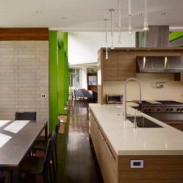
The design looks forward in terms of how people live today. The home is an experiment in transparency and solid form; removing borders and edges from outside to inside the house, and to really depict “flowing and endless space”. The house floor plan is derived by pushing and pulling the house’s form to maximize the backyard and minimize the public front yard while welcoming the sun in key rooms by rotating the house 45-degrees to true north. The angular form of the house is a result of the family’s program, the zoning rules, the lot’s attributes, and the sun’s path. We wanted to construct a house that is smart and efficient in terms of construction and energy, both in terms of the building and the user. We could tell a story of how the house is built in terms of the constructability, structure and enclosure, with a nod to Japanese wood construction in the method in which the siding is installed and the exposed interior beams are placed in the double height space. We engineered the house to be smart which not only looks modern but acts modern; every aspect of user control is simplified to a digital touch button, whether lights, shades, blinds, HVAC, communication, audio, video, or security. We developed a planning module based on a 6-foot square room size and a 6-foot wide connector called an interstitial space for hallways, bathrooms, stairs and mechanical, which keeps the rooms pure and uncluttered. The house is 6,200 SF of livable space, plus garage and basement gallery for a total of 9,200 SF. A large formal foyer celebrates the entry and opens up to the living, dining, kitchen and family rooms all focused on the rear garden. The east side of the second floor is the Master wing and a center bridge connects it to the kid’s wing on the west. Second floor terraces and sunscreens provide views and shade in this suburban setting. The playful mathematical grid of the house in the x, y and z axis also extends into the layout of the trees and hard-scapes, all centered on a suburban one-acre lot.
Many green attributes were designed into the home; Ipe wood sunscreens and window shades block out unwanted solar gain in summer, but allow winter sun in. Patio door and operable windows provide ample opportunity for natural ventilation throughout the open floor plan. Minimal windows on east and west sides to reduce heat loss in winter and unwanted gains in summer. Open floor plan and large window expanse reduces lighting demands and maximizes available daylight. Skylights provide natural light to the basement rooms. Durable, low-maintenance exterior materials include stone, ipe wood siding and decking, and concrete roof pavers. Design is based on a 2' planning grid to minimize construction waste. Basement foundation walls and slab are highly insulated. FSC-certified walnut wood flooring was used. Light colored concrete roof pavers to reduce cooling loads by as much as 15%. 2x6 framing allows for more insulation and energy savings. Super efficient windows have low-E argon gas filled units, and thermally insulated aluminum frames. Permeable brick and stone pavers reduce the site’s storm-water runoff. Countertops use recycled composite materials. Energy-Star rated furnaces and smart thermostats are located throughout the house to minimize duct runs and avoid energy loss. Energy-Star rated boiler that heats up both radiant floors and domestic hot water. Low-flow toilets and plumbing fixtures are used to conserve water usage. No VOC finish options and direct venting fireplaces maintain a high interior air quality. Smart home system controls lighting, HVAC, and shades to better manage energy use. Plumbing runs through interior walls reducing possibilities of heat loss and freezing problems. A large food pantry was placed next to kitchen to reduce trips to the grocery store. Home office reduces need for automobile transit and associated CO2 footprint. Plan allows for aging in place, with guest suite than can become the master suite, with no need to move as family members mature.
28