
Search results for "Maximizing space" in Home Design Ideas
 User
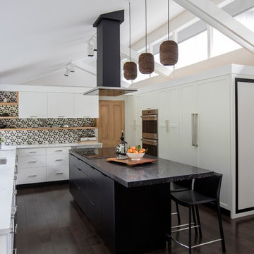
UserExample of a large 1960s u-shaped dark wood floor and brown floor kitchen design in Vancouver with shaker cabinets, black cabinets, quartz countertops, black backsplash, marble backsplash, paneled appliances, an island and white countertops
 Metzger Design
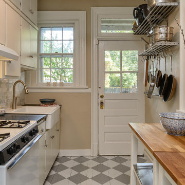
Some spaces are best understood before and after. Our Carytown Kitchen project demonstrates how a small space can be transformed for minimal expense.
First and foremost was maximizing space. With only 9 sf of built-in counter space we understood these work surfaces needed to be kept free of small appliances and clutter - and that meant extra storage. The introduction of high wall cabinets provides much needed storage for occasional use equipment and helps keep everything dust-free in the process.
Photograph by Stephen Barling.
Find the right local pro for your project
 Joshua M Corrigan
Joshua Corrigan
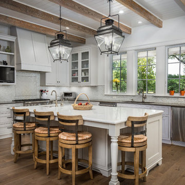
Elegant dark wood floor kitchen photo in Charleston with an undermount sink, glass-front cabinets, stainless steel appliances and an island
Elegant dark wood floor kitchen photo in Charleston with an undermount sink, glass-front cabinets, stainless steel appliances and an island


 Lee Edwards - residential design
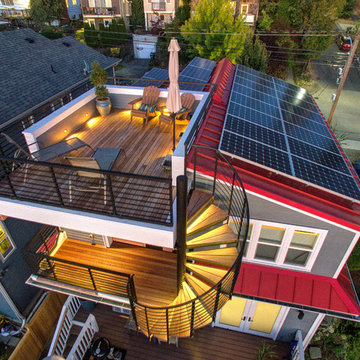
Situated on the west slope of Mt. Baker Ridge, this remodel takes a contemporary view on traditional elements to maximize space, lightness and spectacular views of downtown Seattle and Puget Sound. We were approached by Vertical Construction Group to help a client bring their 1906 craftsman into the 21st century. The original home had many redeeming qualities that were unfortunately compromised by an early 2000’s renovation. This left the new homeowners with awkward and unusable spaces. After studying numerous space plans and roofline modifications, we were able to create quality interior and exterior spaces that reflected our client’s needs and design sensibilities. The resulting master suite, living space, roof deck(s) and re-invented kitchen are great examples of a successful collaboration between homeowner and design and build teams.

 Simply Home Decorating
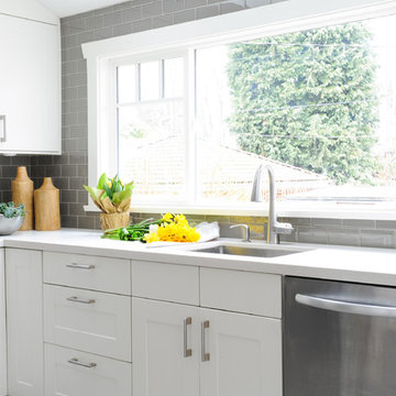
Our goal on this project was to make the main floor of this lovely early 20th century home in a popular Vancouver neighborhood work for a growing family of four. We opened up the space, both literally and aesthetically, with windows and skylights, an efficient layout, some carefully selected furniture pieces and a soft colour palette that lends a light and playful feel to the space. Our clients can hardly believe that their once small, dark, uncomfortable main floor has become a bright, functional and beautiful space where they can now comfortably host friends and hang out as a family. Interior Design by Lori Steeves of Simply Home Decorating Inc. Photos by Tracey Ayton Photography.
 User
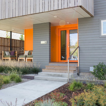
UserThis Bozeman, Montana tiny house residence blends an innovative use of space with high-performance Glo aluminum doors and proper building orientation. Situated specifically, taking advantage of the sun to power the Solar panels located on the southern side of the house. Careful consideration given to the floor plan allows this home to maximize space and keep the small footprint.
Full light exterior doors provide multiple access points across this house. The full lite entry doors provide plenty of natural light to this minimalist home. A full lite entry door adorned with a sidelite provide natural light for the cozy entrance.
This home uses stairs to connect the living spaces and bedrooms. The living and dining areas have soaring ceiling heights thanks to the inventive use of a loft above the kitchen. The living room space is optimized with a well placed window seat and the dining area bench provides comfortable seating on one side of the table to maximize space. Modern design principles and sustainable building practices create a comfortable home with a small footprint on an urban lot. The one car garage complements this home and provides extra storage for the small footprint home.
 Julia Mack Design, LLC
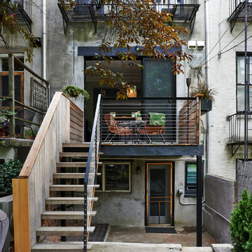
The stair from the deck leads to the yard. Steel wire adds function and openness to the space while greenery softens and enlivens the outdoor deck and yard. A tenant apartment has easy access to the yard..
Photo: Michel Arnaud
 Simply Home Decorating
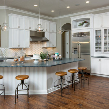
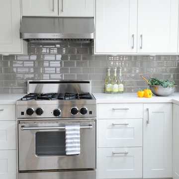
Our goal on this project was to make the main floor of this lovely early 20th century home in a popular Vancouver neighborhood work for a growing family of four. We opened up the space, both literally and aesthetically, with windows and skylights, an efficient layout, some carefully selected furniture pieces and a soft colour palette that lends a light and playful feel to the space. Our clients can hardly believe that their once small, dark, uncomfortable main floor has become a bright, functional and beautiful space where they can now comfortably host friends and hang out as a family. Interior Design by Lori Steeves of Simply Home Decorating Inc. Photos by Tracey Ayton Photography.
 Kimball Starr Interior Design
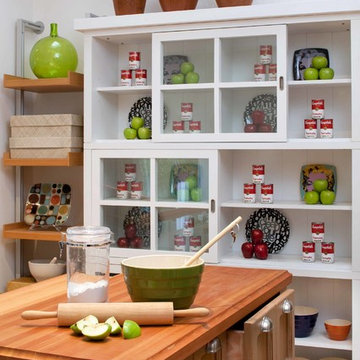
Small space living solutions are used throughout this contemporary 596 square foot tiny house. Adjustable height table in the entry area serves as both a coffee table for socializing and as a dining table for eating. Curved banquette is upholstered in outdoor fabric for durability and maximizes space with hidden storage underneath the seat. Kitchen island has a retractable countertop for additional seating while the living area conceals a work desk and media center behind sliding shoji screens.
Calming tones of sand and deep ocean blue fill the tiny bedroom downstairs. Glowing bedside sconces utilize wall-mounting and swing arms to conserve bedside space and maximize flexibility.


 Alair Homes Plano
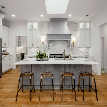
Our clients came to us wanting to maximize the space they had. They were not planning on moving anytime soon, as they loved their neighborhood. They wanted to renovate the front of their house, which included the front atrium, living room, kitchen, and powder bath. They hated their kitchen because it was completely closed off, had low ceilings, was dark and outdated, not to mention the floors were different in each of these rooms! The pantry was in the breakfast area and the kitchen table became a junk catcher, being the first thing you see when coming in from the garage/laundry room. In their living room, they wanted the spaces on either side of the fireplace to be symmetrical, whether that be bookshelves, a wet bar or closed off. Both parents are working professionals with no time and/or desire to design, create and figure this out on their own. They needed help figuring out how to reconfigure their current space in order to maximize what they already had, as they could not see an obvious solution. They could not envision how it would look so the fact that our designers were able to show them their new kitchen in 3D was pertinent.
We removed the pass-through windows that surrounded the atrium and front dining room, as well as the entire kitchen wall, completely opening up those two rooms. We removed a hall that used to lead between the kitchen and the living room since it was a complete waste of space! The ceilings were raised to 10’ in the kitchen and we were able to leave the skylight, letting in that natural light they wanted. We were able to give them a much larger pantry with tons of shelving and increase the size of their laundry room by utilizing the space of their old breakfast nook.
We relocated the door to the garage into their new elongated laundry room, built a wet bar across from their new larger pantry (with a pocket door) and the flow and functionality of these new spaces is just perfect! All new Waypoint cabinets were installed one two main kitchen surrounding walls painted Linen. Calacatta Bianco Polished Porcelain Tile 4x12 was used for the backsplash. A large eat-at island was installed, painted Stone, where the family can now gather for homework, meals, and mingling. The soft champagne bronze hardware and accent lighting really give this white and gray kitchen a soft classic look.
In the living room, we removed the built-in bookshelves to the left of the fireplace and closed off the wet-bar on the other side, giving them more space in their master suite. White Oak wood flooring, stained Putney, was installed throughout the entire new space, giving it the continuity they were looking for.
In the guest bathroom, Carrara white herringbone marble mosaic 12x12 tile was used on the shower floor and niche, while basic marble Bianco polished 12x24 porcelain tile was used on the walls. Luxart polished chrome traditional hardware gives this timeless bathroom the perfect shine.
Our clients are so happy with the new functionality and look of their space. It has definitely changed their lives in a way they could have never imagined!
 Michael A. Gilkey, Inc.
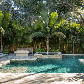
The pool, spa, and deck are informed by the axis of the home, and efficiently maximize space in this family backyard.
Example of a transitional custom-shaped hot tub design in Tampa
Example of a transitional custom-shaped hot tub design in Tampa
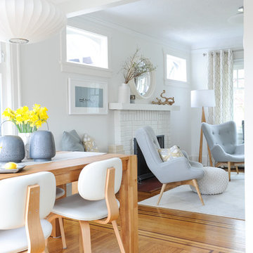 Simply Home Decorating
Our goal on this project was to make the main floor of this lovely early 20th century home in a popular Vancouver neighborhood work for a growing family of four. We opened up the space, both literally and aesthetically, with windows and skylights, an efficient layout, some carefully selected furniture pieces and a soft colour palette that lends a light and playful feel to the space. Our clients can hardly believe that their once small, dark, uncomfortable main floor has become a bright, functional and beautiful space where they can now comfortably host friends and hang out as a family. Interior Design by Lori Steeves of Simply Home Decorating Inc. Photos by Tracey Ayton Photography.
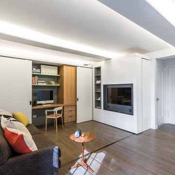
 Michael K Chen Architecture
Photos by Alan Tansey Photographer
Example of a minimalist living room design in New York
Example of a minimalist living room design in New York
Sponsored
Columbus, OH
Free consultation for landscape design!

Peabody Landscape Group
Columbus' Reliable Landscape Design & Contracting
 Studio iF
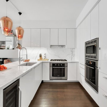
A luxury 1700 Sqft residence, in the heart of TriBeCa, one of New York City’s most desirable neighborhoods. The apartment is designed for modern living, whilst maximizing the comfort and ease of every day life. With an ode to the 70’s, this residence is a clever combination of sourced vintage pieces and bespoke designed interiors from wallpaper to soft furnishings. Whilst boasting top of line appliances and integrated living system including lights, music and drapery.
Design and storage solutions were tasked to Labscape, who maximized space by integrating existing, oversized structural columns into the dynamic design of a wet bar in the living/ dining area and vanity desk in bedroom, both with incorporated hidden storage.
 Drury Design
The Setup:
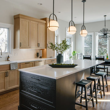
After purchasing this home, the homeowners faced a unique opportunity to reimagine their kitchen and nearby spaces. Water damage from a burst pipe had left much of the home’s interior in need of repair, and while the existing kitchen was functional and in relatively good shape, it didn’t align with the family’s vision for their new home. The layout included a peninsula that wasn’t ideal, and there were some druthers with the nearby pantry.
Since the space needed to be rebuilt anyway, the homeowners saw this as a chance to create a kitchen that was both highly functional for their four young children and timeless in its design. The project also included a refresh of the adjacent message center and dining room — spaces that play key roles in the family’s daily life. The goal was to create a cohesive flow between these areas, balancing modern functionality with the craftsman-inspired character of the rest of the home.
Design Objectives:
- Replace the outdated peninsula with a large island to maximize counter space and create new seating options.
- Open up the space visually by removing soffits and rethinking the cabinetry layout.
Incorporate concealed refrigeration and freezer units to provide significant storage for the family while maintaining a streamlined aesthetic.
- Integrate black cabinetry into the design without making the space feel harsh or heavy.
- Ensure the lighting plan balances functional task lighting with ambient accent lighting.
- Avoid visual clutter in the cabinetry design while still giving a nod to the craftsman aesthetic.
- Incorporate a slab backsplash as a key design feature.
Design Challenges:
- The outdated peninsula left dead space in the kitchen and lacked sufficient seating for the family.
- The cooktop wall was cramped, with small cabinets flanking the hood, limited storage, and soffits that made the space feel closed-in.
- The family needed significant refrigeration space (two refrigerators and a freezer) but wanted to avoid a cluttered look with visible stainless steel appliances.
- Adding black cabinetry risked making the space feel too dark or heavy.
- The original lighting plan was insufficient, particularly over the dining table where a decorative fixture proved too dim.
- The family wanted shaker-style drawer fronts to match the home’s arts-and-crafts design but worried that too much shaker cabinetry might look overly busy.
- Prioritizing a slab backsplash in the wish list priority planning.
The Renewed Space
Design Solutions:
- A functional island: The peninsula was replaced with a large island that provides continuous countertop space for prepping and serving. The island also features seating for four people, creating a central hub for informal meals and activities.
- Streamlined cooktop wall: The soffits were removed, and the upper cabinets on the cooktop wall were eliminated to create a more open, streamlined design. A custom oversized hood became the focal point of the wall, with the blower unit offset inside it to align with the cooktop while maintaining exterior visual symmetry.
- Concealed refrigeration: Two column refrigerators and one freezer were integrated into the cabinetry, concealing them behind wood paneling that blends seamlessly with the overall design.
- Warm black cabinetry: The black cabinetry was crafted from hickory with a visible grain, softening its appearance and adding warmth. The grain detail gives the cabinetry a rich, textured look that avoids feeling stark or overpowering.
- Additional lighting: In the dining area, recessed can lights were added during an additional installation phase to supplement the gorgeous decorative fixture’s dim output. The new lighting plan creates a layered effect, combining functional task lighting with softer ambient lighting.
- Simplified cabinetry details: Slab drawer fronts were used on the upper drawers, while five-piece shaker fronts (with slightly less prominent rail and stile pieces) were reserved for the middle and lower drawers. This approach simplified the overall look while maintaining the craftsman-inspired aesthetic.
- Slab backsplash priority: The slab backsplash was prioritized by making thoughtful adjustments elsewhere, like opting not to extend cabinetry to the ceiling, which also helped visually prioritize the gorgeous slab backsplash. This decision also enhanced the kitchen’s furniture-like feel, aligning with the home’s craftsman character.
- This kitchen perfectly balances practicality with timeless style. By addressing the family’s functional needs — ample seating, smart storage, and effective lighting — while incorporating thoughtful design elements like warm black cabinetry and a striking slab backsplash, Alicia created a space that works beautifully for a busy household. The result is a cohesive, inviting kitchen that honors the home’s craftsman roots and will serve the family well for years to come.
 Simply Home Decorating
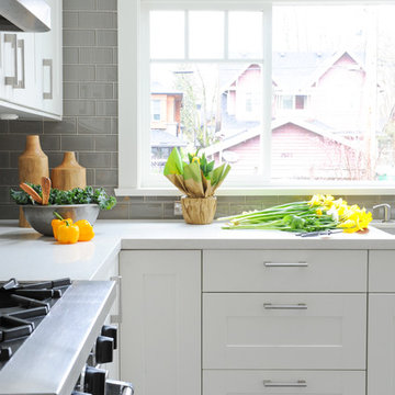
Our goal on this project was to make the main floor of this lovely early 20th century home in a popular Vancouver neighborhood work for a growing family of four. We opened up the space, both literally and aesthetically, with windows and skylights, an efficient layout, some carefully selected furniture pieces and a soft colour palette that lends a light and playful feel to the space. Our clients can hardly believe that their once small, dark, uncomfortable main floor has become a bright, functional and beautiful space where they can now comfortably host friends and hang out as a family. Interior Design by Lori Steeves of Simply Home Decorating Inc. Photos by Tracey Ayton Photography.
31