
Search results for "Meet specific" in Home Design Ideas
 Master Edge Homes
Layout and Scope of Work
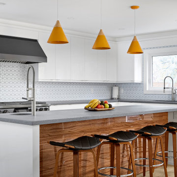
We ingeniously reimagined the original layout of the house to meet the homeowner's specific requirements. This extensive scope of work includes structural modifications, additions, and optimization of existing spaces to maximize functionality and establish a seamless flow within the home. We created significant and life-changing additional space without the extra time or expense of having to go through a minor variance with the city.
The kitchen was the main focus of the renovation and included a significant floorplan reconfiguration. The larger kitchen now boasts a spacious island, complete with a bar sink, microwave drawer, wine fridge, and high-end appliances. The addition of a quartz Caesarstone rugged concrete countertop and a striking rebel-tiled fireplace in the living room further accentuates the contemporary design on the main floor. The primary suite, encompassing a bedroom, a wet-style ensuite with heated floors, and a dressing room, showcases an open-concept layout. Upstairs, we expanded the family's living options and offered private places by adding a fourth upstairs bedroom and private home office.
 Klopf Architecture
Malibu Glass Box House by Klopf Architecture
Following the devastating Woolsey Fire of 2018, the site in Malibu offered a unique opportunity to rebuild not just a home, but a new architectural composition that highlighted the property’s potential while navigating strict fire-rebuild codes in the area. Designed by Klopf Architecture, this project embraced a set of limitations and translated them into an architectural asset.
The city’s fire-rebuild process required the new structure to remain close to the original footprint, size and bulk, a constraint that ultimately clarified the architectural direction. Perched near the front of a long, narrow lot, the new home frames and overlooks a private, park-like rear expanse, an uncommon luxury especially in this part of Malibu .
Without a fixed program, the design process allowed for a different kind of creative focus allowing Klopf Architecture the opportunity to explore how a modernist home could best respond to this site. The team approached the project not with a list of requirements, but with a question: How might a modernist live here? What spatial qualities would inspire calm, connection, and a sense of wonder in this setting? The process became less about problem-solving and more about architectural storytelling—letting the site, the light, and the principles of modern design guide the form and flow of the home.
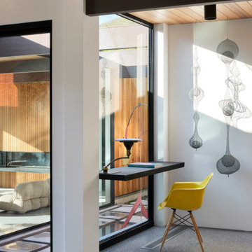
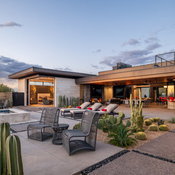
The response emerged in the form of a glass-box pavilion, an open, Mid-Century Modern inspired living, dining, and kitchen space that floats at the edge of the property’s natural descent. Connected to the more enclosed, private areas of the home by a glass-walled hallway, the living pavilion becomes a distinct centerpiece of the design. It opens on all four sides to the landscape with decks and patios on the flanks, an internal garden and water feature to the north, and a dramatic unguarded view of the expansive backyard and ocean horizon to the south.
Because of the mandated footprint, careful planning was required to ensure every space could still engage with light, landscape, or both. Strategic voids in the form of atriums and courtyards allow daylight to filter deep into the home’s core, while offering moments of surprise and retreat. These design gestures allow natural light to filter deep into the interior, creating a sense of brightness and openness throughout the day. At the same time, they expand the perceptual boundaries between inside and out, making the home feel more expansive while anchoring its connection to the surrounding landscape.
The siting of the house is what gives it its unique character. Rather than receding into the backyard like the neighboring homes, the house holds a slight prominence. From the central living pavilion, stepping down into the landscape feels more like entering a secluded park where a separate existing accessory structure, trail, and recreational areas await. The home’s modest street presence gives way to this unfolding drama of space, view, and nature.
Fire-resilient materials and assemblies are integrated seamlessly throughout including triple-pane glazing, under-slab and roof insulation, and locally sourced fire-rated cladding ensure the house not only meets Calfornia’s rigorous wildland-urban interface (WUI) standards, but feels effortlessly aligned with them. While technical decisions like fire-hardening and mechanical systems presented some construction challenges, particularly around the cantilevered glass box, the team found a functional compromise that preserved the integrity of the design.
Inside, a restrained palette and exposed post and beam design celebrate the ethos of mid-century modernism. A central circulation spine extends from the entry to the rear glass wall, offering a continuous visual link from street to ocean. Spaces such as the library and office, though more intimate in scale, are never cut off from nature as each opens to its own unique courtyard or garden view.
Though born out of a strict regulatory framework and developed without a specific client, the rebuild design unfolded with remarkable clarity. Grounded in site logic, refined by limitations and an emphasis on timeless spatial relationships – light, proportion, and a strong connection to nature, the resulting design feels both effortless and uplifting. The home lives lightly on the land, opens generously to its surroundings, and strikes a careful balance between privacy, openness, and calm. For Klopf Architecture, it stands as a compelling case study in how site, code, and circumstantial constraints can inspire enduring, modernist architecture. With years of experience reimagining mid-century modern design for how people live today, the firm took the project’s limitations as an opportunity. The result is a home shaped by open, flowing spaces, strong indoor-outdoor connections, and a calm, clear sense of structure. It’s a good reminder that even with strict constraints, there’s still room for architecture to breathe—and for modernism to keep moving forward.
Klopf Architecture project team: Geoff Campen, John Klopf, AIA, and Sherry Tan
Structural Engineer: ZFA
Contractor: Maison D’Artiste
Photography: ©2025 Mariko Reed
Year Completed: 2023
 Klopf Architecture
Malibu Glass Box House by Klopf Architecture
Following the devastating Woolsey Fire of 2018, the site in Malibu offered a unique opportunity to rebuild not just a home, but a new architectural composition that highlighted the property’s potential while navigating strict fire-rebuild codes in the area. Designed by Klopf Architecture, this project embraced a set of limitations and translated them into an architectural asset.
The city’s fire-rebuild process required the new structure to remain close to the original footprint, size and bulk, a constraint that ultimately clarified the architectural direction. Perched near the front of a long, narrow lot, the new home frames and overlooks a private, park-like rear expanse, an uncommon luxury especially in this part of Malibu .
Without a fixed program, the design process allowed for a different kind of creative focus allowing Klopf Architecture the opportunity to explore how a modernist home could best respond to this site. The team approached the project not with a list of requirements, but with a question: How might a modernist live here? What spatial qualities would inspire calm, connection, and a sense of wonder in this setting? The process became less about problem-solving and more about architectural storytelling—letting the site, the light, and the principles of modern design guide the form and flow of the home.
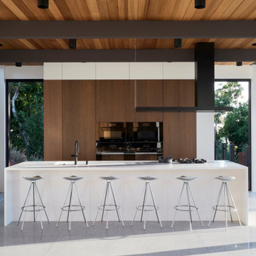
The response emerged in the form of a glass-box pavilion, an open, Mid-Century Modern inspired living, dining, and kitchen space that floats at the edge of the property’s natural descent. Connected to the more enclosed, private areas of the home by a glass-walled hallway, the living pavilion becomes a distinct centerpiece of the design. It opens on all four sides to the landscape with decks and patios on the flanks, an internal garden and water feature to the north, and a dramatic unguarded view of the expansive backyard and ocean horizon to the south.
Because of the mandated footprint, careful planning was required to ensure every space could still engage with light, landscape, or both. Strategic voids in the form of atriums and courtyards allow daylight to filter deep into the home’s core, while offering moments of surprise and retreat. These design gestures allow natural light to filter deep into the interior, creating a sense of brightness and openness throughout the day. At the same time, they expand the perceptual boundaries between inside and out, making the home feel more expansive while anchoring its connection to the surrounding landscape.
The siting of the house is what gives it its unique character. Rather than receding into the backyard like the neighboring homes, the house holds a slight prominence. From the central living pavilion, stepping down into the landscape feels more like entering a secluded park where a separate existing accessory structure, trail, and recreational areas await. The home’s modest street presence gives way to this unfolding drama of space, view, and nature.
Fire-resilient materials and assemblies are integrated seamlessly throughout including triple-pane glazing, under-slab and roof insulation, and locally sourced fire-rated cladding ensure the house not only meets Calfornia’s rigorous wildland-urban interface (WUI) standards, but feels effortlessly aligned with them. While technical decisions like fire-hardening and mechanical systems presented some construction challenges, particularly around the cantilevered glass box, the team found a functional compromise that preserved the integrity of the design.
Inside, a restrained palette and exposed post and beam design celebrate the ethos of mid-century modernism. A central circulation spine extends from the entry to the rear glass wall, offering a continuous visual link from street to ocean. Spaces such as the library and office, though more intimate in scale, are never cut off from nature as each opens to its own unique courtyard or garden view.
Though born out of a strict regulatory framework and developed without a specific client, the rebuild design unfolded with remarkable clarity. Grounded in site logic, refined by limitations and an emphasis on timeless spatial relationships – light, proportion, and a strong connection to nature, the resulting design feels both effortless and uplifting. The home lives lightly on the land, opens generously to its surroundings, and strikes a careful balance between privacy, openness, and calm. For Klopf Architecture, it stands as a compelling case study in how site, code, and circumstantial constraints can inspire enduring, modernist architecture. With years of experience reimagining mid-century modern design for how people live today, the firm took the project’s limitations as an opportunity. The result is a home shaped by open, flowing spaces, strong indoor-outdoor connections, and a calm, clear sense of structure. It’s a good reminder that even with strict constraints, there’s still room for architecture to breathe—and for modernism to keep moving forward.
Klopf Architecture project team: Geoff Campen, John Klopf, AIA, and Sherry Tan
Structural Engineer: ZFA
Contractor: Maison D’Artiste
Photography: ©2025 Mariko Reed
Year Completed: 2023
Find the right local pro for your project
 European Kitchen Center
✨ A masterpiece of modern luxury ✨
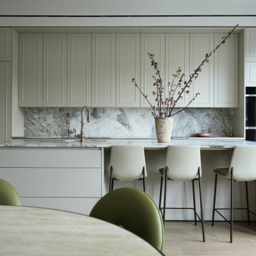
We’re proud to reveal our latest kitchen project made with the exclusive Italian brand, THE CUT KITCHENS — where sophistication meets function.
This custom-designed space features:
• High-end lacquered finishes in a timeless off-white tone
• Our signature rounded island design for flow and elegance
• Stunning natural quartzite countertops
• Fully paneled appliances for a seamless, minimalist look
• And a hidden passage door to a second kitchen — designed by us for both beauty and practicality
Every element was custom-made, crafted with precision and purpose, tailored specifically for our client’s lifestyle.
?Ready to create your own dream kitchen? Visit us at European Kitchen Center, and let’s bring your vision to life. Luxury starts here✨
 Feinmann, Inc.
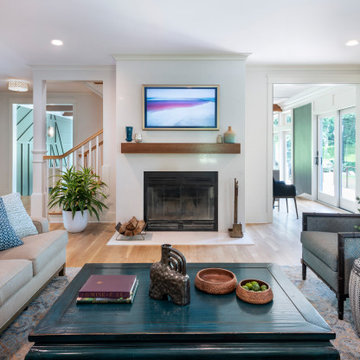
Whole-house remodel of a Lexington bungalow with a two-story garage addition, entertainment space, and luxurious primary suite.
Inspiration for a transitional living room remodel in Boston
Inspiration for a transitional living room remodel in Boston
 Lucvaa Kitchens
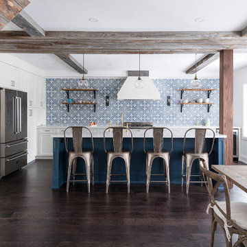
Cabinetry produced by Lucvaa Kitchens to meet the design specifications of JSA Kitchen & Bath and Super Seven Group Inc. design.
Inspiration for a mid-sized transitional l-shaped dark wood floor and brown floor kitchen remodel in Toronto with shaker cabinets, quartz countertops, blue backsplash, stainless steel appliances, an island, white countertops, an undermount sink and white cabinets
Inspiration for a mid-sized transitional l-shaped dark wood floor and brown floor kitchen remodel in Toronto with shaker cabinets, quartz countertops, blue backsplash, stainless steel appliances, an island, white countertops, an undermount sink and white cabinets
 Klopf Architecture
Malibu Glass Box House by Klopf Architecture
Following the devastating Woolsey Fire of 2018, the site in Malibu offered a unique opportunity to rebuild not just a home, but a new architectural composition that highlighted the property’s potential while navigating strict fire-rebuild codes in the area. Designed by Klopf Architecture, this project embraced a set of limitations and translated them into an architectural asset.
The city’s fire-rebuild process required the new structure to remain close to the original footprint, size and bulk, a constraint that ultimately clarified the architectural direction. Perched near the front of a long, narrow lot, the new home frames and overlooks a private, park-like rear expanse, an uncommon luxury especially in this part of Malibu .
Without a fixed program, the design process allowed for a different kind of creative focus allowing Klopf Architecture the opportunity to explore how a modernist home could best respond to this site. The team approached the project not with a list of requirements, but with a question: How might a modernist live here? What spatial qualities would inspire calm, connection, and a sense of wonder in this setting? The process became less about problem-solving and more about architectural storytelling—letting the site, the light, and the principles of modern design guide the form and flow of the home.
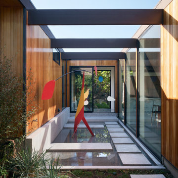
The response emerged in the form of a glass-box pavilion, an open, Mid-Century Modern inspired living, dining, and kitchen space that floats at the edge of the property’s natural descent. Connected to the more enclosed, private areas of the home by a glass-walled hallway, the living pavilion becomes a distinct centerpiece of the design. It opens on all four sides to the landscape with decks and patios on the flanks, an internal garden and water feature to the north, and a dramatic unguarded view of the expansive backyard and ocean horizon to the south.
Because of the mandated footprint, careful planning was required to ensure every space could still engage with light, landscape, or both. Strategic voids in the form of atriums and courtyards allow daylight to filter deep into the home’s core, while offering moments of surprise and retreat. These design gestures allow natural light to filter deep into the interior, creating a sense of brightness and openness throughout the day. At the same time, they expand the perceptual boundaries between inside and out, making the home feel more expansive while anchoring its connection to the surrounding landscape.
The siting of the house is what gives it its unique character. Rather than receding into the backyard like the neighboring homes, the house holds a slight prominence. From the central living pavilion, stepping down into the landscape feels more like entering a secluded park where a separate existing accessory structure, trail, and recreational areas await. The home’s modest street presence gives way to this unfolding drama of space, view, and nature.
Fire-resilient materials and assemblies are integrated seamlessly throughout including triple-pane glazing, under-slab and roof insulation, and locally sourced fire-rated cladding ensure the house not only meets Calfornia’s rigorous wildland-urban interface (WUI) standards, but feels effortlessly aligned with them. While technical decisions like fire-hardening and mechanical systems presented some construction challenges, particularly around the cantilevered glass box, the team found a functional compromise that preserved the integrity of the design.
Inside, a restrained palette and exposed post and beam design celebrate the ethos of mid-century modernism. A central circulation spine extends from the entry to the rear glass wall, offering a continuous visual link from street to ocean. Spaces such as the library and office, though more intimate in scale, are never cut off from nature as each opens to its own unique courtyard or garden view.
Though born out of a strict regulatory framework and developed without a specific client, the rebuild design unfolded with remarkable clarity. Grounded in site logic, refined by limitations and an emphasis on timeless spatial relationships – light, proportion, and a strong connection to nature, the resulting design feels both effortless and uplifting. The home lives lightly on the land, opens generously to its surroundings, and strikes a careful balance between privacy, openness, and calm. For Klopf Architecture, it stands as a compelling case study in how site, code, and circumstantial constraints can inspire enduring, modernist architecture. With years of experience reimagining mid-century modern design for how people live today, the firm took the project’s limitations as an opportunity. The result is a home shaped by open, flowing spaces, strong indoor-outdoor connections, and a calm, clear sense of structure. It’s a good reminder that even with strict constraints, there’s still room for architecture to breathe—and for modernism to keep moving forward.
Klopf Architecture project team: Geoff Campen, John Klopf, AIA, and Sherry Tan
Structural Engineer: ZFA
Contractor: Maison D’Artiste
Photography: ©2025 Mariko Reed
Year Completed: 2023
Sponsored
Sunbury, OH

J.Holderby - Renovations
Franklin County's Leading General Contractors - 2X Best of Houzz!

 Kitchen Design Concepts
Guest bathroom remodel in Dallas, TX by Kitchen Design Concepts.
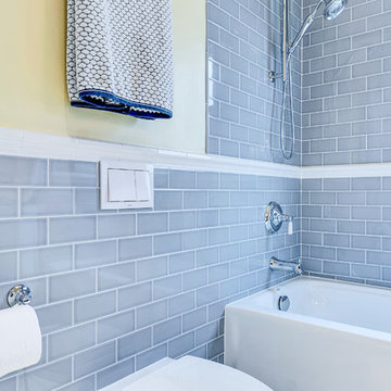
This Girl's Bath features cabinetry by WW Woods Eclipse with a square flat panel door style, maple construction, and a finish of Arctic paint with a Slate Highlight / Brushed finish. Hand towel holder, towel bar and toilet tissue holder from Kohler Bancroft Collection in polished chrome. Heated mirror over vanity with interior storage and lighting. Tile -- Renaissance 2x2 Hex White tile, Matte finish in a straight lay; Daltile Rittenhouse Square Cove 3x6 Tile K101 White as base mold throughout; Arizona Tile H-Line Series 3x6 Denim Glossy in a brick lay up the wall, window casing and built-in niche and matching curb and bullnose pieces. Countertop -- 3 cm Caesarstone Frosty Carina. Vanity sink -- Toto Undercounter Lavatory with SanaGloss Cotton. Vanity faucet-- Widespread faucet with White ceramic lever handles. Tub filler - Kohler Devonshire non-diverter bath spout polished chrome. Shower control – Kohler Bancroft valve trim with white ceramic lever handles. Hand Shower & Slider Bar - one multifunction handshower with Slide Bar. Commode - Toto Maris Wall-Hung Dual-Flush Toilet Cotton w/ Rectangular Push Plate Dual Button White.
Photos by Unique Exposure Photography
 Alair Homes Plano
Our clients called us wanting to not only update their master bathroom but to specifically make it more functional. She had just had knee surgery, so taking a shower wasn’t easy. They wanted to remove the tub and enlarge the shower, as much as possible, and add a bench. She really wanted a seated makeup vanity area, too. They wanted to replace all vanity cabinets making them one height, and possibly add tower storage. With the current layout, they felt that there were too many doors, so we discussed possibly using a barn door to the bedroom.
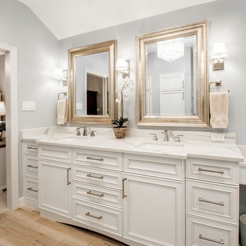
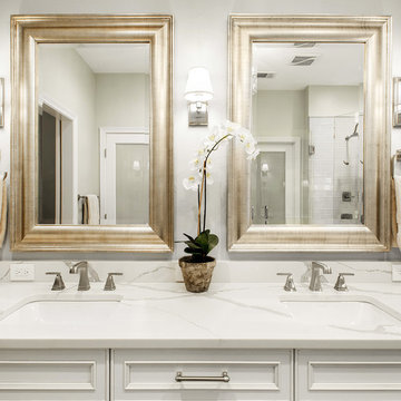
We removed the large oval bathtub and expanded the shower, with an added bench. She got her seated makeup vanity and it’s placed between the shower and the window, right where she wanted it by the natural light. A tilting oval mirror sits above the makeup vanity flanked with Pottery Barn “Hayden” brushed nickel vanity lights. A lit swing arm makeup mirror was installed, making for a perfect makeup vanity! New taller Shiloh “Eclipse” bathroom cabinets painted in Polar with Slate highlights were installed (all at one height), with Kohler “Caxton” square double sinks. Two large beautiful mirrors are hung above each sink, again, flanked with Pottery Barn “Hayden” brushed nickel vanity lights on either side. Beautiful Quartzmasters Polished Calacutta Borghini countertops were installed on both vanities, as well as the shower bench top and shower wall cap.
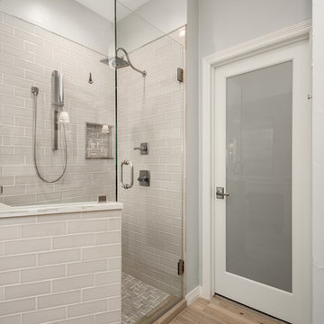
Carrara Valentino basketweave mosaic marble tiles was installed on the shower floor and the back of the niches, while Heirloom Clay 3x9 tile was installed on the shower walls. A Delta Shower System was installed with both a hand held shower and a rainshower. The linen closet that used to have a standard door opening into the middle of the bathroom is now storage cabinets, with the classic Restoration Hardware “Campaign” pulls on the drawers and doors. A beautiful Birch forest gray 6”x 36” floor tile, laid in a random offset pattern was installed for an updated look on the floor. New glass paneled doors were installed to the closet and the water closet, matching the barn door. A gorgeous Shades of Light 20” “Pyramid Crystals” chandelier was hung in the center of the bathroom to top it all off!
The bedroom was painted a soothing Magnetic Gray and a classic updated Capital Lighting “Harlow” Chandelier was hung for an updated look.
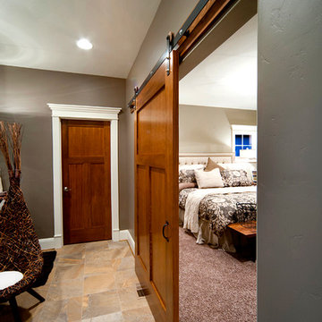
We were able to meet all of our clients needs by removing the tub, enlarging the shower, installing the seated makeup vanity, by the natural light, right were she wanted it and by installing a beautiful barn door between the bathroom from the bedroom! Not only is it beautiful, but it’s more functional for them now and they love it!
Design/Remodel by Hatfield Builders & Remodelers | Photography by Versatile Imaging
 Winsome Construction
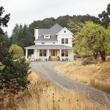
Tucked away in the countryside with a backdrop of big, beautiful trees, this modern farmhouse is a beloved escape from the hustle and bustle of life.
 Alair Homes Plano
Our clients called us wanting to not only update their master bathroom but to specifically make it more functional. She had just had knee surgery, so taking a shower wasn’t easy. They wanted to remove the tub and enlarge the shower, as much as possible, and add a bench. She really wanted a seated makeup vanity area, too. They wanted to replace all vanity cabinets making them one height, and possibly add tower storage. With the current layout, they felt that there were too many doors, so we discussed possibly using a barn door to the bedroom.
We removed the large oval bathtub and expanded the shower, with an added bench. She got her seated makeup vanity and it’s placed between the shower and the window, right where she wanted it by the natural light. A tilting oval mirror sits above the makeup vanity flanked with Pottery Barn “Hayden” brushed nickel vanity lights. A lit swing arm makeup mirror was installed, making for a perfect makeup vanity! New taller Shiloh “Eclipse” bathroom cabinets painted in Polar with Slate highlights were installed (all at one height), with Kohler “Caxton” square double sinks. Two large beautiful mirrors are hung above each sink, again, flanked with Pottery Barn “Hayden” brushed nickel vanity lights on either side. Beautiful Quartzmasters Polished Calacutta Borghini countertops were installed on both vanities, as well as the shower bench top and shower wall cap.
Carrara Valentino basketweave mosaic marble tiles was installed on the shower floor and the back of the niches, while Heirloom Clay 3x9 tile was installed on the shower walls. A Delta Shower System was installed with both a hand held shower and a rainshower. The linen closet that used to have a standard door opening into the middle of the bathroom is now storage cabinets, with the classic Restoration Hardware “Campaign” pulls on the drawers and doors. A beautiful Birch forest gray 6”x 36” floor tile, laid in a random offset pattern was installed for an updated look on the floor. New glass paneled doors were installed to the closet and the water closet, matching the barn door. A gorgeous Shades of Light 20” “Pyramid Crystals” chandelier was hung in the center of the bathroom to top it all off!
The bedroom was painted a soothing Magnetic Gray and a classic updated Capital Lighting “Harlow” Chandelier was hung for an updated look.
We were able to meet all of our clients needs by removing the tub, enlarging the shower, installing the seated makeup vanity, by the natural light, right were she wanted it and by installing a beautiful barn door between the bathroom from the bedroom! Not only is it beautiful, but it’s more functional for them now and they love it!
Design/Remodel by Hatfield Builders & Remodelers | Photography by Versatile Imaging
 Alair Homes Plano
Our clients called us wanting to not only update their master bathroom but to specifically make it more functional. She had just had knee surgery, so taking a shower wasn’t easy. They wanted to remove the tub and enlarge the shower, as much as possible, and add a bench. She really wanted a seated makeup vanity area, too. They wanted to replace all vanity cabinets making them one height, and possibly add tower storage. With the current layout, they felt that there were too many doors, so we discussed possibly using a barn door to the bedroom.
We removed the large oval bathtub and expanded the shower, with an added bench. She got her seated makeup vanity and it’s placed between the shower and the window, right where she wanted it by the natural light. A tilting oval mirror sits above the makeup vanity flanked with Pottery Barn “Hayden” brushed nickel vanity lights. A lit swing arm makeup mirror was installed, making for a perfect makeup vanity! New taller Shiloh “Eclipse” bathroom cabinets painted in Polar with Slate highlights were installed (all at one height), with Kohler “Caxton” square double sinks. Two large beautiful mirrors are hung above each sink, again, flanked with Pottery Barn “Hayden” brushed nickel vanity lights on either side. Beautiful Quartzmasters Polished Calacutta Borghini countertops were installed on both vanities, as well as the shower bench top and shower wall cap.
Carrara Valentino basketweave mosaic marble tiles was installed on the shower floor and the back of the niches, while Heirloom Clay 3x9 tile was installed on the shower walls. A Delta Shower System was installed with both a hand held shower and a rainshower. The linen closet that used to have a standard door opening into the middle of the bathroom is now storage cabinets, with the classic Restoration Hardware “Campaign” pulls on the drawers and doors. A beautiful Birch forest gray 6”x 36” floor tile, laid in a random offset pattern was installed for an updated look on the floor. New glass paneled doors were installed to the closet and the water closet, matching the barn door. A gorgeous Shades of Light 20” “Pyramid Crystals” chandelier was hung in the center of the bathroom to top it all off!
The bedroom was painted a soothing Magnetic Gray and a classic updated Capital Lighting “Harlow” Chandelier was hung for an updated look.
We were able to meet all of our clients needs by removing the tub, enlarging the shower, installing the seated makeup vanity, by the natural light, right were she wanted it and by installing a beautiful barn door between the bathroom from the bedroom! Not only is it beautiful, but it’s more functional for them now and they love it!
Design/Remodel by Hatfield Builders & Remodelers | Photography by Versatile Imaging
Sponsored
Sunbury, OH
J.Holderby - Renovations
Franklin County's Leading General Contractors - 2X Best of Houzz!

 Klopf Architecture
Klopf Architecture and Outer space Landscape Architects designed a new warm, modern, open, indoor-outdoor home in Los Altos, California. Inspired by mid-century modern homes but looking for something completely new and custom, the owners, a couple with two children, bought an older ranch style home with the intention of replacing it.
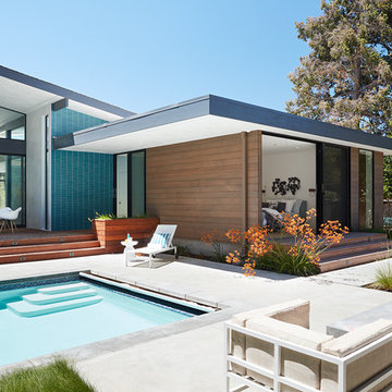
Created on a grid, the house is designed to be at rest with differentiated spaces for activities; living, playing, cooking, dining and a piano space. The low-sloping gable roof over the great room brings a grand feeling to the space. The clerestory windows at the high sloping roof make the grand space light and airy.
Upon entering the house, an open atrium entry in the middle of the house provides light and nature to the great room. The Heath tile wall at the back of the atrium blocks direct view of the rear yard from the entry door for privacy.
The bedrooms, bathrooms, play room and the sitting room are under flat wing-like roofs that balance on either side of the low sloping gable roof of the main space. Large sliding glass panels and pocketing glass doors foster openness to the front and back yards. In the front there is a fenced-in play space connected to the play room, creating an indoor-outdoor play space that could change in use over the years. The play room can also be closed off from the great room with a large pocketing door. In the rear, everything opens up to a deck overlooking a pool where the family can come together outdoors.
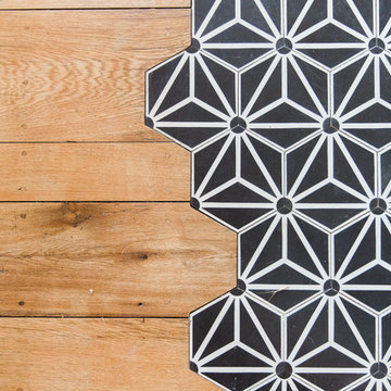
Wood siding travels from exterior to interior, accentuating the indoor-outdoor nature of the house. Where the exterior siding doesn’t come inside, a palette of white oak floors, white walls, walnut cabinetry, and dark window frames ties all the spaces together to create a uniform feeling and flow throughout the house. The custom cabinetry matches the minimal joinery of the rest of the house, a trim-less, minimal appearance. Wood siding was mitered in the corners, including where siding meets the interior drywall. Wall materials were held up off the floor with a minimal reveal. This tight detailing gives a sense of cleanliness to the house.
The garage door of the house is completely flush and of the same material as the garage wall, de-emphasizing the garage door and making the street presentation of the house kinder to the neighborhood.
The house is akin to a custom, modern-day Eichler home in many ways. Inspired by mid-century modern homes with today’s materials, approaches, standards, and technologies. The goals were to create an indoor-outdoor home that was energy-efficient, light and flexible for young children to grow. This 3,000 square foot, 3 bedroom, 2.5 bathroom new house is located in Los Altos in the heart of the Silicon Valley.
Klopf Architecture Project Team: John Klopf, AIA, and Chuang-Ming Liu
Landscape Architect: Outer space Landscape Architects
Structural Engineer: ZFA Structural Engineers
Staging: Da Lusso Design
Photography ©2018 Mariko Reed
Location: Los Altos, CA
Year completed: 2017
 Collaborative Design + ARCH406
Phil Bell
Inspiration for a small cottage master bedroom remodel in Other with gray walls and no fireplace
Inspiration for a small cottage master bedroom remodel in Other with gray walls and no fireplace
 TKS Design Group
Free ebook, Creating the Ideal Kitchen. DOWNLOAD NOW
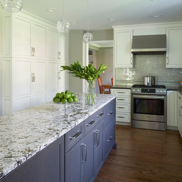
The homeowners of this mid-century Colonial and family of four were frustrated with the layout of their existing kitchen which was a small, narrow peninsula layout but that was adjoining a large space that they could not figure out how to use. Stealing part of the unused space seemed like an easy solution, except that there was an existing transition in floor height which made that a bit tricky. The solution of bringing the floor height up to meet the height of the existing kitchen allowed us to do just that.
This solution also offered some challenges. The exterior door had to be raised which resulted in some exterior rework, and the floor transition had to happen somewhere to get out to the garage, so we ended up “pushing” it towards what is now a new mudroom and powder room area. This solution allows for a small but functional and hidden mudroom area and more private powder room situation.
Another challenge of the design was the very narrow space. To minimize issues with this, we moved the location of the refrigerator into the newly found space which gave us an L-shaped layout allowing for an island and even some shallow pantry storage. The windows over the kitchen sink were expanded in size and relocated to allow more light into the room. A breakfast table fits perfectly in the area adjacent to the existing French doors and there was even room for a small bar area that helps transition from inside to outside for entertaining. The confusing unused space now makes sense and provides functionality on a daily basis.
To help bring some calm to this busy family, a pallet of soft neutrals was chosen -- gray glass tile with a simple metal accent strip, clear modern pendant lights and a neutral color scheme for cabinetry and countertops.
For more information on kitchen and bath design ideas go to: www.kitchenstudio-ge.com
Sponsored
Columbus, OH

Trish Takacs Design
Award Winning & Highly Skilled Kitchen & Bath Designer in Columbus
 50 Degrees North Architects
Overview
Extension and complete refurbishment.
The Brief
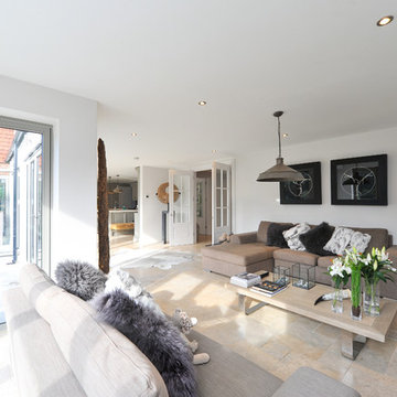
The existing house had very shallow rooms with a need for more depth throughout the property by extending into the rear garden which is large and south facing. We were to look at extending to the rear and to the end of the property, where we had redundant garden space, to maximise the footprint and yield a series of WOW factor spaces maximising the value of the house.
The brief requested 4 bedrooms plus a luxurious guest space with separate access; large, open plan living spaces with large kitchen/entertaining area, utility and larder; family bathroom space and a high specification ensuite to two bedrooms. In addition, we were to create balconies overlooking a beautiful garden and design a ‘kerb appeal’ frontage facing the sought-after street location.
Buildings of this age lend themselves to use of natural materials like handmade tiles, good quality bricks and external insulation/render systems with timber windows. We specified high quality materials to achieve a highly desirable look which has become a hit on Houzz.
Our Solution
One of our specialisms is the refurbishment and extension of detached 1930’s properties.
Taking the existing small rooms and lack of relationship to a large garden we added a double height rear extension to both ends of the plan and a new garage annex with guest suite.
We wanted to create a view of, and route to the garden from the front door and a series of living spaces to meet our client’s needs. The front of the building needed a fresh approach to the ordinary palette of materials and we re-glazed throughout working closely with a great build team.
 Inside Out
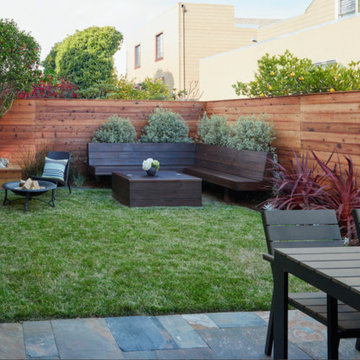
Inspiration for a mid-sized modern backyard tile patio remodel in San Francisco with a fire pit and no cover

46