
Search results for "Meeting" in Home Design Ideas

 Dura Supreme Cabinetry
This modern farmhouse kitchen features a beautiful combination of Navy Blue painted and gray stained Hickory cabinets that’s sure to be an eye-catcher. The elegant “Morel” stain blends and harmonizes the natural Hickory wood grain while emphasizing the grain with a subtle gray tone that beautifully coordinated with the cool, deep blue paint.
The “Gale Force” SW 7605 blue paint from Sherwin-Williams is a stunning deep blue paint color that is sophisticated, fun, and creative. It’s a stunning statement-making color that’s sure to be a classic for years to come and represents the latest in color trends. It’s no surprise this beautiful navy blue has been a part of Dura Supreme’s Curated Color Collection for several years, making the top 6 colors for 2017 through 2020.
Beyond the beautiful exterior, there is so much well-thought-out storage and function behind each and every cabinet door. The two beautiful blue countertop towers that frame the modern wood hood and cooktop are two intricately designed larder cabinets built to meet the homeowner’s exact needs.
The larder cabinet on the left is designed as a beverage center with apothecary drawers designed for housing beverage stir sticks, sugar packets, creamers, and other misc. coffee and home bar supplies. A wine glass rack and shelves provides optimal storage for a full collection of glassware while a power supply in the back helps power coffee & espresso (machines, blenders, grinders and other small appliances that could be used for daily beverage creations. The roll-out shelf makes it easier to fill clean and operate each appliance while also making it easy to put away. Pocket doors tuck out of the way and into the cabinet so you can easily leave open for your household or guests to access, but easily shut the cabinet doors and conceal when you’re ready to tidy up.
Beneath the beverage center larder is a drawer designed with 2 layers of multi-tasking storage for utensils and additional beverage supplies storage with space for tea packets, and a full drawer of K-Cup storage. The cabinet below uses powered roll-out shelves to create the perfect breakfast center with power for a toaster and divided storage to organize all the daily fixings and pantry items the household needs for their morning routine.
On the right, the second larder is the ultimate hub and center for the homeowner’s baking tasks. A wide roll-out shelf helps store heavy small appliances like a KitchenAid Mixer while making them easy to use, clean, and put away. Shelves and a set of apothecary drawers help house an assortment of baking tools, ingredients, mixing bowls and cookbooks. Beneath the counter a drawer and a set of roll-out shelves in various heights provides more easy access storage for pantry items, misc. baking accessories, rolling pins, mixing bowls, and more.
The kitchen island provides a large worktop, seating for 3-4 guests, and even more storage! The back of the island includes an appliance lift cabinet used for a sewing machine for the homeowner’s beloved hobby, a deep drawer built for organizing a full collection of dishware, a waste recycling bin, and more!
All and all this kitchen is as functional as it is beautiful!
Request a FREE Dura Supreme Brochure Packet:
http://www.durasupreme.com/request-brochure


 Robeson Design
With the homeowner’s guests in mind, Interior Designer Rebecca Robeson transforms an outdated and cramped Guest Bathroom into a modern, luxury space by replacing a tiny pedestal sink with a custom built vanity providing much needed storage in a small bathroom. Making every inch count, the vanity is complete with deep storage drawers on soft-close hinges. Contemporary drawer pulls provide stylish, easy-open convenience. A petite under-mount sink allows for maximum countertop space in gleaming white marble, tying in the beautiful laser cut, oval shape stone pieces placed horizontally, Rebecca chose grey grout to surround each piece, giving it an embedded look. Carrying the feature wall from the toilet on into the back wall of the shower, this once tiny bathroom (painted red) gets a new lease on life!
Rebecca’s creative solution to the lack of usable surface space was to design a custom ceiling mounted shelving unit above the toilet. Shown here, it's used for well-appointed accessory pieces but when necessary, can also serve the functional needs of guests for makeup bags, shaving kits, perfume and toiletries.
Smoked glass shelves hang on stainless steel cables, suspended from the ceiling. Custom doors by Earthwood Custom Remodeling, complete the modern clean look in this Bathroom.
Earthwood Custom Remodeling, Inc.
Exquisite Kitchen Design
Tech Lighting - Black Whale Lighting
Photos by Ryan Garvin Photography
Find the right local pro for your project

 Blackfish Homes Ltd.
www.emapeter.com
Example of a mid-sized trendy built-in desk light wood floor and beige floor study room design in Vancouver with white walls and no fireplace
Example of a mid-sized trendy built-in desk light wood floor and beige floor study room design in Vancouver with white walls and no fireplace

 Square Footage
Example of a classic formal and open concept dark wood floor living room design in Los Angeles with beige walls, a standard fireplace and a wall-mounted tv
 FineLine Kitchens, Inc.
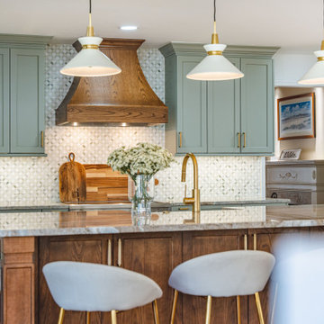
Hi everyone, I'm Sarah and Ogun we are here with fine line kitchens. So we are a couple working together. I do the interior design and remodeling of the space material selection meeting with the clients. And I handled operations outside, you know meaning all the construction work that is taking place the inside. The houses that we work in. I handle all the aspects of the construction, so today's project is very special. We're in Vienna and the client had a very big family. It's a family of seven that lives here. So we had a few aspects that we needed to keep in mind while designing this one. Having everybody be able to sit on the island. So we wanted plenty of seating all the way around. We didn't want anybody standing or anything like that. So what we did is we maximize the space. The center island is the biggest part of the kitchen. We use a natural stone to kind of give it a beautiful texture versus quartz. It's kind of standard white or kind of fabricated, so I wanted something very natural. We did this because I took my inspiration from the outside, so the inspiration if you look at the view right in front of me is there are so many greens there's a lot of brass accents and I wanted to bring this. Into this kitchen while designing it for my clients. She is very warm very. She wanted a very homey, comfy kind of look for the kitchen. So that's what we did today. As you can see, the cabinets are sage green, very light, so I still think it's a neutral, but it's a lighter color that again brings the outside in and we combine that with the oak right behind me so it's a slightly warm oak. It's not very dark. It's not very light. It's a medium brown and the same color went on the island. To kind of tie these two in and the backsplash, my favorite part is where you can see a little bit of design. It is, in my opinion still classic, but includes a pattern so the outside part is as we said in the beginning, is handled by my husband. I'd like him to speak a little bit about that. Thanks, Sarah, I want to talk to you guys a little bit about the construction part of this project. Originally this kitchen was located mostly in this area. They had their stove there sing. It was more of a peninsula layout in Sarah's and the customer vision they wanted. They wanted to get rid of the peninsula and they want to be able to have a huge island that can at least sit seven people because they're familiar with seven. So we wanted to make sure that we can achieve this design and bring it to life so that they can be happy with this layout. Some of the challenges we had, the house, the home being, you know, old home. There were a lot of you know the older electrical and plumbing that had to be replaced. We had to relocate the stove from here to this area. Over here we had put a nice foot fan that we had to relocate all the ductwork and the plumbing. Was being on the peninsula area. We had to relocate it to the center islands. So we achieved all this and kind of like bring it to bring in this kitchen up to date it looks beautiful. That's true, so yes, the old layout did not function for my clients because everything was kind of gathered on one side of the kitchen. So there was like a peninsula right there. So the end of this island kind of continued straight. And that was just the L shape. Kind of where everything was and there used to be another big table here, so they were using only kind of half of the space. So like I said at the beginning, our vision was to kind of feed everybody at the island, create some symmetry. 'cause I love that. So as you can see behind me, this is kind of the focal point symmetrical. Everything is kind of even we wanted to also panel the fridge here so it mimics the pantry and another size. So when you're looking at it, it is bringing again that symmetry back again. I hope you enjoyed this kitchen and this video and I'll see you soon. So how do you think this project turned out? It's nice. I like the color. I think it turned out nice. It's kind of like a little bit different color than what we always do. So I realize. Are you giving me a little bit of credit here that I did something different? Are you proud? I'm so proud of you. Other than that I like it. That they have kind of like a two sink. So if this was our kitchen, if we ever like you can have your own. I can have mine if we ever get into a fight then this can be like my own kitchen. Why are we gonna bring in a fight right now? So I'm cooking anyway. You're grilling most of the time, So what are you even talking about? My kitchen? That's my kitchen. You can just take the small sink. That's fine. It's always good to have your own space right there, so anyways. Thank you guys for watching. We hope to see you soon and if you have any questions please click the link below. It'll lead you to our website, house, YouTube and all of the social media is so nice to have you guys. We'll see you soon. Thanks bye bye-bye.

 Paragon Custom Builders
Opening the pocketing steel lift and slide doors allows nature into this Master Bedroom.
Example of a mid-sized country master medium tone wood floor and brown floor bedroom design in San Francisco with white walls
Example of a mid-sized country master medium tone wood floor and brown floor bedroom design in San Francisco with white walls
Sponsored
Sunbury, OH

J.Holderby - Renovations
Franklin County's Leading General Contractors - 2X Best of Houzz!


 Casey St. John Interiors
Powder room - coastal powder room idea in Denver with a pedestal sink and white walls

 TKS Design Group
Free ebook, Creating the Ideal Kitchen. DOWNLOAD NOW
Our clients and their three teenage kids had outgrown the footprint of their existing home and felt they needed some space to spread out. They came in with a couple of sets of drawings from different architects that were not quite what they were looking for, so we set out to really listen and try to provide a design that would meet their objectives given what the space could offer.
We started by agreeing that a bump out was the best way to go and then decided on the size and the floor plan locations of the mudroom, powder room and butler pantry which were all part of the project. We also planned for an eat-in banquette that is neatly tucked into the corner and surrounded by windows providing a lovely spot for daily meals.
The kitchen itself is L-shaped with the refrigerator and range along one wall, and the new sink along the exterior wall with a large window overlooking the backyard. A large island, with seating for five, houses a prep sink and microwave. A new opening space between the kitchen and dining room includes a butler pantry/bar in one section and a large kitchen pantry in the other. Through the door to the left of the main sink is access to the new mudroom and powder room and existing attached garage.
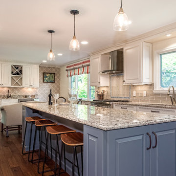
White inset cabinets, quartzite countertops, subway tile and nickel accents provide a traditional feel. The gray island is a needed contrast to the dark wood flooring. Last but not least, professional appliances provide the tools of the trade needed to make this one hardworking kitchen.
Designed by: Susan Klimala, CKD, CBD
Photography by: Mike Kaskel
For more information on kitchen and bath design ideas go to: www.kitchenstudio-ge.com

 Hermitage Kitchen Gallery LLC
Designer: Terri Sears
Photography: Melissa M. Mills
Example of a mid-sized 1950s u-shaped light wood floor and brown floor eat-in kitchen design in Nashville with an undermount sink, flat-panel cabinets, medium tone wood cabinets, quartz countertops, beige backsplash, mosaic tile backsplash, stainless steel appliances, a peninsula and beige countertops
Example of a mid-sized 1950s u-shaped light wood floor and brown floor eat-in kitchen design in Nashville with an undermount sink, flat-panel cabinets, medium tone wood cabinets, quartz countertops, beige backsplash, mosaic tile backsplash, stainless steel appliances, a peninsula and beige countertops

 Megan Hansen
Photo: Megan Hansen © 2017 Houzz
Inspiration for a contemporary backyard patio remodel in San Francisco with no cover and a bbq area
Inspiration for a contemporary backyard patio remodel in San Francisco with no cover and a bbq area
Sponsored
Sunbury, OH
J.Holderby - Renovations
Franklin County's Leading General Contractors - 2X Best of Houzz!



 Chairma Design Group
Example of a small transitional l-shaped medium tone wood floor and brown floor dedicated laundry room design in Houston with shaker cabinets, gray cabinets, yellow walls, a side-by-side washer/dryer, white countertops and an undermount sink

 Peppertree Kitchen & Bath
Example of a large transitional l-shaped light wood floor and beige floor eat-in kitchen design in Salt Lake City with an undermount sink, shaker cabinets, quartz countertops, white backsplash, porcelain backsplash, stainless steel appliances, two islands and light wood cabinets
Sponsored
Columbus, OH

Trish Takacs Design
Award Winning & Highly Skilled Kitchen & Bath Designer in Columbus
 TKS Design Group
Free ebook, Creating the Ideal Kitchen. DOWNLOAD NOW
One of my favorite things to work on is older homes with a bit of history because I find it an interesting challenge to marry the historical architectural features of a home with modern design elements that work well for my client’s current lifestyle.
This home was particularly fun because it was the second kitchen we had done for this family and was quite a departure from the style of the first kitchen.
The before shot of the kitchen shows a view from the family room. See the dropped ceiling? We were curious, was this just part of the design or was the dropped ceiling there to hide mechanicals? Well we soon found out that it was mostly decorative (yay!), and with the exception of a little bit of work to some plumbing from an upstairs bathroom and rerouting of the ventilation system within the original floor joists, we were in the clear, phew! The shot of the completed kitchen from roughly the same vantage point shows how much taller the ceilings are. It makes a huge difference in the feel of the space. Dark and gloomy turned fresh and light!
Another serious consideration was what do we do with the skinny transom window above the refrigerator. After much back and forth, we decided to eliminate it and do some open shelving instead. This ended up being one of the nicest areas in the room. I am calling it the “fun zone” because it houses all the barware, wine cubbies and a bar fridge — the perfect little buffet spot for entertaining. It is flanked on either side by pull out pantries that I’m sure will get a ton of use. Since the neighboring room has literally three walls of almost full height windows, the kitchen gets plenty of light.
The gold shelving brackets, large pendant fixtures over the island and the tile mural behind the range all pay subtle homage to the home’s prairie style architecture and bring a bit of sparkle to the room.
Even though the room is quite large, the work triangle is very tight with the large Subzero fridge, sink and range all nearby for easy maneuvering during meal prep. There is seating for four at the island, and work aisles are generous.
Designed by: Susan Klimala, CKD, CBD
Photography by: LOMA Studios
For more information on kitchen and bath design ideas go to: www.kitchenstudio-ge.com

 Visbeen Architects
The Cicero is a modern styled home for today’s contemporary lifestyle. It features sweeping facades with deep overhangs, tall windows, and grand outdoor patio. The contemporary lifestyle is reinforced through a visually connected array of communal spaces. The kitchen features a symmetrical plan with large island and is connected to the dining room through a wide opening flanked by custom cabinetry. Adjacent to the kitchen, the living and sitting rooms are connected to one another by a see-through fireplace. The communal nature of this plan is reinforced downstairs with a lavish wet-bar and roomy living space, perfect for entertaining guests. Lastly, with vaulted ceilings and grand vistas, the master suite serves as a cozy retreat from today’s busy lifestyle.
Photographer: Brad Gillette

39