
Search results for "Minimum" in Home Design Ideas
 Granger Remodel & Design
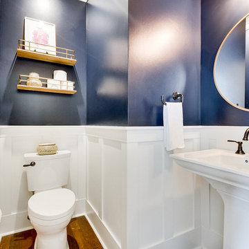
A gorgeous half bath we remodeled in Frisco. Please view our website for a write up and before pictures.
Inspiration for a small timeless white tile dark wood floor and brown floor powder room remodel in Dallas with shaker cabinets, white cabinets, a two-piece toilet, blue walls, a pedestal sink and white countertops
Inspiration for a small timeless white tile dark wood floor and brown floor powder room remodel in Dallas with shaker cabinets, white cabinets, a two-piece toilet, blue walls, a pedestal sink and white countertops
 Framestudio
c david wakely
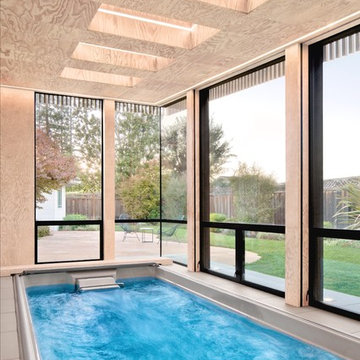
Pool house - small modern indoor rectangular pool house idea in San Francisco
Pool house - small modern indoor rectangular pool house idea in San Francisco
 MASHstudios
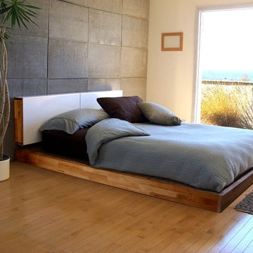
Rest in style. This no-frills bed is designed low to the ground and with a bare minimum of components. An additional wall-mounted headboard with sliding aluminum panels double as a storage space to keep bedside miscellany out of sight.
Find the right local pro for your project
 alairhomesdecatur
Photos by Jeff Herr Photography
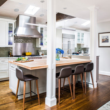
Kitchen - transitional medium tone wood floor kitchen idea in Atlanta with wood countertops and an island
Kitchen - transitional medium tone wood floor kitchen idea in Atlanta with wood countertops and an island
 TOC design & construction inc.
DESIGNED BY TOC design
CONSTRUCTION BY TOC design & Construction inc.
PHOTOS BY : Tania Scardellato
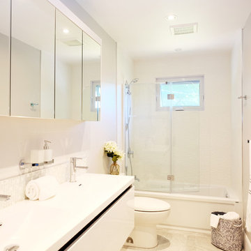
I was fortunate to have a young family approach me in desperate need to renovate there only 3 piece bathroom. This space was In dire need of a remodel, with old brown wall to wall tiles and a dated bulky yellow brown single sink vanity.
Storage was a must, lighting a necessity, and proper accessibility to the shower bath area.
We had a tight budget to respect, but a full gut of this bathroom was required. And a good thing too, once we started doing the demolition we noticed that mildew and rotting floors and walls had accumulated throughout the years. Doing it right the first time is no joke when dealing with water and electrical issues.
We discarded all reminisce of old and built from scratch, new walls, new plumbing, new electrical ,new insulation and a new window, a new fan that actually exhausted outside ( I say this laughing as you would be amazed at how many fans are installed but don’t exhaust outside, and you the client would never know unless you go inside the attic space.
Once all the hard stuff was done, the rest is just a matter of smart design. If you have a small bathroom here are some tips to guide you.
10 tips for making a small bathroom feel larger
Is your tiny bathroom cramping your functionality and style, leaving you longing for the enormous bathrooms gracing the pages of design magazines? Even if your bathroom is a fraction of the size, all it takes is some design savvy to make the most of the space you have. Consider these 10 smart tips that will help your bathroom look, feel and function like those larger contenders.
1-Get creative with corners
Space is at a premium in small bathrooms, so it's important to maximize every inch. Corners, for example, provide extra space for shelving, storage units and even hooks. Get creative and install unique design solutions that are not only functional, but also eye-catching. If you love the airiness of floating cabinets, add baskets or decorative boxes under for extra storage. If you are installing floating cabinets insure that they are installed securely to studs or plywood at wall.
2- Let solid colors shine
Busy patterns have a shrinking effect and make small bathrooms seem even smaller. Conversely, light natural hues make a space feel more open. If you're itching to get creative with design, experiment with textures but keep overpowering patterns to a minimum. Tone on tone is the best to achieve this.
3 - Maximize your bathtub
A bathtub takes up a significant portion of the room, but modern, compact options with curved basins, can make the tub feel larger when in use, all while conserving space.
4 - Select a smaller faucet
A faucet is jewelry for the bathroom. And just as accessories can overpower an outfit, a big bulky faucet isn't flattering in a small bath. Single-handle designs conserve counter space, while a wall-mount installation frees it up all together and can create quite the wow-factor, if the budget can accommodate the required changes to plumbing behind the wall.
5 - Make vanity storage simple
If you're in a storage war with your small bathroom, you're not alone in the battle. Toiletries and personal supplies without a place to call home only add clutter and chaos. Store smart with a space-saving vanity, the dual sink vanity shown here, looks quite simple, but in reality it has 4 sets of full extension drawers, and the vanity tower adds extra storage without overpowering the use of space.
6 - Show off the shower
Shower curtains may be pretty, but they interrupt the visual flow of a bathing space and make it feel significantly smaller. In bathrooms with small footprints, opt for a clear glass sliding shower door that doesn't require the clearance of one with a hinged design. Or as shown in this design and for fraction less expensive a half hinged panel installed on a fixed tempered glass panel. If you're embarking on a big remodel, create the illusion of more space by using same tile in the shower that's used throughout; instead of seeing them as two separate zones, the eye will read them as one.
7 - Discover the treasure of hidden storage
Work with a contractor, and you just might find some serious storage potential hidden behind your walls. Whether it's utilizing space between the studs for shallow shelving or a creating a small linen closet by annexing space from an adjacent room, even small additions can make a big difference.
8 - Focal Point
Tile is a beautiful, durable addition to any bathroom. For dainty spaces, consider installing tile at a diagonal to accentuate the focal point or as in this bathroom I used an oversized textured pattern to bring depth to the space at the window wall.
9 - Choose the right lights
Strategically install light to reflect and brighten a small bathroom to make it appear larger. Recessed lighting is an affordable solution for tiny rooms, offering ample light while taking up little space. Wall sconces alongside a mirror also reflect off the walls and make a room feel bright and airy. I always recommend going with LED lighting at 2800 to 3000K.
10 – Accessorize
This is your time to shine in your decorating skills, have fun with your towels, you can change the color scheme daily just by adding pops of color in your accessories, make sure to get items that serve a dual purpose, like baskets, boxes they can always be used as hampers, storing of towels and even a nice display for your guest.
 Hoi Ning Wong
Photo: Hoi Ning Wong © 2014 Houzz
Architect: square three design studios
Interior designer: GoGo Creations
Builder: Clarum Homes
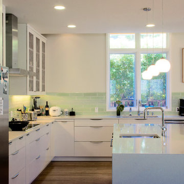
Trendy kitchen photo in San Francisco
Trendy kitchen photo in San Francisco
 Marilyn Hill Interiors
Showcase Photographers
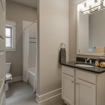
Mid-sized transitional white tile and ceramic tile porcelain tile drop-in bathtub photo in Nashville with an undermount sink, shaker cabinets, white cabinets, quartz countertops, a two-piece toilet and gray walls
Mid-sized transitional white tile and ceramic tile porcelain tile drop-in bathtub photo in Nashville with an undermount sink, shaker cabinets, white cabinets, quartz countertops, a two-piece toilet and gray walls
 JMR Home Services
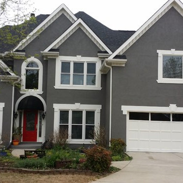
A freshly painted exterior. The dark grey and white combination give this home a clean and renewed look.
Inspiration for a mid-sized timeless gray two-story stucco exterior home remodel in Atlanta with a shingle roof
Inspiration for a mid-sized timeless gray two-story stucco exterior home remodel in Atlanta with a shingle roof

 Vertical Oxygen Ltd
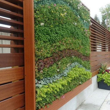
Inspiration for a large contemporary backyard concrete paver patio vertical garden remodel in Calgary with no cover
 Kate Roos Design LLC
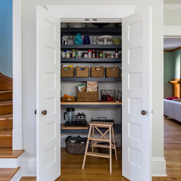
Part of the former family room is now a large, walk-in pantry.
Andrea Rugg Photography
Eat-in kitchen - large transitional l-shaped light wood floor and brown floor eat-in kitchen idea in Minneapolis with flat-panel cabinets, gray cabinets, marble countertops, white backsplash, cement tile backsplash, stainless steel appliances and no island
Eat-in kitchen - large transitional l-shaped light wood floor and brown floor eat-in kitchen idea in Minneapolis with flat-panel cabinets, gray cabinets, marble countertops, white backsplash, cement tile backsplash, stainless steel appliances and no island

 CaliScape Landscape Services
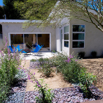
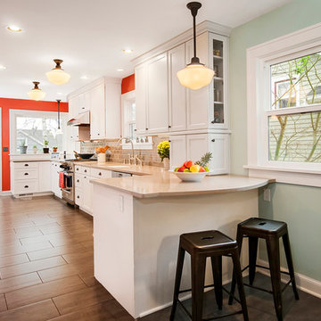
While the Southern California drought is keeping homeowners water usage to a minimum, there are an abundance of plants that thrive on minimal water. A combination of drip irrigation systems and drought tolerant plants can keep your exterior spaces green and beautiful as well as water efficient. This image features our design a few months down the road. With the addition of a few spring flowers, this front yard is officially ready for the Spring and Summer season.


 Haven Design and Construction
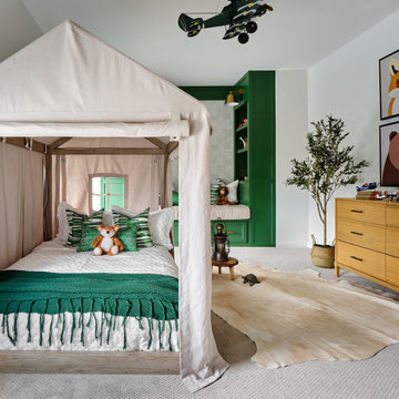
What a fun room for a little boy! Our team decided on a camping theme for this little one complete with a tent bed and an airplane overhead. Custom green built in cabinets provide the perfect reading nook before bedtime. Relaxed bedding and lots of pillows add a cozy feel, along with whimsical animal artwork and masculine touches such as the cowhide rug, camp lantern and rustic wooden night table. The khaki tent bed anchors the room and provides lots of inspiration for creative play, while the punches of bright green add excitement and contrast.

 TKS Design Group
Download our free ebook, Creating the Ideal Kitchen. DOWNLOAD NOW
Lakefront property in the northwest suburbs of Chicago is hard to come by, so when we were hired by this young family with exactly that, we were immediately inspired by not just the unusually large footprint of this 1950’s colonial revival but also the lovely views of the manmade lake it was sited on. The large 5-bedroom home was solidly stuck in the 1980’s, but we saw tons of potential. We started out by updating the existing staircase with a fresh coat of paint and adding new herringbone slate to the entry hall.
The powder room off the entryway also got a refresh - new flooring, new cabinets and fixtures. We ran the new slate right through into this space for some consistency. A fun wallpaper and shiplap trim add a welcoming feel and set the tone for the home.
Next, we tackled the kitchen. Located away from the rest of the first floor, the kitchen felt a little isolated, so we immediately began planning for how to better connect it to the rest of the first floor. We landed on removing the wall between the kitchen and dining room and designed a modified galley style space with separate cooking and clean up zones. The cooking zone consists of the refrigerator, prep sink and cooktop, along with a nice long run of prep space at the island. The cleanup side of the kitchen consists of the main sink and dishwasher. Both areas are situated so that the user can view the lake during prep work and cleanup!
One of the home’s main puzzles was how to incorporate the mudroom and area in front of the patio doors at the back of the house. We already had a breakfast table area, so the space by the patio doors was a bit of a no man’s land. We decided to separate the kitchen proper from what became the new mudroom with a large set of barn doors. That way you can quickly hide any mudroom messes but have easy access to the light coming in through the patio doors as well as the outdoor grilling station. We also love the impact the barn doors add to the overall space.
The homeowners’ first words to us were “it’s time to ditch the brown,” so we did! We chose a lovely blue pallet that reflects the home’s location on the lake which is also vibrant yet easy on the eye. Countertops are white quartz, and the natural oak floor works well with the other honey accents. The breakfast table was given a refresh with new chairs, chandelier and window treatments that frame the gorgeous views of the lake out the back.
We coordinated the slate mudroom flooring with that used in the home’s main entrance for a consistent feel. The storage area consists of open and closed storage to allow for some clutter control as needed.
Next on our “to do” list was revamping the dated brown bar area in the neighboring dining room. We eliminated the clutter by adding some closed cabinets and did some easy updates to help the space feel more current. One snag we ran into here was the discovery of a beam above the existing open shelving that had to be modified with a smaller structural beam to allow for our new design to work. This was an unexpected surprise, but in the end we think it was well worth it!
We kept the colors here a bit more muted to blend with the homeowner’s existing furnishings. Open shelving and polished nickel hardware add some simple detail to the new entertainment zone which also looks out onto the lake!
Next we tackled the upstairs starting with the homeowner’s son’s bath. The bath originally had both a tub shower and a separate shower, so we decided to swap out the shower for a new laundry area. This freed up some space downstairs in what used to be the mudroom/laundry room and is much more convenient for daily laundry needs.
We continued the blue palette here with navy cabinetry and the navy tile in the shower. Porcelain floor tile and chrome fixtures keep maintenance to a minimum while matte black mirrors and lighting add some depth the design. A low maintenance runner adds some warmth underfoot and ties the whole space together.
We added a pocket door to the bathroom to minimize interference with the door swings. The left door of the laundry closet is on a 180 degree hinge to allow for easy full access to the machines. Next we tackled the master bath which is an en suite arrangement. The original was typical of the 1980’s with the vanity outside of the bathroom, situated near the master closet. And the brown theme continued here with multiple shades of brown.
Our first move was to segment off the bath and the closet from the master bedroom. We created a short hall from the bedroom to the bathroom with his and hers walk-in closets on the left and right as well as a separate toilet closet outside of the main bathroom for privacy and flexibility.
The original bathroom had a giant soaking tub with steps (dangerous!) as well as a small shower that did not work well for our homeowner who is 6’3”. With other bathtubs in the home, they decided to eliminate the tub and create an oversized shower which takes up the space where the old tub was located. The double vanity is on the opposite wall and a bench is located under the window for morning conversations and a place to set a couple of towels.
The pallet in here is light and airy with a mix of blond wood, creamy porcelain and marble tile, and brass accents. A simple roman shade adds some texture and it’s top-down mechanism allows for light and privacy.
This large whole house remodel gave our homeowners not only the ability to maximize the potential of their home but also created a lovely new frame from which to view their fabulous lake views.
Designed by: Susan Klimala, CKD, CBD
Photography by: Michael Kaskel
For more information on kitchen and bath design ideas go to: www.kitchenstudio-ge.com
 Coastal Signature Homes
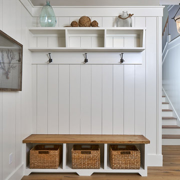
The storage nook, perfect for hanging coats and disposing of "stuff" as we come into the house, helps keep household clutter to a minimum and makes it easier to finds things when heading back out. The bench seating with basket storage, extra cubicles and hooks above is tidy and functional.
 Randy Angell Designs
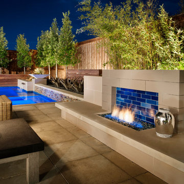
This organic modern design is built in an area known for having notable issues with ground movement. After speaking with the developer and reviewing the soil report with our Structural Engineer, we made our recommendations to the client.
Since the budget for a full-blown pier and beam structure with void boxes under the pool was well beyond the comfort level of our client, they elected to have us utilize a float shell construction method.
For this, we over-excavated the hole and placed a 12" layer of gravel beneath the shell of the pool. Drain lines lead from the deepest point under the pool down into a culvert, placed off to the side of the pool. A sump pump removes any excess water from the culvert as it accumulates.
For the shell of the pool, we utilized a double matt of steel and increased the wall thickness to a minimum of 12". This gave added strength to withstand the volatile soil.
The elements of fire, water, wood and stone were very important in creating the organic modern feel of this design. The layered effect along the back wall creates a visual stimulation across the length of the yard, without overwhelming the senses.
Rather than creating walls only of hard materials, we used Ipe wood to create horizontal screen walls of a more organic nature. At either end, the raised wall and the fire feature are finished in a large-scale porcelain tile, with the look of stained concrete.
Custom stainless steel scuppers, made by a local fabricator, create a soothing sound of falling water. The low wall at the center of the project is faced in natural ledgestone, and carries a color palette that set the tone for the entire project.
Behind this wall and in front of one of the Ipe screens are three Desert Steel Giant Agave sculptures. The unique fire feature isn't quite a fire place, nor is it a fire pit. It is a linear fire burner, surrounded by a 4" thick cantilevered Leuder limestone hearth, with a backdrop wall of blue glazed clay tile.
Although the pool was initially planned as a plaster pool, as the project began to take shape, the client elected to go all the way and finish it in a beautiful blue glass mosaic.
Custom fabricated stainless steel cannon jets send a delicate arch of water over this deep blue, and draw attention to the three square wok planters on the far side of the yard.
For the decking on this project, we elected to work with Mother Nature rather than against her. Two and a half inch thick concrete pavers, set on a bed of compacted, decomposed granite allow for movement around the pool that is easily fixed. If an area of deck moves around, we can simply lift the affected areas, re-level with DG bed, and re-set the pavers.
 Renaissance Homes, DFW
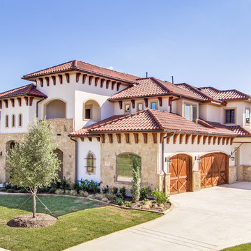
Example of a huge tuscan white two-story mixed siding house exterior design in Dallas with a hip roof and a tile roof
 KraftMaid
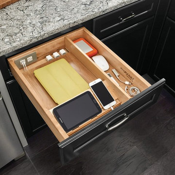
Keep cords to a minimum and gadgets off the counter top.
Example of a classic kitchen design in Detroit
Example of a classic kitchen design in Detroit
34