
Search results for "Modern began" in Home Design Ideas

 Cantoni Atlanta
One can say that the redesign job on this Atlanta-area home was just what the doctor ordered, since physician Jim Linnane chose Cantoni designer Kohl Sudnikovich to help him re-imagine his 50s ranch-style residence.
Online browsing, and a fondness for modern design, led the medical professional into our Georgia store/" title="Cantoni Modern Furniture Stores" class="crosslinking">showroom after purchasing the 50s-built home in early 2011. Since then, walls were torn down, the kitchen got a facelift, a lone loft morphed in to a music room, and the fireplace got haute while the pool became cool.
As always, step one of the design process began with Kohl visiting the home to measure and scale-out floor plans. Next, ideas were tossed around and the client fell in love with the Mondrian sectional, in red. “Jim’s selection set the color scheme for the home’s living areas,” explains Kohl, “and he loves the punchy accents we added with art, both inside and out.”
“Kohl worked closely with me, from start to finish, and guided me through the entire process,” explains Jim. “He helped me find a great contractor, and I’m particularly fond of the plan he conceived to replace the dated fireplace with a more contemporary linear gas box set in striated limestone.”
Adds Kohl, “I love how we opened the loft and staircase walls by replacing them with metal and cable railings, and how we created a sitting area (in what was the dining room) to open to the living room we enhanced with mirrors.”
A creative fix, like re-facing the cabinets, drawers and door panels in the kitchen, illustrates how something simple (and not too pricey) can make a big impact.
The project, on a whole, is also a good example of how our full-service design studio and talented staff can help re-imagine and optimize your living space while working within your budget.
“Meeting and working with Kohl was such a great experience,” says Jim, in closing. “He is so talented. He came up with great design ideas to completely change the look of my home’s interior, and I think the results are amazing.” Guess what, Jim? We think the results of your collaboration with Kohl are pretty amazing, too.

 SV Design
What began as a renovation project morphed into a new house, driven by the natural beauty of the site.
The new structures are perfectly aligned with the coastline, and take full advantage of the views of ocean, islands, and shoals. The location is within walking distance of town and its amenities, yet miles away in the privacy it affords. The house is nestled on a nicely wooded lot, giving the residence screening from the street, with an open meadow leading to the ocean on the rear of the lot.
The design concept was driven by the serenity of the site, enhanced by textures of trees, plantings, sand and shoreline. The newly constructed house sits quietly in a location advantageously positioned to take full advantage of natural light and solar orientations. The visual calm is enhanced by the natural material: stone, wood, and metal throughout the home.
The main structures are comprised of traditional New England forms, with modern connectors serving to unify the structures. Each building is equally suited for single floor living, if that future needs is ever necessary. Unique too is an underground connection between main house and an outbuilding.
With their flowing connections, no room is isolated or ignored; instead each reflects a different level of privacy and social interaction.
Just as there are layers to the exterior in beach, field, forest and oceans, the inside has a layered approach. Textures in wood, stone, and neutral colors combine with the warmth of linens, wools, and metals. Personality and character of the interiors and its furnishings are tailored to the client’s lifestyle. Rooms are arranged and organized in an intersection of public and private spaces. The quiet palette within reflects the nature outside, enhanced with artwork and accessories.

 Sharer Design Group LLC
House hunting for the perfect home is never easy. Our recent clients decided to make the search a bit easier by enlisting the help of Sharer Design Group to help locate the best “canvas” for their new home. After narrowing down their list, our designers visited several prospective homes to determine each property’s potential for our clients’ design vision. Once the home was selected, the Sharer Design Group team began the task of turning the canvas into art.
The entire home was transformed from top to bottom into a modern, updated space that met the vision and needs of our clients. The kitchen was updated using custom Sharer Cabinetry with perimeter cabinets painted a custom grey-beige color. The enlarged center island, in a contrasting dark paint color, was designed to allow for additional seating. Gray Quartz countertops, a glass subway tile backsplash and a stainless steel hood and appliances finish the cool, transitional feel of the room.
The powder room features a unique custom Sharer Cabinetry floating vanity in a dark paint with a granite countertop and vessel sink. Sharer Cabinetry was also used in the laundry room to help maximize storage options, along with the addition of a large broom closet. New wood flooring and carpet was installed throughout the entire home to finish off the dramatic transformation. While finding the perfect home isn’t easy, our clients were able to create the dream home they envisioned, with a little help from Sharer Design Group.
Find the right local pro for your project
 JRP Design & Remodel
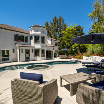
This home is a bachelor’s dream, but it didn’t start that way. It began with a young man purchasing his first single-family home in Westlake Village. The house was dated from the late 1980s, dark, and closed off. In other words, it felt like a man cave — not a home. It needed a masculine makeover.
He turned to his friend, who spoke highly of their experience with us. We had remodeled and designed their home, now known as the “Oak Park Soiree.” The result of this home’s new, open floorplan assured him we could provide the same flow and functionality to his own home. He put his trust in our hands, and the construction began.
The entry of our client’s original home had no “wow factor.” As you walked in, you noticed a staircase enclosed by a wall, making the space feel bulky and uninviting. Our team elevated the entry by designing a new modern staircase with a see-through railing. We even took advantage of the area under the stairs by building a wine cellar underneath it… because wine not?
Down the hall, the kitchen and family room used to be separated by a wall. The kitchen lacked countertop and storage space, and the family room had a high ceiling open to the second floor. This floorplan didn’t function well with our client’s lifestyle. He wanted one large space that allowed him to entertain family and friends while at the same time, not having to worry about noise traveling upstairs. Our architects crafted a new floorplan to make the kitchen, breakfast nook, and family room flow together as a great room. We removed the obstructing wall and enclosed the high ceiling above the family room by building a new loft space above.
The kitchen area of the great room is now the heart of the home! Our client and his guests have plenty of space to gather around the oversized island with additional seating. The walls are surrounded by custom Crystal cabinetry, and the countertops glisten with Vadara quartz, providing ample cooking and storage space. To top it all off, we installed several new appliances, including a built-in fridge and coffee machine, a Miele 48-inch range, and a beautifully designed boxed ventilation hood with brass strapping and contrasting color.
There is now an effortless transition from the kitchen to the family room, where your eyes are drawn to the newly centered, linear fireplace surrounded by floating shelves. Its backlighting spotlights the purposefully placed symmetrical décor inside it. Next to this focal point lies a LaCantina bi-fold door leading to the backyard’s sparkling new pool and additional outdoor living space. Not only does the wide door create a seamless transition to the outside, but it also brings an abundance of natural light into the home.
Once in need of a masculine makeover, this home’s sexy black and gold finishes paired with additional space for wine and guests to have a good time make it a bachelor’s dream.
Photographer: Andrew Orozco

 MCDW + Architecture
Kitchen Cube 1
Upper East- Residence
Work: Full Gut renovation- 2 apartments- in the same ‘S’ line
Size: 650 Sq Ft of space in both apartments, 5S and 4S
Using the Frankfurt Kitchen of 1926 for inspiration, Ms.Cianfaglione began asking herself how the typology of the NYC kitchenette for her building, in the ‘S’ line, needed to be upgraded to fit today’s physical and aesthetic needs. The Frankfurt Kitchen was the forerunner of modern fitted kitchens and had an unified concept to enable efficient work, consolidating a woman’s efforts and allowing her more time to spend else ware. But unlike the Frankfurt kitchen, Ms. Cianfaglione wanted to take this a step further and open it up rather than concealing it, and its user, inside a room. This would showcase the designer’s evolved notion of “cooking”,that would now become an orchestrated dance to be put on display.
Ms. Cianfaglione had a typical NYC kitchenette, a small room with an air grille for ventilation, and in this case, there was a small window that was currently blocked by a refrigerator. There was also the problem of the foyer space, which was just a waste in an apartment this small, and the structural wall that could not be removed. Ms. Cianfaglione responded to these conditions by designing the kitchen to become a wrap around condition, in an ‘L’ shape, that would use the foyer more effectively and at the same time, face the living area, and all the while concealing the structural wall that separates them.
The interesting thing about the ‘L’ shape was that it allows for a beautifully orchestrated flow that makes cooking look like a beautiful dance that moves back and forth along the’ L.’
The appliances are designed within the cabinetry to give a tailored look that does not allow for distraction, and you instead focus on the user. This renovation made the otherwise small, unused foyer and ineffective kitchen, now a focal point that dictates movement throughout. The kitchen has unified and designed an otherwise standard one bedroom apartment and seeks to become a new standard in this building’s typology.
 Phoenix Home Remodeling
Angie & Amanda began their journey to transform the master bathroom in their new home while overcoming their previous disappointing experiences with contractors. Their goal was to craft a space that reflected their style as well as making their shower functional for them for years to come.
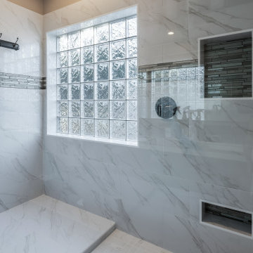
A key change was their decision to remove the existing bathtub, which made space for an over-sized custom shower. This shower includes a dry-off area with multiple towel hooks that were thoughtfully positioned to maximize the space near the window and side wall.
They chose 12" x 24" tiles in Nobleza Lugo with a polished finish for the walls and the matte version for the floor of their dry-off area, ensuring a cohesive design. The shower floor features 2" x 2" square tiles in Contessa Oro, blending perfectly with the walls and floor for a luxurious feel.
One of the highlights was the addition of a large recessed wall niche along with a recessed shaving niche. Both were accentuated with Montage City Chic Glass tiles, injecting a sophisticated and contrasting flair into the shower's functional features.
Angie and Amanda chose to continue this accent throughout their new shower by adding an accent band of the same glass tiles along the shower walls, which introduced another custom touch to the area.
The Delta Lahara shower trim, along with the Delta In2ition shower head, both in the Venetian Bronze finish, enhanced shower experience. A clear frameless tempered glass door with matching hardware completed the look.

 Schmidt Custom Builders
It's a house so close to the inlet, it appears to float. Skirted by water, this Inlet View home is built for a true waterman. This unique property was originally designed by a local architect–Haywood Newkirk, Sr–who was known for his modernistic renderings. As the neighborhood grew, views of the water were replaced with hindered scenes of bordering homes. To gain privacy, we called on another local architect, artist + surfer–Chip Hemmingway–whose industrial design can be viewed on distinctive properties such as the USS North Carolina Battleship + North Carolina Aquarium’s $26 million Jennette’s Pier facility in Nags Head. It would take another waterman's eye to imagine this space anew. With fresh blueprints, the front door took to a new face of the home + an additional 1500 square feet were appended by Schmidt Custom Builders to create an open-concept out of the old family property. The project began with a total gut. And to the bare structure, came new framing + exterior, all new wiring, roof, windows, flooring, insulation, custom cabinetry, granite countertops, luxurious lighting, furniture + landscaping. We hired on Jo Howell of Big Sky Design who worked with the homeowner to select the final touches to make this space feel like home. Outdoors is perhaps the grandest room of all which can be enjoyed plein air. Custom Ipe screens adorn the outdoor dining pavilion which now configure a private space between neighboring homes. Attached is a grand, open porch wrapped with stainless steal cable for a zero-obstruction view of a surfer's haven. || Photos by Mark Steelman
Sponsored
Sunbury, OH

J.Holderby - Renovations
Franklin County's Leading General Contractors - 2X Best of Houzz!
 Metropolis Drafting and Construction Inc
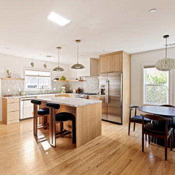
The project involved a spacious 900 sq. ft. master suite addition, complemented by an expanded kitchen and dining area. What began as a simple addition evolved into a complete home remodel, including a guest bathroom and adjacent his-and-her offices.
The design vision centered on clean, modern lines combined with warm, earthy tones and natural materials.
In the kitchen, the absence of upper cabinets creates a minimalist feel, with sleek floating shelves illuminated by built-in LED lights. The hood was integrated into the ceiling/wall, finished with drywall and plaster to seamlessly blend into the space, making it almost invisible. A semi-transparent barn door conceals the bar and laundry area, which were thoughtfully incorporated into the kitchen design.
The master suite features a spacious bathroom with custom details, including a floating vanity designed to exact specifications. The 4” thick waterfall countertop wraps around the vanity for a refined look. The mirrors, also functional as storage, feature hidden medicine cabinets built directly into the wall.
The bathroom floor is lined with warm beige tiles, complemented by 3D peach-colored tiles in the shower and vanity wall, adding texture and warmth to the space. An elegant architectural light fixture, positioned between the two mirrors, enhances the overall ambiance.
 SV Design
What began as a renovation project morphed into a new house, driven by the natural beauty of the site.
The new structures are perfectly aligned with the coastline, and take full advantage of the views of ocean, islands, and shoals. The location is within walking distance of town and its amenities, yet miles away in the privacy it affords. The house is nestled on a nicely wooded lot, giving the residence screening from the street, with an open meadow leading to the ocean on the rear of the lot.
The design concept was driven by the serenity of the site, enhanced by textures of trees, plantings, sand and shoreline. The newly constructed house sits quietly in a location advantageously positioned to take full advantage of natural light and solar orientations. The visual calm is enhanced by the natural material: stone, wood, and metal throughout the home.
The main structures are comprised of traditional New England forms, with modern connectors serving to unify the structures. Each building is equally suited for single floor living, if that future needs is ever necessary. Unique too is an underground connection between main house and an outbuilding.
With their flowing connections, no room is isolated or ignored; instead each reflects a different level of privacy and social interaction.
Just as there are layers to the exterior in beach, field, forest and oceans, the inside has a layered approach. Textures in wood, stone, and neutral colors combine with the warmth of linens, wools, and metals. Personality and character of the interiors and its furnishings are tailored to the client’s lifestyle. Rooms are arranged and organized in an intersection of public and private spaces. The quiet palette within reflects the nature outside, enhanced with artwork and accessories.
 Sharer Design Group LLC
House hunting for the perfect home is never easy. Our recent clients decided to make the search a bit easier by enlisting the help of Sharer Design Group to help locate the best “canvas” for their new home. After narrowing down their list, our designers visited several prospective homes to determine each property’s potential for our clients’ design vision. Once the home was selected, the Sharer Design Group team began the task of turning the canvas into art.
The entire home was transformed from top to bottom into a modern, updated space that met the vision and needs of our clients. The kitchen was updated using custom Sharer Cabinetry with perimeter cabinets painted a custom grey-beige color. The enlarged center island, in a contrasting dark paint color, was designed to allow for additional seating. Gray Quartz countertops, a glass subway tile backsplash and a stainless steel hood and appliances finish the cool, transitional feel of the room.
The powder room features a unique custom Sharer Cabinetry floating vanity in a dark paint with a granite countertop and vessel sink. Sharer Cabinetry was also used in the laundry room to help maximize storage options, along with the addition of a large broom closet. New wood flooring and carpet was installed throughout the entire home to finish off the dramatic transformation. While finding the perfect home isn’t easy, our clients were able to create the dream home they envisioned, with a little help from Sharer Design Group.

 Décor Aid
Everyone deserves to end the day in a comfortable, tranquil home. And for those with children, it can seem impossible to reconcile the challenges of family life with the need to have a well-designed space. Our client—a financial executive and her family of four—had not considered a design makeover since moving into their apartment, which was more than ten years ago. So when she reached out to Decor Aid, she asked us to modernize and brighten her home, in addition to creating a space for her family to hang out and relax.
The apartment originally featured sunflower-yellow walls and a set of brown suede living room furniture, all of which significantly darkened the space. The living room also did not have sufficient seating options, so the client was improvising seating arrangements when guests would come over.
With no outward facing windows, the living room received little natural light, and so we began the redesign by painting the walls a classic grey, and adding white crown molding.
As a pathway from the front door to the kitchen, the living room functions as a high-traffic area of the home. So we sourced a geometric indoor-outdoor area rug, and established a layout that’s easy to walk through. We also sourced a coffee table from Serena & Lily. Our client has teenage twins, and so we sourced a sturdy sectional couch from Restoration Hardware, and placed it in a corner which was previously being underused.
We hired an electrician to hide all of the cables leading to the media console, and added custom window treatments. In the kitchen, we painted the cabinets a semi-gloss white, and added slate flooring, for a clean, crisp, modern look to match the living room.
The finishing touches included a set of geometric table objects, comfortable throw rugs, and plush high-shine pillows. The final result is a fully functional living room for this family of four.
 Built To Perfection Inc.
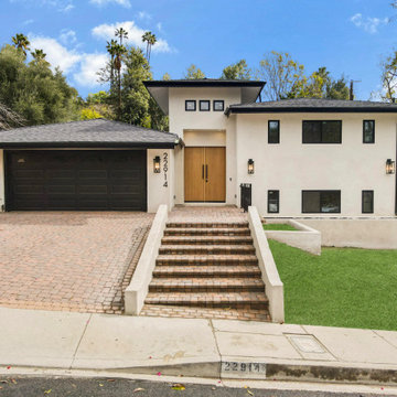
This home addition includes two brand new bedrooms, three stylish bathrooms, and a fully equipped laundry room—all designed with modern living in mind. The thoughtful layout enhances convenience and comfort, while high-quality finishes bring a touch of elegance to each space. Perfect for growing families or hosting guests, this upgrade adds both function and value to the home.
 Homeowner Services of Michigan LLC
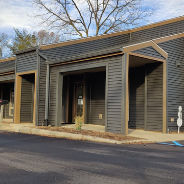
Homeowner Services of Michigan recently completed a comprehensive exterior restoration project for a professional building owned by a commercial property client. The client selected us for our ability to meet their specific needs and adhere to their timeline. A key requirement was to complete the project without disrupting the tenants of the complex.
We began by carefully removing the old, outdated siding. Our team ensured minimal disturbance to the tenants by scheduling work during off-peak hours and utilizing sound-dampening techniques. Once the old siding was removed, we prepared the building’s inner sheath and applied advanced weather-sealing techniques to protect against moisture and improve insulation.
Next, we installed high-quality HardieBoard cement composite siding in a deep slate blue color. This choice provided a modern and professional appearance. Our team ensured precise alignment and secure fastening for maximum durability.
To complete the look, we installed contrasting regal gold trim, gutters, and downspouts. The regal gold trim highlighted the building’s architectural features, while the matching gutters and downspouts ensured efficient water drainage and added to the building's aesthetic appeal.
The project was completed on time and within budget, with no disruption to the building’s tenants. The new exterior not only enhanced the building's curb appeal but also provided improved weather resistance and energy efficiency. The combination of deep slate blue HardieBoard siding and regal gold trim created a striking, professional look that perfectly aligned with the client’s vision.
Sponsored
Sunbury, OH
J.Holderby - Renovations
Franklin County's Leading General Contractors - 2X Best of Houzz!
 Jamie Schachtel Design Group
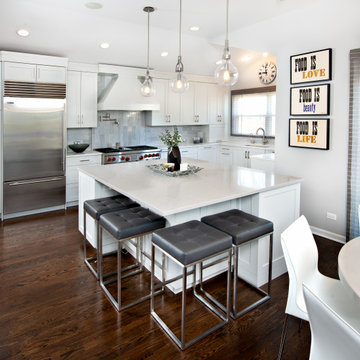
What a joy to bring this exciting renovation to a loyal client: a family of 6 that has called this Highland Park house, “home” for over 25 years. This relationship began in 2017 when we designed their living room, girls’ bedrooms, powder room, and in-home office. We were thrilled when they entrusted us again with their kitchen, family room, dining room, and laundry area design. Their first floor became our JSDG playground…
Our priority was to bring fresh, flowing energy to the family’s first floor. We started by removing partial walls to create a more open floor plan and transformed a once huge fireplace into a modern bar set up. We reconfigured a stunning, ventless fireplace and oriented it floor to ceiling tile in the family room. Our second priority was to create an outdoor space for safe socializing during the pandemic, as we executed this project during the thick of it. We designed the entire outdoor area with the utmost intention and consulted on the gorgeous outdoor paint selections. Stay tuned for photos of this outdoors space on the site soon!
Overall, this project was a true labor of love. We are grateful to again bring beauty, flow and function to this beloved client’s warm home.

 Pool & Hot Tub Alliance
The elements of fire, water, wood, and stone were very important in creating the organic modern feel of this design. The layered effect along the back wall creates visual stimulation across the length of the yard, without overwhelming the senses. Rather than creating walls only of hard materials, we used Ipe wood to create horizontal screen walls of a more organic nature. At either end, the raised wall and the fire feature are finished in a large-scale porcelain tile, with the look of stained concrete. Custom stainless steel scuppers, by a local fabricator, create a soothing sound of falling water. The low wall at the center of the project is faced in natural ledgestone, and carries a color palette that set the tone for the entire project. Behind this wall and in front of one of the Ipe screens are three Desert Steel Giant Agave sculptures. The unique fire feature isnt quite a fire place, nor is it a fire pit. It is a linear fire burner, surrounded by a 4 thick cantilevered Leuder limestone hearth, with a backdrop wall of blue glazed clay tile. Although the pool was initially planned as a plaster pool, as the project began to take shape, the client elected to go all the way, and finish it in a beautiful blue glass mosaic. Custom fabricated stainless steel cannon jets send a delicate arch of water over this deep blue, and draw attention to the three square wok planters on the far side of the yard. For the decking on this project, we elected to work with Mother Nature, rather than against her. Two and a half inch thick concrete pavers, set on a bed of compacted decomposed granite allow for movement around the pool that is easily fixed. If an area of deck moves around, we can simply lift the affected areas, re-level the DG bed, and re-set the pavers.

 3SI Design
Meet Don Fuego—a bold, luxurious, and unforgettable experience. ?
Bringing this vision to life was an incredible journey alongside talented vendors and artists. We began designing Don Fuego at the start of 2024, keeping four key elements at the forefront: Moody, Sophisticated, Bold, and Memorable.
Inspired by Día de los Muertos, this space pays homage to those who are no longer with us physically but remain with us spiritually. Every design choice reflects this essence—deep, rich textures, dramatic lighting, and custom elements that make Don Fuego a true work of art.
One of the focal points is the custom-designed checkout counter, featuring a striking porcelain slab that embodies everything Don Fuego stands for: fire, intensity, and individuality. The moment we saw it, we knew it was destined for this space.
Design is all about the details, and Don Fuego is no exception. From late-night idea exchanges to meticulous material selections, every element was chosen with intention. We introduced texture through limewash, mimicking the organic feel of a grave, and Roman clay, sculpted into arches reminiscent of traditional Mexican architecture.
Lighting is the jewelry of a space, and in Don Fuego, it sets the mood. We layered task, decorative, ambient, and accent lighting to create an immersive atmosphere. One of our favorite details? A light fixture inspired by the cascarón, a cracked egg symbolizing good luck and prosperity in Mexican culture. The moment we discovered it, we knew it belonged here—to bring blessings to our clients and everyone who steps inside this curated experience.
Don Fuego isn’t just a space—it’s a feeling, a story, a tribute. ✨
 MCDW + Architecture
Kitchen Cube 1
Upper East- Residence
Work: Full Gut renovation- 2 apartments- in the same ‘S’ line
Size: 650 Sq Ft of space in both apartments, 5S and 4S
Using the Frankfurt Kitchen of 1926 for inspiration, Ms.Cianfaglione began asking herself how the typology of the NYC kitchenette for her building, in the ‘S’ line, needed to be upgraded to fit today’s physical and aesthetic needs. The Frankfurt Kitchen was the forerunner of modern fitted kitchens and had an unified concept to enable efficient work, consolidating a woman’s efforts and allowing her more time to spend else ware. But unlike the Frankfurt kitchen, Ms. Cianfaglione wanted to take this a step further and open it up rather than concealing it, and its user, inside a room. This would showcase the designer’s evolved notion of “cooking”,that would now become an orchestrated dance to be put on display.
Ms. Cianfaglione had a typical NYC kitchenette, a small room with an air grille for ventilation, and in this case, there was a small window that was currently blocked by a refrigerator. There was also the problem of the foyer space, which was just a waste in an apartment this small, and the structural wall that could not be removed. Ms. Cianfaglione responded to these conditions by designing the kitchen to become a wrap around condition, in an ‘L’ shape, that would use the foyer more effectively and at the same time, face the living area, and all the while concealing the structural wall that separates them.
The interesting thing about the ‘L’ shape was that it allows for a beautifully orchestrated flow that makes cooking look like a beautiful dance that moves back and forth along the’ L.’
The appliances are designed within the cabinetry to give a tailored look that does not allow for distraction, and you instead focus on the user. This renovation made the otherwise small, unused foyer and ineffective kitchen, now a focal point that dictates movement throughout. The kitchen has unified and designed an otherwise standard one bedroom apartment and seeks to become a new standard in this building’s typology.

 Metropolis Drafting and Construction Inc
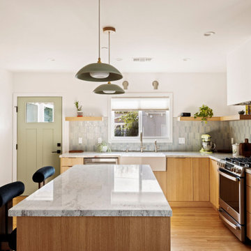
The project involved a spacious 900 sq. ft. master suite addition, complemented by an expanded kitchen and dining area. What began as a simple addition evolved into a complete home remodel, including a guest bathroom and adjacent his-and-her offices.
The design vision centered on clean, modern lines combined with warm, earthy tones and natural materials.
In the kitchen, the absence of upper cabinets creates a minimalist feel, with sleek floating shelves illuminated by built-in LED lights. The hood was integrated into the ceiling/wall, finished with drywall and plaster to seamlessly blend into the space, making it almost invisible. A semi-transparent barn door conceals the bar and laundry area, which were thoughtfully incorporated into the kitchen design.
The master suite features a spacious bathroom with custom details, including a floating vanity designed to exact specifications. The 4” thick waterfall countertop wraps around the vanity for a refined look. The mirrors, also functional as storage, feature hidden medicine cabinets built directly into the wall.
The bathroom floor is lined with warm beige tiles, complemented by 3D peach-colored tiles in the shower and vanity wall, adding texture and warmth to the space. An elegant architectural light fixture, positioned between the two mirrors, enhances the overall ambiance.

 Marlene Zeiger Design
A young family from the Bay Area moved to Portland into a much larger home. They brought with them some art and furnishings and an appreciation for Tuscany. In the new home we began with one fabric that hit the tone they wanted: you can see it in the dining room window treatments.
The furniture that attracted them, after an initial foray into typical Tuscan styles, was on the contemporary side of things; so we created a relaxed blending: Floors were stained darker. Lots of antique bronze, dark woods and rich fabrics live happily with craftsman lighting and tan walls. More modern Transitional seating in oatmeal and off-white actually create islands of rest and repose; they heighten the room’s nature by contrast. Our eclectic range of styles work because they share a tonal character.
We found a rug in reds and blues that was more traditional and dramatic, which connected well with our inspiration fabric. So we were on a roll. Other pieces, including the exciting room divider (the ship) fell into place, as the clients took the elevations and plans with them on various shopping excursions (which were fun because they had the road map to provide a happy level of guidance).
This space, as with the other rooms we designed for the home, exemplifies sprezzatura — a relaxed style that looks as if it has been created by (great taste) over time. Yes, indeed!
 3SI Design
Meet Don Fuego—a bold, luxurious, and unforgettable experience. ?
Bringing this vision to life was an incredible journey alongside talented vendors and artists. We began designing Don Fuego at the start of 2024, keeping four key elements at the forefront: Moody, Sophisticated, Bold, and Memorable.
Inspired by Día de los Muertos, this space pays homage to those who are no longer with us physically but remain with us spiritually. Every design choice reflects this essence—deep, rich textures, dramatic lighting, and custom elements that make Don Fuego a true work of art.
One of the focal points is the custom-designed checkout counter, featuring a striking porcelain slab that embodies everything Don Fuego stands for: fire, intensity, and individuality. The moment we saw it, we knew it was destined for this space.
Design is all about the details, and Don Fuego is no exception. From late-night idea exchanges to meticulous material selections, every element was chosen with intention. We introduced texture through limewash, mimicking the organic feel of a grave, and Roman clay, sculpted into arches reminiscent of traditional Mexican architecture.
Lighting is the jewelry of a space, and in Don Fuego, it sets the mood. We layered task, decorative, ambient, and accent lighting to create an immersive atmosphere. One of our favorite details? A light fixture inspired by the cascarón, a cracked egg symbolizing good luck and prosperity in Mexican culture. The moment we discovered it, we knew it belonged here—to bring blessings to our clients and everyone who steps inside this curated experience.
Don Fuego isn’t just a space—it’s a feeling, a story, a tribute. ✨
147