
Search results for "Modern began" in Home Design Ideas

 jesse ososki art, inc.
This project began as a design-build proposal to build an addition for an indoor swim spa and exercise room to a ranch style house. The Clients were seeking a functional and inviting space reminiscent of the luxury resorts and space they have visited during their international travels.
David Wakely

 Dona Rosene Interiors
Interior Design by Dona Rosene; Built-In Faux Finish Painting by HoldenArt Studio; Photography by Michael Hunter
Living room - mid-sized transitional open concept dark wood floor living room idea in Dallas with blue walls and a media wall
Living room - mid-sized transitional open concept dark wood floor living room idea in Dallas with blue walls and a media wall

 William Baker-Architecture Director-The Agency BH
Shawn Bishop
Mid-century modern garage photo in Los Angeles
Mid-century modern garage photo in Los Angeles
Find the right local pro for your project
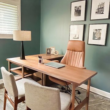
 Home Styling by Alexis E-Design
This office was designed 100% online. He just moved into the home and began with white walls and nothing in the space. He is thrilled with the outcome and loves being in his office!
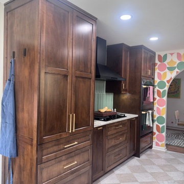
 Mi-Kin Creations, Inc.
This kitchen began as an unfunctional, cluttered space with limited storage. The homeowners envisioned transforming it into their ideal kitchen: bright, open, and highly functional.
We balanced this wall with the double ovens and adding a pantry.
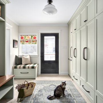
 Simply Home Decorating
When our clients approached us to renovate their 1950s Newfoundland home, their goal was to modernize while reflecting both their West Coast roots and current East Coast lifestyle. What began as a simple ensuite repair expanded into a full home transformation, completed in two thoughtfully phased renovations. Drawing from our cross-coastal experience—and a personal connection to the home’s past—we blended classic East Coast charm with West Coast simplicity. From reworking the layout and finishes to integrating their art collection and layering in warm, tactile materials, every detail was designed to feel cohesive, inviting, and deeply personal.

 Habachy Designs
Michael Habachy designed this luxurious master bathroom for a penthouse in Buckhead. It began as a completely raw space with concrete floors and framing, allowing the designer to tailor every single detail to fit the client’s lifestyle. The client wanted a dramatic and luxurious look, but also functionality. The custom, Neo-classic inspired vanity achieves that by concealing the power for blow dryers and curling irons, and integrating a built-in towel warmer. Materials such as polished Calacutta marble and special cut and beveled diamond shaped mirrors contribute to the luxurious feel. Every feature received a tremendous attention to detail, including the black and white tiled rug with inset stainless steel dots. A rich layering effect was achieved by placing a custom made linear light fixture in front of white sheers, to give the illusion that its droplets of Swarovski crystals were woven into the fabric.
Photography by Jeff Roffman
Sponsored
Sunbury, OH

J.Holderby - Renovations
Franklin County's Leading General Contractors - 2X Best of Houzz!

 Blue Heron Signature Homes
Designed and built by Terramor Homes in Raleigh, NC. The inspiration behind the Farmhouse design began in an attempt to blend a mix of vintage farm style with classic and rustic salvaged warmth, together with modern and clean lined design elements. This balance was a conscious effort throughout the design of this home.
Photography: M. Eric Honeycutt
 Simply Home Decorating
The homeowners of this condo sought our assistance when downsizing from a large family home on Howe Sound to a small urban condo in Lower Lonsdale, North Vancouver. They asked us to incorporate many of their precious antiques and art pieces into the new design. Our challenges here were twofold; first, how to deal with the unconventional curved floor plan with vast South facing windows that provide a 180 degree view of downtown Vancouver, and second, how to successfully merge an eclectic collection of antique pieces into a modern setting. We began by updating most of their artwork with new matting and framing. We created a gallery effect by grouping like artwork together and displaying larger pieces on the sections of wall between the windows, lighting them with black wall sconces for a graphic effect. We re-upholstered their antique seating with more contemporary fabrics choices - a gray flannel on their Victorian fainting couch and a fun orange chenille animal print on their Louis style chairs. We selected black as an accent colour for many of the accessories as well as the dining room wall to give the space a sophisticated modern edge. The new pieces that we added, including the sofa, coffee table and dining light fixture are mid century inspired, bridging the gap between old and new. White walls and understated wallpaper provide the perfect backdrop for the colourful mix of antique pieces. Interior Design by Lori Steeves, Simply Home Decorating. Photos by Tracey Ayton Photography

 Décor Aid
Everyone deserves to end the day in a comfortable, tranquil home. And for those with children, it can seem impossible to reconcile the challenges of family life with the need to have a well-designed space. Our client—a financial executive and her family of four—had not considered a design makeover since moving into their apartment, which was more than ten years ago. So when she reached out to Decor Aid, she asked us to modernize and brighten her home, in addition to creating a space for her family to hang out and relax.
The apartment originally featured sunflower-yellow walls and a set of brown suede living room furniture, all of which significantly darkened the space. The living room also did not have sufficient seating options, so the client was improvising seating arrangements when guests would come over.
With no outward facing windows, the living room received little natural light, and so we began the redesign by painting the walls a classic grey, and adding white crown molding.
As a pathway from the front door to the kitchen, the living room functions as a high-traffic area of the home. So we sourced a geometric indoor-outdoor area rug, and established a layout that’s easy to walk through. We also sourced a coffee table from Serena & Lily. Our client has teenage twins, and so we sourced a sturdy sectional couch from Restoration Hardware, and placed it in a corner which was previously being underused.
We hired an electrician to hide all of the cables leading to the media console, and added custom window treatments. In the kitchen, we painted the cabinets a semi-gloss white, and added slate flooring, for a clean, crisp, modern look to match the living room.
The finishing touches included a set of geometric table objects, comfortable throw rugs, and plush high-shine pillows. The final result is a fully functional living room for this family of four.

 Schwartz and Architecture
This project, an extensive remodel and addition to an existing modern residence high above Silicon Valley, was inspired by dominant images and textures from the site: boulders, bark, and leaves. We created a two-story addition clad in traditional Japanese Shou Sugi Ban burnt wood siding that anchors home and site. Natural textures also prevail in the cosmetic remodeling of all the living spaces. The new volume adjacent to an expanded kitchen contains a family room and staircase to an upper guest suite.
The original home was a joint venture between Min | Day as Design Architect and Burks Toma Architects as Architect of Record and was substantially completed in 1999. In 2005, Min | Day added the swimming pool and related outdoor spaces. Schwartz and Architecture (SaA) began work on the addition and substantial remodel of the interior in 2009, completed in 2015.
Photo by Matthew Millman


 Audio Video Specialists
Andy Mamott
Home theater - huge contemporary enclosed home theater idea in Chicago with gray walls and a projector screen
Home theater - huge contemporary enclosed home theater idea in Chicago with gray walls and a projector screen
Sponsored
Westerville, OH

Custom Home Works
Franklin County's Award-Winning Design, Build and Remodeling Expert

 BRADSHAW DESIGNS LLC
This Texas Treasure began as a simple kitchen remodel, then expanded to include the entire home! What was a tired, dark, cramped space has now become an open, light, bright space fit for a serious cook! She yearned for natural and organic elements that harken to the outdoors. Stone, antique, rough, hand-hewn beams fit the bill perfectly!

 Drewett Works
With adjacent neighbors within a fairly dense section of Paradise Valley, Arizona, C.P. Drewett sought to provide a tranquil retreat for a new-to-the-Valley surgeon and his family who were seeking the modernism they loved though had never lived in. With a goal of consuming all possible site lines and views while maintaining autonomy, a portion of the house — including the entry, office, and master bedroom wing — is subterranean. This subterranean nature of the home provides interior grandeur for guests but offers a welcoming and humble approach, fully satisfying the clients requests.
While the lot has an east-west orientation, the home was designed to capture mainly north and south light which is more desirable and soothing. The architecture’s interior loftiness is created with overlapping, undulating planes of plaster, glass, and steel. The woven nature of horizontal planes throughout the living spaces provides an uplifting sense, inviting a symphony of light to enter the space. The more voluminous public spaces are comprised of stone-clad massing elements which convert into a desert pavilion embracing the outdoor spaces. Every room opens to exterior spaces providing a dramatic embrace of home to natural environment.
Grand Award winner for Best Interior Design of a Custom Home
The material palette began with a rich, tonal, large-format Quartzite stone cladding. The stone’s tones gaveforth the rest of the material palette including a champagne-colored metal fascia, a tonal stucco system, and ceilings clad with hemlock, a tight-grained but softer wood that was tonally perfect with the rest of the materials. The interior case goods and wood-wrapped openings further contribute to the tonal harmony of architecture and materials.
Grand Award Winner for Best Indoor Outdoor Lifestyle for a Home This award-winning project was recognized at the 2020 Gold Nugget Awards with two Grand Awards, one for Best Indoor/Outdoor Lifestyle for a Home, and another for Best Interior Design of a One of a Kind or Custom Home.
At the 2020 Design Excellence Awards and Gala presented by ASID AZ North, Ownby Design received five awards for Tonal Harmony. The project was recognized for 1st place – Bathroom; 3rd place – Furniture; 1st place – Kitchen; 1st place – Outdoor Living; and 2nd place – Residence over 6,000 square ft. Congratulations to Claire Ownby, Kalysha Manzo, and the entire Ownby Design team.
Tonal Harmony was also featured on the cover of the July/August 2020 issue of Luxe Interiors + Design and received a 14-page editorial feature entitled “A Place in the Sun” within the magazine.

 DEANE Inc | Distinctive Design & Cabinetry
Located in the highly sought-after Allwood neighborhood of Darien, this spec house is the fourth collaboration with a client who first began with a renovation of her own home. While architecturally it is a traditional home from the exterior, the interiors are more transitional in style. In order to compete in the speculative market, our client’s directive was clear – ‘differentiation the kitchen design from every other spec house’. So we incorporated painted cabinetry but highlighted with rift-cut white oak base cabinets. This contrast between these finishes influenced our decision to select a subtle white quartzite countertop to deliberately highlight the striking porcelain backsplash.
The steel and glass partition frames the space – drawing the eye to the focal point of the kitchen, the custom stainless steel hood. Gold hardware adds a pop of flair to the space and warms the room. Walnut drawer inserts, stainless steel appliance garage, pull out trash drawers with compost bins and a stylish desk make this the Gold Standard of spec houses.

 Charlie Allen Renovations, Inc.
Renovation is stressful. Wouldn’t it be nice to let someone else oversee product selections, manage day-to-day issues, and bring your project to a successful completion? The owners of a two-family in Arlington recently did just that, flying off to Florida just as we began renovating their first floor unit.
Of course, before they left we thoroughly discussed all aspects of the work order, which included renovating the kitchen and bathroom, painting the bedroom, and adding a laundry closet. We reviewed color and material selections, and set up a schedule for regular briefings.
A handful of issues did come up. But because we had planned ahead, we were able to resolve them with very little stress for our clients. For instance, the client had chosen a bright yellow paint color for the kitchen walls, but once the new cabinets, countertop, and flooring had been installed, it was clear that yellow would clash. We suggested a more complementary Benjamin Moore Lancaster Whitewash shade instead.
In the bathroom, the clients had selected a deep inset mirrored medicine cabinet. But when the wall behind the vanity was opened, it revealed a pipe running up the wall, too close for the inset model. In this small space, a bump-out medicine cabinet would be awkward, so instead we placed a mirror over the sink and two smaller inset cabinets on either side – a solution that pleased the homeowners, who now have his-and-hers storage spaces.
Finally, the homeowners had resigned themselves to the fact that the laundry closet would be too small for storing detergent and other needs. However once the units were in place, we realized that a small custom shelf could be built and had it installed to the delight of the homeowners.
Photo by Shelly Harrison

Sponsored
Sunbury, OH
J.Holderby - Renovations
Franklin County's Leading General Contractors - 2X Best of Houzz!

 User
The client purchased an older home on prime lakefront property in the Windermere area of Orlando, and the project began as a major renovation to a wood-framed, 4,000-square-foot, 1.5-story house. Once the renovation began, it became obvious that the structural systems were severely compromised and the entire house would need to be demolished. The original open-plan design was kept in tact and construction on the 7,500-square foot villa with more substantial materials began.
A new pool runs parallel to the house and lake, featuring a resort deck and “Mexico-style” shallow area for lounging in the water. LED lights illuminate the pool at night, creating a resort-like ambiance.
 Simply Home Decorating
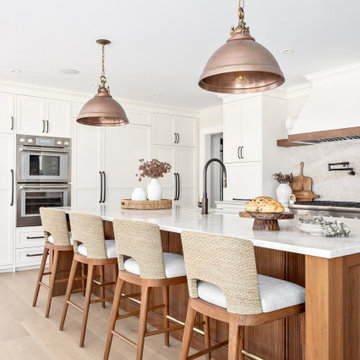
When our clients approached us to renovate their 1950s Newfoundland home, their goal was to modernize while reflecting both their West Coast roots and current East Coast lifestyle. What began as a simple ensuite repair expanded into a full home transformation, completed in two thoughtfully phased renovations. Drawing from our cross-coastal experience—and a personal connection to the home’s past—we blended classic East Coast charm with West Coast simplicity. From reworking the layout and finishes to integrating their art collection and layering in warm, tactile materials, every detail was designed to feel cohesive, inviting, and deeply personal.

 BC&J Architecture
Four years ago, we began the design process of the main house to align with the owner's retirement and move back to the Seattle area from Chicago in 2015.
Although the Boathouse and Carriage house are more Pacific Northwest shingle in character, this time around the owners wanted a modern interpretation for the main house. Now in 2016 - 10 years later - they are settled in and their little "compound" has become the family gathering place for their three grown sons, their wives, and the owner's grandchildren.
The main house is a contemporary interpretation of Northwest Regionalism in which dramatic waterfront conditions are complemented with aesthetic consideration of massing, materials and the embracing of natural light.
The interior spaces are highlighted in marble, steel, walnut, Sapele and limestone finishes.
16