
Search results for "Modern began" in Home Design Ideas

 Simply Home Decorating
The homeowners of this condo sought our assistance when downsizing from a large family home on Howe Sound to a small urban condo in Lower Lonsdale, North Vancouver. They asked us to incorporate many of their precious antiques and art pieces into the new design. Our challenges here were twofold; first, how to deal with the unconventional curved floor plan with vast South facing windows that provide a 180 degree view of downtown Vancouver, and second, how to successfully merge an eclectic collection of antique pieces into a modern setting. We began by updating most of their artwork with new matting and framing. We created a gallery effect by grouping like artwork together and displaying larger pieces on the sections of wall between the windows, lighting them with black wall sconces for a graphic effect. We re-upholstered their antique seating with more contemporary fabrics choices - a gray flannel on their Victorian fainting couch and a fun orange chenille animal print on their Louis style chairs. We selected black as an accent colour for many of the accessories as well as the dining room wall to give the space a sophisticated modern edge. The new pieces that we added, including the sofa, coffee table and dining light fixture are mid century inspired, bridging the gap between old and new. White walls and understated wallpaper provide the perfect backdrop for the colourful mix of antique pieces. Interior Design by Lori Steeves, Simply Home Decorating. Photos by Tracey Ayton Photography

 Dancer Concrete Design
This client came to us looking for a space that would allow their children a place to hang out while still feeling at home. The versatility of finished concrete flooring works well to adapt to a variety of home styles, and works seamlessly with this Craftsman-style home. We worked with the client to decide that a darker reactive stain would really make the space feel warm, inviting, and comfortable. The look and feel of the floor with this stain selection would be similar to the pictures they provided of the look they were targeting when we started the selection process. The clients really embraced the existing cracks in the concrete, and thought they exhibited the character of the house – and we agree.
When our team works on residential projects, it is imperative that we keep everything as clean and mess-free as possible for the client. For this reason, our first step was to apply RAM Board throughout the house where our equipment would be traveling. Tape and 24″ plastic were also applied to the walls of the basement to protect them. The original floor was rather new concrete with some cracks. Our team started by filling the cracks with a patching product. The grinding process then began, concrete reactive stain was applied in the color Wenge Wood, and then the floor was sealed with our two step concrete densification and stain-guard process. The 5 step polishing process was finished by bringing the floor to a 800-grit level. We were excited to see how the space came together after the rest of construction, which was overseen by the contractor Arbor Homes, was complete. View the gallery below to take a look!

 Drewett Works
Believe it or not, this award-winning home began as a speculative project. Typically speculative projects involve a rather generic design that would appeal to many in a style that might be loved by the masses. But the project’s developer loved modern architecture and his personal residence was the first project designed by architect C.P. Drewett when Drewett Works launched in 2001. Together, the architect and developer envisioned a fictitious art collector who would one day purchase this stunning piece of desert modern architecture to showcase their magnificent collection.
The primary views from the site were southwest. Therefore, protecting the interior spaces from the southwest sun while making the primary views available was the greatest challenge. The views were very calculated and carefully managed. Every room needed to not only capture the vistas of the surrounding desert, but also provide viewing spaces for the potential collection to be housed within its walls.
The core of the material palette is utilitarian including exposed masonry and locally quarried cantera stone. An organic nature was added to the project through millwork selections including walnut and red gum veneers.
The eventual owners saw immediately that this could indeed become a home for them as well as their magnificent collection, of which pieces are loaned out to museums around the world. Their decision to purchase the home was based on the dimensions of one particular wall in the dining room which was EXACTLY large enough for one particular painting not yet displayed due to its size. The owners and this home were, as the saying goes, a perfect match!
Project Details | Desert Modern for the Magnificent Collection, Estancia, Scottsdale, AZ
Architecture: C.P. Drewett, Jr., AIA, NCARB | Drewett Works, Scottsdale, AZ
Builder: Shannon Construction | Phoenix, AZ
Interior Selections: Janet Bilotti, NCIDQ, ASID | Naples, FL
Custom Millwork: Linear Fine Woodworking | Scottsdale, AZ
Photography: Dino Tonn | Scottsdale, AZ
Awards: 2014 Gold Nugget Award of Merit
Feature Article: Luxe. Interiors and Design. Winter 2015, “Lofty Exposure”
Find the right local pro for your project

 Alinda Morris Interior Design LLC
Raft Island Kitchen Redesign & Remodel
Project Overview
Located in the beautiful Puget Sound this project began with functionality in mind. The original kitchen was built custom for a very tall person, The custom countertops were not functional for the busy family that purchased the home. The new design has clean lines with elements of nature . The custom oak cabinets were locally made. The stain is a custom blend. The reclaimed island was made from local material. ..the floating shelves and beams are also reclaimed lumber. The island counter top and hood is NEOLITH in Iron Copper , a durable porcelain counter top material The counter tops along the perimeter of the kitchen is Lapitec. The design is original, textured, inviting, brave & complimentary.
Photos by Julie Mannell Photography

 Rocco J Lettieri
This fresh modern farmhouse began as a cape home with years of additions and adds on, creating no formal structure. Rocco J Lettieri worked to keep the footprint of the home due to limitations based on the wetland conservations on the property and opted to go from a traditional home to a modern barn with a semi-open plan. The goal was to feel clean and crisp throughout all of the seasons. It was built for a close family so the layout is designed to be inviting for their children as well.
Photo Credit: Tria Giovan

 Taylor & Taylor, Inc.
“Green Roof”.
Deep green accents complement the wood tones in the family room. Interior Designer Phyllis Taylor says that the deer motif began unexpectedly with a trip to New York’s Chelsea where she discovered a shop the offered multiple paintings of deer and antlers.

 Susan Teare, Professional Photographer
© www.SusanTeare.com
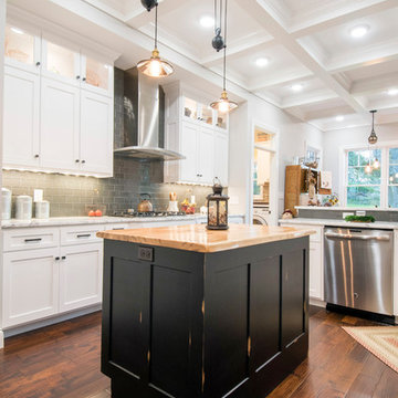
When we started this project it was simply a kitchen remodel, but as the construction phase began it became obvious to the homeowners, the architect (Gregor Masefield of Studio III Architects) and us that the entire house was in need of both structural and aesthetic modernization. By working closely with all involved we were able to update the mechanical systems, repair all structural defects, and create an open floor plan that was rich in detail and creates a warm and welcoming environment.. This project featured in:
Salvage Secrets », Fine Homebuilding »,
and Built-Ins Idea Book.

 AOME Architects
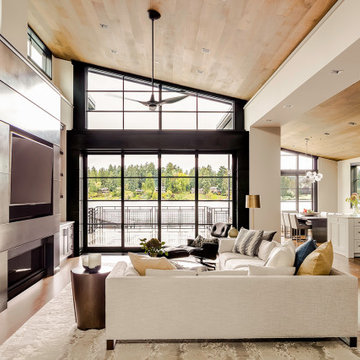
Stacking doors roll entirely away, blending the open floor plan with outdoor living areas // Image : John Granen Photography, Inc.
Family room - contemporary open concept wood ceiling family room idea in Seattle with black walls, a ribbon fireplace, a metal fireplace and a media wall
Family room - contemporary open concept wood ceiling family room idea in Seattle with black walls, a ribbon fireplace, a metal fireplace and a media wall

 Robin LaMonte/Rooms Revamped
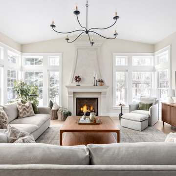
This room was originally the small living room off the foyer. It began as an office but my client wanted it to be sophisticated and was ready for a change. Since this room is off the foyer we wanted to create an elegant room for her.
Photo by Christina Wedge
 Simply Home Decorating
When our clients approached us to renovate their 1950s Newfoundland home, their goal was to modernize while reflecting both their West Coast roots and current East Coast lifestyle. What began as a simple ensuite repair expanded into a full home transformation, completed in two thoughtfully phased renovations. Drawing from our cross-coastal experience—and a personal connection to the home’s past—we blended classic East Coast charm with West Coast simplicity. From reworking the layout and finishes to integrating their art collection and layering in warm, tactile materials, every detail was designed to feel cohesive, inviting, and deeply personal.

 Drury Design
The homeowners were seeking a major renovation from their original master bath. The young family had completed several remodeling projects on the first floor of their 1980’s era home and the time had finally come where they wanted to focus on the second floor, particularly their master bath which was cramped and overpowered by a Jacuzzi-style tub.
After multiple design meetings spent choosing the right hardware and materials, everything was set, and the transformation began! Drury designer, Diana Burton, began by borrowing some space from the bedroom this way they were able to reconfigure the whole layout, which made a big difference to the homeowner. The floating vanity cabinets paired with quartz counters, wall-mounted fixtures, and mirrors featuring built-in lighting enhance the room’s sleek, clean look.

 Advance Design Studio, Ltd.
When this suburban family decided to renovate their kitchen, they knew that they wanted a little more space. Advance Design worked together with the homeowner to design a kitchen that would work for a large family who loved to gather regularly and always ended up in the kitchen! So the project began with extending out an exterior wall to accommodate a larger island and more moving-around space between the island and the perimeter cabinetry.
Style was important to the cook, who began collecting accessories and photos of the look she loved for months prior to the project design. She was drawn to the brightness of whites and grays, and the design accentuated this color palette brilliantly with the incorporation of a warm shade of brown woods that originated from a dining room table that was a family favorite. Classic gray and white cabinetry from Dura Supreme hits the mark creating a perfect balance between bright and subdued. Hints of gray appear in the bead board detail peeking just behind glass doors, and in the application of the handsome floating wood shelves between cabinets. White subway tile is made extra interesting with the application of dark gray grout lines causing it to be a subtle but noticeable detail worthy of attention.
Suede quartz Silestone graces the countertops with a soft matte hint of color that contrasts nicely with the presence of white painted cabinetry finished smartly with the brightness of a milky white farm sink. Old melds nicely with new, as antique bronze accents are sprinkled throughout hardware and fixtures, and work together unassumingly with the sleekness of stainless steel appliances.
The grace and timelessness of this sparkling new kitchen maintains the charm and character of a space that has seen generations past. And now this family will enjoy this new space for many more generations to come in the future with the help of the team at Advance Design Studio.
Dura Supreme Cabinetry
Photographer: Joe Nowak

 BRADSHAW DESIGNS LLC
This Texas Treasure began as a simple kitchen remodel, then expanded to include the entire home! What was a tired, dark, cramped space has now become an open, light, bright space fit for a serious cook! She yearned for natural and organic elements that harken to the outdoors. Stone, antique, rough, hand-hewn beams fit the bill perfectly!
Sponsored
Sunbury, OH

J.Holderby - Renovations
Franklin County's Leading General Contractors - 2X Best of Houzz!
 Laney LA, Inc.
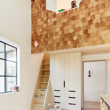
Rather than starting with an outcome in mind, this 1,400 square foot residence began from a polemic place - exploring shared conviction regarding the concentrated power of living with a smaller footprint. From the gabled silhouette to passive ventilation, the home captures the nostalgia for the past with the sustainable practices of the future.
While the exterior materials contrast a calm, minimal palette with the sleek lines of the gabled silhouette, the interior spaces embody a playful, artistic spirit. From the hand painted De Gournay wallpaper in the master bath to the rugged texture of the over-grouted limestone and Portuguese cobblestones, the home is an experience that encapsulates the unexpected and the timeless.

 F. D. Hodge Interiors
Master Bathroom,
Luxurious bathroom with an Art Deco feel. The Sherle Wagner faucets are like little pieces of sculpture. Tone on tone wall finish. Ann Sacks Tile. Frank Hodge Interiors
Photo: Michael J Lee
 Danielle Rose Design Co.
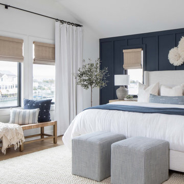
This project was a primary suite remodel that we began pre-pandemic. The primary bedroom was an addition to this waterfront home and we added character with bold board-and-batten statement wall, rich natural textures, and brushed metals. The primary bathroom received a custom white oak vanity that spanned over nine feet long, brass and matte black finishes, and an oversized steam shower in Zellige-inspired tile.

 User
ASID Design Excellence First Place Residential – Kitchen and Bathroom: Michael Merrill Design Studio was approached three years ago by the homeowner to redesign her kitchen. Although she was dissatisfied with some aspects of her home, she still loved it dearly. As we discovered her passion for design, we began to rework her entire home--room by room, top to bottom.
Sponsored
Westerville, OH

Custom Home Works
Franklin County's Award-Winning Design, Build and Remodeling Expert

 Cummings Architecture + Interiors
When Cummings Architects first met with the owners of this understated country farmhouse, the building’s layout and design was an incoherent jumble. The original bones of the building were almost unrecognizable. All of the original windows, doors, flooring, and trims – even the country kitchen – had been removed. Mathew and his team began a thorough design discovery process to find the design solution that would enable them to breathe life back into the old farmhouse in a way that acknowledged the building’s venerable history while also providing for a modern living by a growing family.
The redesign included the addition of a new eat-in kitchen, bedrooms, bathrooms, wrap around porch, and stone fireplaces. To begin the transforming restoration, the team designed a generous, twenty-four square foot kitchen addition with custom, farmers-style cabinetry and timber framing. The team walked the homeowners through each detail the cabinetry layout, materials, and finishes. Salvaged materials were used and authentic craftsmanship lent a sense of place and history to the fabric of the space.
The new master suite included a cathedral ceiling showcasing beautifully worn salvaged timbers. The team continued with the farm theme, using sliding barn doors to separate the custom-designed master bath and closet. The new second-floor hallway features a bold, red floor while new transoms in each bedroom let in plenty of light. A summer stair, detailed and crafted with authentic details, was added for additional access and charm.
Finally, a welcoming farmer’s porch wraps around the side entry, connecting to the rear yard via a gracefully engineered grade. This large outdoor space provides seating for large groups of people to visit and dine next to the beautiful outdoor landscape and the new exterior stone fireplace.
Though it had temporarily lost its identity, with the help of the team at Cummings Architects, this lovely farmhouse has regained not only its former charm but also a new life through beautifully integrated modern features designed for today’s family.
Photo by Eric Roth
 BRADSHAW DESIGNS LLC
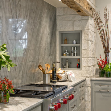
This Texas Treasure began as a simple kitchen remodel, then expanded to include the entire home! What was a tired, dark, cramped space has now become an open, light, bright space fit for a serious cook! She yearned for natural and organic elements that harken to the outdoors. Stone, antique, rough, hand-hewn beams fit the bill perfectly!

 MainStreet Design Build
On April 22, 2013, MainStreet Design Build began a 6-month construction project that ended November 1, 2013 with a beautiful 655 square foot addition off the rear of this client's home. The addition included this gorgeous custom kitchen, a large mudroom with a locker for everyone in the house, a brand new laundry room and 3rd car garage. As part of the renovation, a 2nd floor closet was also converted into a full bathroom, attached to a child’s bedroom; the formal living room and dining room were opened up to one another with custom columns that coordinated with existing columns in the family room and kitchen; and the front entry stairwell received a complete re-design.
KateBenjamin Photography
8