
Search results for "Morphed" in Home Design Ideas
 Mammoth Projects
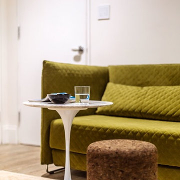
The brief for the living room included creating a space that is comfortable, modern and where the couple’s young children can play and make a mess. We selected a bright, vintage rug to anchor the space on top of which we added a myriad of seating opportunities that can move and morph into whatever is required for playing and entertaining.
 A-1 Builders and Adaptations Design Studio
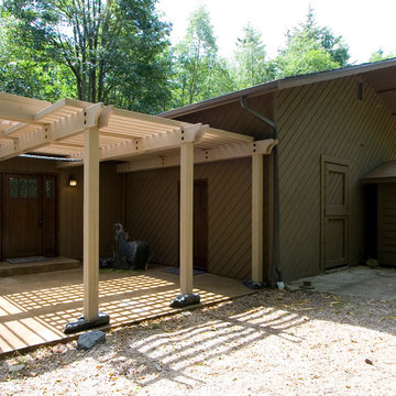
This morphed and expanded space included a great room, media room, craft room and game room... along with this patio and trellis.
For more information and additional photos of this project, which we both designed and built, go to http://a1builders.ws/2012/01/transformation-of-detached-garage-into-a-recreational-retreat/
 SV Design
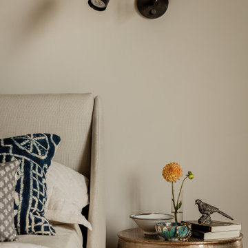
What began as a renovation project morphed into a new house, driven by the natural beauty of the site.
The new structures are perfectly aligned with the coastline, and take full advantage of the views of ocean, islands, and shoals. The location is within walking distance of town and its amenities, yet miles away in the privacy it affords. The house is nestled on a nicely wooded lot, giving the residence screening from the street, with an open meadow leading to the ocean on the rear of the lot.
The design concept was driven by the serenity of the site, enhanced by textures of trees, plantings, sand and shoreline. The newly constructed house sits quietly in a location advantageously positioned to take full advantage of natural light and solar orientations. The visual calm is enhanced by the natural material: stone, wood, and metal throughout the home.
The main structures are comprised of traditional New England forms, with modern connectors serving to unify the structures. Each building is equally suited for single floor living, if that future needs is ever necessary. Unique too is an underground connection between main house and an outbuilding.
With their flowing connections, no room is isolated or ignored; instead each reflects a different level of privacy and social interaction.
Just as there are layers to the exterior in beach, field, forest and oceans, the inside has a layered approach. Textures in wood, stone, and neutral colors combine with the warmth of linens, wools, and metals. Personality and character of the interiors and its furnishings are tailored to the client’s lifestyle. Rooms are arranged and organized in an intersection of public and private spaces. The quiet palette within reflects the nature outside, enhanced with artwork and accessories.
Find the right local pro for your project
 Bilotta Kitchen & Home
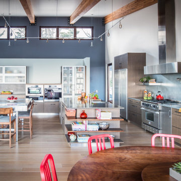
Asymmetry is the defining element in this loft-like kitchen. Stained wood beams spotlight the soaring vaulted ceiling. On the range wall, the fridge enclosure and pantry bookending this section have staggered heights. The flue on the gently curved stainless vent hood is offset toward the left. Additional appliances on another wall are installed in mid-height cabinets, positioned to the right of center.
Flat panel doors are highlighted by a smokey stain on rift-cut white oak. Its deeply-grained surface morphs the color as lighting conditions and viewing angles change. Toekicks are stainless steel for a floating effect. Lift-up uppers and a tall unit feature aluminum-framed doors with acid-etched glass, allowing a peek at tableware and pantry contents. Efficient pullouts and a corner swingout make the room as convenient as it is beautiful.
Mixed materials provide richness. Flanking the hood are stainless steel floating shelves set against a patinated zinc backsplash. Concrete countertops add texture and an industrial accent. Walnut open shelves at the end of the base cabinets and wrapping around the island inject warmth.
Two spacious dining options include a custom breakfast table of 4” thick stainless with a walnut insert; and a round walnut table with a rotating turntable.
Bilotta Designer: Rita Garces
 Four Elements Construction
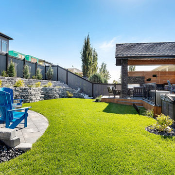
Our clients wanted to create a backyard area to hang out and entertain with some privacy and protection from the elements. The initial vision was to simply build a large roof over one side of the existing deck while providing a little privacy. It was important to them to carefully integrate the new covered deck roofline into the existing home so that it looked it was there from day one. We had our partners at Draw Design help us with the initial drawings.
As work progressed, the scope of the project morphed into something more significant. Check out the outdoor built-in barbecue and seating area complete with custom cabinets, granite countertops, and beautiful outdoor gas fireplace. Stone pillars and black metal capping completed the look giving the structure a mountain resort feel. Extensive use of red cedar finished off the high ceilings and privacy screen. Landscaping and a new hot tub were added afterwards. The end result is truly jaw-dropping!
 Otogawa-Anschel Design-Build
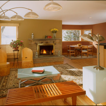
The owners of this 1970s-era split-level on Lake Calhoun recently added a third story bringing the home up-to-date with attractive soffits, angles, and half-walls built to create depth and dimension. But in a house where every room registered a dull white, a healthy dose of color becomes the true force for modernizing this space. The homeowners asked Otogawa-Anschel to bring color into their lives.
The standalone fireplace in the room’s center wears an entirely different chromatic palette on each side. From the sleeping area and looking out toward the lake, cool tones tease out the aqua and dark blue in the slate fireplace surround. From the opposite side, warm hues pick up the rose and violet of the same material. The wall separating the bedroom from the bathroom boasts a rich adobe red, set off by a gold soffit and a rich chocolate panel. The bold, earthy color triad serves as the eye-catching anchor point for the room.
Asymmetrical glass block flanking the bathroom vanity opens up an otherwise restrictive space, allowing it to communicate with the walk-in closet on one side and the natural light spill on the other. Because the green glass block diffuses the light, the room’s colors work to compensate for this softening. A mix of tangerine, pale green, and lemon yellow tile used in the shower find a place on the floor and walls as well for a burst of synthetic sunshine designed to shift and bend depending on vantage point. The gently morphing pattern eliminates the flat sterility of white tile and ordinary glass block.
The transition from the second floor to the third floor features a combination of yellow hues that also appear to shimmer and shift with the movement of natural light through the space. In the intense afternoon sun, the pigments lose their distinction and become a solid glowing wall. As the sun sets, they regain their individual character.
Like any healthy relationship, the living room and dining room work together while maintaining independence. In the living room, a soft suede wall gives way to the room’s large bank of windows and smartly complements the stone fireplace. Muted greens and golds segue effortlessly to the spectacular lake view. Meanwhile, the vibrant tones of the dining room tastefully contrast the cool calm of the living area.
highlights
Fifty-six colors in whole house
Forty-two colors in master suite
 Safferstone Interiors
Meet Kim: a partner in a downtown law firm. To say that she is short on time is a giant understatement. In the rare event she has a free moment, she wants to spend it with her kids, not fussing over home decor.
That’s my cue!
Kim is my favorite type of client. She didn’t know where to go or what to do. She leaned on me to explain and articulate design and style.
She looked to me to make her home a mirror of her best self. Easy peasy lemon squeezy. Fantastic human giving me a blank slate? Yes please!
While Kim’s traditional home had a great layout and good bones, it needed updating to make it contemporary and fresh. It needed fixtures and knobs from this century. It needed a Lulu DK roman shade in the powder room. It needed a durable, snuggle-ready sofa with tufting and little patterns of texture. It needed drapery with small-scale drama. Throw in a Thomas O’ Brian cocktail table, and now there’s no shortage of conversation pieces.
Little spaces make me happy – they are the most intimate snapshot of your entire home’s aesthetic – and this house has some good ones.
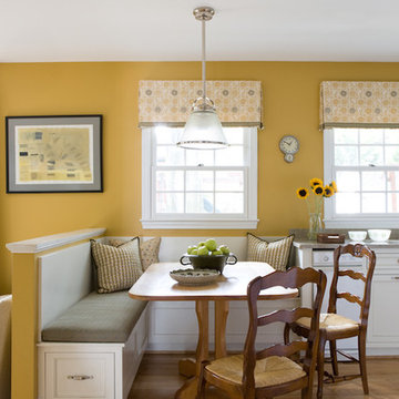
I couldn’t wait to work with the nooks and crannies of this house. Kim’s sitting room, a small den off of the master bedroom, morphed into a craveable cozy space, a quiet adult respite from the occasional chaos of raising a family. The kitchen evolved into something quite unique: playful yet modest, dressed-up but centered. We used a favorite Lucy Rose fabric and Galbraith & Paul pillows to work perfectly with a fresh color palette selected during a prior-to-me renovation. A locally made kitchen farm table fit right in with the high-fashioned quirky blend of color, texture, and pattern.
High-End + Color = Fun + Functional
This is how we articulated Kim’s style and personality. She trusted me with her inner self, allowing me to get to know her and her real, everyday life. I built her a special space to reflect the beautiful life she made for herself. Nothing too fancy or off-limits to little hands, nothing too stuffy (snore!). Everything 100% HER. #nailedit See more Safferstone stuff at www.safferstone.com. Connect with us on Facebook, get inspired on Pinterest, and share modern musings on life & design on Instagram. Or, send us a love note at hello@safferstone.com.
Photo: Angie Seckinger
 Cerno
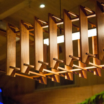
Cerno07-120-AW - Arca - LED Linear Pendant - Oiled Walnut, Brushed Aluminum - Frosted Polymer
The Arca is an experiment with density and mass. As one moves around the room the fixture morphs from a commanding presence of solid walnut into a graceful bar of light surrounded by an elegant porous cage.
 Archevie Design
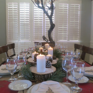
Holiday table decorations that start with Thanksgiving and morph into Christmas
Dining room - transitional dining room idea in Denver
Dining room - transitional dining room idea in Denver
 HORESTCO INDUSTRIES (M) SDN. BHD.
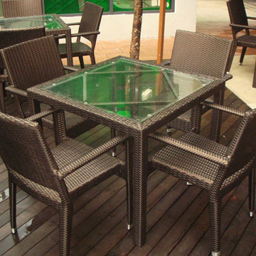
Housed in a spectacularly – decorated building spreading across 2 levels and 8400 square feet. The Roulette Restaurant Bar, has easy access to Kesas highway and Ambang botanic garden housing development. It has amazing looks with over 350 of seating capacity with the ability to morph into a dining venue, special event destination or a club.
Scope of Project:
Panama Bar Chair
Venice Dining Chair
Setia Round Bar Table
Savana Coffee Table
Hawaii Chair
Panama Glass top Table
Veron Bar Chair

 Four Elements Construction
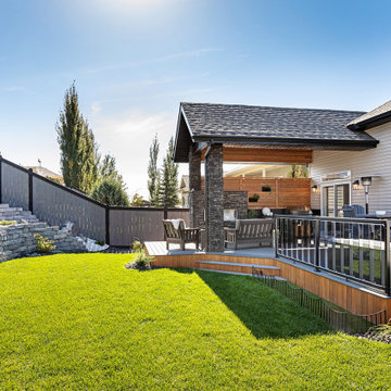
Our clients wanted to create a backyard area to hang out and entertain with some privacy and protection from the elements. The initial vision was to simply build a large roof over one side of the existing deck while providing a little privacy. It was important to them to carefully integrate the new covered deck roofline into the existing home so that it looked it was there from day one. We had our partners at Draw Design help us with the initial drawings.
As work progressed, the scope of the project morphed into something more significant. Check out the outdoor built-in barbecue and seating area complete with custom cabinets, granite countertops, and beautiful outdoor gas fireplace. Stone pillars and black metal capping completed the look giving the structure a mountain resort feel. Extensive use of red cedar finished off the high ceilings and privacy screen. Landscaping and a new hot tub were added afterwards. The end result is truly jaw-dropping!
 Bilotta Kitchen & Home
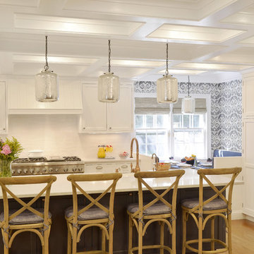
“It’s hard to believe these two sets of photos are actually the same space! The 1950s “modern” kitchen was tiny and dark, and the adjoining family room went largely unused by the family. Yet the owners love to cook and entertain, so this kitchen needed to go! Designer Fabrice Garson removed the wall between the two spaces and created one multi-purpose space: an open kitchen with abundant storage and prep space at the large range and island; a banquette for casual family meals or homework; and a separate table for dinner parties. Because they’d be losing their formal dining room, Fabrice recommended adding the coffered ceiling to lend an air of elegance to the new space. This once-gloomy cave morphed into an airy, luminous room. Pops of dark blue on the island, the banquette upholstery, and the banquette wallpaper add a fun element to temper the traditional tone of the inset cabinetry. And the mixture of stainless appliances with the brushed gold faucet, gold accents on the pendant fixtures, and the bronze crystal chandelier create an eclectic but elegant look.” (This blurb was part of Bilotta’s Blog Post written by Paulette Gambacorta)
The finished space features Signature Custom Cabinetry in a mix of white paint on the perimeter and a custom navy paint on the island. All hardware is a mixed of brushed nickel knobs and cup pulls. The countertops are Ceasarstone’s Bianco Drift and the backsplash is a classic and clean white ceramic subway tile. Appliances are all by Thermador with the exception of the Best hood insert which is hidden by the custom white painted hood. The sink is an apron front by Kohler in cast iron with a white enamel finish and is accented by a brushed copper faucet and water filter. The decorative lighting adding to the elegance of the space is by EuroStyle. The custom-built banquette and coffered ceiling were both designed by Fabrice and brought to life by his long time contractor Breton Contracting.
Designer: Fabrice Garson Photo Credit: After Photos by Peter Krupenye
22