
Search results for "Moves increases" in Home Design Ideas

 Red Pepper Design & Cabinetry
By moving the door to a different location (around the corner) we were able to significantly increase the workable counter space. Dish storage greatly improved as well

 John Webb Construction and Design
Here is an architecturally built house from the early 1970's which was brought into the new century during this complete home remodel by opening up the main living space with two small additions off the back of the house creating a seamless exterior wall, dropping the floor to one level throughout, exposing the post an beam supports, creating main level on-suite, den/office space, refurbishing the existing powder room, adding a butlers pantry, creating an over sized kitchen with 17' island, refurbishing the existing bedrooms and creating a new master bedroom floor plan with walk in closet, adding an upstairs bonus room off an existing porch, remodeling the existing guest bathroom, and creating an in-law suite out of the existing workshop and garden tool room.

 The Artisans Group, Inc.
Winner of the 2018 Tour of Homes Best Remodel, this whole house re-design of a 1963 Bennet & Johnson mid-century raised ranch home is a beautiful example of the magic we can weave through the application of more sustainable modern design principles to existing spaces.
We worked closely with our client on extensive updates to create a modernized MCM gem.
Extensive alterations include:
- a completely redesigned floor plan to promote a more intuitive flow throughout
- vaulted the ceilings over the great room to create an amazing entrance and feeling of inspired openness
- redesigned entry and driveway to be more inviting and welcoming as well as to experientially set the mid-century modern stage
- the removal of a visually disruptive load bearing central wall and chimney system that formerly partitioned the homes’ entry, dining, kitchen and living rooms from each other
- added clerestory windows above the new kitchen to accentuate the new vaulted ceiling line and create a greater visual continuation of indoor to outdoor space
- drastically increased the access to natural light by increasing window sizes and opening up the floor plan
- placed natural wood elements throughout to provide a calming palette and cohesive Pacific Northwest feel
- incorporated Universal Design principles to make the home Aging In Place ready with wide hallways and accessible spaces, including single-floor living if needed
- moved and completely redesigned the stairway to work for the home’s occupants and be a part of the cohesive design aesthetic
- mixed custom tile layouts with more traditional tiling to create fun and playful visual experiences
- custom designed and sourced MCM specific elements such as the entry screen, cabinetry and lighting
- development of the downstairs for potential future use by an assisted living caretaker
- energy efficiency upgrades seamlessly woven in with much improved insulation, ductless mini splits and solar gain
Find the right local pro for your project

 Lauren Shadid Architecture + Interiors
This light and bright bathroom was transformed from it's previously dated state. An awkward jacuzzi tub and a glass block wall were removed and 80s era tile was replaced with Carrara mosaic on the floor and Carrara stone in the shower. A large opaque window brings in light but allows privacy.

 CMC Design Studio LLC
Newlyweds had just moved into their new home and immediately wanted to update their kitchen which is located in the center of the household, lacking any natural light source of its own. To make matters worse, the cabinets in place were dark red with black countertops. Not the picture of brightness they were looking for. To increase the amount of light reflected throughout the kitchen, we incorporated some of the following updates:
1. Replaced the solo ceiling light with 4 recessed cans
2. Updated the florescent undercabinet lights with new LED strips
3. Installed custom white cabinets topped with Silestone’s new Artic Ocean white countertops
4. Updated the dark glass pendants over the bar with larger, clear glass pendants that spoke more to the history of the home
5. Painted the walls a soft gray to compliment the palette
The original kitchen layout was updated to eliminate the existing soffits and open the visual feel of the space. A large white farm sink now centers the natural wood bar area, inviting guests to sit and gather for ballgames and celebrations. Glass tile and USB ports at charging sites complete the space for the family to grow over the years.
Photo by Stockwell Media


 Ninzan Studio, LLC
Freshly renovated Laundry Room. This was moved up from the floor below and the size was increased twice as large to accommodate more activities.
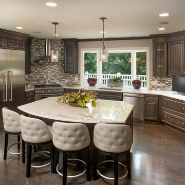
Example of a large classic u-shaped dark wood floor and brown floor utility room design in Tampa with an undermount sink, recessed-panel cabinets, white cabinets, quartz countertops, beige walls, a side-by-side washer/dryer and beige countertops
Example of a large classic u-shaped dark wood floor and brown floor utility room design in Tampa with an undermount sink, recessed-panel cabinets, white cabinets, quartz countertops, beige walls, a side-by-side washer/dryer and beige countertops


 Katarina Devine Design
Beautiful leather chairs, hot rolled steel coffee table, Belgium linen sofa with wool pillows, Agate stone side table and ceramic lamp. Cowhide ottomans atop a cozy rugs.


 The Artisans Group, Inc.
Winner of the 2018 Tour of Homes Best Remodel, this whole house re-design of a 1963 Bennet & Johnson mid-century raised ranch home is a beautiful example of the magic we can weave through the application of more sustainable modern design principles to existing spaces.
We worked closely with our client on extensive updates to create a modernized MCM gem.
Extensive alterations include:
- a completely redesigned floor plan to promote a more intuitive flow throughout
- vaulted the ceilings over the great room to create an amazing entrance and feeling of inspired openness
- redesigned entry and driveway to be more inviting and welcoming as well as to experientially set the mid-century modern stage
- the removal of a visually disruptive load bearing central wall and chimney system that formerly partitioned the homes’ entry, dining, kitchen and living rooms from each other
- added clerestory windows above the new kitchen to accentuate the new vaulted ceiling line and create a greater visual continuation of indoor to outdoor space
- drastically increased the access to natural light by increasing window sizes and opening up the floor plan
- placed natural wood elements throughout to provide a calming palette and cohesive Pacific Northwest feel
- incorporated Universal Design principles to make the home Aging In Place ready with wide hallways and accessible spaces, including single-floor living if needed
- moved and completely redesigned the stairway to work for the home’s occupants and be a part of the cohesive design aesthetic
- mixed custom tile layouts with more traditional tiling to create fun and playful visual experiences
- custom designed and sourced MCM specific elements such as the entry screen, cabinetry and lighting
- development of the downstairs for potential future use by an assisted living caretaker
- energy efficiency upgrades seamlessly woven in with much improved insulation, ductless mini splits and solar gain

 YE-H PHOTOGRAPHY
Bathroom - contemporary multicolored tile and mosaic tile bathroom idea in Seattle with a vessel sink and white walls
 Seed Studio Landscape Design
Photography: Travis Rhoads Photography
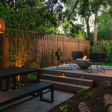
Example of a small trendy backyard wood fence partial sun deck design in San Francisco with a fire pit and decking
Example of a small trendy backyard wood fence partial sun deck design in San Francisco with a fire pit and decking
 Vision Design
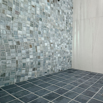
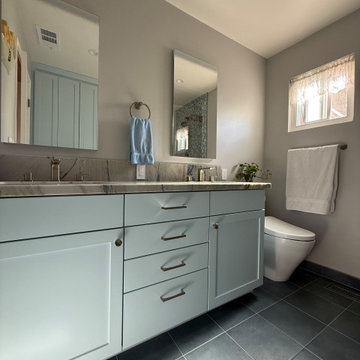
There was no way to enlarge the shower stall of this master bath without moving an internal wall. We did this and expanded the closet area to really increase the functionality of this primary suite.
 Vision Design
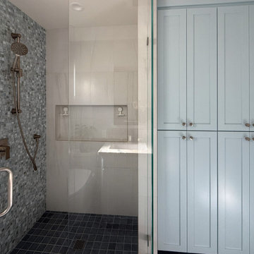
There was no way to enlarge the shower stall of this master bath without moving an internal wall. We did this and expanded the closet area to really increase the functionality of this primary suite.
 Vision Design
There was no way to enlarge the shower stall of this master bath without moving an internal wall. We did this and expanded the closet area to really increase the functionality of this primary suite.

 The Artisans Group, Inc.
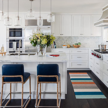
Winner of the 2018 Tour of Homes Best Remodel, this whole house re-design of a 1963 Bennet & Johnson mid-century raised ranch home is a beautiful example of the magic we can weave through the application of more sustainable modern design principles to existing spaces.
We worked closely with our client on extensive updates to create a modernized MCM gem.
Extensive alterations include:
- a completely redesigned floor plan to promote a more intuitive flow throughout
- vaulted the ceilings over the great room to create an amazing entrance and feeling of inspired openness
- redesigned entry and driveway to be more inviting and welcoming as well as to experientially set the mid-century modern stage
- the removal of a visually disruptive load bearing central wall and chimney system that formerly partitioned the homes’ entry, dining, kitchen and living rooms from each other
- added clerestory windows above the new kitchen to accentuate the new vaulted ceiling line and create a greater visual continuation of indoor to outdoor space
- drastically increased the access to natural light by increasing window sizes and opening up the floor plan
- placed natural wood elements throughout to provide a calming palette and cohesive Pacific Northwest feel
- incorporated Universal Design principles to make the home Aging In Place ready with wide hallways and accessible spaces, including single-floor living if needed
- moved and completely redesigned the stairway to work for the home’s occupants and be a part of the cohesive design aesthetic
- mixed custom tile layouts with more traditional tiling to create fun and playful visual experiences
- custom designed and sourced MCM specific elements such as the entry screen, cabinetry and lighting
- development of the downstairs for potential future use by an assisted living caretaker
- energy efficiency upgrades seamlessly woven in with much improved insulation, ductless mini splits and solar gain
 White Sands Coastal Development
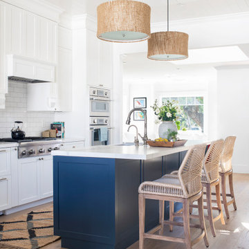
This was a gut remodel of a 1950’s 3 bedroom, 2 bath, 1200-square-foot home. The main house was composed of two bedrooms with one bathroom, and a separate studio unit with a full bathroom was located in the backyard. The new owners, a family of 4, wanted to remove the studio unit and increase the square footage of the main house to include a new master suite, family room, and powder room while leaving enough space for the possible addition of a pool in the backyard down the road. We also expanded the kitchen and remodeled the kids’ shared bathroom.
White Sands advised during the architectural stage of the project to perfect the layout and ensure enough space was carved out for the new kitchen, family room, and master bedroom. We designed a modified galley kitchen with a large eat-in island in the center. Custom cabinetry was key in making the layout work. To provide ample storage, we created a European-style larder pantry, which is flanked by full-height glass hutches and appliance garages to keep countertop gadgets concealed. The family room is anchored by a new fireplace, complete with custom built-ins flanking each side. The client’s goal for the overall aesthetic is very simple, classic coastal cottage. They wanted cutesy charm. They did not want anything fussy or fancy, requesting selections to be pared down and approachable. All tile and counter finishes selected were in timeless shapes and color palettes. We brought in color and personality with the accessories- cabinet hardware, mirrors, wallcoverings, and styling accessories.

 Carlton Edwards
The Cherry Road project is a humble yet striking example of how small changes can have a big impact. A meaningful project as the final room to be renovated in this house, thus our completion aligned with the family’s move-in. The kitchen posed a number of problems the design worked to remedy. Such as an existing window oriented the room towards a neighboring driveway. The initial design move sought to reorganize the space internally, focusing the view from the sink back through the house to the pool and courtyard beyond. This simple repositioning allowed the range to center on the opposite wall, flanked by two windows that reduce direct views to the driveway while increasing the natural light of the space.
Opposite that opening to the dining room, we created a new custom hutch that has the upper doors bypass doors incorporate an antique mirror, then led they magnified the light and view opposite side of the room. The ceilings we were confined to eight foot four, so we wanted to create as much verticality as possible. All the cabinetry was designed to go to the ceiling, incorporating a simple coat mold at the ceiling. The west wall of the kitchen is primarily floor-to-ceiling storage behind paneled doors. So the refrigeration and freezers are fully integrated.
The island has a custom steel base with hammered legs, with a natural wax finish on it. The top is soapstone and incorporates an integral drain board in the kitchen sink. We did custom bar stools with steel bases and upholstered seats. At the range, we incorporated stainless steel countertops to integrate with the range itself, to make that more seamless flow. The edge detail is historic from the 1930s.
There is a concealed sort of office for the homeowner behind custom, bi-folding panel doors. So it can be closed and totally concealed, or opened up and engaged with the kitchen.
In the office area, which was a former pantry, we repurposed a granite marble top that was on the former island. Then the walls have a grass cloth wall covering, which is pinnable, so the homeowner can display photographs, calendars, and schedules.
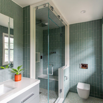
 Griffin Designs LLC
Smokey turquoise glass tiles cover this luxury bath with an interplay of stacked and gridded tile patterns that enhances the sophistication of the monochromatic palette.
Floor to ceiling glass panes define a breathtaking steam shower. Every detail takes the homeowner’s needs into account, including an in-wall waterfall element above the shower bench. Griffin Designs measured not only the space but also the seated homeowner to ensure a soothing stream of water that cascades onto the shoulders, hits just the right places, and melts away the stresses of the day.
Space conserving features such as the wall-hung toilet allowed for more flexibility in the layout. With more possibilities came more storage. Replacing the original pedestal sink, a bureau-style vanity spans four feet and offers six generously sized drawers. One drawer comes complete with outlets to discretely hide away accessories, like a hair dryer, while maximizing function. An additional recessed medicine cabinet measures almost six feet in height.
The comforts of this primary bath continue with radiant floor heating, a built-in towel warmer, and thoughtfully placed niches to hold all the bits and bobs in style.
5