
Search results for "Moves perfectly" in Home Design Ideas
 Charles Hilton Architects
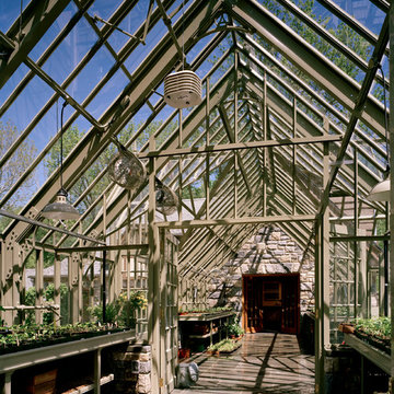
Alice Washburn Award 2013 - Winner - Accessory Building
Charles Hilton Architects
Photography: Woodruff Brown
Garden shed - farmhouse attached garden shed idea in New York
Garden shed - farmhouse attached garden shed idea in New York
 Jessica Koltun Home
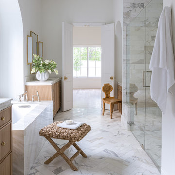
Spacious master bathroom with marble finishes, glass shower, soaking tub, and natural wood cabinetry under soft natural light.
Example of a transitional white tile white floor and double-sink bathroom design in Dallas with shaker cabinets, medium tone wood cabinets, white walls, an undermount sink, a hinged shower door, white countertops and a built-in vanity
Example of a transitional white tile white floor and double-sink bathroom design in Dallas with shaker cabinets, medium tone wood cabinets, white walls, an undermount sink, a hinged shower door, white countertops and a built-in vanity
 SHELTERWERK
Chi Fang Photography (Photography)
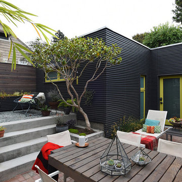
Patio - contemporary brick patio idea in Other with no cover
Patio - contemporary brick patio idea in Other with no cover
Find the right local pro for your project
 AZL interiors
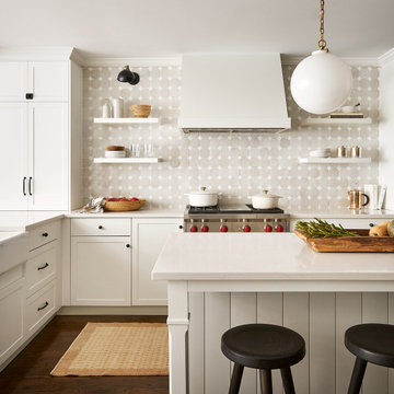
Mid-sized cottage l-shaped medium tone wood floor and brown floor kitchen photo in Chicago with a farmhouse sink, shaker cabinets, white cabinets, quartz countertops, multicolored backsplash, terra-cotta backsplash, stainless steel appliances, two islands and white countertops
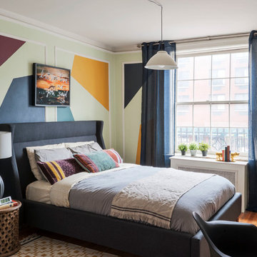
 LABLstudio
A West Village Bachelor pad bedroom, featuring a hand-painted geometric design that highlights the pre-war features of the space, like the picture moldings. Additionally, because the client wanted both a work space and a place to put his TV (the pre-war wall could not hold a wall mounted tv!), we designed a custom desk/console piece out of reclaimed wood and metal hairpin legs that served both purposes, and fit the space perfectly.
Photos by Matthew Williams
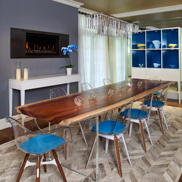
 Clutch Design Studio
Photography by Ron Ruscio
Trendy dark wood floor dining room photo in Denver with blue walls and a standard fireplace
Trendy dark wood floor dining room photo in Denver with blue walls and a standard fireplace
 Kathleen Jennison
An Arts & Crafts Bungalow is one of my favorite styles of homes. We have quite a few of them in our Stockton Mid-Town area. And when C&L called us to help them remodel their 1923 American Bungalow, I was beyond thrilled.
As per usual, when we get a new inquiry, we quickly Google the project location while we are talking to you on the phone. My excitement escalated when I saw the Google Earth Image of the sweet Sage Green bungalow in Mid-Town Stockton. "Yes, we would be interested in working with you," I said trying to keep my cool.
But what made it even better was meeting C&L and touring their home, because they are the nicest young couple, eager to make their home period perfect. Unfortunately, it had been slightly molested by some bad house-flippers, and we needed to bring the bathroom back to it "roots."
We knew we had to banish the hideous brown tile and cheap vanity quickly. But C&L complained about the condensation problems and the constant fight with mold. This immediately told me that improper remodeling had occurred and we needed to remedy that right away.
The Before: Frustrations with a Botched Remodel
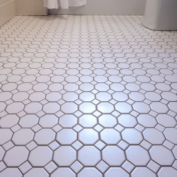
The bathroom needed to be brought back to period appropriate design with all the functionality of a modern bathroom. We thought of things like marble countertop, white mosaic floor tiles, white subway tile, board and batten molding, and of course a fabulous wallpaper.
This small (and only) bathroom on a tight budget required a little bit of design sleuthing to figure out how we could get the proper look and feel. Our goal was to determine where to splurge and where to economize and how to complete the remodel as quickly as possible because C&L would have to move out while construction was going on.
The Process: Hard Work to Remedy Design and Function
During our initial design study, (which included 2 hours in the owners’ home), we noticed framed images of William Morris Arts and Crafts textile patterns and knew this would be our design inspiration. We presented C&L with three options and they quickly selected the Pimpernel Design Concept.
We had originally selected the Black and Olive colors with a black vanity, mirror, and black and white floor tile. C&L liked it but weren’t quite sure about the black, We went back to the drawing board and decided the William & Co Pimpernel Wallpaper in Bayleaf and Manilla color with a softer gray painted vanity and mirror and white floor tile was more to their liking.
After the Design Concept was approved, we went to work securing the building permit, procuring all the elements, and scheduling our trusted tradesmen to perform the work.
We did uncover some shoddy work by the flippers such as live electrical wires hidden behind the wall, plumbing venting cut-off and buried in the walls (hence the constant dampness), the tub barely balancing on two fence boards across the floor joist, and no insulation on the exterior wall.
All of the previous blunders were fixed and the bathroom put back to its previous glory. We could feel the house thanking us for making it pretty again.
The After Reveal: Cohesive Design Decisions
We selected a simple white subway tile for the tub/shower. This is always classic and in keeping with the style of the house.
We selected a pre-fab vanity and mirror, but they look rich with the quartz countertop. There is much more storage in this small vanity than you would think.
The Transformation: A Period Perfect Refresh
We began the remodel just as the pandemic reared and stay-in-place orders went into effect. As C&L were already moved out and living with relatives, we got the go-ahead from city officials to get the work done (after all, how can you shelter in place without a bathroom?).
All our tradesmen were scheduled to work so that only one crew was on the job site at a time. We stayed on the original schedule with only a one week delay.
The end result is the sweetest little bathroom I've ever seen (and I can't wait to start work on C&L's kitchen next).
Thank you for joining me in this project transformation. I hope this inspired you to think about being creative with your design projects, determining what works best in keeping with the architecture of your space, and carefully assessing how you can have the best life in your home.

 Charlie & Co. Design, Ltd
Design: Charlie & Co. Design | Builder: John Kraemer & Sons | Interiors & Photo Styling: Lucy Interior Design | Susan Gilmore Photography
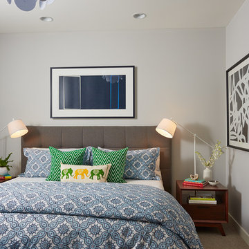
Inspiration for a contemporary master carpeted bedroom remodel in Minneapolis with white walls
Inspiration for a contemporary master carpeted bedroom remodel in Minneapolis with white walls
 Modern Rugs LA
Premier Stagers-Bamboo Silk
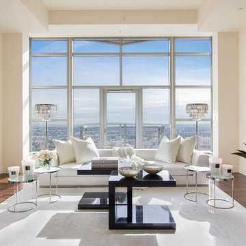
Inspiration for a large contemporary open concept medium tone wood floor living room remodel in Los Angeles with white walls
Inspiration for a large contemporary open concept medium tone wood floor living room remodel in Los Angeles with white walls
 Amazing Spaces
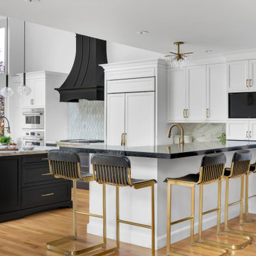
The existing U-shaped kitchen was tucked away in a small corner while the dining table was swimming in a room much too large for its size. The client’s needs and the architecture of the home made it apparent that the perfect design solution for the home was to swap the spaces.
The homeowners entertain frequently and wanted the new layout to accommodate a lot of counter seating, a bar/buffet for serving hors d’oeuvres, an island with prep sink, and all new appliances. They had a strong preference that the hood be a focal point and wanted to go beyond a typical white color scheme even though they wanted white cabinets.
While moving the kitchen to the dining space gave us a generous amount of real estate to work with, two of the exterior walls are occupied with full-height glass creating a challenge how best to fulfill their wish list. We used one available wall for the needed tall appliances, taking advantage of its height to create the hood as a focal point. We opted for both a peninsula and island instead of one large island in order to maximize the seating requirements and create a barrier when entertaining so guests do not flow directly into the work area of the kitchen. This also made it possible to add a second sink as requested. Lastly, the peninsula sets up a well-defined path to the new dining room without feeling like you are walking through the kitchen. We used the remaining fourth wall for the bar/buffet.
Black cabinetry adds strong contrast in several areas of the new kitchen. Wire mesh wall cabinet doors at the bar and gold accents on the hardware, light fixtures, faucets and furniture add further drama to the concept. The focal point is definitely the black hood, looking both dramatic and cohesive at the same time.
 Koffka Phakos Design
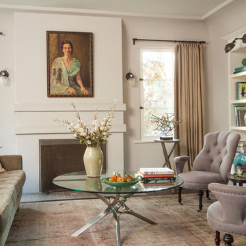
Living room - mediterranean formal living room idea in Los Angeles with a standard fireplace and white walls
 Wake Remodeling
Featured in 2016 Remodelers Home Tour
Our homeowners moved from The Windy City all the way to the land of the pines with dreams of a perfect home for their family. They found Wake Remodeling and together we made their dream a reality. We developed a strategy to utilize as much of their current resources as possible, while adding new features and design throughout the home. We completed a kitchen refacing with appliances, new paint, lighting, and gorgeous customer cabinetry.
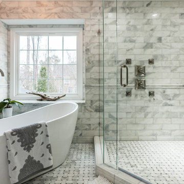
The master bathroom is a must see! We completely redesigned the bathroom with the homeowners' stellar taste in mind and created a haven for them to relax and rejuvenate. From the custom closets to the body spray shower system, the master bathroom makes a statement of elegance.
 Taylor & Taylor, Inc.
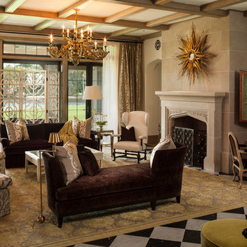
The Tudor style arch on the carved stone fireplace is one of the many found throughout the house. An opulently patterned wool and silk rug from Stark Carpet and a French nineteenth century chandelier add Old-World touches.

Sponsored
Columbus, OH
Free consultation for landscape design!

Peabody Landscape Group
Franklin County's Reliable Landscape Design & Contracting
 Noble Abode
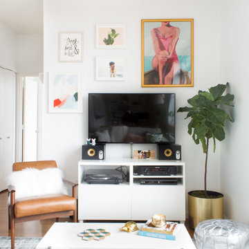
Example of a small trendy medium tone wood floor and brown floor living room design in New York with white walls, no fireplace and a tv stand
 TCP Custom Outdoor Living
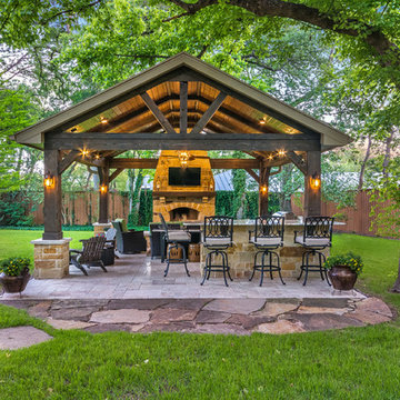
This freestanding covered patio with an outdoor kitchen and fireplace is the perfect retreat! Just a few steps away from the home, this covered patio is about 500 square feet.
The homeowner had an existing structure they wanted replaced. This new one has a custom built wood
burning fireplace with an outdoor kitchen and is a great area for entertaining.
The flooring is a travertine tile in a Versailles pattern over a concrete patio.
The outdoor kitchen has an L-shaped counter with plenty of space for prepping and serving meals as well as
space for dining.
The fascia is stone and the countertops are granite. The wood-burning fireplace is constructed of the same stone and has a ledgestone hearth and cedar mantle. What a perfect place to cozy up and enjoy a cool evening outside.
The structure has cedar columns and beams. The vaulted ceiling is stained tongue and groove and really
gives the space a very open feel. Special details include the cedar braces under the bar top counter, carriage lights on the columns and directional lights along the sides of the ceiling.
Click Photography

 OLSON LEWIS + Architects
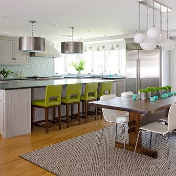
This New England home has the essence of a traditional home, yet offers a modern appeal. The home renovation and addition involved moving the kitchen to the addition, leaving the resulting space to become a formal dining and living area.
The extension over the garage created an expansive open space on the first floor. The large, cleverly designed space seamlessly integrates the kitchen, a family room, and an eating area.
A substantial center island made of soapstone slabs has ample space to accommodate prepping for dinner on one side, and the kids doing their homework on the other. The pull-out drawers at the end contain extra refrigerator and freezer space. Additionally, the glass backsplash tile offers a refreshing luminescence to the area. A custom designed informal dining table fills the space adjacent to the center island.
Paint colors in keeping with the overall color scheme were given to the children. Their resulting artwork sits above the family computers. Chalkboard paint covers the wall opposite the kitchen area creating a drawing wall for the kids. Around the corner from this, a reclaimed door from the grandmother's home hangs in the opening to the pantry. Details such as these provide a sense of family and history to the central hub of the home.
Builder: Anderson Contracting Service
Interior Designer: Kristina Crestin
Photographer: Jamie Salomon


 TKS Design Group
Download our free ebook, Creating the Ideal Kitchen. DOWNLOAD NOW
For many, extra time at home during COVID left them wanting more from their homes. Whether you realized the shortcomings of your space or simply wanted to combat boredom, a well-designed and functional home was no longer a want, it became a need. Tina found herself wanting more from her Old Irving Park home and reached out to The Kitchen Studio about adding function to her kitchen to make the most of the available real estate.
At the end of the day, there is nothing better than returning home to a bright and happy space you love. And this kitchen wasn’t that for Tina. Dark and dated, with a palette from the past and features that didn’t make the most of the available square footage, this remodel required vision and a fresh approach to the space. Lead designer, Stephanie Cole’s main design goal was better flow, while adding greater functionality with organized storage, accessible open shelving, and an overall sense of cohesion with the adjoining family room.
The original kitchen featured a large pizza oven, which was rarely used, yet its footprint limited storage space. The nearby pantry had become a catch-all, lacking the organization needed in the home. The initial plan was to keep the pizza oven, but eventually Tina realized she preferred the design possibilities that came from removing this cumbersome feature, with the goal of adding function throughout the upgraded and elevated space. Eliminating the pantry added square footage and length to the kitchen for greater function and more storage. This redesigned space reflects how she lives and uses her home, as well as her love for entertaining.
The kitchen features a classic, clean, and timeless palette. White cabinetry, with brass and bronze finishes, contrasts with rich wood flooring, and lets the large, deep blue island in Woodland’s custom color Harbor – a neutral, yet statement color – draw your eye.
The kitchen was the main priority. In addition to updating and elevating this space, Tina wanted to maximize what her home had to offer. From moving the location of the patio door and eliminating a window to removing an existing closet in the mudroom and the cluttered pantry, the kitchen footprint grew. Once the floorplan was set, it was time to bring cohesion to her home, creating connection between the kitchen and surrounding spaces.
The color palette carries into the mudroom, where we added beautiful new cabinetry, practical bench seating, and accessible hooks, perfect for guests and everyday living. The nearby bar continues the aesthetic, with stunning Carrara marble subway tile, hints of brass and bronze, and a design that further captures the vibe of the kitchen.
Every home has its unique design challenges. But with a fresh perspective and a bit of creativity, there is always a way to give the client exactly what they want [and need]. In this particular kitchen, the existing soffits and high slanted ceilings added a layer of complexity to the lighting layout and upper perimeter cabinets.
While a space needs to look good, it also needs to function well. This meant making the most of the height of the room and accounting for the varied ceiling features, while also giving Tina everything she wanted and more. Pendants and task lighting paired with an abundance of natural light amplify the bright aesthetic. The cabinetry layout and design compliments the soffits with subtle profile details that bring everything together. The tile selections add visual interest, drawing the eye to the focal area above the range. Glass-doored cabinets further customize the space and give the illusion of even more height within the room.
While her family may be grown and out of the house, Tina was focused on adding function without sacrificing a stunning aesthetic and dreamy finishes that make the kitchen the gathering place of any home. It was time to love her kitchen again, and if you’re wondering what she loves most, it’s the niche with glass door cabinetry and open shelving for display paired with the marble mosaic backsplash over the range and complimenting hood. Each of these features is a stunning point of interest within the kitchen – both brag-worthy additions to a perimeter layout that previously felt limited and lacking.
Whether your remodel is the result of special needs in your home or simply the excitement of focusing your energy on creating a fun new aesthetic, we are here for it. We love a good challenge because there is always a way to make a space better – adding function and beauty simultaneously.
 Allen Construction
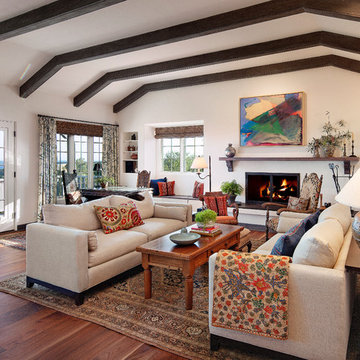
The carpet was removed and replaced with new engineered wood floors, with walnut from the owner's childhood home in Ohio. New windows and doors.
Interior Designer: Deborah Campbell
Photographer: Jim Bartsch
 Denman Construction
Gibeon Photography
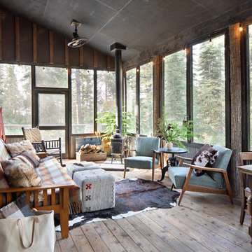
This is an example of a rustic screened-in side porch design in Other with decking and a roof extension.
This is an example of a rustic screened-in side porch design in Other with decking and a roof extension.
26