
Search results for "Narrow close" in Home Design Ideas
 Klopf Architecture
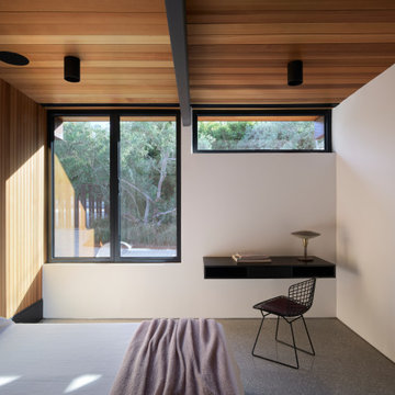
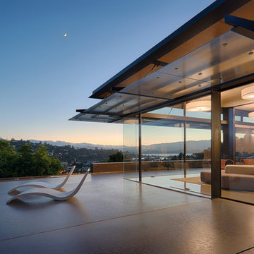
Malibu Glass Box House by Klopf Architecture
Following the devastating Woolsey Fire of 2018, the site in Malibu offered a unique opportunity to rebuild not just a home, but a new architectural composition that highlighted the property’s potential while navigating strict fire-rebuild codes in the area. Designed by Klopf Architecture, this project embraced a set of limitations and translated them into an architectural asset.
The city’s fire-rebuild process required the new structure to remain close to the original footprint, size and bulk, a constraint that ultimately clarified the architectural direction. Perched near the front of a long, narrow lot, the new home frames and overlooks a private, park-like rear expanse, an uncommon luxury especially in this part of Malibu .
Without a fixed program, the design process allowed for a different kind of creative focus allowing Klopf Architecture the opportunity to explore how a modernist home could best respond to this site. The team approached the project not with a list of requirements, but with a question: How might a modernist live here? What spatial qualities would inspire calm, connection, and a sense of wonder in this setting? The process became less about problem-solving and more about architectural storytelling—letting the site, the light, and the principles of modern design guide the form and flow of the home.
The response emerged in the form of a glass-box pavilion, an open, Mid-Century Modern inspired living, dining, and kitchen space that floats at the edge of the property’s natural descent. Connected to the more enclosed, private areas of the home by a glass-walled hallway, the living pavilion becomes a distinct centerpiece of the design. It opens on all four sides to the landscape with decks and patios on the flanks, an internal garden and water feature to the north, and a dramatic unguarded view of the expansive backyard and ocean horizon to the south.
Because of the mandated footprint, careful planning was required to ensure every space could still engage with light, landscape, or both. Strategic voids in the form of atriums and courtyards allow daylight to filter deep into the home’s core, while offering moments of surprise and retreat. These design gestures allow natural light to filter deep into the interior, creating a sense of brightness and openness throughout the day. At the same time, they expand the perceptual boundaries between inside and out, making the home feel more expansive while anchoring its connection to the surrounding landscape.
The siting of the house is what gives it its unique character. Rather than receding into the backyard like the neighboring homes, the house holds a slight prominence. From the central living pavilion, stepping down into the landscape feels more like entering a secluded park where a separate existing accessory structure, trail, and recreational areas await. The home’s modest street presence gives way to this unfolding drama of space, view, and nature.
Fire-resilient materials and assemblies are integrated seamlessly throughout including triple-pane glazing, under-slab and roof insulation, and locally sourced fire-rated cladding ensure the house not only meets Calfornia’s rigorous wildland-urban interface (WUI) standards, but feels effortlessly aligned with them. While technical decisions like fire-hardening and mechanical systems presented some construction challenges, particularly around the cantilevered glass box, the team found a functional compromise that preserved the integrity of the design.
Inside, a restrained palette and exposed post and beam design celebrate the ethos of mid-century modernism. A central circulation spine extends from the entry to the rear glass wall, offering a continuous visual link from street to ocean. Spaces such as the library and office, though more intimate in scale, are never cut off from nature as each opens to its own unique courtyard or garden view.
Though born out of a strict regulatory framework and developed without a specific client, the rebuild design unfolded with remarkable clarity. Grounded in site logic, refined by limitations and an emphasis on timeless spatial relationships – light, proportion, and a strong connection to nature, the resulting design feels both effortless and uplifting. The home lives lightly on the land, opens generously to its surroundings, and strikes a careful balance between privacy, openness, and calm. For Klopf Architecture, it stands as a compelling case study in how site, code, and circumstantial constraints can inspire enduring, modernist architecture. With years of experience reimagining mid-century modern design for how people live today, the firm took the project’s limitations as an opportunity. The result is a home shaped by open, flowing spaces, strong indoor-outdoor connections, and a calm, clear sense of structure. It’s a good reminder that even with strict constraints, there’s still room for architecture to breathe—and for modernism to keep moving forward.
Klopf Architecture project team: Geoff Campen, John Klopf, AIA, and Sherry Tan
Structural Engineer: ZFA
Contractor: Maison D’Artiste
Photography: ©2025 Mariko Reed
Year Completed: 2023
 Peggy Smith
John Richard
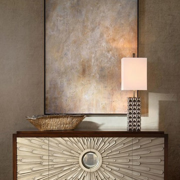
From the center convex églomisé mirror, multilayered, graduated rays radiate outwards, tipped with silver and hand-shading. An American black walnut case and soft-closing hinges complete this credenza. This free form of color by Anne B. Schwartz contains hand-applied textures, colors, and iridescent highlights, and floats in a narrow, aged silver frame. A striking oval bowl with a bark texture, finished in polished nickel, with washes of gold.
 CabinetGlass.com
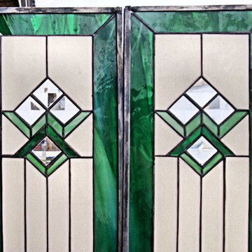
We just wanted to show you a bit better close-up...
This photo was taken just outside our Studio.
This is part of an ongoing project that is being completed in several stages.
These two panels in particular are relatively small and narrow. - Check out the size.
The two panels shown only measure - 6-1/4" x 17-3/8" .
They feature, very small, Custom-Made, Beveled Glass Squares.
The colors used in the Chevrons for these two panels glass were;
Spectrum Glass - 327-2S - Light Green/White
Spectrum Glass - 329-6S - Dark Green/White, Wispy
All the BackGround Glass was Spectrum Glass - 210-71SF Opalized Ivory Amber.
Outside Border was - Spectrum Glass - 329-6S - Dark Green/White, Wispy
The two lower small accent pieces were again - 327-2S - Light Green/White
Due to the small size, we used our Dark Antique Patina Tiffany construction.
.
Find the right local pro for your project
 Donald Pell - Gardens
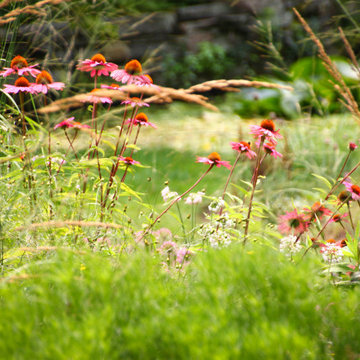
Set against the superb modernist architecture of Moto Designshop, and within the existing COR-TEN steel rain troughs by Studio | Bryan Hanes, this terraced garden frames and maximizes views from the rear facade to the pond below.
The garden design focused on verging wild, intermingled plant communities with the floor-to-ceiling windows of the family's living space to provide ongoing seasonal interest and visual diversity. Working closely with agronomists, aggregate substrates, calcium and humates were incorporated to ensure adequate drainage and soil health. Rapid stabilization of the very wet, narrow spaces was achieved with freely seeding Eupatorium coelestinum and plantings of stoloniferous and rhizomatous plants, such as Carex muskingumensis and Iris fulva, among cespitose clumps.
 Enlightened Tile and Stone Work
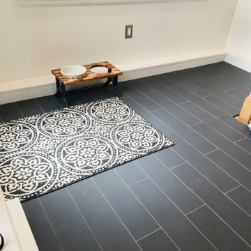
updated the floor and backsplash to help the client sell their house. Backsplash is white penny tile with white grout. floor is dark grey tile with sliver grout.
 Triple Dot Design Studio
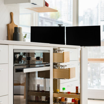
This contemporary kitchen is retrofitted with multiple functional hardware. This pull out spice and oil rack gives it's users an easy way to store items close to the stove, have enough space to see and easily access the items with the pull out drawer are shelves.
 Hearthstone Inc
Richard Herman is in the hospitality business and owns several upscale hotels in Florida and in other states as well as cattle ranches in both Florida and Missouri. Their farm in Ocala is by farm their most unique. The property serves as a 4-H demonstration project for the purpose of children’s education. They have been working with the Academy Prep of St. Pete which is dedicated to inner-city youths that are selected on the basis of need and achievement. Wife Diane spends her time on the farm raising Gypsy Vanners, a diminutive draft horse named after the job they did in Eastern Europe, pulling the wagons (vans) for gypsies that wandered across the continent. On the Ocala farm, there are several mules with a unique profession.
Richard had visited the Hearthstone display at a Log & Timber Home Shows at the Orlando Convention Center many years ago. He was impressed that Hearthstone had stayed in touch with him over the years by mailings, invitations to shows, and periodic phone calls. When the time came to start serious consideration of the design of barn, Hearthstone responded promptly and professionally to Richard and Diane’s requests for information and a review of their ideas for their barn, which would serve as the centerpiece for their new farm.
They wanted a multipurpose facility that could accommodate an educational environment and a large hall suitable for the fundraising events for his charities. Richard wanted a barn that reflected the look and feel of barns built at the dawn of the 20th century. Besides the rustic chicken houses and vegetable gardens, they have completely renovated a 1020’s era farmhouse to be as historically correct as possible and serves as the entry to the farm.
“They very careful to feel us out, get comfortable with our capabilities, and be convinced that we could perform as promised,” said Project Manager John Ricketson of Hearthstone.
Design Process
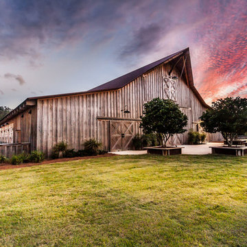
There were some initial drawings that gave us a start on the basic shape and size of the barn. From there, it was a process of narrowing down the uses of each area and the spans that could be achieved. The barn was going to have the traditional “board & batten” exterior siding and a metal roof. There is a cantilevered ‘hay hood” on the north gable end above the large sliding barn doors that open into the foyer and horse stalls. The wings house a combination of areas, beginning with the large restrooms to accommodate crowds for events. Other parts of the wings have garage areas for the farm vehicles, feed room, tack room, wash rack, storage, offices, and smaller restrooms.
Keeping with the look and feel of the turn of the century, Hearthstone developed a process for giving the timbers a surface texture that mimicked the circular cuts of timbers that had just come out of an old sawmill. This was easier said than done. Randy Giles guided his millwright (Wolfgang) in designing a machine that would do this effectively.
The barn was delivered in October of 2014 and was erected over the course of two weeks, thanks to a hardworking crew (Eric Foster) and near-perfect weather. After the Hearthstone crew completed the erection and roof dry-in, it was time for the local carpenters to step up and install some light conventional framing on the gable ends before applying the roof fascia and exterior board & batten siding. Next came the big sliding barn doors, plumbing, electrical, heating, and cooling. Large rustic fixtures were hung from the great hall roof timbers.
Exterior
The board & batten siding was cypress and allowed to turn color naturally as rain hit it and the sun started working on it with UV rays. This method causes a much grayer look closer to the ground and less so where the roof overhang provides protection. The North end has some large limestone boulders and planters arranged around the pad with tall pampas grass. The planters provide casual seating before events and during outside receptions. The entire area was sodded with lush St. Augustine grass and split rail fences were added to enclose the barn area. The corrugated metal roof was a special order material that immediately rusted after being exposed to moisture. The layer of rust protects the metal from the elements.
Interior
The board & batten theme was carried throughout most of the interior with the timbers left natural to show off the circular saw texture. All of the tongue & groove decking was shipped in advance to allow the local painter to pre-stain it with a dark brown transparent stain that is a beautiful background to the light color Eastern White Pine timbers.
“Everything was unique in this project” said Project Manager John Ricketson. “The setting on a small demonstration farm close to Ocala, the multipurpose design, the circular saw texture on the timbers.”
The Hermans are very proud of their farm’s outcome. Richard sent a note to Randy Giles, owner of Hearthstone: “The Barn is fantastic, not a single problem, period. Next month, we have Jo Dee Messina coming in to help with a fundraiser for a local center for abused kids. Folks love the farm, ...... but that barn gets all of the attention. I would encourage you to use me as a reference for your sales team, feel free to extend my cell phone to any prospective purchasers.”

 HwRenewal
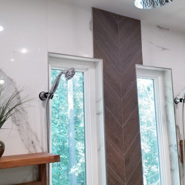
In this 90's cape cod home, we used the space from an overly large bedroom, an oddly deep but narrow closet and the existing garden-tub focused master bath with two dormers, to create a master suite trio that was perfectly proportioned to the client's needs. They wanted a much larger closet but also wanted a large dual shower, and a better-proportioned tub. We stuck with pedestal sinks but upgraded them to large recessed medicine cabinets, vintage styled. And they loved the idea of a concrete floor and large stone walls with low maintenance. For the walls, we brought in a European product that is new for the U.S. - Porcelain Panels that are an eye-popping 5.5 ft. x 10.5 ft. We used a 2ft x 4ft concrete-look porcelain tile for the floor. This bathroom has a mix of low and high ceilings, but a functional arrangement instead of the dreaded “vault-for-no-purpose-bathroom”. We used 8.5 ft ceiling areas for both the shower and the vanity’s producing a symmetry about the toilet room door. The right runner-rug in the center of this bath (not shown yet unfortunately), completes the functional layout, and will look pretty good too.
Of course, no design is close to finished without plenty of well thought out light. The bathroom uses all low-heat, high lumen, LED, 7” low profile surface mounting lighting (whoa that’s a mouthful- but, lighting is critical!). Two 7” LED fixtures light up the shower and the tub and we added two heat lamps for this open shower design. The shower also has a super-quiet moisture-exhaust fan. The customized (ikea) closet has the same lighting and the vanity space has both flanking and overhead LED lighting at 3500K temperature. Natural Light? Yes, and lot’s of it. On the second floor facing the woods, we added custom-sized operable casement windows in the shower, and custom antiqued expansive 4-lite doors on both the toilet room door and the main bath entry which is also a pocket door with a transom over it. We incorporated the trim style: fluted trims and door pediments, that was already throughout the home into these spaces, and we blended vintage and classic elements using modern proportions & patterns along with mix of metal finishes that were in tonal agreement with a simple color scheme. We added teak shower shelves and custom antiqued pine doors, adding these natural wood accents for that subtle warm contrast – and we presented!
Oh btw – we also matched the expansive doors we put in the master bath, on the front entry door, and added some gas lanterns on either side. We also replaced all the carpet in the home and upgraded their stairs with metal balusters and new handrails and coloring.
This client couple, they’re in love again!
 Field Architecture
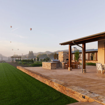
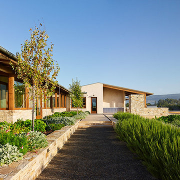
The Yountville Residence was designed to accommodate three family generations coming together over food, wine, outdoor living and the land. Located amongst continuous vineyards on the broad flood plain of the Napa River, creating a strong sense of place was foremost. Rich in a culture of wine making and production from the land, the site demanded a design solution that honored its history and elevated the experience of the land.
The house pays homage to its context by creating a reimagined agrarian compound. Conceived as a family of smaller buildings, the architecture comes together around a shaded patio and pool. The kitchen, dining, and living spaces all flow onto the shaded outdoor patio and gardens. Low-sloped gable roofs evoke the agricultural history of the region and echo the gentle slope of the foothills beyond.
The home remains understated – quietly drawing one’s attention back to the magnificent natural features of the landscape. Gently pulled back into the heart of the serene vineyards, it is carefully oriented with Stag’s Leap at the foot of the Vaca Mountains to the East and the Mayacamas Range to the West. Scenic views continue uninterrupted through the home. Large window walls slide open and pocket on either side of the house, connecting the family to the outdoors and building a personal experience of place on the Valley floor.
“If we can enrich people’s lives, and just maybe inspire them to do something beyond what they might otherwise have done, that brings us great satisfaction.” – Stan Field, fA Principal
The connection of the architecture to the land goes beyond its visual connectivity. The design sensitively responds to land and place by recognizing key passive cooling and natural daylighting strategies present on the site. Broad overhanging roofs and the large slide away doors capture prevailing breezes up the valley. The patio, which is pulled close into a recessed cut-out in the main living space of the house, allows summer breezes across the pool to cool the house. Expansive windows and a narrow cross-section allow natural daylight to penetrate deep into the spaces and illuminate the rich and earthy palette of natural materials.
The architecture created is a vehicle through which the powerful forms of the landscape craft a powerful experience of place. It is a respite from urban life, designed to bring one back to the basics: a love of family, land, food, and of course, wine.
 Klopf Architecture
From Mid-Century Classic to the Present
An iconic design updated with comfort, function, and flow for today.
A Remodel That Balances Past and Present
What started as a desire to update a classic Eichler soon became an exploration of how Mid-Century Modern design can successfully evolve for today. The client, a tech professional with a passion for scuba diving and underwater photography, wanted a home that would both honor its original character and feel tailored to his daily life. A lifelong technology enthusiast, he still owns the very first Mac desktop he saved up for as a teenager working at Radio Shack, a detail that underscores his appreciation for design that melds function and form.
Honoring Separation While Expanding Possibility
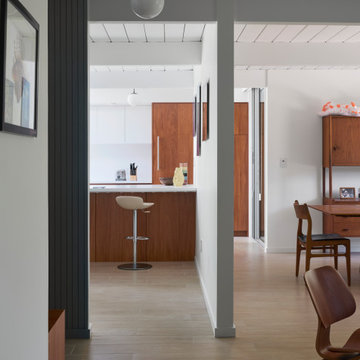
Unlike many contemporary remodels where walls are opened up to create expansive living spaces, this project took a more restrained approach. The client valued the defined rooms of the original plan and wanted to preserve as much wall space as possible for displaying his large-format underwater photography. The emphasis was not on dramatic spatial reinvention, but on thoughtful refinements. Klopf Architecture shaped a gallery-like backdrop while also expanding the primary suite, modernizing materials and fixtures throughout the home, and improving the functionality and layout of the kitchen. The finished home feels at once timeless and renewed, an Eichler that continues to inspire while fully supporting the lifestyle of its present-day owner.
A major turning point came mid-design. The original project brief had not included an addition, but as the reconfiguration of the primary bedroom and bath unfolded, it became clear that an expansion was the best approach to achieve the client’s vision of a more spacious suite. Fortunately, the adjustment came at a stage when revisions were still manageable and was integrated seamlessly, showing how thoughtful course corrections can strengthen a project rather than hinder it.
Navigating Challenges With Precision
The design development included multiple conceptual rounds, balancing preservation with subtle expansion. During construction, an existing post previously thought to be load-bearing turned out not to be. The structural engineer was able to pivot quickly, and both the post and the cross beam that had been intended to replace it could be omitted, allowing the original rhythm of the Eichler beam bays to be preserved.
Sustainability was not just a checklist item, but a way to align the home with the client’s values of simplicity, efficiency, and long-term functionality. R-38 roof insulation reduced energy usage, solar panels with battery storage provided independence and resilience, and passive comfort strategies eliminated the need forenergy-intensive air conditioning. An electric vehicle charger and an on-demand hot water recirculation system (with call buttons as opposed to having constant circulation) add to the home’s long-term efficiency factors. Together, these moves created a home that is quieter, more comfortable, and better equipped for the future, qualities that supported the client’s pragmatic approach to design and living lightly.
Details That Respect the Eichler DNA
The remodel carries forward the Eichler’s original spirit while introducing new layers of modern livability. Originally, the house was approached along a deep, narrow walk, with the garage on one side and the house on the other, leaving the front door tucked far back within this chasm-like space. By pulling the entry forward, the design reshaped the arrival experience, creating a clearer threshold and a natural drop-off zone for bags, shoes, and keys. This shift also made room for a custom bench at the entry that extends seamlessly through the glass sidelight. The bench and drop-off zone now work together as a single, integrated sequence that supports everyday living while offering a tactile reminder of Eichler’s philosophy of connectedness.
At the client’s request, Klopf reintroduced a classic Eichler gesture by extending the exterior siding into the entry and living room. The detail reinforces a sense of indoor/outdoor continuity while providing a subtle architectural surface that allows the client’s photography to take visual precedence.
The signature concrete masonry wall at the front was reconstructed using blocks sourced to match the originals, now strengthened with rebar for seismic resilience while maintaining a private outdoor courtyard, visually extending the kitchen outward. A decorative trellis element, a detail borrowed from a neighboring Eichler, restores a familiar mid-century modern architectural motif. At the courtyard entry door, a custom etched glass sidelight with an ocean-themed design featuring kelp and jellyfish serves as a subtle homage to the client’s passion for deep-sea diving.
Landscaping became an integral part of the overall transformation. The homeowner engaged landscape architect Randi Johnsen of Third Nature Studio to shape a series of calm, inviting outdoor rooms that read as a natural extension of the interiors. While technically outside of the core construction scope, the landscape design proved central to achieving a sense of completeness and connectedness across the property. Such whole-property considerations often emerge as design ideas take shape, underscoring the importance of flexibility in planning and budgeting, as well as close collaboration among the design team starting early in the process.
The Value of Evolving Scope
As with many custom residential projects, the scope evolved during the design process. What began as a targeted remodel grew to include a new/expanded primary suite, a rebuilt CMU patio wall for strength and longevity, and a solar panel array and battery storage for energy resilience and carbon-reduction. Each thoughtful decision represented a conscious investment in the home’s performance and character, rather than a cost overrun.
The result was a project delivered on schedule, tailored precisely to the client’s lifestyle, and positioned to add long-term value both functionally and aesthetically. By embracing scope evolution as an opportunity rather than a challenge, and relying on good design paired with transparent communication, this remodel demonstrates how Eichler homes can be adapted for contemporary living without erasing their DNA.
Klopf Architecture project team: John Klopf, AIA, and Klara Kevane, Elise Webb and Nicholas LaNasa.
Contractor: Golden Cove Construction
Landscape Design: Third Nature Studio
Structural Engineer: Daniel Bastiao Design
Photography: ©2025 Mariko Reed
Year Completed: 2024
Location: Sunnyvale, CA
 Murphy Bros. Design | Build | Remodel
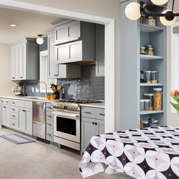
The kitchen expansion also added approximately 5 feet of room in the adjacent bedroom. The new space was used for expanded closet space. The reconfiguration of the kitchen also allowed us to close off a narrow doorway from the kitchen to the adjacent bedroom. Here we see from the new addition dining area back to the new front entrance and blended hardwood flooring.
 Klopf Architecture
Malibu Glass Box House by Klopf Architecture
Following the devastating Woolsey Fire of 2018, the site in Malibu offered a unique opportunity to rebuild not just a home, but a new architectural composition that highlighted the property’s potential while navigating strict fire-rebuild codes in the area. Designed by Klopf Architecture, this project embraced a set of limitations and translated them into an architectural asset.
The city’s fire-rebuild process required the new structure to remain close to the original footprint, size and bulk, a constraint that ultimately clarified the architectural direction. Perched near the front of a long, narrow lot, the new home frames and overlooks a private, park-like rear expanse, an uncommon luxury especially in this part of Malibu .
Without a fixed program, the design process allowed for a different kind of creative focus allowing Klopf Architecture the opportunity to explore how a modernist home could best respond to this site. The team approached the project not with a list of requirements, but with a question: How might a modernist live here? What spatial qualities would inspire calm, connection, and a sense of wonder in this setting? The process became less about problem-solving and more about architectural storytelling—letting the site, the light, and the principles of modern design guide the form and flow of the home.
The response emerged in the form of a glass-box pavilion, an open, Mid-Century Modern inspired living, dining, and kitchen space that floats at the edge of the property’s natural descent. Connected to the more enclosed, private areas of the home by a glass-walled hallway, the living pavilion becomes a distinct centerpiece of the design. It opens on all four sides to the landscape with decks and patios on the flanks, an internal garden and water feature to the north, and a dramatic unguarded view of the expansive backyard and ocean horizon to the south.
Because of the mandated footprint, careful planning was required to ensure every space could still engage with light, landscape, or both. Strategic voids in the form of atriums and courtyards allow daylight to filter deep into the home’s core, while offering moments of surprise and retreat. These design gestures allow natural light to filter deep into the interior, creating a sense of brightness and openness throughout the day. At the same time, they expand the perceptual boundaries between inside and out, making the home feel more expansive while anchoring its connection to the surrounding landscape.
The siting of the house is what gives it its unique character. Rather than receding into the backyard like the neighboring homes, the house holds a slight prominence. From the central living pavilion, stepping down into the landscape feels more like entering a secluded park where a separate existing accessory structure, trail, and recreational areas await. The home’s modest street presence gives way to this unfolding drama of space, view, and nature.
Fire-resilient materials and assemblies are integrated seamlessly throughout including triple-pane glazing, under-slab and roof insulation, and locally sourced fire-rated cladding ensure the house not only meets Calfornia’s rigorous wildland-urban interface (WUI) standards, but feels effortlessly aligned with them. While technical decisions like fire-hardening and mechanical systems presented some construction challenges, particularly around the cantilevered glass box, the team found a functional compromise that preserved the integrity of the design.
Inside, a restrained palette and exposed post and beam design celebrate the ethos of mid-century modernism. A central circulation spine extends from the entry to the rear glass wall, offering a continuous visual link from street to ocean. Spaces such as the library and office, though more intimate in scale, are never cut off from nature as each opens to its own unique courtyard or garden view.
Though born out of a strict regulatory framework and developed without a specific client, the rebuild design unfolded with remarkable clarity. Grounded in site logic, refined by limitations and an emphasis on timeless spatial relationships – light, proportion, and a strong connection to nature, the resulting design feels both effortless and uplifting. The home lives lightly on the land, opens generously to its surroundings, and strikes a careful balance between privacy, openness, and calm. For Klopf Architecture, it stands as a compelling case study in how site, code, and circumstantial constraints can inspire enduring, modernist architecture. With years of experience reimagining mid-century modern design for how people live today, the firm took the project’s limitations as an opportunity. The result is a home shaped by open, flowing spaces, strong indoor-outdoor connections, and a calm, clear sense of structure. It’s a good reminder that even with strict constraints, there’s still room for architecture to breathe—and for modernism to keep moving forward.
Klopf Architecture project team: Geoff Campen, John Klopf, AIA, and Sherry Tan
Structural Engineer: ZFA
Contractor: Maison D’Artiste
Photography: ©2025 Mariko Reed
Year Completed: 2023
 Forward Design Build Remodel
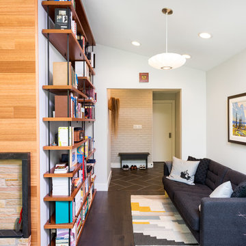
Example of a small 1960s dark wood floor and brown floor home office library design in Detroit with white walls, a standard fireplace and a brick fireplace
Sponsored
Delaware, OH

Buckeye Basements, Inc.
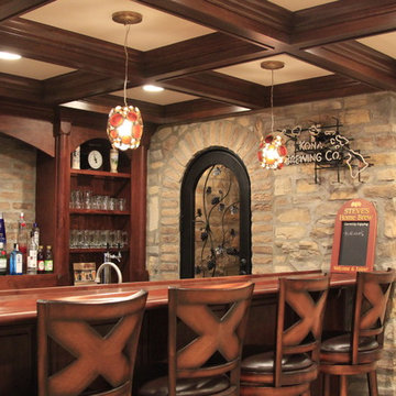
Central Ohio's Basement Finishing ExpertsBest Of Houzz '13-'21
 Amazing Spaces
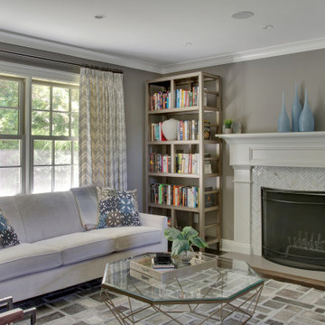
This project incorporated the main floor of the home. The existing kitchen was narrow and dated, and closed off from the rest of the common spaces. The client’s wish list included opening up the space to combine the dining room and kitchen, create a more functional entry foyer, and update the dark sunporch to be more inviting.
The concept resulted in swapping the kitchen and dining area, creating a perfect flow from the entry through to the sunporch.
We borrowed floor space from the existing living room for the new kitchen resulting in the opportunity to create a smaller, more formal space to enjoy a second fireplace.
 TKS Design Group
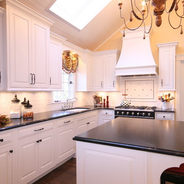
Typical of bungalows and city lots, the footprint of this home was narrow with living spaces in front, bedrooms in back and kitchen centrally located. However, unlike most bungalows, the hall running from front to back have been closed off to, presumably, accommodate a walk-in pantry. Couple that with the fact that this circa 1925 bungalow had seen a lot of living – read boisterous children and remodeling trends like z-brick, soffits, and fluorescent overhead lighting – the kitchen was due for a major overhaul.
Truly the hub of this house, the modest 11’ x 12’ kitchen was most in need of additional countertop space, convenient garbage/recycle bin, counter-depth refrigerator, storage aids, informal dining for two, and sound-proofing to enable this musically adept family to coexist despite varied schedules.
Gone are the wall soffits, boxy overhead lighting, six-foot baseboard heat unit, extra deep refrigerator, refurbished cabinets, laminate countertops, z-brick wall covering, and makeshift door swags. Enter rich mahogany cabinets, roll and pull-out storage units, endcap spice storage, gorgeous granite tops, marble backsplash, LED lighting, acoustic insulation and solid-wood doors.
Under the guise of such a handsome room, provisions such as a period style sink allow for more efficient use of corners with pull-out half-moon trays for storage. Redirecting the baseboard heat to a compact, toekick unit, means more cabinet and counter space – perfect for a baking and/or entertaining area removed from the basic work triangle. The eating area, also, doubles as a work station with drawers for office supplies and dedicated outlet for cable tv. Functional yet beautiful, this kitchen is at the ready as its owners look forward to their golden years.
Designed by: The Kitchen Studio of Glen Ellyn
Photography by: Dawn Jackman
For more information on kitchen and bath design ideas go to: www.kitchenstudio-ge.com
URL http://www.kitchenstudio-ge.com
 Field Architecture
The Yountville Residence was designed to accommodate three family generations coming together over food, wine, outdoor living and the land. Located amongst continuous vineyards on the broad flood plain of the Napa River, creating a strong sense of place was foremost. Rich in a culture of wine making and production from the land, the site demanded a design solution that honored its history and elevated the experience of the land.
The house pays homage to its context by creating a reimagined agrarian compound. Conceived as a family of smaller buildings, the architecture comes together around a shaded patio and pool. The kitchen, dining, and living spaces all flow onto the shaded outdoor patio and gardens. Low-sloped gable roofs evoke the agricultural history of the region and echo the gentle slope of the foothills beyond.
The home remains understated – quietly drawing one’s attention back to the magnificent natural features of the landscape. Gently pulled back into the heart of the serene vineyards, it is carefully oriented with Stag’s Leap at the foot of the Vaca Mountains to the East and the Mayacamas Range to the West. Scenic views continue uninterrupted through the home. Large window walls slide open and pocket on either side of the house, connecting the family to the outdoors and building a personal experience of place on the Valley floor.
“If we can enrich people’s lives, and just maybe inspire them to do something beyond what they might otherwise have done, that brings us great satisfaction.” – Stan Field, fA Principal
The connection of the architecture to the land goes beyond its visual connectivity. The design sensitively responds to land and place by recognizing key passive cooling and natural daylighting strategies present on the site. Broad overhanging roofs and the large slide away doors capture prevailing breezes up the valley. The patio, which is pulled close into a recessed cut-out in the main living space of the house, allows summer breezes across the pool to cool the house. Expansive windows and a narrow cross-section allow natural daylight to penetrate deep into the spaces and illuminate the rich and earthy palette of natural materials.
The architecture created is a vehicle through which the powerful forms of the landscape craft a powerful experience of place. It is a respite from urban life, designed to bring one back to the basics: a love of family, land, food, and of course, wine.
 Dimensions in Wood Inc
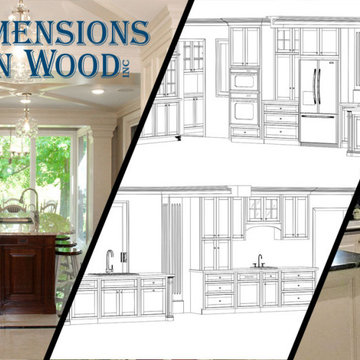
This Historical Home was built in the Columbia Country Club in 1925 and was ready for a new, modern kitchen which kept the traditional feel of the home. A previous sunroom addition created a dining room, but the original kitchen layout kept the two rooms divided. The kitchen was a small and cramped c-shape with a narrow door leading into the dining area.
The kitchen and dining room were completely opened up, creating a long, galley style, open layout which maximized the space and created a very good flow. Dimensions In Wood worked in conjuction with the client’s architect and contractor to complete this renovation.
Custom cabinets were built to use every square inch of the floorplan, with the cabinets extending all the way to the ceiling for the most storage possible. Our woodworkers even created a step stool, staining it to match the kitchen for reaching these high cabinets. The family already had a kitchen table and chairs they were happy with, so we refurbished them to match the kitchen’s new stain and paint color.
Crown molding top the cabinet boxes and extends across the ceiling where they create a coffered ceiling, highlighting the beautiful light fixtures centered on a wood medallion.
Columns were custom built to provide separation between the different sections of the kitchen, while also providing structural support.
Our master craftsmen kept the original 1925 glass cabinet doors, fitted them with modern hardware, repainted and incorporated them into new cabinet boxes. TASK LED Lighting was added to this china cabinet, highlighting the family’s decorative dishes.
Appliance Garage
On one side of the kitchen we built an appliance garage with doors that slide back into the cabinet, integrated power outlets and door activated lighting. Beside this is a small Galley Workstation for beverage and bar service which has the Galley Bar Kit perfect for sliced limes and more.
Baking Cabinet with Pocket Doors
On the opposite side, a baking cabinet was built to house a mixer and all the supplies needed for creating confections. Automatic LED lights, triggered by opening the door, create a perfect baker’s workstation. Both pocket doors slide back inside the cabinet for maximum workspace, then close to hide everything, leaving a clean, minimal kitchen devoid of clutter.
Super deep, custom drawers feature custom dividers beneath the baking cabinet. Then beneath the appliance garage another deep drawer has custom crafted produce boxes per the customer’s request.
Central to the kitchen is a walnut accent island with a granite countertop and a Stainless Steel Galley Workstation and an overhang for seating. Matching bar stools slide out of the way, under the overhang, when not in use. A color matched outlet cover hides power for the island whenever appliances are needed during preparation.
The Galley Workstation has several useful attachments like a cutting board, drying rack, colander holder, and more. Integrated into the stone countertops are a drinking water spigot, a soap dispenser, garbage disposal button and the pull out, sprayer integrated faucet.
Directly across from the conveniently positioned stainless steel sink is a Bertazzoni Italia stove with 5 burner cooktop. A custom mosaic tile backsplash makes a beautiful focal point. Then, on opposite sides of the stove, columns conceal Rev-a-Shelf pull out towers which are great for storing small items, spices, and more. All outlets on the stone covered walls also sport dual USB outlets for charging mobile devices.
Stainless Steel Whirlpool appliances throughout keep a consistent and clean look. The oven has a matching microwave above it which also works as a convection oven. Dual Whirlpool dishwashers can handle all the family’s dirty dishes.
The flooring has black, marble tile inlays surrounded by ceramic tile, which are period correct for the age of this home, while still being modern, durable and easy to clean.
Finally, just off the kitchen we also remodeled their bar and snack alcove. A small liquor cabinet, with a refrigerator and wine fridge sits opposite a snack bar and wine glass cabinets. Crown molding, granite countertops and cabinets were all customized to match this space with the rest of the stunning kitchen.
Dimensions In Wood is more than 40 years of custom cabinets. We always have been, but we want YOU to know just how much more there is to our Dimensions.
The Dimensions we cover are endless: custom cabinets, quality water, appliances, countertops, wooden beams, Marvin windows, and more. We can handle every aspect of your kitchen, bathroom or home remodel.
Sponsored
Plain City, OH

Kuhns Contracting, Inc.
Central Ohio's Trusted Home Remodeler Specializing in Kitchens & Baths
 Dimensions in Wood Inc
This Historical Home was built in the Columbia Country Club in 1925 and was ready for a new, modern kitchen which kept the traditional feel of the home. A previous sunroom addition created a dining room, but the original kitchen layout kept the two rooms divided. The kitchen was a small and cramped c-shape with a narrow door leading into the dining area.
The kitchen and dining room were completely opened up, creating a long, galley style, open layout which maximized the space and created a very good flow. Dimensions In Wood worked in conjuction with the client’s architect and contractor to complete this renovation.
Custom cabinets were built to use every square inch of the floorplan, with the cabinets extending all the way to the ceiling for the most storage possible. Our woodworkers even created a step stool, staining it to match the kitchen for reaching these high cabinets. The family already had a kitchen table and chairs they were happy with, so we refurbished them to match the kitchen’s new stain and paint color.
Crown molding top the cabinet boxes and extends across the ceiling where they create a coffered ceiling, highlighting the beautiful light fixtures centered on a wood medallion.
Columns were custom built to provide separation between the different sections of the kitchen, while also providing structural support.
Our master craftsmen kept the original 1925 glass cabinet doors, fitted them with modern hardware, repainted and incorporated them into new cabinet boxes. TASK LED Lighting was added to this china cabinet, highlighting the family’s decorative dishes.
Appliance Garage
On one side of the kitchen we built an appliance garage with doors that slide back into the cabinet, integrated power outlets and door activated lighting. Beside this is a small Galley Workstation for beverage and bar service which has the Galley Bar Kit perfect for sliced limes and more.
Baking Cabinet with Pocket Doors
On the opposite side, a baking cabinet was built to house a mixer and all the supplies needed for creating confections. Automatic LED lights, triggered by opening the door, create a perfect baker’s workstation. Both pocket doors slide back inside the cabinet for maximum workspace, then close to hide everything, leaving a clean, minimal kitchen devoid of clutter.
Super deep, custom drawers feature custom dividers beneath the baking cabinet. Then beneath the appliance garage another deep drawer has custom crafted produce boxes per the customer’s request.
Central to the kitchen is a walnut accent island with a granite countertop and a Stainless Steel Galley Workstation and an overhang for seating. Matching bar stools slide out of the way, under the overhang, when not in use. A color matched outlet cover hides power for the island whenever appliances are needed during preparation.
The Galley Workstation has several useful attachments like a cutting board, drying rack, colander holder, and more. Integrated into the stone countertops are a drinking water spigot, a soap dispenser, garbage disposal button and the pull out, sprayer integrated faucet.
Directly across from the conveniently positioned stainless steel sink is a Bertazzoni Italia stove with 5 burner cooktop. A custom mosaic tile backsplash makes a beautiful focal point. Then, on opposite sides of the stove, columns conceal Rev-a-Shelf pull out towers which are great for storing small items, spices, and more. All outlets on the stone covered walls also sport dual USB outlets for charging mobile devices.
Stainless Steel Whirlpool appliances throughout keep a consistent and clean look. The oven has a matching microwave above it which also works as a convection oven. Dual Whirlpool dishwashers can handle all the family’s dirty dishes.
The flooring has black, marble tile inlays surrounded by ceramic tile, which are period correct for the age of this home, while still being modern, durable and easy to clean.
Finally, just off the kitchen we also remodeled their bar and snack alcove. A small liquor cabinet, with a refrigerator and wine fridge sits opposite a snack bar and wine glass cabinets. Crown molding, granite countertops and cabinets were all customized to match this space with the rest of the stunning kitchen.
Dimensions In Wood is more than 40 years of custom cabinets. We always have been, but we want YOU to know just how much more there is to our Dimensions.
The Dimensions we cover are endless: custom cabinets, quality water, appliances, countertops, wooden beams, Marvin windows, and more. We can handle every aspect of your kitchen, bathroom or home remodel.
 Cheng Design
Fu-Tung Cheng, CHENG Design
• Side Close-up Exterior of Tiburon House
Tiburon House is Cheng Design's eighth custom home project. The topography of the site for Bluff House was a rift cut into the hillside, which inspired the design concept of an ascent up a narrow canyon path. Two main wings comprise a “T” floor plan; the first includes a two-story family living wing with office, children’s rooms and baths, and Master bedroom suite. The second wing features the living room, media room, kitchen and dining space that open to a rewarding 180-degree panorama of the San Francisco Bay, the iconic Golden Gate Bridge, and Belvedere Island.
Photography: Tim Maloney
 Drury Design
THE SETUP
Senior Designer Diana Burton’s client loved her sixties-era home – it just needed some work. The cozy galley kitchen was narrow and mostly closed off from the family room. A pass-through window served as a limited pipeline for treats and chatter. The appliances were failing, too. It was simply time for an overhaul.
Design Objectives:
Remove load bearing wall and open kitchen to the family room
Omit large unused fireplace in family room
Increase work surfaces and overall storage solutions
Dedicated small countertop appliance storage
Seating for 3 or 4 at island
Add pantry storage
Offer solution for lack of mudroom
Upgrade all appliances
THE REMODEL
Design Challenges:
Finding a location to hide structural support for new beam
Reworking awkward configuration of existing walls
Adding a walk-in pantry
Creating mudroom storage
Allowing room for large sectional in family room
Design Solutions:
Add a discreet column by the fridge to hide essential support
Flush out wall by bath to be even with the range wall, where the new walk in pantry exists
Use void space behind new wall for large appliance garage
Create combination walk in pantry/mudroom by adding bench with shoe storage and hooks
Maintain island depth for comfortable seating without infringing on space for the sectional
THE RENEWED SPACE
This cramped, dated kitchen has a new lease on life! Opening it to the family room dramatically transformed the space. Diana’s client now has plenty of storage, a big island for food prep, and an open-concept space that’s perfect for entertaining and hanging out with friends and family.
59