
Search results for "Navigating" in Home Design Ideas
 Debby Evans Garden Design
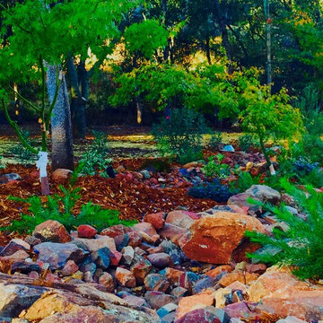
Photos by Debby Evans. This property slopes from the street to a seasonal creek in the back yard. Navigating the various spaces was troublesome so we created various, natural - as well as concrete steps, crushed granite pathways, stone steps, and flagstone - travel options throughout the landscape. Updated irrigation, efficient drainage, as well as dry creek beds to catch rain water that previously had simply gone directly at the residence were added. Many diseased, dangerous (hanging over the residence) oaks were assessed by several arborists. Sadly, more than 100 (mostly scrub oaks) required removal. This changed the natural lighting to the garden, how the sun impacted the residence, and offered opportunities to plant drought tolerant trees and shrubs of both visual interest, and fitting the space. Client had quite a few Japanese Maples that had originally been volunteers from a very large maple at another residence. All have been used and are doing beautifully. Olive trees and Little Ollie shrubs were used along with Carpet Roses, Lorapetalum, several varieties of Grevellia, Crape Myrtle Natchez and Red Rocket trees and shrubs, Maiden Hair grass, Blue Fescue, Redwoods, a specimen Limelight Hydrangea, Cistus, native Redbud, Vinca, Tree Hibiscus, Tree Roses, Birch, Dogwood, Penstemon, Pittosporum, Heavenly Bamboo, Miniature Roses, Succulents, Euphorbia, Bloodgood Maple, Redtwig Maple, Podocarpus and Oleander (screening), various groundcovers, evergreen shrubs and more were selected for their ease of care, color, seasonal color, and dynamic - but not busy - plant palette. The dated deck was redone with a relocation of the stairs to go directly to the pool. with a little effort, we saved the client hundreds of dollars on lighting by shopping for knock offs of higher priced lighting. A partial retractable awning, now provides an area of shade that was previously a non-issue over the deck with the oaks. The seasonal creek was completely cleaned out, made to be deeper and wider in anticipation of the heaving 2016 rains, with large native boulders from the property. Pistache trees were strategically planted for fall color. With one neighbor, on the West side of the property, vines were planted along their chain link fence for privacy for a private garden off the master bedroom. Wood fencing provides the majority of necessary enclosures.
 Loftic Interior Design Studio
Pages
dragmore Home pageupdatehome pagestandard
dragmore Ongoing Projects pagestandard
dragmore Modern Luxe: Mixed Use Building pagestandard
dragmore SKYGO Showroom & Offices pagestandard
dragmore Modern Organic: 2Br Condo - Arterra pagestandard
dragmore Happy Chic: Student's Studio - San Marino pagestandard
dragmore Residential pagestandard
dragmore Eclectic Chic: 2Br Condo - One Oasis pagestandard
dragmore Dainty Chic: Master Bedroom - One Oasis pagestandard
dragmore Urban Appeal: 2Br Condo - San Remo pagestandard
dragmore Modern Asian: 3Br Townhouse - Pristina North pagestandard
dragmore Modern Asian/Art Deco: 5Br House - Amara pagestandard
dragmore Contemporary Chic: 1Br Condo - Midori pagestandard
dragmore Scandinavian Penthouse: Master Bedroom - 1016 Residences pagestandard
dragmore Utilitarian Chic: Rental Studio - Midori pagestandard
dragmore Black & White Movie: Rental Studio - San Marino pagestandard
dragmore Hotel Luxury: 3Br Condo Unit - 1016 Residences pagestandard
dragmore Quaint Escape: 1Br Condo Unit - Azalea pagestandard
dragmore Modern Japanese: A Penthouse Studio Unit - Avenir pagestandard
dragmore Gothic Elegance: Bachelor's Pad - BLOQ Residences pagestandard
dragmore Commercial pagestandard
dragmore Nursery School: Abbey Park pagestandard
dragmore The Persimmon Lobby pagestandard
dragmore Others pagestandard
dragmore Modern Japanese: Ginza Restaurant pagestandard
dragmore Modern Baroque Dining Room pagestandard
dragmore Modern Asian: Tubod Exhibit pagestandard
dragmore Contemporary Sitting Room pagestandard
dragmore Lighting Makeover: Living Room - Panorama Residences pagestandard
dragmore Design pagestandard
dragmore Profile pagestandard
dragmore Process pagestandard
dragmore Contact Us pagestandard
leftarrowlarge Modern Japanese: A Penthouse Studio Unit - Avenir
PAGE NAME
Modern Japanese: A Penthouse Studio Unit - Avenir
Hide in Navigation
HEADER TYPE
Short Header
Visibility rightarrowsmall
SEO Settings rightarrowsmall
Copy Delete
Add Photos
Choose Files
Save
Manage Slideshow Photos
Drag to reorder photos. Click the bubble icons to add captions.
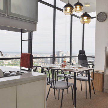
View of the kitchen, dining and study area with two sides of the room in tinted glass curtain wall!
Save
Cancel


Find the right local pro for your project

 Mason Elliott Designs
This magnificent mountain home had 8 foot ceilings and a tiny kitchen with incredible long range views when we looked at it the first time. The clients first question to me was, what would you do if you could. When I said," the first thing I would do is move the kitchen to the sitting room and raise the ceiling" they asked the contractor," can you do that" Brian Sineath with Sineath Construction of Weaverville North Carolina after evaluating the roof line said, " I think we can" and this picture is the result of that conversation.
WWW.bsineath@sineathconstruction.com,
Thanks to Heather Allen at Acanthus Interiors of Asheville N.C.. www.heather.acanthusinteriors@yahoo.com,

 Universal Appliance and Kitchen Center
Miele Ranges at Universal Appliance and Kitchen Center
26767 Agoura Road, Calabasas, CA 91302
Phone 818.880.0011 Fax 818.880.0411
12050 Ventura Blvd.,Studio City, CA 91604
Phone 818.755.1111 Fax 818.755.9111
www.uakc.com
Miele focuses on delivering precise, reliable, gourmet cooking results – compromise is simply not an option when it comes to performance. Miele ranges offering different size configurations (30", 36" and 48") and power configurations (dual fuel, gas, electric and induction). All aligning perfectly with Miele Generation 6000 built-in appliances in terms of design, function and user interface.
Key Features of Miele ranges:
M Touch
Miele's new M Touch controls are both easy-to-operate and navigate. An intuitive swipe of the screen will quickly lead you to your desired selection. Whether choosing an automatic Chicken program or calling up one of your Favorites, the screen with provide a pleasing visual with easy to read touch controls.
M Pro Dual Stacked Burner System
The M Pro Dual Stacked Burner System enables each of the burners on a Miele Range or Rangetop to both simmer and sear. Regular burners reaching up to 19,000 BTUs and the True Simmer burner reaching a maximum of 12,000 BTU, offers a wide range of precision temperatures for any recipe.
Moisture Plus
Increasing the humidity in the oven optimizes the cooking of a variety of foods: soft bread with a shiny, appetizing crust; dinner rolls and croissants as if from the local baker; succulent, tender meat with a nicely browned crust, perfect casseroles, delicious pastries and so much more.
MasterChef and MasterChef Plus
Both found in the Gourmet Center, MasterChef allows you to choose from over 100 easy-to-use programs for items such as baked goods, pizza, turkey and much more making preparation a breeze. Miele will deliver menu options that guide you step by step to the desired oven mode and temperature to create the perfect dish. MasterChef Plus Programs feature 15 Automatic bread programs bake as if from a bakery, guiding you to the correct mode, temperature, time and integration of Moisture Plus to create the perfect bread.
Wireless Roast Probe
Enjoy individualized and accurate roasting of meat, fish and poultry with the wireless roast probe, which measures the core temperature and displays the time remaining. No need to monitor the cooking process. Easy to use - and great for poultry, fish and roasts.

 Fiorito Interior Design
Sometimes the shape and size of a space is great but the details inside seem wrong. That was what my clients thought about their primary bathroom in their newly purchased mountain home. As only the second owners of this large house built in the early 90s, they were eager to be rid of an array of artifacts from that period: a wall of glass bricks at the shower; a huge Jacuzzi tub and deck; and an odd, unnecessary run of shelving about a foot down from the ceiling line. These clients spent many years living on the east coast and brought with them a wonderful classical sense for their interiors—so I created a space that would give them that feeling of Classicism while simultaneously feeling fresh and current.
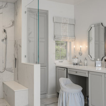
To start we chose a cooler color palette for the entire space. Tiles that look like Statuario marble are set off by a white and blue marble Arabesque mosaic medallion in the center of the room.
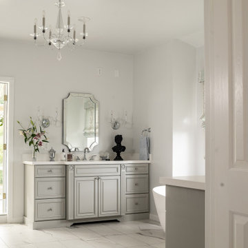
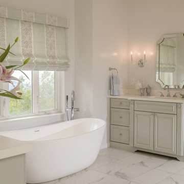
Once the space-hogging Jacuzzi tub was removed, I was able to fit larger, dueling vanities in a lovely French green (a grey with a slight, cool olive tone). These furniture-style units feature a breakfront sink base flanked by fluted columns topped with rosettes. A sculptural, contemporary tub now sits in the alcove looking out over the lush hillside.
The Neo-Classicism of the Georgian aesthetic inspired my choices for light fixtures. The central chandelier and vanity sconces feature glass finials and simplified flourishes.
We removed the glass bricks and rebuilt the entire shower to accommodate a linear drain, making it a true zero-clearance shower without a curb. My clients are now able to waltz into the shower without navigating oddly placed walls and an unusually high step into the pan.
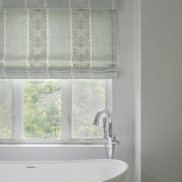
Even the adjacent make-up vanity got a make-over—and a beverage refrigerator concealed by a panel of the same French green--to blend with the new, lighter style of the space. Finally, I designed custom Roman shades in a stunning embroidered material of cream and aqua to complete the room. The high style of the space references the past while reveling in a current moment of comfort and convenience.
Photo: Bernardo Grijalva
 wood mgmt furniture + interior spaces
Governors Island Welcome Center by Office III
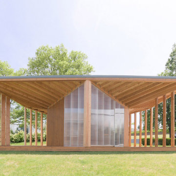
The pavilion is the first-ever welcome centre for Governors Island, and was added to help tourists better navigate the small island in the city's harbour. It lies just 800 yards (732 metres) from Manhattan's southern-most tip, and reachable by ferry from both there or downtown Brooklyn.
Governors Island Welcome Center by Office III
The Friends of Governors Island asked Office III to design the wooden structure, but with a few constraints: it had to be prefabricated, temporary and portable, and pitched to them just six weeks later.
Governors Island Welcome Center by Office III
The studio – founded by Stephanie Lin, Ryan Golenberg, and Sean Canty from Harvard's Graduate School of Design – looked to the island's Georgian Revival-style barracks and two military forts for subtle references.
Governors Island Welcome Center by Office III
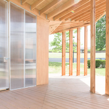
A butterfly roof covers an 800-square-foot (74-square-metre) wooden deck to protect visitors from the sun, while remaining open to the grassy lawn.
Governors Island Welcome Center by Office III
Underneath, an information kiosk is the only fully enclosed structure. Polycarbonate windows and slatted wood serve as semi-walls, which create triangular nooks and lounging areas.
Governors Island Welcome Center by Office III
Office III collaborated with Laufs Engineering Design for structural engineering. The team chose timber louvres to resist the vertical loads of the roof, while a pentagon-shaped core supports the floor deck.
Governors Island Welcome Center by Office III
Marine-grade plywood lines the interior, while cedar planks cover the exterior. Both materials are resilient to New York's infamous summer rainstorms.
Governors Island Welcome Center by Office III
The centre's "Welcome" sign showcases the same lettering used around the island. Design agency Pentagram created the custom typeface, titled Guppy Sans, for Governors Island in 2014.
The Hills on Governor's Island by West 8
Related story
West 8 creates artificial hills on New York's Governors Island
Only open in the summer months, Governors Island is a popular day-trip destination. Citygoers ferry over to see the Statue of Liberty from a recently completed hilly park by the Dutch architecture firm West 8, or for enjoying music festivals and seasonal installations, like last year's City of Dreams Pavilion by Folio.


 Fiorito Interior Design
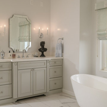
Sometimes the shape and size of a space is great but the details inside seem wrong. That was what my clients thought about their primary bathroom in their newly purchased mountain home. As only the second owners of this large house built in the early 90s, they were eager to be rid of an array of artifacts from that period: a wall of glass bricks at the shower; a huge Jacuzzi tub and deck; and an odd, unnecessary run of shelving about a foot down from the ceiling line. These clients spent many years living on the east coast and brought with them a wonderful classical sense for their interiors—so I created a space that would give them that feeling of Classicism while simultaneously feeling fresh and current.
To start we chose a cooler color palette for the entire space. Tiles that look like Statuario marble are set off by a white and blue marble Arabesque mosaic medallion in the center of the room.
Once the space-hogging Jacuzzi tub was removed, I was able to fit larger, dueling vanities in a lovely French green (a grey with a slight, cool olive tone). These furniture-style units feature a breakfront sink base flanked by fluted columns topped with rosettes. A sculptural, contemporary tub now sits in the alcove looking out over the lush hillside.
The Neo-Classicism of the Georgian aesthetic inspired my choices for light fixtures. The central chandelier and vanity sconces feature glass finials and simplified flourishes.
We removed the glass bricks and rebuilt the entire shower to accommodate a linear drain, making it a true zero-clearance shower without a curb. My clients are now able to waltz into the shower without navigating oddly placed walls and an unusually high step into the pan.
Even the adjacent make-up vanity got a make-over—and a beverage refrigerator concealed by a panel of the same French green--to blend with the new, lighter style of the space. Finally, I designed custom Roman shades in a stunning embroidered material of cream and aqua to complete the room. The high style of the space references the past while reveling in a current moment of comfort and convenience.
Photo: Bernardo Grijalva
 Fiorito Interior Design
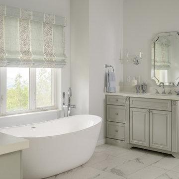
Sometimes the shape and size of a space is great but the details inside seem wrong. That was what my clients thought about their primary bathroom in their newly purchased mountain home. As only the second owners of this large house built in the early 90s, they were eager to be rid of an array of artifacts from that period: a wall of glass bricks at the shower; a huge Jacuzzi tub and deck; and an odd, unnecessary run of shelving about a foot down from the ceiling line. These clients spent many years living on the east coast and brought with them a wonderful classical sense for their interiors—so I created a space that would give them that feeling of Classicism while simultaneously feeling fresh and current.
To start we chose a cooler color palette for the entire space. Tiles that look like Statuario marble are set off by a white and blue marble Arabesque mosaic medallion in the center of the room.
Once the space-hogging Jacuzzi tub was removed, I was able to fit larger, dueling vanities in a lovely French green (a grey with a slight, cool olive tone). These furniture-style units feature a breakfront sink base flanked by fluted columns topped with rosettes. A sculptural, contemporary tub now sits in the alcove looking out over the lush hillside.
The Neo-Classicism of the Georgian aesthetic inspired my choices for light fixtures. The central chandelier and vanity sconces feature glass finials and simplified flourishes.
We removed the glass bricks and rebuilt the entire shower to accommodate a linear drain, making it a true zero-clearance shower without a curb. My clients are now able to waltz into the shower without navigating oddly placed walls and an unusually high step into the pan.
Even the adjacent make-up vanity got a make-over—and a beverage refrigerator concealed by a panel of the same French green--to blend with the new, lighter style of the space. Finally, I designed custom Roman shades in a stunning embroidered material of cream and aqua to complete the room. The high style of the space references the past while reveling in a current moment of comfort and convenience.
Photo: Bernardo Grijalva
 Fiorito Interior Design
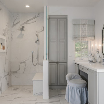
Sometimes the shape and size of a space is great but the details inside seem wrong. That was what my clients thought about their primary bathroom in their newly purchased mountain home. As only the second owners of this large house built in the early 90s, they were eager to be rid of an array of artifacts from that period: a wall of glass bricks at the shower; a huge Jacuzzi tub and deck; and an odd, unnecessary run of shelving about a foot down from the ceiling line. These clients spent many years living on the east coast and brought with them a wonderful classical sense for their interiors—so I created a space that would give them that feeling of Classicism while simultaneously feeling fresh and current.
To start we chose a cooler color palette for the entire space. Tiles that look like Statuario marble are set off by a white and blue marble Arabesque mosaic medallion in the center of the room.
Once the space-hogging Jacuzzi tub was removed, I was able to fit larger, dueling vanities in a lovely French green (a grey with a slight, cool olive tone). These furniture-style units feature a breakfront sink base flanked by fluted columns topped with rosettes. A sculptural, contemporary tub now sits in the alcove looking out over the lush hillside.
The Neo-Classicism of the Georgian aesthetic inspired my choices for light fixtures. The central chandelier and vanity sconces feature glass finials and simplified flourishes.
We removed the glass bricks and rebuilt the entire shower to accommodate a linear drain, making it a true zero-clearance shower without a curb. My clients are now able to waltz into the shower without navigating oddly placed walls and an unusually high step into the pan.
Even the adjacent make-up vanity got a make-over—and a beverage refrigerator concealed by a panel of the same French green--to blend with the new, lighter style of the space. Finally, I designed custom Roman shades in a stunning embroidered material of cream and aqua to complete the room. The high style of the space references the past while reveling in a current moment of comfort and convenience.
Photo: Bernardo Grijalva
 wood mgmt furniture + interior spaces
Governors Island Welcome Center by Office III
The pavilion is the first-ever welcome centre for Governors Island, and was added to help tourists better navigate the small island in the city's harbour. It lies just 800 yards (732 metres) from Manhattan's southern-most tip, and reachable by ferry from both there or downtown Brooklyn.
Governors Island Welcome Center by Office III
The Friends of Governors Island asked Office III to design the wooden structure, but with a few constraints: it had to be prefabricated, temporary and portable, and pitched to them just six weeks later.
Governors Island Welcome Center by Office III
The studio – founded by Stephanie Lin, Ryan Golenberg, and Sean Canty from Harvard's Graduate School of Design – looked to the island's Georgian Revival-style barracks and two military forts for subtle references.
Governors Island Welcome Center by Office III
A butterfly roof covers an 800-square-foot (74-square-metre) wooden deck to protect visitors from the sun, while remaining open to the grassy lawn.
Governors Island Welcome Center by Office III
Underneath, an information kiosk is the only fully enclosed structure. Polycarbonate windows and slatted wood serve as semi-walls, which create triangular nooks and lounging areas.
Governors Island Welcome Center by Office III
Office III collaborated with Laufs Engineering Design for structural engineering. The team chose timber louvres to resist the vertical loads of the roof, while a pentagon-shaped core supports the floor deck.
Governors Island Welcome Center by Office III
Marine-grade plywood lines the interior, while cedar planks cover the exterior. Both materials are resilient to New York's infamous summer rainstorms.
Governors Island Welcome Center by Office III
The centre's "Welcome" sign showcases the same lettering used around the island. Design agency Pentagram created the custom typeface, titled Guppy Sans, for Governors Island in 2014.
The Hills on Governor's Island by West 8
Related story
West 8 creates artificial hills on New York's Governors Island
Only open in the summer months, Governors Island is a popular day-trip destination. Citygoers ferry over to see the Statue of Liberty from a recently completed hilly park by the Dutch architecture firm West 8, or for enjoying music festivals and seasonal installations, like last year's City of Dreams Pavilion by Folio.
 Fiorito Interior Design
Sometimes the shape and size of a space is great but the details inside seem wrong. That was what my clients thought about their primary bathroom in their newly purchased mountain home. As only the second owners of this large house built in the early 90s, they were eager to be rid of an array of artifacts from that period: a wall of glass bricks at the shower; a huge Jacuzzi tub and deck; and an odd, unnecessary run of shelving about a foot down from the ceiling line. These clients spent many years living on the east coast and brought with them a wonderful classical sense for their interiors—so I created a space that would give them that feeling of Classicism while simultaneously feeling fresh and current.
To start we chose a cooler color palette for the entire space. Tiles that look like Statuario marble are set off by a white and blue marble Arabesque mosaic medallion in the center of the room.
Once the space-hogging Jacuzzi tub was removed, I was able to fit larger, dueling vanities in a lovely French green (a grey with a slight, cool olive tone). These furniture-style units feature a breakfront sink base flanked by fluted columns topped with rosettes. A sculptural, contemporary tub now sits in the alcove looking out over the lush hillside.
The Neo-Classicism of the Georgian aesthetic inspired my choices for light fixtures. The central chandelier and vanity sconces feature glass finials and simplified flourishes.
We removed the glass bricks and rebuilt the entire shower to accommodate a linear drain, making it a true zero-clearance shower without a curb. My clients are now able to waltz into the shower without navigating oddly placed walls and an unusually high step into the pan.
Even the adjacent make-up vanity got a make-over—and a beverage refrigerator concealed by a panel of the same French green--to blend with the new, lighter style of the space. Finally, I designed custom Roman shades in a stunning embroidered material of cream and aqua to complete the room. The high style of the space references the past while reveling in a current moment of comfort and convenience.
Photo: Bernardo Grijalva
 Fiorito Interior Design
Sometimes the shape and size of a space is great but the details inside seem wrong. That was what my clients thought about their primary bathroom in their newly purchased mountain home. As only the second owners of this large house built in the early 90s, they were eager to be rid of an array of artifacts from that period: a wall of glass bricks at the shower; a huge Jacuzzi tub and deck; and an odd, unnecessary run of shelving about a foot down from the ceiling line. These clients spent many years living on the east coast and brought with them a wonderful classical sense for their interiors—so I created a space that would give them that feeling of Classicism while simultaneously feeling fresh and current.
To start we chose a cooler color palette for the entire space. Tiles that look like Statuario marble are set off by a white and blue marble Arabesque mosaic medallion in the center of the room.
Once the space-hogging Jacuzzi tub was removed, I was able to fit larger, dueling vanities in a lovely French green (a grey with a slight, cool olive tone). These furniture-style units feature a breakfront sink base flanked by fluted columns topped with rosettes. A sculptural, contemporary tub now sits in the alcove looking out over the lush hillside.
The Neo-Classicism of the Georgian aesthetic inspired my choices for light fixtures. The central chandelier and vanity sconces feature glass finials and simplified flourishes.
We removed the glass bricks and rebuilt the entire shower to accommodate a linear drain, making it a true zero-clearance shower without a curb. My clients are now able to waltz into the shower without navigating oddly placed walls and an unusually high step into the pan.
Even the adjacent make-up vanity got a make-over—and a beverage refrigerator concealed by a panel of the same French green--to blend with the new, lighter style of the space. Finally, I designed custom Roman shades in a stunning embroidered material of cream and aqua to complete the room. The high style of the space references the past while reveling in a current moment of comfort and convenience.
Photo: Bernardo Grijalva
 Fiorito Interior Design
Sometimes the shape and size of a space is great but the details inside seem wrong. That was what my clients thought about their primary bathroom in their newly purchased mountain home. As only the second owners of this large house built in the early 90s, they were eager to be rid of an array of artifacts from that period: a wall of glass bricks at the shower; a huge Jacuzzi tub and deck; and an odd, unnecessary run of shelving about a foot down from the ceiling line. These clients spent many years living on the east coast and brought with them a wonderful classical sense for their interiors—so I created a space that would give them that feeling of Classicism while simultaneously feeling fresh and current.
To start we chose a cooler color palette for the entire space. Tiles that look like Statuario marble are set off by a white and blue marble Arabesque mosaic medallion in the center of the room.
Once the space-hogging Jacuzzi tub was removed, I was able to fit larger, dueling vanities in a lovely French green (a grey with a slight, cool olive tone). These furniture-style units feature a breakfront sink base flanked by fluted columns topped with rosettes. A sculptural, contemporary tub now sits in the alcove looking out over the lush hillside.
The Neo-Classicism of the Georgian aesthetic inspired my choices for light fixtures. The central chandelier and vanity sconces feature glass finials and simplified flourishes.
We removed the glass bricks and rebuilt the entire shower to accommodate a linear drain, making it a true zero-clearance shower without a curb. My clients are now able to waltz into the shower without navigating oddly placed walls and an unusually high step into the pan.
Even the adjacent make-up vanity got a make-over—and a beverage refrigerator concealed by a panel of the same French green--to blend with the new, lighter style of the space. Finally, I designed custom Roman shades in a stunning embroidered material of cream and aqua to complete the room. The high style of the space references the past while reveling in a current moment of comfort and convenience.
Photo: Bernardo Grijalva
 Fiorito Interior Design
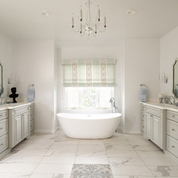
Sometimes the shape and size of a space is great but the details inside seem wrong. That was what my clients thought about their primary bathroom in their newly purchased mountain home. As only the second owners of this large house built in the early 90s, they were eager to be rid of an array of artifacts from that period: a wall of glass bricks at the shower; a huge Jacuzzi tub and deck; and an odd, unnecessary run of shelving about a foot down from the ceiling line. These clients spent many years living on the east coast and brought with them a wonderful classical sense for their interiors—so I created a space that would give them that feeling of Classicism while simultaneously feeling fresh and current.
To start we chose a cooler color palette for the entire space. Tiles that look like Statuario marble are set off by a white and blue marble Arabesque mosaic medallion in the center of the room.
Once the space-hogging Jacuzzi tub was removed, I was able to fit larger, dueling vanities in a lovely French green (a grey with a slight, cool olive tone). These furniture-style units feature a breakfront sink base flanked by fluted columns topped with rosettes. A sculptural, contemporary tub now sits in the alcove looking out over the lush hillside.
The Neo-Classicism of the Georgian aesthetic inspired my choices for light fixtures. The central chandelier and vanity sconces feature glass finials and simplified flourishes.
We removed the glass bricks and rebuilt the entire shower to accommodate a linear drain, making it a true zero-clearance shower without a curb. My clients are now able to waltz into the shower without navigating oddly placed walls and an unusually high step into the pan.
Even the adjacent make-up vanity got a make-over—and a beverage refrigerator concealed by a panel of the same French green--to blend with the new, lighter style of the space. Finally, I designed custom Roman shades in a stunning embroidered material of cream and aqua to complete the room. The high style of the space references the past while reveling in a current moment of comfort and convenience.
Photo: Bernardo Grijalva
 Fiorito Interior Design
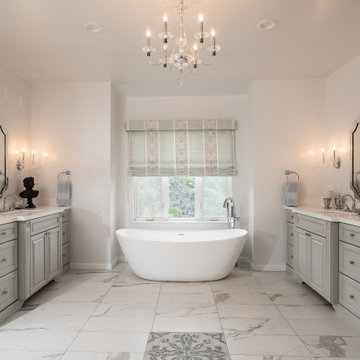
Sometimes the shape and size of a space is great but the details inside seem wrong. That was what my clients thought about their primary bathroom in their newly purchased mountain home. As only the second owners of this large house built in the early 90s, they were eager to be rid of an array of artifacts from that period: a wall of glass bricks at the shower; a huge Jacuzzi tub and deck; and an odd, unnecessary run of shelving about a foot down from the ceiling line. These clients spent many years living on the east coast and brought with them a wonderful classical sense for their interiors—so I created a space that would give them that feeling of Classicism while simultaneously feeling fresh and current.
To start we chose a cooler color palette for the entire space. Tiles that look like Statuario marble are set off by a white and blue marble Arabesque mosaic medallion in the center of the room.
Once the space-hogging Jacuzzi tub was removed, I was able to fit larger, dueling vanities in a lovely French green (a grey with a slight, cool olive tone). These furniture-style units feature a breakfront sink base flanked by fluted columns topped with rosettes. A sculptural, contemporary tub now sits in the alcove looking out over the lush hillside.
The Neo-Classicism of the Georgian aesthetic inspired my choices for light fixtures. The central chandelier and vanity sconces feature glass finials and simplified flourishes.
We removed the glass bricks and rebuilt the entire shower to accommodate a linear drain, making it a true zero-clearance shower without a curb. My clients are now able to waltz into the shower without navigating oddly placed walls and an unusually high step into the pan.
Even the adjacent make-up vanity got a make-over—and a beverage refrigerator concealed by a panel of the same French green--to blend with the new, lighter style of the space. Finally, I designed custom Roman shades in a stunning embroidered material of cream and aqua to complete the room. The high style of the space references the past while reveling in a current moment of comfort and convenience.
Photo: Bernardo Grijalva
 wood mgmt furniture + interior spaces
Governors Island Welcome Center by Office III
The pavilion is the first-ever welcome centre for Governors Island, and was added to help tourists better navigate the small island in the city's harbour. It lies just 800 yards (732 metres) from Manhattan's southern-most tip, and reachable by ferry from both there or downtown Brooklyn.
Governors Island Welcome Center by Office III
The Friends of Governors Island asked Office III to design the wooden structure, but with a few constraints: it had to be prefabricated, temporary and portable, and pitched to them just six weeks later.
Governors Island Welcome Center by Office III
The studio – founded by Stephanie Lin, Ryan Golenberg, and Sean Canty from Harvard's Graduate School of Design – looked to the island's Georgian Revival-style barracks and two military forts for subtle references.
Governors Island Welcome Center by Office III
A butterfly roof covers an 800-square-foot (74-square-metre) wooden deck to protect visitors from the sun, while remaining open to the grassy lawn.
Governors Island Welcome Center by Office III
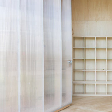
Underneath, an information kiosk is the only fully enclosed structure. Polycarbonate windows and slatted wood serve as semi-walls, which create triangular nooks and lounging areas.
Governors Island Welcome Center by Office III
Office III collaborated with Laufs Engineering Design for structural engineering. The team chose timber louvres to resist the vertical loads of the roof, while a pentagon-shaped core supports the floor deck.
Governors Island Welcome Center by Office III
Marine-grade plywood lines the interior, while cedar planks cover the exterior. Both materials are resilient to New York's infamous summer rainstorms.
Governors Island Welcome Center by Office III
The centre's "Welcome" sign showcases the same lettering used around the island. Design agency Pentagram created the custom typeface, titled Guppy Sans, for Governors Island in 2014.
The Hills on Governor's Island by West 8
Related story
West 8 creates artificial hills on New York's Governors Island
Only open in the summer months, Governors Island is a popular day-trip destination. Citygoers ferry over to see the Statue of Liberty from a recently completed hilly park by the Dutch architecture firm West 8, or for enjoying music festivals and seasonal installations, like last year's City of Dreams Pavilion by Folio.
 Universal Appliance and Kitchen Center
Miele Ranges at Universal Appliance and Kitchen Center
26767 Agoura Road, Calabasas, CA 91302
Phone 818.880.0011 Fax 818.880.0411
12050 Ventura Blvd.,Studio City, CA 91604
Phone 818.755.1111 Fax 818.755.9111
www.uakc.com
Miele focuses on delivering precise, reliable, gourmet cooking results – compromise is simply not an option when it comes to performance. Miele ranges offering different size configurations (30", 36" and 48") and power configurations (dual fuel, gas, electric and induction). All aligning perfectly with Miele Generation 6000 built-in appliances in terms of design, function and user interface.
Key Features of Miele ranges:
M Touch
Miele's new M Touch controls are both easy-to-operate and navigate. An intuitive swipe of the screen will quickly lead you to your desired selection. Whether choosing an automatic Chicken program or calling up one of your Favorites, the screen with provide a pleasing visual with easy to read touch controls.
M Pro Dual Stacked Burner System
The M Pro Dual Stacked Burner System enables each of the burners on a Miele Range or Rangetop to both simmer and sear. Regular burners reaching up to 19,000 BTUs and the True Simmer burner reaching a maximum of 12,000 BTU, offers a wide range of precision temperatures for any recipe.
Moisture Plus
Increasing the humidity in the oven optimizes the cooking of a variety of foods: soft bread with a shiny, appetizing crust; dinner rolls and croissants as if from the local baker; succulent, tender meat with a nicely browned crust, perfect casseroles, delicious pastries and so much more.
MasterChef and MasterChef Plus
Both found in the Gourmet Center, MasterChef allows you to choose from over 100 easy-to-use programs for items such as baked goods, pizza, turkey and much more making preparation a breeze. Miele will deliver menu options that guide you step by step to the desired oven mode and temperature to create the perfect dish. MasterChef Plus Programs feature 15 Automatic bread programs bake as if from a bakery, guiding you to the correct mode, temperature, time and integration of Moisture Plus to create the perfect bread.
Wireless Roast Probe
Enjoy individualized and accurate roasting of meat, fish and poultry with the wireless roast probe, which measures the core temperature and displays the time remaining. No need to monitor the cooking process. Easy to use - and great for poultry, fish and roasts.
177