
Search results for "Neglected" in Home Design Ideas
 Goodman's Painting Service
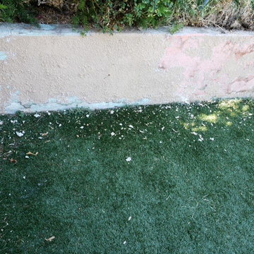
Neglected Garden bed and pool area resurfaced, cleaned and painted.
Photo of a mid-sized traditional full sun backyard raised garden bed in Los Angeles for summer.
Photo of a mid-sized traditional full sun backyard raised garden bed in Los Angeles for summer.
 Linda Daly, ASID
Photography by Todd A. Trice
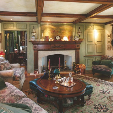
Example of a mid-sized classic enclosed medium tone wood floor living room design in Philadelphia with a standard fireplace, a wood fireplace surround and a concealed tv
Example of a mid-sized classic enclosed medium tone wood floor living room design in Philadelphia with a standard fireplace, a wood fireplace surround and a concealed tv
 Simply Perfect
It’s been said that when you dream about a house, the basement represents your subconscious level. Perhaps that was true in the past, when basements were often neglected. But in most of today’s new builds and remodels, lower levels are becoming valuable living spaces. If you’re looking at building or renovating, opening up that lower level with sufficient light can add square footage and value to your home.
In addition, having access to bright indoor areas can help combat cabin fever, which peaks in late winter. Looking at the photos here, you’d never know what you’re seeing is a lower level. That’s because a smart builder knew that bringing natural light into the space was key.
Our job, in furnishing the space, was to make the most of that light. The off-white walls and light grey carpet provide a good base.
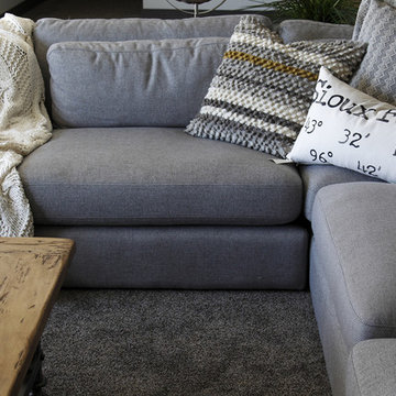
A grey sectional sofa with clean, modern lines easily fits into the spacious room. It’s an ideal piece to encourage people to spend time together. The strong, forgiving linen resists staining, and like a blank canvas this true neutral allows for accessorizing with various throws and pillows depending on the season.
The cream-colored throw echoes the light colors in the space, while the nubby pillow adds a textured contrast.
Find the right local pro for your project
 Rosenberg Kolb Architects
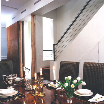
Formerly the site of a medical laboratory, Rosenberg Kolb redesigned this townhouse to accommodate a single family residence and home office.
The original building had been very badly neglected for many years. The structure dates to the late 19th Century. Rosenberg Kolb restored and opened up the space considerably. The upper three floors were combined into a single residence, while the ground floor and basement were converted into office space.
Working with a strict budget, Rosenberg Kolb employed a mixed of high-end and more economical finishes to keep costs down while still maintaining a high standard for design and beauty.
 Klopf Architecture
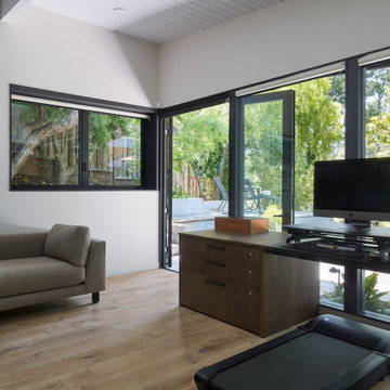
A family of passionate athletes and sports aficionados embarked on a remarkable endeavor alongside our team and Studio M Merge. Their vision? To breathe new life into their outdated mid-century modern home and neglected pool, resulting in the dramatic “Sports Enthusiasts’ Hideaway.” The transformative journey focused on opening the interior spaces out toward the beautiful gardens and amenities. The renewed house features expanded open-plan living areas, a new bedroom, and a reimagined primary bath. An attached ADU added a sports bar and a flexible office space that can double as a private guest bedroom. The outdoor spaces were brought to life with the addition of expansive decks, inviting patios, a horseshoe pit, a basketball half-court, refreshing plunge pools, and a lush sports lawn. A pool house artfully frames the view from the pool to the neighboring golf course. This family of five finds themselves immersed in their expanded home and experiential outdoor hideaway. Every element has been thoughtfully designed to cater to their favorite activities, providing a peaceful haven where they can fully indulge their shared passion for sports.
Klopf Architecture Project Team: John Klopf, AIA, Angela Todorova, Geoff Campen
Interior Architectural Design: Klopf Architecture
Landscape Architect: Studio M Merge
Contractor: Flegels Construction
Landscape Contractor: Frank & Grossman (phase 1), Garden Group (phase 2)
Photography: ©2013-2023 Mariko Reed
Year Completed: 2012 through 2020
Location: Los Gatos, CA
 Painting in Partnership, Inc.
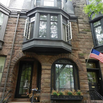
After decades of neglect, the metal bay window and cornice on this 1885 building façade had deteriorated to the point where they had to be completely rebuilt, replicating the intricate original designs with galvanized steel. The work involved the complete removal of the metal elements, as well as the old slate on the slanted roofs and the reinstallation of new one.
 Moto Designshop
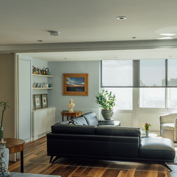
In the top floor of the Hopkinson House lived a neglected, dingy corner apartment facing Washington Square. The new owner purchased the unit and undertook a complete gut renovation of the space. With parallels to her own life, the owner craved a new, fresh, light filled, colorful space to call her own. The design centers around a retractable suede wall panel system which when open, draws in the western sun, creating a spacious living area. When closed, it allows for a guest bedroom complete with Murphy bed. Fine finishes accent the space throughout and wood shelving provide displays for an extensive teapot collection.
 Custom Design & Construction
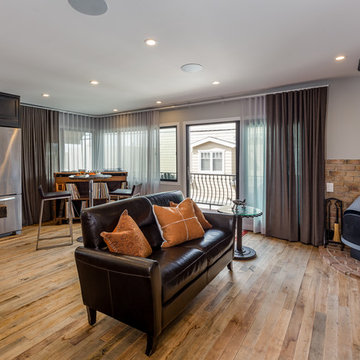
Our client approached us while he was in the process of purchasing his ½ lot detached unit in Hermosa Beach. He was drawn to a design / build approach because although he has great design taste, as a busy professional he didn’t have the time or energy to manage every detail involved in a home remodel. The property had been used as a rental unit and was in need of TLC. By bringing us onto the project during the purchase we were able to help assess the true condition of the home. Built in 1976, the 894 sq. ft. home had extensive termite and dry rot damage from years of neglect. The project required us to reframe the home from the inside out.
To design a space that your client will love you really need to spend time getting to know them. Our client enjoys entertaining small groups. He has a custom turntable and considers himself a mixologist. We opened up the space, space-planning for his custom turntable, to make it ideal for entertaining. The wood floor is reclaimed wood from manufacturing facilities. The reframing work also allowed us to make the roof a deck with an ocean view. The home is now a blend of the latest design trends and vintage elements and our client couldn’t be happier!
View the 'before' and 'after' images of this project at:
http://www.houzz.com/discussions/4189186/bachelors-whole-house-remodel-in-hermosa-beach-ca-part-1
http://www.houzz.com/discussions/4203075/m=23/bachelors-whole-house-remodel-in-hermosa-beach-ca-part-2
http://www.houzz.com/discussions/4216693/m=23/bachelors-whole-house-remodel-in-hermosa-beach-ca-part-3
Features: subway tile, reclaimed wood floors, quartz countertops, bamboo wood cabinetry, Ebony finish cabinets in kitchen
 Front Range Woodworks, LLC
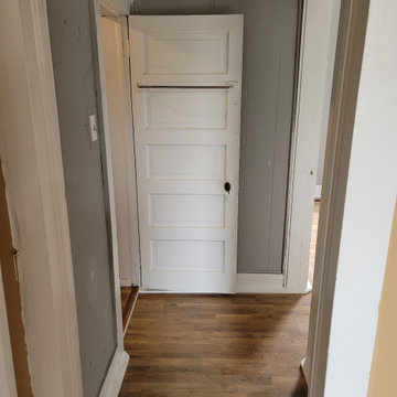
This house had been severely neglected and not maintained at all by past tenants. The homeowner asked if we could restore her house. This project was a complete refresh that started with removing everything from inside the home. The old warn out carpet was removed and throughout the whole house Luxury vinyl tile that is waterproof, and dent and scratch resistant was installed. The outdated wood paneling was replaced, and holes patched and textured and then painted with a modern paint color. The kitchen and bathrooms were updated with epoxy counter tops, new cabinets and fixtures.
 Rebecca Mitchell Interiors
VICTORIAN LAKEFRONT BEFORE & AFTER
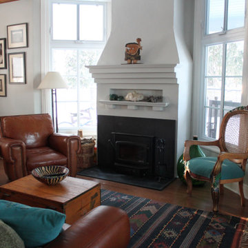
This neglected Victorian on the waterfront in Hudson was a perfect example of a diamond in the rough. But its new owners recognized its potential and (lucky for us) we were hired to redesign the main floor. Everything was replaced, from the uneven and mismatched floor boards, to the dilapidated, rickety old staircase. Not to mention, new windows, sexy new hot water heaters imported from England., a new kitchen and main floor bathroom. The entire house was painted Moonshine by Benjamin Moore - a watery blue-grey colour which works perfectly with all the wood and white trim. The kitchen was gutted and reconfigured to optimize the fantastic water views allowing the owners to relax at their new island (with soapstone counters). The beautiful blue backsplash tiles make this traditional white kitchen anything but boring. And we painted the adjacent dining room ceiling the same deep blue colour to add impact.
Our clients had travelled all over the world for work before returning to Montreal, and their art collection, geological artifacts, wool rugs and assortment of wood furniture (collected in Chile, Mexico and Arizona to name a few places) give this updated Victorian a lived-in, eclectic look. We added some unexpected lighting with a nod to the Victorian age throughout and the back room, once the exterior porch, is now a the perfect retreat to relax, hold book club meetings or just enjoy the views from the elegant new furniture or the newly reupholstered family heirloom bench.
 K&N Appliance Gallery
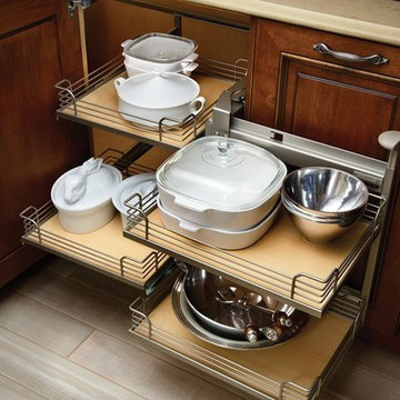
No corner should feel neglected, thanks to Wood-Mode.
Example of a small classic light wood floor kitchen design in Houston with beaded inset cabinets, dark wood cabinets, solid surface countertops and stainless steel appliances
Example of a small classic light wood floor kitchen design in Houston with beaded inset cabinets, dark wood cabinets, solid surface countertops and stainless steel appliances
 dirzobriceno@gmail.com
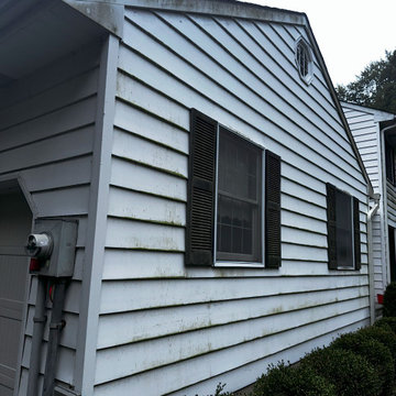
I gave the house a new look; it previously looked gloomy and neglected. I used high-quality materials, including special ones for plant care and to delay the reappearance of mold. With the right tools and my experience, I was able to finish washing it in two days, which helped my client keep costs low.
 REVIVAL
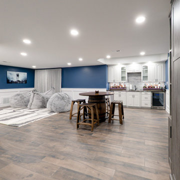
This multi-use basement renovation maximizes every square inch of the lower level, transforming it from a neglected storage area into a high-end entertainment suite. The design centers on versatility, featuring a spacious open-concept layout that seamlessly transitions between a cozy media lounge and a sophisticated home bar area.
 Michael Nash Design, Build & Homes
2011 NARI CAPITAL COTY FINALIST AWARD WINNER
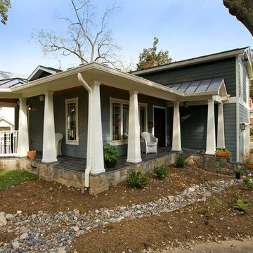
This 1970’s split-level single-family home in an upscale Arlington neighborhood had been neglected for years. With his surrounding neighbors all doing major exterior and interior remodeling, however, the owner decided it was time to renovate his property as well. After several consultation meetings with the design team at Michael Nash Design, Build & Homes, he settled on an exterior layout to create an Art & Craft design for the home.
It all got started by excavating the front and left side of the house and attaching a wrap-around stone porch. Key design attributes include a black metal roof, large tapered columns, blue and grey random style flag stone, beaded stain ceiling paneling and an octagonal seating area on the left side of this porch. The front porch has a wide stairway and another set of stairs leads to the back yard.
All exterior walls of the home were modified with new headers to allow much larger custom-made windows, new front doors garage doors, and French side and back doors. A custom-designed mahogany front door with leaded glass provides more light and offers a wider entrance into the home’s living area.
Design challenges included removing the entire face of the home and then adding new insulation, Tyvek and Hardiplank siding. The use of high-efficiency low-e windows makes the home air tight.
The Arts & Crafts design touches include the front gable over the front porch, the prairie-style grill pattern on the windows and doors, the use of tapered columns sitting over stone columns and the leaded glass front door. Decorative exterior lighting provides the finishing touches to this look.
Inside, custom woodwork, crown molding, custom glass cabinets and interior pillars carry the design. Upon entering the space, visitors face a large partition that separates the living area from a gourmet Arts & Crafts kitchen and dining room.
The home’s signature space, the kitchen offers contrasting dark and light cherry cabinets. Wide plank hard wood floors, exotic granite counters and stainless steel professional-grade appliances make this a kitchen fit for any chef.
 Donna Boerner a Smith & Noble In-Home Designer
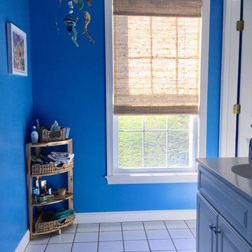
In the kid’s bath my customer wanted something that had visual appeal, provided privacy at all times since the shade is down most of the time yet still allowed light into the space. Our cordless natural woven shade done in 16796 Tongli/Sandstone with a privacy lining is perfect. Did you notice there is art in the bathroom as well. I love it, no space is neglected.
 Michael Nash Design, Build & Homes
2013 CHRYSALIS AWARD SOUTH REGION WINNER, RESIDENTIAL EXTERIOR
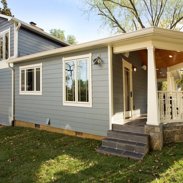
This 1970’s split-level single-family home in an upscale Arlington neighborhood had been neglected for years. With his surrounding neighbors all doing major exterior and interior remodeling, however, the owner decided it was time to renovate his property as well. After several consultation meetings with the design team at Michael Nash Design, Build & Homes, he settled on an exterior layout to create an Art & Craft design for the home.
It all got started by excavating the front and left side of the house and attaching a wrap-around stone porch. Key design attributes include a black metal roof, large tapered columns, blue and grey random style flag stone, beaded stain ceiling paneling and an octagonal seating area on the left side of this porch. The front porch has a wide stairway and another set of stairs leads to the back yard.
All exterior walls of homes were modified with new headers to allow much larger custom-made windows, new front doors garage doors, and French side and back doors. A custom-designed mahogany front door with leaded glass provides more light and offers a wider entrance into the home’s living area.
Design challenges included removing the entire face of the home and then adding new insulation, Tyvek and Hardiplank siding. The use of high-efficiency low-e windows makes the home air tight.
The Arts & Crafts design touches include the front gable over the front porch, the prairie-style grill pattern on the windows and doors, the use of tapered columns sitting over stone columns and the leaded glass front door. Decorative exterior lighting provides the finishing touches to this look.
 Renée’s – Interior & Lifestyle Design
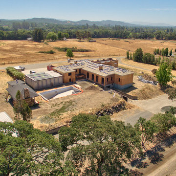
Another design project underway, is a complete renovation of a neglected estate, with so much potential. Located in a beautiful setting of vineyards and views. The exterior and interior will reflect my love of the French Provence style. A little French, a little chateau – with a casual, classic, elegant style.
 Piperbear Designs
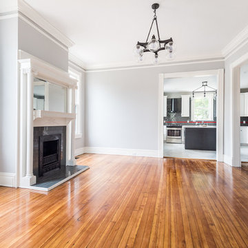
Located in Church Hill, Richmond’s oldest neighborhood, this very early 1900s Victorian had tons of historical details, but the house itself had been neglected (badly!). The home had two major renovation periods – one in 1950’s, and then again in the 1980s’s, which covered over or disrupted the original aesthetics of the house (think open ductwork, framing and drywall obscuring the beautiful mantels and moldings, and the hot water heater taking up valuable kitchen space). Our Piperbear team had to “undo” much before we could tackle the restoration of the historical features, while at the same time modernizing the layout.
 User
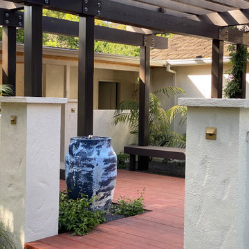
UserThis home was not even visible from the street because of the overgrown and neglected landscape. There was no obvious entrance to the front door, and the garden area was surprisingly spacious once the over grown brush was removed. We added an arbored and walled patio in the rear garden, near the kitchen, for morning coffee and meditation. .
 User
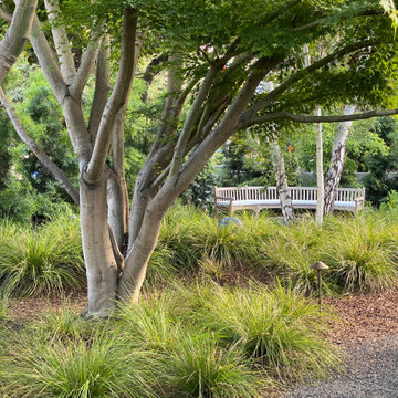
UserThis home was not even visible from the street because of the overgrown and neglected landscape. There was no obvious entrance to the front door, and the garden area was surprisingly spacious once the over grown brush was removed. We added an arbored and walled patio in the rear garden, near the kitchen, for morning coffee and meditation. .
33