
Search results for "Never before seen" in Home Design Ideas
 Jack Calderone
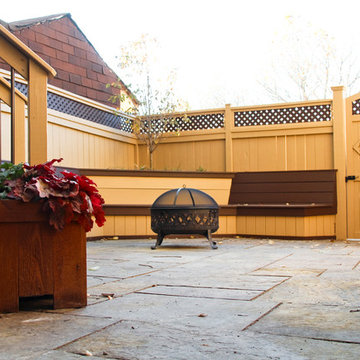
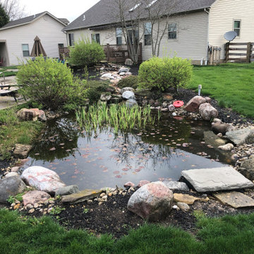
The flagstone patio was the most expensive and difficult part of the whole project. I had never done a patio before, and I didn’t realize how much dirt would need to be removed to create the gravel base. Fortunately, my wife was working for a landscaping company at the time, and they let us borrow a Dingo mini excavator. Since our house backs up to a hill, the Dingo was also very helpful in bringing the crushed stone several hundred feet from where the dump truck dropped it. However, we had to return the Dingo before the job was finished, and a good friend helped me move about 15,000 lbs. of gravel in wheel barrows from the front driveway to the back yard. He also helped me pick up the flagstone from the local stone yard (another 6,000 lbs.).
 Advance Design Studio, Ltd.
Willie & Leslie of Barrington Hills loved the location of their home. Its breathtaking views overlooked a wooded backyard and a captivating lake. They didn’t want to move, but they needed more space. But the house was missing that big family room where everyone could gather, relax and converse, and the house was completely cut off visually from the beautiful outdoor view right outside!
They knew what they wanted meant building an addition to their home. They began searching the internet and came across Advance Design Studio, and after browsing through project after project and reading one outstanding client review after another, they were sold on Advance Design. Additionally, they loved Advance Design’s “Common Sense Remodeling” process and felt confident that it would allow the Design/Build company to easily coordinate the multiple projects they wanted to complete all at one time. Willie and Leslie immediately set up a meeting with Owner Todd Jurs and Project Designer Claudia Pop. When the meeting ended, they were sure that Advance Design were the right people and the right approach for their project.
"Establishing a direction and a budget is always key in project of this size," Todd said. "This house was screaming for a family room and it didn't have one. Ultimately, it's about working together towards the same goal of a beautiful functional addition."
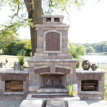
The project consisted of a significant family room addition with an extraordinary vaulted ceiling and floor to ceiling fireplace, a guest suite renovation with a luxury bath, a garage addition, and an adjoining outdoor patio renovation complete with a fantastic built in grilling station. The main goal was to add comfort and space to the existing home that would last their lifetime, and finally allow them to capture the amazing view of the backyard and lake that they never could really enjoy previously.
Willie, Leslie and Claudia paid special attention to designing the space to make sure that the footprint of the room did not interfere with the views. Floor to ceiling Pella windows were incorporated into a spectacular window wall to provide plenty of natural light.
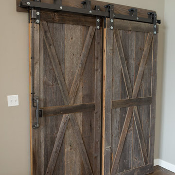
Vaulted ceilings gave the room a bigger feel and the stunning floor to ceiling masonry fireplace was designed giving the room a rustic, comfortable feel of a Colorado Lodge. Barnwood doors and exposed wooden beams accentuate the crackling fireplace and family gathering space. An oversized statement chandelier bathes the space in soft light once the sun sets and compliments the exposed wood and fireplace perfectly.
“It simple elegant and beautiful,” Designer Claudia Pop said. “It is a great family room that captures the views perfectly. They love the fireplace, the barndoors and the openness of the space we designed for the whole family now to enjoy.”
And when warm weather beckons, the outdoor patio is a terrific place to spend an evening. The family now enjoys fall nights in front of their outdoor fireplace overlooking the quiet lake. Dekton Trillium Quartz counters tops adorn an amazing grilling bar. Nearly indestructible, they are the only manufactured stone product designed exclusively to withstand high heat in summer and extreme cold temperatures in winter.
The guest bath renovation makes Willie and Leslie’s friends and family feel like they are staying at a 5-star hotel. Carlisle colored Maple cabinets from Medallion make a roomy dual vanity more than adequate with plenty of space to get ready for the day after a peaceful night’s sleep. Cambria Quartz countertops are durable and elegant, while contrasting the neutral cabinets flawlessly. Heated flooring from Warmly Yours is the cherry on top for this cozy guest bath.
All the projects turned out better than they even imagined. Willie and Leslie now have a spacious family room with even better views of the lake and woods, a much larger garage, a fantastic relaxing outdoor patio, and a guest bath that makes it almost impossible to get the guest to leave after their stay.
Are you thinking about a remodeling project? Talk to the experts at Advance Design about the renovation of your dreams. Now is the perfect time to renovate. Check out other amazing projects here. With “Common Sense Remodeling”, the process of renovating your home has never been easier. Contact us today at 847-836-2600 or schedule an appointment to talk with us about your kitchen remodeling project, or any other home renovation you are planning. Our talented team can help you design and build the new space you’ve been dreaming about.
 Staging Consultants
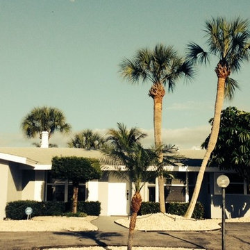
Improved curb appeal. AFTER. Light gray paint with crisp white trim & shutters. Existing trees and shrubs were removed or trimmed up to reveal a clean, low maintenance landscape sure to attract buyers. It's amazing what can be accomplished with paint and a little elbow grease. There's never a second chance to make a good first impression. If you were in the market, would you have wanted to see the inside of the house in the before photos?
Find the right local pro for your project
 Tile Doctor Ltd
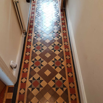
This client had just moved into a property in York and having pulled back the old carpet revealed a lovely old period Victorian tiled floor she didn’t know existed when she bought the house!
I went over at the beginning of this year to survey the floor and could see that fortunately, no glue or carpet grips had been used to secure the carpet; additionally the floor was in good physical condition considering its age with no cracks or loose tiles. The tiles were however very dusty and dirty with ingrained dirt and so had probably been covered with carpet for a very long time. The hallway was quite dark I’m afraid with little natural light so apologies for the photographs.
With old houses like this you never know what you are going to find so whilst I was there surveying the floor, I took some moisture readings with a damp meter on the floors and walls. The readings came back low so no sign of damp which was a relief to the owner.
We agreed a price for the work, and I arranged to come back the following week.
I must admit I do like York, its steeped in history and famous for its Cathedral and Viking museum. The houses in the city have loads of character and period features like this floor are quite common.
I deep cleaned the floor with a strong 1:3 dilution of Tile Doctor Pro-Clean worked in with a black scrubbing pad fitted to a rotary machine. Initially the solution was left to soak into the tile before being agitated by the machine. The soil was then rinsed off with minimal water and then extracted with a wet vacuum.
I followed this up with an Acid Wash using Tile Doctor Acid Gel to further clean up the tiles and help inhibit any potential efflorescent salt issues which are common in floors of this age due to the absence of the damp proof membrane. The floor was given a further rinse and extraction and allowed to dry out fully overnight. I needed the floor to be dry for the next day so it could be sealed.
I came back the next day and started by taking more damp readings which showed similar readings to the day before. Given the low readings I was able to move straight onto sealing which was done using four coats of Tile Doctor Seal and Go. This product works really well on old Victorian Tiles like these and being water based it doesn’t leave a smell as it dries.
Once the final coat of sealer had dried there was a significant improvement in the appearance of the floor which was much appreciated by client who was very happy with the end result.
For aftercare I recommended the use of Tile Doctor Neutral Tile Cleaner to maintain the floor, it has a nice fresh smell and can be used regularly due to its pH neutral nature which won’t prematurely erode the sealer like stronger bleach based cleaners.
Nigel Stoker
North West Yorkshire Tile Doctor
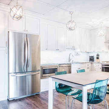
 RAJ Kitchen and Bath, LLC
 “Full apartment design”.
IF you have not yet seen this apartment conversion before, we strongly urge you to go to the bottom left of this page and click on the short 2-minutes video. It would put a lot of things into perspective when you come back and continue reading this.
It is true we were literally handed the keys and told a list of things that they wanted to have happen and we were to go into the apartment, look at the space and come up with a design that would satisfy all of that need. UNTIL we showed up! The unit had really seen some better days but we knew we had to look past that and come up with a concept that would work for them.
The immediate challenges were centered around 3 big ideas:
1. Adding a second bedroom to the already small footprint
2. Figuring out a way to make the kitchen bigger, better and brighter
3. Creating a master room walk in closet
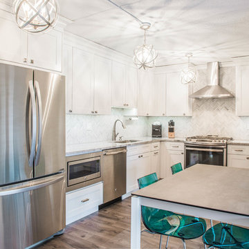
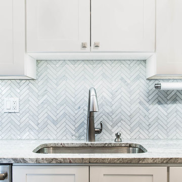
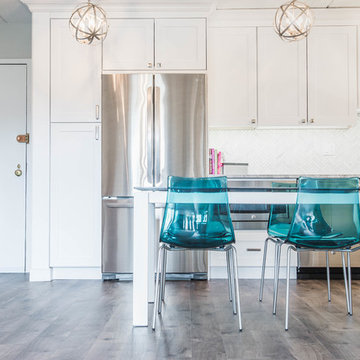
It’s always difficult to add new rooms into existing footprint without expanding out or up and not incurring any opportunity cost. In this case, that was exactly what we had to do. Item one and two above had to be tackled as one. We went ahead and switched out the location of the dining room and eliminating an area where there was a “nook” type eat-in area. By doing so, we were able to cut right into that footprint and change the layout of the kitchen.
That one move allowed us to dig into the kitchen design because it was now the main focal point in the apartment. It was no longer an option to keep it in that tiny hole where it was, so we had to ensure that this design was functional and aesthetically pleasing at the same time. By adding the table into the space where an Island typically would go, we were able to both cut cost and still provide a dining experience. The Table serves as an Island as well when cooking.
We then proceeded to block in the existing doorway to the dining room. By doing this, we were able to create a full room which allowed us to put a door on the other side and called that room Bedroom #2. This was easier to do because all of the mechanicals were already in that space (light, heater and windows). By shifting things around, we also achieved a huge wall to wall closet from inside. PERFECT!
Then we moved into the Single bedroom. We thought it was a big room with a small closet, so by creatively adding an L shaped wall and steal some footprint into the bedroom side, we were able to put a door on that new room and design it for the walk-in closet. Even after this, the bedroom still holds a queen size bed with 2 night stands, a TV on the wall, a sitting chair and plenty of room to walk around. This was done by rethinking the location for the bed and night stands.
The bathroom was gutted to make sure there was no leaks and rebuild from the ground up. We kept all of the plumbing where it was, added a new vanity, medicine cabinet, tiles and lighting and it was done.
From there, the rest of the unit had new flooring all throughout, paint, and lighting. After completion and walk through, this project was handed over back to the clients.
Execution and collaboration between all the trades were: Reggie and his team from Premier Interiors and Rohan from RD Mechanical Services.
p.s. Please see our website to see the video.
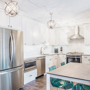 RAJ Kitchen and Bath, LLC
 “Full apartment design”.
IF you have not yet seen this apartment conversion before, we strongly urge you to go to the bottom left of this page and click on the short 2-minutes video. It would put a lot of things into perspective when you come back and continue reading this.
It is true we were literally handed the keys and told a list of things that they wanted to have happen and we were to go into the apartment, look at the space and come up with a design that would satisfy all of that need. UNTIL we showed up! The unit had really seen some better days but we knew we had to look past that and come up with a concept that would work for them.
The immediate challenges were centered around 3 big ideas:
1. Adding a second bedroom to the already small footprint
2. Figuring out a way to make the kitchen bigger, better and brighter
3. Creating a master room walk in closet
It’s always difficult to add new rooms into existing footprint without expanding out or up and not incurring any opportunity cost. In this case, that was exactly what we had to do. Item one and two above had to be tackled as one. We went ahead and switched out the location of the dining room and eliminating an area where there was a “nook” type eat-in area. By doing so, we were able to cut right into that footprint and change the layout of the kitchen.
That one move allowed us to dig into the kitchen design because it was now the main focal point in the apartment. It was no longer an option to keep it in that tiny hole where it was, so we had to ensure that this design was functional and aesthetically pleasing at the same time. By adding the table into the space where an Island typically would go, we were able to both cut cost and still provide a dining experience. The Table serves as an Island as well when cooking.
We then proceeded to block in the existing doorway to the dining room. By doing this, we were able to create a full room which allowed us to put a door on the other side and called that room Bedroom #2. This was easier to do because all of the mechanicals were already in that space (light, heater and windows). By shifting things around, we also achieved a huge wall to wall closet from inside. PERFECT!
Then we moved into the Single bedroom. We thought it was a big room with a small closet, so by creatively adding an L shaped wall and steal some footprint into the bedroom side, we were able to put a door on that new room and design it for the walk-in closet. Even after this, the bedroom still holds a queen size bed with 2 night stands, a TV on the wall, a sitting chair and plenty of room to walk around. This was done by rethinking the location for the bed and night stands.
The bathroom was gutted to make sure there was no leaks and rebuild from the ground up. We kept all of the plumbing where it was, added a new vanity, medicine cabinet, tiles and lighting and it was done.
From there, the rest of the unit had new flooring all throughout, paint, and lighting. After completion and walk through, this project was handed over back to the clients.
Execution and collaboration between all the trades were: Reggie and his team from Premier Interiors and Rohan from RD Mechanical Services.
p.s. Please see our website to see the video.
 Bilotta Kitchen & Home
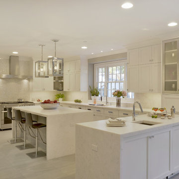
From the outside of this very traditional home in Harrison, New York, you would never expect the contemporary styling and pops of color throughout the interior, including the white feather chandelier and oversized painting of Marilyn Monroe with pink bubblegum, both of which accent the dinner table. When the client first came into meet with Bilotta designer, Danielle Florie, they had an idea of what they wanted, and what they didn’t want. They have modern/transitional taste and wanted both an aesthetically “wow” kitchen that was also very functional. Danielle made it come to life. They had been collecting photos for ten years before they decided to pull the trigger. They opted for Bilotta’s private cabinetry line, the Bilotta Collection, and selected a frameless, stepped door with double tiered wall cabinets, all accented by polished chrome rectangular pulls and square knobs. Instead of a deep corner cabinet they went with thick alumasteel shelves in the corner of the kitchen. At the peninsula they added some “bling” with the polished chrome and glass doors above the appliance garage. Also at the peninsula they decided to face their secondary, “prep” sink out towards the dinner table primarily so the kids could wash their hands before eating. There is also an undercounter beverage center to the right of that sink for easy access to drinks. Instead of going with a smooth painted finish they opted for a hand-brushed finish for a little texture. All appliances are Miele including their brand new 48” duel fuel range, smart enough on its own to tell you how to cook! The backsplash behind the range is the Stone Fox Collection from Ellen Blakeley of Ellen Blakely Studio in Santa Rosa, CA. It is a custom made tempered glass mosaic. The countertops and rest of the backsplash are White Diamond marble from Rye Marble, and the flooring is a porcelain Tile from Terra Tile. Designer: Danielle Florie. Photo Credit: Peter Krupenye

 RAJ Kitchen and Bath, LLC
 “Full apartment design”.
IF you have not yet seen this apartment conversion before, we strongly urge you to go to the bottom left of this page and click on the short 2-minutes video. It would put a lot of things into perspective when you come back and continue reading this.
It is true we were literally handed the keys and told a list of things that they wanted to have happen and we were to go into the apartment, look at the space and come up with a design that would satisfy all of that need. UNTIL we showed up! The unit had really seen some better days but we knew we had to look past that and come up with a concept that would work for them.
The immediate challenges were centered around 3 big ideas:
1. Adding a second bedroom to the already small footprint
2. Figuring out a way to make the kitchen bigger, better and brighter
3. Creating a master room walk in closet
It’s always difficult to add new rooms into existing footprint without expanding out or up and not incurring any opportunity cost. In this case, that was exactly what we had to do. Item one and two above had to be tackled as one. We went ahead and switched out the location of the dining room and eliminating an area where there was a “nook” type eat-in area. By doing so, we were able to cut right into that footprint and change the layout of the kitchen.
That one move allowed us to dig into the kitchen design because it was now the main focal point in the apartment. It was no longer an option to keep it in that tiny hole where it was, so we had to ensure that this design was functional and aesthetically pleasing at the same time. By adding the table into the space where an Island typically would go, we were able to both cut cost and still provide a dining experience. The Table serves as an Island as well when cooking.
We then proceeded to block in the existing doorway to the dining room. By doing this, we were able to create a full room which allowed us to put a door on the other side and called that room Bedroom #2. This was easier to do because all of the mechanicals were already in that space (light, heater and windows). By shifting things around, we also achieved a huge wall to wall closet from inside. PERFECT!
Then we moved into the Single bedroom. We thought it was a big room with a small closet, so by creatively adding an L shaped wall and steal some footprint into the bedroom side, we were able to put a door on that new room and design it for the walk-in closet. Even after this, the bedroom still holds a queen size bed with 2 night stands, a TV on the wall, a sitting chair and plenty of room to walk around. This was done by rethinking the location for the bed and night stands.
The bathroom was gutted to make sure there was no leaks and rebuild from the ground up. We kept all of the plumbing where it was, added a new vanity, medicine cabinet, tiles and lighting and it was done.
From there, the rest of the unit had new flooring all throughout, paint, and lighting. After completion and walk through, this project was handed over back to the clients.
Execution and collaboration between all the trades were: Reggie and his team from Premier Interiors and Rohan from RD Mechanical Services.
p.s. Please see our website to see the video.
 Carl Mattison Design
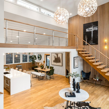
Take a home that has seen many lives and give it yet another one! This entry foyer got opened up to the kitchen and now gives the home a flow it had never seen.
 Jeanne Schultz Design Studio
Words by Wilson Hack
The best architecture allows what has come before it to be seen and cared for while at the same time injecting something new, if not idealistic. Spartan at first glance, the interior of this stately apartment building, located on the iconic Passeig de Gràcia in Barcelona, quickly begins to unfold as a calculated series of textures, visual artifacts and perfected aesthetic continuities.
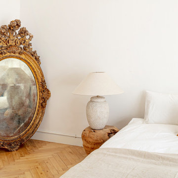
The client, a globe-trotting entrepreneur, selected Jeanne Schultz Design Studio for the remodel and requested that the space be reconditioned into a purposeful and peaceful landing pad. It was to be furnished simply using natural and sustainable materials. Schultz began by gently peeling back before adding only the essentials, resulting in a harmoniously restorative living space where darkness and light coexist and comfort reigns.
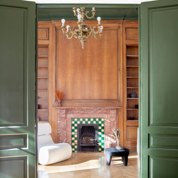
The design was initially guided by the fireplace—from there a subtle injection of matching color extends up into the thick tiered molding and ceiling trim. “The most reckless patterns live here,” remarks Schultz, referring to the checkered green and white tiles, pink-Pollack-y stone and cast iron detailing. The millwork and warm wood wall panels devour the remainder of the living room, eliminating the need for unnecessary artwork.
A curved living room chair by Kave Home punctuates playfully; its shape reveals its pleasant conformity to the human body and sits back, inviting rest and respite. “It’s good for all body types and sizes,” explains Schultz. The single sofa by Dareels is purposefully oversized, casual and inviting. A beige cover was added to soften the otherwise rectilinear edges. Additionally sourced from Dareels, a small yet centrally located side table anchors the space with its dark black wood texture, its visual weight on par with the larger pieces. The black bulbous free standing lamp converses directly with the antique chandelier above. Composed of individual black leather strips, it is seemingly harsh—yet its soft form is reminiscent of a spring tulip.
The continuation of the color palette slips softly into the dining room where velvety green chairs sit delicately on a cascade array of pointed legs. The doors that lead out to the patio were sanded down and treated so that the original shape and form could be retained. Although the same green paint was used throughout, this set of doors speaks in darker tones alongside the acute and penetrating daylight. A few different shades of white paint were used throughout the space to add additional depth and embellish this shadowy texture.
Specialty lights were added into the space to complement the existing overhead lighting. A wall sconce was added in the living room and extra lighting was placed in the kitchen. However, because of the existing barrel vaulted tile ceiling, sconces were placed on the walls rather than above to avoid penetrating the existing architecture.
 Advance Design Studio, Ltd.
Willie & Leslie of Barrington Hills loved the location of their home. Its breathtaking views overlooked a wooded backyard and a captivating lake. They didn’t want to move, but they needed more space. But the house was missing that big family room where everyone could gather, relax and converse, and the house was completely cut off visually from the beautiful outdoor view right outside!
They knew what they wanted meant building an addition to their home. They began searching the internet and came across Advance Design Studio, and after browsing through project after project and reading one outstanding client review after another, they were sold on Advance Design. Additionally, they loved Advance Design’s “Common Sense Remodeling” process and felt confident that it would allow the Design/Build company to easily coordinate the multiple projects they wanted to complete all at one time. Willie and Leslie immediately set up a meeting with Owner Todd Jurs and Project Designer Claudia Pop. When the meeting ended, they were sure that Advance Design were the right people and the right approach for their project.
"Establishing a direction and a budget is always key in project of this size," Todd said. "This house was screaming for a family room and it didn't have one. Ultimately, it's about working together towards the same goal of a beautiful functional addition."
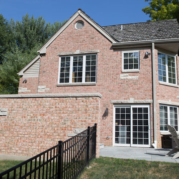
The project consisted of a significant family room addition with an extraordinary vaulted ceiling and floor to ceiling fireplace, a guest suite renovation with a luxury bath, a garage addition, and an adjoining outdoor patio renovation complete with a fantastic built in grilling station. The main goal was to add comfort and space to the existing home that would last their lifetime, and finally allow them to capture the amazing view of the backyard and lake that they never could really enjoy previously.
Willie, Leslie and Claudia paid special attention to designing the space to make sure that the footprint of the room did not interfere with the views. Floor to ceiling Pella windows were incorporated into a spectacular window wall to provide plenty of natural light.
Vaulted ceilings gave the room a bigger feel and the stunning floor to ceiling masonry fireplace was designed giving the room a rustic, comfortable feel of a Colorado Lodge. Barnwood doors and exposed wooden beams accentuate the crackling fireplace and family gathering space. An oversized statement chandelier bathes the space in soft light once the sun sets and compliments the exposed wood and fireplace perfectly.
“It simple elegant and beautiful,” Designer Claudia Pop said. “It is a great family room that captures the views perfectly. They love the fireplace, the barndoors and the openness of the space we designed for the whole family now to enjoy.”
And when warm weather beckons, the outdoor patio is a terrific place to spend an evening. The family now enjoys fall nights in front of their outdoor fireplace overlooking the quiet lake. Dekton Trillium Quartz counters tops adorn an amazing grilling bar. Nearly indestructible, they are the only manufactured stone product designed exclusively to withstand high heat in summer and extreme cold temperatures in winter.
The guest bath renovation makes Willie and Leslie’s friends and family feel like they are staying at a 5-star hotel. Carlisle colored Maple cabinets from Medallion make a roomy dual vanity more than adequate with plenty of space to get ready for the day after a peaceful night’s sleep. Cambria Quartz countertops are durable and elegant, while contrasting the neutral cabinets flawlessly. Heated flooring from Warmly Yours is the cherry on top for this cozy guest bath.
All the projects turned out better than they even imagined. Willie and Leslie now have a spacious family room with even better views of the lake and woods, a much larger garage, a fantastic relaxing outdoor patio, and a guest bath that makes it almost impossible to get the guest to leave after their stay.
Are you thinking about a remodeling project? Talk to the experts at Advance Design about the renovation of your dreams. Now is the perfect time to renovate. Check out other amazing projects here. With “Common Sense Remodeling”, the process of renovating your home has never been easier. Contact us today at 847-836-2600 or schedule an appointment to talk with us about your kitchen remodeling project, or any other home renovation you are planning. Our talented team can help you design and build the new space you’ve been dreaming about.
 Pro-Tile & Marble
Pro-Tile & Marble, Inc.
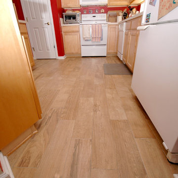
Something you may never have thought about is actually the hot trend: faux wood tile flooring. If you’ve never seen a faux wood tile floor, then you are missing out. These types of floors not only give you the look of wood, but also the durability of tile.
This homeowner chose a beautiful natural color plank tile floor for her home at the beach. She wanted a floor that could stand up to her animals, the beach sand, ad everything else that goes with living at the beach. She was pleased with the final results and is loving the look of her new flooring. After all home is where the heart is....
Call us today for a free in home estimate 904-731-6471
 RAJ Kitchen and Bath, LLC
 “Full apartment design”.
IF you have not yet seen this apartment conversion before, we strongly urge you to go to the bottom left of this page and click on the short 2-minutes video. It would put a lot of things into perspective when you come back and continue reading this.
It is true we were literally handed the keys and told a list of things that they wanted to have happen and we were to go into the apartment, look at the space and come up with a design that would satisfy all of that need. UNTIL we showed up! The unit had really seen some better days but we knew we had to look past that and come up with a concept that would work for them.
The immediate challenges were centered around 3 big ideas:
1. Adding a second bedroom to the already small footprint
2. Figuring out a way to make the kitchen bigger, better and brighter
3. Creating a master room walk in closet
It’s always difficult to add new rooms into existing footprint without expanding out or up and not incurring any opportunity cost. In this case, that was exactly what we had to do. Item one and two above had to be tackled as one. We went ahead and switched out the location of the dining room and eliminating an area where there was a “nook” type eat-in area. By doing so, we were able to cut right into that footprint and change the layout of the kitchen.
That one move allowed us to dig into the kitchen design because it was now the main focal point in the apartment. It was no longer an option to keep it in that tiny hole where it was, so we had to ensure that this design was functional and aesthetically pleasing at the same time. By adding the table into the space where an Island typically would go, we were able to both cut cost and still provide a dining experience. The Table serves as an Island as well when cooking.
We then proceeded to block in the existing doorway to the dining room. By doing this, we were able to create a full room which allowed us to put a door on the other side and called that room Bedroom #2. This was easier to do because all of the mechanicals were already in that space (light, heater and windows). By shifting things around, we also achieved a huge wall to wall closet from inside. PERFECT!
Then we moved into the Single bedroom. We thought it was a big room with a small closet, so by creatively adding an L shaped wall and steal some footprint into the bedroom side, we were able to put a door on that new room and design it for the walk-in closet. Even after this, the bedroom still holds a queen size bed with 2 night stands, a TV on the wall, a sitting chair and plenty of room to walk around. This was done by rethinking the location for the bed and night stands.
The bathroom was gutted to make sure there was no leaks and rebuild from the ground up. We kept all of the plumbing where it was, added a new vanity, medicine cabinet, tiles and lighting and it was done.
From there, the rest of the unit had new flooring all throughout, paint, and lighting. After completion and walk through, this project was handed over back to the clients.
Execution and collaboration between all the trades were: Reggie and his team from Premier Interiors and Rohan from RD Mechanical Services.
p.s. Please see our website to see the video.

 Phoenix Home Remodeling
It was a great experience working with Barbara & Peter on their bathroom remodel. They never did a remodel before on their 1983 built house and were looking to refresh the outdated master bathroom.
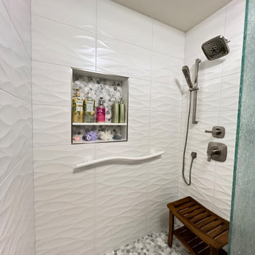
A new custom shower was installed with a new backer board, waterproof, and shower wall tile. They chose Idole Tear White ceramic tile from Floor & Decor for the shower wall tile.
They picked White Marble Flat Pebble for the new shower floor tile and the new shower wall niche. They also had us install a new shower handheld fixture, shower head, and grab bar that has a fun curve to it and matches the shower wall.
They also had us install a new frameless tempered rain glass with a door on the new shower.
For the bathroom flooring, we used Valley Ridge Mansfield Amber III Porcelain, which adds a fresh and sleek feel to the area.
 RAJ Kitchen and Bath, LLC
 “Full apartment design”.
IF you have not yet seen this apartment conversion before, we strongly urge you to go to the bottom left of this page and click on the short 2-minutes video. It would put a lot of things into perspective when you come back and continue reading this.
It is true we were literally handed the keys and told a list of things that they wanted to have happen and we were to go into the apartment, look at the space and come up with a design that would satisfy all of that need. UNTIL we showed up! The unit had really seen some better days but we knew we had to look past that and come up with a concept that would work for them.
The immediate challenges were centered around 3 big ideas:
1. Adding a second bedroom to the already small footprint
2. Figuring out a way to make the kitchen bigger, better and brighter
3. Creating a master room walk in closet
It’s always difficult to add new rooms into existing footprint without expanding out or up and not incurring any opportunity cost. In this case, that was exactly what we had to do. Item one and two above had to be tackled as one. We went ahead and switched out the location of the dining room and eliminating an area where there was a “nook” type eat-in area. By doing so, we were able to cut right into that footprint and change the layout of the kitchen.
That one move allowed us to dig into the kitchen design because it was now the main focal point in the apartment. It was no longer an option to keep it in that tiny hole where it was, so we had to ensure that this design was functional and aesthetically pleasing at the same time. By adding the table into the space where an Island typically would go, we were able to both cut cost and still provide a dining experience. The Table serves as an Island as well when cooking.
We then proceeded to block in the existing doorway to the dining room. By doing this, we were able to create a full room which allowed us to put a door on the other side and called that room Bedroom #2. This was easier to do because all of the mechanicals were already in that space (light, heater and windows). By shifting things around, we also achieved a huge wall to wall closet from inside. PERFECT!
Then we moved into the Single bedroom. We thought it was a big room with a small closet, so by creatively adding an L shaped wall and steal some footprint into the bedroom side, we were able to put a door on that new room and design it for the walk-in closet. Even after this, the bedroom still holds a queen size bed with 2 night stands, a TV on the wall, a sitting chair and plenty of room to walk around. This was done by rethinking the location for the bed and night stands.
The bathroom was gutted to make sure there was no leaks and rebuild from the ground up. We kept all of the plumbing where it was, added a new vanity, medicine cabinet, tiles and lighting and it was done.
From there, the rest of the unit had new flooring all throughout, paint, and lighting. After completion and walk through, this project was handed over back to the clients.
Execution and collaboration between all the trades were: Reggie and his team from Premier Interiors and Rohan from RD Mechanical Services.
p.s. Please see our website to see the video.
 RAJ Kitchen and Bath, LLC
 “Full apartment design”.
IF you have not yet seen this apartment conversion before, we strongly urge you to go to the bottom left of this page and click on the short 2-minutes video. It would put a lot of things into perspective when you come back and continue reading this.
It is true we were literally handed the keys and told a list of things that they wanted to have happen and we were to go into the apartment, look at the space and come up with a design that would satisfy all of that need. UNTIL we showed up! The unit had really seen some better days but we knew we had to look past that and come up with a concept that would work for them.
The immediate challenges were centered around 3 big ideas:
1. Adding a second bedroom to the already small footprint
2. Figuring out a way to make the kitchen bigger, better and brighter
3. Creating a master room walk in closet
It’s always difficult to add new rooms into existing footprint without expanding out or up and not incurring any opportunity cost. In this case, that was exactly what we had to do. Item one and two above had to be tackled as one. We went ahead and switched out the location of the dining room and eliminating an area where there was a “nook” type eat-in area. By doing so, we were able to cut right into that footprint and change the layout of the kitchen.
That one move allowed us to dig into the kitchen design because it was now the main focal point in the apartment. It was no longer an option to keep it in that tiny hole where it was, so we had to ensure that this design was functional and aesthetically pleasing at the same time. By adding the table into the space where an Island typically would go, we were able to both cut cost and still provide a dining experience. The Table serves as an Island as well when cooking.
We then proceeded to block in the existing doorway to the dining room. By doing this, we were able to create a full room which allowed us to put a door on the other side and called that room Bedroom #2. This was easier to do because all of the mechanicals were already in that space (light, heater and windows). By shifting things around, we also achieved a huge wall to wall closet from inside. PERFECT!
Then we moved into the Single bedroom. We thought it was a big room with a small closet, so by creatively adding an L shaped wall and steal some footprint into the bedroom side, we were able to put a door on that new room and design it for the walk-in closet. Even after this, the bedroom still holds a queen size bed with 2 night stands, a TV on the wall, a sitting chair and plenty of room to walk around. This was done by rethinking the location for the bed and night stands.
The bathroom was gutted to make sure there was no leaks and rebuild from the ground up. We kept all of the plumbing where it was, added a new vanity, medicine cabinet, tiles and lighting and it was done.
From there, the rest of the unit had new flooring all throughout, paint, and lighting. After completion and walk through, this project was handed over back to the clients.
Execution and collaboration between all the trades were: Reggie and his team from Premier Interiors and Rohan from RD Mechanical Services.
p.s. Please see our website to see the video.
 Jeanne Schultz Design Studio
Words by Wilson Hack
The best architecture allows what has come before it to be seen and cared for while at the same time injecting something new, if not idealistic. Spartan at first glance, the interior of this stately apartment building, located on the iconic Passeig de Gràcia in Barcelona, quickly begins to unfold as a calculated series of textures, visual artifacts and perfected aesthetic continuities.
The client, a globe-trotting entrepreneur, selected Jeanne Schultz Design Studio for the remodel and requested that the space be reconditioned into a purposeful and peaceful landing pad. It was to be furnished simply using natural and sustainable materials. Schultz began by gently peeling back before adding only the essentials, resulting in a harmoniously restorative living space where darkness and light coexist and comfort reigns.
The design was initially guided by the fireplace—from there a subtle injection of matching color extends up into the thick tiered molding and ceiling trim. “The most reckless patterns live here,” remarks Schultz, referring to the checkered green and white tiles, pink-Pollack-y stone and cast iron detailing. The millwork and warm wood wall panels devour the remainder of the living room, eliminating the need for unnecessary artwork.
A curved living room chair by Kave Home punctuates playfully; its shape reveals its pleasant conformity to the human body and sits back, inviting rest and respite. “It’s good for all body types and sizes,” explains Schultz. The single sofa by Dareels is purposefully oversized, casual and inviting. A beige cover was added to soften the otherwise rectilinear edges. Additionally sourced from Dareels, a small yet centrally located side table anchors the space with its dark black wood texture, its visual weight on par with the larger pieces. The black bulbous free standing lamp converses directly with the antique chandelier above. Composed of individual black leather strips, it is seemingly harsh—yet its soft form is reminiscent of a spring tulip.
The continuation of the color palette slips softly into the dining room where velvety green chairs sit delicately on a cascade array of pointed legs. The doors that lead out to the patio were sanded down and treated so that the original shape and form could be retained. Although the same green paint was used throughout, this set of doors speaks in darker tones alongside the acute and penetrating daylight. A few different shades of white paint were used throughout the space to add additional depth and embellish this shadowy texture.
Specialty lights were added into the space to complement the existing overhead lighting. A wall sconce was added in the living room and extra lighting was placed in the kitchen. However, because of the existing barrel vaulted tile ceiling, sconces were placed on the walls rather than above to avoid penetrating the existing architecture.

Sponsored
Sunbury, OH

J.Holderby - Renovations
Franklin County's Leading General Contractors - 2X Best of Houzz!
 Advance Design Studio, Ltd.
Willie & Leslie of Barrington Hills loved the location of their home. Its breathtaking views overlooked a wooded backyard and a captivating lake. They didn’t want to move, but they needed more space. But the house was missing that big family room where everyone could gather, relax and converse, and the house was completely cut off visually from the beautiful outdoor view right outside!
They knew what they wanted meant building an addition to their home. They began searching the internet and came across Advance Design Studio, and after browsing through project after project and reading one outstanding client review after another, they were sold on Advance Design. Additionally, they loved Advance Design’s “Common Sense Remodeling” process and felt confident that it would allow the Design/Build company to easily coordinate the multiple projects they wanted to complete all at one time. Willie and Leslie immediately set up a meeting with Owner Todd Jurs and Project Designer Claudia Pop. When the meeting ended, they were sure that Advance Design were the right people and the right approach for their project.
"Establishing a direction and a budget is always key in project of this size," Todd said. "This house was screaming for a family room and it didn't have one. Ultimately, it's about working together towards the same goal of a beautiful functional addition."
The project consisted of a significant family room addition with an extraordinary vaulted ceiling and floor to ceiling fireplace, a guest suite renovation with a luxury bath, a garage addition, and an adjoining outdoor patio renovation complete with a fantastic built in grilling station. The main goal was to add comfort and space to the existing home that would last their lifetime, and finally allow them to capture the amazing view of the backyard and lake that they never could really enjoy previously.
Willie, Leslie and Claudia paid special attention to designing the space to make sure that the footprint of the room did not interfere with the views. Floor to ceiling Pella windows were incorporated into a spectacular window wall to provide plenty of natural light.
Vaulted ceilings gave the room a bigger feel and the stunning floor to ceiling masonry fireplace was designed giving the room a rustic, comfortable feel of a Colorado Lodge. Barnwood doors and exposed wooden beams accentuate the crackling fireplace and family gathering space. An oversized statement chandelier bathes the space in soft light once the sun sets and compliments the exposed wood and fireplace perfectly.
“It simple elegant and beautiful,” Designer Claudia Pop said. “It is a great family room that captures the views perfectly. They love the fireplace, the barndoors and the openness of the space we designed for the whole family now to enjoy.”
And when warm weather beckons, the outdoor patio is a terrific place to spend an evening. The family now enjoys fall nights in front of their outdoor fireplace overlooking the quiet lake. Dekton Trillium Quartz counters tops adorn an amazing grilling bar. Nearly indestructible, they are the only manufactured stone product designed exclusively to withstand high heat in summer and extreme cold temperatures in winter.
The guest bath renovation makes Willie and Leslie’s friends and family feel like they are staying at a 5-star hotel. Carlisle colored Maple cabinets from Medallion make a roomy dual vanity more than adequate with plenty of space to get ready for the day after a peaceful night’s sleep. Cambria Quartz countertops are durable and elegant, while contrasting the neutral cabinets flawlessly. Heated flooring from Warmly Yours is the cherry on top for this cozy guest bath.
All the projects turned out better than they even imagined. Willie and Leslie now have a spacious family room with even better views of the lake and woods, a much larger garage, a fantastic relaxing outdoor patio, and a guest bath that makes it almost impossible to get the guest to leave after their stay.
Are you thinking about a remodeling project? Talk to the experts at Advance Design about the renovation of your dreams. Now is the perfect time to renovate. Check out other amazing projects here. With “Common Sense Remodeling”, the process of renovating your home has never been easier. Contact us today at 847-836-2600 or schedule an appointment to talk with us about your kitchen remodeling project, or any other home renovation you are planning. Our talented team can help you design and build the new space you’ve been dreaming about.
 Spring Lake Garden Design
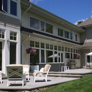
This new patio was designed and installed long distance, with never having met the clients. It relied on lots of communication and trust.
Elegant pool photo in New York
Elegant pool photo in New York
 Bilotta Kitchen & Home
From the outside of this very traditional home in Harrison, New York, you would never expect the contemporary styling and pops of color throughout the interior, including the white feather chandelier and oversized painting of Marilyn Monroe with pink bubblegum, both of which accent the dinner table. When the client first came into meet with Bilotta designer, Danielle Florie, they had an idea of what they wanted, and what they didn’t want. They have modern/transitional taste and wanted both an aesthetically “wow” kitchen that was also very functional. Danielle made it come to life. They had been collecting photos for ten years before they decided to pull the trigger. They opted for Bilotta’s private cabinetry line, the Bilotta Collection, and selected a frameless, stepped door with double tiered wall cabinets, all accented by polished chrome rectangular pulls and square knobs. Instead of a deep corner cabinet they went with thick alumasteel shelves in the corner of the kitchen. At the peninsula they added some “bling” with the polished chrome and glass doors above the appliance garage. Also at the peninsula they decided to face their secondary, “prep” sink out towards the dinner table primarily so the kids could wash their hands before eating. There is also an undercounter beverage center to the right of that sink for easy access to drinks. Instead of going with a smooth painted finish they opted for a hand-brushed finish for a little texture. All appliances are Miele including their brand new 48” duel fuel range, smart enough on its own to tell you how to cook! The backsplash behind the range is the Stone Fox Collection from Ellen Blakeley of Ellen Blakely Studio in Santa Rosa, CA. It is a custom made tempered glass mosaic. The countertops and rest of the backsplash are White Diamond marble from Rye Marble, and the flooring is a porcelain Tile from Terra Tile. Designer: Danielle Florie. Photo Credit: Peter Krupenye
44